Venture Capital Metric Handbook (2026)

Your board meeting is tomorrow. Revenue is wobbling, spend looks messy, and three different spreadsheets disagree with each other in three different ways. You don't need more tabs. You need clean answers.
That's why a Venture Capital Metric Handbook matters. Not as a glossary for finance cosplay, but as a working playbook for founders who need to talk to investors without sounding vague, and run the business without waiting on an analyst to rescue them.
The trick is simple. Learn which metrics matter, why they matter, and where people routinely fool themselves with them.
Stop Drowning in Spreadsheets Start Asking Questions
Most founders don't have a metrics problem. They have a translation problem.
The data exists. It lives in Stripe, HubSpot, Postgres, Shopify, your bank account, your CRM, and that one spreadsheet everyone swears is temporary. The hard part is turning all that mess into a board-ready answer before midnight. That's where things usually go sideways.
A lot of metric handbooks make this worse. They read like someone dumped a finance textbook into a slide deck. You get acronyms, formulas, and enough jargon to make a normal person close the tab.
A useful Venture Capital Metric Handbook should do three things:
Tell you what investors are looking at
Separate company health from fund math
Help you ask smarter questions about your own numbers
Practical rule: If a metric doesn't help you make a decision, it's trivia wearing a tie.
Founders also get trapped by false precision. They spend hours debating a formula while ignoring the bigger issue, which is whether the business is improving, stalling, or catching fire. Metrics are decision tools. They are not decorative objects for board decks.
That's why I like a plain-English approach. Start with the investor-facing numbers. Then move to operational survival. Then drill into product and growth. Once you organize metrics this way, investor conversations get easier, internal reviews get sharper, and the noise drops fast.
The Three Tiers of Startup Metrics
Founders often dump every KPI into one dashboard and call it a strategy. That's not a strategy. That's a junk drawer.
A cleaner way to think about the Venture Capital Metric Handbook is by three tiers. Each tier answers a different question, serves a different audience, and deserves a different level of attention depending on your stage.
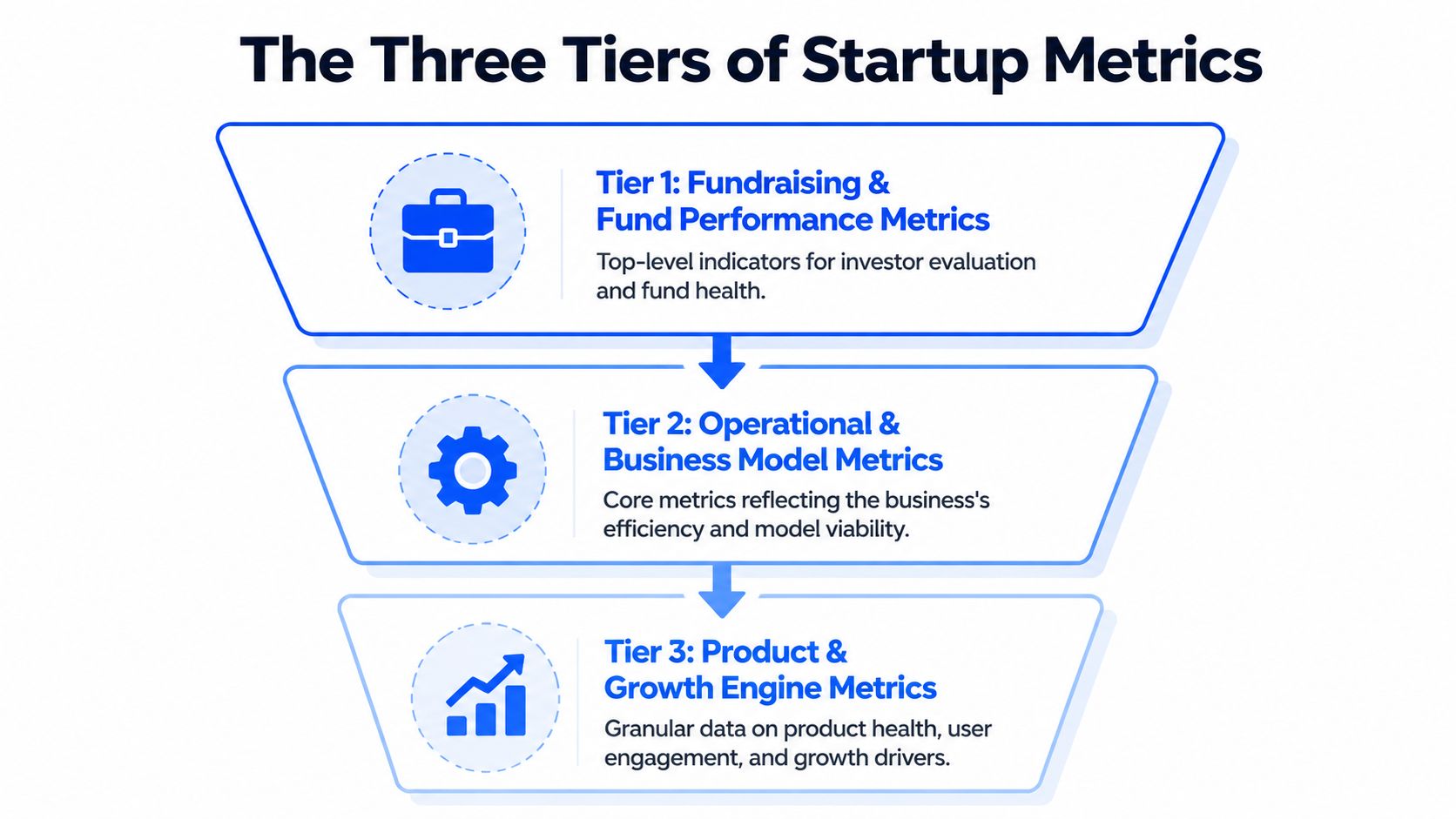
Tier 1 is investor language
This is the layer that shows up in fund reporting, LP conversations, and serious fundraising discussions. Think TVPI, DPI, RVPI, and IRR.
These metrics answer questions like:
How much value exists right now
How much cash has come back
How much of the story is still unrealized
How fast returns are materializing
If you don't understand Tier 1, you can still build a company. But you'll be at a disadvantage in investor conversations because you won't know how the people writing checks evaluate risk and performance.
Tier 2 keeps the lights on
This is the operating system of the company. Burn, runway, CAC, LTV. Less glamorous, more life-or-death.
Tier 2 tells you whether your business model can support growth without eating itself. It also tells investors whether your ambition is grounded in math or in wishful thinking.
A founder can survive weak storytelling for a while. Weak cash discipline is less forgiving.
Tier 3 proves people care
The product earns its keep. Metrics like MRR, ARR, churn, activation, and DAU/MAU help you see whether users are sticking, expanding, and turning into a repeatable growth engine.
Tier 3 is where product-market fit stops being a slogan and starts behaving like evidence.
Good board updates usually move top-down. Start with investor-relevant outcomes, explain operating health, then show the product signals driving the whole machine.
Used together, the three tiers stop metric sprawl. They also help you decide what belongs in a weekly leadership review versus a monthly board pack versus a fundraising memo.
Tier 1 Fundraising and Fund Performance Metrics
You are in a partner meeting. One investor says the fund is performing well because TVPI looks strong. Another asks why DPI is still thin. A third brings up IRR, and suddenly the room sounds like a private equity crossword puzzle.
This section fixes that problem. The goal is not to memorize jargon. The goal is to ask better questions, fast, and use conversational AI to translate fund-speak into plain English before you walk into the meeting.
TVPI tells you how good the fund looks today
TVPI means Total Value to Paid-In Capital. The formula is (Distributions + Residual Value) / Paid-In Capital, using the framework outlined in this VC metrics reference.
Plain-English version: for every dollar paid into the fund, how much total value exists right now, including both cash already returned and portfolio value that still lives on paper.
TVPI is useful because it gives a fast read on overall performance. It is also easy to overread. A strong TVPI can come from real exits, aggressive marks, or one breakout company doing a lot of narrative heavy lifting.
That trade-off matters to founders. If your lead investor talks up fund performance using TVPI alone, ask one follow-up question: how much of that value is realized?
A conversational AI tool helps here. Paste in the metric and ask, “Break this into realized versus unrealized value, and tell me what would make this look stronger or weaker in a board discussion.” That gets you from acronym recognition to actual judgment.
DPI shows who has turned paper gains into cash
DPI stands for Distributions to Paid-In Capital. It measures how much cash has been returned to investors relative to what they put in.
This is the grown-up metric.
TVPI can support a nice story. DPI answers the harder question. Did anyone get paid?
Founders should care because DPI shapes investor behavior. Funds with low distributions may be more patient, or more pressured. Sometimes both at once. If a fund is rich in unrealized value but light on cash returns, partners may push portfolio companies harder on milestones, secondary opportunities, or exit timing.
That pressure does not show up in the pitch deck. It shows up later, in board conversations.
RVPI shows how much of the story is still waiting to happen
RVPI means Residual Value to Paid-In Capital. It tracks the unrealized value still sitting in the portfolio.
For younger funds, RVPI often carries most of the performance story. That is normal. Early-stage investing takes time. But high RVPI also means more uncertainty, because private marks are opinions until a financing, acquisition, or IPO tests them in public.
Founders live inside this metric whether they mention it or not. If your company is one of the positions propping up a fund's residual value, expect attention. Expect questions. Expect a sharper interest in growth efficiency if the market is less forgiving than it was during the last pricing bubble.
If you want a practical shortcut, ask AI: “What would make a high-RVPI fund look healthy versus fragile?” That usually surfaces the right issues quickly. Concentration risk, stale marks, exit paths, and whether follow-on capital is still available.
IRR measures speed, which is why it can mislead smart people
IRR, or Internal Rate of Return, measures how quickly returns are generated over time.
Speed matters. Capital returned earlier is worth more than capital returned later. Two funds can end up with similar multiples, but the one that got there faster usually posts a better IRR.
IRR also has a talent for flattering early success. One timely exit can make the number look terrific while the rest of the portfolio still needs years of work. So IRR is useful, but only when you read it next to TVPI, DPI, and RVPI instead of treating it like a final verdict.
A good prompt for a founder is simple: “Explain whether this IRR looks strong because the whole portfolio is working, or because one early win is distorting timing.”
Read the four metrics as a set
None of these numbers should travel alone. They each answer a different question.
Metric | What it shows | What to watch out for |
|---|---|---|
TVPI | Total value created so far | Unrealized marks can inflate the picture |
DPI | Cash actually returned | Says little about remaining upside |
RVPI | Value still held in the portfolio | Exit timing and valuation risk are unresolved |
IRR | Speed of returns | Early outcomes can skew the number |
That is the practical use of a Venture Capital Metric Handbook. It helps founders stay calm when investors start speaking in shorthand. Better yet, it gives you enough fluency to use AI like an on-call analyst. Drop in the metric, ask what is driving it, ask what it hides, then show up to the conversation sounding like someone who understands both the math and the incentives behind it.
One side note that founders often miss. Fund performance metrics can look fine while cash discipline inside portfolio companies is messy. If collections are slipping and reported revenue is doing all the charisma work, optimizing accounts receivable for professional services is a useful reminder that booked revenue and usable cash are not the same thing.
Tier 2 Core Operational and Financial Health Metrics
Tier 2 is where startups either become durable or become cautionary tales. Investors care about these numbers, but your leadership team should care more because this is the layer that determines whether you get another shot at growth.
The four workhorse metrics here are net burn rate, runway, CAC, and LTV. They are simple in theory. In practice, teams mangle them with inconsistent definitions, missing costs, and optimism that belongs in fiction.
Net burn and runway are your survival pair
Net burn rate is the amount of cash the business loses over a period after revenue is accounted for. Runway is how long current cash can support that burn.
These numbers should be boringly clear. If they aren't, that's usually a systems problem, not a finance problem.
Founders often make three mistakes:
They use stale numbers. Last quarter's burn tells you very little if hiring, ad spend, or pricing changed.
They ignore timing. A planned enterprise deal is not cash in the bank.
They forget working capital drag. Revenue can look solid while collections lag badly.
If cash collection is the part of your business that keeps introducing surprise stress, this practical guide on optimizing accounts receivable for professional services is worth a read. It's a useful reminder that “booked revenue” and “available cash” are close cousins, not twins.
What works in the real world
Keep one operating definition of burn. Use it every month. Tie it to actual cash movement, not just accounting elegance.
What doesn't
Changing the definition when the board pack gets uncomfortable.
If runway only looks healthy after excluding normal expenses, you don't have healthy runway. You have a spreadsheet hobby.
CAC is easy to fake accidentally
Customer Acquisition Cost, or CAC, sounds straightforward. Total acquisition spend divided by new customers. Then the arguments begin.
Should salaries count? What about software? Agency fees? Founder-led sales? Brand marketing? Events? Referral incentives?
The right answer depends on what question you're asking.
Three versions teams confuse constantly
Blended CAC includes all meaningful acquisition costs across channels.
Paid CAC isolates direct paid spend and its attributable costs.
Segment CAC breaks acquisition cost by channel, customer type, or market.
Blended CAC helps you judge the whole machine. Paid CAC helps you judge campaign efficiency. Segment CAC helps you stop overspending on channels that look busy but don't convert profitably.
A common mistake is presenting the cheapest version as if it reflects the whole business. That's how companies convince themselves growth is efficient when it's being subsidized by founder time, undercounted labor, or channels that don't scale.
LTV is only useful if retention is real
Lifetime Value, or LTV, estimates the value a customer generates over their relationship with your company. Great in theory. Fragile in sloppy hands.
LTV becomes fiction when teams calculate it from thin cohorts, ideal customers only, or retention assumptions that haven't held for long enough to trust. If your churn is noisy, your LTV is probably overconfident.
A practical way to handle LTV:
Start with gross profit, not just revenue
Use retention patterns from real cohorts
Segment by customer type when behavior differs meaningfully
That last point matters a lot. One enterprise customer and one self-serve customer can share a product but live in different economic universes.
The LTV to CAC relationship matters more than either number alone
A standalone CAC number doesn't tell you if the business works. A standalone LTV number doesn't tell you if growth is efficient. Put them together and the picture gets sharper.
Questions worth asking in leadership reviews:
Are we acquiring customers faster than value deteriorates?
Which channels bring durable customers, not just cheap ones?
Does payback improve for the customer segments we want more of?
Metric | Good use | Bad use |
|---|---|---|
Net Burn | Cash discipline and hiring pace | Vanity trimming before fundraising |
Runway | Planning milestones and financing timing | Assuming future revenue will rescue weak cash controls |
CAC | Channel efficiency and scaling decisions | Cherry-picking low-cost acquisition slices |
LTV | Unit economics and retention quality | Forecasting fantasy from immature cohorts |
Tier 2 doesn't reward cleverness. It rewards consistency. The founders who stay in control are usually the ones who can answer uncomfortable questions without reworking the spreadsheet for an hour first.
Tier 3 Product and Growth Engine Metrics
A startup can survive mediocre dashboards. It can't survive weak product signals forever.
Tier 3 is where you learn whether customers are adopting the product, returning to it, paying for it, and sticking around long enough for growth to compound. This is the part of the Venture Capital Metric Handbook that founders should look at most often, because it catches trouble before finance does.
Here's the visual shorthand. Product health isn't one number. It's a pattern across revenue, usage, and retention.

MRR and ARR show momentum, not just size
MRR and ARR are the recurring revenue staples. They matter because recurring revenue is easier to reason about than one-off sales.
But founders often overfocus on the topline number and ignore its composition. Healthy recurring revenue usually has a few traits:
It's expanding from existing accounts, not just being replaced
It isn't heavily propped up by discounts or unusual deal terms
It grows with a repeatable sales or product motion
A flat ARR number with improving retention and expansion can be more promising than a bigger ARR number that leaks customers constantly. Raw size doesn't tell the whole story. Quality of revenue matters.
Useful prompt for your analytics workflow
Try asking your analytics tool: “Show monthly recurring revenue by segment over the last 12 months as a line chart.”
That question is better than “How's revenue doing?” because it forces a structure. Good analysis starts with sharper questions.
Churn separates growth from self-deception
Churn is one of the few metrics that can wreck a business while the team celebrates top-line growth.
You should track both:
User churn, which shows how many customers leave
Revenue churn, which shows how much recurring revenue disappears
They answer different questions. User churn tells you about product stickiness across the base. Revenue churn tells you whether the dollars are holding up.
Churn is rarely one company-wide problem. It usually hides in a customer segment, an onboarding flaw, a pricing mismatch, or a product promise the team can't consistently keep.
Questions worth asking
Which signup cohorts retain best after activation?
Does churn spike after a pricing change or product update?
Which acquisition channels bring users who stay versus users who vanish?
Prompt example: “Compare monthly revenue churn by acquisition channel and customer segment as a stacked bar chart.”
That's the kind of query that changes decisions.
Activation and DAU MAU expose product reality
If churn tells you who leaves, activation helps explain who ever got value in the first place.
Activation should reflect a real “aha” moment, not a vanity event like account creation. Logging in once is not activation. Uploading data, completing a workflow, inviting teammates, or finishing a core task might be.
DAU/MAU then helps you judge ongoing engagement. For some products, daily use matters. For others, monthly workflow completion is more meaningful. Context matters, but the principle is the same. Track behavior that maps to value, not behavior that merely creates noise.
Better prompt examples
“Show activation rate by signup cohort for the last six months.”
“Chart DAU and MAU trends by product workspace.”
“Which features are most used by retained customers versus churned customers?”
A practical growth review cadence
When I review product and growth dashboards, I like a sequence that goes from broad to diagnostic:
Revenue movement with MRR or ARR trend lines
Retention behavior through user and revenue churn
Activation patterns by cohort or channel
Engagement depth using DAU/MAU or feature usage
That order matters. It keeps teams from staring at feature clicks while recurring revenue degrades.
Metric | What it helps you answer |
|---|---|
MRR | Is recurring revenue growing consistently? |
ARR | What's the annualized revenue base today? |
User Churn | Are customers leaving the product? |
Revenue Churn | Are the dollars staying even if logos change? |
Activation Rate | Are new users reaching first value? |
DAU/MAU | Is the product habit-forming or merely installed? |
Tier 3 is where evidence for product-market fit shows up. Not in a pitch deck. In repeat usage, retained revenue, and behavior that keeps happening without the team begging for it.
Interpreting Metrics Context Is Everything
Monday, 8:42 a.m. A founder drops one line into the board Slack channel: “Our IRR looks below benchmark.” That sentence can trigger an hour of bad discussion if nobody asks the obvious follow-up questions. Benchmark for what stage, what region, what fund strategy, and what point in the cycle?
That is the fundamental job here. A metric is only useful when it is tied to the operating reality around it. Founders get into trouble when they treat a glossary definition like a decision-making system.
Venture metrics are especially easy to misuse because the same number can signal strength in one context and mediocrity in another. According to Q1 2025 benchmark context from GoingVC, global seed-stage funds might average a 25 to 35 percent IRR, while that can fall to 15 to 20 percent in Europe due to slower exits. Same formula. Different market mechanics.
Stage changes the meaning
Early companies get more room for ugly efficiency if they are still proving demand, pricing, or retention. Later-stage companies do not. Burn that looks rational in a seed company can look undisciplined in a Series B business with flat expansion revenue.
Fund metrics operate similarly. A strong paper multiple in year two often reflects marks rather than distributions. In year eight, investors should ask harder questions about what converted to cash, what remains marked up on paper, and whether the headline number flatters reality.
Geography changes the benchmark
Regional comparisons go wrong fast. A founder in Berlin using Bay Area benchmarks without adjustment is not being rigorous. They are importing someone else's market structure.
Exit timing, hiring costs, pricing power, and follow-on capital all vary by region. That changes what “good” looks like. It also changes how long you should expect weak-looking numbers to stay weak before they improve.
Timing and strategy distort the headline
IRR is sensitive to when capital goes out and when value comes back. Two funds can hold similar assets and show very different IRRs because one deployed faster or caught a different market window. The same problem shows up in startups. A jump in CAC or burn can be smart during a deliberate expansion push and reckless during a retention problem.
This is why I prefer questions before conclusions. Conversational AI is useful here because founders can pressure-test a metric in plain English instead of staring at a dashboard and guessing what matters.
Ask things like:
How does this benchmark change for our stage and region?
What does this number look like excluding unrealized gains?
Did deployment timing inflate or suppress the current result?
Which comparison group matches our strategy?
If your team needs a cleaner lens for metric interpretation, this guide to understanding key performance indicators is a useful companion. For a practical case for clearer reporting discipline, see Jacksonville CPA's guide to financial reporting.
Boards do not need more metric definitions. They need sharper framing, better comparisons, and faster answers to the next obvious question. That is how non-technical founders stop reciting numbers and start using them.
Building Your VC-Ready Dashboard with Statspresso
Most startups don't fail to track metrics because the math is hard. They fail because the workflow is annoying.
The old setup usually looks like this. Data lives in a few systems. Someone exports CSVs. Someone else writes SQL. A dashboard gets built after the question has already become urgent. By the time everyone agrees on definitions, the board meeting has arrived and the numbers are half stale.
That process still exists because many teams assume it's normal. It's not. It's just old.
A financial dashboard is supposed to reduce confusion, not create more of it. If you want a practical non-technical primer on why dashboard clarity matters, Jacksonville CPA's guide to financial reporting makes the point well.
Data Analysis Old Way vs New Way
Task | Old Way (Manual BI & SQL) | New Way (Statspresso) |
|---|---|---|
Checking burn and runway | Ask finance for exports, rebuild formulas, verify assumptions manually | Ask a plain-English question and get a chart in seconds |
Reviewing churn by cohort | Wait for SQL joins across billing and product data | Query the connected sources conversationally |
Preparing board updates | Stitch slides from several dashboards and spreadsheets | Pull current metrics into one shareable workflow |
Investigating a revenue dip | Create ad hoc reports after the issue appears | Ask follow-up questions on the spot |
Comparing channel efficiency | Reconcile CRM, ad, and revenue data manually | Use one conversational interface across sources |
Questions that actually produce useful dashboards
A VC-ready dashboard should answer management questions before it starts decorating the page.
Try prompts like these:
“Show monthly burn and runway trend over time.”
“Compare CAC by channel and customer segment.”
“Chart MRR growth and revenue churn by month.”
“Which cohorts have the strongest activation and retention?”
“Show recurring revenue expansion versus contraction across accounts.”
Those are operational questions, not BI project requests. That distinction matters. A Conversational AI Data Analyst should shorten the gap between a question and a decision.
What a strong dashboard includes
You don't need dozens of tiles. You need a handful of reliable views:
Investor-facing summary with top-level performance indicators
Operational health panel for cash, efficiency, and runway
Product and growth view covering retention, activation, and recurring revenue
Diagnostic cuts by segment, cohort, and acquisition source
Good dashboards reduce follow-up work. Great dashboards invite better questions.
If your current reporting stack still requires someone to translate every business question into SQL before you get an answer, the process is the bottleneck. Not the people.
Quick Reference and TLDR
Here's the cheat sheet version for your next board prep sprint.
TLDR
Tier 1 metrics help you speak investor. Think TVPI, DPI, RVPI, and IRR.
Tier 2 metrics keep the business alive. Watch net burn, runway, CAC, and LTV relentlessly.
Tier 3 metrics prove the product has legs. Focus on MRR, ARR, churn, activation, and DAU/MAU.
Context beats formulas. Stage, region, and timing change what “good” looks like.
A useful Venture Capital Metric Handbook is a decision tool, not an acronym museum.
Quick glossary
TVPI. Total value created relative to capital paid in. Includes realized and unrealized value. Tier 1
DPI. Cash returned relative to capital paid in. Tier 1
RVPI. Unrealized value still sitting in the portfolio. Tier 1
IRR. Time-sensitive return metric based on cash flow timing. Tier 1
Net Burn. Cash lost over a period after revenue is considered. Tier 2
Runway. How long current cash lasts at the current burn pace. Tier 2
CAC. Cost to acquire a customer. Tier 2
LTV. Expected value generated by a customer over time. Tier 2
MRR / ARR. Recurring revenue tracked monthly or annualized. Tier 3
Churn. Customer or revenue loss over time. Tier 3
Activation Rate. Share of new users who reach first real value. Tier 3
DAU / MAU. Frequency and consistency of active product usage. Tier 3
If you're tired of spreadsheet archaeology, try Statspresso, a Conversational AI Data Analyst built for teams that want answers fast. Skip the SQL. Just ask your data a question and get a chart in seconds. Connect your first data source for free and ask your first question.
Your board meeting is tomorrow. Revenue is wobbling, spend looks messy, and three different spreadsheets disagree with each other in three different ways. You don't need more tabs. You need clean answers.
That's why a Venture Capital Metric Handbook matters. Not as a glossary for finance cosplay, but as a working playbook for founders who need to talk to investors without sounding vague, and run the business without waiting on an analyst to rescue them.
The trick is simple. Learn which metrics matter, why they matter, and where people routinely fool themselves with them.
Stop Drowning in Spreadsheets Start Asking Questions
Most founders don't have a metrics problem. They have a translation problem.
The data exists. It lives in Stripe, HubSpot, Postgres, Shopify, your bank account, your CRM, and that one spreadsheet everyone swears is temporary. The hard part is turning all that mess into a board-ready answer before midnight. That's where things usually go sideways.
A lot of metric handbooks make this worse. They read like someone dumped a finance textbook into a slide deck. You get acronyms, formulas, and enough jargon to make a normal person close the tab.
A useful Venture Capital Metric Handbook should do three things:
Tell you what investors are looking at
Separate company health from fund math
Help you ask smarter questions about your own numbers
Practical rule: If a metric doesn't help you make a decision, it's trivia wearing a tie.
Founders also get trapped by false precision. They spend hours debating a formula while ignoring the bigger issue, which is whether the business is improving, stalling, or catching fire. Metrics are decision tools. They are not decorative objects for board decks.
That's why I like a plain-English approach. Start with the investor-facing numbers. Then move to operational survival. Then drill into product and growth. Once you organize metrics this way, investor conversations get easier, internal reviews get sharper, and the noise drops fast.
The Three Tiers of Startup Metrics
Founders often dump every KPI into one dashboard and call it a strategy. That's not a strategy. That's a junk drawer.
A cleaner way to think about the Venture Capital Metric Handbook is by three tiers. Each tier answers a different question, serves a different audience, and deserves a different level of attention depending on your stage.
Tier 1 is investor language
This is the layer that shows up in fund reporting, LP conversations, and serious fundraising discussions. Think TVPI, DPI, RVPI, and IRR.
These metrics answer questions like:
How much value exists right now
How much cash has come back
How much of the story is still unrealized
How fast returns are materializing
If you don't understand Tier 1, you can still build a company. But you'll be at a disadvantage in investor conversations because you won't know how the people writing checks evaluate risk and performance.
Tier 2 keeps the lights on
This is the operating system of the company. Burn, runway, CAC, LTV. Less glamorous, more life-or-death.
Tier 2 tells you whether your business model can support growth without eating itself. It also tells investors whether your ambition is grounded in math or in wishful thinking.
A founder can survive weak storytelling for a while. Weak cash discipline is less forgiving.
Tier 3 proves people care
The product earns its keep. Metrics like MRR, ARR, churn, activation, and DAU/MAU help you see whether users are sticking, expanding, and turning into a repeatable growth engine.
Tier 3 is where product-market fit stops being a slogan and starts behaving like evidence.
Good board updates usually move top-down. Start with investor-relevant outcomes, explain operating health, then show the product signals driving the whole machine.
Used together, the three tiers stop metric sprawl. They also help you decide what belongs in a weekly leadership review versus a monthly board pack versus a fundraising memo.
Tier 1 Fundraising and Fund Performance Metrics
You are in a partner meeting. One investor says the fund is performing well because TVPI looks strong. Another asks why DPI is still thin. A third brings up IRR, and suddenly the room sounds like a private equity crossword puzzle.
This section fixes that problem. The goal is not to memorize jargon. The goal is to ask better questions, fast, and use conversational AI to translate fund-speak into plain English before you walk into the meeting.
TVPI tells you how good the fund looks today
TVPI means Total Value to Paid-In Capital. The formula is (Distributions + Residual Value) / Paid-In Capital, using the framework outlined in this VC metrics reference.
Plain-English version: for every dollar paid into the fund, how much total value exists right now, including both cash already returned and portfolio value that still lives on paper.
TVPI is useful because it gives a fast read on overall performance. It is also easy to overread. A strong TVPI can come from real exits, aggressive marks, or one breakout company doing a lot of narrative heavy lifting.
That trade-off matters to founders. If your lead investor talks up fund performance using TVPI alone, ask one follow-up question: how much of that value is realized?
A conversational AI tool helps here. Paste in the metric and ask, “Break this into realized versus unrealized value, and tell me what would make this look stronger or weaker in a board discussion.” That gets you from acronym recognition to actual judgment.
DPI shows who has turned paper gains into cash
DPI stands for Distributions to Paid-In Capital. It measures how much cash has been returned to investors relative to what they put in.
This is the grown-up metric.
TVPI can support a nice story. DPI answers the harder question. Did anyone get paid?
Founders should care because DPI shapes investor behavior. Funds with low distributions may be more patient, or more pressured. Sometimes both at once. If a fund is rich in unrealized value but light on cash returns, partners may push portfolio companies harder on milestones, secondary opportunities, or exit timing.
That pressure does not show up in the pitch deck. It shows up later, in board conversations.
RVPI shows how much of the story is still waiting to happen
RVPI means Residual Value to Paid-In Capital. It tracks the unrealized value still sitting in the portfolio.
For younger funds, RVPI often carries most of the performance story. That is normal. Early-stage investing takes time. But high RVPI also means more uncertainty, because private marks are opinions until a financing, acquisition, or IPO tests them in public.
Founders live inside this metric whether they mention it or not. If your company is one of the positions propping up a fund's residual value, expect attention. Expect questions. Expect a sharper interest in growth efficiency if the market is less forgiving than it was during the last pricing bubble.
If you want a practical shortcut, ask AI: “What would make a high-RVPI fund look healthy versus fragile?” That usually surfaces the right issues quickly. Concentration risk, stale marks, exit paths, and whether follow-on capital is still available.
IRR measures speed, which is why it can mislead smart people
IRR, or Internal Rate of Return, measures how quickly returns are generated over time.
Speed matters. Capital returned earlier is worth more than capital returned later. Two funds can end up with similar multiples, but the one that got there faster usually posts a better IRR.
IRR also has a talent for flattering early success. One timely exit can make the number look terrific while the rest of the portfolio still needs years of work. So IRR is useful, but only when you read it next to TVPI, DPI, and RVPI instead of treating it like a final verdict.
A good prompt for a founder is simple: “Explain whether this IRR looks strong because the whole portfolio is working, or because one early win is distorting timing.”
Read the four metrics as a set
None of these numbers should travel alone. They each answer a different question.
Metric | What it shows | What to watch out for |
|---|---|---|
TVPI | Total value created so far | Unrealized marks can inflate the picture |
DPI | Cash actually returned | Says little about remaining upside |
RVPI | Value still held in the portfolio | Exit timing and valuation risk are unresolved |
IRR | Speed of returns | Early outcomes can skew the number |
That is the practical use of a Venture Capital Metric Handbook. It helps founders stay calm when investors start speaking in shorthand. Better yet, it gives you enough fluency to use AI like an on-call analyst. Drop in the metric, ask what is driving it, ask what it hides, then show up to the conversation sounding like someone who understands both the math and the incentives behind it.
One side note that founders often miss. Fund performance metrics can look fine while cash discipline inside portfolio companies is messy. If collections are slipping and reported revenue is doing all the charisma work, optimizing accounts receivable for professional services is a useful reminder that booked revenue and usable cash are not the same thing.
Tier 2 Core Operational and Financial Health Metrics
Tier 2 is where startups either become durable or become cautionary tales. Investors care about these numbers, but your leadership team should care more because this is the layer that determines whether you get another shot at growth.
The four workhorse metrics here are net burn rate, runway, CAC, and LTV. They are simple in theory. In practice, teams mangle them with inconsistent definitions, missing costs, and optimism that belongs in fiction.
Net burn and runway are your survival pair
Net burn rate is the amount of cash the business loses over a period after revenue is accounted for. Runway is how long current cash can support that burn.
These numbers should be boringly clear. If they aren't, that's usually a systems problem, not a finance problem.
Founders often make three mistakes:
They use stale numbers. Last quarter's burn tells you very little if hiring, ad spend, or pricing changed.
They ignore timing. A planned enterprise deal is not cash in the bank.
They forget working capital drag. Revenue can look solid while collections lag badly.
If cash collection is the part of your business that keeps introducing surprise stress, this practical guide on optimizing accounts receivable for professional services is worth a read. It's a useful reminder that “booked revenue” and “available cash” are close cousins, not twins.
What works in the real world
Keep one operating definition of burn. Use it every month. Tie it to actual cash movement, not just accounting elegance.
What doesn't
Changing the definition when the board pack gets uncomfortable.
If runway only looks healthy after excluding normal expenses, you don't have healthy runway. You have a spreadsheet hobby.
CAC is easy to fake accidentally
Customer Acquisition Cost, or CAC, sounds straightforward. Total acquisition spend divided by new customers. Then the arguments begin.
Should salaries count? What about software? Agency fees? Founder-led sales? Brand marketing? Events? Referral incentives?
The right answer depends on what question you're asking.
Three versions teams confuse constantly
Blended CAC includes all meaningful acquisition costs across channels.
Paid CAC isolates direct paid spend and its attributable costs.
Segment CAC breaks acquisition cost by channel, customer type, or market.
Blended CAC helps you judge the whole machine. Paid CAC helps you judge campaign efficiency. Segment CAC helps you stop overspending on channels that look busy but don't convert profitably.
A common mistake is presenting the cheapest version as if it reflects the whole business. That's how companies convince themselves growth is efficient when it's being subsidized by founder time, undercounted labor, or channels that don't scale.
LTV is only useful if retention is real
Lifetime Value, or LTV, estimates the value a customer generates over their relationship with your company. Great in theory. Fragile in sloppy hands.
LTV becomes fiction when teams calculate it from thin cohorts, ideal customers only, or retention assumptions that haven't held for long enough to trust. If your churn is noisy, your LTV is probably overconfident.
A practical way to handle LTV:
Start with gross profit, not just revenue
Use retention patterns from real cohorts
Segment by customer type when behavior differs meaningfully
That last point matters a lot. One enterprise customer and one self-serve customer can share a product but live in different economic universes.
The LTV to CAC relationship matters more than either number alone
A standalone CAC number doesn't tell you if the business works. A standalone LTV number doesn't tell you if growth is efficient. Put them together and the picture gets sharper.
Questions worth asking in leadership reviews:
Are we acquiring customers faster than value deteriorates?
Which channels bring durable customers, not just cheap ones?
Does payback improve for the customer segments we want more of?
Metric | Good use | Bad use |
|---|---|---|
Net Burn | Cash discipline and hiring pace | Vanity trimming before fundraising |
Runway | Planning milestones and financing timing | Assuming future revenue will rescue weak cash controls |
CAC | Channel efficiency and scaling decisions | Cherry-picking low-cost acquisition slices |
LTV | Unit economics and retention quality | Forecasting fantasy from immature cohorts |
Tier 2 doesn't reward cleverness. It rewards consistency. The founders who stay in control are usually the ones who can answer uncomfortable questions without reworking the spreadsheet for an hour first.
Tier 3 Product and Growth Engine Metrics
A startup can survive mediocre dashboards. It can't survive weak product signals forever.
Tier 3 is where you learn whether customers are adopting the product, returning to it, paying for it, and sticking around long enough for growth to compound. This is the part of the Venture Capital Metric Handbook that founders should look at most often, because it catches trouble before finance does.
Here's the visual shorthand. Product health isn't one number. It's a pattern across revenue, usage, and retention.
MRR and ARR show momentum, not just size
MRR and ARR are the recurring revenue staples. They matter because recurring revenue is easier to reason about than one-off sales.
But founders often overfocus on the topline number and ignore its composition. Healthy recurring revenue usually has a few traits:
It's expanding from existing accounts, not just being replaced
It isn't heavily propped up by discounts or unusual deal terms
It grows with a repeatable sales or product motion
A flat ARR number with improving retention and expansion can be more promising than a bigger ARR number that leaks customers constantly. Raw size doesn't tell the whole story. Quality of revenue matters.
Useful prompt for your analytics workflow
Try asking your analytics tool: “Show monthly recurring revenue by segment over the last 12 months as a line chart.”
That question is better than “How's revenue doing?” because it forces a structure. Good analysis starts with sharper questions.
Churn separates growth from self-deception
Churn is one of the few metrics that can wreck a business while the team celebrates top-line growth.
You should track both:
User churn, which shows how many customers leave
Revenue churn, which shows how much recurring revenue disappears
They answer different questions. User churn tells you about product stickiness across the base. Revenue churn tells you whether the dollars are holding up.
Churn is rarely one company-wide problem. It usually hides in a customer segment, an onboarding flaw, a pricing mismatch, or a product promise the team can't consistently keep.
Questions worth asking
Which signup cohorts retain best after activation?
Does churn spike after a pricing change or product update?
Which acquisition channels bring users who stay versus users who vanish?
Prompt example: “Compare monthly revenue churn by acquisition channel and customer segment as a stacked bar chart.”
That's the kind of query that changes decisions.
Activation and DAU MAU expose product reality
If churn tells you who leaves, activation helps explain who ever got value in the first place.
Activation should reflect a real “aha” moment, not a vanity event like account creation. Logging in once is not activation. Uploading data, completing a workflow, inviting teammates, or finishing a core task might be.
DAU/MAU then helps you judge ongoing engagement. For some products, daily use matters. For others, monthly workflow completion is more meaningful. Context matters, but the principle is the same. Track behavior that maps to value, not behavior that merely creates noise.
Better prompt examples
“Show activation rate by signup cohort for the last six months.”
“Chart DAU and MAU trends by product workspace.”
“Which features are most used by retained customers versus churned customers?”
A practical growth review cadence
When I review product and growth dashboards, I like a sequence that goes from broad to diagnostic:
Revenue movement with MRR or ARR trend lines
Retention behavior through user and revenue churn
Activation patterns by cohort or channel
Engagement depth using DAU/MAU or feature usage
That order matters. It keeps teams from staring at feature clicks while recurring revenue degrades.
Metric | What it helps you answer |
|---|---|
MRR | Is recurring revenue growing consistently? |
ARR | What's the annualized revenue base today? |
User Churn | Are customers leaving the product? |
Revenue Churn | Are the dollars staying even if logos change? |
Activation Rate | Are new users reaching first value? |
DAU/MAU | Is the product habit-forming or merely installed? |
Tier 3 is where evidence for product-market fit shows up. Not in a pitch deck. In repeat usage, retained revenue, and behavior that keeps happening without the team begging for it.
Interpreting Metrics Context Is Everything
Monday, 8:42 a.m. A founder drops one line into the board Slack channel: “Our IRR looks below benchmark.” That sentence can trigger an hour of bad discussion if nobody asks the obvious follow-up questions. Benchmark for what stage, what region, what fund strategy, and what point in the cycle?
That is the fundamental job here. A metric is only useful when it is tied to the operating reality around it. Founders get into trouble when they treat a glossary definition like a decision-making system.
Venture metrics are especially easy to misuse because the same number can signal strength in one context and mediocrity in another. According to Q1 2025 benchmark context from GoingVC, global seed-stage funds might average a 25 to 35 percent IRR, while that can fall to 15 to 20 percent in Europe due to slower exits. Same formula. Different market mechanics.
Stage changes the meaning
Early companies get more room for ugly efficiency if they are still proving demand, pricing, or retention. Later-stage companies do not. Burn that looks rational in a seed company can look undisciplined in a Series B business with flat expansion revenue.
Fund metrics operate similarly. A strong paper multiple in year two often reflects marks rather than distributions. In year eight, investors should ask harder questions about what converted to cash, what remains marked up on paper, and whether the headline number flatters reality.
Geography changes the benchmark
Regional comparisons go wrong fast. A founder in Berlin using Bay Area benchmarks without adjustment is not being rigorous. They are importing someone else's market structure.
Exit timing, hiring costs, pricing power, and follow-on capital all vary by region. That changes what “good” looks like. It also changes how long you should expect weak-looking numbers to stay weak before they improve.
Timing and strategy distort the headline
IRR is sensitive to when capital goes out and when value comes back. Two funds can hold similar assets and show very different IRRs because one deployed faster or caught a different market window. The same problem shows up in startups. A jump in CAC or burn can be smart during a deliberate expansion push and reckless during a retention problem.
This is why I prefer questions before conclusions. Conversational AI is useful here because founders can pressure-test a metric in plain English instead of staring at a dashboard and guessing what matters.
Ask things like:
How does this benchmark change for our stage and region?
What does this number look like excluding unrealized gains?
Did deployment timing inflate or suppress the current result?
Which comparison group matches our strategy?
If your team needs a cleaner lens for metric interpretation, this guide to understanding key performance indicators is a useful companion. For a practical case for clearer reporting discipline, see Jacksonville CPA's guide to financial reporting.
Boards do not need more metric definitions. They need sharper framing, better comparisons, and faster answers to the next obvious question. That is how non-technical founders stop reciting numbers and start using them.
Building Your VC-Ready Dashboard with Statspresso
Most startups don't fail to track metrics because the math is hard. They fail because the workflow is annoying.
The old setup usually looks like this. Data lives in a few systems. Someone exports CSVs. Someone else writes SQL. A dashboard gets built after the question has already become urgent. By the time everyone agrees on definitions, the board meeting has arrived and the numbers are half stale.
That process still exists because many teams assume it's normal. It's not. It's just old.
A financial dashboard is supposed to reduce confusion, not create more of it. If you want a practical non-technical primer on why dashboard clarity matters, Jacksonville CPA's guide to financial reporting makes the point well.
Data Analysis Old Way vs New Way
Task | Old Way (Manual BI & SQL) | New Way (Statspresso) |
|---|---|---|
Checking burn and runway | Ask finance for exports, rebuild formulas, verify assumptions manually | Ask a plain-English question and get a chart in seconds |
Reviewing churn by cohort | Wait for SQL joins across billing and product data | Query the connected sources conversationally |
Preparing board updates | Stitch slides from several dashboards and spreadsheets | Pull current metrics into one shareable workflow |
Investigating a revenue dip | Create ad hoc reports after the issue appears | Ask follow-up questions on the spot |
Comparing channel efficiency | Reconcile CRM, ad, and revenue data manually | Use one conversational interface across sources |
Questions that actually produce useful dashboards
A VC-ready dashboard should answer management questions before it starts decorating the page.
Try prompts like these:
“Show monthly burn and runway trend over time.”
“Compare CAC by channel and customer segment.”
“Chart MRR growth and revenue churn by month.”
“Which cohorts have the strongest activation and retention?”
“Show recurring revenue expansion versus contraction across accounts.”
Those are operational questions, not BI project requests. That distinction matters. A Conversational AI Data Analyst should shorten the gap between a question and a decision.
What a strong dashboard includes
You don't need dozens of tiles. You need a handful of reliable views:
Investor-facing summary with top-level performance indicators
Operational health panel for cash, efficiency, and runway
Product and growth view covering retention, activation, and recurring revenue
Diagnostic cuts by segment, cohort, and acquisition source
Good dashboards reduce follow-up work. Great dashboards invite better questions.
If your current reporting stack still requires someone to translate every business question into SQL before you get an answer, the process is the bottleneck. Not the people.
Quick Reference and TLDR
Here's the cheat sheet version for your next board prep sprint.
TLDR
Tier 1 metrics help you speak investor. Think TVPI, DPI, RVPI, and IRR.
Tier 2 metrics keep the business alive. Watch net burn, runway, CAC, and LTV relentlessly.
Tier 3 metrics prove the product has legs. Focus on MRR, ARR, churn, activation, and DAU/MAU.
Context beats formulas. Stage, region, and timing change what “good” looks like.
A useful Venture Capital Metric Handbook is a decision tool, not an acronym museum.
Quick glossary
TVPI. Total value created relative to capital paid in. Includes realized and unrealized value. Tier 1
DPI. Cash returned relative to capital paid in. Tier 1
RVPI. Unrealized value still sitting in the portfolio. Tier 1
IRR. Time-sensitive return metric based on cash flow timing. Tier 1
Net Burn. Cash lost over a period after revenue is considered. Tier 2
Runway. How long current cash lasts at the current burn pace. Tier 2
CAC. Cost to acquire a customer. Tier 2
LTV. Expected value generated by a customer over time. Tier 2
MRR / ARR. Recurring revenue tracked monthly or annualized. Tier 3
Churn. Customer or revenue loss over time. Tier 3
Activation Rate. Share of new users who reach first real value. Tier 3
DAU / MAU. Frequency and consistency of active product usage. Tier 3
If you're tired of spreadsheet archaeology, try Statspresso, a Conversational AI Data Analyst built for teams that want answers fast. Skip the SQL. Just ask your data a question and get a chart in seconds. Connect your first data source for free and ask your first question.