Data Analytics for Startups (2026 Guide)

You have data. Lots of it. It’s in your CRM, your database, your ad platforms. But getting answers feels impossible. You ask a question, and an engineer promises to "look into it next week." Waiting for insights is a startup-killer. It’s a relic of the past. The goal is simple: stop guessing and start making decisions based on solid evidence, right now. This guide shows you how.
Your Startup's Data Is An Unused Superpower

Every startup is sitting on a goldmine. Seriously. The answers to your most burning questions—Which features do our power users love? Where is our marketing spend actually making a difference?—are already there. But getting at them is painfully slow.
The core challenge for startups isn't just getting data anymore; in 2026, most teams are awash in it, struggling to discern signal from noise. The real liability is operating without a clear, unifying metric that connects every insight directly to your Northstar. This shift demands a focus beyond mere access, to truly aligning your team around what measurably moves the business.
The Problem With Traditional BI
Let’s be honest: traditional business intelligence (BI) wasn't built for startup speed. It means complex tools, long setups, and skills most teams don't have. For a nimble startup, this approach is broken.
It’s Too Slow: You can't wait a week for a report to make a decision needed today.
It’s Too Expensive: A full-time data team is a luxury most early-stage companies can’t afford.
It’s Too Complicated: Tools like Tableau or Looker have a steep learning curve. Your team doesn’t have time to master SQL.
The modern way forward? Skip the SQL. Just ask your data a question and get a chart in seconds. With a Conversational AI Data Analyst like Statspresso, you ask a question in plain English and get an answer instantly.
Try asking Statspresso: "Compare our user signups month-over-month for the past year from Google Ads vs. organic search."
This guide walks you through how to unlock your own insights, minus the headache. It’s time to stop guessing and start knowing.
Want to see how the BI landscape has shifted? Read our full Business Intelligence for Startups: A 2026 Guide.
TL;DR
Your data holds the answers: The biggest barrier to growth isn't a lack of data; it's the slow, painful process of analyzing it.
Traditional BI is too slow for startups: It requires expensive tools, specialized skills (SQL), and creates bottlenecks.
Conversational AI is the solution: Ask questions in plain English and get charts in seconds.
Statspresso is your Conversational AI Data Analyst: Connect your data, ask a question, and get an instant answer.
What Startup Analytics Actually Means
Let's be real. "Data analytics" probably conjures images of complex code and PhDs. For a startup, that's not it.
Think of it as having a direct conversation with your business. It’s the difference between wondering, "Which marketing channel works?" and knowing, "Our newsletter drove 30% of signups that converted to paid last quarter." This isn't a nice-to-have; it's a fundamental shift in how you operate.
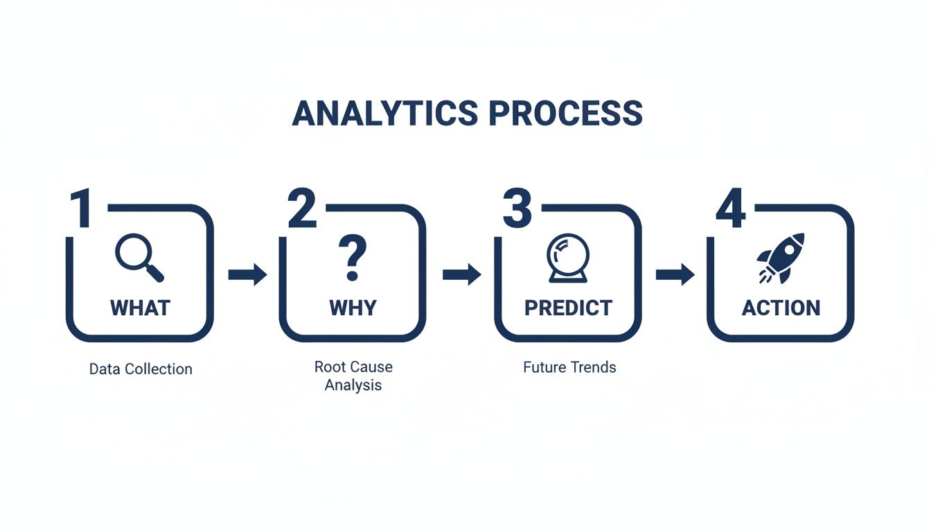
The Four Layers of Insight
Analytics unfolds in four stages, each building on the last. It’s like climbing a ladder—each rung gives you a better view.
Descriptive Analytics (The "What"): The raw facts. It tells you what happened. "We hit $150k in revenue in Q3." It’s a snapshot of the past.
Diagnostic Analytics (The "Why"): Now we dig into why. Was that $150k from our new ad campaign, or just a seasonal bump? This is where you connect the dots.
Predictive Analytics (The "What If"): Based on past data, what will Q4 revenue look like? You’re moving from reporting to forecasting.
Prescriptive Analytics (The "Now What"): The final step—turning insight into action. If we predict a sales dip, what should we do? Run a promotion? This is about making a concrete plan.
For years, climbing this ladder was a slow, expensive process. Not anymore.
The Rise of Conversational Analytics
The data analytics market is exploding. Valued at $82.23 billion in 2025, it's projected to climb, with small and medium-sized businesses now commanding over 35% of the market share. Check the full data analytics market report to see the growth. Powerful analytics is no longer a luxury for giants.
A huge part of this shift is conversational analytics, or what some call "GenBI." The idea is simple: you ask a question in plain English, and a smart system gives you an answer.
A Conversational AI Data Analyst like Statspresso lets you bypass technical roadblocks. You don’t need to write SQL or build a dashboard just to see last month's numbers.
You just ask.
Try asking Statspresso: "Show me my monthly recurring revenue (MRR) trend for the last 6 months as a line chart."
That’s the essence of data analytics for startups today. It’s not about making everyone a data scientist. It’s about giving them the power to get immediate, evidence-backed answers.
Curious about the tech? Explore What Is an AI Data Analyst and Why You Need One and how it replaces the old model.
Your Roadmap From Raw Data To Real Insights
Diving into data can feel like drinking from a firehose. You have information pouring in from your CRM, product database, and marketing platforms. Where do you even begin?
The good news is you don't need to analyze everything at once. Build a simple roadmap that gets you from a messy pile of data to useful insights you can act on.
Start With Your Core Data Sources
First, where does your most valuable information live? Don't try to connect every tool on day one. Focus on the "big three" that hold the keys to your startup's health.
Customer Relationship Management (CRM): Tools like HubSpot or Salesforce track your sales funnel. This is where you find answers about sales cycle length and conversion rates.
Product Database: Your Postgres or MySQL database holds a goldmine of user behavior. It’s the source of truth for feature adoption and retention.
Marketing & Ad Platforms: Google Analytics, Google Ads, and social platforms tell you how people find you and which channels drive growth.
Connecting just these three gives you a powerful, 360-degree view. A Conversational AI Data Analyst like Statspresso lets you link them in minutes, not weeks.
Define The Metrics That Actually Matter
Once connected, resist the urge to track every number. Focus on the key performance indicators (KPIs) that truly reflect business health. Move beyond vanity metrics (like total signups) and zero in on what fuels sustainable growth.
A great way to think about this is a simple four-step process.
This flow is critical. It starts with understanding what happened, forces you to dig into why, predict what's next, and finally, decide what to do.
Try asking Statspresso: "What is our Lifetime Value to Customer Acquisition Cost (LTV:CAC) ratio by marketing channel for the last six months?"
A single question like that tells you which channels are bringing in profitable customers. That’s a real insight you can act on immediately.
Want to go deeper? Read our full guide on building a Modern Data Strategy for Startups.
The Old Way vs. The New Way
For a long time, getting answers from data was a slow, manual ordeal. Today, things are different. The new way is fast, automated, and designed for self-service.
Task | The Old Way (Manual SQL) | The New Way (Statspresso) |
|---|---|---|
Asking a Question | File a ticket with the data team; wait 2-3 days. | Ask a question in plain English; get a chart in 30 seconds. |
Building a Report | An analyst spends hours writing SQL and building a dashboard. | Ask the AI to create a dashboard; add charts with one click. |
Sharing Insights | Export to a static spreadsheet or screenshot. | Share a live, interactive dashboard with a link. |
Required Skills | Deep knowledge of SQL, Python, and complex BI software. | The ability to ask a clear question. |
The goal is to make data analytics a daily habit, not a dreaded quarterly project. Skip the SQL. Just ask your data a question and get a chart in seconds.
Ready to bridge the gap? Here is how to start Using AI to Analyze Data: Get Fast Insights Without Learning SQL.
Putting Your Analytics Into Action
A solid plan is a great start, but the magic happens when you put it to work. Let's look at how smart startups use data to solve real-world problems. This isn't about abstract models; it's about getting specific answers that drive immediate results.
The truth is, data is now table stakes. A recent analysis found that over 90% of organizations saw measurable value from analytics in 2023. Even more telling, 3 out of 5 now use analytics for business innovation. It’s no longer a "nice-to-have." You can see the full analytics trend report here.
Growth and Marketing Analytics
Your marketing team lives and dies by proving ROI. Instead of throwing money at channels and hoping for the best, data gives you crystal-clear attribution.
Common questions marketing needs to answer:
Which ad campaign is driving the most qualified leads?
What's our customer acquisition cost (CAC) for each channel?
How does our blog content contribute to signups?
With a Conversational AI Data Analyst like Statspresso, you skip the spreadsheet gymnastics. No more manually exporting data from three different platforms to stitch together an answer.
Try asking Statspresso: “Show me our top 5 lead sources by conversion rate last month as a table.”
In seconds, you get a ranked list that tells you exactly where to focus your budget.
Product Management Analytics
For product managers, data is the unfiltered voice of the user. It tells you which features people love, where they get stuck, and what they ignore.
Product teams constantly wrestle with questions like:
What's the 30-day retention for users who tried feature X?
Where are people dropping off in our onboarding funnel?
Which user segment has the highest adoption of our new dashboard?
Figuring this out used to mean writing a ticket for an engineer, who then had to write a custom SQL query. That friction means important questions often go unanswered.
Try asking Statspresso: “What is the 30-day retention rate for users who activated our new reporting feature versus those who didn’t?”
A simple question like this can instantly validate if a new feature is making your product stickier. No SQL, no waiting.
Operations and Finance Analytics
The ops and finance teams are the backbone of a startup. They need precise, real-time data to monitor cash flow, track performance, and spot inefficiencies.
They need quick answers to crucial questions:
What's our monthly recurring revenue (MRR) trend over the last year?
How is our average revenue per user (ARPU) changing?
Which customer support tickets take the longest to resolve?
These aren't just numbers for a board deck; they are the vital signs of your business. Waiting for a monthly report is too slow when you need to make a decision today.
Try asking Statspresso: “Compare our MRR growth in Q1 vs Q2 of this year and show it as a bar chart.”
This ability for anyone to self-serve metrics empowers your entire leadership team, giving you a constant, real-time pulse on the business.
Looking for more ways to put your data to work? Check out these 10 Practical Business Intelligence Examples you can try today.
Common Data Pitfalls Startups Must Avoid
The path to becoming data-savvy is littered with avoidable traps. It’s rarely a lack of data that trips teams up; it's getting bogged down by the wrong things. Sidestepping these mistakes is key to turning data into a growth engine.
The Siren Song of Vanity Metrics
The first pitfall is chasing vanity metrics. These are numbers that look fantastic but tell you almost nothing about business health. Think "total signups" or "app downloads." They feel great, but they don't tell you if people are using your product.
The real goal is to focus on actionable metrics—numbers that tie directly to business objectives. Instead of total signups, track the percentage of users who complete onboarding. A Conversational AI Data Analyst helps you cut through the noise.
Try asking Statspresso: "What is the 30-day retention rate for users who signed up in January vs. users who signed up in February?"
The Quicksand of Analysis Paralysis
On the flip side is analysis paralysis. This happens when your team gets so overwhelmed by data that you can't make a decision. You just keep digging for one more data point, one more chart.
The perfect answer doesn't exist. The point of data analytics for startups isn't to eliminate risk; it's to reduce uncertainty so you can make a confident, timely decision. Speed matters more than perfection.
To avoid this, set clear deadlines and frame your data questions around a specific action.
The Trust-Killer of Poor Data Quality
The third pitfall is ignoring data quality. If your team doesn't trust the numbers, they won't use them. Inconsistent naming, duplicate records, or broken tracking can quickly undermine confidence.
A simple first step is to establish a single source of truth. A tool like Statspresso helps by connecting directly to your primary data sources, ensuring everyone looks at the same live information. When you skip the SQL, you also skip the risk of manual errors in your queries. You can ask a question and know the answer is based on real-time truth.
Moving From Questions To Action With Conversational AI

Let’s be honest. The biggest bottleneck in data analytics has always been the human translator—the specialist you need to turn a business question into code. For a fast-moving startup, that model is broken. Waiting weeks for an analyst to build a dashboard is a relic of the past.
The future of analytics is conversational. It's about giving everyone on your team the power to get their own answers, instantly. This isn't about replacing data analysts. It’s about freeing them from ad-hoc requests so they can tackle deep, strategic work.
Closing The Insight-to-Action Gap
The agonizing delay between having a question and getting an answer is the core problem. Conversational AI collapses that timeline from days into seconds. This is exactly what a Conversational AI Data Analyst like Statspresso was built for.
Connect scattered data in minutes: Securely link your Postgres database, HubSpot, and Google Ads over a single lunch break.
Ask plain-English questions, get instant charts: No more remembering SQL syntax. Just ask, and the AI handles the complex query.
Create shared dashboards without the wait: Found an important chart? Add it to a shared dashboard with one click.
This rips data out of its technical silo and turns it into a company-wide utility. To see this in action, check out our guide on how to chat with your data using AI.
Your Team's New Superpower
Imagine your product manager notices something odd in the onboarding flow. Instead of filing a ticket, they can just ask.
Try asking Statspresso: “Show me the user drop-off rate between each step of our onboarding funnel last month as a funnel chart.”
They get an answer right away. They can form a hypothesis, pull up another chart to verify it, and start planning a fix—all in the same meeting. That’s the real power. It transforms curiosity into immediate action. Industry reports from 2026 show that Automated BI is the key to flipping the script from data prep to data action.
The goal isn't just faster charts. It's building a culture where anyone can confidently use data to make their next decision.
TL;DR
The old model is broken: Relying on specialists to code every query is too slow for startups.
Conversational AI is the answer: It lets any team member get instant answers by asking questions in plain English.
Statspresso is your Conversational AI Data Analyst: It connects data sources in minutes, turns questions into charts instantly, and makes dashboard creation a breeze.
It’s all about action: This closes the gap between curiosity and decision-making, accelerating your startup's growth cycle.
Frequently Asked Questions About Startup Analytics
Jumping into analytics can feel like learning a new language. Let's clear up some of the most common questions we hear from startup teams.
Do I Need A Data Scientist To Get Started With Analytics?
Honestly? No. This is the biggest myth holding startups back.
In the beginning, you’re not building complex AI models. You just need answers to critical business questions. Modern tools, especially conversational AI platforms like Statspresso, act as a translator, letting you talk to your database in plain English. This empowers your product managers, marketers, and founders to get their own answers.
You skip the SQL and get straight to the insights. A Conversational AI Data Analyst handles the technical work for you.
How Much Does It Cost To Set Up A Data Stack?
It's way more affordable than you think. The days of six-figure budgets for clunky enterprise software are over. A nimble startup can build a powerful stack using affordable, cloud-based tools that grow with you.
Many platforms, including Statspresso, have startup-friendly pricing. You can start small by connecting your most important data sources first. Remember, cost isn't just the subscription. Think about the hidden cost of not having data—the price of a bad marketing decision or wasted team hours. A good analytics setup pays for itself quickly.
What Is The Single Most Important Metric For An Early-Stage Startup?
While it depends on your business, the most important concept is the "North Star Metric." It's the one number that best represents the core value you deliver. If it's going up, you're on the right track.
Examples:
SaaS company like Slack: "Daily Active Users."
Marketplace like Airbnb: "Nights Booked."
Media company like Spotify: "Time Spent Listening."
A North Star Metric focuses your entire team. When everyone is trying to move the same number, you stop chasing vanity metrics and start driving real growth.
How Do I Build A Data-Driven Culture In My Team?
A data-driven culture isn't about spreadsheets. It's about making data a normal part of decision-making. It comes down to three habits.
Make Data Accessible: The biggest hurdle is just getting to the data. If people have to file a ticket and wait, they won't bother. Tools like Statspresso, where anyone can ask a question, remove that friction.
Lead by Example: As a leader, set the tone. Instead of saying, "I think we should do this," frame it as, "The data shows X, so how can we do more of that?"
Celebrate Data-Driven Wins: Did marketing use an insight to double a campaign's ROI? Shout it from the rooftops! Public recognition shows that curiosity about data pays off.
Ready to stop guessing and start knowing? Statspresso is the Conversational AI Data Analyst that lets your team get answers from your business data in seconds. No SQL, no complex dashboards, just clear insights.
Connect your first data source for free and ask your first question at https://www.statspresso.com
You have data. Lots of it. It’s in your CRM, your database, your ad platforms. But getting answers feels impossible. You ask a question, and an engineer promises to "look into it next week." Waiting for insights is a startup-killer. It’s a relic of the past. The goal is simple: stop guessing and start making decisions based on solid evidence, right now. This guide shows you how.
Your Startup's Data Is An Unused Superpower
Every startup is sitting on a goldmine. Seriously. The answers to your most burning questions—Which features do our power users love? Where is our marketing spend actually making a difference?—are already there. But getting at them is painfully slow.
The core challenge for startups isn't just getting data anymore; in 2026, most teams are awash in it, struggling to discern signal from noise. The real liability is operating without a clear, unifying metric that connects every insight directly to your Northstar. This shift demands a focus beyond mere access, to truly aligning your team around what measurably moves the business.
The Problem With Traditional BI
Let’s be honest: traditional business intelligence (BI) wasn't built for startup speed. It means complex tools, long setups, and skills most teams don't have. For a nimble startup, this approach is broken.
It’s Too Slow: You can't wait a week for a report to make a decision needed today.
It’s Too Expensive: A full-time data team is a luxury most early-stage companies can’t afford.
It’s Too Complicated: Tools like Tableau or Looker have a steep learning curve. Your team doesn’t have time to master SQL.
The modern way forward? Skip the SQL. Just ask your data a question and get a chart in seconds. With a Conversational AI Data Analyst like Statspresso, you ask a question in plain English and get an answer instantly.
Try asking Statspresso: "Compare our user signups month-over-month for the past year from Google Ads vs. organic search."
This guide walks you through how to unlock your own insights, minus the headache. It’s time to stop guessing and start knowing.
Want to see how the BI landscape has shifted? Read our full Business Intelligence for Startups: A 2026 Guide.
TL;DR
Your data holds the answers: The biggest barrier to growth isn't a lack of data; it's the slow, painful process of analyzing it.
Traditional BI is too slow for startups: It requires expensive tools, specialized skills (SQL), and creates bottlenecks.
Conversational AI is the solution: Ask questions in plain English and get charts in seconds.
Statspresso is your Conversational AI Data Analyst: Connect your data, ask a question, and get an instant answer.
What Startup Analytics Actually Means
Let's be real. "Data analytics" probably conjures images of complex code and PhDs. For a startup, that's not it.
Think of it as having a direct conversation with your business. It’s the difference between wondering, "Which marketing channel works?" and knowing, "Our newsletter drove 30% of signups that converted to paid last quarter." This isn't a nice-to-have; it's a fundamental shift in how you operate.
The Four Layers of Insight
Analytics unfolds in four stages, each building on the last. It’s like climbing a ladder—each rung gives you a better view.
Descriptive Analytics (The "What"): The raw facts. It tells you what happened. "We hit $150k in revenue in Q3." It’s a snapshot of the past.
Diagnostic Analytics (The "Why"): Now we dig into why. Was that $150k from our new ad campaign, or just a seasonal bump? This is where you connect the dots.
Predictive Analytics (The "What If"): Based on past data, what will Q4 revenue look like? You’re moving from reporting to forecasting.
Prescriptive Analytics (The "Now What"): The final step—turning insight into action. If we predict a sales dip, what should we do? Run a promotion? This is about making a concrete plan.
For years, climbing this ladder was a slow, expensive process. Not anymore.
The Rise of Conversational Analytics
The data analytics market is exploding. Valued at $82.23 billion in 2025, it's projected to climb, with small and medium-sized businesses now commanding over 35% of the market share. Check the full data analytics market report to see the growth. Powerful analytics is no longer a luxury for giants.
A huge part of this shift is conversational analytics, or what some call "GenBI." The idea is simple: you ask a question in plain English, and a smart system gives you an answer.
A Conversational AI Data Analyst like Statspresso lets you bypass technical roadblocks. You don’t need to write SQL or build a dashboard just to see last month's numbers.
You just ask.
Try asking Statspresso: "Show me my monthly recurring revenue (MRR) trend for the last 6 months as a line chart."
That’s the essence of data analytics for startups today. It’s not about making everyone a data scientist. It’s about giving them the power to get immediate, evidence-backed answers.
Curious about the tech? Explore What Is an AI Data Analyst and Why You Need One and how it replaces the old model.
Your Roadmap From Raw Data To Real Insights
Diving into data can feel like drinking from a firehose. You have information pouring in from your CRM, product database, and marketing platforms. Where do you even begin?
The good news is you don't need to analyze everything at once. Build a simple roadmap that gets you from a messy pile of data to useful insights you can act on.
Start With Your Core Data Sources
First, where does your most valuable information live? Don't try to connect every tool on day one. Focus on the "big three" that hold the keys to your startup's health.
Customer Relationship Management (CRM): Tools like HubSpot or Salesforce track your sales funnel. This is where you find answers about sales cycle length and conversion rates.
Product Database: Your Postgres or MySQL database holds a goldmine of user behavior. It’s the source of truth for feature adoption and retention.
Marketing & Ad Platforms: Google Analytics, Google Ads, and social platforms tell you how people find you and which channels drive growth.
Connecting just these three gives you a powerful, 360-degree view. A Conversational AI Data Analyst like Statspresso lets you link them in minutes, not weeks.
Define The Metrics That Actually Matter
Once connected, resist the urge to track every number. Focus on the key performance indicators (KPIs) that truly reflect business health. Move beyond vanity metrics (like total signups) and zero in on what fuels sustainable growth.
A great way to think about this is a simple four-step process.
This flow is critical. It starts with understanding what happened, forces you to dig into why, predict what's next, and finally, decide what to do.
Try asking Statspresso: "What is our Lifetime Value to Customer Acquisition Cost (LTV:CAC) ratio by marketing channel for the last six months?"
A single question like that tells you which channels are bringing in profitable customers. That’s a real insight you can act on immediately.
Want to go deeper? Read our full guide on building a Modern Data Strategy for Startups.
The Old Way vs. The New Way
For a long time, getting answers from data was a slow, manual ordeal. Today, things are different. The new way is fast, automated, and designed for self-service.
Task | The Old Way (Manual SQL) | The New Way (Statspresso) |
|---|---|---|
Asking a Question | File a ticket with the data team; wait 2-3 days. | Ask a question in plain English; get a chart in 30 seconds. |
Building a Report | An analyst spends hours writing SQL and building a dashboard. | Ask the AI to create a dashboard; add charts with one click. |
Sharing Insights | Export to a static spreadsheet or screenshot. | Share a live, interactive dashboard with a link. |
Required Skills | Deep knowledge of SQL, Python, and complex BI software. | The ability to ask a clear question. |
The goal is to make data analytics a daily habit, not a dreaded quarterly project. Skip the SQL. Just ask your data a question and get a chart in seconds.
Ready to bridge the gap? Here is how to start Using AI to Analyze Data: Get Fast Insights Without Learning SQL.
Putting Your Analytics Into Action
A solid plan is a great start, but the magic happens when you put it to work. Let's look at how smart startups use data to solve real-world problems. This isn't about abstract models; it's about getting specific answers that drive immediate results.
The truth is, data is now table stakes. A recent analysis found that over 90% of organizations saw measurable value from analytics in 2023. Even more telling, 3 out of 5 now use analytics for business innovation. It’s no longer a "nice-to-have." You can see the full analytics trend report here.
Growth and Marketing Analytics
Your marketing team lives and dies by proving ROI. Instead of throwing money at channels and hoping for the best, data gives you crystal-clear attribution.
Common questions marketing needs to answer:
Which ad campaign is driving the most qualified leads?
What's our customer acquisition cost (CAC) for each channel?
How does our blog content contribute to signups?
With a Conversational AI Data Analyst like Statspresso, you skip the spreadsheet gymnastics. No more manually exporting data from three different platforms to stitch together an answer.
Try asking Statspresso: “Show me our top 5 lead sources by conversion rate last month as a table.”
In seconds, you get a ranked list that tells you exactly where to focus your budget.
Product Management Analytics
For product managers, data is the unfiltered voice of the user. It tells you which features people love, where they get stuck, and what they ignore.
Product teams constantly wrestle with questions like:
What's the 30-day retention for users who tried feature X?
Where are people dropping off in our onboarding funnel?
Which user segment has the highest adoption of our new dashboard?
Figuring this out used to mean writing a ticket for an engineer, who then had to write a custom SQL query. That friction means important questions often go unanswered.
Try asking Statspresso: “What is the 30-day retention rate for users who activated our new reporting feature versus those who didn’t?”
A simple question like this can instantly validate if a new feature is making your product stickier. No SQL, no waiting.
Operations and Finance Analytics
The ops and finance teams are the backbone of a startup. They need precise, real-time data to monitor cash flow, track performance, and spot inefficiencies.
They need quick answers to crucial questions:
What's our monthly recurring revenue (MRR) trend over the last year?
How is our average revenue per user (ARPU) changing?
Which customer support tickets take the longest to resolve?
These aren't just numbers for a board deck; they are the vital signs of your business. Waiting for a monthly report is too slow when you need to make a decision today.
Try asking Statspresso: “Compare our MRR growth in Q1 vs Q2 of this year and show it as a bar chart.”
This ability for anyone to self-serve metrics empowers your entire leadership team, giving you a constant, real-time pulse on the business.
Looking for more ways to put your data to work? Check out these 10 Practical Business Intelligence Examples you can try today.
Common Data Pitfalls Startups Must Avoid
The path to becoming data-savvy is littered with avoidable traps. It’s rarely a lack of data that trips teams up; it's getting bogged down by the wrong things. Sidestepping these mistakes is key to turning data into a growth engine.
The Siren Song of Vanity Metrics
The first pitfall is chasing vanity metrics. These are numbers that look fantastic but tell you almost nothing about business health. Think "total signups" or "app downloads." They feel great, but they don't tell you if people are using your product.
The real goal is to focus on actionable metrics—numbers that tie directly to business objectives. Instead of total signups, track the percentage of users who complete onboarding. A Conversational AI Data Analyst helps you cut through the noise.
Try asking Statspresso: "What is the 30-day retention rate for users who signed up in January vs. users who signed up in February?"
The Quicksand of Analysis Paralysis
On the flip side is analysis paralysis. This happens when your team gets so overwhelmed by data that you can't make a decision. You just keep digging for one more data point, one more chart.
The perfect answer doesn't exist. The point of data analytics for startups isn't to eliminate risk; it's to reduce uncertainty so you can make a confident, timely decision. Speed matters more than perfection.
To avoid this, set clear deadlines and frame your data questions around a specific action.
The Trust-Killer of Poor Data Quality
The third pitfall is ignoring data quality. If your team doesn't trust the numbers, they won't use them. Inconsistent naming, duplicate records, or broken tracking can quickly undermine confidence.
A simple first step is to establish a single source of truth. A tool like Statspresso helps by connecting directly to your primary data sources, ensuring everyone looks at the same live information. When you skip the SQL, you also skip the risk of manual errors in your queries. You can ask a question and know the answer is based on real-time truth.
Moving From Questions To Action With Conversational AI
Let’s be honest. The biggest bottleneck in data analytics has always been the human translator—the specialist you need to turn a business question into code. For a fast-moving startup, that model is broken. Waiting weeks for an analyst to build a dashboard is a relic of the past.
The future of analytics is conversational. It's about giving everyone on your team the power to get their own answers, instantly. This isn't about replacing data analysts. It’s about freeing them from ad-hoc requests so they can tackle deep, strategic work.
Closing The Insight-to-Action Gap
The agonizing delay between having a question and getting an answer is the core problem. Conversational AI collapses that timeline from days into seconds. This is exactly what a Conversational AI Data Analyst like Statspresso was built for.
Connect scattered data in minutes: Securely link your Postgres database, HubSpot, and Google Ads over a single lunch break.
Ask plain-English questions, get instant charts: No more remembering SQL syntax. Just ask, and the AI handles the complex query.
Create shared dashboards without the wait: Found an important chart? Add it to a shared dashboard with one click.
This rips data out of its technical silo and turns it into a company-wide utility. To see this in action, check out our guide on how to chat with your data using AI.
Your Team's New Superpower
Imagine your product manager notices something odd in the onboarding flow. Instead of filing a ticket, they can just ask.
Try asking Statspresso: “Show me the user drop-off rate between each step of our onboarding funnel last month as a funnel chart.”
They get an answer right away. They can form a hypothesis, pull up another chart to verify it, and start planning a fix—all in the same meeting. That’s the real power. It transforms curiosity into immediate action. Industry reports from 2026 show that Automated BI is the key to flipping the script from data prep to data action.
The goal isn't just faster charts. It's building a culture where anyone can confidently use data to make their next decision.
TL;DR
The old model is broken: Relying on specialists to code every query is too slow for startups.
Conversational AI is the answer: It lets any team member get instant answers by asking questions in plain English.
Statspresso is your Conversational AI Data Analyst: It connects data sources in minutes, turns questions into charts instantly, and makes dashboard creation a breeze.
It’s all about action: This closes the gap between curiosity and decision-making, accelerating your startup's growth cycle.
Frequently Asked Questions About Startup Analytics
Jumping into analytics can feel like learning a new language. Let's clear up some of the most common questions we hear from startup teams.
Do I Need A Data Scientist To Get Started With Analytics?
Honestly? No. This is the biggest myth holding startups back.
In the beginning, you’re not building complex AI models. You just need answers to critical business questions. Modern tools, especially conversational AI platforms like Statspresso, act as a translator, letting you talk to your database in plain English. This empowers your product managers, marketers, and founders to get their own answers.
You skip the SQL and get straight to the insights. A Conversational AI Data Analyst handles the technical work for you.
How Much Does It Cost To Set Up A Data Stack?
It's way more affordable than you think. The days of six-figure budgets for clunky enterprise software are over. A nimble startup can build a powerful stack using affordable, cloud-based tools that grow with you.
Many platforms, including Statspresso, have startup-friendly pricing. You can start small by connecting your most important data sources first. Remember, cost isn't just the subscription. Think about the hidden cost of not having data—the price of a bad marketing decision or wasted team hours. A good analytics setup pays for itself quickly.
What Is The Single Most Important Metric For An Early-Stage Startup?
While it depends on your business, the most important concept is the "North Star Metric." It's the one number that best represents the core value you deliver. If it's going up, you're on the right track.
Examples:
SaaS company like Slack: "Daily Active Users."
Marketplace like Airbnb: "Nights Booked."
Media company like Spotify: "Time Spent Listening."
A North Star Metric focuses your entire team. When everyone is trying to move the same number, you stop chasing vanity metrics and start driving real growth.
How Do I Build A Data-Driven Culture In My Team?
A data-driven culture isn't about spreadsheets. It's about making data a normal part of decision-making. It comes down to three habits.
Make Data Accessible: The biggest hurdle is just getting to the data. If people have to file a ticket and wait, they won't bother. Tools like Statspresso, where anyone can ask a question, remove that friction.
Lead by Example: As a leader, set the tone. Instead of saying, "I think we should do this," frame it as, "The data shows X, so how can we do more of that?"
Celebrate Data-Driven Wins: Did marketing use an insight to double a campaign's ROI? Shout it from the rooftops! Public recognition shows that curiosity about data pays off.
Ready to stop guessing and start knowing? Statspresso is the Conversational AI Data Analyst that lets your team get answers from your business data in seconds. No SQL, no complex dashboards, just clear insights.
Connect your first data source for free and ask your first question at https://www.statspresso.com