10 No-Code Analytics Tools for Non-Technical Teams

Waiting weeks for an analyst to build a dashboard is old BI thinking. No-code analytics tools for non-technical teams are moving fast into the mainstream, with 70% of new business applications projected to use low-code or no-code by 2026 according to SQ Magazine’s no-code statistics roundup. That shift makes sense. Founders, PMs, and marketers don’t want another reporting queue. They want answers.
The best tools now let you skip SQL, ask a question in plain English, and get a chart fast. The catch is that many “no-code” products still need real setup work before they feel easy. That’s why this guide focuses on the actual job-to-be-done, not glossy feature grids.
If your current workflow still involves exporting CSVs, stitching spreadsheets, or begging someone to update pivot table data, it’s time to simplify.
TL DR
Statspresso is the best fit if you want a Conversational AI Data Analyst that turns plain-English questions into charts and explanations fast.
ThoughtSpot is strong for search-driven ad hoc analysis in governed environments.
Data Studio works well when your world already lives inside Google.
Power BI is the practical pick for Microsoft-heavy companies.
Tableau still shines for polished dashboards, but it’s not the easiest true no-code option.
Amplitude, Mixpanel, and Heap are best when your main question is product usage, retention, or churn.
Databox is excellent for SMB dashboards and agency reporting.
Geckoboard is the simple answer for live KPI screens on TVs.
The main trade-off isn’t “features.” It’s how quickly a non-technical team can get to a trustworthy first insight.
1. Statspresso
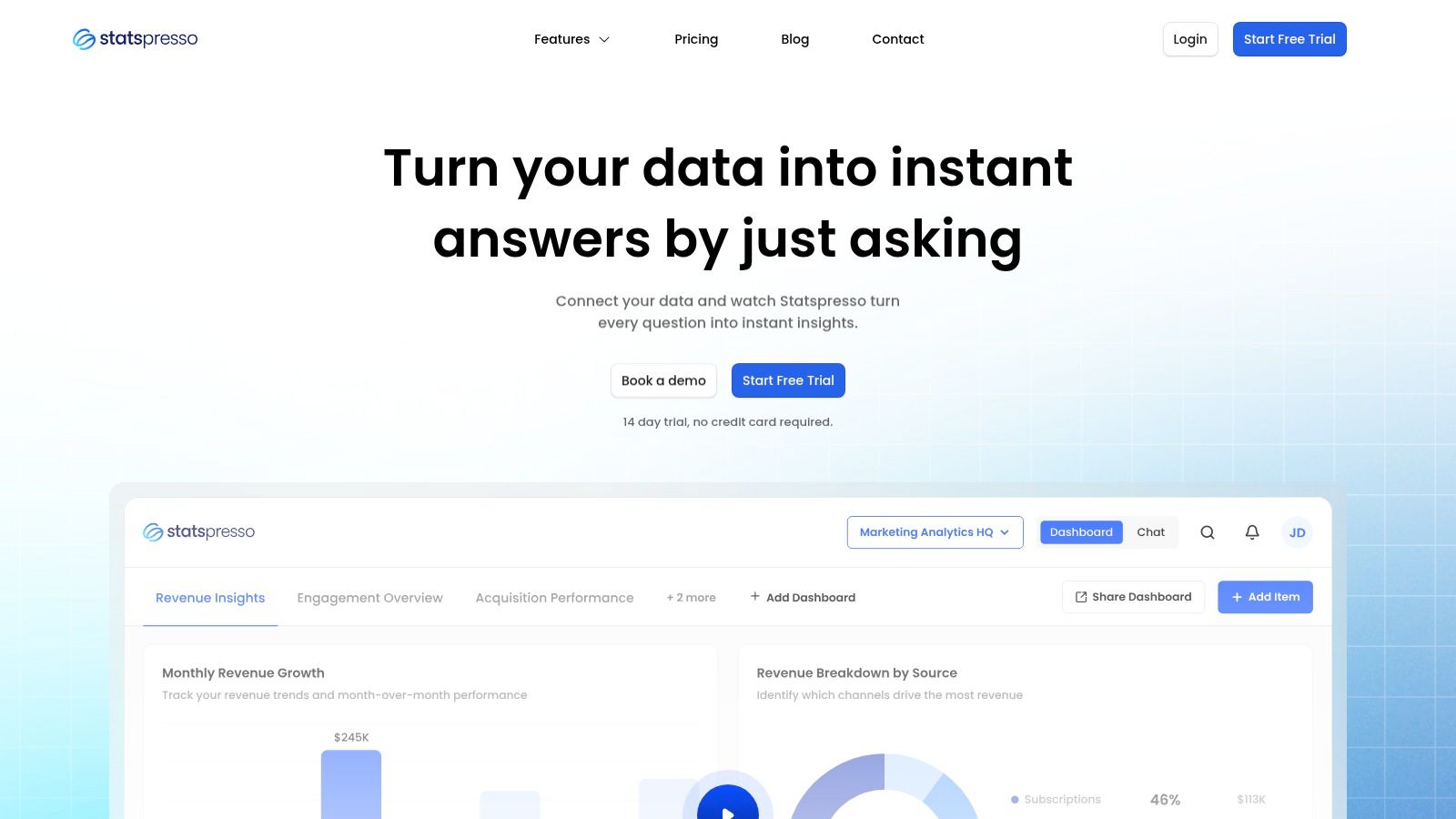
Statspresso fits teams that need answers this week, not a BI rebuild that drags on for a quarter. The core job here is simple. A non-technical teammate asks a business question in plain English and gets back a chart, a number, and a written explanation without waiting on SQL.
That changes the workflow more than the feature list suggests.
The old way is familiar. A sales lead asks why pipeline conversion dropped. An analyst writes SQL, checks joins, builds a chart, posts the result later, then gets three follow-up questions that require another round. Statspresso is built for the faster loop. Ask the question directly, refine it in conversation, and keep going.
A basic example: “Show me revenue by month for the last year as a bar chart.”
Best job-to-be-done
Statspresso is a good fit when the problem is, “We have data across Shopify, HubSpot, Linear, and Postgres, and the team needs quick answers without learning BI tools.” It also fits a second problem that a lot of roundups miss: “We need to share analytics with clients or executives in a format they can use.”
That matters because internal dashboarding and client delivery are different jobs. Many analytics tools handle the first one well enough. Fewer handle branded reporting, embeddable chat, and executive-friendly output without extra work.
Practical rule: If the same KPI questions keep showing up in Slack, a conversational interface usually beats building another static dashboard.
What works
The value is not just that it accepts natural language. It shortens the path from question to usable answer and gives teams a way to keep the useful output.
Plain-English analysis: Ask for a metric, trend, or breakdown without SQL.
Charts plus explanations: Results are easier for non-technical stakeholders to interpret and share.
AI Insight Gallery: Useful findings can be surfaced and saved instead of disappearing into one-off analysis.
Client-facing options: Embeddable chat, branding controls, and PDF exports make sense for agencies, consultants, and SaaS teams serving customers.
Published pricing: Starter begins at $49/month, with Growth at $249/month and Advanced at $499/month, plus a 14-day free trial and 15% off yearly plans, based on pricing listed on the official site.
Teams moving toward self-serve BI should also read their guide to self-serve business intelligence.
Trade-offs worth knowing
Statspresso works best when speed of access matters more than deep custom modeling. If your team needs highly customized semantic layers, complex governance workflows, or enterprise-wide procurement controls, you need to check those details carefully before rollout.
Plan limits also matter. The entry tier is fine for a small team proving out the workflow, but it can get tight fast if multiple people are asking questions every day or if you need more connectors and dashboards.
For startups, SMBs, agencies, and product teams, the appeal is straightforward. Skip the analyst queue for routine questions, get a first answer fast, and spend the human analysis time on harder problems.
2. ThoughtSpot
ThoughtSpot fits a very specific job well. It helps teams answer, “What changed in this metric, and where should I look next?” without sending every question through an analyst queue.
That matters because the old workflow is slow. A sales leader notices pipeline conversion dropped, asks BI for a report, waits for SQL, gets a dashboard, then asks three follow-up questions that were not in the first request. ThoughtSpot shortens that loop. Type the question, inspect the result, filter by segment, and keep going.
Best job-to-be-done
Use ThoughtSpot when the business problem is, “I need to monitor a KPI, spot a shift, and investigate the cause fast.” It is a better fit for exploration on top of prepared data than for teams trying to build their data model from scratch inside the tool.
That trade-off is the whole story. ThoughtSpot feels fast for business users once someone has defined clean metrics, clear field names, and sensible access rules. If that foundation is weak, search quality drops fast and user trust goes with it.
A practical way to frame it is simple. Manual SQL works when the question is rare, complex, or high stakes. ThoughtSpot works when business teams ask variations of the same questions all week and need answers in minutes, not by the next sprint.
Where it works well, and where it can frustrate teams
ThoughtSpot is strong in a few common situations:
Ad hoc search: Good for executives, RevOps, and product managers who want quick answers without learning a dashboard maze.
Drill-down workflows: Users can move from top-line KPI to region, rep, product line, or cohort without opening a new tool.
Governed self-serve analytics: Larger teams can give business users freedom while keeping security and metric definitions under control.
Embedded analytics: SaaS teams can place search and reporting inside a product experience.
The weak points are just as real:
Setup quality determines the experience: If your schema is messy or metric names are inconsistent, natural-language search becomes hit or miss.
Pricing can be hard to model: Enterprise packaging and add-ons can make budget planning less clear than simpler flat-rate tools.
Freeform analysis still has limits: It is easier than writing SQL, but users still need to understand the business logic behind the numbers.
ThoughtSpot is a strong choice for companies that already have a warehouse and want to give non-technical teams faster access to trusted metrics. If the core issue is messy source data, undefined KPIs, or missing ownership of the semantic layer, fix that first. Otherwise, you are buying a faster interface on top of the same reporting confusion.
3. Data Studio
Data Studio, now commonly called Looker Studio, is the default answer for teams that live in Google Analytics, Google Ads, Sheets, and BigQuery. It’s free at the core product level, browser-based, and easy to share with stakeholders who just want a link.
For marketing teams, that simplicity is the whole point. If you need campaign dashboards, channel reporting, or e-commerce snapshots without buying a BI platform first, Data Studio is still hard to ignore.
Best for Google-native reporting
Use Data Studio when the question is, “How do I get a clean report in front of the team this afternoon?” It’s well suited to recurring reports, stakeholder dashboards, and simple shared views.
It’s not the best tool for deeper data modeling. Once you need complex joins, stricter governance, or advanced metric logic, the limits show up quickly.
Practical pros and cons
Low barrier to entry: Free access makes adoption easy for SMBs and lean teams.
Google ecosystem fit: Works naturally with GA4, Ads, Sheets, and BigQuery.
Easy sharing: Browser-based collaboration is straightforward.
Template-friendly: Good for repeatable reports.
The downside is familiar to anyone who has tried to stretch it too far.
Non-Google data often adds friction: Partner connectors may cost extra.
Prepared data helps a lot: Messy source data makes the experience worse.
Advanced governance isn’t the selling point: Larger teams may need more control than the basic setup provides.
If your team mainly wants lightweight visibility, Data Studio is enough. If your team wants a conversational AI data analyst, it isn’t.
4. Microsoft Power BI
Microsoft Power BI is what I recommend when a company is already deep in Microsoft 365 and wants one analytics standard across teams. It’s mature, widely adopted, and familiar enough that Excel-heavy users often feel less intimidated by it than by other BI tools.
That said, “less intimidated” doesn’t mean “no learning curve.” Power BI is a drag-and-drop platform, but business users still run into modeling concepts fast if they move beyond curated datasets.
Best for Microsoft-first companies
Power BI works best for companies asking, “How do we standardize reporting across finance, ops, and leadership without replacing our Microsoft stack?” It scales well from small teams to larger environments and has strong sharing inside Microsoft workflows.
It’s practical, not glamorous. That’s often a compliment.
Where it earns its place
Power BI’s strengths are clear:
Excel adjacency: Users coming from spreadsheets adapt faster.
Microsoft integration: Teams, Microsoft 365, and Fabric connections are a real advantage.
Governed self-serve: Certified datasets and row-level security help organizations keep definitions consistent.
Broad connector support: It can cover a lot of operational reporting needs.
But the trade-offs are just as real.
Modeling can get technical: often causing many non-technical users to hit a wall.
Sharing often adds licensing complexity: Especially outside a tightly managed workspace.
“No-code” depends on preparation: If someone hasn’t shaped the data well, business users feel the pain.
The Querio article on low-code and no-code data analysis calls out this broader shift away from rigid BI toward AI-driven querying and reusable semantic layers. Power BI can support self-serve reporting, but it often works best when a more technical person sets the stage first.
5. Tableau

Tableau still sets the standard for polished visual exploration. If you want dashboards that executives immediately understand and analysts don’t mind presenting, Tableau remains one of the safest picks.
It’s also one of the easiest tools to overestimate in a “true no-code” conversation. Tableau is friendly once someone has already prepared clean, trusted data sources. It’s much less friendly when non-technical users need to define everything themselves.
Best for visual storytelling
Choose Tableau when the job is, “I need interactive dashboards that make complex business performance easy to understand.” It’s widely used across industries for a reason. The visual quality is strong, and the ecosystem is mature.
That’s different from asking, “I need my PM to answer their own messy data questions without support.” Tableau can help there, but it’s not the cleanest answer.
Field note: The better your curated data layer, the more “no-code” Tableau feels. Without that layer, users spend more time wrestling with structure than learning from charts.
Real trade-offs
What Tableau does well:
Excellent visuals: Dashboards are polished and easy for stakeholders to consume.
Strong community: Templates, training, and examples are everywhere.
Flexible deployment: Cloud and server options give teams choices.
Role-based access: Good for governed self-serve.
What to watch:
Cost can rise as usage expands: Especially with more viewers and creators.
Setup quality matters: Bad source design creates a lot of confusion downstream.
Ask Data and similar features aren’t magic: Even vendor-friendly natural-language features still depend on structured inputs.
That last point matters. The Fabi.ai review of no-code analytics platforms puts the problem plainly: “Most ‘no-code’ analytics tools still require a data team to configure them, model your data, or maintain the dashboards.” Tableau is one of the clearest examples of that setup paradox.
6. Amplitude
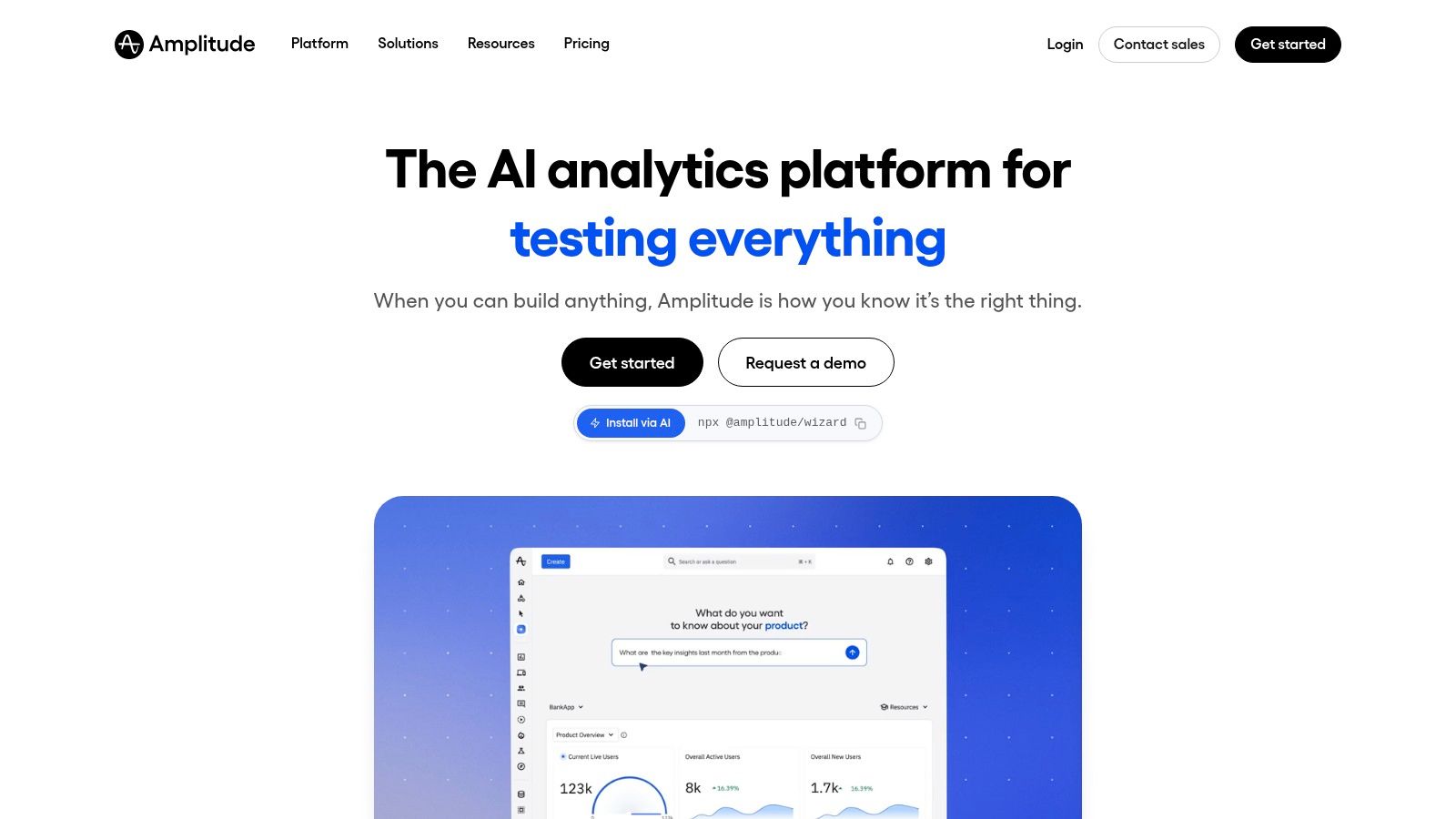
Amplitude is for teams whose main problem isn’t generic BI. It’s product behavior. If you need to understand activation, retention, funnels, feature adoption, and user paths, Amplitude is much more useful than trying to force those questions into a broad dashboard tool.
PMs and growth teams usually pick this up quickly because the interface matches the questions they already ask. You don’t start with tables and joins. You start with users moving through a product.
Best for churn and product adoption questions
Amplitude is the right fit when the question is, “Where are users dropping off, which cohort is sticking, and what changed after a release?” That’s different from finance reporting or general executive dashboards.
It’s also a good example of why “no-code analytics tools for non-technical teams” is a broad category. No-code for product analytics looks different from no-code for BI.
What teams like
Funnels and retention reports: Core product questions are easy to answer.
Cohorts and behavior flows: Helpful for growth experiments and onboarding analysis.
Experimentation and feature flags: Good for teams that want analysis and testing close together.
Session replay options: Adds context to quantitative trends.
The main caution is scope creep.
Usage limits can push upgrades: Event-heavy products need to watch plan boundaries.
It’s not your whole analytics stack: You may still need separate business reporting elsewhere.
Warehouse-first teams may prefer a different architecture: Especially if they want one semantic layer for everything.
Amplitude is strong when your product team needs speed without SQL. It’s weaker when leadership expects it to answer every business metric across the company.
7. Mixpanel
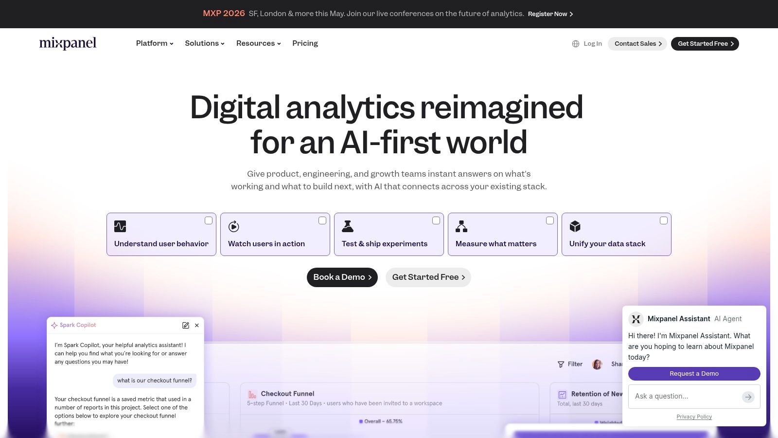
Mixpanel sits in a similar neighborhood to Amplitude, but it often feels more approachable for founders, marketers, and lean product teams that want quick answers without a lot of ceremony. Funnels, retention, cohorts, and flows are all front and center.
Its appeal is straightforward. You can get from event data to a business answer quickly, and the interface doesn’t punish non-technical users for asking normal questions.
Best for startup product teams
Mixpanel is a smart choice when the job is, “I need to understand which actions drive signups, retention, or revenue, and I need to see it fast.” It’s also useful when teams want a lightweight bridge between product analytics and marketing analysis.
The newer AI-style query assistance helps, but the core strength is still the underlying product analytics workflow.
The practical view
Approachable UI: Teams usually get productive quickly.
Strong templates: Good for common questions without reinventing everything.
Metric Trees: Helpful for connecting product actions to business outcomes.
Session replay and heatmaps: Useful context when a chart raises more questions.
Costs are the main thing to watch.
Event volume drives pricing pressure: High-usage products need discipline.
Some advanced capabilities may sit behind add-ons: Read the plan details carefully.
General BI is not the point: Mixpanel is best when user behavior is the center of the analysis.
If you’re a founder or PM who wants fewer reporting tickets and more self-serve product insight, Mixpanel is easy to shortlist.
8. Heap
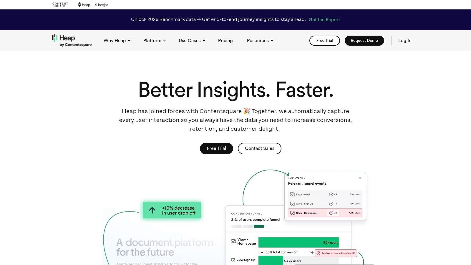
Heap takes a different angle. Instead of asking your team to define every event perfectly upfront, it leans hard into autocapture. That’s useful when your tracking plan is incomplete, your product changes often, or your team keeps realizing too late that it forgot to instrument something.
That retroactive flexibility is Heap’s real selling point. It reduces the penalty for imperfect planning.
Best when tracking discipline is weak
Heap fits teams asking, “Can we start analyzing behavior without waiting for a perfect event taxonomy?” Early-stage products, fast-moving UX teams, and companies with messy instrumentation often benefit from this approach.
It also helps when you need both quantitative analysis and qualitative context from replay or heatmap-style tools in one place.
The biggest Heap advantage isn’t that it captures a lot. It’s that teams can define useful events after the fact and still recover analysis value.
What to know before buying
Heap’s strengths:
Autocapture: Less dependency on a perfect implementation upfront.
Retroactive event definition: Useful when product questions change.
Replay and heatmap workflow: Good for combining behavior data with visual context.
Faster early setup: Helpful for teams without a mature analytics process.
Heap’s trade-offs:
You can collect too much: Governance matters or the data gets noisy fast.
Pricing isn’t public: That slows clean comparison.
It’s still a specialized tool: Heap solves product analytics problems, not every reporting problem.
For teams with weak instrumentation discipline, Heap can be the most forgiving option on this list.
9. Databox
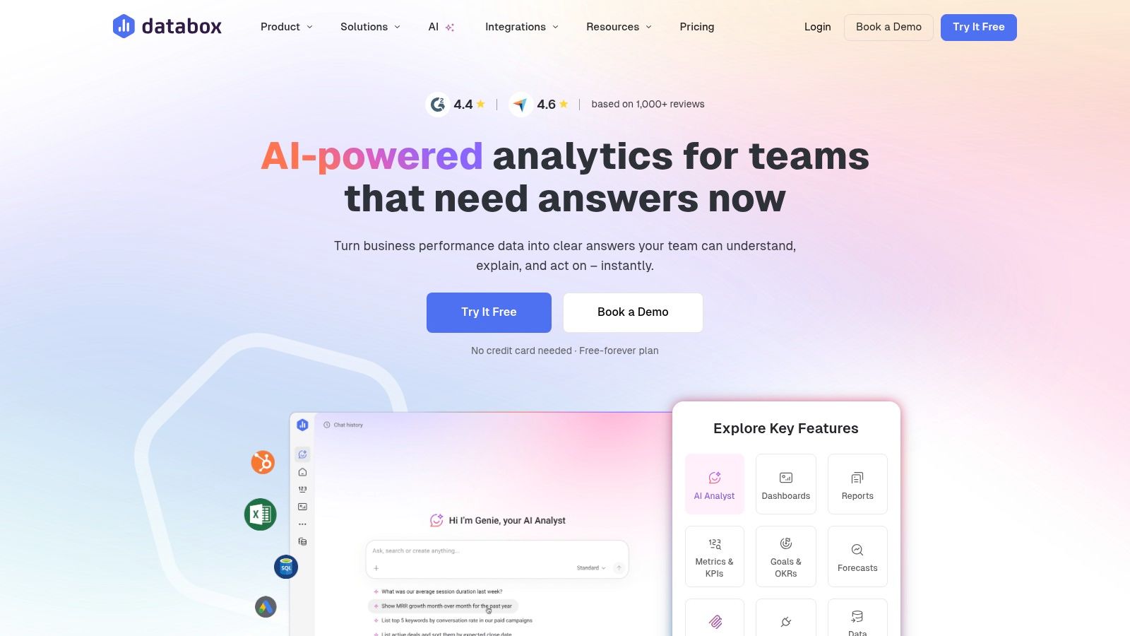
Databox is one of the easiest tools to recommend to SMBs, agencies, and cross-functional teams that want live dashboards without building a BI function. It’s fast to implement, easy to share, and oriented around business visibility rather than analytics purity.
That makes it practical. It also makes it limited in the ways you’d expect.
Best for KPI reporting and agency dashboards
Databox works well when the business problem is, “I need daily sales, pipeline, campaign, or support numbers visible to everyone without constant manual updates.” Agencies especially like it because client reporting and dashboard sharing are built into the product shape.
This is also one of the cleaner choices for teams that want easy TV dashboards, Slack sharing, or scheduled snapshots without adding a lot of overhead.
Why teams pick it
Many connectors: Good for pulling together common SaaS metrics.
Goals and alerts: Useful for teams that want operating rhythms, not just charts.
Sharing options: Links, mobile, Slack, Teams, and TV screens cover most SMB needs.
Agency-friendly setup: Client accounts and white-label options are practical.
What it won’t replace:
Deep modeling: This isn’t a full semantic-layer BI tool.
Complex analysis: You’ll feel the ceiling if your questions get more nuanced.
Predictable cost at larger scale: More sources and advanced features can increase spend.
If your team needs visibility more than exploration, Databox is often the right answer.
10. Geckoboard
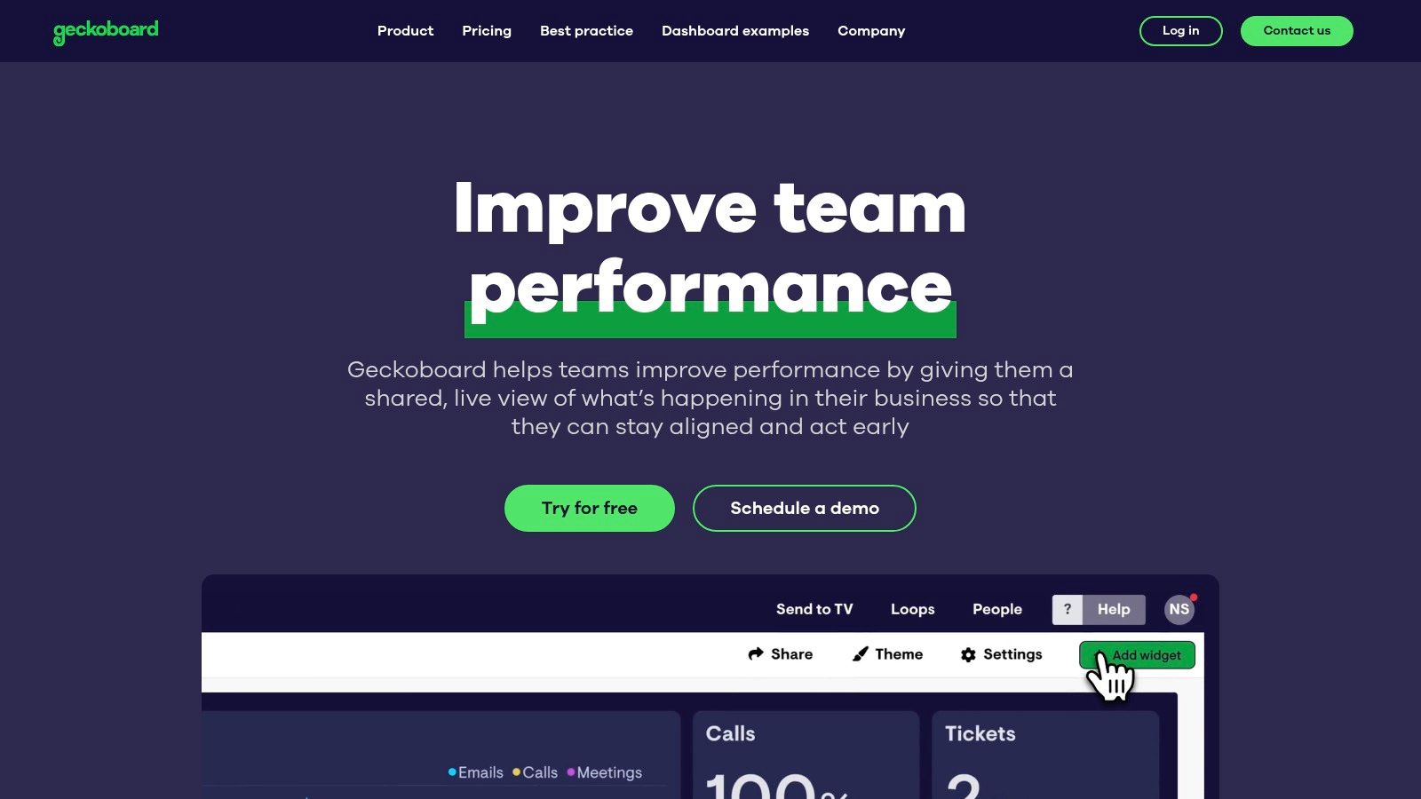
Geckoboard knows exactly what it is. It’s a KPI broadcasting tool. Not a full BI suite. Not a product analytics platform. Not a semantic layer. That focus is why it works.
If you need numbers on a wall, a TV, or a simple shared dashboard that non-technical teams will look at, Geckoboard is excellent.
Best for always-on team visibility
Use Geckoboard when the question is, “How do I keep daily performance visible without asking anyone to log into a complex analytics tool?” Support teams, sales teams, marketing teams, and ops groups all benefit from that kind of lightweight visibility.
This is a classic “daily sales on a TV” tool. It does that job better than many broader platforms because it doesn’t try to be everything.
Where it wins and where it doesn’t
Simple setup: Teams can get useful dashboards live quickly.
Screen-friendly design: It’s made for office displays and loops.
Easy sharing: Stakeholders don’t need a complicated viewer workflow.
Strong native integrations: Enough for many operational KPI needs.
The constraints are obvious:
Not for complex joins or modeling: If your data needs heavy prep, look elsewhere.
Not built for exploratory analysis: It surfaces KPIs. It doesn’t investigate them.
Higher tiers provide more capacity: Larger teams may need them.
Geckoboard is one of the best examples of choosing a tool by job-to-be-done instead of by feature count.
Top 10 No-Code Analytics Tools, Feature Comparison
Product | Core features | Best for | Key differentiator | Pricing & trial |
|---|---|---|---|---|
Statspresso | Conversational no‑SQL analytics, AI Insight Gallery, connectors, embeddable chat, real‑time dashboards, PDF export | Startups/SMBs, product & growth teams, agencies, execs | ChatGPT‑style answers grounded in your data; one‑click insights & embeddable analytics | Starter $49/mo · Growth $249/mo · Advanced $499/mo · 14‑day free trial · yearly 15% off |
ThoughtSpot | Natural‑language search, automated insights, interactive drilldowns, enterprise connectors | Execs, product/growth teams, large orgs | Search‑driven analytics at scale with strong governance & embedding | Enterprise pricing; add‑ons and usage tiers |
Data Studio (Looker Studio) | Free dashboards, Google native connectors (GA4/Ads/BigQuery/Sheets), sharing & templates | Marketing, e‑commerce, SMBs | No‑cost visual reports tightly integrated with Google ecosystem | Free core product; some partner connectors paid |
Microsoft Power BI | Drag‑drop reports, Power Query, Fabric/Microsoft 365 integration, row‑level security | SMBs → Enterprises on Microsoft stack | Excel familiarity, enterprise governance and Fabric scale | Free Desktop · Pro/PPU for sharing · paid capacity tiers |
Tableau (Salesforce) | Point‑and‑click exploration, rich visuals, Cloud & Server, role‑based licenses | Analysts, enterprises needing polished dashboards | Highly polished visualizations, large community & templates | Per‑user paid tiers; cost scales with viewers/editors |
Amplitude | Funnels, retention, cohorts, experimentation, session replay | PMs, growth, CX teams | Product analytics + built‑in experimentation & feature flags | Starter tier (generous) → paid plans; event/MTU limits apply |
Mixpanel | Drag‑and‑drop funnels, retention, Metric Trees, session replay, AI query builder | PMs, marketers, founders | Fast, approachable UI with Metric Trees for outcome mapping | Tiered pricing; costs scale with event volume |
Heap | Autocapture of user events, retroactive event definitions, session replay, heatmaps | Teams without tracking plans, product/UX teams | Autocapture enables retroactive analysis without preplanned tracking | Contact sales; pricing not publicly listed |
Databox | 130+ connectors, custom metrics & blending, goals/alerts, AI Analyst, easy sharing (Slack/TV) | SMBs, agencies, cross‑functional teams | Rapid no‑code dashboards with agency features and AI Q&A | Free tier available · paid plans for more sources/features |
Geckoboard | Purpose‑built KPI dashboards, 90+ integrations, TV loops, shareable links | Support, sales, marketing, ops needing always‑on KPIs | Optimized for live KPI broadcasting and TV screens | Paid tiers; scales by features and data volume |
Final Thoughts
No-code analytics is no longer a nice-to-have for business teams. It is now the fastest way to get from a question to a decision without waiting on a queue, a spreadsheet cleanup, or a SQL pass from the data team.
The main buying mistake is simple. Teams shop by feature grid instead of by job-to-be-done. That leads to predictable disappointment. A KPI dashboard for a sales floor is a different product from a tool built to diagnose churn, and both are different from a search-first BI layer for company-wide reporting.
Start with the job:
Need daily sales, pipeline, or support numbers on a TV? Geckoboard or Databox fit that job.
Need to understand retention, funnels, and drop-off in a product? Amplitude, Mixpanel, or Heap are better fits.
Need polished internal reporting across finance, operations, and leadership? Power BI or Tableau usually make more sense.
Need governed, self-serve analytics with search at the center? ThoughtSpot is built for that.
Need plain-English questions, fast charts, and a shorter path to insight? Statspresso fits that workflow.
The trade-off many teams miss is setup. “No-code” rarely means zero work. It usually means business users do not have to write code after the data model, connectors, permissions, and metric definitions are set up. If those foundations are weak, the interface can look easy while the answers stay unreliable.
Embedded analytics is another gap to watch. Internal dashboards get most of the attention, but agencies, consultancies, and SaaS companies often need branded reporting, client-facing views, exports, or product embeds. The Index article on no-code analytics tools calls out how often this use case gets glossed over. If external reporting matters, treat embedding and sharing as core buying criteria, not bonus features.
Good self-serve bi also changes how teams work together. Marketing can check campaign performance, sales can check sales performance - self service BI is the future.
Waiting weeks for an analyst to build a dashboard is old BI thinking. No-code analytics tools for non-technical teams are moving fast into the mainstream, with 70% of new business applications projected to use low-code or no-code by 2026 according to SQ Magazine’s no-code statistics roundup. That shift makes sense. Founders, PMs, and marketers don’t want another reporting queue. They want answers.
The best tools now let you skip SQL, ask a question in plain English, and get a chart fast. The catch is that many “no-code” products still need real setup work before they feel easy. That’s why this guide focuses on the actual job-to-be-done, not glossy feature grids.
If your current workflow still involves exporting CSVs, stitching spreadsheets, or begging someone to update pivot table data, it’s time to simplify.
TL DR
Statspresso is the best fit if you want a Conversational AI Data Analyst that turns plain-English questions into charts and explanations fast.
ThoughtSpot is strong for search-driven ad hoc analysis in governed environments.
Data Studio works well when your world already lives inside Google.
Power BI is the practical pick for Microsoft-heavy companies.
Tableau still shines for polished dashboards, but it’s not the easiest true no-code option.
Amplitude, Mixpanel, and Heap are best when your main question is product usage, retention, or churn.
Databox is excellent for SMB dashboards and agency reporting.
Geckoboard is the simple answer for live KPI screens on TVs.
The main trade-off isn’t “features.” It’s how quickly a non-technical team can get to a trustworthy first insight.
1. Statspresso
Statspresso fits teams that need answers this week, not a BI rebuild that drags on for a quarter. The core job here is simple. A non-technical teammate asks a business question in plain English and gets back a chart, a number, and a written explanation without waiting on SQL.
That changes the workflow more than the feature list suggests.
The old way is familiar. A sales lead asks why pipeline conversion dropped. An analyst writes SQL, checks joins, builds a chart, posts the result later, then gets three follow-up questions that require another round. Statspresso is built for the faster loop. Ask the question directly, refine it in conversation, and keep going.
A basic example: “Show me revenue by month for the last year as a bar chart.”
Best job-to-be-done
Statspresso is a good fit when the problem is, “We have data across Shopify, HubSpot, Linear, and Postgres, and the team needs quick answers without learning BI tools.” It also fits a second problem that a lot of roundups miss: “We need to share analytics with clients or executives in a format they can use.”
That matters because internal dashboarding and client delivery are different jobs. Many analytics tools handle the first one well enough. Fewer handle branded reporting, embeddable chat, and executive-friendly output without extra work.
Practical rule: If the same KPI questions keep showing up in Slack, a conversational interface usually beats building another static dashboard.
What works
The value is not just that it accepts natural language. It shortens the path from question to usable answer and gives teams a way to keep the useful output.
Plain-English analysis: Ask for a metric, trend, or breakdown without SQL.
Charts plus explanations: Results are easier for non-technical stakeholders to interpret and share.
AI Insight Gallery: Useful findings can be surfaced and saved instead of disappearing into one-off analysis.
Client-facing options: Embeddable chat, branding controls, and PDF exports make sense for agencies, consultants, and SaaS teams serving customers.
Published pricing: Starter begins at $49/month, with Growth at $249/month and Advanced at $499/month, plus a 14-day free trial and 15% off yearly plans, based on pricing listed on the official site.
Teams moving toward self-serve BI should also read their guide to self-serve business intelligence.
Trade-offs worth knowing
Statspresso works best when speed of access matters more than deep custom modeling. If your team needs highly customized semantic layers, complex governance workflows, or enterprise-wide procurement controls, you need to check those details carefully before rollout.
Plan limits also matter. The entry tier is fine for a small team proving out the workflow, but it can get tight fast if multiple people are asking questions every day or if you need more connectors and dashboards.
For startups, SMBs, agencies, and product teams, the appeal is straightforward. Skip the analyst queue for routine questions, get a first answer fast, and spend the human analysis time on harder problems.
2. ThoughtSpot
ThoughtSpot fits a very specific job well. It helps teams answer, “What changed in this metric, and where should I look next?” without sending every question through an analyst queue.
That matters because the old workflow is slow. A sales leader notices pipeline conversion dropped, asks BI for a report, waits for SQL, gets a dashboard, then asks three follow-up questions that were not in the first request. ThoughtSpot shortens that loop. Type the question, inspect the result, filter by segment, and keep going.
Best job-to-be-done
Use ThoughtSpot when the business problem is, “I need to monitor a KPI, spot a shift, and investigate the cause fast.” It is a better fit for exploration on top of prepared data than for teams trying to build their data model from scratch inside the tool.
That trade-off is the whole story. ThoughtSpot feels fast for business users once someone has defined clean metrics, clear field names, and sensible access rules. If that foundation is weak, search quality drops fast and user trust goes with it.
A practical way to frame it is simple. Manual SQL works when the question is rare, complex, or high stakes. ThoughtSpot works when business teams ask variations of the same questions all week and need answers in minutes, not by the next sprint.
Where it works well, and where it can frustrate teams
ThoughtSpot is strong in a few common situations:
Ad hoc search: Good for executives, RevOps, and product managers who want quick answers without learning a dashboard maze.
Drill-down workflows: Users can move from top-line KPI to region, rep, product line, or cohort without opening a new tool.
Governed self-serve analytics: Larger teams can give business users freedom while keeping security and metric definitions under control.
Embedded analytics: SaaS teams can place search and reporting inside a product experience.
The weak points are just as real:
Setup quality determines the experience: If your schema is messy or metric names are inconsistent, natural-language search becomes hit or miss.
Pricing can be hard to model: Enterprise packaging and add-ons can make budget planning less clear than simpler flat-rate tools.
Freeform analysis still has limits: It is easier than writing SQL, but users still need to understand the business logic behind the numbers.
ThoughtSpot is a strong choice for companies that already have a warehouse and want to give non-technical teams faster access to trusted metrics. If the core issue is messy source data, undefined KPIs, or missing ownership of the semantic layer, fix that first. Otherwise, you are buying a faster interface on top of the same reporting confusion.
3. Data Studio
Data Studio, now commonly called Looker Studio, is the default answer for teams that live in Google Analytics, Google Ads, Sheets, and BigQuery. It’s free at the core product level, browser-based, and easy to share with stakeholders who just want a link.
For marketing teams, that simplicity is the whole point. If you need campaign dashboards, channel reporting, or e-commerce snapshots without buying a BI platform first, Data Studio is still hard to ignore.
Best for Google-native reporting
Use Data Studio when the question is, “How do I get a clean report in front of the team this afternoon?” It’s well suited to recurring reports, stakeholder dashboards, and simple shared views.
It’s not the best tool for deeper data modeling. Once you need complex joins, stricter governance, or advanced metric logic, the limits show up quickly.
Practical pros and cons
Low barrier to entry: Free access makes adoption easy for SMBs and lean teams.
Google ecosystem fit: Works naturally with GA4, Ads, Sheets, and BigQuery.
Easy sharing: Browser-based collaboration is straightforward.
Template-friendly: Good for repeatable reports.
The downside is familiar to anyone who has tried to stretch it too far.
Non-Google data often adds friction: Partner connectors may cost extra.
Prepared data helps a lot: Messy source data makes the experience worse.
Advanced governance isn’t the selling point: Larger teams may need more control than the basic setup provides.
If your team mainly wants lightweight visibility, Data Studio is enough. If your team wants a conversational AI data analyst, it isn’t.
4. Microsoft Power BI
Microsoft Power BI is what I recommend when a company is already deep in Microsoft 365 and wants one analytics standard across teams. It’s mature, widely adopted, and familiar enough that Excel-heavy users often feel less intimidated by it than by other BI tools.
That said, “less intimidated” doesn’t mean “no learning curve.” Power BI is a drag-and-drop platform, but business users still run into modeling concepts fast if they move beyond curated datasets.
Best for Microsoft-first companies
Power BI works best for companies asking, “How do we standardize reporting across finance, ops, and leadership without replacing our Microsoft stack?” It scales well from small teams to larger environments and has strong sharing inside Microsoft workflows.
It’s practical, not glamorous. That’s often a compliment.
Where it earns its place
Power BI’s strengths are clear:
Excel adjacency: Users coming from spreadsheets adapt faster.
Microsoft integration: Teams, Microsoft 365, and Fabric connections are a real advantage.
Governed self-serve: Certified datasets and row-level security help organizations keep definitions consistent.
Broad connector support: It can cover a lot of operational reporting needs.
But the trade-offs are just as real.
Modeling can get technical: often causing many non-technical users to hit a wall.
Sharing often adds licensing complexity: Especially outside a tightly managed workspace.
“No-code” depends on preparation: If someone hasn’t shaped the data well, business users feel the pain.
The Querio article on low-code and no-code data analysis calls out this broader shift away from rigid BI toward AI-driven querying and reusable semantic layers. Power BI can support self-serve reporting, but it often works best when a more technical person sets the stage first.
5. Tableau
Tableau still sets the standard for polished visual exploration. If you want dashboards that executives immediately understand and analysts don’t mind presenting, Tableau remains one of the safest picks.
It’s also one of the easiest tools to overestimate in a “true no-code” conversation. Tableau is friendly once someone has already prepared clean, trusted data sources. It’s much less friendly when non-technical users need to define everything themselves.
Best for visual storytelling
Choose Tableau when the job is, “I need interactive dashboards that make complex business performance easy to understand.” It’s widely used across industries for a reason. The visual quality is strong, and the ecosystem is mature.
That’s different from asking, “I need my PM to answer their own messy data questions without support.” Tableau can help there, but it’s not the cleanest answer.
Field note: The better your curated data layer, the more “no-code” Tableau feels. Without that layer, users spend more time wrestling with structure than learning from charts.
Real trade-offs
What Tableau does well:
Excellent visuals: Dashboards are polished and easy for stakeholders to consume.
Strong community: Templates, training, and examples are everywhere.
Flexible deployment: Cloud and server options give teams choices.
Role-based access: Good for governed self-serve.
What to watch:
Cost can rise as usage expands: Especially with more viewers and creators.
Setup quality matters: Bad source design creates a lot of confusion downstream.
Ask Data and similar features aren’t magic: Even vendor-friendly natural-language features still depend on structured inputs.
That last point matters. The Fabi.ai review of no-code analytics platforms puts the problem plainly: “Most ‘no-code’ analytics tools still require a data team to configure them, model your data, or maintain the dashboards.” Tableau is one of the clearest examples of that setup paradox.
6. Amplitude
Amplitude is for teams whose main problem isn’t generic BI. It’s product behavior. If you need to understand activation, retention, funnels, feature adoption, and user paths, Amplitude is much more useful than trying to force those questions into a broad dashboard tool.
PMs and growth teams usually pick this up quickly because the interface matches the questions they already ask. You don’t start with tables and joins. You start with users moving through a product.
Best for churn and product adoption questions
Amplitude is the right fit when the question is, “Where are users dropping off, which cohort is sticking, and what changed after a release?” That’s different from finance reporting or general executive dashboards.
It’s also a good example of why “no-code analytics tools for non-technical teams” is a broad category. No-code for product analytics looks different from no-code for BI.
What teams like
Funnels and retention reports: Core product questions are easy to answer.
Cohorts and behavior flows: Helpful for growth experiments and onboarding analysis.
Experimentation and feature flags: Good for teams that want analysis and testing close together.
Session replay options: Adds context to quantitative trends.
The main caution is scope creep.
Usage limits can push upgrades: Event-heavy products need to watch plan boundaries.
It’s not your whole analytics stack: You may still need separate business reporting elsewhere.
Warehouse-first teams may prefer a different architecture: Especially if they want one semantic layer for everything.
Amplitude is strong when your product team needs speed without SQL. It’s weaker when leadership expects it to answer every business metric across the company.
7. Mixpanel
Mixpanel sits in a similar neighborhood to Amplitude, but it often feels more approachable for founders, marketers, and lean product teams that want quick answers without a lot of ceremony. Funnels, retention, cohorts, and flows are all front and center.
Its appeal is straightforward. You can get from event data to a business answer quickly, and the interface doesn’t punish non-technical users for asking normal questions.
Best for startup product teams
Mixpanel is a smart choice when the job is, “I need to understand which actions drive signups, retention, or revenue, and I need to see it fast.” It’s also useful when teams want a lightweight bridge between product analytics and marketing analysis.
The newer AI-style query assistance helps, but the core strength is still the underlying product analytics workflow.
The practical view
Approachable UI: Teams usually get productive quickly.
Strong templates: Good for common questions without reinventing everything.
Metric Trees: Helpful for connecting product actions to business outcomes.
Session replay and heatmaps: Useful context when a chart raises more questions.
Costs are the main thing to watch.
Event volume drives pricing pressure: High-usage products need discipline.
Some advanced capabilities may sit behind add-ons: Read the plan details carefully.
General BI is not the point: Mixpanel is best when user behavior is the center of the analysis.
If you’re a founder or PM who wants fewer reporting tickets and more self-serve product insight, Mixpanel is easy to shortlist.
8. Heap
Heap takes a different angle. Instead of asking your team to define every event perfectly upfront, it leans hard into autocapture. That’s useful when your tracking plan is incomplete, your product changes often, or your team keeps realizing too late that it forgot to instrument something.
That retroactive flexibility is Heap’s real selling point. It reduces the penalty for imperfect planning.
Best when tracking discipline is weak
Heap fits teams asking, “Can we start analyzing behavior without waiting for a perfect event taxonomy?” Early-stage products, fast-moving UX teams, and companies with messy instrumentation often benefit from this approach.
It also helps when you need both quantitative analysis and qualitative context from replay or heatmap-style tools in one place.
The biggest Heap advantage isn’t that it captures a lot. It’s that teams can define useful events after the fact and still recover analysis value.
What to know before buying
Heap’s strengths:
Autocapture: Less dependency on a perfect implementation upfront.
Retroactive event definition: Useful when product questions change.
Replay and heatmap workflow: Good for combining behavior data with visual context.
Faster early setup: Helpful for teams without a mature analytics process.
Heap’s trade-offs:
You can collect too much: Governance matters or the data gets noisy fast.
Pricing isn’t public: That slows clean comparison.
It’s still a specialized tool: Heap solves product analytics problems, not every reporting problem.
For teams with weak instrumentation discipline, Heap can be the most forgiving option on this list.
9. Databox
Databox is one of the easiest tools to recommend to SMBs, agencies, and cross-functional teams that want live dashboards without building a BI function. It’s fast to implement, easy to share, and oriented around business visibility rather than analytics purity.
That makes it practical. It also makes it limited in the ways you’d expect.
Best for KPI reporting and agency dashboards
Databox works well when the business problem is, “I need daily sales, pipeline, campaign, or support numbers visible to everyone without constant manual updates.” Agencies especially like it because client reporting and dashboard sharing are built into the product shape.
This is also one of the cleaner choices for teams that want easy TV dashboards, Slack sharing, or scheduled snapshots without adding a lot of overhead.
Why teams pick it
Many connectors: Good for pulling together common SaaS metrics.
Goals and alerts: Useful for teams that want operating rhythms, not just charts.
Sharing options: Links, mobile, Slack, Teams, and TV screens cover most SMB needs.
Agency-friendly setup: Client accounts and white-label options are practical.
What it won’t replace:
Deep modeling: This isn’t a full semantic-layer BI tool.
Complex analysis: You’ll feel the ceiling if your questions get more nuanced.
Predictable cost at larger scale: More sources and advanced features can increase spend.
If your team needs visibility more than exploration, Databox is often the right answer.
10. Geckoboard
Geckoboard knows exactly what it is. It’s a KPI broadcasting tool. Not a full BI suite. Not a product analytics platform. Not a semantic layer. That focus is why it works.
If you need numbers on a wall, a TV, or a simple shared dashboard that non-technical teams will look at, Geckoboard is excellent.
Best for always-on team visibility
Use Geckoboard when the question is, “How do I keep daily performance visible without asking anyone to log into a complex analytics tool?” Support teams, sales teams, marketing teams, and ops groups all benefit from that kind of lightweight visibility.
This is a classic “daily sales on a TV” tool. It does that job better than many broader platforms because it doesn’t try to be everything.
Where it wins and where it doesn’t
Simple setup: Teams can get useful dashboards live quickly.
Screen-friendly design: It’s made for office displays and loops.
Easy sharing: Stakeholders don’t need a complicated viewer workflow.
Strong native integrations: Enough for many operational KPI needs.
The constraints are obvious:
Not for complex joins or modeling: If your data needs heavy prep, look elsewhere.
Not built for exploratory analysis: It surfaces KPIs. It doesn’t investigate them.
Higher tiers provide more capacity: Larger teams may need them.
Geckoboard is one of the best examples of choosing a tool by job-to-be-done instead of by feature count.
Top 10 No-Code Analytics Tools, Feature Comparison
Product | Core features | Best for | Key differentiator | Pricing & trial |
|---|---|---|---|---|
Statspresso | Conversational no‑SQL analytics, AI Insight Gallery, connectors, embeddable chat, real‑time dashboards, PDF export | Startups/SMBs, product & growth teams, agencies, execs | ChatGPT‑style answers grounded in your data; one‑click insights & embeddable analytics | Starter $49/mo · Growth $249/mo · Advanced $499/mo · 14‑day free trial · yearly 15% off |
ThoughtSpot | Natural‑language search, automated insights, interactive drilldowns, enterprise connectors | Execs, product/growth teams, large orgs | Search‑driven analytics at scale with strong governance & embedding | Enterprise pricing; add‑ons and usage tiers |
Data Studio (Looker Studio) | Free dashboards, Google native connectors (GA4/Ads/BigQuery/Sheets), sharing & templates | Marketing, e‑commerce, SMBs | No‑cost visual reports tightly integrated with Google ecosystem | Free core product; some partner connectors paid |
Microsoft Power BI | Drag‑drop reports, Power Query, Fabric/Microsoft 365 integration, row‑level security | SMBs → Enterprises on Microsoft stack | Excel familiarity, enterprise governance and Fabric scale | Free Desktop · Pro/PPU for sharing · paid capacity tiers |
Tableau (Salesforce) | Point‑and‑click exploration, rich visuals, Cloud & Server, role‑based licenses | Analysts, enterprises needing polished dashboards | Highly polished visualizations, large community & templates | Per‑user paid tiers; cost scales with viewers/editors |
Amplitude | Funnels, retention, cohorts, experimentation, session replay | PMs, growth, CX teams | Product analytics + built‑in experimentation & feature flags | Starter tier (generous) → paid plans; event/MTU limits apply |
Mixpanel | Drag‑and‑drop funnels, retention, Metric Trees, session replay, AI query builder | PMs, marketers, founders | Fast, approachable UI with Metric Trees for outcome mapping | Tiered pricing; costs scale with event volume |
Heap | Autocapture of user events, retroactive event definitions, session replay, heatmaps | Teams without tracking plans, product/UX teams | Autocapture enables retroactive analysis without preplanned tracking | Contact sales; pricing not publicly listed |
Databox | 130+ connectors, custom metrics & blending, goals/alerts, AI Analyst, easy sharing (Slack/TV) | SMBs, agencies, cross‑functional teams | Rapid no‑code dashboards with agency features and AI Q&A | Free tier available · paid plans for more sources/features |
Geckoboard | Purpose‑built KPI dashboards, 90+ integrations, TV loops, shareable links | Support, sales, marketing, ops needing always‑on KPIs | Optimized for live KPI broadcasting and TV screens | Paid tiers; scales by features and data volume |
Final Thoughts
No-code analytics is no longer a nice-to-have for business teams. It is now the fastest way to get from a question to a decision without waiting on a queue, a spreadsheet cleanup, or a SQL pass from the data team.
The main buying mistake is simple. Teams shop by feature grid instead of by job-to-be-done. That leads to predictable disappointment. A KPI dashboard for a sales floor is a different product from a tool built to diagnose churn, and both are different from a search-first BI layer for company-wide reporting.
Start with the job:
Need daily sales, pipeline, or support numbers on a TV? Geckoboard or Databox fit that job.
Need to understand retention, funnels, and drop-off in a product? Amplitude, Mixpanel, or Heap are better fits.
Need polished internal reporting across finance, operations, and leadership? Power BI or Tableau usually make more sense.
Need governed, self-serve analytics with search at the center? ThoughtSpot is built for that.
Need plain-English questions, fast charts, and a shorter path to insight? Statspresso fits that workflow.
The trade-off many teams miss is setup. “No-code” rarely means zero work. It usually means business users do not have to write code after the data model, connectors, permissions, and metric definitions are set up. If those foundations are weak, the interface can look easy while the answers stay unreliable.
Embedded analytics is another gap to watch. Internal dashboards get most of the attention, but agencies, consultancies, and SaaS companies often need branded reporting, client-facing views, exports, or product embeds. The Index article on no-code analytics tools calls out how often this use case gets glossed over. If external reporting matters, treat embedding and sharing as core buying criteria, not bonus features.
Good self-serve bi also changes how teams work together. Marketing can check campaign performance, sales can check sales performance - self service BI is the future.