
Multiple Regression Analysis Example: A Practical Guide

Waiting weeks for a data report is a relic of the past. You’ve got questions now. What’s driving conversions, which campaigns deserve more budget, and why did retention dip after a product launch?

A good multiple regression analysis example answers those questions without turning your week into a statistics seminar. It helps you sort out which inputs matter, which ones only look important, and which ones are just tagging along for the ride.

Your Burning Questions Answered Before an Analyst Can Reply

Business data rarely behaves like a clean classroom example. Sales don’t move because of one thing. Product usage doesn’t change because of one feature. Churn doesn’t spike because of one email.

That’s why multiple regression is useful. Imagine tasting a pasta sauce and figuring out whether the flavor came from garlic, basil, salt, or the extra simmer time. You’re not asking whether one ingredient matters in isolation. You’re asking how several inputs shape the final result together.

If you need a quick refresher on the notation behind coefficients, residuals, and standard formulas, this statistics formulas cheat sheet is a handy reference without being overly academic.

A practical business question might sound like this:

  • Marketing lead asks: Which factors best predict qualified leads?

  • Product manager asks: Does onboarding completion still matter after controlling for plan type and traffic source?

  • Founder asks: Are revenue changes more tied to pricing, sales activity, or seasonality?

Multiple regression matters because it moves you past “these things seem related” and into “this variable still matters after accounting for the others.”

Why Multiple Regression Is Your Business Superpower


A professional man in a business suit gestures towards colorful, abstract data visualizations and digital charts.

Simple regression is fine for toy problems. Real businesses don’t run on toy problems.

A founder wants to know what affects revenue. A growth team wants to know what affects CAC efficiency. A support lead wants to know what affects satisfaction. In each case, several variables are in play at the same time. That’s exactly why multiple regression gets used more often in practice than simple regression. It lets analysts evaluate relationships while controlling for other variables, and it depends on assumptions like linear relationships and normally distributed residuals, which is why it remains a core method across business, biology, and social sciences, as outlined in this overview of multiple regression fundamentals.

What it does better than simple correlation

Correlation is where many teams get stuck. They see that traffic went up when revenue went up and assume traffic caused it. Maybe it did. Maybe a pricing change, seasonal demand, and an outbound push also happened at the same time.

Multiple regression helps separate those effects.

It gives you a way to ask sharper questions:

  • Not just: Is ad spend related to sales?

  • But: Does ad spend still matter after accounting for seasonality, discounting, and email volume?

  • Not just: Do power users renew more?

  • But: Do they renew more after controlling for account age and company size?

That “after controlling for” language is where the method earns its keep.

The assumptions that make it trustworthy

At this stage, people either build a useful model or build a very polished mistake.

A workable model usually assumes:

  • Linearity: The relationship should be roughly straight-line, not wildly curved.

  • Independent observations: One row shouldn’t secretly depend on another row.

  • Homoscedasticity: The prediction errors shouldn’t explode for certain groups.

  • Normal residuals: The leftover errors should be reasonably well behaved.

Ignore those, and the model may still produce coefficients. They just won’t deserve your confidence.

Approach

Old Way Manual SQL

New Way Statspresso

Question framing

Write the metric definition, pull tables, align fields manually

Ask the question in plain English

Data assembly

Join sources, debug schema mismatches, reshape data

Connect sources and let the platform organize context

Model setup

Export to Python, R, or spreadsheet tools

Request analysis conversationally

Iteration

Rewrite queries for every follow-up

Ask a follow-up question instantly

Sharing

Screenshot charts or rebuild in slides

Share live answers and dashboards

Practical rule: Multiple regression is powerful because it reflects how businesses actually work. Several forces push on the same outcome at once.

Prepping Your Data Without Losing Your Mind

Most regression projects don’t fail because the math is hard. They fail because the data is annoying.

You want to predict customer spending. Great. Then you discover country is stored three different ways, last_purchase_date includes blanks, and age has values that were clearly entered by a distracted human with a broken keyboard. That’s normal.

A solid model starts with a dataset where the outcome is clearly defined and the predictors are usable. If your team is still building better pipelines and ownership around customer data, this guide to first-party data strategy is worth reading because regression only gets better when the underlying data is consistent and intentional.

A simple business example

Say the goal is to predict total customer spending.

Your variables might look like this:

  • Dependent variable: total spending

  • Predictor 1: age

  • Predictor 2: country

  • Predictor 3: days since last purchase

That sounds straightforward until you inspect the table.

You’ll need to:

  • Check for missing values: Nulls in the target or key predictors can break the analysis or skew results.

  • Fix data types: Dates should be dates, numbers should be numeric, and text fields should stop pretending to be both.

  • Encode categories: country can’t go directly into a standard linear model as raw text, so it usually becomes a set of indicator columns.

  • Review outliers: One bizarre value can tug coefficients around more than you’d expect.

Clean data beats fancy modeling. Every time.

What the work looks like under the hood

Here’s the kind of Python setup an analyst might use:

import pandas as pd

df = pd.read_csv("customers.csv")
df = df.dropna(subset=["total_spending", "age", "country", "last_purchase_date"])

df["last_purchase_date"] = pd.to_datetime(df["last_purchase_date"])
df["days_since_purchase"] = (pd.Timestamp("today") - df["last_purchase_date"]).dt.days

df = pd.get_dummies(df, columns=["country"], drop_first=True)

X = df[["age", "days_since_purchase"] + [c for c in df.columns if c.startswith("country_")]]
y = df["total_spending"]

And the same idea in R:

df <- read.csv("customers.csv")
df <- na.omit(df[, c("total_spending", "age", "country", "last_purchase_date")])

df$last_purchase_date <- as.Date(df$last_purchase_date)
df$days_since_purchase <- as.numeric(Sys.Date() - df$last_purchase_date)

df$country <- as.factor(df$country)
model_data <- model.matrix(total_spending ~ age + days_since_purchase + country, data = df)

You don’t need to memorize the syntax. What matters is the logic. Clean rows. Fix types. Convert categories. Build a usable matrix.

Data Prep The Old Way vs The Statspresso Way

Task

Old Way (Manual SQL & Python)

New Way (Statspresso)

Find missing fields

Profile each column manually across exports

Surface gaps during exploration

Convert dates

Write transformation logic in SQL or pandas

Ask for trends and let the system interpret date structure

Handle categories

One-hot encode text variables by hand

Let the platform organize dimensions for analysis

Trace bad joins

Debug key mismatches across tables

Work from connected sources with source-level context

Prepare stakeholder-ready output

Export charts into slides or docs

Keep findings in shareable analytics views

If your team is still stuck in the cleanup stage, this walkthrough on how to clean up data gets into the operational side of making messy tables usable.

Building the Model in Python and R

Once the dataset is clean, fitting the model is the easy part. That surprises a lot of people. The long part is usually preparing the inputs and checking whether the output is believable.

The standard fitting process uses ordinary least squares, which tries to minimize prediction error. In practical tools like R or SAS, the output usually includes an R² value, an F-statistic, and t-tests for each coefficient. One example cited in a teaching reference reported 71.3% explained variance in a body fat prediction model, alongside the usual significance tests, as described in this multiple linear regression guide.

Python example

Using statsmodels keeps the output readable:

import statsmodels.api as sm

X_with_const = sm.add_constant(X)
model = sm.OLS(y, X_with_const).fit()
print(model.summary())

That summary gives you the things decision-makers ask about later:

  • Coefficients

  • P-values

  • R-squared

  • Residual diagnostics

If you prefer scikit-learn, it’s great for prediction workflows, but statsmodels is usually better when you want classic statistical output.

R example

R keeps this pleasingly simple:

model <- lm(total_spending ~ age + days_since_purchase + country, data = df)
summary(model)

That one line is doing a lot. It estimates the intercept, calculates each coefficient, and reports whether each predictor looks useful once the others are included.

The model fit is not the finish line. It’s the start of quality control.

Think of this as a health intake, not a verdict

A rookie move is stopping at the first nice-looking summary table. A professional asks whether the model is showing symptoms of trouble.

Watch for things like:

  • A strong overall fit with nonsense coefficients

  • Variables that flip sign when you add another predictor

  • A decent in-sample fit that falls apart on new data

  • Predictors that look important only because they overlap heavily with each other

The code is the easy bit. Judgment is where the work lives.

Giving Your Model a Health Check
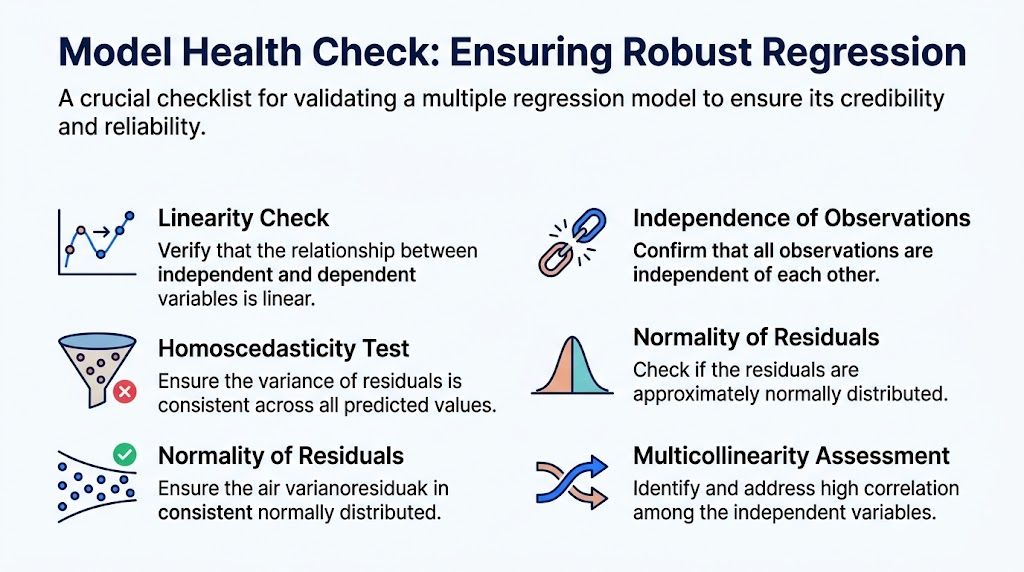

A checklist for performing a model health check to ensure the reliability of multiple regression analysis.

A regression model can look polished and still be wrong. Consequently, many business analyses go sideways. Someone runs the model, spots a few exciting coefficients, and starts pitching strategy off shaky foundations.

The health check is what separates useful insight from statistical fan fiction.

Four checks that matter in the real world

Start with linearity. If your relationship is curved but you force a straight-line model, your coefficients may look clean while your predictions drift. A simple scatterplot often catches this quickly.

Then check independence of observations. If rows aren’t independent, the model may overstate confidence. This issue shows up often in repeated measures and time-based business data.

Homoscedasticity comes next. The phrase sounds grander than it is. You want residuals with a fairly even spread across predicted values. If the errors fan out into a funnel shape, the model’s reliability changes across the range.

Finally, inspect normality of residuals. A Q-Q plot is the standard shortcut. You’re not chasing perfection. You’re checking whether the leftover error behaves reasonably.

The sneaky problem most teams underestimate

Multicollinearity deserves special attention because it wrecks interpretation while leaving the model looking technically alive.

A cited 2025 Kaggle survey of 1,200 data analysts found that 68% struggle with multicollinearity in SMB datasets, especially where variables like ad spend and traffic move together, according to this practical multicollinearity discussion.

That matters because a business user sees one coefficient and thinks, “Great, this is the lever.” Meanwhile, two overlapping predictors may be fighting inside the model and making each other unstable.

Look for symptoms like:

  • Coefficient sign flips: A variable that should be positive turns negative after adding a related predictor.

  • Large standard errors: The model can’t pin down the effect cleanly.

  • Counterintuitive stories: The output says something that clashes with domain knowledge for no good reason.

A coefficient you can’t trust is worse than no coefficient at all.

How to translate the diagnostics into business language

Suppose your model gives a coefficient of -5.2 for support response time. The useful sentence isn’t “beta equals negative five point two.”

The useful sentence is this: holding the other included variables constant, longer response times are associated with lower customer satisfaction.

That translation matters because executives don’t make decisions from coefficient tables. They make decisions from stories supported by evidence.

A few practical moves help:

  • If residuals show patterns, revisit the model form or add missing structure.

  • If VIF is high, combine variables, remove redundant ones, or use a different approach.

  • If one row has too much influence, inspect whether it’s a real business case or bad data.

  • If the model breaks by segment, consider separate models instead of one blended average.

Turning Statistics into Business Strategy


A hand pointing at statistical data including R-squared, coefficient, and p-value alongside marketing growth arrows.

A model is only useful if someone can act on it. That sounds obvious, yet teams regularly stop at output tables and call it analysis.

Three numbers usually carry the story: coefficients, p-values, and R-squared.

What each output means when you’re in a meeting

A coefficient tells you the direction and size of a relationship, assuming the model is well specified. Positive means the outcome tends to rise as that predictor rises. Negative means the opposite.

A p-value helps you judge whether a variable’s apparent effect is likely to be meaningful rather than noise. It’s not magic. It’s a confidence signal.

R-squared tells you how much of the variation in the outcome the model explains. But context matters more than ego.

A real estate case study reported an R-squared of 0.9278, meaning the model explained over 92% of the variation in rental income. A separate health study reported an R-squared of 0.25 and was still highly significant with p < .001. That contrast is a good reminder that interpretation depends on the domain, not just the headline number, as shown in this case study and application overview.

The boardroom version beats the stats-lab version

Don’t say this:

  • “Variable A was significant and Variable B was not.”

Say this:

  • “After accounting for the other included factors, onboarding completion remained a meaningful predictor of retention, while campaign source looked less reliable than we expected.”

That’s what stakeholders need. A ranking of likely levers. A warning about weak signals. A reason to shift budget, staffing, or roadmap attention.

Clear interpretation is where analytics starts paying rent.

You also need a communication format people will use. If insights live in a notebook, they die in a notebook. If they live in a shareable chart with a short explanation, they show up in planning meetings.

From Model to Actionable Insights

Once the model is fit and checked, the real work is choosing what to do next. Good regression doesn’t just explain the past. It helps you prioritize the next move.

Prediction is the obvious use case. Feed in new values and estimate an outcome. But the better use in most companies is decision support. Which lever deserves testing first? Which metric should be watched together with another? Which story in the dashboard is real enough to take seriously?

Validation before action

Before anyone changes budget or headcount, make sure the model survives contact with new data.

Advanced validation often includes checking for influential points, because those can inflate variance and reduce adjusted R² by 0.1 to 0.2 if ignored. A common practical setup is a 70/30 data split, and stronger models tend to maintain predictive R-squared above 0.7 while avoiding traps like autocorrelation in business time-series data, based on this regression validation reference.

That leads to a useful management habit: trust models that keep behaving when the data changes, not models that only look smart on the training set.

Reporting that actually moves decisions

Don’t send a spreadsheet with thirty columns and wish the team luck.

Do this instead:

  • Lead with the main finding: What changed, what matters, and what likely doesn’t.

  • Show one strong visual: A coefficient chart, partial effect view, or predicted-versus-actual plot.

  • Flag caveats plainly: Mention segments, missing drivers, or unstable variables.

  • Invite follow-up questions: The best analysis usually triggers a better second question.

Here are a few prompts worth trying in an AI analytics workflow:

  • Try asking: “Which factors best predict repeat purchases in the last twelve months?”

  • Try asking: “Show the relationship between onboarding completion, support tickets, and retention.”

  • Try asking: “Which variables remain significant when predicting monthly revenue?”

TL DR Key Takeaways

Takeaway

Multiple regression helps you isolate which factors matter while accounting for others.

Most of the hard work happens before and after the model fit, in data prep and validation.

A trustworthy model needs health checks for linearity, residual behavior, independence, and multicollinearity.

R-squared is useful, but its meaning depends on the business context.

A model only creates value when the findings are translated into decisions people can act on.

A strong multiple regression analysis example doesn’t end with “the model ran successfully.” It ends with a sharper decision, a cleaner story, and a team that knows what to test next.

If you want to skip the SQL, ask your data plain-English questions, and get charts in seconds, try Statspresso, a Conversational AI Data Analyst built for teams that need answers fast. Connect your first data source for free and ask your first question.

Waiting weeks for a data report is a relic of the past. You’ve got questions now. What’s driving conversions, which campaigns deserve more budget, and why did retention dip after a product launch?

A good multiple regression analysis example answers those questions without turning your week into a statistics seminar. It helps you sort out which inputs matter, which ones only look important, and which ones are just tagging along for the ride.

Your Burning Questions Answered Before an Analyst Can Reply

Business data rarely behaves like a clean classroom example. Sales don’t move because of one thing. Product usage doesn’t change because of one feature. Churn doesn’t spike because of one email.

That’s why multiple regression is useful. Imagine tasting a pasta sauce and figuring out whether the flavor came from garlic, basil, salt, or the extra simmer time. You’re not asking whether one ingredient matters in isolation. You’re asking how several inputs shape the final result together.

If you need a quick refresher on the notation behind coefficients, residuals, and standard formulas, this statistics formulas cheat sheet is a handy reference without being overly academic.

A practical business question might sound like this:

  • Marketing lead asks: Which factors best predict qualified leads?

  • Product manager asks: Does onboarding completion still matter after controlling for plan type and traffic source?

  • Founder asks: Are revenue changes more tied to pricing, sales activity, or seasonality?

Multiple regression matters because it moves you past “these things seem related” and into “this variable still matters after accounting for the others.”

Why Multiple Regression Is Your Business Superpower


A professional man in a business suit gestures towards colorful, abstract data visualizations and digital charts.

Simple regression is fine for toy problems. Real businesses don’t run on toy problems.

A founder wants to know what affects revenue. A growth team wants to know what affects CAC efficiency. A support lead wants to know what affects satisfaction. In each case, several variables are in play at the same time. That’s exactly why multiple regression gets used more often in practice than simple regression. It lets analysts evaluate relationships while controlling for other variables, and it depends on assumptions like linear relationships and normally distributed residuals, which is why it remains a core method across business, biology, and social sciences, as outlined in this overview of multiple regression fundamentals.

What it does better than simple correlation

Correlation is where many teams get stuck. They see that traffic went up when revenue went up and assume traffic caused it. Maybe it did. Maybe a pricing change, seasonal demand, and an outbound push also happened at the same time.

Multiple regression helps separate those effects.

It gives you a way to ask sharper questions:

  • Not just: Is ad spend related to sales?

  • But: Does ad spend still matter after accounting for seasonality, discounting, and email volume?

  • Not just: Do power users renew more?

  • But: Do they renew more after controlling for account age and company size?

That “after controlling for” language is where the method earns its keep.

The assumptions that make it trustworthy

At this stage, people either build a useful model or build a very polished mistake.

A workable model usually assumes:

  • Linearity: The relationship should be roughly straight-line, not wildly curved.

  • Independent observations: One row shouldn’t secretly depend on another row.

  • Homoscedasticity: The prediction errors shouldn’t explode for certain groups.

  • Normal residuals: The leftover errors should be reasonably well behaved.

Ignore those, and the model may still produce coefficients. They just won’t deserve your confidence.

Approach

Old Way Manual SQL

New Way Statspresso

Question framing

Write the metric definition, pull tables, align fields manually

Ask the question in plain English

Data assembly

Join sources, debug schema mismatches, reshape data

Connect sources and let the platform organize context

Model setup

Export to Python, R, or spreadsheet tools

Request analysis conversationally

Iteration

Rewrite queries for every follow-up

Ask a follow-up question instantly

Sharing

Screenshot charts or rebuild in slides

Share live answers and dashboards

Practical rule: Multiple regression is powerful because it reflects how businesses actually work. Several forces push on the same outcome at once.

Prepping Your Data Without Losing Your Mind

Most regression projects don’t fail because the math is hard. They fail because the data is annoying.

You want to predict customer spending. Great. Then you discover country is stored three different ways, last_purchase_date includes blanks, and age has values that were clearly entered by a distracted human with a broken keyboard. That’s normal.

A solid model starts with a dataset where the outcome is clearly defined and the predictors are usable. If your team is still building better pipelines and ownership around customer data, this guide to first-party data strategy is worth reading because regression only gets better when the underlying data is consistent and intentional.

A simple business example

Say the goal is to predict total customer spending.

Your variables might look like this:

  • Dependent variable: total spending

  • Predictor 1: age

  • Predictor 2: country

  • Predictor 3: days since last purchase

That sounds straightforward until you inspect the table.

You’ll need to:

  • Check for missing values: Nulls in the target or key predictors can break the analysis or skew results.

  • Fix data types: Dates should be dates, numbers should be numeric, and text fields should stop pretending to be both.

  • Encode categories: country can’t go directly into a standard linear model as raw text, so it usually becomes a set of indicator columns.

  • Review outliers: One bizarre value can tug coefficients around more than you’d expect.

Clean data beats fancy modeling. Every time.

What the work looks like under the hood

Here’s the kind of Python setup an analyst might use:

import pandas as pd

df = pd.read_csv("customers.csv")
df = df.dropna(subset=["total_spending", "age", "country", "last_purchase_date"])

df["last_purchase_date"] = pd.to_datetime(df["last_purchase_date"])
df["days_since_purchase"] = (pd.Timestamp("today") - df["last_purchase_date"]).dt.days

df = pd.get_dummies(df, columns=["country"], drop_first=True)

X = df[["age", "days_since_purchase"] + [c for c in df.columns if c.startswith("country_")]]
y = df["total_spending"]

And the same idea in R:

df <- read.csv("customers.csv")
df <- na.omit(df[, c("total_spending", "age", "country", "last_purchase_date")])

df$last_purchase_date <- as.Date(df$last_purchase_date)
df$days_since_purchase <- as.numeric(Sys.Date() - df$last_purchase_date)

df$country <- as.factor(df$country)
model_data <- model.matrix(total_spending ~ age + days_since_purchase + country, data = df)

You don’t need to memorize the syntax. What matters is the logic. Clean rows. Fix types. Convert categories. Build a usable matrix.

Data Prep The Old Way vs The Statspresso Way

Task

Old Way (Manual SQL & Python)

New Way (Statspresso)

Find missing fields

Profile each column manually across exports

Surface gaps during exploration

Convert dates

Write transformation logic in SQL or pandas

Ask for trends and let the system interpret date structure

Handle categories

One-hot encode text variables by hand

Let the platform organize dimensions for analysis

Trace bad joins

Debug key mismatches across tables

Work from connected sources with source-level context

Prepare stakeholder-ready output

Export charts into slides or docs

Keep findings in shareable analytics views

If your team is still stuck in the cleanup stage, this walkthrough on how to clean up data gets into the operational side of making messy tables usable.

Building the Model in Python and R

Once the dataset is clean, fitting the model is the easy part. That surprises a lot of people. The long part is usually preparing the inputs and checking whether the output is believable.

The standard fitting process uses ordinary least squares, which tries to minimize prediction error. In practical tools like R or SAS, the output usually includes an R² value, an F-statistic, and t-tests for each coefficient. One example cited in a teaching reference reported 71.3% explained variance in a body fat prediction model, alongside the usual significance tests, as described in this multiple linear regression guide.

Python example

Using statsmodels keeps the output readable:

import statsmodels.api as sm

X_with_const = sm.add_constant(X)
model = sm.OLS(y, X_with_const).fit()
print(model.summary())

That summary gives you the things decision-makers ask about later:

  • Coefficients

  • P-values

  • R-squared

  • Residual diagnostics

If you prefer scikit-learn, it’s great for prediction workflows, but statsmodels is usually better when you want classic statistical output.

R example

R keeps this pleasingly simple:

model <- lm(total_spending ~ age + days_since_purchase + country, data = df)
summary(model)

That one line is doing a lot. It estimates the intercept, calculates each coefficient, and reports whether each predictor looks useful once the others are included.

The model fit is not the finish line. It’s the start of quality control.

Think of this as a health intake, not a verdict

A rookie move is stopping at the first nice-looking summary table. A professional asks whether the model is showing symptoms of trouble.

Watch for things like:

  • A strong overall fit with nonsense coefficients

  • Variables that flip sign when you add another predictor

  • A decent in-sample fit that falls apart on new data

  • Predictors that look important only because they overlap heavily with each other

The code is the easy bit. Judgment is where the work lives.

Giving Your Model a Health Check


A checklist for performing a model health check to ensure the reliability of multiple regression analysis.

A regression model can look polished and still be wrong. Consequently, many business analyses go sideways. Someone runs the model, spots a few exciting coefficients, and starts pitching strategy off shaky foundations.

The health check is what separates useful insight from statistical fan fiction.

Four checks that matter in the real world

Start with linearity. If your relationship is curved but you force a straight-line model, your coefficients may look clean while your predictions drift. A simple scatterplot often catches this quickly.

Then check independence of observations. If rows aren’t independent, the model may overstate confidence. This issue shows up often in repeated measures and time-based business data.

Homoscedasticity comes next. The phrase sounds grander than it is. You want residuals with a fairly even spread across predicted values. If the errors fan out into a funnel shape, the model’s reliability changes across the range.

Finally, inspect normality of residuals. A Q-Q plot is the standard shortcut. You’re not chasing perfection. You’re checking whether the leftover error behaves reasonably.

The sneaky problem most teams underestimate

Multicollinearity deserves special attention because it wrecks interpretation while leaving the model looking technically alive.

A cited 2025 Kaggle survey of 1,200 data analysts found that 68% struggle with multicollinearity in SMB datasets, especially where variables like ad spend and traffic move together, according to this practical multicollinearity discussion.

That matters because a business user sees one coefficient and thinks, “Great, this is the lever.” Meanwhile, two overlapping predictors may be fighting inside the model and making each other unstable.

Look for symptoms like:

  • Coefficient sign flips: A variable that should be positive turns negative after adding a related predictor.

  • Large standard errors: The model can’t pin down the effect cleanly.

  • Counterintuitive stories: The output says something that clashes with domain knowledge for no good reason.

A coefficient you can’t trust is worse than no coefficient at all.

How to translate the diagnostics into business language

Suppose your model gives a coefficient of -5.2 for support response time. The useful sentence isn’t “beta equals negative five point two.”

The useful sentence is this: holding the other included variables constant, longer response times are associated with lower customer satisfaction.

That translation matters because executives don’t make decisions from coefficient tables. They make decisions from stories supported by evidence.

A few practical moves help:

  • If residuals show patterns, revisit the model form or add missing structure.

  • If VIF is high, combine variables, remove redundant ones, or use a different approach.

  • If one row has too much influence, inspect whether it’s a real business case or bad data.

  • If the model breaks by segment, consider separate models instead of one blended average.

Turning Statistics into Business Strategy


A hand pointing at statistical data including R-squared, coefficient, and p-value alongside marketing growth arrows.

A model is only useful if someone can act on it. That sounds obvious, yet teams regularly stop at output tables and call it analysis.

Three numbers usually carry the story: coefficients, p-values, and R-squared.

What each output means when you’re in a meeting

A coefficient tells you the direction and size of a relationship, assuming the model is well specified. Positive means the outcome tends to rise as that predictor rises. Negative means the opposite.

A p-value helps you judge whether a variable’s apparent effect is likely to be meaningful rather than noise. It’s not magic. It’s a confidence signal.

R-squared tells you how much of the variation in the outcome the model explains. But context matters more than ego.

A real estate case study reported an R-squared of 0.9278, meaning the model explained over 92% of the variation in rental income. A separate health study reported an R-squared of 0.25 and was still highly significant with p < .001. That contrast is a good reminder that interpretation depends on the domain, not just the headline number, as shown in this case study and application overview.

The boardroom version beats the stats-lab version

Don’t say this:

  • “Variable A was significant and Variable B was not.”

Say this:

  • “After accounting for the other included factors, onboarding completion remained a meaningful predictor of retention, while campaign source looked less reliable than we expected.”

That’s what stakeholders need. A ranking of likely levers. A warning about weak signals. A reason to shift budget, staffing, or roadmap attention.

Clear interpretation is where analytics starts paying rent.

You also need a communication format people will use. If insights live in a notebook, they die in a notebook. If they live in a shareable chart with a short explanation, they show up in planning meetings.

From Model to Actionable Insights

Once the model is fit and checked, the real work is choosing what to do next. Good regression doesn’t just explain the past. It helps you prioritize the next move.

Prediction is the obvious use case. Feed in new values and estimate an outcome. But the better use in most companies is decision support. Which lever deserves testing first? Which metric should be watched together with another? Which story in the dashboard is real enough to take seriously?

Validation before action

Before anyone changes budget or headcount, make sure the model survives contact with new data.

Advanced validation often includes checking for influential points, because those can inflate variance and reduce adjusted R² by 0.1 to 0.2 if ignored. A common practical setup is a 70/30 data split, and stronger models tend to maintain predictive R-squared above 0.7 while avoiding traps like autocorrelation in business time-series data, based on this regression validation reference.

That leads to a useful management habit: trust models that keep behaving when the data changes, not models that only look smart on the training set.

Reporting that actually moves decisions

Don’t send a spreadsheet with thirty columns and wish the team luck.

Do this instead:

  • Lead with the main finding: What changed, what matters, and what likely doesn’t.

  • Show one strong visual: A coefficient chart, partial effect view, or predicted-versus-actual plot.

  • Flag caveats plainly: Mention segments, missing drivers, or unstable variables.

  • Invite follow-up questions: The best analysis usually triggers a better second question.

Here are a few prompts worth trying in an AI analytics workflow:

  • Try asking: “Which factors best predict repeat purchases in the last twelve months?”

  • Try asking: “Show the relationship between onboarding completion, support tickets, and retention.”

  • Try asking: “Which variables remain significant when predicting monthly revenue?”

TL DR Key Takeaways

Takeaway

Multiple regression helps you isolate which factors matter while accounting for others.

Most of the hard work happens before and after the model fit, in data prep and validation.

A trustworthy model needs health checks for linearity, residual behavior, independence, and multicollinearity.

R-squared is useful, but its meaning depends on the business context.

A model only creates value when the findings are translated into decisions people can act on.

A strong multiple regression analysis example doesn’t end with “the model ran successfully.” It ends with a sharper decision, a cleaner story, and a team that knows what to test next.

If you want to skip the SQL, ask your data plain-English questions, and get charts in seconds, try Statspresso, a Conversational AI Data Analyst built for teams that need answers fast. Connect your first data source for free and ask your first question.

Waiting weeks for a data report is a relic of the past. You’ve got questions now. What’s driving conversions, which campaigns deserve more budget, and why did retention dip after a product launch?

A good multiple regression analysis example answers those questions without turning your week into a statistics seminar. It helps you sort out which inputs matter, which ones only look important, and which ones are just tagging along for the ride.

Your Burning Questions Answered Before an Analyst Can Reply

Business data rarely behaves like a clean classroom example. Sales don’t move because of one thing. Product usage doesn’t change because of one feature. Churn doesn’t spike because of one email.

That’s why multiple regression is useful. Imagine tasting a pasta sauce and figuring out whether the flavor came from garlic, basil, salt, or the extra simmer time. You’re not asking whether one ingredient matters in isolation. You’re asking how several inputs shape the final result together.

If you need a quick refresher on the notation behind coefficients, residuals, and standard formulas, this statistics formulas cheat sheet is a handy reference without being overly academic.

A practical business question might sound like this:

  • Marketing lead asks: Which factors best predict qualified leads?

  • Product manager asks: Does onboarding completion still matter after controlling for plan type and traffic source?

  • Founder asks: Are revenue changes more tied to pricing, sales activity, or seasonality?

Multiple regression matters because it moves you past “these things seem related” and into “this variable still matters after accounting for the others.”

Why Multiple Regression Is Your Business Superpower


A professional man in a business suit gestures towards colorful, abstract data visualizations and digital charts.

Simple regression is fine for toy problems. Real businesses don’t run on toy problems.

A founder wants to know what affects revenue. A growth team wants to know what affects CAC efficiency. A support lead wants to know what affects satisfaction. In each case, several variables are in play at the same time. That’s exactly why multiple regression gets used more often in practice than simple regression. It lets analysts evaluate relationships while controlling for other variables, and it depends on assumptions like linear relationships and normally distributed residuals, which is why it remains a core method across business, biology, and social sciences, as outlined in this overview of multiple regression fundamentals.

What it does better than simple correlation

Correlation is where many teams get stuck. They see that traffic went up when revenue went up and assume traffic caused it. Maybe it did. Maybe a pricing change, seasonal demand, and an outbound push also happened at the same time.

Multiple regression helps separate those effects.

It gives you a way to ask sharper questions:

  • Not just: Is ad spend related to sales?

  • But: Does ad spend still matter after accounting for seasonality, discounting, and email volume?

  • Not just: Do power users renew more?

  • But: Do they renew more after controlling for account age and company size?

That “after controlling for” language is where the method earns its keep.

The assumptions that make it trustworthy

At this stage, people either build a useful model or build a very polished mistake.

A workable model usually assumes:

  • Linearity: The relationship should be roughly straight-line, not wildly curved.

  • Independent observations: One row shouldn’t secretly depend on another row.

  • Homoscedasticity: The prediction errors shouldn’t explode for certain groups.

  • Normal residuals: The leftover errors should be reasonably well behaved.

Ignore those, and the model may still produce coefficients. They just won’t deserve your confidence.

Approach

Old Way Manual SQL

New Way Statspresso

Question framing

Write the metric definition, pull tables, align fields manually

Ask the question in plain English

Data assembly

Join sources, debug schema mismatches, reshape data

Connect sources and let the platform organize context

Model setup

Export to Python, R, or spreadsheet tools

Request analysis conversationally

Iteration

Rewrite queries for every follow-up

Ask a follow-up question instantly

Sharing

Screenshot charts or rebuild in slides

Share live answers and dashboards

Practical rule: Multiple regression is powerful because it reflects how businesses actually work. Several forces push on the same outcome at once.

Prepping Your Data Without Losing Your Mind

Most regression projects don’t fail because the math is hard. They fail because the data is annoying.

You want to predict customer spending. Great. Then you discover country is stored three different ways, last_purchase_date includes blanks, and age has values that were clearly entered by a distracted human with a broken keyboard. That’s normal.

A solid model starts with a dataset where the outcome is clearly defined and the predictors are usable. If your team is still building better pipelines and ownership around customer data, this guide to first-party data strategy is worth reading because regression only gets better when the underlying data is consistent and intentional.

A simple business example

Say the goal is to predict total customer spending.

Your variables might look like this:

  • Dependent variable: total spending

  • Predictor 1: age

  • Predictor 2: country

  • Predictor 3: days since last purchase

That sounds straightforward until you inspect the table.

You’ll need to:

  • Check for missing values: Nulls in the target or key predictors can break the analysis or skew results.

  • Fix data types: Dates should be dates, numbers should be numeric, and text fields should stop pretending to be both.

  • Encode categories: country can’t go directly into a standard linear model as raw text, so it usually becomes a set of indicator columns.

  • Review outliers: One bizarre value can tug coefficients around more than you’d expect.

Clean data beats fancy modeling. Every time.

What the work looks like under the hood

Here’s the kind of Python setup an analyst might use:

import pandas as pd

df = pd.read_csv("customers.csv")
df = df.dropna(subset=["total_spending", "age", "country", "last_purchase_date"])

df["last_purchase_date"] = pd.to_datetime(df["last_purchase_date"])
df["days_since_purchase"] = (pd.Timestamp("today") - df["last_purchase_date"]).dt.days

df = pd.get_dummies(df, columns=["country"], drop_first=True)

X = df[["age", "days_since_purchase"] + [c for c in df.columns if c.startswith("country_")]]
y = df["total_spending"]

And the same idea in R:

df <- read.csv("customers.csv")
df <- na.omit(df[, c("total_spending", "age", "country", "last_purchase_date")])

df$last_purchase_date <- as.Date(df$last_purchase_date)
df$days_since_purchase <- as.numeric(Sys.Date() - df$last_purchase_date)

df$country <- as.factor(df$country)
model_data <- model.matrix(total_spending ~ age + days_since_purchase + country, data = df)

You don’t need to memorize the syntax. What matters is the logic. Clean rows. Fix types. Convert categories. Build a usable matrix.

Data Prep The Old Way vs The Statspresso Way

Task

Old Way (Manual SQL & Python)

New Way (Statspresso)

Find missing fields

Profile each column manually across exports

Surface gaps during exploration

Convert dates

Write transformation logic in SQL or pandas

Ask for trends and let the system interpret date structure

Handle categories

One-hot encode text variables by hand

Let the platform organize dimensions for analysis

Trace bad joins

Debug key mismatches across tables

Work from connected sources with source-level context

Prepare stakeholder-ready output

Export charts into slides or docs

Keep findings in shareable analytics views

If your team is still stuck in the cleanup stage, this walkthrough on how to clean up data gets into the operational side of making messy tables usable.

Building the Model in Python and R

Once the dataset is clean, fitting the model is the easy part. That surprises a lot of people. The long part is usually preparing the inputs and checking whether the output is believable.

The standard fitting process uses ordinary least squares, which tries to minimize prediction error. In practical tools like R or SAS, the output usually includes an R² value, an F-statistic, and t-tests for each coefficient. One example cited in a teaching reference reported 71.3% explained variance in a body fat prediction model, alongside the usual significance tests, as described in this multiple linear regression guide.

Python example

Using statsmodels keeps the output readable:

import statsmodels.api as sm

X_with_const = sm.add_constant(X)
model = sm.OLS(y, X_with_const).fit()
print(model.summary())

That summary gives you the things decision-makers ask about later:

  • Coefficients

  • P-values

  • R-squared

  • Residual diagnostics

If you prefer scikit-learn, it’s great for prediction workflows, but statsmodels is usually better when you want classic statistical output.

R example

R keeps this pleasingly simple:

model <- lm(total_spending ~ age + days_since_purchase + country, data = df)
summary(model)

That one line is doing a lot. It estimates the intercept, calculates each coefficient, and reports whether each predictor looks useful once the others are included.

The model fit is not the finish line. It’s the start of quality control.

Think of this as a health intake, not a verdict

A rookie move is stopping at the first nice-looking summary table. A professional asks whether the model is showing symptoms of trouble.

Watch for things like:

  • A strong overall fit with nonsense coefficients

  • Variables that flip sign when you add another predictor

  • A decent in-sample fit that falls apart on new data

  • Predictors that look important only because they overlap heavily with each other

The code is the easy bit. Judgment is where the work lives.

Giving Your Model a Health Check


A checklist for performing a model health check to ensure the reliability of multiple regression analysis.

A regression model can look polished and still be wrong. Consequently, many business analyses go sideways. Someone runs the model, spots a few exciting coefficients, and starts pitching strategy off shaky foundations.

The health check is what separates useful insight from statistical fan fiction.

Four checks that matter in the real world

Start with linearity. If your relationship is curved but you force a straight-line model, your coefficients may look clean while your predictions drift. A simple scatterplot often catches this quickly.

Then check independence of observations. If rows aren’t independent, the model may overstate confidence. This issue shows up often in repeated measures and time-based business data.

Homoscedasticity comes next. The phrase sounds grander than it is. You want residuals with a fairly even spread across predicted values. If the errors fan out into a funnel shape, the model’s reliability changes across the range.

Finally, inspect normality of residuals. A Q-Q plot is the standard shortcut. You’re not chasing perfection. You’re checking whether the leftover error behaves reasonably.

The sneaky problem most teams underestimate

Multicollinearity deserves special attention because it wrecks interpretation while leaving the model looking technically alive.

A cited 2025 Kaggle survey of 1,200 data analysts found that 68% struggle with multicollinearity in SMB datasets, especially where variables like ad spend and traffic move together, according to this practical multicollinearity discussion.

That matters because a business user sees one coefficient and thinks, “Great, this is the lever.” Meanwhile, two overlapping predictors may be fighting inside the model and making each other unstable.

Look for symptoms like:

  • Coefficient sign flips: A variable that should be positive turns negative after adding a related predictor.

  • Large standard errors: The model can’t pin down the effect cleanly.

  • Counterintuitive stories: The output says something that clashes with domain knowledge for no good reason.

A coefficient you can’t trust is worse than no coefficient at all.

How to translate the diagnostics into business language

Suppose your model gives a coefficient of -5.2 for support response time. The useful sentence isn’t “beta equals negative five point two.”

The useful sentence is this: holding the other included variables constant, longer response times are associated with lower customer satisfaction.

That translation matters because executives don’t make decisions from coefficient tables. They make decisions from stories supported by evidence.

A few practical moves help:

  • If residuals show patterns, revisit the model form or add missing structure.

  • If VIF is high, combine variables, remove redundant ones, or use a different approach.

  • If one row has too much influence, inspect whether it’s a real business case or bad data.

  • If the model breaks by segment, consider separate models instead of one blended average.

Turning Statistics into Business Strategy


A hand pointing at statistical data including R-squared, coefficient, and p-value alongside marketing growth arrows.

A model is only useful if someone can act on it. That sounds obvious, yet teams regularly stop at output tables and call it analysis.

Three numbers usually carry the story: coefficients, p-values, and R-squared.

What each output means when you’re in a meeting

A coefficient tells you the direction and size of a relationship, assuming the model is well specified. Positive means the outcome tends to rise as that predictor rises. Negative means the opposite.

A p-value helps you judge whether a variable’s apparent effect is likely to be meaningful rather than noise. It’s not magic. It’s a confidence signal.

R-squared tells you how much of the variation in the outcome the model explains. But context matters more than ego.

A real estate case study reported an R-squared of 0.9278, meaning the model explained over 92% of the variation in rental income. A separate health study reported an R-squared of 0.25 and was still highly significant with p < .001. That contrast is a good reminder that interpretation depends on the domain, not just the headline number, as shown in this case study and application overview.

The boardroom version beats the stats-lab version

Don’t say this:

  • “Variable A was significant and Variable B was not.”

Say this:

  • “After accounting for the other included factors, onboarding completion remained a meaningful predictor of retention, while campaign source looked less reliable than we expected.”

That’s what stakeholders need. A ranking of likely levers. A warning about weak signals. A reason to shift budget, staffing, or roadmap attention.

Clear interpretation is where analytics starts paying rent.

You also need a communication format people will use. If insights live in a notebook, they die in a notebook. If they live in a shareable chart with a short explanation, they show up in planning meetings.

From Model to Actionable Insights

Once the model is fit and checked, the real work is choosing what to do next. Good regression doesn’t just explain the past. It helps you prioritize the next move.

Prediction is the obvious use case. Feed in new values and estimate an outcome. But the better use in most companies is decision support. Which lever deserves testing first? Which metric should be watched together with another? Which story in the dashboard is real enough to take seriously?

Validation before action

Before anyone changes budget or headcount, make sure the model survives contact with new data.

Advanced validation often includes checking for influential points, because those can inflate variance and reduce adjusted R² by 0.1 to 0.2 if ignored. A common practical setup is a 70/30 data split, and stronger models tend to maintain predictive R-squared above 0.7 while avoiding traps like autocorrelation in business time-series data, based on this regression validation reference.

That leads to a useful management habit: trust models that keep behaving when the data changes, not models that only look smart on the training set.

Reporting that actually moves decisions

Don’t send a spreadsheet with thirty columns and wish the team luck.

Do this instead:

  • Lead with the main finding: What changed, what matters, and what likely doesn’t.

  • Show one strong visual: A coefficient chart, partial effect view, or predicted-versus-actual plot.

  • Flag caveats plainly: Mention segments, missing drivers, or unstable variables.

  • Invite follow-up questions: The best analysis usually triggers a better second question.

Here are a few prompts worth trying in an AI analytics workflow:

  • Try asking: “Which factors best predict repeat purchases in the last twelve months?”

  • Try asking: “Show the relationship between onboarding completion, support tickets, and retention.”

  • Try asking: “Which variables remain significant when predicting monthly revenue?”

TL DR Key Takeaways

Takeaway

Multiple regression helps you isolate which factors matter while accounting for others.

Most of the hard work happens before and after the model fit, in data prep and validation.

A trustworthy model needs health checks for linearity, residual behavior, independence, and multicollinearity.

R-squared is useful, but its meaning depends on the business context.

A model only creates value when the findings are translated into decisions people can act on.

A strong multiple regression analysis example doesn’t end with “the model ran successfully.” It ends with a sharper decision, a cleaner story, and a team that knows what to test next.

If you want to skip the SQL, ask your data plain-English questions, and get charts in seconds, try Statspresso, a Conversational AI Data Analyst built for teams that need answers fast. Connect your first data source for free and ask your first question.