Interpretation of Data: A 2026 Business Guide

Your data is trying to tell you something. Every click, every sale, every support ticket is a breadcrumb. But raw data is just noise. The interpretation of data is how you find the signal, turning numbers into a story that helps you make smarter decisions.
But let's be honest. Waiting weeks for an analyst to build a dashboard is a relic of the past. By the time you get the numbers, the opportunity is gone. It's time to stop waiting and start asking.
Key Takeaways TL;DR
You're busy, so here’s the bottom line on everything we've covered about the interpretation of data:
Interpretation is the 'So What?': Analysis finds the facts ("what happened"), but interpretation tells you why those facts matter and what you should do about them. It’s the story, not just the numbers.
Follow a Framework: Don’t just wing it. Use a structured process: Ask a sharp question, get data you can trust, find the pattern, and then decide what to do next.
Watch for Mind Traps: Always be on guard for confirmation bias, survivorship bias, and mistaking correlation for causation. These mental shortcuts are the source of expensive mistakes.
Technology is Your Ally: The old way of waiting days for an SQL report is over. A Conversational AI Data Analyst like Statspresso lets you ask questions in plain English and get unbiased answers in seconds.
Your Data Has Answers, But Are You Asking The Right Questions?

All the information you could want is already sitting in your Postgres database, your Shopify account, or your HubSpot portal. The issue has never been a lack of data; it’s about having a meaningful way to interact with it.
The old way—filing a ticket and waiting weeks for a report—doesn't cut it. You're forced to make decisions based on old news. This isn't just inefficient; it's expensive.
The Problem With Traditional BI
The traditional business intelligence model is a classic bottleneck. You have a question, so you get in line. An analyst eventually writes a query, builds a chart, and sends it back. It’s a slow, frustrating cycle that kills curiosity. And when that first chart sparks a new question? Back to the end of the line you go.
This isn't just inefficient; industry reports predict that by 2026, more businesses will shift to automated BI to get faster insights. They know that slow, manual analysis means leaving money on the table. The goal was never more charts; it’s faster answers.
This is where a Conversational AI Data Analyst like Statspresso flips the script. You can skip the SQL and just ask your data a question to get a chart in seconds.
No more waiting: Get answers to your most important business questions in real-time.
No more coding: If you can ask a question, you can analyze your data. It's that simple.
No more guessing: Ground every single decision in clear, verifiable numbers.
Instead of navigating a maze of filters, you can finally have a direct dialogue with your data. This is the future of analyzing and interpreting data.
Try asking Statspresso: "Show me my monthly recurring revenue growth over the last 12 months."
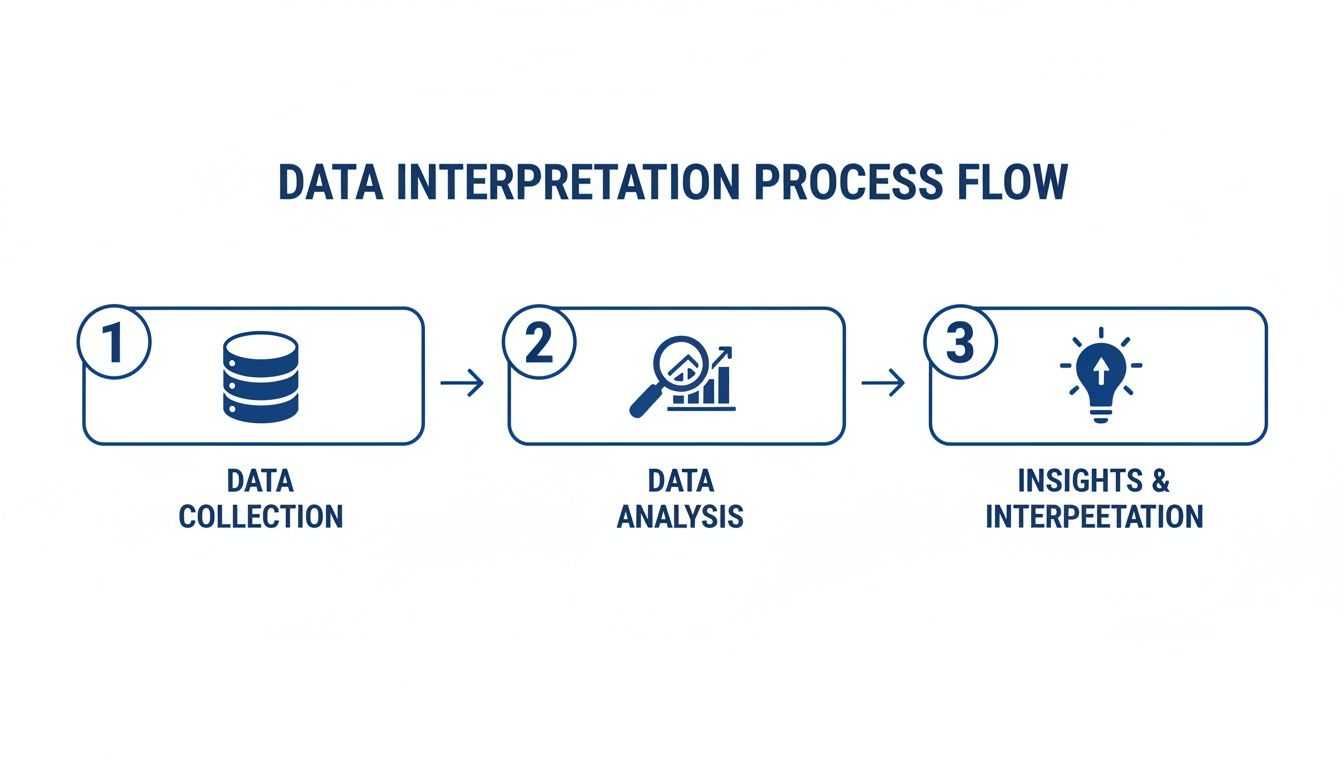
What Data Interpretation Actually Means
Let’s get one thing straight: data interpretation isn’t about the numbers themselves. It's about finding the story behind the numbers—the "so what?" that drives your next move.
Think of it this way. All your raw data is like a pile of ingredients. Data analysis is the prep work: dicing the onions, measuring the flour. It's the necessary step of getting organized.
Data interpretation, however, is the recipe. It's knowing how to combine those ingredients to create something meaningful. It's the art, not just the science.
Analysis Is The "What," Interpretation Is The "Why"
This is where many teams get stuck. They have analysis but miss the interpretation.
Analysis tells you what happened. Interpretation explains why it matters.
Analysis: “We saw a 15% drop in user retention in May.” (This is a fact, but it’s a dead end.)
Interpretation: “Our user retention dropped by 15% in May right after we launched a new checkout flow. The drop-off is concentrated there, which means a bug is likely killing conversions. We need to roll back that update while we fix it.” (This is an actionable insight.)
One is a passive observation. The other is a strategic conclusion. For too long, finding that conclusion required a data scientist to spend hours writing SQL. This bottleneck is a massive liability. A staggering 60-73% of all data within a company is often inaccurate or incomplete, leading businesses to waste nearly 30% of their budgets on bad decisions. You can read more about these industry trends and their impact on data analytics.
Getting Straight to the "So What"
This is where a Conversational AI Data Analyst like Statspresso comes in. It closes the gap between raw analysis and meaningful interpretation. The old way forced you to learn SQL. The new way teaches the database to understand your language.
Instead of getting bogged down in code, you just ask for what you need. The AI does the heavy lifting—the "analysis"—in the background and gives you a clear, interpreted answer.
Try asking Statspresso: “Compare my revenue from new vs. returning customers for the last six months as a line chart.”
A simple question like this completely bypasses the old, manual workflow. No more writing SQL or wrestling with pivot tables. You just ask. This is what modern data interpretation is all about—it's a conversation, not a coding exam.
A Simple Framework For Accurate Data Interpretation
It’s easy to look at a chart, have a “eureka!” moment, and jump to a conclusion. The problem is, those moments can be incredibly expensive. A hasty interpretation can send your team down the wrong path, burning time and money on the wrong problem.
Getting it right isn't about a flash of genius. It's about a repeatable process that grounds your conclusions in evidence, not just a gut feeling.
1. Ask a Specific Question
Everything starts here. A vague question gets a vague answer. Be brutally specific.
Vague Question: "How are sales doing?"
Specific Question: "Which product category had the highest profit margin in Q2, and was that driven by a higher average order value or a lower cost of goods sold?"
The second question defines the metrics, timeframe, and potential causes. This specificity is crucial, whether you're analyzing sales numbers or qualitative feedback from thematic analysis in qualitative research.
2. Gather Trustworthy Data
Next, find the right information. Ensure your data is both relevant and reliable. If you pull numbers from an outdated report, your analysis is built on a shaky foundation.
This is why a single source of truth is non-negotiable. Connect directly to your core platforms—your Shopify store, your HubSpot CRM—to guarantee you're working with live, accurate information. Your insights are only as good as the numbers they're built on.
3. Find the Pattern
Now for the fun part: finding the story. This is where analysis and visualization come into play. Your goal is to spot trends, identify outliers, and understand relationships.
Is revenue trending up while profit margins shrink? Did a marketing campaign correlate with a spike in sign-ups? A Conversational AI Data Analyst like Statspresso makes this step feel like magic.
Try asking Statspresso: “Compare the lifetime value of customers acquired through Google Ads vs. organic search as a bar chart.”
This lets you explore from multiple angles without writing a single line of SQL.
4. Decide and Act
The final step is turning your findings into a concrete decision. The whole point is to guide intelligent action. Based on the pattern, what's the "so what"?
Finding: "Customers acquired via Google Ads have a lower LTV but a much higher initial conversion rate."
Decision: "Let's create a targeted onboarding sequence for Google Ads customers to increase their long-term engagement and boost their LTV."
This framework turns numbers on a screen into a strategic roadmap for growth.
Common Data Interpretation Pitfalls And How To Avoid Them
I've seen it a thousand times: a team with data makes a decision with absolute confidence, only to watch it fail spectacularly. What went wrong? Not the data—the interpretation.
Bad data interpretation is worse than no data at all. Guessing is one thing, but acting on a flawed interpretation gives you a false sense of security that can steer your business straight toward expensive mistakes.
Mind Traps That Derail Your Data Analysis
Most errors come from cognitive shortcuts that feel like smart leaps but lead you astray. Here are the most common culprits:
Confirmation Bias: You hunt for proof, not truth. You have a hunch, so you instinctively highlight data that confirms it while downplaying anything that contradicts it.
Survivorship Bias: You focus on the winners and ignore the losers, painting a dangerously rosy picture. Basing your plan on unicorn startups ignores the thousands of failed companies that did the exact same thing.
Correlation vs. Causation: This is the big one. Just because two things move together doesn't mean one caused the other. Did sales jump because of your new ad, or was it the usual seasonal bump?
These biases have serious consequences. According to a 2026 industry report, integrating machine learning into data analysis can improve forecasting accuracy by up to 30%, helping prevent these blunders. You can dive deeper into these market research statistics and trends.
Validating Data Insights: Old Way vs. New Way
So, how do you guard against these mental traps? Today, a Conversational AI Data Analyst like Statspresso acts as a neutral sparring partner, instantly challenging your assumptions.
Validation Step | The Old Way (Manual SQL & Spreadsheets) | The New Way (Statspresso AI Analyst) |
|---|---|---|
Checking Confirmation Bias | Manually pulling counter-evidence. Slow and prone to groupthink. | Instantly ask for opposing views. "Show me customers who didn't use the new feature." The AI finds the counter-narrative for you. |
Avoiding Survivorship Bias | Trying to find data on churned users, which is often siloed or hard to access. | Directly query churned user data. "What was the last action taken by users who churned in May?" Instantly see what went wrong. |
Testing Correlation | Exporting datasets to a spreadsheet and running complex statistical tests. | Let the AI do the work. "Did my revenue increase last month correlate with ad spend, or was it organic traffic?" Get a clear answer in seconds. |
To avoid these pitfalls, you have to question your own conclusions. An AI assistant is the perfect partner for this. It has no ego, no preconceived notions, and no emotional attachment to your pet projects.
Try asking Statspresso: "Is there a correlation between my recent marketing campaign and the dip in user satisfaction scores?"
Putting Data Interpretation Into Practice
So, what does data interpretation look like on a busy Tuesday afternoon? Let's get practical.
Simply having more data isn't a silver bullet. If you can't make sense of it quickly, all that information can be counterproductive. Here are three scenarios where busy leaders use a Conversational AI Data Analyst like Statspresso to skip the manual work and get straight to the answer.
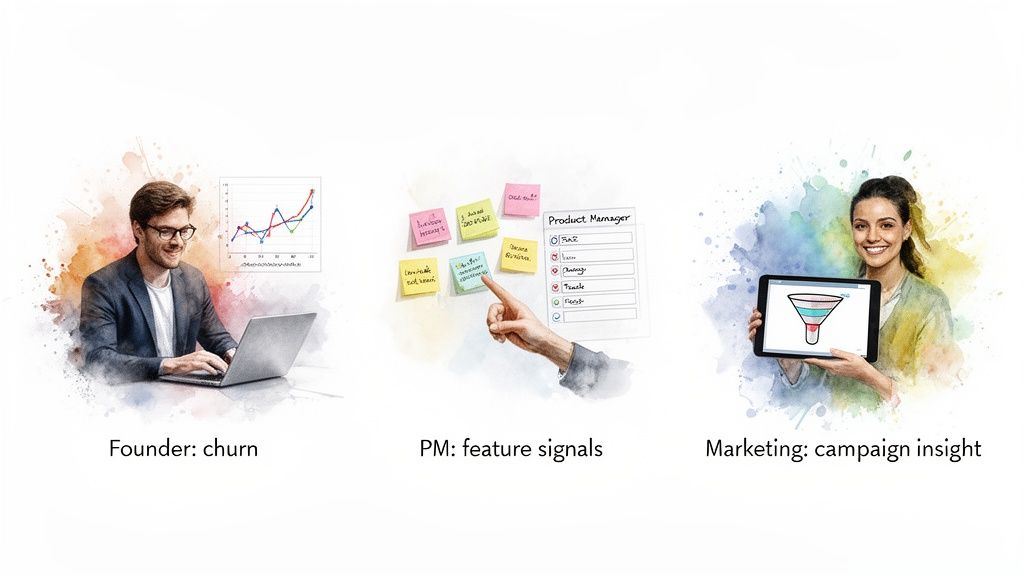
Use Case 1: The SaaS Founder and Customer Churn
A founder notices churn is creeping up. The old way would be exporting data and fighting with spreadsheets for hours. Instead, she connects her Stripe account and asks a question.
Try asking Statspresso: “Show me my user churn rate by subscription plan over the last 6 months.”
A chart appears, showing her "Pro" plan has the highest churn. She digs deeper: "What is the average user tenure for churned 'Pro' plan customers?" The answer comes back instantly: 14 days.
The Actionable Insight: This isn't a feature problem; it's an onboarding problem. Customers are leaving right after their trial. The mission is clear: fix the first two weeks of the Pro plan experience.
Use Case 2: The Product Manager and Feature Engagement
A Product Manager needs to decide what to build next. What she really needs to know is which features are actually driving engagement. Setting up systems for automated data processing is a great first step. With her data sources connected, she gets to the heart of the matter.
Try asking Statspresso: “Which feature requests from Q2 have the highest number of associated active users?”
The AI cross-references Jira tickets with live user activity. It returns a list revealing that small, iterative improvements are getting far more use than flashy "moonshot" features.
The Actionable Insight: She can now build a Q3 roadmap backed by hard evidence, prioritizing quick wins that will make a real difference.
Use Case 3: The Marketing Lead and Campaign ROI
A marketing lead is juggling a dozen campaigns. She's drowning in metrics but has no sense of what's driving actual demo requests. After connecting her platforms, she asks the one question that cuts through the noise.
Try asking Statspresso: “Which blog posts from the last 90 days drove the most demo requests?”
The AI joins the data and attributes conversions back to the original content. A ranked list shows that just three "how-to" articles are responsible for 70% of all content-driven demos.
The Actionable Insight: The path is clear. She can reallocate her budget, pulling resources from underperforming topics and doubling down on what’s proven to work.
From Data Insight To Business Action
An insight that just sits in a report is expensive trivia. The whole point is to find a clear path forward—to bridge the gap between "huh, that's interesting" and a confident business move.
A Simple Checklist for Action
Once you've validated an insight, give it momentum with this simple checklist.
Define the Next Step: What is the single, most logical thing to do? "Add a welcome video to the Pro plan's day-one email" is a concrete action.
Assign Ownership: Who is on the hook for getting this done?
Set a Deadline: When will this be completed?
Measure Success: How will you know if it worked? Pinpoint the key metric you'll watch.
This process ensures your work doesn't end with a chart but with a clear plan. For more on this, check out our guide on data-driven decision-making.
The days of waiting for a dashboard are over. The conversation with your data should be direct, fast, and continuous. Stop waiting for reports and start asking questions.
Connect your first data source for free and ask your first question. Go from data to decision in seconds.
Frequently Asked Questions
Still have questions about the interpretation of data? Let's clear up the common ones.
What Is The Difference Between Data Analysis And Data Interpretation?
Think of analysis as the "what" and interpretation as the "so what?" Analysis is the technical process of crunching numbers to find a pattern—for example, a chart showing a 20% dip in sales.
Interpretation is the human part: looking at that chart and figuring out why sales dipped and what to do next. A Conversational AI Data Analyst like Statspresso merges these two steps. You ask a business question, and it delivers the "what" (the chart) and a starting point for the "so what."
How Can I Ensure My Data Interpretation Is Unbiased?
This is a big one. The single best practice is to actively try to prove yourself wrong. Before confirming a hunch, challenge yourself to find data that disproves it.
Another great tactic is to bring in fresh eyes from different departments. Finally, rely on tools that provide transparency. A good AI analyst like Statspresso grounds every insight directly in your data, allowing you to trace every answer back to its source. It’s a fantastic guardrail against bias.
Do I Need To Know SQL For Effective Data Interpretation?
Not anymore. For a long time, the answer was "yes." If you couldn't write SQL, you were stuck waiting.
But modern tools have made effective data interpretation accessible to anyone. A Conversational AI Data Analyst like Statspresso acts as your personal translator. You ask a question in plain English, and it handles the complex queries in the background. You can skip the SQL and just ask your data a question to get a chart in seconds, freeing you to focus on what the data means for your business.
Stop waiting for reports and start having a direct conversation with your data. With Statspresso, you can connect your first data source for free and get your first answer in seconds.
Your data is trying to tell you something. Every click, every sale, every support ticket is a breadcrumb. But raw data is just noise. The interpretation of data is how you find the signal, turning numbers into a story that helps you make smarter decisions.
But let's be honest. Waiting weeks for an analyst to build a dashboard is a relic of the past. By the time you get the numbers, the opportunity is gone. It's time to stop waiting and start asking.
Key Takeaways TL;DR
You're busy, so here’s the bottom line on everything we've covered about the interpretation of data:
Interpretation is the 'So What?': Analysis finds the facts ("what happened"), but interpretation tells you why those facts matter and what you should do about them. It’s the story, not just the numbers.
Follow a Framework: Don’t just wing it. Use a structured process: Ask a sharp question, get data you can trust, find the pattern, and then decide what to do next.
Watch for Mind Traps: Always be on guard for confirmation bias, survivorship bias, and mistaking correlation for causation. These mental shortcuts are the source of expensive mistakes.
Technology is Your Ally: The old way of waiting days for an SQL report is over. A Conversational AI Data Analyst like Statspresso lets you ask questions in plain English and get unbiased answers in seconds.
Your Data Has Answers, But Are You Asking The Right Questions?
All the information you could want is already sitting in your Postgres database, your Shopify account, or your HubSpot portal. The issue has never been a lack of data; it’s about having a meaningful way to interact with it.
The old way—filing a ticket and waiting weeks for a report—doesn't cut it. You're forced to make decisions based on old news. This isn't just inefficient; it's expensive.
The Problem With Traditional BI
The traditional business intelligence model is a classic bottleneck. You have a question, so you get in line. An analyst eventually writes a query, builds a chart, and sends it back. It’s a slow, frustrating cycle that kills curiosity. And when that first chart sparks a new question? Back to the end of the line you go.
This isn't just inefficient; industry reports predict that by 2026, more businesses will shift to automated BI to get faster insights. They know that slow, manual analysis means leaving money on the table. The goal was never more charts; it’s faster answers.
This is where a Conversational AI Data Analyst like Statspresso flips the script. You can skip the SQL and just ask your data a question to get a chart in seconds.
No more waiting: Get answers to your most important business questions in real-time.
No more coding: If you can ask a question, you can analyze your data. It's that simple.
No more guessing: Ground every single decision in clear, verifiable numbers.
Instead of navigating a maze of filters, you can finally have a direct dialogue with your data. This is the future of analyzing and interpreting data.
Try asking Statspresso: "Show me my monthly recurring revenue growth over the last 12 months."
What Data Interpretation Actually Means
Let’s get one thing straight: data interpretation isn’t about the numbers themselves. It's about finding the story behind the numbers—the "so what?" that drives your next move.
Think of it this way. All your raw data is like a pile of ingredients. Data analysis is the prep work: dicing the onions, measuring the flour. It's the necessary step of getting organized.
Data interpretation, however, is the recipe. It's knowing how to combine those ingredients to create something meaningful. It's the art, not just the science.
Analysis Is The "What," Interpretation Is The "Why"
This is where many teams get stuck. They have analysis but miss the interpretation.
Analysis tells you what happened. Interpretation explains why it matters.
Analysis: “We saw a 15% drop in user retention in May.” (This is a fact, but it’s a dead end.)
Interpretation: “Our user retention dropped by 15% in May right after we launched a new checkout flow. The drop-off is concentrated there, which means a bug is likely killing conversions. We need to roll back that update while we fix it.” (This is an actionable insight.)
One is a passive observation. The other is a strategic conclusion. For too long, finding that conclusion required a data scientist to spend hours writing SQL. This bottleneck is a massive liability. A staggering 60-73% of all data within a company is often inaccurate or incomplete, leading businesses to waste nearly 30% of their budgets on bad decisions. You can read more about these industry trends and their impact on data analytics.
Getting Straight to the "So What"
This is where a Conversational AI Data Analyst like Statspresso comes in. It closes the gap between raw analysis and meaningful interpretation. The old way forced you to learn SQL. The new way teaches the database to understand your language.
Instead of getting bogged down in code, you just ask for what you need. The AI does the heavy lifting—the "analysis"—in the background and gives you a clear, interpreted answer.
Try asking Statspresso: “Compare my revenue from new vs. returning customers for the last six months as a line chart.”
A simple question like this completely bypasses the old, manual workflow. No more writing SQL or wrestling with pivot tables. You just ask. This is what modern data interpretation is all about—it's a conversation, not a coding exam.
A Simple Framework For Accurate Data Interpretation
It’s easy to look at a chart, have a “eureka!” moment, and jump to a conclusion. The problem is, those moments can be incredibly expensive. A hasty interpretation can send your team down the wrong path, burning time and money on the wrong problem.
Getting it right isn't about a flash of genius. It's about a repeatable process that grounds your conclusions in evidence, not just a gut feeling.
1. Ask a Specific Question
Everything starts here. A vague question gets a vague answer. Be brutally specific.
Vague Question: "How are sales doing?"
Specific Question: "Which product category had the highest profit margin in Q2, and was that driven by a higher average order value or a lower cost of goods sold?"
The second question defines the metrics, timeframe, and potential causes. This specificity is crucial, whether you're analyzing sales numbers or qualitative feedback from thematic analysis in qualitative research.
2. Gather Trustworthy Data
Next, find the right information. Ensure your data is both relevant and reliable. If you pull numbers from an outdated report, your analysis is built on a shaky foundation.
This is why a single source of truth is non-negotiable. Connect directly to your core platforms—your Shopify store, your HubSpot CRM—to guarantee you're working with live, accurate information. Your insights are only as good as the numbers they're built on.
3. Find the Pattern
Now for the fun part: finding the story. This is where analysis and visualization come into play. Your goal is to spot trends, identify outliers, and understand relationships.
Is revenue trending up while profit margins shrink? Did a marketing campaign correlate with a spike in sign-ups? A Conversational AI Data Analyst like Statspresso makes this step feel like magic.
Try asking Statspresso: “Compare the lifetime value of customers acquired through Google Ads vs. organic search as a bar chart.”
This lets you explore from multiple angles without writing a single line of SQL.
4. Decide and Act
The final step is turning your findings into a concrete decision. The whole point is to guide intelligent action. Based on the pattern, what's the "so what"?
Finding: "Customers acquired via Google Ads have a lower LTV but a much higher initial conversion rate."
Decision: "Let's create a targeted onboarding sequence for Google Ads customers to increase their long-term engagement and boost their LTV."
This framework turns numbers on a screen into a strategic roadmap for growth.
Common Data Interpretation Pitfalls And How To Avoid Them
I've seen it a thousand times: a team with data makes a decision with absolute confidence, only to watch it fail spectacularly. What went wrong? Not the data—the interpretation.
Bad data interpretation is worse than no data at all. Guessing is one thing, but acting on a flawed interpretation gives you a false sense of security that can steer your business straight toward expensive mistakes.
Mind Traps That Derail Your Data Analysis
Most errors come from cognitive shortcuts that feel like smart leaps but lead you astray. Here are the most common culprits:
Confirmation Bias: You hunt for proof, not truth. You have a hunch, so you instinctively highlight data that confirms it while downplaying anything that contradicts it.
Survivorship Bias: You focus on the winners and ignore the losers, painting a dangerously rosy picture. Basing your plan on unicorn startups ignores the thousands of failed companies that did the exact same thing.
Correlation vs. Causation: This is the big one. Just because two things move together doesn't mean one caused the other. Did sales jump because of your new ad, or was it the usual seasonal bump?
These biases have serious consequences. According to a 2026 industry report, integrating machine learning into data analysis can improve forecasting accuracy by up to 30%, helping prevent these blunders. You can dive deeper into these market research statistics and trends.
Validating Data Insights: Old Way vs. New Way
So, how do you guard against these mental traps? Today, a Conversational AI Data Analyst like Statspresso acts as a neutral sparring partner, instantly challenging your assumptions.
Validation Step | The Old Way (Manual SQL & Spreadsheets) | The New Way (Statspresso AI Analyst) |
|---|---|---|
Checking Confirmation Bias | Manually pulling counter-evidence. Slow and prone to groupthink. | Instantly ask for opposing views. "Show me customers who didn't use the new feature." The AI finds the counter-narrative for you. |
Avoiding Survivorship Bias | Trying to find data on churned users, which is often siloed or hard to access. | Directly query churned user data. "What was the last action taken by users who churned in May?" Instantly see what went wrong. |
Testing Correlation | Exporting datasets to a spreadsheet and running complex statistical tests. | Let the AI do the work. "Did my revenue increase last month correlate with ad spend, or was it organic traffic?" Get a clear answer in seconds. |
To avoid these pitfalls, you have to question your own conclusions. An AI assistant is the perfect partner for this. It has no ego, no preconceived notions, and no emotional attachment to your pet projects.
Try asking Statspresso: "Is there a correlation between my recent marketing campaign and the dip in user satisfaction scores?"
Putting Data Interpretation Into Practice
So, what does data interpretation look like on a busy Tuesday afternoon? Let's get practical.
Simply having more data isn't a silver bullet. If you can't make sense of it quickly, all that information can be counterproductive. Here are three scenarios where busy leaders use a Conversational AI Data Analyst like Statspresso to skip the manual work and get straight to the answer.
Use Case 1: The SaaS Founder and Customer Churn
A founder notices churn is creeping up. The old way would be exporting data and fighting with spreadsheets for hours. Instead, she connects her Stripe account and asks a question.
Try asking Statspresso: “Show me my user churn rate by subscription plan over the last 6 months.”
A chart appears, showing her "Pro" plan has the highest churn. She digs deeper: "What is the average user tenure for churned 'Pro' plan customers?" The answer comes back instantly: 14 days.
The Actionable Insight: This isn't a feature problem; it's an onboarding problem. Customers are leaving right after their trial. The mission is clear: fix the first two weeks of the Pro plan experience.
Use Case 2: The Product Manager and Feature Engagement
A Product Manager needs to decide what to build next. What she really needs to know is which features are actually driving engagement. Setting up systems for automated data processing is a great first step. With her data sources connected, she gets to the heart of the matter.
Try asking Statspresso: “Which feature requests from Q2 have the highest number of associated active users?”
The AI cross-references Jira tickets with live user activity. It returns a list revealing that small, iterative improvements are getting far more use than flashy "moonshot" features.
The Actionable Insight: She can now build a Q3 roadmap backed by hard evidence, prioritizing quick wins that will make a real difference.
Use Case 3: The Marketing Lead and Campaign ROI
A marketing lead is juggling a dozen campaigns. She's drowning in metrics but has no sense of what's driving actual demo requests. After connecting her platforms, she asks the one question that cuts through the noise.
Try asking Statspresso: “Which blog posts from the last 90 days drove the most demo requests?”
The AI joins the data and attributes conversions back to the original content. A ranked list shows that just three "how-to" articles are responsible for 70% of all content-driven demos.
The Actionable Insight: The path is clear. She can reallocate her budget, pulling resources from underperforming topics and doubling down on what’s proven to work.
From Data Insight To Business Action
An insight that just sits in a report is expensive trivia. The whole point is to find a clear path forward—to bridge the gap between "huh, that's interesting" and a confident business move.
A Simple Checklist for Action
Once you've validated an insight, give it momentum with this simple checklist.
Define the Next Step: What is the single, most logical thing to do? "Add a welcome video to the Pro plan's day-one email" is a concrete action.
Assign Ownership: Who is on the hook for getting this done?
Set a Deadline: When will this be completed?
Measure Success: How will you know if it worked? Pinpoint the key metric you'll watch.
This process ensures your work doesn't end with a chart but with a clear plan. For more on this, check out our guide on data-driven decision-making.
The days of waiting for a dashboard are over. The conversation with your data should be direct, fast, and continuous. Stop waiting for reports and start asking questions.
Connect your first data source for free and ask your first question. Go from data to decision in seconds.
Frequently Asked Questions
Still have questions about the interpretation of data? Let's clear up the common ones.
What Is The Difference Between Data Analysis And Data Interpretation?
Think of analysis as the "what" and interpretation as the "so what?" Analysis is the technical process of crunching numbers to find a pattern—for example, a chart showing a 20% dip in sales.
Interpretation is the human part: looking at that chart and figuring out why sales dipped and what to do next. A Conversational AI Data Analyst like Statspresso merges these two steps. You ask a business question, and it delivers the "what" (the chart) and a starting point for the "so what."
How Can I Ensure My Data Interpretation Is Unbiased?
This is a big one. The single best practice is to actively try to prove yourself wrong. Before confirming a hunch, challenge yourself to find data that disproves it.
Another great tactic is to bring in fresh eyes from different departments. Finally, rely on tools that provide transparency. A good AI analyst like Statspresso grounds every insight directly in your data, allowing you to trace every answer back to its source. It’s a fantastic guardrail against bias.
Do I Need To Know SQL For Effective Data Interpretation?
Not anymore. For a long time, the answer was "yes." If you couldn't write SQL, you were stuck waiting.
But modern tools have made effective data interpretation accessible to anyone. A Conversational AI Data Analyst like Statspresso acts as your personal translator. You ask a question in plain English, and it handles the complex queries in the background. You can skip the SQL and just ask your data a question to get a chart in seconds, freeing you to focus on what the data means for your business.
Stop waiting for reports and start having a direct conversation with your data. With Statspresso, you can connect your first data source for free and get your first answer in seconds.