How to Interpret T-Test Results: A Founder's Guide

You just wrapped an A/B test. The data's in. But now you're staring at a screen full of jargon like 'p-value' and 't-statistic,' trying to figure out if your new headline actually moved the needle. Sound familiar? Waiting weeks for a data analyst to build a dashboard is a relic of the past. The good news is you don't need a Ph.D. in statistics to make sense of it all. Making a clear business decision comes down to understanding just a few key numbers.
TL;DR: Your T-Test Cheat Sheet
P-Value & Effect Size are a Package Deal: A low p-value (< 0.05) says the difference is real. Effect size (Cohen's d) says if the difference is big enough to matter. You need both.
The Confidence Interval is Your Reality Check: This is your risk meter. If the range includes zero (e.g., -2% to +5%), your result is unstable. Don't bet the farm on it.
Translate to Plain English: No one in the boardroom cares about your t-statistic. They want to know if the new feature will make money. Always frame your findings around business impact.
Ditch the Manual Work: Use a conversational AI data analyst like Statspresso to skip the SQL. Just ask your data a question and get a chart in seconds.
Your T-Test Results Are In. What Now?
So, the test is done. The results are in. But instead of a clear answer, you have a table of numbers that looks like it came straight out of a textbook. In the past, you'd wait for a data analyst to translate it for you—a bottleneck you can’t afford.
You need to know what to look for to get from this jumble of data to a confident "yes" or "no" and move on. It’s all about decoding the story your numbers are trying to tell you.
Breaking Down the Key Numbers
Every t-test output, whether from a fancy stats package or a simple online calculator, will give you a few essential metrics. Let's focus on what they actually mean for your business.
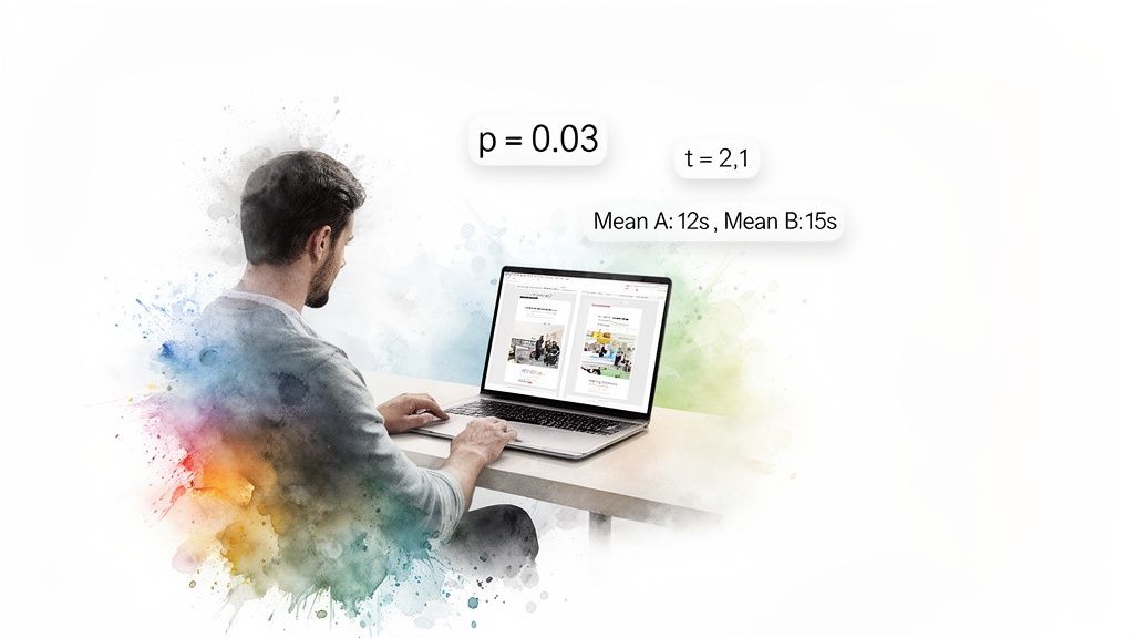
Group Means: This is the most straightforward part. It’s simply the average result for your control (Group A) and your variant (Group B). For example, if your original headline saw an average time on page of 45 seconds and the new one hit 65 seconds, those are your means. It's the raw performance snapshot.
The T-Statistic (or t-value): Think of this as your signal-to-noise ratio. It measures how big the difference between your groups is, relative to the natural variation (the "noise") in the data. A large absolute t-value—generally anything above 2 or below -2—suggests a strong signal that the difference you're seeing isn't just random chance.
The P-Value: This is the one everyone obsesses over, and for good reason. The p-value tells you the probability of seeing your results (or even more extreme ones) if there were no real difference between the two versions. When you see a low p-value (usually < 0.05), you can be confident your result is "statistically significant." It means it's highly unlikely your finding is just a fluke.
I once worked with a retail client on a sales promotion analysis projected for 2026. They tested two strategies: Strategy A led to an average sales lift of $1,192.50, while Strategy B brought in $1,452.50. Their t-test produced a t-statistic of -4.3392 and a tiny p-value of 0.0004. That gave them over 99.96% confidence to roll out Strategy B, knowing the uplift was real. A/B testing is a powerful driver for these kinds of decisions, a topic explored in depth on Amplitude's blog.
From Numbers to Plain English
The real goal here is to turn that statistical output into a simple, actionable story. This is where modern tools make a huge difference. Instead of wrestling with spreadsheets or code, you can use a conversational AI data analyst like Statspresso to get answers directly.
You skip the technical setup and just ask a question in plain English.
Try asking Statspresso: "Compare conversion rates for my landing page A/B test and tell me if the result is significant."
A tool like this doesn't just give you a data dump; it provides the bottom-line interpretation. It does the heavy lifting, translating stats into a clear narrative so you can focus on what matters most: making the right call for your business.
Why The P-Value Isn't The Whole Story
The first number everyone’s eyes jump to is the p-value. It’s become a magic threshold. If it’s under 0.05, we celebrate; if it’s over, back to the drawing board. But I’ve learned the hard way that chasing a low p-value without looking deeper is a classic rookie mistake.
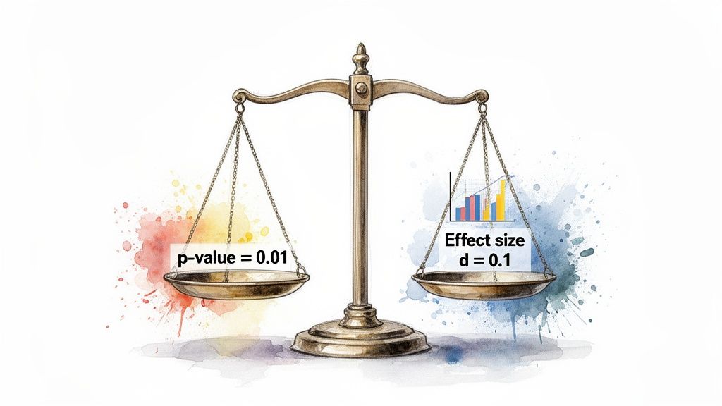
A low p-value is great—it confirms statistical significance. It's the test's way of telling you, "Hey, the difference you're seeing probably isn't just random noise." But that’s all it tells you. It answers if there's a difference, not how big or important that difference is. That's the critical gap between statistical significance and practical significance.
Finding The Real Impact with Effect Size
Let’s say you run a massive A/B test on a new call-to-action button. You get a beautiful p-value of 0.01. The problem? It only nudged the conversion rate by 0.003%. With millions of users, even a microscopic change can register as statistically significant. But is it worth your engineering team's time to roll it out? Almost certainly not.
This is where effect size becomes your most valuable metric. It’s a standardized measure that quantifies the magnitude of the difference. It answers the crucial business question: "Okay, it's a real difference—but is it big enough to matter?"
For t-tests, the go-to measure is Cohen's d. You don't need to sweat the formula, but you should know the general rules of thumb for interpreting it:
Small Effect (d ≈ 0.2): The difference is there, but subtle. Probably not worth diverting major resources.
Medium Effect (d ≈ 0.5): A solid, noticeable difference. This is often where you start seeing a tangible impact on your KPIs.
Large Effect (d ≥ 0.8): A huge, unmistakable difference. These are the game-changing results we're all hoping for.
A Real-World Near-Miss
I once worked with a SaaS client testing a redesigned onboarding flow. They ran the test with thousands of new users and were ecstatic to get a p-value of 0.04. The product team was already clearing their next sprint to deploy it.
I had to pump the brakes. I asked them to pull up the effect size. It turned out Cohen's d was a paltry 0.09. The new flow was technically better, sure, but its real-world impact was almost zero. It was statistically significant but practically useless. We dodged a bullet.
This is precisely the kind of expensive misinterpretation that a conversational AI data analyst like Statspresso is designed to prevent. It moves beyond just spitting out a p-value and gives you the context you need.
Instead of getting lost in manual calculations, you get straight to the business implications.
Try asking Statspresso: "What's the effect size of my last email campaign A/B test?"
It connects the dots for you, making sure your team invests its valuable time on changes that will deliver a real, measurable impact.
Decoding The Rest Of The T-Test Output
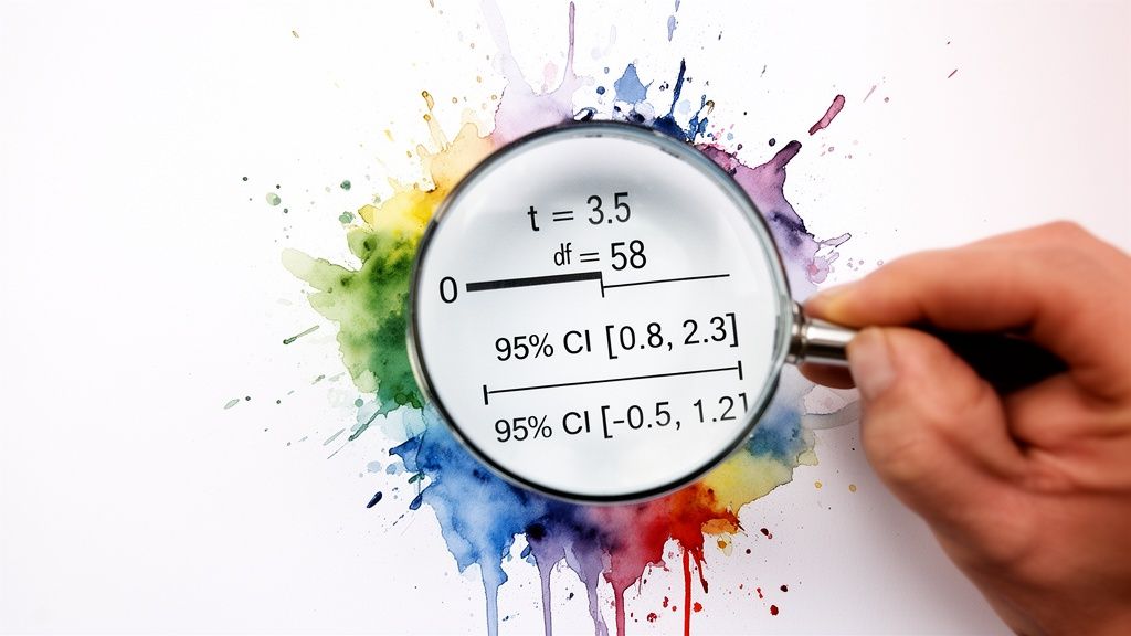
Alright, you've got your p-value and effect size. Great start, but don't stop there. A standard t-test output gives you other crucial numbers. It’s easy to let your eyes glaze over them, but the t-statistic, degrees of freedom, and especially the confidence interval are what give your main findings their backbone.
Think of it like this: if the p-value is the headline ("The new feature is a winner!"), these other numbers are the fine print that tells you exactly how much confidence—and budget—you should put behind that headline.
The Confidence Interval: Your True North for Decisions
This brings us to the unsung hero of applied statistics: the confidence interval (CI). While a p-value tells you if there's a difference, the CI tells you how big that difference really is. It gives you a practical, plausible range for the true effect.
A standard 95% confidence interval means that if you were to run the exact same experiment 100 times, the true difference between your groups would fall inside that calculated range 95 of those times. It’s your margin of error, your reality check.
For anyone making a business decision, the confidence interval is arguably more useful than the p-value. It shifts the question from a simple "yes/no" to "What's the best- and worst-case scenario for this change?"
Let's ground this with a real-world example. Imagine you're A/B testing a new app feature to boost daily engagement time. You get these results for the difference in average minutes spent per user:
P-value: 0.03 (Statistically significant!)
Mean Difference: +5 minutes (On average, the new feature added 5 minutes of engagement.)
95% Confidence Interval: [ +1 minute, +9 minutes ]
This is a fantastic result. You can be 95% confident that the real-world impact is somewhere between a 1-minute and a 9-minute lift. It’s a clear win.
But what if the numbers looked slightly different?
P-value: 0.04 (Still significant!)
Mean Difference: +5 minutes (The average is the same!)
95% Confidence Interval: [ -2 minutes, +12 minutes ]
Suddenly, the picture is much murkier. Because the interval crosses zero, you can't be sure the feature isn't actually hurting engagement. Rolling this out would be a gamble.
The Old Way (Manual SQL) | The New Way (Statspresso) |
|---|---|
Write complex SQL queries to pull data. | Connect your database once. |
Export to a spreadsheet or stats software. | Ask a question in plain English. |
Manually run calculations for p-value, CI. | Get an auto-generated chart and summary. |
Spend hours trying to interpret the numbers. | Get a decision-ready answer in seconds. |
A conversational AI data analyst from Statspresso presents these metrics in a way that makes sense instantly.
Try asking Statspresso: "What's the 95% confidence interval for the user engagement A/B test?"
It's designed to give you the full picture without forcing you to write SQL. You can just ask your data a question and get a clear, decision-ready answer in seconds.
One-Tailed Vs. Two-Tailed Tests: Which One To Use?
Before you can interpret a t-test output, you have to run the right test in the first place. One of the first decisions is whether to use a one-tailed or a two-tailed test. Getting it wrong can invalidate your findings.
A two-tailed test is your workhorse. It’s the default, skeptical approach. It simply tests for a significant difference between two groups in either direction. Think of it as asking an open-ended question: "Is the new checkout flow different from the old one?" It could be better, or it could be worse.
A one-tailed test, however, is like placing a specific bet. You’re testing for a difference in one specific direction. You’re asking, "Is the new checkout flow specifically better than the old one?" This test deliberately ignores the possibility of the new flow being worse.
When To Use Each Test
Let's stick with that checkout flow A/B test. Your goal is to increase conversions. While you hope the new design is a winner, there's a real chance it could confuse users and actually decrease conversions.
This is why a two-tailed test is the only responsible choice here. You’re prepared to detect a statistically significant result whether conversions shoot up or plummet. Using a one-tailed test would be putting on blinders.
My personal rule of thumb is simple: when in doubt, always use a two-tailed test. It’s the more conservative and intellectually honest approach for most A/B tests. Claiming a one-tailed victory when your experiment could have backfired is bad practice.
Most testing tools will have a clear option for this.
Choosing the "Two-sided" or "Two-tailed" option ensures your analysis is rigorous and accounts for changes in both positive and negative directions.
A Quick Look at T-Test Flavors
Beyond one-tailed vs. two-tailed, t-tests also come in a few "flavors." Choosing the right one depends on your data structure.
Independent Samples T-Test: Your classic A/B test setup. You're comparing two separate groups, like "visitors who saw headline A" vs. "visitors who saw headline B."
Paired Samples T-Test: This is for comparing two measurements from the same group. "Before-and-after" scenarios are the perfect example.
One Sample T-Test: Less common in marketing, this test compares the average of a single group against a known benchmark, like an industry average.
Getting these fundamentals right is the foundation of a solid analysis. Fortunately, you don't have to be a statistician to do it. A conversational AI data analyst like Statspresso can automatically select the correct test based on how you've structured your data. The goal is to skip the SQL and the stats manuals. Just ask your data a question and get a chart in seconds.
Avoiding Common T-Test Traps and Reporting Your Results
You've run your t-test and have the numbers in front of you. It’s easy to feel like you're at the finish line, but this is where the most critical mistakes happen. Knowing the theory is one thing; sidestepping the real-world traps is another.
The Siren Song of Multiple Comparisons
Picture this: you're A/B testing five different headlines. You're eager to find a winner, so you run a t-test comparing each new headline against the original. Five separate t-tests. It feels logical, right?
Unfortunately, this is one of the most common and dangerous statistical mistakes. It’s called the problem of multiple comparisons. Every time you run a t-test, you're accepting a 5% chance of a false positive. Run five tests, and your chance of getting at least one false positive jumps to about 23%. Run twenty, and it’s practically guaranteed.
The Fix: If you need to compare more than two groups at once, a t-test isn't the right tool. You should use an Analysis of Variance (ANOVA) instead.
"Not Significant" Doesn't Mean "No Difference"
Here’s another classic blunder. Your p-value comes back at 0.25. The conclusion many people jump to is, "Well, that proves there’s no difference."
This is a huge misinterpretation. A non-significant result doesn't prove there's no difference. It just means you failed to find enough evidence to say there is one. Think of it like a courtroom verdict: "not guilty" isn't the same as "proven innocent."
The Fix: Be precise. Instead of saying "there is no effect," the correct conclusion is "we did not find a significant effect." Then, check your confidence interval. If it’s really wide, it could be a sign your sample size was too small.
How to Talk About Your Results with Stakeholders
You’ve navigated the pitfalls. Now for the final, and arguably most important, step: explaining it all to people who don't live and breathe statistics. Your product manager, your CEO, your marketing lead—they need a clear, actionable story, not a lecture on p-values.
Here’s a simple template for a summary that gets straight to the point:
"Our test showed the new ad copy significantly increased CTR by 3% (p < .01). We are 95% confident the true increase is somewhere between 2.5% and 3.5%. Based on this, we recommend rolling out the new copy."
This sentence does all the heavy lifting:
States the outcome: The new copy won.
Quantifies the impact: It led to a 3% increase.
Provides the proof: It was statistically significant (p < .01).
Presents the confidence: The confidence interval gives a realistic range.
Ends with a clear recommendation: "Roll it out."
This is the kind of powerful, simple communication that drives smart business decisions. It’s also the kind of summary that conversational AI tools can generate automatically. Check out our guide on the power of AI in data storytelling to learn more.
Try asking Statspresso: "Summarize the results of my pricing experiment in plain English."
This is the future of business intelligence. You can skip the tedious manual reporting and get a clear, stakeholder-ready answer in seconds.
From Numbers to Decisions: A Practical T-Test Checklist
Alright, we've walked through the theory, but let's be honest—when a report hits your desk, you need to get to the answer, fast. This is that guide. Think of it as your cheat sheet for turning statistical outputs into a confident business decision.
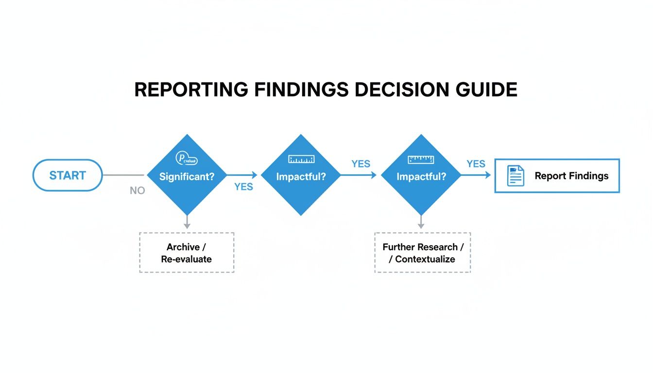
The path is straightforward: first, see if you have a statistically significant result. If you do, assess whether the impact is actually big enough to matter. From there, you report your conclusion.
A 4-Point Inspection for Every T-Test
Each time you run a test, walk through these four points. This process ensures you find a truly meaningful result.
1. Check for Statistical Significance
This is your first gate. Look at your p-value. Is it below your alpha level (usually 0.05)? If your p-value is, say, 0.21, the conversation stops here. You don't have enough evidence to claim a true difference exists.
2. Measure the Practical Impact
A significant p-value is great, but it doesn't tell you if the change is worthwhile. For that, check the effect size. Look at a measure like Cohen's d. Is the effect small (0.2), medium (0.5), or large (0.8)? A tiny p-value with a tiny effect size might mean you found a real—but practically useless—difference.
3. Examine the Confidence Interval
This is where you gauge your certainty. The 95% confidence interval gives you the plausible range for the true effect. Does the interval contain zero? An interval for a conversion lift of [-0.5%, +4.5%] is a warning sign. You want a narrow range that is either entirely positive (e.g., [+1.5%, +5.0%]) or entirely negative.
4. Synthesize Your Business Takeaway
Now, put it all together in one clear, concise sentence. For example: "The new checkout button increased conversions by 3% (p < .01), and we're 95% confident the true lift is between 2.1% and 3.9%. We recommend rolling this out."
This simple framework takes the ambiguity out of interpretation. Of course, you can make this even faster. A conversational AI data analyst like Statspresso can give you these answers automatically.
Try asking Statspresso: "Give me the p-value, effect size, and confidence interval for my last campaign's A/B test."
Frequently Asked T-Test Questions
Even after you've run a few t-tests, some practical questions always surface. Let's tackle a few common ones.
What Is a Good Sample Size for a T-Test?
Everyone wants a magic number, but the real answer is "it depends." As a general rule, at least 30 samples per group is a good starting point. This is where the t-test becomes more reliable. But the most rigorous way to determine your sample size is by running a power analysis. Thankfully, this is something a conversational AI data analyst like Statspresso can handle for you.
Try asking Statspresso: "Is my sample size large enough for the recent pricing test?"
What if My Data Is Not Normally Distributed?
This is a huge source of anxiety, but it’s often not a crisis. The t-test is surprisingly tough and can handle data that isn’t perfectly “normal,” especially with a decent sample size (N > 30). If your sample is small or data is wildly skewed, you might look at a non-parametric test like the Mann-Whitney U test.
Can I Run a T-Test in Excel?
You absolutely can. For years, running the T.TEST function in Excel was standard practice. It works, but it's the manual approach. Today, you can skip most of that. With a conversational AI data analyst, you connect your data and ask your question in plain English. For anyone just starting out, getting a handle on what is hypothesis testing in statistics provides a great foundation.
Ready to get answers from your data without wrestling with spreadsheets or statistical formulas? With Statspresso, you can skip the SQL and the guesswork. Skip the SQL. Just ask your data a question and get a chart in seconds.
Connect your first data source for free and ask your first question.
You just wrapped an A/B test. The data's in. But now you're staring at a screen full of jargon like 'p-value' and 't-statistic,' trying to figure out if your new headline actually moved the needle. Sound familiar? Waiting weeks for a data analyst to build a dashboard is a relic of the past. The good news is you don't need a Ph.D. in statistics to make sense of it all. Making a clear business decision comes down to understanding just a few key numbers.
TL;DR: Your T-Test Cheat Sheet
P-Value & Effect Size are a Package Deal: A low p-value (< 0.05) says the difference is real. Effect size (Cohen's d) says if the difference is big enough to matter. You need both.
The Confidence Interval is Your Reality Check: This is your risk meter. If the range includes zero (e.g., -2% to +5%), your result is unstable. Don't bet the farm on it.
Translate to Plain English: No one in the boardroom cares about your t-statistic. They want to know if the new feature will make money. Always frame your findings around business impact.
Ditch the Manual Work: Use a conversational AI data analyst like Statspresso to skip the SQL. Just ask your data a question and get a chart in seconds.
Your T-Test Results Are In. What Now?
So, the test is done. The results are in. But instead of a clear answer, you have a table of numbers that looks like it came straight out of a textbook. In the past, you'd wait for a data analyst to translate it for you—a bottleneck you can’t afford.
You need to know what to look for to get from this jumble of data to a confident "yes" or "no" and move on. It’s all about decoding the story your numbers are trying to tell you.
Breaking Down the Key Numbers
Every t-test output, whether from a fancy stats package or a simple online calculator, will give you a few essential metrics. Let's focus on what they actually mean for your business.
Group Means: This is the most straightforward part. It’s simply the average result for your control (Group A) and your variant (Group B). For example, if your original headline saw an average time on page of 45 seconds and the new one hit 65 seconds, those are your means. It's the raw performance snapshot.
The T-Statistic (or t-value): Think of this as your signal-to-noise ratio. It measures how big the difference between your groups is, relative to the natural variation (the "noise") in the data. A large absolute t-value—generally anything above 2 or below -2—suggests a strong signal that the difference you're seeing isn't just random chance.
The P-Value: This is the one everyone obsesses over, and for good reason. The p-value tells you the probability of seeing your results (or even more extreme ones) if there were no real difference between the two versions. When you see a low p-value (usually < 0.05), you can be confident your result is "statistically significant." It means it's highly unlikely your finding is just a fluke.
I once worked with a retail client on a sales promotion analysis projected for 2026. They tested two strategies: Strategy A led to an average sales lift of $1,192.50, while Strategy B brought in $1,452.50. Their t-test produced a t-statistic of -4.3392 and a tiny p-value of 0.0004. That gave them over 99.96% confidence to roll out Strategy B, knowing the uplift was real. A/B testing is a powerful driver for these kinds of decisions, a topic explored in depth on Amplitude's blog.
From Numbers to Plain English
The real goal here is to turn that statistical output into a simple, actionable story. This is where modern tools make a huge difference. Instead of wrestling with spreadsheets or code, you can use a conversational AI data analyst like Statspresso to get answers directly.
You skip the technical setup and just ask a question in plain English.
Try asking Statspresso: "Compare conversion rates for my landing page A/B test and tell me if the result is significant."
A tool like this doesn't just give you a data dump; it provides the bottom-line interpretation. It does the heavy lifting, translating stats into a clear narrative so you can focus on what matters most: making the right call for your business.
Why The P-Value Isn't The Whole Story
The first number everyone’s eyes jump to is the p-value. It’s become a magic threshold. If it’s under 0.05, we celebrate; if it’s over, back to the drawing board. But I’ve learned the hard way that chasing a low p-value without looking deeper is a classic rookie mistake.
A low p-value is great—it confirms statistical significance. It's the test's way of telling you, "Hey, the difference you're seeing probably isn't just random noise." But that’s all it tells you. It answers if there's a difference, not how big or important that difference is. That's the critical gap between statistical significance and practical significance.
Finding The Real Impact with Effect Size
Let’s say you run a massive A/B test on a new call-to-action button. You get a beautiful p-value of 0.01. The problem? It only nudged the conversion rate by 0.003%. With millions of users, even a microscopic change can register as statistically significant. But is it worth your engineering team's time to roll it out? Almost certainly not.
This is where effect size becomes your most valuable metric. It’s a standardized measure that quantifies the magnitude of the difference. It answers the crucial business question: "Okay, it's a real difference—but is it big enough to matter?"
For t-tests, the go-to measure is Cohen's d. You don't need to sweat the formula, but you should know the general rules of thumb for interpreting it:
Small Effect (d ≈ 0.2): The difference is there, but subtle. Probably not worth diverting major resources.
Medium Effect (d ≈ 0.5): A solid, noticeable difference. This is often where you start seeing a tangible impact on your KPIs.
Large Effect (d ≥ 0.8): A huge, unmistakable difference. These are the game-changing results we're all hoping for.
A Real-World Near-Miss
I once worked with a SaaS client testing a redesigned onboarding flow. They ran the test with thousands of new users and were ecstatic to get a p-value of 0.04. The product team was already clearing their next sprint to deploy it.
I had to pump the brakes. I asked them to pull up the effect size. It turned out Cohen's d was a paltry 0.09. The new flow was technically better, sure, but its real-world impact was almost zero. It was statistically significant but practically useless. We dodged a bullet.
This is precisely the kind of expensive misinterpretation that a conversational AI data analyst like Statspresso is designed to prevent. It moves beyond just spitting out a p-value and gives you the context you need.
Instead of getting lost in manual calculations, you get straight to the business implications.
Try asking Statspresso: "What's the effect size of my last email campaign A/B test?"
It connects the dots for you, making sure your team invests its valuable time on changes that will deliver a real, measurable impact.
Decoding The Rest Of The T-Test Output
Alright, you've got your p-value and effect size. Great start, but don't stop there. A standard t-test output gives you other crucial numbers. It’s easy to let your eyes glaze over them, but the t-statistic, degrees of freedom, and especially the confidence interval are what give your main findings their backbone.
Think of it like this: if the p-value is the headline ("The new feature is a winner!"), these other numbers are the fine print that tells you exactly how much confidence—and budget—you should put behind that headline.
The Confidence Interval: Your True North for Decisions
This brings us to the unsung hero of applied statistics: the confidence interval (CI). While a p-value tells you if there's a difference, the CI tells you how big that difference really is. It gives you a practical, plausible range for the true effect.
A standard 95% confidence interval means that if you were to run the exact same experiment 100 times, the true difference between your groups would fall inside that calculated range 95 of those times. It’s your margin of error, your reality check.
For anyone making a business decision, the confidence interval is arguably more useful than the p-value. It shifts the question from a simple "yes/no" to "What's the best- and worst-case scenario for this change?"
Let's ground this with a real-world example. Imagine you're A/B testing a new app feature to boost daily engagement time. You get these results for the difference in average minutes spent per user:
P-value: 0.03 (Statistically significant!)
Mean Difference: +5 minutes (On average, the new feature added 5 minutes of engagement.)
95% Confidence Interval: [ +1 minute, +9 minutes ]
This is a fantastic result. You can be 95% confident that the real-world impact is somewhere between a 1-minute and a 9-minute lift. It’s a clear win.
But what if the numbers looked slightly different?
P-value: 0.04 (Still significant!)
Mean Difference: +5 minutes (The average is the same!)
95% Confidence Interval: [ -2 minutes, +12 minutes ]
Suddenly, the picture is much murkier. Because the interval crosses zero, you can't be sure the feature isn't actually hurting engagement. Rolling this out would be a gamble.
The Old Way (Manual SQL) | The New Way (Statspresso) |
|---|---|
Write complex SQL queries to pull data. | Connect your database once. |
Export to a spreadsheet or stats software. | Ask a question in plain English. |
Manually run calculations for p-value, CI. | Get an auto-generated chart and summary. |
Spend hours trying to interpret the numbers. | Get a decision-ready answer in seconds. |
A conversational AI data analyst from Statspresso presents these metrics in a way that makes sense instantly.
Try asking Statspresso: "What's the 95% confidence interval for the user engagement A/B test?"
It's designed to give you the full picture without forcing you to write SQL. You can just ask your data a question and get a clear, decision-ready answer in seconds.
One-Tailed Vs. Two-Tailed Tests: Which One To Use?
Before you can interpret a t-test output, you have to run the right test in the first place. One of the first decisions is whether to use a one-tailed or a two-tailed test. Getting it wrong can invalidate your findings.
A two-tailed test is your workhorse. It’s the default, skeptical approach. It simply tests for a significant difference between two groups in either direction. Think of it as asking an open-ended question: "Is the new checkout flow different from the old one?" It could be better, or it could be worse.
A one-tailed test, however, is like placing a specific bet. You’re testing for a difference in one specific direction. You’re asking, "Is the new checkout flow specifically better than the old one?" This test deliberately ignores the possibility of the new flow being worse.
When To Use Each Test
Let's stick with that checkout flow A/B test. Your goal is to increase conversions. While you hope the new design is a winner, there's a real chance it could confuse users and actually decrease conversions.
This is why a two-tailed test is the only responsible choice here. You’re prepared to detect a statistically significant result whether conversions shoot up or plummet. Using a one-tailed test would be putting on blinders.
My personal rule of thumb is simple: when in doubt, always use a two-tailed test. It’s the more conservative and intellectually honest approach for most A/B tests. Claiming a one-tailed victory when your experiment could have backfired is bad practice.
Most testing tools will have a clear option for this.
Choosing the "Two-sided" or "Two-tailed" option ensures your analysis is rigorous and accounts for changes in both positive and negative directions.
A Quick Look at T-Test Flavors
Beyond one-tailed vs. two-tailed, t-tests also come in a few "flavors." Choosing the right one depends on your data structure.
Independent Samples T-Test: Your classic A/B test setup. You're comparing two separate groups, like "visitors who saw headline A" vs. "visitors who saw headline B."
Paired Samples T-Test: This is for comparing two measurements from the same group. "Before-and-after" scenarios are the perfect example.
One Sample T-Test: Less common in marketing, this test compares the average of a single group against a known benchmark, like an industry average.
Getting these fundamentals right is the foundation of a solid analysis. Fortunately, you don't have to be a statistician to do it. A conversational AI data analyst like Statspresso can automatically select the correct test based on how you've structured your data. The goal is to skip the SQL and the stats manuals. Just ask your data a question and get a chart in seconds.
Avoiding Common T-Test Traps and Reporting Your Results
You've run your t-test and have the numbers in front of you. It’s easy to feel like you're at the finish line, but this is where the most critical mistakes happen. Knowing the theory is one thing; sidestepping the real-world traps is another.
The Siren Song of Multiple Comparisons
Picture this: you're A/B testing five different headlines. You're eager to find a winner, so you run a t-test comparing each new headline against the original. Five separate t-tests. It feels logical, right?
Unfortunately, this is one of the most common and dangerous statistical mistakes. It’s called the problem of multiple comparisons. Every time you run a t-test, you're accepting a 5% chance of a false positive. Run five tests, and your chance of getting at least one false positive jumps to about 23%. Run twenty, and it’s practically guaranteed.
The Fix: If you need to compare more than two groups at once, a t-test isn't the right tool. You should use an Analysis of Variance (ANOVA) instead.
"Not Significant" Doesn't Mean "No Difference"
Here’s another classic blunder. Your p-value comes back at 0.25. The conclusion many people jump to is, "Well, that proves there’s no difference."
This is a huge misinterpretation. A non-significant result doesn't prove there's no difference. It just means you failed to find enough evidence to say there is one. Think of it like a courtroom verdict: "not guilty" isn't the same as "proven innocent."
The Fix: Be precise. Instead of saying "there is no effect," the correct conclusion is "we did not find a significant effect." Then, check your confidence interval. If it’s really wide, it could be a sign your sample size was too small.
How to Talk About Your Results with Stakeholders
You’ve navigated the pitfalls. Now for the final, and arguably most important, step: explaining it all to people who don't live and breathe statistics. Your product manager, your CEO, your marketing lead—they need a clear, actionable story, not a lecture on p-values.
Here’s a simple template for a summary that gets straight to the point:
"Our test showed the new ad copy significantly increased CTR by 3% (p < .01). We are 95% confident the true increase is somewhere between 2.5% and 3.5%. Based on this, we recommend rolling out the new copy."
This sentence does all the heavy lifting:
States the outcome: The new copy won.
Quantifies the impact: It led to a 3% increase.
Provides the proof: It was statistically significant (p < .01).
Presents the confidence: The confidence interval gives a realistic range.
Ends with a clear recommendation: "Roll it out."
This is the kind of powerful, simple communication that drives smart business decisions. It’s also the kind of summary that conversational AI tools can generate automatically. Check out our guide on the power of AI in data storytelling to learn more.
Try asking Statspresso: "Summarize the results of my pricing experiment in plain English."
This is the future of business intelligence. You can skip the tedious manual reporting and get a clear, stakeholder-ready answer in seconds.
From Numbers to Decisions: A Practical T-Test Checklist
Alright, we've walked through the theory, but let's be honest—when a report hits your desk, you need to get to the answer, fast. This is that guide. Think of it as your cheat sheet for turning statistical outputs into a confident business decision.
The path is straightforward: first, see if you have a statistically significant result. If you do, assess whether the impact is actually big enough to matter. From there, you report your conclusion.
A 4-Point Inspection for Every T-Test
Each time you run a test, walk through these four points. This process ensures you find a truly meaningful result.
1. Check for Statistical Significance
This is your first gate. Look at your p-value. Is it below your alpha level (usually 0.05)? If your p-value is, say, 0.21, the conversation stops here. You don't have enough evidence to claim a true difference exists.
2. Measure the Practical Impact
A significant p-value is great, but it doesn't tell you if the change is worthwhile. For that, check the effect size. Look at a measure like Cohen's d. Is the effect small (0.2), medium (0.5), or large (0.8)? A tiny p-value with a tiny effect size might mean you found a real—but practically useless—difference.
3. Examine the Confidence Interval
This is where you gauge your certainty. The 95% confidence interval gives you the plausible range for the true effect. Does the interval contain zero? An interval for a conversion lift of [-0.5%, +4.5%] is a warning sign. You want a narrow range that is either entirely positive (e.g., [+1.5%, +5.0%]) or entirely negative.
4. Synthesize Your Business Takeaway
Now, put it all together in one clear, concise sentence. For example: "The new checkout button increased conversions by 3% (p < .01), and we're 95% confident the true lift is between 2.1% and 3.9%. We recommend rolling this out."
This simple framework takes the ambiguity out of interpretation. Of course, you can make this even faster. A conversational AI data analyst like Statspresso can give you these answers automatically.
Try asking Statspresso: "Give me the p-value, effect size, and confidence interval for my last campaign's A/B test."
Frequently Asked T-Test Questions
Even after you've run a few t-tests, some practical questions always surface. Let's tackle a few common ones.
What Is a Good Sample Size for a T-Test?
Everyone wants a magic number, but the real answer is "it depends." As a general rule, at least 30 samples per group is a good starting point. This is where the t-test becomes more reliable. But the most rigorous way to determine your sample size is by running a power analysis. Thankfully, this is something a conversational AI data analyst like Statspresso can handle for you.
Try asking Statspresso: "Is my sample size large enough for the recent pricing test?"
What if My Data Is Not Normally Distributed?
This is a huge source of anxiety, but it’s often not a crisis. The t-test is surprisingly tough and can handle data that isn’t perfectly “normal,” especially with a decent sample size (N > 30). If your sample is small or data is wildly skewed, you might look at a non-parametric test like the Mann-Whitney U test.
Can I Run a T-Test in Excel?
You absolutely can. For years, running the T.TEST function in Excel was standard practice. It works, but it's the manual approach. Today, you can skip most of that. With a conversational AI data analyst, you connect your data and ask your question in plain English. For anyone just starting out, getting a handle on what is hypothesis testing in statistics provides a great foundation.
Ready to get answers from your data without wrestling with spreadsheets or statistical formulas? With Statspresso, you can skip the SQL and the guesswork. Skip the SQL. Just ask your data a question and get a chart in seconds.
Connect your first data source for free and ask your first question.