How to Analyze Data as a Solo Entrepreneur

Most advice about how to analyze data as a solo entrepreneur is backwards. It tells you to collect more data, build more dashboards, and maybe learn enough SQL to become your own analyst on weekends. That's how founders end up with fifteen tabs open and no answer to the one question that matters.
Waiting weeks for a report is a relic. You don't need another BI project. You need a faster way to turn scattered numbers into a useful decision.
Your Data Has Answers But You Have Too Many Questions
Shopify shows sales. Google Analytics shows traffic. Stripe shows payments. Your CRM shows leads. Each tool is technically helpful and practically annoying when you're the only person trying to make sense of all of it.
The first mistake is opening every report and hoping a pattern jumps out. That's like packing for a trip before choosing the destination. You bring too much, miss what matters, and still feel unprepared.
A solo founder needs a narrower approach.
Practical rule: Start with the business question, not the dataset.
If the question is "Why did revenue dip last month?" you already know what to look for. Orders, traffic, conversion, refunds, repeat purchases, and maybe channel mix. If the question is "Which product deserves more ad budget?" that's a different path.
That shift sounds small. It changes everything. Instead of doing "analytics," you're trying to get one useful number, one useful comparison, or one useful explanation at a time.
Define Your Goals Before You Drown in Data
The cleanest analysis starts before you touch a chart. If you skip this part, every dashboard looks important and none of it helps you decide what to do next.
A solo business doesn't need broad visibility. It needs ruthless prioritization.

Pick three to five KPIs that actually matter
Most founders don't have a data problem. They have a priority problem.
Choose 3 to 5 KPIs that map directly to survival or growth. Good examples include revenue, cash flow, customer acquisition cost, repeat purchase behavior, churn, average order value, or lead-to-customer conversion. The exact list depends on the business model. An ecommerce store and a SaaS product shouldn't stare at the same scorecard.
If a metric doesn't influence an action you can take, it doesn't belong on your core list.
Use a simple filter:
Revenue impact: Does this metric help you grow sales or protect margin?
Operational value: Does it reveal waste, delays, or preventable problems?
Decision usefulness: Can you do something different this week based on it?
Data availability: Can you reliably pull it from tools you already use?
This discipline matters because data-driven organizations are 23 times more likely to acquire customers, and businesses using big data report an 8% profit increase and 10% cost reduction, according to McKinsey and the summary cited by Keboola. For a solo operator, that doesn't mean "become a data scientist." It means learn to focus on the few numbers that move the business.
Match each KPI to a source you already own
Once your KPI list exists, map each one to a real data source.
That usually looks something like this:
Sales and orders from Shopify, Stripe, WooCommerce, or a payment platform
Traffic and behavior from Google Analytics
Lead and customer status from HubSpot or another CRM
Product usage from Postgres, app events, or internal exports
Support and feedback from email tags, help desk tools, surveys, or even a spreadsheet
Many founders make a second mistake by collecting everything available because it feels productive. It isn't. Pull only the data that can answer one of your KPI questions.
A practical setup note: write down each KPI beside its source and the refresh rhythm you need. Daily for revenue. Weekly for channel performance. Monthly for retention trends. Not every number deserves real-time drama.
Avoid dashboard sprawl before it starts
The fastest way to get buried is to confuse access with insight. Every SaaS app now offers reports. Left alone, you'll end up with a mini museum of charts that all describe a sliver of reality.
A better rule is this:
If a chart doesn't help explain a KPI or trigger an action, archive it mentally and move on.
That means you don't begin with "What can I track?" You begin with "What decision am I making?"
Examples help:
If you're worried about growth, ask which channels bring buyers, not just visitors.
If profitability is tight, compare product mix, refunds, discounts, and acquisition costs.
If retention feels shaky, look at first purchase versus repeat purchase behavior.
Write questions before you analyze anything
This sounds basic because it is. It's also the habit that saves the most time.
Turn your KPI list into plain-English questions:
Which traffic sources are producing actual customers?
Which products bring repeat buyers?
Did revenue drop because of lower traffic, lower conversion, or smaller order size?
Are repeat customers buying on a predictable cadence?
Which campaigns create noise and which create sales?
Good analysis sessions start with a short list like that, not a blank stare at a reporting tool.
If you do nothing else, do this: keep one note called "questions worth answering." Every time you feel tempted to wander through reports, go back to that list. It will keep you out of the swamp.
Connect Your Data Sources Without The Headaches
Connecting everything is where solo founders accidentally create a second job.
The usual advice is to set up a warehouse, learn SQL, wire together dashboards, and call it "being data-driven." That works if you have an analyst, an engineer, or a high tolerance for weekend plumbing. If you're running the business alone, it usually creates data overload first and useful answers much later.
Your numbers are split across tools that were never designed to cooperate. Shopify has orders. Stripe has payments. Google Analytics has acquisition data. Your CRM has lead history. Your product database has behavior. None of that is unusual. The problem starts when you have to stitch it together by hand every time you want one clear answer.
That manual route fails in boring ways. CSV exports break. Field names drift. Dates arrive in conflicting formats. One tool records gross sales, another records net, and suddenly your "revenue" chart depends on which file you opened first.
I have seen founders spend two hours preparing a report to answer a five-minute question.
Manual integration is usually the wrong trade-off
You can absolutely build this yourself. Pull APIs, write SQL, normalize tables, schedule refreshes, patch failures. If data work is your craft, that can be a rational choice.
For a solo operator, the cost is usually maintenance.
Every source you add creates another place where definitions can drift or imports can fail. The issue is not technical purity. The issue is whether the setup gets you to a decision faster than a conversational tool that already knows how to connect common business systems.
Approach | Manual setup | Conversational analytics setup |
|---|---|---|
Initial work | High | Low |
Ongoing upkeep | Yours | Mostly handled for you |
Skills needed | SQL, APIs, data modeling | Basic business context |
Time to first answer | Slow | Fast |
Failure mode | Silent data mess | Usually obvious mapping errors |
That last row matters. Silent data mess is dangerous because it looks legitimate.
A sane setup starts small and stays boring
Connect the fewest sources required to answer the questions you already care about. For many solo businesses, that means:
one transaction source, such as Shopify or Stripe
one traffic source, such as Google Analytics
one customer source, such as a CRM or product database
That small stack is enough to answer real operating questions. Which channels bring buyers, not just clicks? Are repeat customers growing? Did conversion slip, or did average order value drop? If your current focus is website performance, this conversion rate optimization guide pairs well with that setup because it helps you connect traffic and purchase behavior without turning analysis into a research project.
Clean structure beats fancy tooling
Before you connect anything, fix the fields that usually create nonsense:
Standardize date formats
Separate gross sales, discounts, refunds, taxes, and net revenue
Confirm customer IDs, order IDs, and account identifiers match across tools
Rename vague metrics before they spread into reports
If your exports are messy, use a simple cleanup process first. This guide to cleaning up business data before analysis covers the common issues that wreck joins and trend lines.
A factual example helps here. Statspresso connects tools like Shopify, HubSpot, Linear, and Postgres, then lets you ask questions in plain English instead of writing SQL. That matters for solo founders because the bottleneck is rarely access. It is the time required to turn scattered data into one trustworthy answer.
Keep the stack light. If a source will not change a decision this month, leave it disconnected. More inputs do not automatically produce better insight. They often produce one more tab, one more sync issue, and one more reason to postpone the actual decision.
From Raw Data to Real Answers in Seconds
Once your data is connected, the game changes. You no longer need to think like a reporting specialist. You need to think like an operator asking sharper questions.
That is the practical advantage of conversational analytics. You stop building charts from scratch and start requesting answers in plain language.
Ask for trends first
Start broad. Trends tell you where to dig.
Useful prompts look like this:
Try asking: "Show me my revenue by month for the last year as a bar chart."
Try asking: "Compare new versus repeat customer revenue over time."
Try asking: "Show refund trends by month."
Try asking: "Which traffic sources drove the most purchases this quarter?"
These aren't fancy prompts. That's the point. Good analysis begins with obvious questions asked quickly.
Traditional workflows make this slower than it should be. According to Sona's guide to the data analysis process, data cleaning and preparation can consume 60-80% of a total data project's time, and skipping that step can create 30-50% error propagation in analytical models. Solo founders feel this pain immediately because they don't have a team absorbing the setup work.
If you're still cleaning exports by hand every week, you're spending energy on plumbing instead of decisions. If you need a practical refresher on the messy parts, this guide on how to clean up data is worth bookmarking.
Then segment the result
A chart becomes useful when you slice it.
Suppose monthly revenue is down. That's still too vague. Segment it:
By product to see if one SKU is dragging the total down
By channel to separate traffic problems from offer problems
By customer type to compare first-time buyers and repeat buyers
By region if your business serves more than one market
By device when conversion differs on mobile and desktop
Conversational tools save time. A useful chart should lead directly to the next question, not force you back into spreadsheet surgery.
For ecommerce brands, this habit also pairs well with broader site optimization work. If you're diagnosing weak product-page performance or checkout leaks, this conversion rate optimization guide gives solid context on how to turn traffic data into website decisions.
Use simple question types
You don't need a statistics degree to ask meaningful analytical questions. Most solo founders get a lot of value from just three types.
Descriptive questions
These tell you what happened.
Examples:
What were my top-selling products this month?
Which channel brought the most customers?
How did average order value change after the promotion?
Diagnostic questions
These explain why something happened.
Examples:
Why did revenue drop if traffic stayed flat?
Did lower conversion come from mobile users?
Did discounts increase orders but shrink margin?
Prescriptive questions
These help you decide what to do next.
Examples:
Which underperforming product should I remove from the homepage?
Which traffic source deserves more budget?
Which customer segment should get the next email campaign?
That progression matters. Many founders jump straight to "What should I do?" before they've confirmed what happened. That's how you end up confidently wrong.
Build a tiny living report, not a BI monster
Once you've asked a few useful questions, keep the outputs that earn repeat attention. A solo founder does not need a sprawling dashboard full of vanity charts. A solo founder needs a handful of numbers that can be checked quickly and trusted.
Here's a simple comparison:
Task | Old Way (Manual SQL/Excel) | New Way (Statspresso) |
|---|---|---|
Find monthly revenue trend | Export orders, group by date, build chart manually | Ask for revenue by month and get a chart |
Compare new vs repeat buyers | Merge customer and order data by hand | Ask for first purchase vs repeat purchase comparison |
Review top products | Sort pivot tables after cleaning exports | Ask for top products in the selected period |
Investigate channel performance | Combine analytics and sales data manually | Ask which sources drove purchases or revenue |
Save useful outputs | Rebuild spreadsheet tabs or dashboard widgets | Pin useful answers into a lightweight report |
A good working report is alive. You ask a question, get a chart, decide it's useful, and keep it. That's much closer to how operators think than the old "design the perfect dashboard upfront" approach.
The fastest path to insight is usually one plain-English question followed by one sharper follow-up.
Build Your Own Lightweight Business Dashboard
A lot of founders think the hard part is getting data. It isn't. The hard part is not lying to yourself once the data shows up.
A dashboard can become a comfort blanket. You check familiar charts, find something that supports your hunch, and move on. That's not analysis. That's selective reading with nicer colors.

Keep it small enough to review in a minute
Your main dashboard should fit on one screen and contain 5 to 7 core metrics at most. If it takes more than about a minute to scan, it's too big.
Strong candidates include:
Revenue trend: A short line chart for the last month or quarter
Cash position: A current snapshot if cash timing matters
Top traffic sources: A quick read on where demand is coming from
Best-selling products: A current ranking, not a museum archive
Repeat purchase indicator: A simple way to see whether customers come back
This focus matters because small businesses using data analytics can see up to 10% cost reductions and an 8% average profit gain when they focus on high-impact KPIs from accessible data sources, according to William & Mary's overview of small-business data analytics.
Notice what's missing: dozens of charts, decorative slices, and every metric your tools offer by default.
Build a dashboard that argues with you
A useful dashboard shouldn't just confirm the story you already like.
If you think ads are working, include a metric that might challenge that belief. If you think repeat customers are strong, pair revenue with order frequency or time-between-purchases. If you believe traffic is the issue, include conversion next to sessions.
A practical self-audit looks like this:
Pair a result with a cause candidate: Revenue next to traffic, or sales next to conversion
Include one disconfirming metric: If one number rises, keep another nearby that could expose a weakness
Review exceptions first: Refunds, drop-offs, and unusual channel shifts deserve attention before vanity wins
Remove stale widgets: If you haven't acted on a chart lately, it probably doesn't belong
Pin answers you actually reuse
The best dashboards usually start as repeated questions.
You ask for revenue by month. Then you ask again next week. That belongs on the dashboard. You ask which products sold best this week. Same thing. You ask which channel generated customers, not just clicks. Save it.
That pin-and-prune habit works better than trying to design an extensive reporting system upfront. Founders don't need a monument to observability. They need a reliable morning check-in that keeps them honest.
Common Traps and How to Sidestep Them
The dangerous part of solo analytics isn't lack of access. It's confidence without pushback. When you're the operator, analyst, and decision-maker, nobody is sitting across the table asking whether your conclusion is flimsy.
That's why good solo analysis needs skepticism built into the workflow.
Confirmation bias is the quiet killer
One of the biggest unanswered problems in founder analytics is validation. 73% of solo operators misinterpret patterns, according to the summary in Business.com's discussion of data analysis for small business. The practical fix isn't hiring a committee. It's using explainable AI and deliberately asking for counterarguments.
If you see a positive trend, challenge it immediately.
Try prompts like:
Try asking: "Revenue is up. What anomalies in the data might challenge that conclusion?"
Try asking: "Could this increase be seasonal rather than campaign-driven?"
Try asking: "Which segments are underperforming even if total sales improved?"
Try asking: "What evidence contradicts my assumption that price drove growth?"
That last move matters more than is often appreciated. Good analysis isn't finding support for your theory. It's pressure-testing the theory before you bet money on it.
Ask your analytics tool to disagree with you. If it can't explain the answer, don't trust the answer yet.
Analysis paralysis looks productive
The second trap is endless exploration. Founders can lose hours clicking through reports because every chart suggests another question. Curiosity is useful. Unbounded curiosity is expensive.
Set constraints.
Use a short session with a narrow target:
one business question
one primary comparison
one action you'll take if the answer is clear
If the answer is muddy, log the next question and move on. Don't turn one investigation into a full-day expedition.
Don't confuse prettier charts with better decisions
Classic BI tools trained people to think the job was building dashboards. It isn't. The job is getting a reliable answer quickly enough to change what happens next.
This marks a shift from traditional BI to conversational analytics. Instead of managing queries, chart settings, joins, filters, and dashboard layouts, you ask the business question directly and inspect the reasoning. For a solo operator, that's not just more convenient. It's a better fit for how decisions are made under time pressure.
What works:
asking direct questions in business language
checking whether the result is grounded in your source data
following with one skeptical question
saving only the answers that earn repeat use
What doesn't:
browsing dashboards without a decision in mind
measuring everything because storage is cheap
trusting a trend because it matches the story you wanted
spending more time preparing charts than acting on them
If you've ever thought, "I need better BI," there's a decent chance you just need fewer steps between question and answer.
My Actual Weekly Analytics Workflow (12 Minutes Every Monday)
Most solo entrepreneur analytics advice tells you what to track. It doesn't tell you when, in what order, or what a real session looks like. Here's the exact routine I'd run for a Shopify + HubSpot business doing $500K–$2M in annual revenue. The whole thing takes 12 minutes if you're disciplined.
Minute 1–2: Revenue pulse
Open Statspresso, ask: "Show me revenue by day for the last 14 days as a bar chart." Don't spend time here unless a bar is obviously shorter than the rest. You're not analyzing — you're checking for an alarm. If revenue last week was within 15% of the prior week and there's no obvious gap, move on. If something looks off, that becomes the session's question, and you stop here until you have an answer.
Tools: Statspresso connected to Shopify. Time: 2 minutes. Decision trigger: anything down >15% WoW.
Minute 3–4: Top channel check
Ask: "Which traffic sources produced the most orders last week? Compare to the prior week." I'm looking for channel mix shift, not raw traffic. If Meta is down and email is up, that's fine — they balance. If everything is down except direct traffic, there's a paid channel problem. If paid is up but orders are flat, something broke in conversion.
Tools: Statspresso connected to Shopify (orders by UTM source). Time: 90 seconds. Decision trigger: any single channel down >25% WoW with no obvious explanation.
Minute 5–6: Repeat buyer rate
Ask: "What percentage of customers who first ordered in the last 90 days have placed a second order?" Run this once a week and track it in a note — not a fancy dashboard, just a number in a doc. This is the metric that tells me whether the product is creating a habit or just getting a one-time transaction. A healthy repeat purchase rate in most DTC categories is 25–40% at 90 days. If it drops below 20%, there's a retention problem, a product problem, or an acquisition problem (wrong audience).
Tools: Statspresso connected to Shopify. Time: 90 seconds. Decision trigger: RPR drops below 20% for the second consecutive week.
Minute 7–8: Refund scan
Ask: "What's my refund rate by product for orders placed in the last 30 days?" This is the canary in the coal mine for product quality and listing accuracy. A refund rate above 5% on a specific SKU means something is wrong — the listing misrepresents the product, there's a quality issue, or sizing/fit is off. I've found margin drains that looked fine in revenue reports because the products were selling well but refunding at 12%. You can't see that without breaking refunds down by SKU.
Tools: Statspresso connected to Shopify. Time: 90 seconds. Decision trigger: any SKU above 5% refund rate.
Minute 9–10: Pipeline or leads (if B2B / SaaS)
If the business has a sales component, ask: "How many new deals were created in HubSpot last week, and what stage are the deals opened 30 days ago in now?" This is a conversion velocity check, not a deal count trophy. What I care about: are deals moving from stage 1 to stage 2 in under 7 days? If deals are stalling at proposal stage for more than 14 days, I investigate why (usually pricing friction or wrong ICP).
Tools: Statspresso connected to HubSpot. Time: 2 minutes. Decision trigger: deal velocity down two weeks in a row, or more than 3 deals stalled at the same stage.
Minute 11–12: One follow-up question or done
If all five checks are green, I'm done in 10 minutes. If one check flagged an anomaly, I use minutes 11–12 to ask one follow-up: "Is the drop in meta orders correlated with a specific ad set or a broad audience issue?" or "Which products have both high refund rates and declining sales?" One follow-up question, maximum. If I can't close the loop in 2 minutes, I log the question and return to it tomorrow with dedicated time. I don't let the Monday pulse turn into a 45-minute investigation session.
The full weekly checklist
Check | Question to ask | Tool | Time | Trigger to act |
|---|---|---|---|---|
Revenue pulse | Revenue by day, last 14 days | Statspresso + Shopify | 2 min | >15% WoW drop |
Channel mix | Orders by traffic source, WoW | Statspresso + Shopify | 90 sec | Any channel >25% down |
Repeat buyer rate | 90-day RPR for recent cohort | Statspresso + Shopify | 90 sec | RPR <20% two weeks running |
Refund scan | Refund rate by SKU, last 30d | Statspresso + Shopify | 90 sec | Any SKU >5% |
Pipeline velocity | New deals + stage movement | Statspresso + HubSpot | 2 min | Deals stalling at same stage |
Follow-up | One specific anomaly question | Statspresso | 2 min | Stop here if no anomaly found |
The whole thing works because it's designed around triggers, not observations. You're not reading dashboards. You're running five specific checks with clear thresholds for when to dig deeper. That distinction is what keeps analytics from becoming a time sink.
You can run this exact workflow with Statspresso's AI Data Chat — connect Shopify in under 3 minutes and ask each question in plain English. No SQL, no dashboard to build, no export to clean. Start your 14-day free trial and run the full checklist today.
Stop Analyzing, Start Asking
The solo founder doesn't need to become a junior data scientist. You need a repeatable way to get from scattered numbers to a sane decision while your coffee is still hot.
That means choosing a handful of KPIs, connecting the few sources that matter, asking direct questions, and keeping a lightweight dashboard that earns its place. It also means treating every insight as guilty until proven useful.
A good financial habit helps here too. If you're tightening up the business side of the scorecard, this piece on demystifying P&L management is a useful companion to operational analytics.
The working playbook is simple:
Choose fewer metrics: Pick the numbers tied to growth, cash, or retention.
Unify the right sources: Connect only what helps answer current questions.
Ask in plain English: Don't burn time translating business questions into tool jargon.
Challenge your own conclusion: Ask what else could explain the pattern.
Save repeat answers: Let frequent questions become your standing dashboard.
Act quickly: Analytics earns its keep only when it changes a decision.
TL;DR The Solo Entrepreneur's Data Playbook
Define 3 to 5 goals first: Don't start with reports. Start with the few KPIs that affect survival and growth.
Connect, don't collect: Pull together your key sources instead of living in CSV exports and disconnected app dashboards.
Ask, don't build: Use plain-English questions to get the chart or number you need, fast.
Keep the dashboard lean: A single screen with your core metrics beats a sprawling BI setup you'll never maintain.
Challenge the answer: Ask what might contradict the trend before making a decision.
Prefer action over analysis theater: The right insight today beats a beautiful dashboard next month.
If you're ready to stop wrestling with exports and start getting answers, connect your first data source in Statspresso and ask your first question in plain English. It's a practical way to skip the SQL, cut through dashboard sprawl, and get to a useful number fast.
Most advice about how to analyze data as a solo entrepreneur is backwards. It tells you to collect more data, build more dashboards, and maybe learn enough SQL to become your own analyst on weekends. That's how founders end up with fifteen tabs open and no answer to the one question that matters.
Waiting weeks for a report is a relic. You don't need another BI project. You need a faster way to turn scattered numbers into a useful decision.
Your Data Has Answers But You Have Too Many Questions
Shopify shows sales. Google Analytics shows traffic. Stripe shows payments. Your CRM shows leads. Each tool is technically helpful and practically annoying when you're the only person trying to make sense of all of it.
The first mistake is opening every report and hoping a pattern jumps out. That's like packing for a trip before choosing the destination. You bring too much, miss what matters, and still feel unprepared.
A solo founder needs a narrower approach.
Practical rule: Start with the business question, not the dataset.
If the question is "Why did revenue dip last month?" you already know what to look for. Orders, traffic, conversion, refunds, repeat purchases, and maybe channel mix. If the question is "Which product deserves more ad budget?" that's a different path.
That shift sounds small. It changes everything. Instead of doing "analytics," you're trying to get one useful number, one useful comparison, or one useful explanation at a time.
Define Your Goals Before You Drown in Data
The cleanest analysis starts before you touch a chart. If you skip this part, every dashboard looks important and none of it helps you decide what to do next.
A solo business doesn't need broad visibility. It needs ruthless prioritization.
Pick three to five KPIs that actually matter
Most founders don't have a data problem. They have a priority problem.
Choose 3 to 5 KPIs that map directly to survival or growth. Good examples include revenue, cash flow, customer acquisition cost, repeat purchase behavior, churn, average order value, or lead-to-customer conversion. The exact list depends on the business model. An ecommerce store and a SaaS product shouldn't stare at the same scorecard.
If a metric doesn't influence an action you can take, it doesn't belong on your core list.
Use a simple filter:
Revenue impact: Does this metric help you grow sales or protect margin?
Operational value: Does it reveal waste, delays, or preventable problems?
Decision usefulness: Can you do something different this week based on it?
Data availability: Can you reliably pull it from tools you already use?
This discipline matters because data-driven organizations are 23 times more likely to acquire customers, and businesses using big data report an 8% profit increase and 10% cost reduction, according to McKinsey and the summary cited by Keboola. For a solo operator, that doesn't mean "become a data scientist." It means learn to focus on the few numbers that move the business.
Match each KPI to a source you already own
Once your KPI list exists, map each one to a real data source.
That usually looks something like this:
Sales and orders from Shopify, Stripe, WooCommerce, or a payment platform
Traffic and behavior from Google Analytics
Lead and customer status from HubSpot or another CRM
Product usage from Postgres, app events, or internal exports
Support and feedback from email tags, help desk tools, surveys, or even a spreadsheet
Many founders make a second mistake by collecting everything available because it feels productive. It isn't. Pull only the data that can answer one of your KPI questions.
A practical setup note: write down each KPI beside its source and the refresh rhythm you need. Daily for revenue. Weekly for channel performance. Monthly for retention trends. Not every number deserves real-time drama.
Avoid dashboard sprawl before it starts
The fastest way to get buried is to confuse access with insight. Every SaaS app now offers reports. Left alone, you'll end up with a mini museum of charts that all describe a sliver of reality.
A better rule is this:
If a chart doesn't help explain a KPI or trigger an action, archive it mentally and move on.
That means you don't begin with "What can I track?" You begin with "What decision am I making?"
Examples help:
If you're worried about growth, ask which channels bring buyers, not just visitors.
If profitability is tight, compare product mix, refunds, discounts, and acquisition costs.
If retention feels shaky, look at first purchase versus repeat purchase behavior.
Write questions before you analyze anything
This sounds basic because it is. It's also the habit that saves the most time.
Turn your KPI list into plain-English questions:
Which traffic sources are producing actual customers?
Which products bring repeat buyers?
Did revenue drop because of lower traffic, lower conversion, or smaller order size?
Are repeat customers buying on a predictable cadence?
Which campaigns create noise and which create sales?
Good analysis sessions start with a short list like that, not a blank stare at a reporting tool.
If you do nothing else, do this: keep one note called "questions worth answering." Every time you feel tempted to wander through reports, go back to that list. It will keep you out of the swamp.
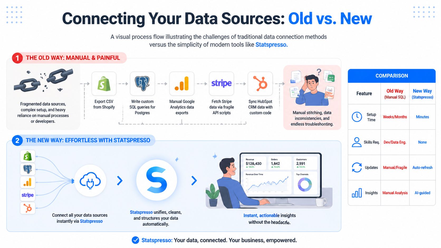
Connect Your Data Sources Without The Headaches
Connecting everything is where solo founders accidentally create a second job.
The usual advice is to set up a warehouse, learn SQL, wire together dashboards, and call it "being data-driven." That works if you have an analyst, an engineer, or a high tolerance for weekend plumbing. If you're running the business alone, it usually creates data overload first and useful answers much later.
Your numbers are split across tools that were never designed to cooperate. Shopify has orders. Stripe has payments. Google Analytics has acquisition data. Your CRM has lead history. Your product database has behavior. None of that is unusual. The problem starts when you have to stitch it together by hand every time you want one clear answer.
That manual route fails in boring ways. CSV exports break. Field names drift. Dates arrive in conflicting formats. One tool records gross sales, another records net, and suddenly your "revenue" chart depends on which file you opened first.
I have seen founders spend two hours preparing a report to answer a five-minute question.
Manual integration is usually the wrong trade-off
You can absolutely build this yourself. Pull APIs, write SQL, normalize tables, schedule refreshes, patch failures. If data work is your craft, that can be a rational choice.
For a solo operator, the cost is usually maintenance.
Every source you add creates another place where definitions can drift or imports can fail. The issue is not technical purity. The issue is whether the setup gets you to a decision faster than a conversational tool that already knows how to connect common business systems.
Approach | Manual setup | Conversational analytics setup |
|---|---|---|
Initial work | High | Low |
Ongoing upkeep | Yours | Mostly handled for you |
Skills needed | SQL, APIs, data modeling | Basic business context |
Time to first answer | Slow | Fast |
Failure mode | Silent data mess | Usually obvious mapping errors |
That last row matters. Silent data mess is dangerous because it looks legitimate.
A sane setup starts small and stays boring
Connect the fewest sources required to answer the questions you already care about. For many solo businesses, that means:
one transaction source, such as Shopify or Stripe
one traffic source, such as Google Analytics
one customer source, such as a CRM or product database
That small stack is enough to answer real operating questions. Which channels bring buyers, not just clicks? Are repeat customers growing? Did conversion slip, or did average order value drop? If your current focus is website performance, this conversion rate optimization guide pairs well with that setup because it helps you connect traffic and purchase behavior without turning analysis into a research project.
Clean structure beats fancy tooling
Before you connect anything, fix the fields that usually create nonsense:
Standardize date formats
Separate gross sales, discounts, refunds, taxes, and net revenue
Confirm customer IDs, order IDs, and account identifiers match across tools
Rename vague metrics before they spread into reports
If your exports are messy, use a simple cleanup process first. This guide to cleaning up business data before analysis covers the common issues that wreck joins and trend lines.
A factual example helps here. Statspresso connects tools like Shopify, HubSpot, Linear, and Postgres, then lets you ask questions in plain English instead of writing SQL. That matters for solo founders because the bottleneck is rarely access. It is the time required to turn scattered data into one trustworthy answer.
Keep the stack light. If a source will not change a decision this month, leave it disconnected. More inputs do not automatically produce better insight. They often produce one more tab, one more sync issue, and one more reason to postpone the actual decision.
From Raw Data to Real Answers in Seconds
Once your data is connected, the game changes. You no longer need to think like a reporting specialist. You need to think like an operator asking sharper questions.
That is the practical advantage of conversational analytics. You stop building charts from scratch and start requesting answers in plain language.
Ask for trends first
Start broad. Trends tell you where to dig.
Useful prompts look like this:
Try asking: "Show me my revenue by month for the last year as a bar chart."
Try asking: "Compare new versus repeat customer revenue over time."
Try asking: "Show refund trends by month."
Try asking: "Which traffic sources drove the most purchases this quarter?"
These aren't fancy prompts. That's the point. Good analysis begins with obvious questions asked quickly.
Traditional workflows make this slower than it should be. According to Sona's guide to the data analysis process, data cleaning and preparation can consume 60-80% of a total data project's time, and skipping that step can create 30-50% error propagation in analytical models. Solo founders feel this pain immediately because they don't have a team absorbing the setup work.
If you're still cleaning exports by hand every week, you're spending energy on plumbing instead of decisions. If you need a practical refresher on the messy parts, this guide on how to clean up data is worth bookmarking.
Then segment the result
A chart becomes useful when you slice it.
Suppose monthly revenue is down. That's still too vague. Segment it:
By product to see if one SKU is dragging the total down
By channel to separate traffic problems from offer problems
By customer type to compare first-time buyers and repeat buyers
By region if your business serves more than one market
By device when conversion differs on mobile and desktop
Conversational tools save time. A useful chart should lead directly to the next question, not force you back into spreadsheet surgery.
For ecommerce brands, this habit also pairs well with broader site optimization work. If you're diagnosing weak product-page performance or checkout leaks, this conversion rate optimization guide gives solid context on how to turn traffic data into website decisions.
Use simple question types
You don't need a statistics degree to ask meaningful analytical questions. Most solo founders get a lot of value from just three types.
Descriptive questions
These tell you what happened.
Examples:
What were my top-selling products this month?
Which channel brought the most customers?
How did average order value change after the promotion?
Diagnostic questions
These explain why something happened.
Examples:
Why did revenue drop if traffic stayed flat?
Did lower conversion come from mobile users?
Did discounts increase orders but shrink margin?
Prescriptive questions
These help you decide what to do next.
Examples:
Which underperforming product should I remove from the homepage?
Which traffic source deserves more budget?
Which customer segment should get the next email campaign?
That progression matters. Many founders jump straight to "What should I do?" before they've confirmed what happened. That's how you end up confidently wrong.
Build a tiny living report, not a BI monster
Once you've asked a few useful questions, keep the outputs that earn repeat attention. A solo founder does not need a sprawling dashboard full of vanity charts. A solo founder needs a handful of numbers that can be checked quickly and trusted.
Here's a simple comparison:
Task | Old Way (Manual SQL/Excel) | New Way (Statspresso) |
|---|---|---|
Find monthly revenue trend | Export orders, group by date, build chart manually | Ask for revenue by month and get a chart |
Compare new vs repeat buyers | Merge customer and order data by hand | Ask for first purchase vs repeat purchase comparison |
Review top products | Sort pivot tables after cleaning exports | Ask for top products in the selected period |
Investigate channel performance | Combine analytics and sales data manually | Ask which sources drove purchases or revenue |
Save useful outputs | Rebuild spreadsheet tabs or dashboard widgets | Pin useful answers into a lightweight report |
A good working report is alive. You ask a question, get a chart, decide it's useful, and keep it. That's much closer to how operators think than the old "design the perfect dashboard upfront" approach.
The fastest path to insight is usually one plain-English question followed by one sharper follow-up.
Build Your Own Lightweight Business Dashboard
A lot of founders think the hard part is getting data. It isn't. The hard part is not lying to yourself once the data shows up.
A dashboard can become a comfort blanket. You check familiar charts, find something that supports your hunch, and move on. That's not analysis. That's selective reading with nicer colors.
Keep it small enough to review in a minute
Your main dashboard should fit on one screen and contain 5 to 7 core metrics at most. If it takes more than about a minute to scan, it's too big.
Strong candidates include:
Revenue trend: A short line chart for the last month or quarter
Cash position: A current snapshot if cash timing matters
Top traffic sources: A quick read on where demand is coming from
Best-selling products: A current ranking, not a museum archive
Repeat purchase indicator: A simple way to see whether customers come back
This focus matters because small businesses using data analytics can see up to 10% cost reductions and an 8% average profit gain when they focus on high-impact KPIs from accessible data sources, according to William & Mary's overview of small-business data analytics.
Notice what's missing: dozens of charts, decorative slices, and every metric your tools offer by default.
Build a dashboard that argues with you
A useful dashboard shouldn't just confirm the story you already like.
If you think ads are working, include a metric that might challenge that belief. If you think repeat customers are strong, pair revenue with order frequency or time-between-purchases. If you believe traffic is the issue, include conversion next to sessions.
A practical self-audit looks like this:
Pair a result with a cause candidate: Revenue next to traffic, or sales next to conversion
Include one disconfirming metric: If one number rises, keep another nearby that could expose a weakness
Review exceptions first: Refunds, drop-offs, and unusual channel shifts deserve attention before vanity wins
Remove stale widgets: If you haven't acted on a chart lately, it probably doesn't belong
Pin answers you actually reuse
The best dashboards usually start as repeated questions.
You ask for revenue by month. Then you ask again next week. That belongs on the dashboard. You ask which products sold best this week. Same thing. You ask which channel generated customers, not just clicks. Save it.
That pin-and-prune habit works better than trying to design an extensive reporting system upfront. Founders don't need a monument to observability. They need a reliable morning check-in that keeps them honest.
Common Traps and How to Sidestep Them
The dangerous part of solo analytics isn't lack of access. It's confidence without pushback. When you're the operator, analyst, and decision-maker, nobody is sitting across the table asking whether your conclusion is flimsy.
That's why good solo analysis needs skepticism built into the workflow.
Confirmation bias is the quiet killer
One of the biggest unanswered problems in founder analytics is validation. 73% of solo operators misinterpret patterns, according to the summary in Business.com's discussion of data analysis for small business. The practical fix isn't hiring a committee. It's using explainable AI and deliberately asking for counterarguments.
If you see a positive trend, challenge it immediately.
Try prompts like:
Try asking: "Revenue is up. What anomalies in the data might challenge that conclusion?"
Try asking: "Could this increase be seasonal rather than campaign-driven?"
Try asking: "Which segments are underperforming even if total sales improved?"
Try asking: "What evidence contradicts my assumption that price drove growth?"
That last move matters more than is often appreciated. Good analysis isn't finding support for your theory. It's pressure-testing the theory before you bet money on it.
Ask your analytics tool to disagree with you. If it can't explain the answer, don't trust the answer yet.
Analysis paralysis looks productive
The second trap is endless exploration. Founders can lose hours clicking through reports because every chart suggests another question. Curiosity is useful. Unbounded curiosity is expensive.
Set constraints.
Use a short session with a narrow target:
one business question
one primary comparison
one action you'll take if the answer is clear
If the answer is muddy, log the next question and move on. Don't turn one investigation into a full-day expedition.
Don't confuse prettier charts with better decisions
Classic BI tools trained people to think the job was building dashboards. It isn't. The job is getting a reliable answer quickly enough to change what happens next.
This marks a shift from traditional BI to conversational analytics. Instead of managing queries, chart settings, joins, filters, and dashboard layouts, you ask the business question directly and inspect the reasoning. For a solo operator, that's not just more convenient. It's a better fit for how decisions are made under time pressure.
What works:
asking direct questions in business language
checking whether the result is grounded in your source data
following with one skeptical question
saving only the answers that earn repeat use
What doesn't:
browsing dashboards without a decision in mind
measuring everything because storage is cheap
trusting a trend because it matches the story you wanted
spending more time preparing charts than acting on them
If you've ever thought, "I need better BI," there's a decent chance you just need fewer steps between question and answer.
My Actual Weekly Analytics Workflow (12 Minutes Every Monday)
Most solo entrepreneur analytics advice tells you what to track. It doesn't tell you when, in what order, or what a real session looks like. Here's the exact routine I'd run for a Shopify + HubSpot business doing $500K–$2M in annual revenue. The whole thing takes 12 minutes if you're disciplined.
Minute 1–2: Revenue pulse
Open Statspresso, ask: "Show me revenue by day for the last 14 days as a bar chart." Don't spend time here unless a bar is obviously shorter than the rest. You're not analyzing — you're checking for an alarm. If revenue last week was within 15% of the prior week and there's no obvious gap, move on. If something looks off, that becomes the session's question, and you stop here until you have an answer.
Tools: Statspresso connected to Shopify. Time: 2 minutes. Decision trigger: anything down >15% WoW.
Minute 3–4: Top channel check
Ask: "Which traffic sources produced the most orders last week? Compare to the prior week." I'm looking for channel mix shift, not raw traffic. If Meta is down and email is up, that's fine — they balance. If everything is down except direct traffic, there's a paid channel problem. If paid is up but orders are flat, something broke in conversion.
Tools: Statspresso connected to Shopify (orders by UTM source). Time: 90 seconds. Decision trigger: any single channel down >25% WoW with no obvious explanation.
Minute 5–6: Repeat buyer rate
Ask: "What percentage of customers who first ordered in the last 90 days have placed a second order?" Run this once a week and track it in a note — not a fancy dashboard, just a number in a doc. This is the metric that tells me whether the product is creating a habit or just getting a one-time transaction. A healthy repeat purchase rate in most DTC categories is 25–40% at 90 days. If it drops below 20%, there's a retention problem, a product problem, or an acquisition problem (wrong audience).
Tools: Statspresso connected to Shopify. Time: 90 seconds. Decision trigger: RPR drops below 20% for the second consecutive week.
Minute 7–8: Refund scan
Ask: "What's my refund rate by product for orders placed in the last 30 days?" This is the canary in the coal mine for product quality and listing accuracy. A refund rate above 5% on a specific SKU means something is wrong — the listing misrepresents the product, there's a quality issue, or sizing/fit is off. I've found margin drains that looked fine in revenue reports because the products were selling well but refunding at 12%. You can't see that without breaking refunds down by SKU.
Tools: Statspresso connected to Shopify. Time: 90 seconds. Decision trigger: any SKU above 5% refund rate.
Minute 9–10: Pipeline or leads (if B2B / SaaS)
If the business has a sales component, ask: "How many new deals were created in HubSpot last week, and what stage are the deals opened 30 days ago in now?" This is a conversion velocity check, not a deal count trophy. What I care about: are deals moving from stage 1 to stage 2 in under 7 days? If deals are stalling at proposal stage for more than 14 days, I investigate why (usually pricing friction or wrong ICP).
Tools: Statspresso connected to HubSpot. Time: 2 minutes. Decision trigger: deal velocity down two weeks in a row, or more than 3 deals stalled at the same stage.
Minute 11–12: One follow-up question or done
If all five checks are green, I'm done in 10 minutes. If one check flagged an anomaly, I use minutes 11–12 to ask one follow-up: "Is the drop in meta orders correlated with a specific ad set or a broad audience issue?" or "Which products have both high refund rates and declining sales?" One follow-up question, maximum. If I can't close the loop in 2 minutes, I log the question and return to it tomorrow with dedicated time. I don't let the Monday pulse turn into a 45-minute investigation session.
The full weekly checklist
Check | Question to ask | Tool | Time | Trigger to act |
|---|---|---|---|---|
Revenue pulse | Revenue by day, last 14 days | Statspresso + Shopify | 2 min | >15% WoW drop |
Channel mix | Orders by traffic source, WoW | Statspresso + Shopify | 90 sec | Any channel >25% down |
Repeat buyer rate | 90-day RPR for recent cohort | Statspresso + Shopify | 90 sec | RPR <20% two weeks running |
Refund scan | Refund rate by SKU, last 30d | Statspresso + Shopify | 90 sec | Any SKU >5% |
Pipeline velocity | New deals + stage movement | Statspresso + HubSpot | 2 min | Deals stalling at same stage |
Follow-up | One specific anomaly question | Statspresso | 2 min | Stop here if no anomaly found |
The whole thing works because it's designed around triggers, not observations. You're not reading dashboards. You're running five specific checks with clear thresholds for when to dig deeper. That distinction is what keeps analytics from becoming a time sink.
You can run this exact workflow with Statspresso's AI Data Chat — connect Shopify in under 3 minutes and ask each question in plain English. No SQL, no dashboard to build, no export to clean. Start your 14-day free trial and run the full checklist today.
Stop Analyzing, Start Asking
The solo founder doesn't need to become a junior data scientist. You need a repeatable way to get from scattered numbers to a sane decision while your coffee is still hot.
That means choosing a handful of KPIs, connecting the few sources that matter, asking direct questions, and keeping a lightweight dashboard that earns its place. It also means treating every insight as guilty until proven useful.
A good financial habit helps here too. If you're tightening up the business side of the scorecard, this piece on demystifying P&L management is a useful companion to operational analytics.
The working playbook is simple:
Choose fewer metrics: Pick the numbers tied to growth, cash, or retention.
Unify the right sources: Connect only what helps answer current questions.
Ask in plain English: Don't burn time translating business questions into tool jargon.
Challenge your own conclusion: Ask what else could explain the pattern.
Save repeat answers: Let frequent questions become your standing dashboard.
Act quickly: Analytics earns its keep only when it changes a decision.
TL;DR The Solo Entrepreneur's Data Playbook
Define 3 to 5 goals first: Don't start with reports. Start with the few KPIs that affect survival and growth.
Connect, don't collect: Pull together your key sources instead of living in CSV exports and disconnected app dashboards.
Ask, don't build: Use plain-English questions to get the chart or number you need, fast.
Keep the dashboard lean: A single screen with your core metrics beats a sprawling BI setup you'll never maintain.
Challenge the answer: Ask what might contradict the trend before making a decision.
Prefer action over analysis theater: The right insight today beats a beautiful dashboard next month.
If you're ready to stop wrestling with exports and start getting answers, connect your first data source in Statspresso and ask your first question in plain English. It's a practical way to skip the SQL, cut through dashboard sprawl, and get to a useful number fast.
Most advice about how to analyze data as a solo entrepreneur is backwards. It tells you to collect more data, build more dashboards, and maybe learn enough SQL to become your own analyst on weekends. That's how founders end up with fifteen tabs open and no answer to the one question that matters.
Waiting weeks for a report is a relic. You don't need another BI project. You need a faster way to turn scattered numbers into a useful decision.
Your Data Has Answers But You Have Too Many Questions
Shopify shows sales. Google Analytics shows traffic. Stripe shows payments. Your CRM shows leads. Each tool is technically helpful and practically annoying when you're the only person trying to make sense of all of it.
The first mistake is opening every report and hoping a pattern jumps out. That's like packing for a trip before choosing the destination. You bring too much, miss what matters, and still feel unprepared.
A solo founder needs a narrower approach.
Practical rule: Start with the business question, not the dataset.
If the question is "Why did revenue dip last month?" you already know what to look for. Orders, traffic, conversion, refunds, repeat purchases, and maybe channel mix. If the question is "Which product deserves more ad budget?" that's a different path.
That shift sounds small. It changes everything. Instead of doing "analytics," you're trying to get one useful number, one useful comparison, or one useful explanation at a time.
Define Your Goals Before You Drown in Data
The cleanest analysis starts before you touch a chart. If you skip this part, every dashboard looks important and none of it helps you decide what to do next.
A solo business doesn't need broad visibility. It needs ruthless prioritization.
Pick three to five KPIs that actually matter
Most founders don't have a data problem. They have a priority problem.
Choose 3 to 5 KPIs that map directly to survival or growth. Good examples include revenue, cash flow, customer acquisition cost, repeat purchase behavior, churn, average order value, or lead-to-customer conversion. The exact list depends on the business model. An ecommerce store and a SaaS product shouldn't stare at the same scorecard.
If a metric doesn't influence an action you can take, it doesn't belong on your core list.
Use a simple filter:
Revenue impact: Does this metric help you grow sales or protect margin?
Operational value: Does it reveal waste, delays, or preventable problems?
Decision usefulness: Can you do something different this week based on it?
Data availability: Can you reliably pull it from tools you already use?
This discipline matters because data-driven organizations are 23 times more likely to acquire customers, and businesses using big data report an 8% profit increase and 10% cost reduction, according to McKinsey and the summary cited by Keboola. For a solo operator, that doesn't mean "become a data scientist." It means learn to focus on the few numbers that move the business.
Match each KPI to a source you already own
Once your KPI list exists, map each one to a real data source.
That usually looks something like this:
Sales and orders from Shopify, Stripe, WooCommerce, or a payment platform
Traffic and behavior from Google Analytics
Lead and customer status from HubSpot or another CRM
Product usage from Postgres, app events, or internal exports
Support and feedback from email tags, help desk tools, surveys, or even a spreadsheet
Many founders make a second mistake by collecting everything available because it feels productive. It isn't. Pull only the data that can answer one of your KPI questions.
A practical setup note: write down each KPI beside its source and the refresh rhythm you need. Daily for revenue. Weekly for channel performance. Monthly for retention trends. Not every number deserves real-time drama.
Avoid dashboard sprawl before it starts
The fastest way to get buried is to confuse access with insight. Every SaaS app now offers reports. Left alone, you'll end up with a mini museum of charts that all describe a sliver of reality.
A better rule is this:
If a chart doesn't help explain a KPI or trigger an action, archive it mentally and move on.
That means you don't begin with "What can I track?" You begin with "What decision am I making?"
Examples help:
If you're worried about growth, ask which channels bring buyers, not just visitors.
If profitability is tight, compare product mix, refunds, discounts, and acquisition costs.
If retention feels shaky, look at first purchase versus repeat purchase behavior.
Write questions before you analyze anything
This sounds basic because it is. It's also the habit that saves the most time.
Turn your KPI list into plain-English questions:
Which traffic sources are producing actual customers?
Which products bring repeat buyers?
Did revenue drop because of lower traffic, lower conversion, or smaller order size?
Are repeat customers buying on a predictable cadence?
Which campaigns create noise and which create sales?
Good analysis sessions start with a short list like that, not a blank stare at a reporting tool.
If you do nothing else, do this: keep one note called "questions worth answering." Every time you feel tempted to wander through reports, go back to that list. It will keep you out of the swamp.
Connect Your Data Sources Without The Headaches
Connecting everything is where solo founders accidentally create a second job.
The usual advice is to set up a warehouse, learn SQL, wire together dashboards, and call it "being data-driven." That works if you have an analyst, an engineer, or a high tolerance for weekend plumbing. If you're running the business alone, it usually creates data overload first and useful answers much later.
Your numbers are split across tools that were never designed to cooperate. Shopify has orders. Stripe has payments. Google Analytics has acquisition data. Your CRM has lead history. Your product database has behavior. None of that is unusual. The problem starts when you have to stitch it together by hand every time you want one clear answer.
That manual route fails in boring ways. CSV exports break. Field names drift. Dates arrive in conflicting formats. One tool records gross sales, another records net, and suddenly your "revenue" chart depends on which file you opened first.
I have seen founders spend two hours preparing a report to answer a five-minute question.
Manual integration is usually the wrong trade-off
You can absolutely build this yourself. Pull APIs, write SQL, normalize tables, schedule refreshes, patch failures. If data work is your craft, that can be a rational choice.
For a solo operator, the cost is usually maintenance.
Every source you add creates another place where definitions can drift or imports can fail. The issue is not technical purity. The issue is whether the setup gets you to a decision faster than a conversational tool that already knows how to connect common business systems.
Approach | Manual setup | Conversational analytics setup |
|---|---|---|
Initial work | High | Low |
Ongoing upkeep | Yours | Mostly handled for you |
Skills needed | SQL, APIs, data modeling | Basic business context |
Time to first answer | Slow | Fast |
Failure mode | Silent data mess | Usually obvious mapping errors |
That last row matters. Silent data mess is dangerous because it looks legitimate.
A sane setup starts small and stays boring
Connect the fewest sources required to answer the questions you already care about. For many solo businesses, that means:
one transaction source, such as Shopify or Stripe
one traffic source, such as Google Analytics
one customer source, such as a CRM or product database
That small stack is enough to answer real operating questions. Which channels bring buyers, not just clicks? Are repeat customers growing? Did conversion slip, or did average order value drop? If your current focus is website performance, this conversion rate optimization guide pairs well with that setup because it helps you connect traffic and purchase behavior without turning analysis into a research project.
Clean structure beats fancy tooling
Before you connect anything, fix the fields that usually create nonsense:
Standardize date formats
Separate gross sales, discounts, refunds, taxes, and net revenue
Confirm customer IDs, order IDs, and account identifiers match across tools
Rename vague metrics before they spread into reports
If your exports are messy, use a simple cleanup process first. This guide to cleaning up business data before analysis covers the common issues that wreck joins and trend lines.
A factual example helps here. Statspresso connects tools like Shopify, HubSpot, Linear, and Postgres, then lets you ask questions in plain English instead of writing SQL. That matters for solo founders because the bottleneck is rarely access. It is the time required to turn scattered data into one trustworthy answer.
Keep the stack light. If a source will not change a decision this month, leave it disconnected. More inputs do not automatically produce better insight. They often produce one more tab, one more sync issue, and one more reason to postpone the actual decision.
From Raw Data to Real Answers in Seconds
Once your data is connected, the game changes. You no longer need to think like a reporting specialist. You need to think like an operator asking sharper questions.
That is the practical advantage of conversational analytics. You stop building charts from scratch and start requesting answers in plain language.
Ask for trends first
Start broad. Trends tell you where to dig.
Useful prompts look like this:
Try asking: "Show me my revenue by month for the last year as a bar chart."
Try asking: "Compare new versus repeat customer revenue over time."
Try asking: "Show refund trends by month."
Try asking: "Which traffic sources drove the most purchases this quarter?"
These aren't fancy prompts. That's the point. Good analysis begins with obvious questions asked quickly.
Traditional workflows make this slower than it should be. According to Sona's guide to the data analysis process, data cleaning and preparation can consume 60-80% of a total data project's time, and skipping that step can create 30-50% error propagation in analytical models. Solo founders feel this pain immediately because they don't have a team absorbing the setup work.
If you're still cleaning exports by hand every week, you're spending energy on plumbing instead of decisions. If you need a practical refresher on the messy parts, this guide on how to clean up data is worth bookmarking.
Then segment the result
A chart becomes useful when you slice it.
Suppose monthly revenue is down. That's still too vague. Segment it:
By product to see if one SKU is dragging the total down
By channel to separate traffic problems from offer problems
By customer type to compare first-time buyers and repeat buyers
By region if your business serves more than one market
By device when conversion differs on mobile and desktop
Conversational tools save time. A useful chart should lead directly to the next question, not force you back into spreadsheet surgery.
For ecommerce brands, this habit also pairs well with broader site optimization work. If you're diagnosing weak product-page performance or checkout leaks, this conversion rate optimization guide gives solid context on how to turn traffic data into website decisions.
Use simple question types
You don't need a statistics degree to ask meaningful analytical questions. Most solo founders get a lot of value from just three types.
Descriptive questions
These tell you what happened.
Examples:
What were my top-selling products this month?
Which channel brought the most customers?
How did average order value change after the promotion?
Diagnostic questions
These explain why something happened.
Examples:
Why did revenue drop if traffic stayed flat?
Did lower conversion come from mobile users?
Did discounts increase orders but shrink margin?
Prescriptive questions
These help you decide what to do next.
Examples:
Which underperforming product should I remove from the homepage?
Which traffic source deserves more budget?
Which customer segment should get the next email campaign?
That progression matters. Many founders jump straight to "What should I do?" before they've confirmed what happened. That's how you end up confidently wrong.
Build a tiny living report, not a BI monster
Once you've asked a few useful questions, keep the outputs that earn repeat attention. A solo founder does not need a sprawling dashboard full of vanity charts. A solo founder needs a handful of numbers that can be checked quickly and trusted.
Here's a simple comparison:
Task | Old Way (Manual SQL/Excel) | New Way (Statspresso) |
|---|---|---|
Find monthly revenue trend | Export orders, group by date, build chart manually | Ask for revenue by month and get a chart |
Compare new vs repeat buyers | Merge customer and order data by hand | Ask for first purchase vs repeat purchase comparison |
Review top products | Sort pivot tables after cleaning exports | Ask for top products in the selected period |
Investigate channel performance | Combine analytics and sales data manually | Ask which sources drove purchases or revenue |
Save useful outputs | Rebuild spreadsheet tabs or dashboard widgets | Pin useful answers into a lightweight report |
A good working report is alive. You ask a question, get a chart, decide it's useful, and keep it. That's much closer to how operators think than the old "design the perfect dashboard upfront" approach.
The fastest path to insight is usually one plain-English question followed by one sharper follow-up.
Build Your Own Lightweight Business Dashboard
A lot of founders think the hard part is getting data. It isn't. The hard part is not lying to yourself once the data shows up.
A dashboard can become a comfort blanket. You check familiar charts, find something that supports your hunch, and move on. That's not analysis. That's selective reading with nicer colors.
Keep it small enough to review in a minute
Your main dashboard should fit on one screen and contain 5 to 7 core metrics at most. If it takes more than about a minute to scan, it's too big.
Strong candidates include:
Revenue trend: A short line chart for the last month or quarter
Cash position: A current snapshot if cash timing matters
Top traffic sources: A quick read on where demand is coming from
Best-selling products: A current ranking, not a museum archive
Repeat purchase indicator: A simple way to see whether customers come back
This focus matters because small businesses using data analytics can see up to 10% cost reductions and an 8% average profit gain when they focus on high-impact KPIs from accessible data sources, according to William & Mary's overview of small-business data analytics.
Notice what's missing: dozens of charts, decorative slices, and every metric your tools offer by default.
Build a dashboard that argues with you
A useful dashboard shouldn't just confirm the story you already like.
If you think ads are working, include a metric that might challenge that belief. If you think repeat customers are strong, pair revenue with order frequency or time-between-purchases. If you believe traffic is the issue, include conversion next to sessions.
A practical self-audit looks like this:
Pair a result with a cause candidate: Revenue next to traffic, or sales next to conversion
Include one disconfirming metric: If one number rises, keep another nearby that could expose a weakness
Review exceptions first: Refunds, drop-offs, and unusual channel shifts deserve attention before vanity wins
Remove stale widgets: If you haven't acted on a chart lately, it probably doesn't belong
Pin answers you actually reuse
The best dashboards usually start as repeated questions.
You ask for revenue by month. Then you ask again next week. That belongs on the dashboard. You ask which products sold best this week. Same thing. You ask which channel generated customers, not just clicks. Save it.
That pin-and-prune habit works better than trying to design an extensive reporting system upfront. Founders don't need a monument to observability. They need a reliable morning check-in that keeps them honest.
Common Traps and How to Sidestep Them
The dangerous part of solo analytics isn't lack of access. It's confidence without pushback. When you're the operator, analyst, and decision-maker, nobody is sitting across the table asking whether your conclusion is flimsy.
That's why good solo analysis needs skepticism built into the workflow.
Confirmation bias is the quiet killer
One of the biggest unanswered problems in founder analytics is validation. 73% of solo operators misinterpret patterns, according to the summary in Business.com's discussion of data analysis for small business. The practical fix isn't hiring a committee. It's using explainable AI and deliberately asking for counterarguments.
If you see a positive trend, challenge it immediately.
Try prompts like:
Try asking: "Revenue is up. What anomalies in the data might challenge that conclusion?"
Try asking: "Could this increase be seasonal rather than campaign-driven?"
Try asking: "Which segments are underperforming even if total sales improved?"
Try asking: "What evidence contradicts my assumption that price drove growth?"
That last move matters more than is often appreciated. Good analysis isn't finding support for your theory. It's pressure-testing the theory before you bet money on it.
Ask your analytics tool to disagree with you. If it can't explain the answer, don't trust the answer yet.
Analysis paralysis looks productive
The second trap is endless exploration. Founders can lose hours clicking through reports because every chart suggests another question. Curiosity is useful. Unbounded curiosity is expensive.
Set constraints.
Use a short session with a narrow target:
one business question
one primary comparison
one action you'll take if the answer is clear
If the answer is muddy, log the next question and move on. Don't turn one investigation into a full-day expedition.
Don't confuse prettier charts with better decisions
Classic BI tools trained people to think the job was building dashboards. It isn't. The job is getting a reliable answer quickly enough to change what happens next.
This marks a shift from traditional BI to conversational analytics. Instead of managing queries, chart settings, joins, filters, and dashboard layouts, you ask the business question directly and inspect the reasoning. For a solo operator, that's not just more convenient. It's a better fit for how decisions are made under time pressure.
What works:
asking direct questions in business language
checking whether the result is grounded in your source data
following with one skeptical question
saving only the answers that earn repeat use
What doesn't:
browsing dashboards without a decision in mind
measuring everything because storage is cheap
trusting a trend because it matches the story you wanted
spending more time preparing charts than acting on them
If you've ever thought, "I need better BI," there's a decent chance you just need fewer steps between question and answer.
My Actual Weekly Analytics Workflow (12 Minutes Every Monday)
Most solo entrepreneur analytics advice tells you what to track. It doesn't tell you when, in what order, or what a real session looks like. Here's the exact routine I'd run for a Shopify + HubSpot business doing $500K–$2M in annual revenue. The whole thing takes 12 minutes if you're disciplined.
Minute 1–2: Revenue pulse
Open Statspresso, ask: "Show me revenue by day for the last 14 days as a bar chart." Don't spend time here unless a bar is obviously shorter than the rest. You're not analyzing — you're checking for an alarm. If revenue last week was within 15% of the prior week and there's no obvious gap, move on. If something looks off, that becomes the session's question, and you stop here until you have an answer.
Tools: Statspresso connected to Shopify. Time: 2 minutes. Decision trigger: anything down >15% WoW.
Minute 3–4: Top channel check
Ask: "Which traffic sources produced the most orders last week? Compare to the prior week." I'm looking for channel mix shift, not raw traffic. If Meta is down and email is up, that's fine — they balance. If everything is down except direct traffic, there's a paid channel problem. If paid is up but orders are flat, something broke in conversion.
Tools: Statspresso connected to Shopify (orders by UTM source). Time: 90 seconds. Decision trigger: any single channel down >25% WoW with no obvious explanation.
Minute 5–6: Repeat buyer rate
Ask: "What percentage of customers who first ordered in the last 90 days have placed a second order?" Run this once a week and track it in a note — not a fancy dashboard, just a number in a doc. This is the metric that tells me whether the product is creating a habit or just getting a one-time transaction. A healthy repeat purchase rate in most DTC categories is 25–40% at 90 days. If it drops below 20%, there's a retention problem, a product problem, or an acquisition problem (wrong audience).
Tools: Statspresso connected to Shopify. Time: 90 seconds. Decision trigger: RPR drops below 20% for the second consecutive week.
Minute 7–8: Refund scan
Ask: "What's my refund rate by product for orders placed in the last 30 days?" This is the canary in the coal mine for product quality and listing accuracy. A refund rate above 5% on a specific SKU means something is wrong — the listing misrepresents the product, there's a quality issue, or sizing/fit is off. I've found margin drains that looked fine in revenue reports because the products were selling well but refunding at 12%. You can't see that without breaking refunds down by SKU.
Tools: Statspresso connected to Shopify. Time: 90 seconds. Decision trigger: any SKU above 5% refund rate.
Minute 9–10: Pipeline or leads (if B2B / SaaS)
If the business has a sales component, ask: "How many new deals were created in HubSpot last week, and what stage are the deals opened 30 days ago in now?" This is a conversion velocity check, not a deal count trophy. What I care about: are deals moving from stage 1 to stage 2 in under 7 days? If deals are stalling at proposal stage for more than 14 days, I investigate why (usually pricing friction or wrong ICP).
Tools: Statspresso connected to HubSpot. Time: 2 minutes. Decision trigger: deal velocity down two weeks in a row, or more than 3 deals stalled at the same stage.
Minute 11–12: One follow-up question or done
If all five checks are green, I'm done in 10 minutes. If one check flagged an anomaly, I use minutes 11–12 to ask one follow-up: "Is the drop in meta orders correlated with a specific ad set or a broad audience issue?" or "Which products have both high refund rates and declining sales?" One follow-up question, maximum. If I can't close the loop in 2 minutes, I log the question and return to it tomorrow with dedicated time. I don't let the Monday pulse turn into a 45-minute investigation session.
The full weekly checklist
Check | Question to ask | Tool | Time | Trigger to act |
|---|---|---|---|---|
Revenue pulse | Revenue by day, last 14 days | Statspresso + Shopify | 2 min | >15% WoW drop |
Channel mix | Orders by traffic source, WoW | Statspresso + Shopify | 90 sec | Any channel >25% down |
Repeat buyer rate | 90-day RPR for recent cohort | Statspresso + Shopify | 90 sec | RPR <20% two weeks running |
Refund scan | Refund rate by SKU, last 30d | Statspresso + Shopify | 90 sec | Any SKU >5% |
Pipeline velocity | New deals + stage movement | Statspresso + HubSpot | 2 min | Deals stalling at same stage |
Follow-up | One specific anomaly question | Statspresso | 2 min | Stop here if no anomaly found |
The whole thing works because it's designed around triggers, not observations. You're not reading dashboards. You're running five specific checks with clear thresholds for when to dig deeper. That distinction is what keeps analytics from becoming a time sink.
You can run this exact workflow with Statspresso's AI Data Chat — connect Shopify in under 3 minutes and ask each question in plain English. No SQL, no dashboard to build, no export to clean. Start your 14-day free trial and run the full checklist today.
Stop Analyzing, Start Asking
The solo founder doesn't need to become a junior data scientist. You need a repeatable way to get from scattered numbers to a sane decision while your coffee is still hot.
That means choosing a handful of KPIs, connecting the few sources that matter, asking direct questions, and keeping a lightweight dashboard that earns its place. It also means treating every insight as guilty until proven useful.
A good financial habit helps here too. If you're tightening up the business side of the scorecard, this piece on demystifying P&L management is a useful companion to operational analytics.
The working playbook is simple:
Choose fewer metrics: Pick the numbers tied to growth, cash, or retention.
Unify the right sources: Connect only what helps answer current questions.
Ask in plain English: Don't burn time translating business questions into tool jargon.
Challenge your own conclusion: Ask what else could explain the pattern.
Save repeat answers: Let frequent questions become your standing dashboard.
Act quickly: Analytics earns its keep only when it changes a decision.
TL;DR The Solo Entrepreneur's Data Playbook
Define 3 to 5 goals first: Don't start with reports. Start with the few KPIs that affect survival and growth.
Connect, don't collect: Pull together your key sources instead of living in CSV exports and disconnected app dashboards.
Ask, don't build: Use plain-English questions to get the chart or number you need, fast.
Keep the dashboard lean: A single screen with your core metrics beats a sprawling BI setup you'll never maintain.
Challenge the answer: Ask what might contradict the trend before making a decision.
Prefer action over analysis theater: The right insight today beats a beautiful dashboard next month.
If you're ready to stop wrestling with exports and start getting answers, connect your first data source in Statspresso and ask your first question in plain English. It's a practical way to skip the SQL, cut through dashboard sprawl, and get to a useful number fast.