Build a Real-Time Dashboard Without an Analyst

Waiting weeks for a data analyst to build a dashboard is a relic of the past. If you're a founder, PM, or marketing lead, that delay doesn't just slow reporting. It slows decisions, hides problems, and wastes money while everyone argues over spreadsheets.
The better question isn't whether you can build a real-time dashboard yourself. It's how do i build a real-time dashboard without waiting for a data analyst in a way that's fast, trustworthy, and financially sane. My short answer: use a conversational AI data analyst, start with one metric, and stop overbuilding.
The Analyst Bottleneck Is Costing You More Than Time
Many believe the dashboard problem is technical. It usually isn't. It's economic.
You have data in Stripe, Shopify, HubSpot, Postgres, and half a dozen other tools. Someone needs a number. Then someone else needs it broken down by month, by source, by customer segment. That request goes into a queue. A few days later, maybe longer, you get a chart. By then the meeting has passed and the decision got made on instinct.
That old model is expensive even before you look at software costs. Research highlights that 60-70% of SMBs name budget constraints as the main obstacle to adopting analytics, and the same research points to the unanswered financial question many teams wrestle with: the cost of a BI tool versus hiring a junior analyst for $70K/year (Tinybird on real-time dashboard economics).
The real cost isn't the salary line
The obvious cost is headcount. The hidden cost is delay.
When a growth team waits on reporting, campaigns stay live longer than they should. When a product team can't see adoption quickly, onboarding issues linger. When finance closes the month with scattered exports, leaders spend more time reconciling than deciding.
That's why I push startups and SMBs toward self-serve analytics and conversational analytics much earlier than they expect. Not because analysts aren't valuable. They are. But hiring an analyst to answer every routine question is like hiring a chef to make toast.
Stop paying specialist rates for repetitive reporting work.
A Conversational AI Data Analyst changes the operating model. Instead of filing a ticket, you ask a question in plain English and get a chart back in seconds. Skip the SQL. Just ask your data a question and get a chart in seconds.
The old way versus the new way
Here's the practical comparison.
Metric | Old Way (Manual SQL & Analyst) | New Way (Statspresso) |
|---|---|---|
Question intake | Slack message, meeting note, or ticket | Plain-English prompt |
Time to first chart | Often tied to analyst bandwidth | Minutes after connecting data |
Who can explore | Analyst or technical operator | Founders, PMs, marketers, ops leads |
Workflow | SQL, export, clean-up, chart, revise | Ask, review, refine |
Cost structure | Salary plus tool overhead | Software-first, lighter operating load |
Best use of analyst time | Routine pull requests | Deeper modeling and strategic analysis |
Notice what changed. The win isn't just speed. It's who gets access to answers.
What I'd recommend if you're cash-conscious
If budget is tight, don't start by shopping for the fanciest BI suite. Start by asking three blunt questions:
What question keeps coming up weekly that nobody can answer quickly?
Which data source contains the source of truth for that question?
Who needs access first to make faster decisions without creating chaos?
If you can answer those, you don't need a giant analytics program. You need a narrow, useful dashboard that solves an expensive delay.
That's the financially smart move. Build a small system that people use. Then expand.
Understanding the Modern Real-Time Data Architecture
The term "real-time dashboard" often conjures images of a mess of pipelines, warehouses, ETL jobs, and engineers staring at logs. That's the old mental model. A practical setup is much simpler.
Think in three layers: connect, analyze, visualize.
Connect
You need a path from your source systems into the dashboard layer.
Modern no-code platforms usually handle this with tiered connectivity. Direct database links work for real-time operational data. API-based connections handle near-real-time updates. Batch imports are fine for slower-moving historical context.
The useful rule is simple. Match the connection type to the business need, not your ego. Your support queue might need near-live visibility. Your monthly finance summary does not.
According to guidance on no-code dashboard architecture, teams get the best results when they balance freshness and speed with three patterns: direct database links for live data, API configurations for near-real-time updates with 5-60 second latency, and batch imports for historical data. The same guidance notes that platforms using natural language can reduce time-to-dashboard from weeks to minutes by translating plain English into SQL (Stackby on no-code dashboard architecture).
Analyze
At this point, many DIY dashboard projects go sideways.
The dashboard tool isn't magic. It needs a way to interpret your question, map it to the right tables or connectors, and generate a query that makes sense. Good platforms do that under the hood with a semantic layer or query generation system. In plain English, they convert "show me MRR by month" into logic your data source understands.
If you're evaluating tools and the architecture still feels fuzzy, this overview of scalable data pipeline solutions is worth a read. It gives useful context on how teams move data without turning their stack into a science project.
Visualize
The final layer is where the answer becomes usable.
A chart isn't just decoration. It's the interface between raw data and a business decision. The best modern systems don't force you to drag fields around for twenty minutes to get one line chart. They let you ask a question, inspect the result, and refine it.
That matters because most non-technical users don't want to "build BI." They want an answer.
A real-time dashboard should feel like a conversation with your business, not a part-time engineering project.
What this architecture means for you
You don't need to build the plumbing from scratch. You need a platform that already handles:
Connection choices that fit live, near-live, and historical use cases
Natural language querying so non-SQL users can work independently
Refresh controls so not every metric updates on the same schedule
Transparent query logic so you can verify how a metric was calculated
That's the shift. You're no longer assembling an analytics stack from loose parts unless you want to. You're choosing how much infrastructure you want to own.
If your team is small, own less.
Connecting Your Data Sources Without Writing Code
Your data probably isn't in one place. That's normal.
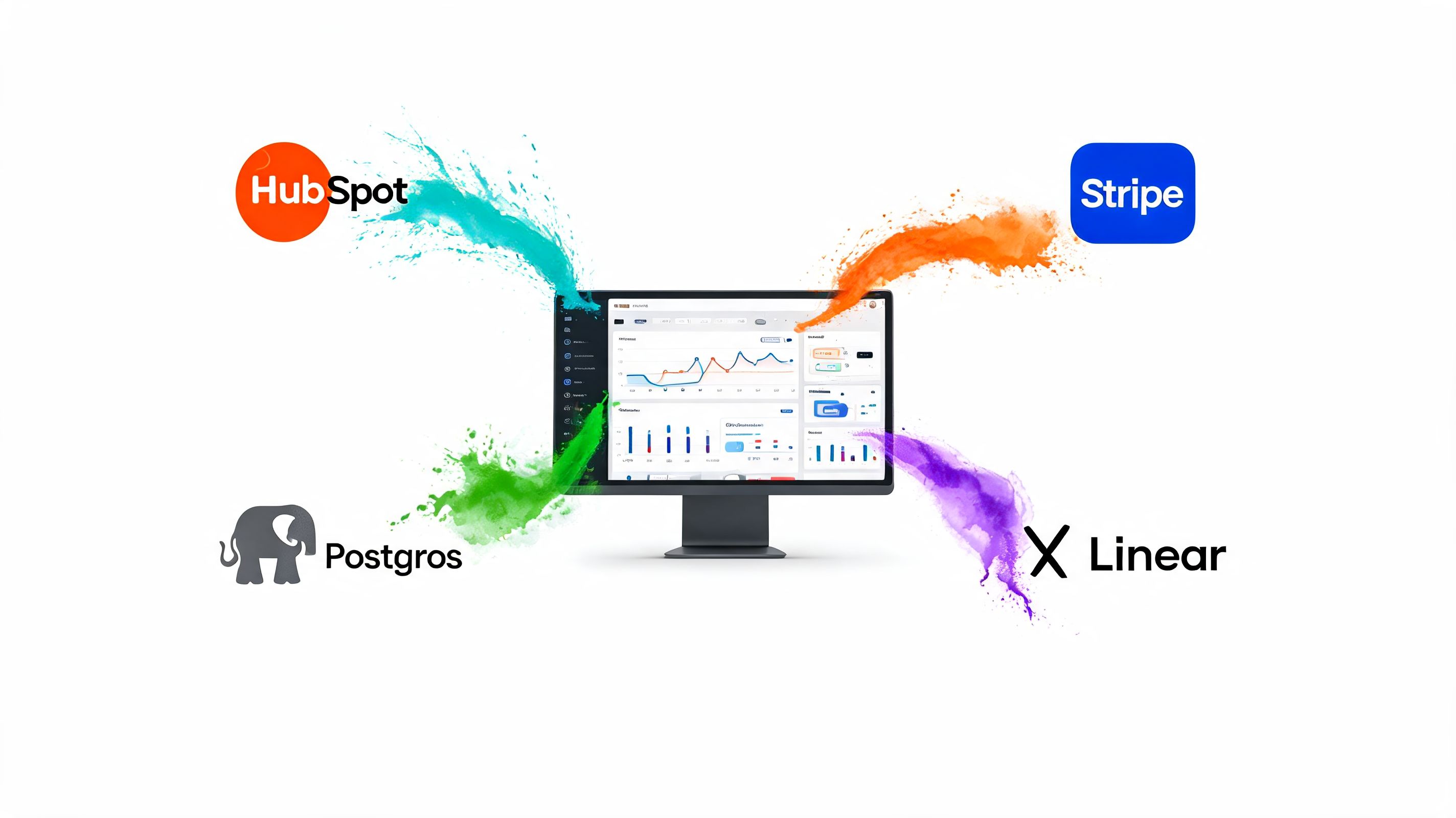
Revenue might sit in Stripe or Shopify. Customer records live in HubSpot. Product activity is in Postgres. Roadmap and issue data might be in Linear. The trick isn't collecting every source on day one. The trick is connecting the first source that answers the question you care about most.
Start with one source, not your entire stack
Founders love ambition. Dashboard projects punish it.
If your first dashboard is about cash flow, connect Stripe or Shopify first. If it's product adoption, connect Postgres first. If it's pipeline health, start with HubSpot. One useful connection beats six half-configured ones.
Here's the practical checklist I give clients.
Pick the business question first
Don't begin with "what can we connect?" Begin with "what do we need to know every day or every week?"Choose the source of truth
If the same metric appears in multiple systems, pick one owner. Revenue from billing should come from billing. Lead stages should come from CRM.Use read-only access
Read-only permissions matter. They let the analytics tool query data without changing records. That's the default you want.Limit the initial scope
Pull the tables, objects, or reports tied to your first dashboard. Save the rest for later.Test a simple query immediately
Don't connect and walk away. Ask a basic question right after setup to confirm the data is usable.
Database connections versus SaaS connectors
These two connection types feel different, and teams often confuse them.
A direct database connection is common when your core product or app data lives in something like Postgres. This gives you the most flexibility and usually the cleanest route to operational reporting. If you're working with app events, subscriptions, user records, or internal transactions, this is often the right first move. If that's your world, you should also read The Guide to Postgres Analytics.
An API connector is what you'll use for tools like Shopify, HubSpot, or Linear. It's usually point-and-click. You authenticate, approve access, and choose what to sync or query. It's dramatically easier than hand-rolling scripts.
That broader shift toward point-and-click operations is why so many ops teams now use no-code tools across the stack. If you're also simplifying back-office workflows, this guide to no-code document automation gives useful perspective on how much busywork modern no-code tooling can remove.
What to avoid on day one
I've seen the same mistakes over and over:
Connecting every tool at once and creating metric conflicts before anyone defines terms
Ignoring permissions and using overly broad access because it's faster
Skipping a live test after authorization
Starting with vanity metrics instead of a hard business question
The right first setup should feel almost boring. Secure connection. One data source. One question. One result.
That's how you get momentum without creating cleanup work.
From Raw Data to Trusted Metrics That Matter
A dashboard full of wrong numbers is worse than no dashboard. At least with no dashboard, people know they're guessing.
This is the step that separates useful self-serve analytics from dashboard theater. You don't earn trust by showing lots of charts. You earn trust by getting one important metric right.

Build one metric first
If you're trying to track MRR, don't also build churn, activation, CAC, and funnel conversion in the same sitting. That's how teams create a polished lie.
The disciplined workflow is much better. Connect a single source. Build one metric that answers your most important question. Verify the result. Then ask someone else to sanity-check the logic before you move on.
According to analytics guidance on self-serve dashboards, building one chart at a time and validating the underlying data before scaling prevents cascading errors, and this staged approach can reduce downstream maintenance by up to 70% when teams catch issues early (Fabi.ai on dashboard validation).
What metric validation actually looks like
Validation sounds technical. It isn't. It's mostly disciplined comparison.
For example, say you want monthly recurring revenue from Stripe.
Pull the monthly total in your dashboard.
Compare it to the billing system export or finance report you already trust.
Check edge cases like refunds, failed payments, plan changes, and timing.
Ask a teammate to review the business logic, not just the visual.
If the chart is wrong, the problem is usually one of three things:
Definition drift
Different teams mean different things by the same metric.Dirty source data Dates, currencies, duplicated records, and inconsistent text fields break logic in unobtrusive ways.
Bad assumptions in the query
The tool grouped, filtered, or joined data in a way that looks plausible but isn't correct.
Practical rule: If you haven't compared the number against a trusted source, you haven't validated the metric.
Why query transparency matters
Conversational analytics proves more useful than many people expect. Natural language is fast, but speed only matters if you can inspect the logic.
A good AI analytics tool should let you review the generated query or at least the metric logic behind the chart. If the system says "MRR by month," you need to know whether it's counting invoices, successful subscription payments, or something else entirely.
That visibility matters even more when non-technical users rely on the system. If no one can inspect how the answer was built, trust will eventually collapse.
One option in this category is Statspresso, a conversational AI data analyst that lets teams connect data sources, ask plain-English questions, and generate charts without writing SQL. That's useful for teams that want self-serve speed but still need a way to inspect and organize trusted metrics.
Try asking Statspresso: "Show me my monthly recurring revenue (MRR) from Stripe for the last 12 months, and segment it by plan type."
Clean data before you decorate it
A surprising number of teams obsess over chart colors before they fix their dates.
Do the ugly work first:
Standardize date formats so time series charts don't split the same period into multiple buckets
Normalize currency handling before comparing revenue sources
Remove duplicate records where connectors or imports overlap
Clean text values when categories differ by capitalization or naming
That prep work isn't glamorous. It is what makes the dashboard reliable.
A simple trust-building sequence
When you're building your first serious dashboard, follow this order:
Name the metric clearly
"Revenue" is vague. "Successful subscription payments collected" is clearer.Write the business definition in plain English
If a PM can't understand it, the metric isn't ready.Generate the chart
Keep it simple. One line chart or one big number is enough at first.Compare against a trusted source
Manual verification beats false confidence.Get a second reviewer
Someone should challenge the assumptions.Lock the definition before expanding
Only then add supporting charts.
That sequence feels slower at the start. It saves a lot of pain later.
Designing a Dashboard That People Actually Use
Most dashboards fail for a boring reason. They ask the user to do too much work.
A useful dashboard should answer the first question at a glance, then support the second question with one or two clicks. If your team has to stare at it for five minutes to figure out what's happening, you've built wall art.

Put the critical KPI where the eye lands first
Users often scan from the top left. Use that.
If the dashboard is for founders, put the number they care about most in the top-left position. Revenue. Cash collected. Pipeline created. Daily active users. Pick one.
Don't hide the headline metric beneath filters, secondary charts, or decorative nonsense.
The dashboard's first job is orientation. The user should know where the business stands in a few seconds.
Choose charts that match the question
Chart selection is where smart teams accidentally get cute.
Use a line chart for trends over time. Use a bar chart for comparing categories. Use a single big number when one KPI matters more than breakdowns. That's enough for most startup dashboards.
Here are the common mismatches I keep seeing:
Pie charts for trend analysis
Wrong tool. Use a line chart.Stacked visuals with too many categories
Hard to read, harder to act on.Tables as the default answer
Fine for exports. Weak for decision-making.Everything on one screen
That's not a dashboard. That's a junk drawer.
Try asking Statspresso: "What was our daily active user count last month? Show it as a line chart."
Build focused dashboards, not giant ones
One dashboard per business objective is usually the right move.
A Marketing Leads dashboard might track leads, qualified leads, campaign breakdowns, and conversion signals. A Product Engagement dashboard might focus on activation, feature usage, and retention behavior. A Revenue Overview dashboard should stay about revenue, not become a side quest into support ticket volume.
That separation keeps dashboards understandable and keeps ownership clear.
Add context so the numbers mean something
A chart without context invites bad storytelling.
If a metric jumps, add a note explaining the likely cause. Maybe a pricing change went live. Maybe a campaign launched. Maybe onboarding broke after a product release. A short annotation can stop a ten-minute argument before it starts.
Good dashboards don't just display values. They preserve institutional memory.
A quick layout rule set
If you want a clean default, use this layout:
Area | What goes there |
|---|---|
Top left | Primary KPI |
Top right | Supporting KPI or comparison view |
Middle row | Trend chart and main breakdown |
Bottom row | Secondary detail, notes, or drill-down table |
This keeps the dashboard scannable without overexplaining it.
Design choices that improve adoption
People use dashboards that feel easy.
That usually means:
Fewer filters so casual users don't get lost
Consistent metric names across every view
Readable labels instead of analyst shorthand
Whitespace so charts don't blur together
If you remember one thing, remember this: clarity beats cleverness. Every time.
Automation, Governance, and Sharing Your Insights
A dashboard that only works when someone babysits it isn't finished. It's a chore.
Once the core metrics are right and the layout is clean, you need the system to keep working without constant manual intervention. That means refresh schedules, permissions, and sharing rules.
Set refresh schedules based on decision speed
Not every metric deserves the same freshness.
Operational metrics often need more frequent updates. Finance summaries usually don't. If you refresh everything constantly, you'll waste resources and make the system harder to manage. If you refresh too slowly, people stop trusting the dashboard.
Use business rhythm as your guide. Ask how often the team can realistically act on the number. Then set the refresh expectation around that.
Governance isn't bureaucracy when it's done right
Founders tend to resist governance because it sounds heavy. In practice, it's just basic discipline.
Who can see financial metrics? Who can edit a shared dashboard? Which team owns the definition of qualified lead, active user, or booked revenue? If nobody owns those answers, your self-serve analytics layer turns into metric anarchy.
Keep it simple:
Restrict sensitive dashboards by role
Separate editors from viewers so definitions don't drift
Name dashboard owners for each business area
Document key metrics in plain language
That's enough governance for most startups.
Sharing should create action, not noise
A good dashboard isn't the end product. It's the trigger for better decisions.
The best teams share a chart in Slack, drop it into a weekly review, or keep it in a shared workspace where everyone works from the same version of the truth. That's where analytics stops being a reporting function and starts becoming operating infrastructure.
If you're thinking more broadly about where automation fits into daily business work, this explanation from Mindlink Systems on AI automation is a useful companion read.
If your team keeps asking "what happened," your dashboard is doing reporting. If they ask "what should we do next," it's doing its job.
The minimum viable operating model
You don't need a governance committee. You need a few rules people follow.
Try this lightweight model:
One owner per dashboard
One clear refresh policy per metric group
One place to share approved dashboards
One process for changing metric definitions
That setup is enough to keep the system reliable without dragging your team into enterprise theater.
Your Path to Instant Answers
You don't need to wait for a data analyst to get a useful real-time dashboard. You need a tighter process and a simpler toolset.
The financially smart move is to stop treating every reporting question like a custom analytics project. Connect the right source. Ask a plain-English question. Validate the first metric carefully. Build a dashboard that people can scan quickly. Then automate the refresh and share the result where your team already works.
If you want a broader view of how teams move from ad hoc reporting to a repeatable self-serve model, Statspresso's post on self-serve business intelligence is a solid next read.
TL;DR
Fix the bottleneck: Waiting on analyst queues costs time and money.
Use modern architecture: Connect, analyze, visualize. Don't overbuild.
Start with one source: The first dashboard should answer one pressing question.
Validate before scaling: Trust one metric before adding ten more.
Design for scanning: Put the key KPI top-left and keep the layout simple.
Automate the boring part: Set refresh rules, permissions, and sharing habits.
Stop waiting for data. Your answers are already sitting in your systems. You just need a faster way to ask.
Connect your first data source in Statspresso and ask your first question in plain English. If you're tired of report queues, spreadsheet sprawl, and dashboard projects that never quite ship, this is the faster path: connect the data, verify the first metric, and get a chart back in seconds.
Waiting weeks for a data analyst to build a dashboard is a relic of the past. If you're a founder, PM, or marketing lead, that delay doesn't just slow reporting. It slows decisions, hides problems, and wastes money while everyone argues over spreadsheets.
The better question isn't whether you can build a real-time dashboard yourself. It's how do i build a real-time dashboard without waiting for a data analyst in a way that's fast, trustworthy, and financially sane. My short answer: use a conversational AI data analyst, start with one metric, and stop overbuilding.
The Analyst Bottleneck Is Costing You More Than Time
Many believe the dashboard problem is technical. It usually isn't. It's economic.
You have data in Stripe, Shopify, HubSpot, Postgres, and half a dozen other tools. Someone needs a number. Then someone else needs it broken down by month, by source, by customer segment. That request goes into a queue. A few days later, maybe longer, you get a chart. By then the meeting has passed and the decision got made on instinct.
That old model is expensive even before you look at software costs. Research highlights that 60-70% of SMBs name budget constraints as the main obstacle to adopting analytics, and the same research points to the unanswered financial question many teams wrestle with: the cost of a BI tool versus hiring a junior analyst for $70K/year (Tinybird on real-time dashboard economics).
The real cost isn't the salary line
The obvious cost is headcount. The hidden cost is delay.
When a growth team waits on reporting, campaigns stay live longer than they should. When a product team can't see adoption quickly, onboarding issues linger. When finance closes the month with scattered exports, leaders spend more time reconciling than deciding.
That's why I push startups and SMBs toward self-serve analytics and conversational analytics much earlier than they expect. Not because analysts aren't valuable. They are. But hiring an analyst to answer every routine question is like hiring a chef to make toast.
Stop paying specialist rates for repetitive reporting work.
A Conversational AI Data Analyst changes the operating model. Instead of filing a ticket, you ask a question in plain English and get a chart back in seconds. Skip the SQL. Just ask your data a question and get a chart in seconds.
The old way versus the new way
Here's the practical comparison.
Metric | Old Way (Manual SQL & Analyst) | New Way (Statspresso) |
|---|---|---|
Question intake | Slack message, meeting note, or ticket | Plain-English prompt |
Time to first chart | Often tied to analyst bandwidth | Minutes after connecting data |
Who can explore | Analyst or technical operator | Founders, PMs, marketers, ops leads |
Workflow | SQL, export, clean-up, chart, revise | Ask, review, refine |
Cost structure | Salary plus tool overhead | Software-first, lighter operating load |
Best use of analyst time | Routine pull requests | Deeper modeling and strategic analysis |
Notice what changed. The win isn't just speed. It's who gets access to answers.
What I'd recommend if you're cash-conscious
If budget is tight, don't start by shopping for the fanciest BI suite. Start by asking three blunt questions:
What question keeps coming up weekly that nobody can answer quickly?
Which data source contains the source of truth for that question?
Who needs access first to make faster decisions without creating chaos?
If you can answer those, you don't need a giant analytics program. You need a narrow, useful dashboard that solves an expensive delay.
That's the financially smart move. Build a small system that people use. Then expand.
Understanding the Modern Real-Time Data Architecture
The term "real-time dashboard" often conjures images of a mess of pipelines, warehouses, ETL jobs, and engineers staring at logs. That's the old mental model. A practical setup is much simpler.
Think in three layers: connect, analyze, visualize.
Connect
You need a path from your source systems into the dashboard layer.
Modern no-code platforms usually handle this with tiered connectivity. Direct database links work for real-time operational data. API-based connections handle near-real-time updates. Batch imports are fine for slower-moving historical context.
The useful rule is simple. Match the connection type to the business need, not your ego. Your support queue might need near-live visibility. Your monthly finance summary does not.
According to guidance on no-code dashboard architecture, teams get the best results when they balance freshness and speed with three patterns: direct database links for live data, API configurations for near-real-time updates with 5-60 second latency, and batch imports for historical data. The same guidance notes that platforms using natural language can reduce time-to-dashboard from weeks to minutes by translating plain English into SQL (Stackby on no-code dashboard architecture).
Analyze
At this point, many DIY dashboard projects go sideways.
The dashboard tool isn't magic. It needs a way to interpret your question, map it to the right tables or connectors, and generate a query that makes sense. Good platforms do that under the hood with a semantic layer or query generation system. In plain English, they convert "show me MRR by month" into logic your data source understands.
If you're evaluating tools and the architecture still feels fuzzy, this overview of scalable data pipeline solutions is worth a read. It gives useful context on how teams move data without turning their stack into a science project.
Visualize
The final layer is where the answer becomes usable.
A chart isn't just decoration. It's the interface between raw data and a business decision. The best modern systems don't force you to drag fields around for twenty minutes to get one line chart. They let you ask a question, inspect the result, and refine it.
That matters because most non-technical users don't want to "build BI." They want an answer.
A real-time dashboard should feel like a conversation with your business, not a part-time engineering project.
What this architecture means for you
You don't need to build the plumbing from scratch. You need a platform that already handles:
Connection choices that fit live, near-live, and historical use cases
Natural language querying so non-SQL users can work independently
Refresh controls so not every metric updates on the same schedule
Transparent query logic so you can verify how a metric was calculated
That's the shift. You're no longer assembling an analytics stack from loose parts unless you want to. You're choosing how much infrastructure you want to own.
If your team is small, own less.
Connecting Your Data Sources Without Writing Code
Your data probably isn't in one place. That's normal.
Revenue might sit in Stripe or Shopify. Customer records live in HubSpot. Product activity is in Postgres. Roadmap and issue data might be in Linear. The trick isn't collecting every source on day one. The trick is connecting the first source that answers the question you care about most.
Start with one source, not your entire stack
Founders love ambition. Dashboard projects punish it.
If your first dashboard is about cash flow, connect Stripe or Shopify first. If it's product adoption, connect Postgres first. If it's pipeline health, start with HubSpot. One useful connection beats six half-configured ones.
Here's the practical checklist I give clients.
Pick the business question first
Don't begin with "what can we connect?" Begin with "what do we need to know every day or every week?"Choose the source of truth
If the same metric appears in multiple systems, pick one owner. Revenue from billing should come from billing. Lead stages should come from CRM.Use read-only access
Read-only permissions matter. They let the analytics tool query data without changing records. That's the default you want.Limit the initial scope
Pull the tables, objects, or reports tied to your first dashboard. Save the rest for later.Test a simple query immediately
Don't connect and walk away. Ask a basic question right after setup to confirm the data is usable.
Database connections versus SaaS connectors
These two connection types feel different, and teams often confuse them.
A direct database connection is common when your core product or app data lives in something like Postgres. This gives you the most flexibility and usually the cleanest route to operational reporting. If you're working with app events, subscriptions, user records, or internal transactions, this is often the right first move. If that's your world, you should also read The Guide to Postgres Analytics.
An API connector is what you'll use for tools like Shopify, HubSpot, or Linear. It's usually point-and-click. You authenticate, approve access, and choose what to sync or query. It's dramatically easier than hand-rolling scripts.
That broader shift toward point-and-click operations is why so many ops teams now use no-code tools across the stack. If you're also simplifying back-office workflows, this guide to no-code document automation gives useful perspective on how much busywork modern no-code tooling can remove.
What to avoid on day one
I've seen the same mistakes over and over:
Connecting every tool at once and creating metric conflicts before anyone defines terms
Ignoring permissions and using overly broad access because it's faster
Skipping a live test after authorization
Starting with vanity metrics instead of a hard business question
The right first setup should feel almost boring. Secure connection. One data source. One question. One result.
That's how you get momentum without creating cleanup work.
From Raw Data to Trusted Metrics That Matter
A dashboard full of wrong numbers is worse than no dashboard. At least with no dashboard, people know they're guessing.
This is the step that separates useful self-serve analytics from dashboard theater. You don't earn trust by showing lots of charts. You earn trust by getting one important metric right.
Build one metric first
If you're trying to track MRR, don't also build churn, activation, CAC, and funnel conversion in the same sitting. That's how teams create a polished lie.
The disciplined workflow is much better. Connect a single source. Build one metric that answers your most important question. Verify the result. Then ask someone else to sanity-check the logic before you move on.
According to analytics guidance on self-serve dashboards, building one chart at a time and validating the underlying data before scaling prevents cascading errors, and this staged approach can reduce downstream maintenance by up to 70% when teams catch issues early (Fabi.ai on dashboard validation).
What metric validation actually looks like
Validation sounds technical. It isn't. It's mostly disciplined comparison.
For example, say you want monthly recurring revenue from Stripe.
Pull the monthly total in your dashboard.
Compare it to the billing system export or finance report you already trust.
Check edge cases like refunds, failed payments, plan changes, and timing.
Ask a teammate to review the business logic, not just the visual.
If the chart is wrong, the problem is usually one of three things:
Definition drift
Different teams mean different things by the same metric.Dirty source data Dates, currencies, duplicated records, and inconsistent text fields break logic in unobtrusive ways.
Bad assumptions in the query
The tool grouped, filtered, or joined data in a way that looks plausible but isn't correct.
Practical rule: If you haven't compared the number against a trusted source, you haven't validated the metric.
Why query transparency matters
Conversational analytics proves more useful than many people expect. Natural language is fast, but speed only matters if you can inspect the logic.
A good AI analytics tool should let you review the generated query or at least the metric logic behind the chart. If the system says "MRR by month," you need to know whether it's counting invoices, successful subscription payments, or something else entirely.
That visibility matters even more when non-technical users rely on the system. If no one can inspect how the answer was built, trust will eventually collapse.
One option in this category is Statspresso, a conversational AI data analyst that lets teams connect data sources, ask plain-English questions, and generate charts without writing SQL. That's useful for teams that want self-serve speed but still need a way to inspect and organize trusted metrics.
Try asking Statspresso: "Show me my monthly recurring revenue (MRR) from Stripe for the last 12 months, and segment it by plan type."
Clean data before you decorate it
A surprising number of teams obsess over chart colors before they fix their dates.
Do the ugly work first:
Standardize date formats so time series charts don't split the same period into multiple buckets
Normalize currency handling before comparing revenue sources
Remove duplicate records where connectors or imports overlap
Clean text values when categories differ by capitalization or naming
That prep work isn't glamorous. It is what makes the dashboard reliable.
A simple trust-building sequence
When you're building your first serious dashboard, follow this order:
Name the metric clearly
"Revenue" is vague. "Successful subscription payments collected" is clearer.Write the business definition in plain English
If a PM can't understand it, the metric isn't ready.Generate the chart
Keep it simple. One line chart or one big number is enough at first.Compare against a trusted source
Manual verification beats false confidence.Get a second reviewer
Someone should challenge the assumptions.Lock the definition before expanding
Only then add supporting charts.
That sequence feels slower at the start. It saves a lot of pain later.
Designing a Dashboard That People Actually Use
Most dashboards fail for a boring reason. They ask the user to do too much work.
A useful dashboard should answer the first question at a glance, then support the second question with one or two clicks. If your team has to stare at it for five minutes to figure out what's happening, you've built wall art.
Put the critical KPI where the eye lands first
Users often scan from the top left. Use that.
If the dashboard is for founders, put the number they care about most in the top-left position. Revenue. Cash collected. Pipeline created. Daily active users. Pick one.
Don't hide the headline metric beneath filters, secondary charts, or decorative nonsense.
The dashboard's first job is orientation. The user should know where the business stands in a few seconds.
Choose charts that match the question
Chart selection is where smart teams accidentally get cute.
Use a line chart for trends over time. Use a bar chart for comparing categories. Use a single big number when one KPI matters more than breakdowns. That's enough for most startup dashboards.
Here are the common mismatches I keep seeing:
Pie charts for trend analysis
Wrong tool. Use a line chart.Stacked visuals with too many categories
Hard to read, harder to act on.Tables as the default answer
Fine for exports. Weak for decision-making.Everything on one screen
That's not a dashboard. That's a junk drawer.
Try asking Statspresso: "What was our daily active user count last month? Show it as a line chart."
Build focused dashboards, not giant ones
One dashboard per business objective is usually the right move.
A Marketing Leads dashboard might track leads, qualified leads, campaign breakdowns, and conversion signals. A Product Engagement dashboard might focus on activation, feature usage, and retention behavior. A Revenue Overview dashboard should stay about revenue, not become a side quest into support ticket volume.
That separation keeps dashboards understandable and keeps ownership clear.
Add context so the numbers mean something
A chart without context invites bad storytelling.
If a metric jumps, add a note explaining the likely cause. Maybe a pricing change went live. Maybe a campaign launched. Maybe onboarding broke after a product release. A short annotation can stop a ten-minute argument before it starts.
Good dashboards don't just display values. They preserve institutional memory.
A quick layout rule set
If you want a clean default, use this layout:
Area | What goes there |
|---|---|
Top left | Primary KPI |
Top right | Supporting KPI or comparison view |
Middle row | Trend chart and main breakdown |
Bottom row | Secondary detail, notes, or drill-down table |
This keeps the dashboard scannable without overexplaining it.
Design choices that improve adoption
People use dashboards that feel easy.
That usually means:
Fewer filters so casual users don't get lost
Consistent metric names across every view
Readable labels instead of analyst shorthand
Whitespace so charts don't blur together
If you remember one thing, remember this: clarity beats cleverness. Every time.
Automation, Governance, and Sharing Your Insights
A dashboard that only works when someone babysits it isn't finished. It's a chore.
Once the core metrics are right and the layout is clean, you need the system to keep working without constant manual intervention. That means refresh schedules, permissions, and sharing rules.
Set refresh schedules based on decision speed
Not every metric deserves the same freshness.
Operational metrics often need more frequent updates. Finance summaries usually don't. If you refresh everything constantly, you'll waste resources and make the system harder to manage. If you refresh too slowly, people stop trusting the dashboard.
Use business rhythm as your guide. Ask how often the team can realistically act on the number. Then set the refresh expectation around that.
Governance isn't bureaucracy when it's done right
Founders tend to resist governance because it sounds heavy. In practice, it's just basic discipline.
Who can see financial metrics? Who can edit a shared dashboard? Which team owns the definition of qualified lead, active user, or booked revenue? If nobody owns those answers, your self-serve analytics layer turns into metric anarchy.
Keep it simple:
Restrict sensitive dashboards by role
Separate editors from viewers so definitions don't drift
Name dashboard owners for each business area
Document key metrics in plain language
That's enough governance for most startups.
Sharing should create action, not noise
A good dashboard isn't the end product. It's the trigger for better decisions.
The best teams share a chart in Slack, drop it into a weekly review, or keep it in a shared workspace where everyone works from the same version of the truth. That's where analytics stops being a reporting function and starts becoming operating infrastructure.
If you're thinking more broadly about where automation fits into daily business work, this explanation from Mindlink Systems on AI automation is a useful companion read.
If your team keeps asking "what happened," your dashboard is doing reporting. If they ask "what should we do next," it's doing its job.
The minimum viable operating model
You don't need a governance committee. You need a few rules people follow.
Try this lightweight model:
One owner per dashboard
One clear refresh policy per metric group
One place to share approved dashboards
One process for changing metric definitions
That setup is enough to keep the system reliable without dragging your team into enterprise theater.
Your Path to Instant Answers
You don't need to wait for a data analyst to get a useful real-time dashboard. You need a tighter process and a simpler toolset.
The financially smart move is to stop treating every reporting question like a custom analytics project. Connect the right source. Ask a plain-English question. Validate the first metric carefully. Build a dashboard that people can scan quickly. Then automate the refresh and share the result where your team already works.
If you want a broader view of how teams move from ad hoc reporting to a repeatable self-serve model, Statspresso's post on self-serve business intelligence is a solid next read.
TL;DR
Fix the bottleneck: Waiting on analyst queues costs time and money.
Use modern architecture: Connect, analyze, visualize. Don't overbuild.
Start with one source: The first dashboard should answer one pressing question.
Validate before scaling: Trust one metric before adding ten more.
Design for scanning: Put the key KPI top-left and keep the layout simple.
Automate the boring part: Set refresh rules, permissions, and sharing habits.
Stop waiting for data. Your answers are already sitting in your systems. You just need a faster way to ask.
Connect your first data source in Statspresso and ask your first question in plain English. If you're tired of report queues, spreadsheet sprawl, and dashboard projects that never quite ship, this is the faster path: connect the data, verify the first metric, and get a chart back in seconds.