Examples of Misleading Graphs: A 2026 Guide

Waiting weeks for a data analyst to build a dashboard is a relic of the past. But what if the charts you get—or build yourself—are lying? A single example of a misleading graph can send your strategy spiraling, wasting budget and eroding trust. These errors aren't just academic; they happen in boardrooms every day, turning good data into bad decisions. You don't have time to second-guess every chart.
This guide moves beyond theory. We'll dissect common ways charts deceive, from truncated axes that exaggerate growth to cherry-picked data that hides a downward trend. The good news? You don’t need a statistics degree to spot these tricks. You just need to know what to look for and have the right tools to ask better questions.
Key Takeaways (TL;DR)
Always check the Y-axis: If it doesn't start at zero, ask why. It's a classic trick to make small changes look massive.
Be skeptical of dual-axis charts: They often imply a relationship (causation) where only a convenient correlation exists. Separate the charts for a clearer view.
Question the timeframe: A short, favorable time window can hide a long-term downward trend. Always ask for the year-over-year or trailing-twelve-months view.
The real fix is speed: Most misleading graphs aren't malicious—they're born from the frustration of slow, manual analytics. The faster you can ask follow-up questions, the faster you get to the truth. A conversational AI data analyst like Statspresso lets you skip the SQL and just ask your data questions directly.
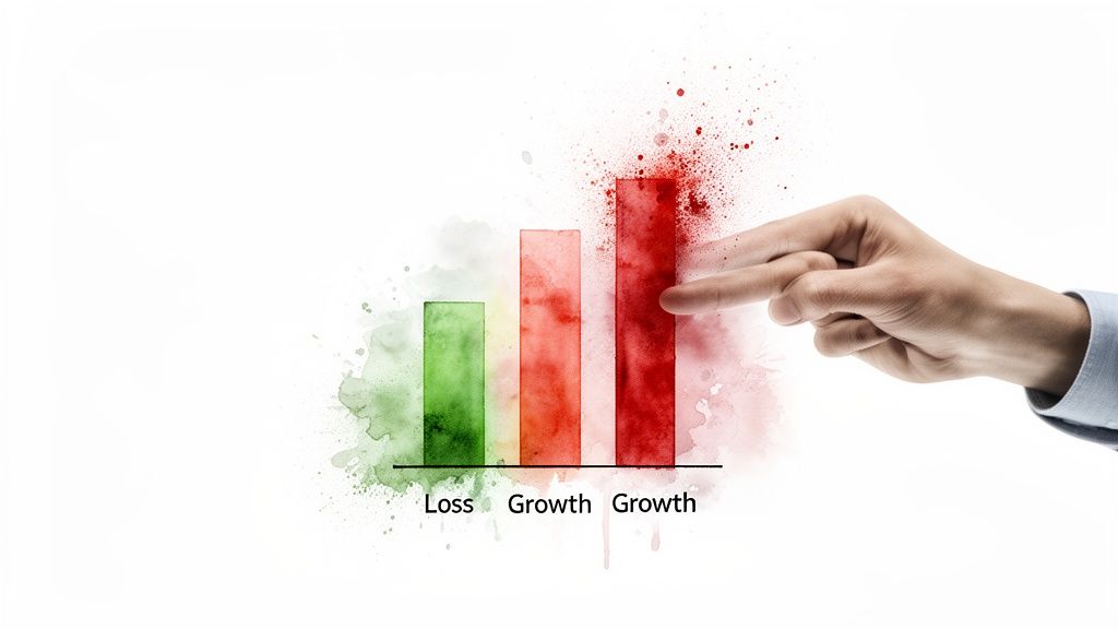
1. Truncated Y-Axis (The "Mountain out of a Molehill" Trick)
Truncating the Y-axis is one of the oldest tricks in the book. It involves starting the vertical axis at a value greater than zero, which visually exaggerates the differences between data points. A minor fluctuation suddenly looks like a massive spike. This is a classic example of misleading graph creation, often used to create a more dramatic narrative.
Why It's Misleading
The manipulation works by removing the baseline. For bar charts, this is especially deceptive because our brains instinctively compare the total length of the bars. When you chop off the bottom, a 5% difference can look like a 50% one.
How to Spot It: Always check the Y-axis. Does it start at zero? If not, question it. While rare, legitimate reasons exist (e.g., visualizing stock price fluctuations), it usually signals an attempt to magnify small changes.
The Fix: Reset the axis to zero. With a conversational AI data analyst like Statspresso, you can bypass manual chart editors. Skip the SQL. Just ask your data a question and get a chart in seconds.
Try asking Statspresso: "Show me monthly user growth for the last year with the y-axis starting at 0."
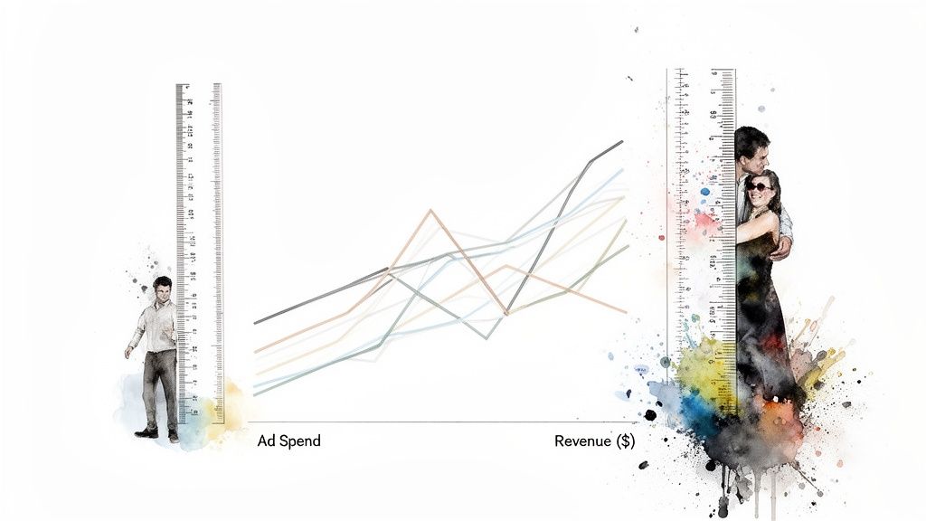
2. Dual-Axis Misalignment (The "Forced Friendship")
Using a dual-axis chart is a slippery slope. While sometimes useful, it's often a tool for creating a misleading graph by implying a relationship that isn't really there. By carefully choosing the scales for each axis, a creator can make two unrelated trends look perfectly correlated, creating a powerful but false narrative. This is a common example of misleading graph construction in financial reports and marketing dashboards.
Why It's Misleading
The deception lies in our brain's natural tendency to find patterns. When two lines on a graph move together, we assume they're connected. By manipulating the start and end points of each Y-axis independently, you can force almost any two data sets to appear to move in lockstep.
How to Spot It: Be skeptical of any dual-axis chart. Scrutinize both Y-axes. Are their scales proportional? Often, the correlation is an illusion created by convenient scaling.
The Fix: Separate the charts. A better way to compare two metrics with different scales is to place two single-axis charts side-by-side.
Try asking Statspresso: "Compare monthly marketing spend and new user signups on two separate charts for the last 6 months."
3. Cherry-Picked Time Periods (The "Convenient Snapshot")
Selecting a specific date range that conveniently supports a narrative is a subtle yet potent way to mislead. This technique involves isolating a favorable window of time while ignoring the broader context. It’s a common tactic used to frame a short-term win as a long-term trend, making it another powerful example of misleading graph creation.

Why It's Misleading
This method presents an incomplete story. A chart showing massive user growth in December looks great but omits the fact that growth is always high during the holiday season. The viewer is led to believe the growth is organic and sustainable, not cyclical.
How to Spot It: Question the timeframe. Does the chart show a full year, or just a few select weeks? Always ask for a wider view, like a year-over-year (YoY) comparison, to understand the full context.
The Fix: Standardize reporting periods and always include historical context. With a conversational AI data analyst, you can easily pull multiple views without any SQL.
Try asking Statspresso: "Compare Q4 revenue this year to Q4 last year" or "Show me the trailing 12 months of user signups."
The Old Way vs. The New Way
The Old Way (Manual SQL & BI Tools) | The New Way (Statspresso) | |
|---|---|---|
Process | File a ticket with the data team. | Just ask a question in plain English. |
Wait Time | Days or weeks. | Seconds. |
Flexibility | Low. Rework requires a new ticket. | High. Ask follow-up questions instantly. |
Risk | High risk of accidental errors (like truncated axes) from hurried analysts or DIY Excel charts. | Low risk. The AI applies best practices automatically, ensuring honest charts. |
Outcome | Slow decisions based on potentially misleading graphs. | Fast, confident decisions based on trustworthy answers. |
Stop Debating Charts. Get Answers.
The ability to spot a bad chart is a superpower for any leader. We’ve walked through several common culprits, from the classic truncated y-axis that inflates minor changes to the subtle deception of cherry-picked time periods that hide inconvenient truths. Each example of misleading graph we analyzed serves as a reminder: the story data tells depends entirely on how it's presented.
But being a professional chart debunker isn't the end goal. It’s a defensive skill. The real objective is to build a culture where these errors rarely happen because getting accurate insights is fast and intuitive.
The bottleneck is the old way of doing things. This friction is where misleading visualizations are born. The solution isn't more training on chart design theory; it's removing the friction entirely.
From Defense to Offense with Conversational AI
Instead of just spotting bad data stories, it’s time to empower your team to create good ones on demand. This is where a Conversational AI Data Analyst like Statspresso changes the game. Imagine your product manager, instead of waiting for a report, simply asking:
"Compare user retention for cohorts acquired in Q1 vs Q2, but exclude users from the beta test."
The right chart appears in seconds, correctly scaled and clearly labeled. You skip the SQL. Just ask your data a question and get a chart in seconds. This approach democratizes access to trustworthy data, turning every team member into a capable analyst. For a deeper dive on visualization principles, check out our guide to data visualization best practices. Developing strong critical thinking skills is also paramount.
Ready to stop policing charts and start getting answers? Connect your first data source for free and ask your first question. See how simple honest data can be.
Waiting weeks for a data analyst to build a dashboard is a relic of the past. But what if the charts you get—or build yourself—are lying? A single example of a misleading graph can send your strategy spiraling, wasting budget and eroding trust. These errors aren't just academic; they happen in boardrooms every day, turning good data into bad decisions. You don't have time to second-guess every chart.
This guide moves beyond theory. We'll dissect common ways charts deceive, from truncated axes that exaggerate growth to cherry-picked data that hides a downward trend. The good news? You don’t need a statistics degree to spot these tricks. You just need to know what to look for and have the right tools to ask better questions.
Key Takeaways (TL;DR)
Always check the Y-axis: If it doesn't start at zero, ask why. It's a classic trick to make small changes look massive.
Be skeptical of dual-axis charts: They often imply a relationship (causation) where only a convenient correlation exists. Separate the charts for a clearer view.
Question the timeframe: A short, favorable time window can hide a long-term downward trend. Always ask for the year-over-year or trailing-twelve-months view.
The real fix is speed: Most misleading graphs aren't malicious—they're born from the frustration of slow, manual analytics. The faster you can ask follow-up questions, the faster you get to the truth. A conversational AI data analyst like Statspresso lets you skip the SQL and just ask your data questions directly.
1. Truncated Y-Axis (The "Mountain out of a Molehill" Trick)
Truncating the Y-axis is one of the oldest tricks in the book. It involves starting the vertical axis at a value greater than zero, which visually exaggerates the differences between data points. A minor fluctuation suddenly looks like a massive spike. This is a classic example of misleading graph creation, often used to create a more dramatic narrative.
Why It's Misleading
The manipulation works by removing the baseline. For bar charts, this is especially deceptive because our brains instinctively compare the total length of the bars. When you chop off the bottom, a 5% difference can look like a 50% one.
How to Spot It: Always check the Y-axis. Does it start at zero? If not, question it. While rare, legitimate reasons exist (e.g., visualizing stock price fluctuations), it usually signals an attempt to magnify small changes.
The Fix: Reset the axis to zero. With a conversational AI data analyst like Statspresso, you can bypass manual chart editors. Skip the SQL. Just ask your data a question and get a chart in seconds.
Try asking Statspresso: "Show me monthly user growth for the last year with the y-axis starting at 0."
2. Dual-Axis Misalignment (The "Forced Friendship")
Using a dual-axis chart is a slippery slope. While sometimes useful, it's often a tool for creating a misleading graph by implying a relationship that isn't really there. By carefully choosing the scales for each axis, a creator can make two unrelated trends look perfectly correlated, creating a powerful but false narrative. This is a common example of misleading graph construction in financial reports and marketing dashboards.
Why It's Misleading
The deception lies in our brain's natural tendency to find patterns. When two lines on a graph move together, we assume they're connected. By manipulating the start and end points of each Y-axis independently, you can force almost any two data sets to appear to move in lockstep.
How to Spot It: Be skeptical of any dual-axis chart. Scrutinize both Y-axes. Are their scales proportional? Often, the correlation is an illusion created by convenient scaling.
The Fix: Separate the charts. A better way to compare two metrics with different scales is to place two single-axis charts side-by-side.
Try asking Statspresso: "Compare monthly marketing spend and new user signups on two separate charts for the last 6 months."
3. Cherry-Picked Time Periods (The "Convenient Snapshot")
Selecting a specific date range that conveniently supports a narrative is a subtle yet potent way to mislead. This technique involves isolating a favorable window of time while ignoring the broader context. It’s a common tactic used to frame a short-term win as a long-term trend, making it another powerful example of misleading graph creation.
Why It's Misleading
This method presents an incomplete story. A chart showing massive user growth in December looks great but omits the fact that growth is always high during the holiday season. The viewer is led to believe the growth is organic and sustainable, not cyclical.
How to Spot It: Question the timeframe. Does the chart show a full year, or just a few select weeks? Always ask for a wider view, like a year-over-year (YoY) comparison, to understand the full context.
The Fix: Standardize reporting periods and always include historical context. With a conversational AI data analyst, you can easily pull multiple views without any SQL.
Try asking Statspresso: "Compare Q4 revenue this year to Q4 last year" or "Show me the trailing 12 months of user signups."
The Old Way vs. The New Way
The Old Way (Manual SQL & BI Tools) | The New Way (Statspresso) | |
|---|---|---|
Process | File a ticket with the data team. | Just ask a question in plain English. |
Wait Time | Days or weeks. | Seconds. |
Flexibility | Low. Rework requires a new ticket. | High. Ask follow-up questions instantly. |
Risk | High risk of accidental errors (like truncated axes) from hurried analysts or DIY Excel charts. | Low risk. The AI applies best practices automatically, ensuring honest charts. |
Outcome | Slow decisions based on potentially misleading graphs. | Fast, confident decisions based on trustworthy answers. |
Stop Debating Charts. Get Answers.
The ability to spot a bad chart is a superpower for any leader. We’ve walked through several common culprits, from the classic truncated y-axis that inflates minor changes to the subtle deception of cherry-picked time periods that hide inconvenient truths. Each example of misleading graph we analyzed serves as a reminder: the story data tells depends entirely on how it's presented.
But being a professional chart debunker isn't the end goal. It’s a defensive skill. The real objective is to build a culture where these errors rarely happen because getting accurate insights is fast and intuitive.
The bottleneck is the old way of doing things. This friction is where misleading visualizations are born. The solution isn't more training on chart design theory; it's removing the friction entirely.
From Defense to Offense with Conversational AI
Instead of just spotting bad data stories, it’s time to empower your team to create good ones on demand. This is where a Conversational AI Data Analyst like Statspresso changes the game. Imagine your product manager, instead of waiting for a report, simply asking:
"Compare user retention for cohorts acquired in Q1 vs Q2, but exclude users from the beta test."
The right chart appears in seconds, correctly scaled and clearly labeled. You skip the SQL. Just ask your data a question and get a chart in seconds. This approach democratizes access to trustworthy data, turning every team member into a capable analyst. For a deeper dive on visualization principles, check out our guide to data visualization best practices. Developing strong critical thinking skills is also paramount.
Ready to stop policing charts and start getting answers? Connect your first data source for free and ask your first question. See how simple honest data can be.