10 Data Visualization Best Practices (2026)

Got data? Great. Is it stuck in slow, confusing dashboards that are outdated by the time you see them? The real challenge isn't getting more data; it's getting clear answers now. Waiting weeks for a data analyst to build a dashboard is a relic of the past. This isn't about making pretty charts. It’s about turning raw numbers into fact-based decisions, fast.
This guide cuts through the noise. It’s a straightforward, actionable list of data visualization best practices that work. No abstract theories. Just practical steps to create visuals that drive decisions. You'll see how a Conversational AI Data Analyst like Statspresso automates these principles, so you can skip the SQL and just ask your data a question to get a chart in seconds. Let's build charts that get used.
TL;DR: Data Visualization Best Practices
Pick the Right Chart: Use bars for comparisons, lines for trends. Don't use a pie chart for trends.
Kill the Clutter: Remove 3D effects, heavy gridlines, and extra colors. Make your data the hero.
Use Color with Purpose: Use color to highlight what's important, not for decoration. Ensure it's accessible for all.
Context is King: A chart without a clear title, labels, and annotations is just art. State the main finding in the title.
Tell a Story: Frame your data with a beginning (context), middle (conflict), and end (resolution/action).
Compare Everything: Show data against targets, past periods, or benchmarks. A number alone means nothing.
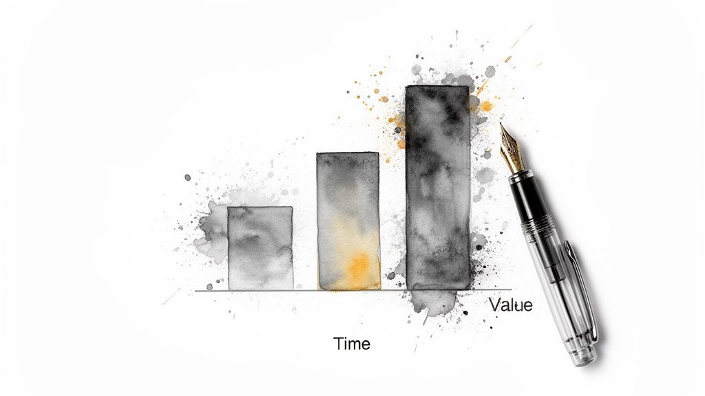
1. Choose the Right Chart Type for Your Data
Picking the right chart is the foundation of clear communication. The whole point is to show an insight faster than a table of numbers ever could. One of the most critical data visualization best practices is matching the chart type to your data and your story. A bad chart misleads people. The right one makes the takeaway obvious.
Think of it this way: you wouldn't use a hammer to turn a screw. Using a pie chart to show a trend over time is the wrong tool for the job. Your goal is to map the data's relationships to a visual grammar people get instantly.
Matching Data to Visuals
The rule is simple: different charts do different jobs. First, define what you need to show.
For Comparisons: To compare values across categories, a bar chart is your best friend. The human eye excels at comparing lengths, making it easy to see what’s bigger or smaller. Perfect for "Which marketing channel brought in the most leads?"
For Trends Over Time: To show how a metric changes, a line chart is the undisputed champ. It connects the dots, clearly showing growth, decline, or volatility. This is the go-to for Monthly Recurring Revenue (MRR) or daily active users.
For Composition: To show parts of a whole, use a stacked bar chart. Use a pie chart only with extreme caution (3-4 slices max) and ensure it adds up to 100%. A stacked bar is almost always easier to read.
For Relationships: To see if two variables are related, use a scatter plot. This helps you spot correlations, clusters, or outliers, answering questions like, "Is there a relationship between ad spend and new sign-ups?"
With Statspresso, a Conversational AI Data Analyst, this process is automated. You don't have to remember the rules.
Try asking Statspresso: "Show me my top 5 products by revenue last quarter as a bar chart." It knows the task is a comparison and generates the right visual, skipping the manual chart selection entirely.
2. Maintain Data-Ink Ratio and Minimize Clutter
Every pixel on your chart should earn its keep. Maximize the "data-ink" (ink showing actual data) and erase the "non-data-ink" (chart junk that distracts). This principle, from pioneer Edward Tufte, is one of the most impactful data visualization best practices because it fights information overload. A clean chart delivers insight instantly. A cluttered one makes you work for it.
Think of it as decluttering a room. 3D effects, heavy gridlines, and busy backgrounds are junk. They add zero analytical value. The best dashboards embrace minimalism because it works.
How to Declutter Your Visuals
The approach is ruthless subtraction. Ask of every element: "Does this help the user understand the data?" If not, delete it.
Ditch the Junk: The worst offenders are gridlines, borders, and shadows. A horizontal gridline might help on a complex line chart, but vertical gridlines on a bar chart are almost always useless. Remove them.
Use Color to Focus: Start with a neutral palette (like grayscale). Apply color only to highlight key data points. A financial dashboard doesn't need a rainbow; it needs one color to show which metric is underperforming.
Kill 3D Effects: Say no to 3D, gradients, and textures. A 3D pie chart not only adds junk but actively distorts the data, making some slices look bigger than they are. Flat design is the standard for a reason.
Remove Redundant Labels: If your chart is titled "Monthly Sales," you don't need to label the y-axis "Sales in USD." Keep it clean.
Statspresso, your Conversational AI Data Analyst, builds these principles in.
Try asking Statspresso: "Compare my top 3 campaigns by CPA." It generates a clean bar chart without asking you to manually flatten 3D effects. The data, not the decoration, is the hero.
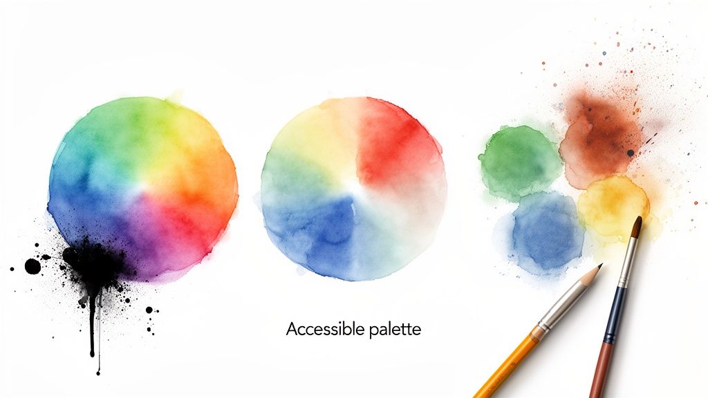
3. Use Color Strategically and Accessibly
Color is a powerful tool, but it's often used for decoration instead of communication. A crucial data visualization best practice is to treat color as a functional element. Strategic color guides attention, highlights insights, and makes charts instantly understandable. Poor color choices create confusion.
Your goal is to use color with intention. Every hue should serve a purpose, whether it's to represent a category, show change, or create an accessible experience for everyone.
Matching Color to Meaning
Use color to reinforce your data's story, not compete with it.
For Highlighting: Use a single, bright color to draw the eye to the most important data point. Don't just make things colorful; make the important things colorful.
For Sequential Data: When showing a range from low to high (like in a heatmap), use a sequential color palette. This involves shades of one color, from light (low) to dark (high).
For Diverging Data: To show values with a meaningful midpoint (like profit and loss), use a diverging palette. Red for negative, a neutral for zero, and green for positive is a classic.
For Accessibility: Never rely on color alone. An estimated 8% of men have some form of color blindness. Use colorblind-safe palettes and supplement with labels or icons. Check your charts with a colorblindness simulator and ensure you meet WCAG contrast ratios.
With a Conversational AI Data Analyst like Statspresso, you bypass the manual work.
Try asking Statspresso: "Compare our Q3 customer churn rate to our target." It can automatically apply a red-green diverging palette to show over/under performance, ensuring your visuals are both insightful and accessible.
4. Establish Clear Context with Titles, Labels, and Annotations
A chart without context is just abstract art. It’s pretty but useless for business decisions. One of the most critical data visualization best practices is providing a clear hierarchy of information with titles, labels, and annotations. This context transforms a graph into a story, answering "What am I looking at?" and "Why should I care?"
Think of it as the difference between getting a number, "4,120," and an insight: "New Users This Week: 4,120 (+15% vs. last week)." The first is a fact; the second is a story.
Building a Narrative with Text
Good context doesn't just describe the data; it explains its significance.
Insightful Titles: Instead of "User Growth," write a headline that tells the story: "User Growth Spiked 30% After Product Hunt Launch." The title should state the main finding.
Clear Labels: Never assume your audience knows what "10K" on an axis means. Is it dollars, users, or units sold? Label axes clearly with the metric and its unit (e.g., "Monthly Revenue ($USD)").
Strategic Annotations: Annotations are your secret weapon. Use them to highlight a specific data point, explain an anomaly ("Downtime on July 10th caused dip"), or mark an event ("Marketing campaign started").
Essential Metadata: For credibility, always include the data source and a "last updated" timestamp. This shows your data is fresh and trustworthy.
Statspresso, your Conversational AI Data Analyst, builds this contextual layer in.
Try asking Statspresso: "What caused the spike in signups last month?" It can automatically annotate the chart with the corresponding marketing campaign date, so you spend your time on insights, not formatting.
5. Optimize for Your Medium and Audience
A brilliant visualization on a desktop dashboard can become a useless mess on a mobile phone. A critical data visualization best practice is designing for the specific medium and audience. A chart is only effective if it's clear and legible where it's viewed, whether that’s a slide, a report, or a phone.
Failing to adapt is like giving the same speech to data scientists and busy executives; the message gets lost. The context dictates the complexity. Your goal is to deliver the core insight with zero friction.
Matching Design to Context
Make your data feel native to its environment.
For Interactive Dashboards: On a desktop, you have space for complexity. You can include filters, drill-downs, and multiple charts. This is for analysts who need to explore data.
For Mobile Devices: Screen real estate is precious. Focus on one key metric per card. Use vertical scrolling. Mobile-first design is a powerful approach; start with the simplest view.
For Presentations: Your audience is viewing from a distance. Use large fonts, high-contrast colors, and simplified charts that communicate a single message per slide.
For Printed Reports: Colors can render differently on paper, and there's no interactivity. Use a high-contrast scheme and ensure all annotations are printed directly on the page.
Tools like Statspresso handle this responsiveness automatically. A dashboard created for desktop seamlessly adapts to mobile, ensuring charts remain readable. It also formats visualizations for PDF exports. For a deeper dive, see our guide on building better data visualization dashboards.
From Reading About Problems to Solving Them
We’ve walked through the most critical data visualization best practices. From picking the right chart to telling a story, you now have a framework for creating visuals that deliver insights. But here’s the hard truth: knowing these rules is one thing. Implementing them is another. The real obstacle for busy founders, PMs, and marketers isn't knowledge. It's the time and technical overhead required to build one.
The old way is painful:
The Old Way (Manual BI) | The New Way (Conversational AI) |
|---|---|
1. Submit a ticket to a data analyst. | 1. Ask your data a question. |
2. Wait days or weeks for a first draft. | 2. Get a perfect chart in seconds. |
3. Go back and forth on revisions. | 3. Ask a follow-up question. |
4. Finally get your chart, insight is stale. | 4. Get an instant, revised chart. |
This cycle of waiting kills momentum. Statspresso is a Conversational AI Data Analyst that internalizes all these best practices for you. Skip the SQL. Just ask your data a question and get a chart in seconds. It handles the tedious mechanics of chart selection, color, and labeling, freeing you to focus on the "why" behind the numbers. The best practice is the one that gets used.
Ready to stop waiting and start asking? Connect your first data source for free and ask your first question. See how simple it is to put these best practices into action instantly.
Got data? Great. Is it stuck in slow, confusing dashboards that are outdated by the time you see them? The real challenge isn't getting more data; it's getting clear answers now. Waiting weeks for a data analyst to build a dashboard is a relic of the past. This isn't about making pretty charts. It’s about turning raw numbers into fact-based decisions, fast.
This guide cuts through the noise. It’s a straightforward, actionable list of data visualization best practices that work. No abstract theories. Just practical steps to create visuals that drive decisions. You'll see how a Conversational AI Data Analyst like Statspresso automates these principles, so you can skip the SQL and just ask your data a question to get a chart in seconds. Let's build charts that get used.
TL;DR: Data Visualization Best Practices
Pick the Right Chart: Use bars for comparisons, lines for trends. Don't use a pie chart for trends.
Kill the Clutter: Remove 3D effects, heavy gridlines, and extra colors. Make your data the hero.
Use Color with Purpose: Use color to highlight what's important, not for decoration. Ensure it's accessible for all.
Context is King: A chart without a clear title, labels, and annotations is just art. State the main finding in the title.
Tell a Story: Frame your data with a beginning (context), middle (conflict), and end (resolution/action).
Compare Everything: Show data against targets, past periods, or benchmarks. A number alone means nothing.
1. Choose the Right Chart Type for Your Data
Picking the right chart is the foundation of clear communication. The whole point is to show an insight faster than a table of numbers ever could. One of the most critical data visualization best practices is matching the chart type to your data and your story. A bad chart misleads people. The right one makes the takeaway obvious.
Think of it this way: you wouldn't use a hammer to turn a screw. Using a pie chart to show a trend over time is the wrong tool for the job. Your goal is to map the data's relationships to a visual grammar people get instantly.
Matching Data to Visuals
The rule is simple: different charts do different jobs. First, define what you need to show.
For Comparisons: To compare values across categories, a bar chart is your best friend. The human eye excels at comparing lengths, making it easy to see what’s bigger or smaller. Perfect for "Which marketing channel brought in the most leads?"
For Trends Over Time: To show how a metric changes, a line chart is the undisputed champ. It connects the dots, clearly showing growth, decline, or volatility. This is the go-to for Monthly Recurring Revenue (MRR) or daily active users.
For Composition: To show parts of a whole, use a stacked bar chart. Use a pie chart only with extreme caution (3-4 slices max) and ensure it adds up to 100%. A stacked bar is almost always easier to read.
For Relationships: To see if two variables are related, use a scatter plot. This helps you spot correlations, clusters, or outliers, answering questions like, "Is there a relationship between ad spend and new sign-ups?"
With Statspresso, a Conversational AI Data Analyst, this process is automated. You don't have to remember the rules.
Try asking Statspresso: "Show me my top 5 products by revenue last quarter as a bar chart." It knows the task is a comparison and generates the right visual, skipping the manual chart selection entirely.
2. Maintain Data-Ink Ratio and Minimize Clutter
Every pixel on your chart should earn its keep. Maximize the "data-ink" (ink showing actual data) and erase the "non-data-ink" (chart junk that distracts). This principle, from pioneer Edward Tufte, is one of the most impactful data visualization best practices because it fights information overload. A clean chart delivers insight instantly. A cluttered one makes you work for it.
Think of it as decluttering a room. 3D effects, heavy gridlines, and busy backgrounds are junk. They add zero analytical value. The best dashboards embrace minimalism because it works.
How to Declutter Your Visuals
The approach is ruthless subtraction. Ask of every element: "Does this help the user understand the data?" If not, delete it.
Ditch the Junk: The worst offenders are gridlines, borders, and shadows. A horizontal gridline might help on a complex line chart, but vertical gridlines on a bar chart are almost always useless. Remove them.
Use Color to Focus: Start with a neutral palette (like grayscale). Apply color only to highlight key data points. A financial dashboard doesn't need a rainbow; it needs one color to show which metric is underperforming.
Kill 3D Effects: Say no to 3D, gradients, and textures. A 3D pie chart not only adds junk but actively distorts the data, making some slices look bigger than they are. Flat design is the standard for a reason.
Remove Redundant Labels: If your chart is titled "Monthly Sales," you don't need to label the y-axis "Sales in USD." Keep it clean.
Statspresso, your Conversational AI Data Analyst, builds these principles in.
Try asking Statspresso: "Compare my top 3 campaigns by CPA." It generates a clean bar chart without asking you to manually flatten 3D effects. The data, not the decoration, is the hero.
3. Use Color Strategically and Accessibly
Color is a powerful tool, but it's often used for decoration instead of communication. A crucial data visualization best practice is to treat color as a functional element. Strategic color guides attention, highlights insights, and makes charts instantly understandable. Poor color choices create confusion.
Your goal is to use color with intention. Every hue should serve a purpose, whether it's to represent a category, show change, or create an accessible experience for everyone.
Matching Color to Meaning
Use color to reinforce your data's story, not compete with it.
For Highlighting: Use a single, bright color to draw the eye to the most important data point. Don't just make things colorful; make the important things colorful.
For Sequential Data: When showing a range from low to high (like in a heatmap), use a sequential color palette. This involves shades of one color, from light (low) to dark (high).
For Diverging Data: To show values with a meaningful midpoint (like profit and loss), use a diverging palette. Red for negative, a neutral for zero, and green for positive is a classic.
For Accessibility: Never rely on color alone. An estimated 8% of men have some form of color blindness. Use colorblind-safe palettes and supplement with labels or icons. Check your charts with a colorblindness simulator and ensure you meet WCAG contrast ratios.
With a Conversational AI Data Analyst like Statspresso, you bypass the manual work.
Try asking Statspresso: "Compare our Q3 customer churn rate to our target." It can automatically apply a red-green diverging palette to show over/under performance, ensuring your visuals are both insightful and accessible.
4. Establish Clear Context with Titles, Labels, and Annotations
A chart without context is just abstract art. It’s pretty but useless for business decisions. One of the most critical data visualization best practices is providing a clear hierarchy of information with titles, labels, and annotations. This context transforms a graph into a story, answering "What am I looking at?" and "Why should I care?"
Think of it as the difference between getting a number, "4,120," and an insight: "New Users This Week: 4,120 (+15% vs. last week)." The first is a fact; the second is a story.
Building a Narrative with Text
Good context doesn't just describe the data; it explains its significance.
Insightful Titles: Instead of "User Growth," write a headline that tells the story: "User Growth Spiked 30% After Product Hunt Launch." The title should state the main finding.
Clear Labels: Never assume your audience knows what "10K" on an axis means. Is it dollars, users, or units sold? Label axes clearly with the metric and its unit (e.g., "Monthly Revenue ($USD)").
Strategic Annotations: Annotations are your secret weapon. Use them to highlight a specific data point, explain an anomaly ("Downtime on July 10th caused dip"), or mark an event ("Marketing campaign started").
Essential Metadata: For credibility, always include the data source and a "last updated" timestamp. This shows your data is fresh and trustworthy.
Statspresso, your Conversational AI Data Analyst, builds this contextual layer in.
Try asking Statspresso: "What caused the spike in signups last month?" It can automatically annotate the chart with the corresponding marketing campaign date, so you spend your time on insights, not formatting.
5. Optimize for Your Medium and Audience
A brilliant visualization on a desktop dashboard can become a useless mess on a mobile phone. A critical data visualization best practice is designing for the specific medium and audience. A chart is only effective if it's clear and legible where it's viewed, whether that’s a slide, a report, or a phone.
Failing to adapt is like giving the same speech to data scientists and busy executives; the message gets lost. The context dictates the complexity. Your goal is to deliver the core insight with zero friction.
Matching Design to Context
Make your data feel native to its environment.
For Interactive Dashboards: On a desktop, you have space for complexity. You can include filters, drill-downs, and multiple charts. This is for analysts who need to explore data.
For Mobile Devices: Screen real estate is precious. Focus on one key metric per card. Use vertical scrolling. Mobile-first design is a powerful approach; start with the simplest view.
For Presentations: Your audience is viewing from a distance. Use large fonts, high-contrast colors, and simplified charts that communicate a single message per slide.
For Printed Reports: Colors can render differently on paper, and there's no interactivity. Use a high-contrast scheme and ensure all annotations are printed directly on the page.
Tools like Statspresso handle this responsiveness automatically. A dashboard created for desktop seamlessly adapts to mobile, ensuring charts remain readable. It also formats visualizations for PDF exports. For a deeper dive, see our guide on building better data visualization dashboards.
From Reading About Problems to Solving Them
We’ve walked through the most critical data visualization best practices. From picking the right chart to telling a story, you now have a framework for creating visuals that deliver insights. But here’s the hard truth: knowing these rules is one thing. Implementing them is another. The real obstacle for busy founders, PMs, and marketers isn't knowledge. It's the time and technical overhead required to build one.
The old way is painful:
The Old Way (Manual BI) | The New Way (Conversational AI) |
|---|---|
1. Submit a ticket to a data analyst. | 1. Ask your data a question. |
2. Wait days or weeks for a first draft. | 2. Get a perfect chart in seconds. |
3. Go back and forth on revisions. | 3. Ask a follow-up question. |
4. Finally get your chart, insight is stale. | 4. Get an instant, revised chart. |
This cycle of waiting kills momentum. Statspresso is a Conversational AI Data Analyst that internalizes all these best practices for you. Skip the SQL. Just ask your data a question and get a chart in seconds. It handles the tedious mechanics of chart selection, color, and labeling, freeing you to focus on the "why" behind the numbers. The best practice is the one that gets used.
Ready to stop waiting and start asking? Connect your first data source for free and ask your first question. See how simple it is to put these best practices into action instantly.