

Master Data Visualization in Marketing Without SQL

You already know the scene. A marketer asks for a “quick chart” on channel performance. A PM wants to see where trial users drop off. The founder wants answers before the next standup. Then everyone waits while someone pulls CSVs, writes SQL, fixes naming issues, and builds a dashboard nobody fully trusts.
Waiting weeks for a data analyst to build a dashboard is a relic of the past. Marketing moves too fast for that. The goal isn’t prettier reporting. It’s seeing what matters fast enough to do something about it.
Stop Drowning in Data and Start Seeing Answers
Monday, 9:12 a.m. Paid search looks expensive, email looks fine, and revenue still feels soft. The CMO wants to know which channel is pulling its weight before lunch. The numbers exist somewhere. The answer does not.
That gap is the core problem.
Marketing teams rarely lack data. They lack a fast way to turn scattered data into a picture someone can act on. Shopify shows sales. HubSpot shows pipeline. Meta Ads shows spend. GA4 shows traffic, sort of. Then there’s the spreadsheet with hand-fixed campaign names because nobody agreed on naming conventions in March.
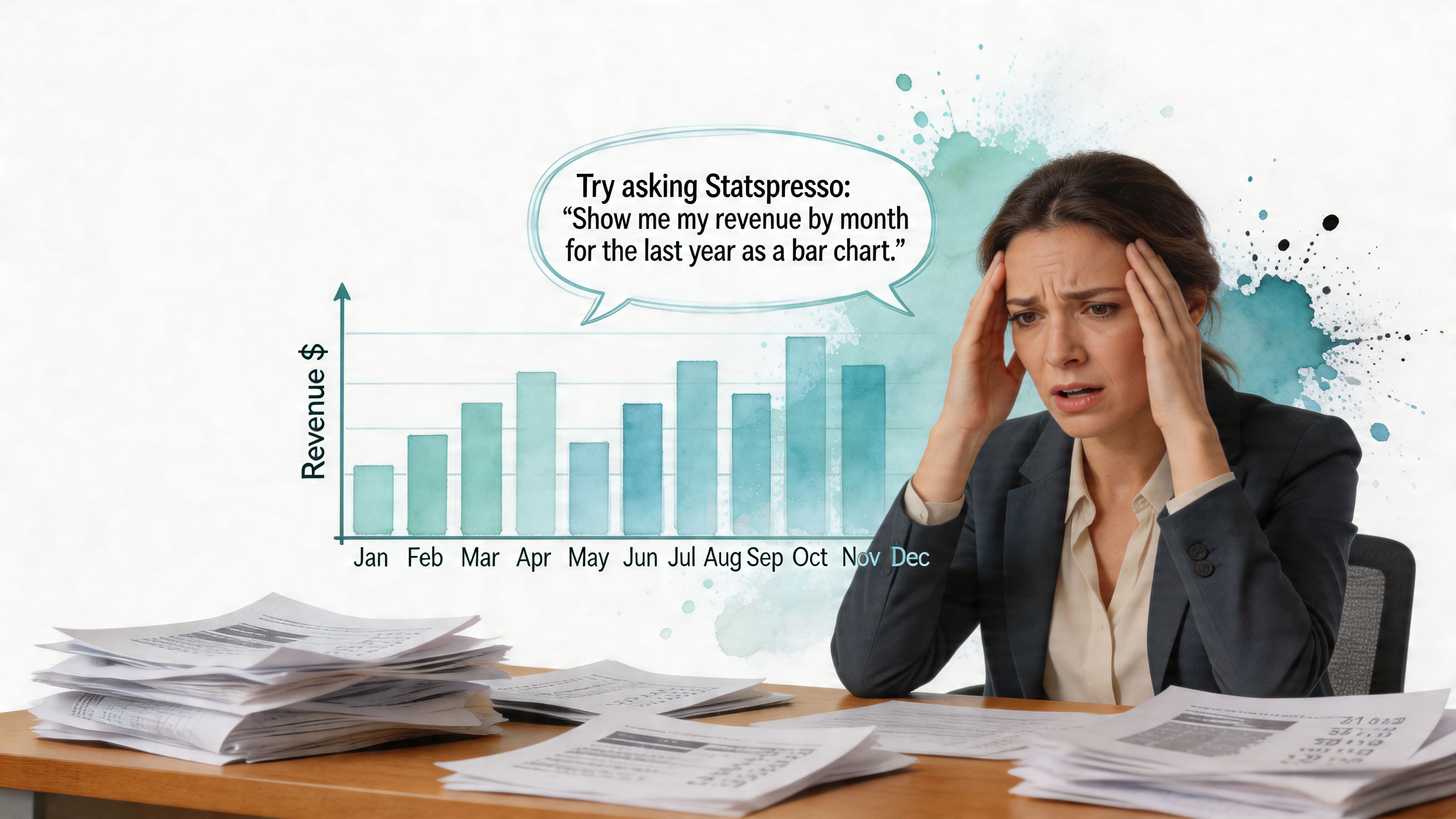
Visuals beat spreadsheets for a reason
A spreadsheet is storage. A chart is judgment support.
Rows and columns are fine when someone already knows what they’re looking for. Marketing questions rarely work that way. You need to spot a drop, compare segments, see a trend line bend, or catch the outlier that explains why CAC jumped this week. A good visual compresses all of that into a few seconds of attention.
That matters because decision windows are short. If a founder has to sit through ten minutes of filter logic before they understand the problem, the chart failed. If a campaign lead needs an analyst to explain whether the spike is good or bad, the chart failed twice.
Practical rule: If a stakeholder needs a narrated walkthrough to understand a chart, the chart isn’t doing enough work.
There’s also a direct business angle. If you’re trying to measure Marketing ROI, you need to see the relationship between spend, conversions, and revenue without squinting at five tabs and a pivot table from 2022. Visualization makes weak signal obvious. It shows when reach is rising but lead quality is falling, or when a channel looks efficient until you compare it against downstream revenue.
Slow reporting creates bad marketing decisions
I’ve built enough dashboards to know how this usually goes. A team asks for a single source of truth. What they get is a polished chart that answers last week’s version of the question.
The bigger issue is not design. It’s workflow. Traditional reporting treats every chart like a small production project. Someone requests it. Someone writes SQL. Someone fixes the joins. Someone debates the metric definition. By the time the dashboard lands, the budget has already moved.
AI changes the job from build to ask.
That shift is easy to miss, but it’s the whole story. A marketer should be able to ask, “Show paid social spend against qualified pipeline by week for the last 90 days,” get a chart, and refine it on the spot. No ticket. No waiting. No pretending a giant dashboard is more useful than a direct answer.
Three things make marketing reporting worse:
Too many KPIs: Cramming every metric into one view hides the few that drive decisions.
Static exports: Slides and screenshots go stale fast, especially when channel performance changes daily.
Specialist bottlenecks: If only SQL users can answer simple questions, the team stops asking better ones.
The point of data visualization in marketing is speed to insight. Pretty dashboards are nice. Fast answers are what save budget.
The Old Way vs The New Way of Marketing Analytics
Traditional marketing analytics asks non-technical teams to work like BI developers. That’s backwards.
A campaign lead shouldn’t need to know table joins to compare paid search performance against email-assisted conversions. A founder shouldn’t wait in a queue to see weekly pipeline trends. Yet that’s still how many teams operate. They file a request, clarify it twice, wait for a chart, then realize they needed a slightly different cut of the data.
That loop burns time and patience.
The workflow most teams still tolerate
The old way is familiar because it grew out of real constraints. Databases were hard to access. BI tools were built for specialists. Governance mattered. But the practical result is a lot of friction around simple questions.
The newer model is conversational analytics. Ask a plain-English question. Get a chart. Refine the question. Keep going.
That’s where a Conversational AI Data Analyst changes the shape of work. Instead of translating every business question into SQL first, the team starts with the question itself.
Step | The Old Way (Manual SQL & BI Tools) | The New Way (Statspresso) |
|---|---|---|
Ask a question | Write a ticket or message an analyst | Type the question in plain English |
Access the data | Wait for someone with permissions and context | Query connected sources directly through chat |
Define the metric | Clarify naming, filters, and date logic in a back-and-forth thread | Refine the prompt conversationally until the metric matches intent |
Build the chart | Open Tableau, Looker Studio, Power BI, or a notebook | Get a chart in seconds |
Make changes | Request another version | Ask a follow-up like “break that down by channel” |
Share findings | Export screenshots or rebuild for a dashboard | Share the answer or save it into a live dashboard |
Repeat next week | Start over, often from scratch | Reuse the question, update the date range, move on |
Why this shift matters
The biggest gain isn’t only speed. It’s access.
When more people can inspect data without waiting for a specialist, the team asks better follow-up questions. That’s the part old BI setups often miss. Most useful analysis is iterative. Nobody asks the perfect question the first time.
A marketer might start with “Which campaigns drove the most leads?” Then realize the core question is “Which campaigns drove qualified leads?” Then “Which channel produced leads that turned into revenue?” The old way makes each refinement expensive. The new way makes refinement normal.
Good analytics tools don’t just answer questions. They make it cheap to ask the next one.
Automated BI, Conversational Analytics, and GenBI become practical rather than trendy. They reduce the cost of curiosity. That matters more than fancy chart libraries.
Match the Right Chart to Your Marketing Metric
Most chart problems aren’t design problems. They’re matching problems.
Teams choose the wrong visual, then blame the tool. A pie chart gets asked to show trend. A line chart gets forced to compare categories. A table becomes a substitute for thinking. Data visualization in marketing gets much easier once you treat chart selection as a decision about what question the viewer should answer at a glance.
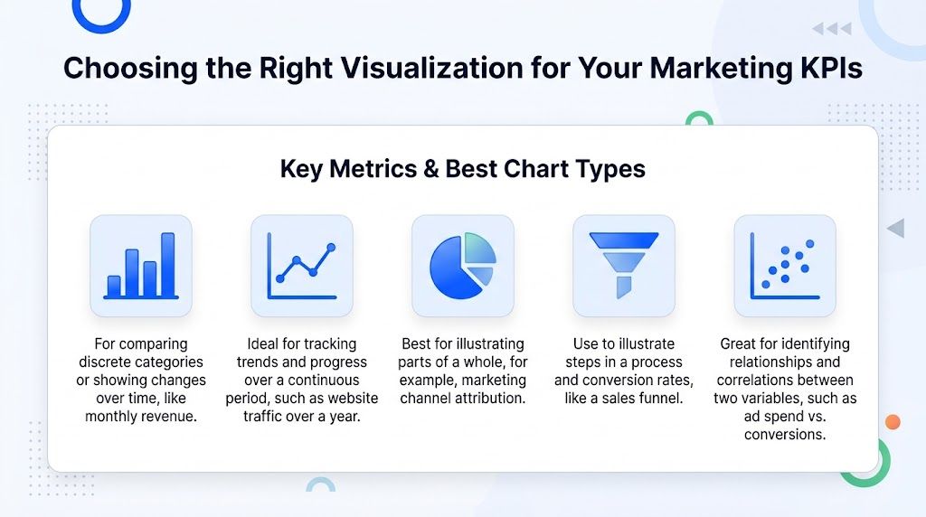
Use the chart that fits the decision
Here’s the practical version.
Line chart for trends over time: Use it for revenue, traffic, signups, retention, or email performance across weeks and months. The shape matters more than any single point.
Bar chart for comparing categories: Best for CAC by channel, conversions by campaign, or leads by source. People compare lengths faster than scattered labels.
Funnel chart for staged conversion: Use it when the business question is “where do people drop off?” Trial to activated, landing page to checkout, MQL to SQL.
Treemap for allocation: Helpful when showing budget split, revenue share, or product contribution. It’s useful when categories are many and hierarchy matters.
Scatter plot for relationships: Good for ad spend vs conversions, discount depth vs order volume, or session count vs conversion rate.
A bad chart can make a healthy campaign look broken. Or worse, make a broken campaign look “interesting.”
Common marketing metrics and the best visual for each
The pairing matters because each metric tells a different kind of story.
Marketing metric | Best chart | Why it works |
|---|---|---|
Monthly revenue or MRR | Line chart | Shows direction, momentum, seasonality, and inflection points clearly |
CAC by channel | Bar chart | Makes side-by-side efficiency differences easy to compare |
Website traffic by source | Stacked bar or grouped bar chart | Highlights contribution and mix across sources without flattening detail |
Landing page conversion steps | Funnel chart | Reveals where users abandon the process |
Budget allocation by channel | Treemap | Shows proportion of spend without creating a giant table |
Email opens and clicks over time | Line chart | Makes campaign rhythm and trend shifts visible |
Campaign ROI by campaign | Bar chart | Lets you rank and compare distinct initiatives quickly |
Ad spend vs conversions | Scatter plot | Helps spot correlation, outliers, and inefficient spend pockets |
What works and what usually doesn’t
Pie charts aren’t evil. They’re just overused. If you’re showing a simple part-to-whole split with a small number of categories, they can work. But if you’re comparing many segments or small differences, bars win almost every time.
Tables are also fine, just not as the first view. Use them when someone needs exact values after the visual has already made the pattern clear.
A few practical chart-selection rules save a lot of pain:
If time is on the x-axis, start with a line chart.
If categories compete, start with bars.
If movement through steps matters, use a funnel.
If the relationship between two variables matters, use a scatter plot.
If you can’t explain why this chart type is best, choose a simpler one.
Clarity beats novelty. Nobody ever made a better budget decision because the chart looked clever.
Five common scenarios marketers run into
Revenue trend reviews
When a founder asks, “How are we doing?” they usually mean trend, not detail. Use a line chart. Add comparison periods only if they clarify rather than clutter.
Channel efficiency reviews
When the question is “Which channel is cheapest or strongest?” use a bar chart. Don’t force channel comparison into a line chart unless time is the main variable.
Funnel troubleshooting
If trial starts look healthy but paid conversion lags, a funnel chart makes the weak stage obvious. A spreadsheet hides that in plain sight.
Mix and allocation reviews
Budget and attribution are often shown in giant tables. That’s a fast route to glazed eyes. A treemap helps stakeholders see where the business is concentrating spend or revenue.
Relationship hunting
Sometimes the goal isn’t ranking. It’s asking whether two things move together. Scatter plots are excellent for this, especially when teams are debating whether more spend is producing proportionate returns.
The easiest way to get good at chart selection is to stop asking, “What chart should I build?” and start asking, “What should the viewer notice first?”
Practical Visualization Templates for Growth Marketers
Most marketing teams don’t need a giant analytics estate. They need a handful of dependable views they can revisit every week.
The best templates are boring in the right way. They answer recurring questions, surface exceptions, and stay small enough that people use them. I’d take four sharp views over one all-purpose dashboard monster every time.
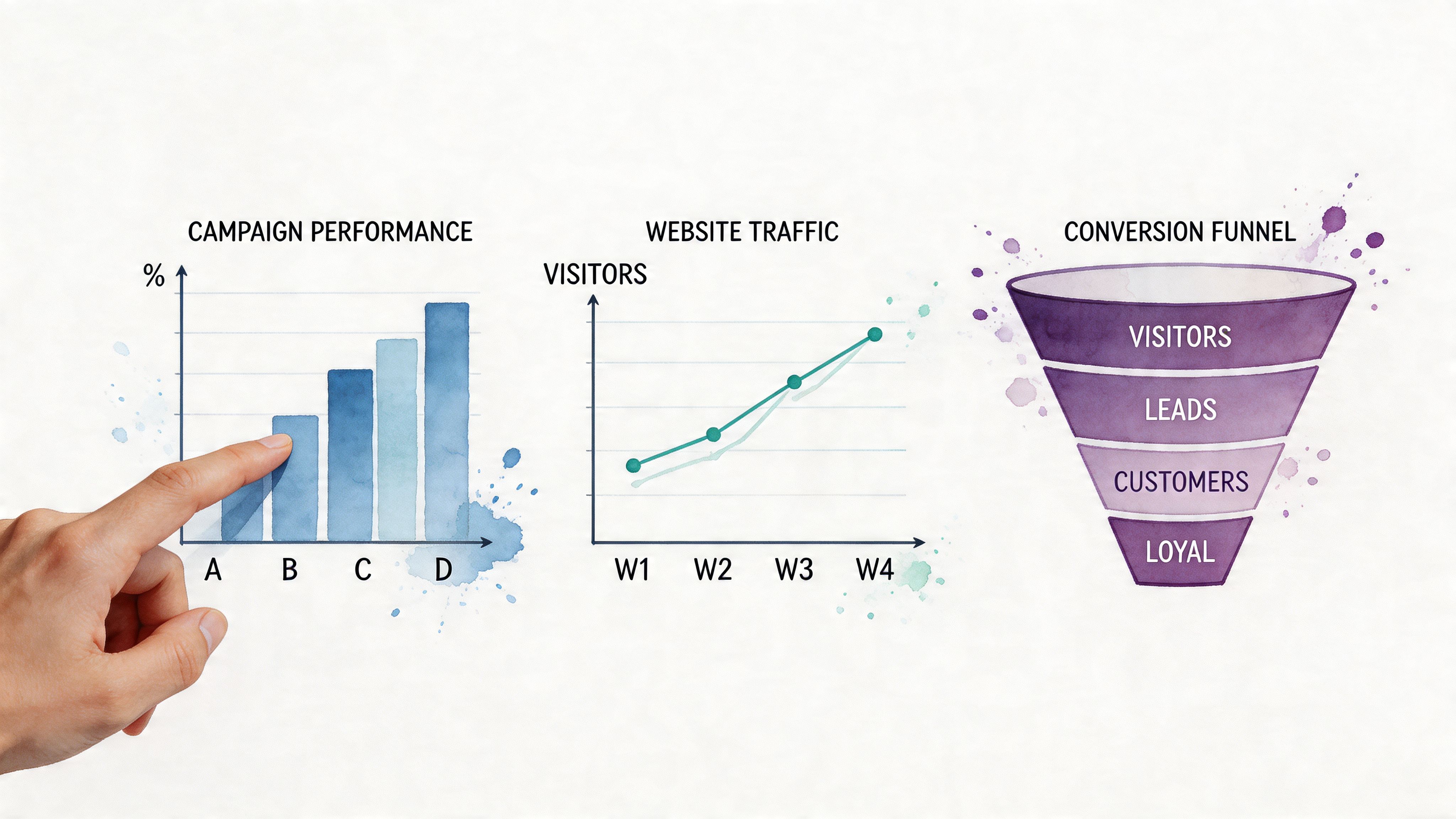
Campaign performance reporting
This is the weekly workhorse. The goal isn’t to show every click metric under the sun. The goal is to decide where to keep spending, where to pause, and where to investigate.
A practical campaign view usually includes trend, breakdown, and one efficiency lens. For example, spend over time, conversions by campaign, and cost per acquisition by channel. That combination gives context without creating a dashboard maze.
Good questions for this template:
What changed this week: Look for movement in spend, conversions, and efficiency.
Which campaigns deserve more budget: Compare outcomes, not just traffic volume.
What needs inspection: Outliers matter more than averages in campaign management.
Try asking Statspresso: “Show me conversions by campaign for the last 30 days as a bar chart.”
Try asking Statspresso: “Plot ad spend and conversions by week for the last quarter.”
Try asking Statspresso: “Break down CAC by channel and sort from lowest to highest.”
Funnel analysis
Funnels are where opinions go to meet physics.
Everyone says the top of funnel is the problem until a funnel chart shows the leak is further down. That’s why funnel analysis stays valuable. It forces the team to name the stages, define the transitions, and confront where users disappear.
A useful funnel template should show both the staged flow and a time view. The static funnel shows the bottleneck. The trend view shows whether the bottleneck is new, persistent, or getting worse.
If your funnel has ten stages, you probably have a workflow diagram, not a decision tool.
Ask questions like these:
Where is the largest drop-off: Don’t guess. Count transitions.
Did the leak start after a campaign change or product change: Pair stage data with time.
Are some sources feeding low-quality traffic: Compare funnels by source or audience.
Try asking Statspresso: “Show me a funnel from landing page visit to signup to activation to purchase.”
Try asking Statspresso: “Compare the conversion funnel for paid social vs organic search.”
Try asking Statspresso: “Show drop-off by funnel stage over time.”
Cohort and retention analysis
Many marketing dashboards get too shallow. They celebrate acquisition, then ignore whether those users stick around.
Cohort views fix that. Instead of asking how many users arrived, you ask whether users acquired in the same period behave differently over time. Marketing leaders need this because a channel that floods the funnel can still be a weak growth engine if retention collapses.
Retention visuals are often more useful as heatmaps or structured cohort tables than as generic summary charts. You want to see patterns by signup period and how behavior changes after acquisition.
Questions worth asking:
Which signup cohorts retain better: This shows whether acquisition quality is changing.
Did campaign or onboarding changes improve post-signup behavior: Pair cohorts with launch timing.
Which channel brings users who return, not just register: Acquisition volume alone can mislead.
Try asking Statspresso: “Show me user retention by weekly cohort for customers who signed up in Q1.”
Try asking Statspresso: “Compare retention by acquisition channel for new users.”
Try asking Statspresso: “Which signup cohorts had the strongest repeat purchase behavior?”
Customer lifetime value tracking
LTV reporting gets overcomplicated fast. Teams often turn it into a finance project when what they really need is a directional operating view.
For marketing use, keep it grounded. Show how customer value differs by source, segment, or first purchase month. Then compare it against acquisition cost. If one channel looks expensive up front but brings stronger long-term customers, that’s useful. If another channel looks cheap but fades quickly, that’s useful too.
This is also where visualization can reveal patterns spreadsheets hide. According to AlphaServ’s discussion of marketing visualization use cases, data visualization in marketing can expose customer behavior correlations that stay invisible in spreadsheets, including geospatial mapping of shipping addresses to identify better ad targeting zones, leading to 25-40% sales uplift via resource reallocation.
That doesn’t mean every team needs a map on day one. It means behavior patterns often become obvious only after you visualize them.
Useful prompts for LTV work:
Which channels bring the most valuable customers over time
How does first purchase month relate to repeat revenue
Are there geographic clusters worth targeted spend
Try asking Statspresso: “Show customer lifetime value by acquisition channel.”
Try asking Statspresso: “Map revenue by customer region.”
Try asking Statspresso: “Compare repeat purchase rate for customers acquired from email, paid search, and paid social.”
Keep templates small enough to survive
If you’re building these views for a real team, a few trade-offs matter:
Favor one question per view: Mixed-purpose dashboards get ignored.
Use exact labels: “Leads” means different things to different teams.
Limit filters: More control sounds helpful until nobody knows what they’re looking at.
Design for conversation: A dashboard should trigger next actions, not just reporting rituals.
The best marketing visualization templates aren’t impressive. They’re reusable. That’s better.
From Raw Data to an Actionable Story
A chart without a decision attached is just organized decoration.
This is the part teams often skip. They finally get the dashboard right, then still struggle in the meeting because nobody translates the visual into a recommendation. Data visualization in marketing only pays off when somebody can answer three questions quickly: what happened, why it matters, and what to do next.

Start with usable data, not perfect data
Teams often delay analysis because the data model isn’t pristine. That’s understandable, but it’s also how useful work gets postponed forever.
You don’t need a perfect warehouse to begin. You need enough consistency to define the metric, filter the timeframe, and trust the direction of the result. Clean what affects the decision first. Fix the rest as you go.
Three prep habits help:
Standardize names that break interpretation: Channel labels and lifecycle stages matter.
Check date logic early: Misaligned time windows create fake stories.
Define key metrics plainly: If two teams define “conversion” differently, no chart will save the meeting.
Build smaller dashboards with sharper intent
Most dashboards are too broad. They try to answer everything, so they answer nothing cleanly.
The better pattern is a focused dashboard tied to one operating question. Campaign efficiency. Funnel leakage. Retention quality. Executive summary. Separate views are not a failure. They’re usually a sign that the builder respected the audience.
There’s a practical reason for this too. According to the University of Wisconsin Parkside analysis on how data visualization transforms strategy, expert use of data visualization techniques yields a 44% increase in engagement metrics, and interactive dashboards with drill-down capability reduce decision latency by 67%.
That second figure matters a lot. Faster decisions aren’t a vanity metric. They’re what let teams reallocate spend while a campaign is still alive.
The dashboard should fit the meeting. If the audience needs a tour guide, the dashboard is too big.
Use a simple storytelling format
I’ve seen analysts lose a room with a technically correct chart because they opened with method instead of meaning.
Use this sequence instead:
State the finding “Paid social is producing volume, but email is converting more efficiently.”
Show the evidence Use one visual that makes the contrast obvious.
Recommend the action “Shift budget from the weakest ad set into the stronger nurture sequence and monitor conversion quality next week.”
That’s it. You don’t need theatrical storytelling. You need disciplined storytelling.
This approach also works well in adjacent channels. If you’re looking at creator campaigns, for example, the practical challenge isn’t collecting more post-campaign metrics. It’s turning influencer tracking insights into action so spend, creative direction, and channel choices improve.
A few habits make stories more actionable:
Lead with the implication: Don’t bury the business impact under chart setup.
Show one main visual per point: Multiple charts per claim usually dilute the message.
Name the next move: If no action follows, the insight is unfinished.
Good analytics doesn’t stop at “interesting.” It ends at “do this next.”
How to Implement AI-Driven Analytics Today
The old assumption is that analytics implementation means a long project. New warehouse. New BI layer. New training plan. A lot of meetings with tabs open and little progress.
That assumption is outdated.
Modern Automated BI and Generative BI, often shortened to GenBI, can start with the systems you already use. Shopify, HubSpot, Postgres, product events, CRM records. Connect the source, define a few trusted metrics, and start asking questions in plain English.
What a practical rollout looks like
The simplest rollout is not company-wide. It’s one team, one data source, one repeated question.
Start with a narrow use case:
Campaign review: “Which channels produced the most conversions last month?”
Funnel check: “Where do trial users drop off before activation?”
Retention look: “Do users from paid search come back less often than email-acquired users?”
If the system can answer those reliably, people will keep using it. If you begin with a grand analytics transformation plan, you’ll spend more time architecting than learning.
Where conversational analytics helps most
This model works especially well when the team needs speed more than dashboard craftsmanship.
A growth lead wants a chart for the weekly meeting. A product manager wants to compare cohorts without opening SQL. A founder wants a clean visual before speaking to investors. Those are practical moments where conversational analytics beats the old request queue.
For a deeper look at what this workflow can look like in practice, Statspresso has a useful guide on automated data visualization.
Start with the question people already ask every week. If AI can answer that cleanly, adoption gets a lot easier.
What to avoid on day one
A few mistakes show up over and over:
Don’t connect everything at once: More sources usually means more ambiguity.
Don’t begin with edge cases: Start with stable, high-value questions.
Don’t chase visual perfection: Speed to insight matters more than pixel polish.
Don’t skip metric definitions: Conversational tools still need trustworthy business logic.
The best implementation is boringly useful. Connect the data. Ask a real question. Save the chart people keep needing. Repeat.
Key Takeaways for Busy Leaders (The TL;DR)
If your team asks the same five marketing questions every week, you do not have a reporting problem. You have a speed problem.
The useful shift is simple. Stop treating data visualization like a specialist build project and start treating it like a question-answer workflow. Ask for the chart you need, check the result, make the decision, then get back to work.
Faster understanding beats more reporting: Raw data rarely changes a decision on its own. A clear answer, delivered quickly, does.
Good visuals shorten the path to action: People grasp patterns in charts faster than in tables or slide-sized blocks of text. That is why a decent chart delivered today usually beats a perfect dashboard delivered next month.
Traditional reporting creates drag: SQL requests, BI backlogs, and static dashboards turn ordinary marketing questions into multi-step projects.
Conversational analytics cuts that drag: A marketer can ask a plain-English question, get a chart, refine it, and move on without waiting in line.
Chart choice still matters: Line charts show trends, bar charts compare categories, funnels show stage drop-off, treemaps show allocation, and scatter plots reveal relationships.
Small templates cover most real decisions: Campaign pacing, funnel performance, retention cohorts, and LTV by channel handle a large share of weekly growth analysis.
A chart alone is incomplete: Pair it with a takeaway and a next step. Otherwise it is just decoration with axis labels.
Start narrow: Connect one clean data source, answer one repeated business question, then expand after the team trusts the output.
Speed to insight is the actual win: The goal is not a prettier analytics stack. The goal is getting useful answers while the campaign can still be changed.
If you're tired of waiting on dashboards and want a Conversational AI Data Analyst that turns plain-English questions into charts, try Statspresso. Connect your first data source for free and ask your first question.
You already know the scene. A marketer asks for a “quick chart” on channel performance. A PM wants to see where trial users drop off. The founder wants answers before the next standup. Then everyone waits while someone pulls CSVs, writes SQL, fixes naming issues, and builds a dashboard nobody fully trusts.
Waiting weeks for a data analyst to build a dashboard is a relic of the past. Marketing moves too fast for that. The goal isn’t prettier reporting. It’s seeing what matters fast enough to do something about it.
Stop Drowning in Data and Start Seeing Answers
Monday, 9:12 a.m. Paid search looks expensive, email looks fine, and revenue still feels soft. The CMO wants to know which channel is pulling its weight before lunch. The numbers exist somewhere. The answer does not.
That gap is the core problem.
Marketing teams rarely lack data. They lack a fast way to turn scattered data into a picture someone can act on. Shopify shows sales. HubSpot shows pipeline. Meta Ads shows spend. GA4 shows traffic, sort of. Then there’s the spreadsheet with hand-fixed campaign names because nobody agreed on naming conventions in March.

Visuals beat spreadsheets for a reason
A spreadsheet is storage. A chart is judgment support.
Rows and columns are fine when someone already knows what they’re looking for. Marketing questions rarely work that way. You need to spot a drop, compare segments, see a trend line bend, or catch the outlier that explains why CAC jumped this week. A good visual compresses all of that into a few seconds of attention.
That matters because decision windows are short. If a founder has to sit through ten minutes of filter logic before they understand the problem, the chart failed. If a campaign lead needs an analyst to explain whether the spike is good or bad, the chart failed twice.
Practical rule: If a stakeholder needs a narrated walkthrough to understand a chart, the chart isn’t doing enough work.
There’s also a direct business angle. If you’re trying to measure Marketing ROI, you need to see the relationship between spend, conversions, and revenue without squinting at five tabs and a pivot table from 2022. Visualization makes weak signal obvious. It shows when reach is rising but lead quality is falling, or when a channel looks efficient until you compare it against downstream revenue.
Slow reporting creates bad marketing decisions
I’ve built enough dashboards to know how this usually goes. A team asks for a single source of truth. What they get is a polished chart that answers last week’s version of the question.
The bigger issue is not design. It’s workflow. Traditional reporting treats every chart like a small production project. Someone requests it. Someone writes SQL. Someone fixes the joins. Someone debates the metric definition. By the time the dashboard lands, the budget has already moved.
AI changes the job from build to ask.
That shift is easy to miss, but it’s the whole story. A marketer should be able to ask, “Show paid social spend against qualified pipeline by week for the last 90 days,” get a chart, and refine it on the spot. No ticket. No waiting. No pretending a giant dashboard is more useful than a direct answer.
Three things make marketing reporting worse:
Too many KPIs: Cramming every metric into one view hides the few that drive decisions.
Static exports: Slides and screenshots go stale fast, especially when channel performance changes daily.
Specialist bottlenecks: If only SQL users can answer simple questions, the team stops asking better ones.
The point of data visualization in marketing is speed to insight. Pretty dashboards are nice. Fast answers are what save budget.
The Old Way vs The New Way of Marketing Analytics
Traditional marketing analytics asks non-technical teams to work like BI developers. That’s backwards.
A campaign lead shouldn’t need to know table joins to compare paid search performance against email-assisted conversions. A founder shouldn’t wait in a queue to see weekly pipeline trends. Yet that’s still how many teams operate. They file a request, clarify it twice, wait for a chart, then realize they needed a slightly different cut of the data.
That loop burns time and patience.
The workflow most teams still tolerate
The old way is familiar because it grew out of real constraints. Databases were hard to access. BI tools were built for specialists. Governance mattered. But the practical result is a lot of friction around simple questions.
The newer model is conversational analytics. Ask a plain-English question. Get a chart. Refine the question. Keep going.
That’s where a Conversational AI Data Analyst changes the shape of work. Instead of translating every business question into SQL first, the team starts with the question itself.
Step | The Old Way (Manual SQL & BI Tools) | The New Way (Statspresso) |
|---|---|---|
Ask a question | Write a ticket or message an analyst | Type the question in plain English |
Access the data | Wait for someone with permissions and context | Query connected sources directly through chat |
Define the metric | Clarify naming, filters, and date logic in a back-and-forth thread | Refine the prompt conversationally until the metric matches intent |
Build the chart | Open Tableau, Looker Studio, Power BI, or a notebook | Get a chart in seconds |
Make changes | Request another version | Ask a follow-up like “break that down by channel” |
Share findings | Export screenshots or rebuild for a dashboard | Share the answer or save it into a live dashboard |
Repeat next week | Start over, often from scratch | Reuse the question, update the date range, move on |
Why this shift matters
The biggest gain isn’t only speed. It’s access.
When more people can inspect data without waiting for a specialist, the team asks better follow-up questions. That’s the part old BI setups often miss. Most useful analysis is iterative. Nobody asks the perfect question the first time.
A marketer might start with “Which campaigns drove the most leads?” Then realize the core question is “Which campaigns drove qualified leads?” Then “Which channel produced leads that turned into revenue?” The old way makes each refinement expensive. The new way makes refinement normal.
Good analytics tools don’t just answer questions. They make it cheap to ask the next one.
Automated BI, Conversational Analytics, and GenBI become practical rather than trendy. They reduce the cost of curiosity. That matters more than fancy chart libraries.
Match the Right Chart to Your Marketing Metric
Most chart problems aren’t design problems. They’re matching problems.
Teams choose the wrong visual, then blame the tool. A pie chart gets asked to show trend. A line chart gets forced to compare categories. A table becomes a substitute for thinking. Data visualization in marketing gets much easier once you treat chart selection as a decision about what question the viewer should answer at a glance.

Use the chart that fits the decision
Here’s the practical version.
Line chart for trends over time: Use it for revenue, traffic, signups, retention, or email performance across weeks and months. The shape matters more than any single point.
Bar chart for comparing categories: Best for CAC by channel, conversions by campaign, or leads by source. People compare lengths faster than scattered labels.
Funnel chart for staged conversion: Use it when the business question is “where do people drop off?” Trial to activated, landing page to checkout, MQL to SQL.
Treemap for allocation: Helpful when showing budget split, revenue share, or product contribution. It’s useful when categories are many and hierarchy matters.
Scatter plot for relationships: Good for ad spend vs conversions, discount depth vs order volume, or session count vs conversion rate.
A bad chart can make a healthy campaign look broken. Or worse, make a broken campaign look “interesting.”
Common marketing metrics and the best visual for each
The pairing matters because each metric tells a different kind of story.
Marketing metric | Best chart | Why it works |
|---|---|---|
Monthly revenue or MRR | Line chart | Shows direction, momentum, seasonality, and inflection points clearly |
CAC by channel | Bar chart | Makes side-by-side efficiency differences easy to compare |
Website traffic by source | Stacked bar or grouped bar chart | Highlights contribution and mix across sources without flattening detail |
Landing page conversion steps | Funnel chart | Reveals where users abandon the process |
Budget allocation by channel | Treemap | Shows proportion of spend without creating a giant table |
Email opens and clicks over time | Line chart | Makes campaign rhythm and trend shifts visible |
Campaign ROI by campaign | Bar chart | Lets you rank and compare distinct initiatives quickly |
Ad spend vs conversions | Scatter plot | Helps spot correlation, outliers, and inefficient spend pockets |
What works and what usually doesn’t
Pie charts aren’t evil. They’re just overused. If you’re showing a simple part-to-whole split with a small number of categories, they can work. But if you’re comparing many segments or small differences, bars win almost every time.
Tables are also fine, just not as the first view. Use them when someone needs exact values after the visual has already made the pattern clear.
A few practical chart-selection rules save a lot of pain:
If time is on the x-axis, start with a line chart.
If categories compete, start with bars.
If movement through steps matters, use a funnel.
If the relationship between two variables matters, use a scatter plot.
If you can’t explain why this chart type is best, choose a simpler one.
Clarity beats novelty. Nobody ever made a better budget decision because the chart looked clever.
Five common scenarios marketers run into
Revenue trend reviews
When a founder asks, “How are we doing?” they usually mean trend, not detail. Use a line chart. Add comparison periods only if they clarify rather than clutter.
Channel efficiency reviews
When the question is “Which channel is cheapest or strongest?” use a bar chart. Don’t force channel comparison into a line chart unless time is the main variable.
Funnel troubleshooting
If trial starts look healthy but paid conversion lags, a funnel chart makes the weak stage obvious. A spreadsheet hides that in plain sight.
Mix and allocation reviews
Budget and attribution are often shown in giant tables. That’s a fast route to glazed eyes. A treemap helps stakeholders see where the business is concentrating spend or revenue.
Relationship hunting
Sometimes the goal isn’t ranking. It’s asking whether two things move together. Scatter plots are excellent for this, especially when teams are debating whether more spend is producing proportionate returns.
The easiest way to get good at chart selection is to stop asking, “What chart should I build?” and start asking, “What should the viewer notice first?”
Practical Visualization Templates for Growth Marketers
Most marketing teams don’t need a giant analytics estate. They need a handful of dependable views they can revisit every week.
The best templates are boring in the right way. They answer recurring questions, surface exceptions, and stay small enough that people use them. I’d take four sharp views over one all-purpose dashboard monster every time.

Campaign performance reporting
This is the weekly workhorse. The goal isn’t to show every click metric under the sun. The goal is to decide where to keep spending, where to pause, and where to investigate.
A practical campaign view usually includes trend, breakdown, and one efficiency lens. For example, spend over time, conversions by campaign, and cost per acquisition by channel. That combination gives context without creating a dashboard maze.
Good questions for this template:
What changed this week: Look for movement in spend, conversions, and efficiency.
Which campaigns deserve more budget: Compare outcomes, not just traffic volume.
What needs inspection: Outliers matter more than averages in campaign management.
Try asking Statspresso: “Show me conversions by campaign for the last 30 days as a bar chart.”
Try asking Statspresso: “Plot ad spend and conversions by week for the last quarter.”
Try asking Statspresso: “Break down CAC by channel and sort from lowest to highest.”
Funnel analysis
Funnels are where opinions go to meet physics.
Everyone says the top of funnel is the problem until a funnel chart shows the leak is further down. That’s why funnel analysis stays valuable. It forces the team to name the stages, define the transitions, and confront where users disappear.
A useful funnel template should show both the staged flow and a time view. The static funnel shows the bottleneck. The trend view shows whether the bottleneck is new, persistent, or getting worse.
If your funnel has ten stages, you probably have a workflow diagram, not a decision tool.
Ask questions like these:
Where is the largest drop-off: Don’t guess. Count transitions.
Did the leak start after a campaign change or product change: Pair stage data with time.
Are some sources feeding low-quality traffic: Compare funnels by source or audience.
Try asking Statspresso: “Show me a funnel from landing page visit to signup to activation to purchase.”
Try asking Statspresso: “Compare the conversion funnel for paid social vs organic search.”
Try asking Statspresso: “Show drop-off by funnel stage over time.”
Cohort and retention analysis
Many marketing dashboards get too shallow. They celebrate acquisition, then ignore whether those users stick around.
Cohort views fix that. Instead of asking how many users arrived, you ask whether users acquired in the same period behave differently over time. Marketing leaders need this because a channel that floods the funnel can still be a weak growth engine if retention collapses.
Retention visuals are often more useful as heatmaps or structured cohort tables than as generic summary charts. You want to see patterns by signup period and how behavior changes after acquisition.
Questions worth asking:
Which signup cohorts retain better: This shows whether acquisition quality is changing.
Did campaign or onboarding changes improve post-signup behavior: Pair cohorts with launch timing.
Which channel brings users who return, not just register: Acquisition volume alone can mislead.
Try asking Statspresso: “Show me user retention by weekly cohort for customers who signed up in Q1.”
Try asking Statspresso: “Compare retention by acquisition channel for new users.”
Try asking Statspresso: “Which signup cohorts had the strongest repeat purchase behavior?”
Customer lifetime value tracking
LTV reporting gets overcomplicated fast. Teams often turn it into a finance project when what they really need is a directional operating view.
For marketing use, keep it grounded. Show how customer value differs by source, segment, or first purchase month. Then compare it against acquisition cost. If one channel looks expensive up front but brings stronger long-term customers, that’s useful. If another channel looks cheap but fades quickly, that’s useful too.
This is also where visualization can reveal patterns spreadsheets hide. According to AlphaServ’s discussion of marketing visualization use cases, data visualization in marketing can expose customer behavior correlations that stay invisible in spreadsheets, including geospatial mapping of shipping addresses to identify better ad targeting zones, leading to 25-40% sales uplift via resource reallocation.
That doesn’t mean every team needs a map on day one. It means behavior patterns often become obvious only after you visualize them.
Useful prompts for LTV work:
Which channels bring the most valuable customers over time
How does first purchase month relate to repeat revenue
Are there geographic clusters worth targeted spend
Try asking Statspresso: “Show customer lifetime value by acquisition channel.”
Try asking Statspresso: “Map revenue by customer region.”
Try asking Statspresso: “Compare repeat purchase rate for customers acquired from email, paid search, and paid social.”
Keep templates small enough to survive
If you’re building these views for a real team, a few trade-offs matter:
Favor one question per view: Mixed-purpose dashboards get ignored.
Use exact labels: “Leads” means different things to different teams.
Limit filters: More control sounds helpful until nobody knows what they’re looking at.
Design for conversation: A dashboard should trigger next actions, not just reporting rituals.
The best marketing visualization templates aren’t impressive. They’re reusable. That’s better.
From Raw Data to an Actionable Story
A chart without a decision attached is just organized decoration.
This is the part teams often skip. They finally get the dashboard right, then still struggle in the meeting because nobody translates the visual into a recommendation. Data visualization in marketing only pays off when somebody can answer three questions quickly: what happened, why it matters, and what to do next.

Start with usable data, not perfect data
Teams often delay analysis because the data model isn’t pristine. That’s understandable, but it’s also how useful work gets postponed forever.
You don’t need a perfect warehouse to begin. You need enough consistency to define the metric, filter the timeframe, and trust the direction of the result. Clean what affects the decision first. Fix the rest as you go.
Three prep habits help:
Standardize names that break interpretation: Channel labels and lifecycle stages matter.
Check date logic early: Misaligned time windows create fake stories.
Define key metrics plainly: If two teams define “conversion” differently, no chart will save the meeting.
Build smaller dashboards with sharper intent
Most dashboards are too broad. They try to answer everything, so they answer nothing cleanly.
The better pattern is a focused dashboard tied to one operating question. Campaign efficiency. Funnel leakage. Retention quality. Executive summary. Separate views are not a failure. They’re usually a sign that the builder respected the audience.
There’s a practical reason for this too. According to the University of Wisconsin Parkside analysis on how data visualization transforms strategy, expert use of data visualization techniques yields a 44% increase in engagement metrics, and interactive dashboards with drill-down capability reduce decision latency by 67%.
That second figure matters a lot. Faster decisions aren’t a vanity metric. They’re what let teams reallocate spend while a campaign is still alive.
The dashboard should fit the meeting. If the audience needs a tour guide, the dashboard is too big.
Use a simple storytelling format
I’ve seen analysts lose a room with a technically correct chart because they opened with method instead of meaning.
Use this sequence instead:
State the finding “Paid social is producing volume, but email is converting more efficiently.”
Show the evidence Use one visual that makes the contrast obvious.
Recommend the action “Shift budget from the weakest ad set into the stronger nurture sequence and monitor conversion quality next week.”
That’s it. You don’t need theatrical storytelling. You need disciplined storytelling.
This approach also works well in adjacent channels. If you’re looking at creator campaigns, for example, the practical challenge isn’t collecting more post-campaign metrics. It’s turning influencer tracking insights into action so spend, creative direction, and channel choices improve.
A few habits make stories more actionable:
Lead with the implication: Don’t bury the business impact under chart setup.
Show one main visual per point: Multiple charts per claim usually dilute the message.
Name the next move: If no action follows, the insight is unfinished.
Good analytics doesn’t stop at “interesting.” It ends at “do this next.”
How to Implement AI-Driven Analytics Today
The old assumption is that analytics implementation means a long project. New warehouse. New BI layer. New training plan. A lot of meetings with tabs open and little progress.
That assumption is outdated.
Modern Automated BI and Generative BI, often shortened to GenBI, can start with the systems you already use. Shopify, HubSpot, Postgres, product events, CRM records. Connect the source, define a few trusted metrics, and start asking questions in plain English.
What a practical rollout looks like
The simplest rollout is not company-wide. It’s one team, one data source, one repeated question.
Start with a narrow use case:
Campaign review: “Which channels produced the most conversions last month?”
Funnel check: “Where do trial users drop off before activation?”
Retention look: “Do users from paid search come back less often than email-acquired users?”
If the system can answer those reliably, people will keep using it. If you begin with a grand analytics transformation plan, you’ll spend more time architecting than learning.
Where conversational analytics helps most
This model works especially well when the team needs speed more than dashboard craftsmanship.
A growth lead wants a chart for the weekly meeting. A product manager wants to compare cohorts without opening SQL. A founder wants a clean visual before speaking to investors. Those are practical moments where conversational analytics beats the old request queue.
For a deeper look at what this workflow can look like in practice, Statspresso has a useful guide on automated data visualization.
Start with the question people already ask every week. If AI can answer that cleanly, adoption gets a lot easier.
What to avoid on day one
A few mistakes show up over and over:
Don’t connect everything at once: More sources usually means more ambiguity.
Don’t begin with edge cases: Start with stable, high-value questions.
Don’t chase visual perfection: Speed to insight matters more than pixel polish.
Don’t skip metric definitions: Conversational tools still need trustworthy business logic.
The best implementation is boringly useful. Connect the data. Ask a real question. Save the chart people keep needing. Repeat.
Key Takeaways for Busy Leaders (The TL;DR)
If your team asks the same five marketing questions every week, you do not have a reporting problem. You have a speed problem.
The useful shift is simple. Stop treating data visualization like a specialist build project and start treating it like a question-answer workflow. Ask for the chart you need, check the result, make the decision, then get back to work.
Faster understanding beats more reporting: Raw data rarely changes a decision on its own. A clear answer, delivered quickly, does.
Good visuals shorten the path to action: People grasp patterns in charts faster than in tables or slide-sized blocks of text. That is why a decent chart delivered today usually beats a perfect dashboard delivered next month.
Traditional reporting creates drag: SQL requests, BI backlogs, and static dashboards turn ordinary marketing questions into multi-step projects.
Conversational analytics cuts that drag: A marketer can ask a plain-English question, get a chart, refine it, and move on without waiting in line.
Chart choice still matters: Line charts show trends, bar charts compare categories, funnels show stage drop-off, treemaps show allocation, and scatter plots reveal relationships.
Small templates cover most real decisions: Campaign pacing, funnel performance, retention cohorts, and LTV by channel handle a large share of weekly growth analysis.
A chart alone is incomplete: Pair it with a takeaway and a next step. Otherwise it is just decoration with axis labels.
Start narrow: Connect one clean data source, answer one repeated business question, then expand after the team trusts the output.
Speed to insight is the actual win: The goal is not a prettier analytics stack. The goal is getting useful answers while the campaign can still be changed.
If you're tired of waiting on dashboards and want a Conversational AI Data Analyst that turns plain-English questions into charts, try Statspresso. Connect your first data source for free and ask your first question.
You already know the scene. A marketer asks for a “quick chart” on channel performance. A PM wants to see where trial users drop off. The founder wants answers before the next standup. Then everyone waits while someone pulls CSVs, writes SQL, fixes naming issues, and builds a dashboard nobody fully trusts.
Waiting weeks for a data analyst to build a dashboard is a relic of the past. Marketing moves too fast for that. The goal isn’t prettier reporting. It’s seeing what matters fast enough to do something about it.
Stop Drowning in Data and Start Seeing Answers
Monday, 9:12 a.m. Paid search looks expensive, email looks fine, and revenue still feels soft. The CMO wants to know which channel is pulling its weight before lunch. The numbers exist somewhere. The answer does not.
That gap is the core problem.
Marketing teams rarely lack data. They lack a fast way to turn scattered data into a picture someone can act on. Shopify shows sales. HubSpot shows pipeline. Meta Ads shows spend. GA4 shows traffic, sort of. Then there’s the spreadsheet with hand-fixed campaign names because nobody agreed on naming conventions in March.

Visuals beat spreadsheets for a reason
A spreadsheet is storage. A chart is judgment support.
Rows and columns are fine when someone already knows what they’re looking for. Marketing questions rarely work that way. You need to spot a drop, compare segments, see a trend line bend, or catch the outlier that explains why CAC jumped this week. A good visual compresses all of that into a few seconds of attention.
That matters because decision windows are short. If a founder has to sit through ten minutes of filter logic before they understand the problem, the chart failed. If a campaign lead needs an analyst to explain whether the spike is good or bad, the chart failed twice.
Practical rule: If a stakeholder needs a narrated walkthrough to understand a chart, the chart isn’t doing enough work.
There’s also a direct business angle. If you’re trying to measure Marketing ROI, you need to see the relationship between spend, conversions, and revenue without squinting at five tabs and a pivot table from 2022. Visualization makes weak signal obvious. It shows when reach is rising but lead quality is falling, or when a channel looks efficient until you compare it against downstream revenue.
Slow reporting creates bad marketing decisions
I’ve built enough dashboards to know how this usually goes. A team asks for a single source of truth. What they get is a polished chart that answers last week’s version of the question.
The bigger issue is not design. It’s workflow. Traditional reporting treats every chart like a small production project. Someone requests it. Someone writes SQL. Someone fixes the joins. Someone debates the metric definition. By the time the dashboard lands, the budget has already moved.
AI changes the job from build to ask.
That shift is easy to miss, but it’s the whole story. A marketer should be able to ask, “Show paid social spend against qualified pipeline by week for the last 90 days,” get a chart, and refine it on the spot. No ticket. No waiting. No pretending a giant dashboard is more useful than a direct answer.
Three things make marketing reporting worse:
Too many KPIs: Cramming every metric into one view hides the few that drive decisions.
Static exports: Slides and screenshots go stale fast, especially when channel performance changes daily.
Specialist bottlenecks: If only SQL users can answer simple questions, the team stops asking better ones.
The point of data visualization in marketing is speed to insight. Pretty dashboards are nice. Fast answers are what save budget.
The Old Way vs The New Way of Marketing Analytics
Traditional marketing analytics asks non-technical teams to work like BI developers. That’s backwards.
A campaign lead shouldn’t need to know table joins to compare paid search performance against email-assisted conversions. A founder shouldn’t wait in a queue to see weekly pipeline trends. Yet that’s still how many teams operate. They file a request, clarify it twice, wait for a chart, then realize they needed a slightly different cut of the data.
That loop burns time and patience.
The workflow most teams still tolerate
The old way is familiar because it grew out of real constraints. Databases were hard to access. BI tools were built for specialists. Governance mattered. But the practical result is a lot of friction around simple questions.
The newer model is conversational analytics. Ask a plain-English question. Get a chart. Refine the question. Keep going.
That’s where a Conversational AI Data Analyst changes the shape of work. Instead of translating every business question into SQL first, the team starts with the question itself.
Step | The Old Way (Manual SQL & BI Tools) | The New Way (Statspresso) |
|---|---|---|
Ask a question | Write a ticket or message an analyst | Type the question in plain English |
Access the data | Wait for someone with permissions and context | Query connected sources directly through chat |
Define the metric | Clarify naming, filters, and date logic in a back-and-forth thread | Refine the prompt conversationally until the metric matches intent |
Build the chart | Open Tableau, Looker Studio, Power BI, or a notebook | Get a chart in seconds |
Make changes | Request another version | Ask a follow-up like “break that down by channel” |
Share findings | Export screenshots or rebuild for a dashboard | Share the answer or save it into a live dashboard |
Repeat next week | Start over, often from scratch | Reuse the question, update the date range, move on |
Why this shift matters
The biggest gain isn’t only speed. It’s access.
When more people can inspect data without waiting for a specialist, the team asks better follow-up questions. That’s the part old BI setups often miss. Most useful analysis is iterative. Nobody asks the perfect question the first time.
A marketer might start with “Which campaigns drove the most leads?” Then realize the core question is “Which campaigns drove qualified leads?” Then “Which channel produced leads that turned into revenue?” The old way makes each refinement expensive. The new way makes refinement normal.
Good analytics tools don’t just answer questions. They make it cheap to ask the next one.
Automated BI, Conversational Analytics, and GenBI become practical rather than trendy. They reduce the cost of curiosity. That matters more than fancy chart libraries.
Match the Right Chart to Your Marketing Metric
Most chart problems aren’t design problems. They’re matching problems.
Teams choose the wrong visual, then blame the tool. A pie chart gets asked to show trend. A line chart gets forced to compare categories. A table becomes a substitute for thinking. Data visualization in marketing gets much easier once you treat chart selection as a decision about what question the viewer should answer at a glance.

Use the chart that fits the decision
Here’s the practical version.
Line chart for trends over time: Use it for revenue, traffic, signups, retention, or email performance across weeks and months. The shape matters more than any single point.
Bar chart for comparing categories: Best for CAC by channel, conversions by campaign, or leads by source. People compare lengths faster than scattered labels.
Funnel chart for staged conversion: Use it when the business question is “where do people drop off?” Trial to activated, landing page to checkout, MQL to SQL.
Treemap for allocation: Helpful when showing budget split, revenue share, or product contribution. It’s useful when categories are many and hierarchy matters.
Scatter plot for relationships: Good for ad spend vs conversions, discount depth vs order volume, or session count vs conversion rate.
A bad chart can make a healthy campaign look broken. Or worse, make a broken campaign look “interesting.”
Common marketing metrics and the best visual for each
The pairing matters because each metric tells a different kind of story.
Marketing metric | Best chart | Why it works |
|---|---|---|
Monthly revenue or MRR | Line chart | Shows direction, momentum, seasonality, and inflection points clearly |
CAC by channel | Bar chart | Makes side-by-side efficiency differences easy to compare |
Website traffic by source | Stacked bar or grouped bar chart | Highlights contribution and mix across sources without flattening detail |
Landing page conversion steps | Funnel chart | Reveals where users abandon the process |
Budget allocation by channel | Treemap | Shows proportion of spend without creating a giant table |
Email opens and clicks over time | Line chart | Makes campaign rhythm and trend shifts visible |
Campaign ROI by campaign | Bar chart | Lets you rank and compare distinct initiatives quickly |
Ad spend vs conversions | Scatter plot | Helps spot correlation, outliers, and inefficient spend pockets |
What works and what usually doesn’t
Pie charts aren’t evil. They’re just overused. If you’re showing a simple part-to-whole split with a small number of categories, they can work. But if you’re comparing many segments or small differences, bars win almost every time.
Tables are also fine, just not as the first view. Use them when someone needs exact values after the visual has already made the pattern clear.
A few practical chart-selection rules save a lot of pain:
If time is on the x-axis, start with a line chart.
If categories compete, start with bars.
If movement through steps matters, use a funnel.
If the relationship between two variables matters, use a scatter plot.
If you can’t explain why this chart type is best, choose a simpler one.
Clarity beats novelty. Nobody ever made a better budget decision because the chart looked clever.
Five common scenarios marketers run into
Revenue trend reviews
When a founder asks, “How are we doing?” they usually mean trend, not detail. Use a line chart. Add comparison periods only if they clarify rather than clutter.
Channel efficiency reviews
When the question is “Which channel is cheapest or strongest?” use a bar chart. Don’t force channel comparison into a line chart unless time is the main variable.
Funnel troubleshooting
If trial starts look healthy but paid conversion lags, a funnel chart makes the weak stage obvious. A spreadsheet hides that in plain sight.
Mix and allocation reviews
Budget and attribution are often shown in giant tables. That’s a fast route to glazed eyes. A treemap helps stakeholders see where the business is concentrating spend or revenue.
Relationship hunting
Sometimes the goal isn’t ranking. It’s asking whether two things move together. Scatter plots are excellent for this, especially when teams are debating whether more spend is producing proportionate returns.
The easiest way to get good at chart selection is to stop asking, “What chart should I build?” and start asking, “What should the viewer notice first?”
Practical Visualization Templates for Growth Marketers
Most marketing teams don’t need a giant analytics estate. They need a handful of dependable views they can revisit every week.
The best templates are boring in the right way. They answer recurring questions, surface exceptions, and stay small enough that people use them. I’d take four sharp views over one all-purpose dashboard monster every time.

Campaign performance reporting
This is the weekly workhorse. The goal isn’t to show every click metric under the sun. The goal is to decide where to keep spending, where to pause, and where to investigate.
A practical campaign view usually includes trend, breakdown, and one efficiency lens. For example, spend over time, conversions by campaign, and cost per acquisition by channel. That combination gives context without creating a dashboard maze.
Good questions for this template:
What changed this week: Look for movement in spend, conversions, and efficiency.
Which campaigns deserve more budget: Compare outcomes, not just traffic volume.
What needs inspection: Outliers matter more than averages in campaign management.
Try asking Statspresso: “Show me conversions by campaign for the last 30 days as a bar chart.”
Try asking Statspresso: “Plot ad spend and conversions by week for the last quarter.”
Try asking Statspresso: “Break down CAC by channel and sort from lowest to highest.”
Funnel analysis
Funnels are where opinions go to meet physics.
Everyone says the top of funnel is the problem until a funnel chart shows the leak is further down. That’s why funnel analysis stays valuable. It forces the team to name the stages, define the transitions, and confront where users disappear.
A useful funnel template should show both the staged flow and a time view. The static funnel shows the bottleneck. The trend view shows whether the bottleneck is new, persistent, or getting worse.
If your funnel has ten stages, you probably have a workflow diagram, not a decision tool.
Ask questions like these:
Where is the largest drop-off: Don’t guess. Count transitions.
Did the leak start after a campaign change or product change: Pair stage data with time.
Are some sources feeding low-quality traffic: Compare funnels by source or audience.
Try asking Statspresso: “Show me a funnel from landing page visit to signup to activation to purchase.”
Try asking Statspresso: “Compare the conversion funnel for paid social vs organic search.”
Try asking Statspresso: “Show drop-off by funnel stage over time.”
Cohort and retention analysis
Many marketing dashboards get too shallow. They celebrate acquisition, then ignore whether those users stick around.
Cohort views fix that. Instead of asking how many users arrived, you ask whether users acquired in the same period behave differently over time. Marketing leaders need this because a channel that floods the funnel can still be a weak growth engine if retention collapses.
Retention visuals are often more useful as heatmaps or structured cohort tables than as generic summary charts. You want to see patterns by signup period and how behavior changes after acquisition.
Questions worth asking:
Which signup cohorts retain better: This shows whether acquisition quality is changing.
Did campaign or onboarding changes improve post-signup behavior: Pair cohorts with launch timing.
Which channel brings users who return, not just register: Acquisition volume alone can mislead.
Try asking Statspresso: “Show me user retention by weekly cohort for customers who signed up in Q1.”
Try asking Statspresso: “Compare retention by acquisition channel for new users.”
Try asking Statspresso: “Which signup cohorts had the strongest repeat purchase behavior?”
Customer lifetime value tracking
LTV reporting gets overcomplicated fast. Teams often turn it into a finance project when what they really need is a directional operating view.
For marketing use, keep it grounded. Show how customer value differs by source, segment, or first purchase month. Then compare it against acquisition cost. If one channel looks expensive up front but brings stronger long-term customers, that’s useful. If another channel looks cheap but fades quickly, that’s useful too.
This is also where visualization can reveal patterns spreadsheets hide. According to AlphaServ’s discussion of marketing visualization use cases, data visualization in marketing can expose customer behavior correlations that stay invisible in spreadsheets, including geospatial mapping of shipping addresses to identify better ad targeting zones, leading to 25-40% sales uplift via resource reallocation.
That doesn’t mean every team needs a map on day one. It means behavior patterns often become obvious only after you visualize them.
Useful prompts for LTV work:
Which channels bring the most valuable customers over time
How does first purchase month relate to repeat revenue
Are there geographic clusters worth targeted spend
Try asking Statspresso: “Show customer lifetime value by acquisition channel.”
Try asking Statspresso: “Map revenue by customer region.”
Try asking Statspresso: “Compare repeat purchase rate for customers acquired from email, paid search, and paid social.”
Keep templates small enough to survive
If you’re building these views for a real team, a few trade-offs matter:
Favor one question per view: Mixed-purpose dashboards get ignored.
Use exact labels: “Leads” means different things to different teams.
Limit filters: More control sounds helpful until nobody knows what they’re looking at.
Design for conversation: A dashboard should trigger next actions, not just reporting rituals.
The best marketing visualization templates aren’t impressive. They’re reusable. That’s better.
From Raw Data to an Actionable Story
A chart without a decision attached is just organized decoration.
This is the part teams often skip. They finally get the dashboard right, then still struggle in the meeting because nobody translates the visual into a recommendation. Data visualization in marketing only pays off when somebody can answer three questions quickly: what happened, why it matters, and what to do next.

Start with usable data, not perfect data
Teams often delay analysis because the data model isn’t pristine. That’s understandable, but it’s also how useful work gets postponed forever.
You don’t need a perfect warehouse to begin. You need enough consistency to define the metric, filter the timeframe, and trust the direction of the result. Clean what affects the decision first. Fix the rest as you go.
Three prep habits help:
Standardize names that break interpretation: Channel labels and lifecycle stages matter.
Check date logic early: Misaligned time windows create fake stories.
Define key metrics plainly: If two teams define “conversion” differently, no chart will save the meeting.
Build smaller dashboards with sharper intent
Most dashboards are too broad. They try to answer everything, so they answer nothing cleanly.
The better pattern is a focused dashboard tied to one operating question. Campaign efficiency. Funnel leakage. Retention quality. Executive summary. Separate views are not a failure. They’re usually a sign that the builder respected the audience.
There’s a practical reason for this too. According to the University of Wisconsin Parkside analysis on how data visualization transforms strategy, expert use of data visualization techniques yields a 44% increase in engagement metrics, and interactive dashboards with drill-down capability reduce decision latency by 67%.
That second figure matters a lot. Faster decisions aren’t a vanity metric. They’re what let teams reallocate spend while a campaign is still alive.
The dashboard should fit the meeting. If the audience needs a tour guide, the dashboard is too big.
Use a simple storytelling format
I’ve seen analysts lose a room with a technically correct chart because they opened with method instead of meaning.
Use this sequence instead:
State the finding “Paid social is producing volume, but email is converting more efficiently.”
Show the evidence Use one visual that makes the contrast obvious.
Recommend the action “Shift budget from the weakest ad set into the stronger nurture sequence and monitor conversion quality next week.”
That’s it. You don’t need theatrical storytelling. You need disciplined storytelling.
This approach also works well in adjacent channels. If you’re looking at creator campaigns, for example, the practical challenge isn’t collecting more post-campaign metrics. It’s turning influencer tracking insights into action so spend, creative direction, and channel choices improve.
A few habits make stories more actionable:
Lead with the implication: Don’t bury the business impact under chart setup.
Show one main visual per point: Multiple charts per claim usually dilute the message.
Name the next move: If no action follows, the insight is unfinished.
Good analytics doesn’t stop at “interesting.” It ends at “do this next.”
How to Implement AI-Driven Analytics Today
The old assumption is that analytics implementation means a long project. New warehouse. New BI layer. New training plan. A lot of meetings with tabs open and little progress.
That assumption is outdated.
Modern Automated BI and Generative BI, often shortened to GenBI, can start with the systems you already use. Shopify, HubSpot, Postgres, product events, CRM records. Connect the source, define a few trusted metrics, and start asking questions in plain English.
What a practical rollout looks like
The simplest rollout is not company-wide. It’s one team, one data source, one repeated question.
Start with a narrow use case:
Campaign review: “Which channels produced the most conversions last month?”
Funnel check: “Where do trial users drop off before activation?”
Retention look: “Do users from paid search come back less often than email-acquired users?”
If the system can answer those reliably, people will keep using it. If you begin with a grand analytics transformation plan, you’ll spend more time architecting than learning.
Where conversational analytics helps most
This model works especially well when the team needs speed more than dashboard craftsmanship.
A growth lead wants a chart for the weekly meeting. A product manager wants to compare cohorts without opening SQL. A founder wants a clean visual before speaking to investors. Those are practical moments where conversational analytics beats the old request queue.
For a deeper look at what this workflow can look like in practice, Statspresso has a useful guide on automated data visualization.
Start with the question people already ask every week. If AI can answer that cleanly, adoption gets a lot easier.
What to avoid on day one
A few mistakes show up over and over:
Don’t connect everything at once: More sources usually means more ambiguity.
Don’t begin with edge cases: Start with stable, high-value questions.
Don’t chase visual perfection: Speed to insight matters more than pixel polish.
Don’t skip metric definitions: Conversational tools still need trustworthy business logic.
The best implementation is boringly useful. Connect the data. Ask a real question. Save the chart people keep needing. Repeat.
Key Takeaways for Busy Leaders (The TL;DR)
If your team asks the same five marketing questions every week, you do not have a reporting problem. You have a speed problem.
The useful shift is simple. Stop treating data visualization like a specialist build project and start treating it like a question-answer workflow. Ask for the chart you need, check the result, make the decision, then get back to work.
Faster understanding beats more reporting: Raw data rarely changes a decision on its own. A clear answer, delivered quickly, does.
Good visuals shorten the path to action: People grasp patterns in charts faster than in tables or slide-sized blocks of text. That is why a decent chart delivered today usually beats a perfect dashboard delivered next month.
Traditional reporting creates drag: SQL requests, BI backlogs, and static dashboards turn ordinary marketing questions into multi-step projects.
Conversational analytics cuts that drag: A marketer can ask a plain-English question, get a chart, refine it, and move on without waiting in line.
Chart choice still matters: Line charts show trends, bar charts compare categories, funnels show stage drop-off, treemaps show allocation, and scatter plots reveal relationships.
Small templates cover most real decisions: Campaign pacing, funnel performance, retention cohorts, and LTV by channel handle a large share of weekly growth analysis.
A chart alone is incomplete: Pair it with a takeaway and a next step. Otherwise it is just decoration with axis labels.
Start narrow: Connect one clean data source, answer one repeated business question, then expand after the team trusts the output.
Speed to insight is the actual win: The goal is not a prettier analytics stack. The goal is getting useful answers while the campaign can still be changed.
If you're tired of waiting on dashboards and want a Conversational AI Data Analyst that turns plain-English questions into charts, try Statspresso. Connect your first data source for free and ask your first question.