Automated Data Visualization Guide for Busy Teams

You’ve got data in Shopify, HubSpot, Postgres, maybe a few spreadsheets that refuse to die. What you don’t have is time to wait on a dashboard ticket, decode a brittle SQL query, or click through fifteen chart settings just to answer one basic question.
That delay is the primary tax in analytics. Not the software bill. The stop-start workflow. Automated data visualization fixes that by turning raw data into charts, summaries, and usable signals with far less manual work. And if you use a conversational AI data analyst, you can skip the SQL entirely and just ask.
Why Manual Dashboards Are Holding You Back
Manual BI breaks in the same place every time. A founder needs a revenue trend. A product manager wants feature usage by cohort. Marketing asks for channel performance before a campaign review. Then everyone waits for someone fluent in SQL and dashboard logic to translate the question into charts.
That model is old. It also hides costs that teams rarely budget for.
A manual dashboard workflow usually means:
Question translation: Someone has to turn a business question into joins, filters, and metric definitions.
Chart trial and error: Even after the query works, the first chart often isn't the right one.
Refresh lag: Static dashboards age fast, especially when teams are moving daily.
Context switching: Stakeholders leave the meeting, analysts go build, then everyone regroups later.
If you’ve already tried patching the problem with scheduled reporting, resources like Automated Google Analytics reports are useful because they show how reporting automation removes recurring handwork. The bigger jump is moving beyond scheduled reports into systems that choose visuals, surface patterns, and answer follow-up questions on demand.
Manual dashboards don't just slow reporting. They slow decisions because the answer arrives after the moment that mattered.
Understanding Automated Data Visualization
Automated data visualization is the process of turning raw or prepared data into charts, summaries, and visual explanations with software doing much of the heavy lifting. That includes selecting a suitable chart type, detecting anomalies or trends, and in some tools, generating narrative explanations alongside the visual.
This is not the same thing as dragging a bar chart into a slide deck.
It does more than basic charting
A spreadsheet can make a chart. A BI tool can let you assemble a dashboard. Automated data visualization goes further by reducing the number of decisions a human has to make before insight appears.
That matters because major platforms have already shifted in this direction. AI-driven insight features are standard across major tools in 2025, with examples like Tableau Explain Data and Power BI Smart Narratives surfacing trends, anomalies, and text summaries directly in the workflow, helping teams move from raw data to action in minutes rather than hours (test-king.com).
The practical difference is simple:
In a manual setup, you ask, query, build, inspect, revise.
In an automated setup, you ask, review, refine.
That sounds subtle. It isn’t. One workflow assumes the chart is the endpoint. The other treats the chart as the first draft of the answer.
Why this matters for non-analysts
Busy operators don't want a lesson in dimensional modeling before they can inspect churn, CAC payback, or ticket volume. They want a chart that makes sense and a quick explanation of what changed.
That’s where a Conversational AI Data Analyst becomes useful. Instead of opening a report builder, the user types a question in plain English and gets back a visualization with context. The interface feels less like BI software and more like talking to the teammate who already knows your schema.
Try asking Statspresso: “Show me my revenue by month for the last year as a bar chart.”
Try another: “Which acquisition channels dropped after the latest campaign launch?”
The hidden win is not convenience. It’s compression. You compress question framing, query generation, chart choice, and interpretation into one interaction.
The overlooked piece is accessibility
Most articles about automated data visualization focus on speed and prettier dashboards. They rarely ask a harder question. Can everyone on the team access the insight once the chart exists?
That gap is real. MIT research highlighted that blind and low-vision readers often miss 70 to 80% of visual insights when charts lack useful descriptions, and current systems rarely provide the richer, multi-level perceptual captions people need (news.mit.edu).
That changes how I define “good” automation.
A solid automated visualization system should do at least three jobs:
Render the chart
Explain the chart
Describe the chart accessibly
If it only does the first one, it’s still making part of the team work around the software.
Good analytics automation doesn't stop at visual output. It should translate visual meaning into language, too.
How Automated Data Visualization Works
Under the hood, automated data visualization looks less like magic and more like a well-run assembly line. Data comes in messy. Rules clean it. Models inspect it. A rendering layer turns the result into a chart someone can use.
The easiest way to think about it is this. Your data is the raw material. The automation layer is the factory. The AI is the chart engineer.
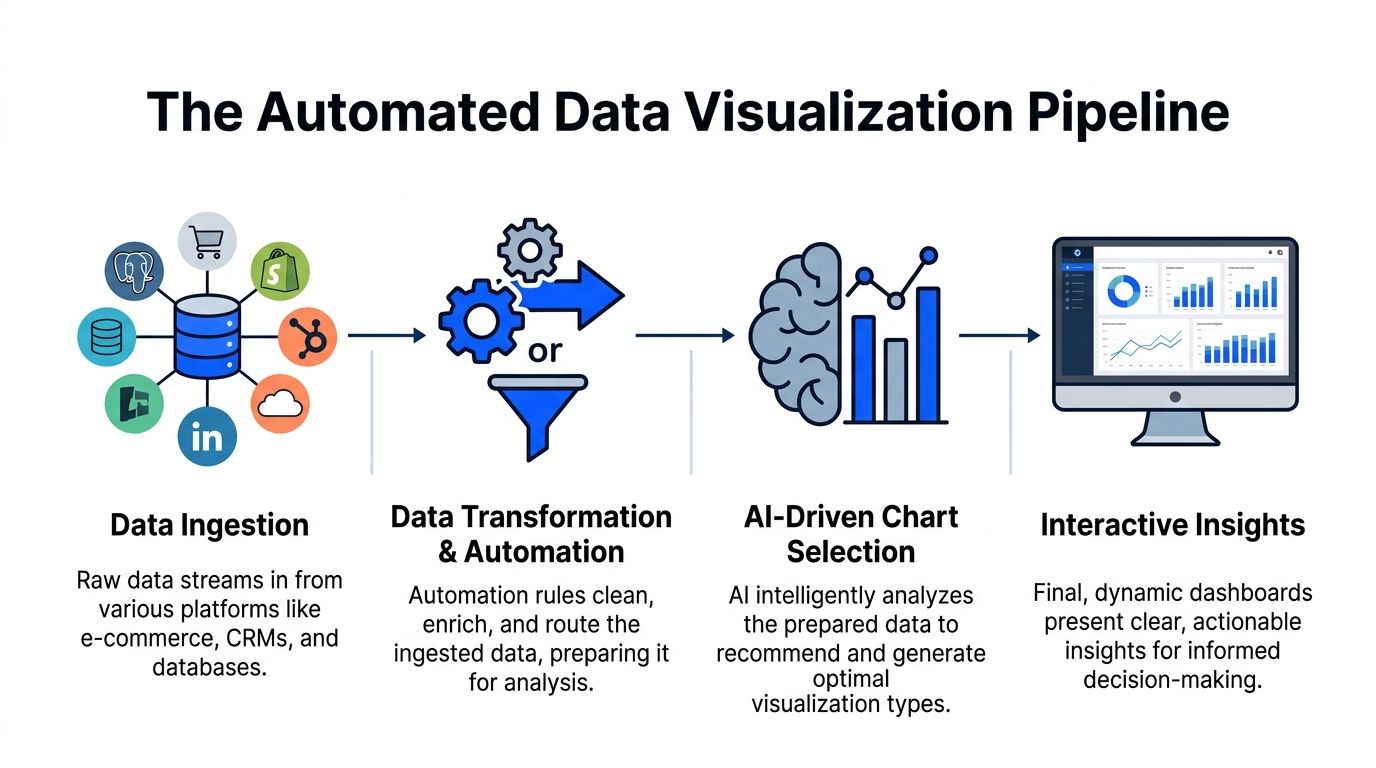
Data comes in from the systems you already use
Teams rarely start from one clean warehouse table. They’re pulling from product databases, CRM data, ad platforms, billing systems, and whatever spreadsheet someone exported last Friday.
A typical pipeline ingests sources like:
Postgres: product events, subscriptions, operational data
Shopify: orders, product sales, refunds
HubSpot: leads, lifecycle stages, pipeline activity
Other business apps: support, project tracking, finance, and growth tools
The first technical challenge is not visualization. It’s getting these sources into a format where one question doesn't produce five conflicting answers.
Automation handles the prep work people underestimate
Manual BI burns a shocking amount of time. Analysts often spend more energy shaping the data than analyzing it.
In an automated workflow, transformation logic handles tasks like:
Renaming fields that mean the same thing across tools
Standardizing date formats and currencies
Resolving IDs across systems
Routing cleaned data into a model the charting layer can query
That prep work is why conversational analytics feels instant later. The speed isn't luck. It’s pre-arranged structure.
NLP turns a plain-English question into something queryable
When someone types, “Show weekly trial signups by channel,” the system has to do several things quickly:
identify the metric
infer the time grain
map “channel” to the right field
determine whether the user wants a trend, comparison, or breakdown
This is the language layer. It parses intent, maps words to schema, and builds the underlying query path without making the user write SQL.
A good system also handles ambiguity. If “revenue” could mean booked revenue, recognized revenue, or net sales, the tool needs to either use a trusted metric definition or ask for clarification. Otherwise the chart looks polished and says the wrong thing. That’s worse than no chart.
ML models inspect the data before the chart appears
This is the step people often miss. Automated data visualization isn't just chart generation. It includes automated analysis of the data itself.
AI-powered automated data visualization uses machine learning methods such as K-means and Isolation Forest to detect patterns and anomalies, then select a suitable chart type without manual intervention. The result can cut insight generation to under 5 minutes per chart (zebrabi.com).
That has two implications.
First, the software is evaluating structure, not just display. It can detect that one variable tracks with another, that a time series contains an outlier, or that a categorical comparison is better shown as bars than a line.
Second, chart selection becomes evidence-based instead of preference-based. That saves analysts from the classic ritual of trying three visuals before finding the one that answers the question.
The rendering layer chooses form, not just color
Once the data has been parsed and inspected, the visualization engine maps it to a form people can read quickly.
Common mapping logic looks like this:
Data shape | Likely visual choice | Why it works |
|---|---|---|
Time series | Line chart | Shows movement over time clearly |
Category comparison | Bar chart | Makes ranking and size differences easy to see |
Relationship between variables | Scatter plot | Reveals clusters and correlation patterns |
Multi-variable matrix | Heatmap | Useful for dense comparisons |
Funnel stages | Funnel or stacked bars | Highlights drop-off through steps |
The point isn't that AI invents new chart types. It reduces the chance that a human picks the wrong one for the job.
Interactive delivery is where the workflow changes
In older BI, a chart gets published to a dashboard and mostly sits there until someone edits it. In automated systems, the chart is the start of a conversation.
One practical implementation pattern is a tool that lets users connect live business data, ask natural-language questions, and receive charts with explanations inside the same interface. Statspresso is one example of this conversational AI data analyst model. The key workflow change is that users can keep asking follow-up questions without leaving the charting context.
Try asking:
“Break that chart down by region.”
“Highlight anomalies in the last quarter.”
“Compare this month to the previous month.”
That’s the true replacement for repetitive SQL. Not a prettier dashboard. A tighter loop between question and answer.
Benefits and ROI of Automated Data Visualization
The return from automated data visualization rarely shows up in one giant line item. It shows up in friction removed. Fewer manual reviews. Fewer dashboard rebuilds. Fewer meetings spent arguing over what the chart should have been.
That’s why the ROI is easy to miss if you only compare software subscriptions.
The first payoff is time compression
When AI-driven insight features summarize and explain visuals directly inside the tool, teams stop treating every chart as a mini investigation. Tableau’s Explain Data and Power BI’s Smart Narratives are good examples of this shift. They reduce manual chart review and help teams move from raw data to actionable intelligence in minutes rather than hours (test-king.com).
That changes the cost structure of analytics work.
Instead of spending analyst time on:
validating whether a spike is real
annotating obvious takeaways
rewriting the same observations for different stakeholders
Teams can spend more time on the hard part, which is deciding what to do next.
The hidden ROI is less bottlenecking
Most companies think they have a dashboard problem. They have a queue problem.
When every question has to pass through a technical gatekeeper, simple decisions stack up behind deep analytical work. A founder asking for a revenue chart and a PM asking for adoption by plan tier both compete for the same scarce resource.
Automated BI removes a chunk of that queue by making low-friction questions self-serve.
Practical rule: If a stakeholder can phrase the question clearly, they should be able to get a first-pass chart without opening a ticket.
That doesn’t eliminate analysts. It upgrades their job. They spend less time producing routine visuals and more time defining trusted metrics, validating edge cases, and investigating the questions automation surfaces.
Better speed changes business behavior
Fast answers don't just save time. They change how often teams are willing to ask questions.
When every chart takes effort, people ask fewer questions and settle for stale summaries. When chart creation is lightweight, teams explore more. Marketing checks campaign movement sooner. Product spots adoption issues earlier. Ops notices process drift before it becomes a monthly postmortem.
That’s the compounding effect. Not “we built dashboards faster.” More like “we made it normal to inspect the business while it was still moving.”
A simple before-and-after view
Cost area | Manual dashboard workflow | Automated data visualization workflow |
|---|---|---|
Initial question handling | Analyst translates request into SQL and logic | User asks directly in plain English |
Chart review | Manual inspection of visuals and outliers | Built-in summaries and surfaced patterns |
Repeat requests | Rebuilt or modified by analyst | Handled as follow-up questions |
Stakeholder access | Limited by tool skills | Broader self-serve access |
Analyst time | Heavy on production | More focused on interpretation and governance |
The strongest ROI case isn’t that automation replaces headcount. It’s that it protects scarce analytical talent from being consumed by routine chart production.
Implementation Patterns and Best Practices
Most automated data visualization projects fail for boring reasons. Not because the charts are ugly. Because the data model is brittle, the connector setup is too rigid, or the system assumes your schema is cleaner than reality.
The messy middle matters more than the demo.
Start with a modular pipeline
A modular setup lets you swap pieces without rebuilding the whole stack. That usually means separating:
Ingestion: how data enters from apps and databases
Transformation: how fields are cleaned, joined, and standardized
Semantic logic: how metrics are defined
Visualization and query layer: how users ask questions and see results
Tools like Apache Airflow or Kubeflow are useful patterns for orchestration because they let teams schedule and monitor pipeline logic in a controlled way. Even if you don’t expose that layer to business users, the discipline matters.
If one connector fails, your whole reporting system shouldn't become a murder mystery.
Design for ugly schemas, not ideal ones
Many no-code AI visualization tools still struggle with this problem. 65% of SMB analysts cite data wrangling as their top blocker, and fewer than 20% of AI viz tools automate schema inference on mixed sources, which leads to manual tweaks that can slow insights by up to 60% (zendy.io).
That finding lines up with what most analysts already know. Real business data is not tidy.
One app calls it customer_id. Another uses contactID. A third stores the same idea as a nested object. If your automated layer assumes perfect alignment, users will get polished nonsense.
A better pattern is to build schema-agnostic handling where possible:
Normalize naming early: Create consistent field names for core entities.
Version transformations: Treat metric logic like code so changes are reviewable.
Flag uncertain mappings: If the system isn't confident, it should ask.
Keep a trusted metric layer: Don't let every prompt invent a new revenue definition.
For additional design guidance, Statspresso’s post on data visualization best practices is a useful reference for reducing clutter and improving interpretability once the data is ready.
Put governance close to the question layer
In conversational analytics, governance can't live only in the warehouse. It also needs to shape the answering experience.
That means:
limiting access by role
exposing approved metrics before custom ones
logging how charts were generated
preserving query history so teams can audit what was asked and answered
A conversational interface can make analytics feel casual. The underlying controls should not be casual.
If users can ask anything, the system must still answer within the boundaries of trusted data definitions.
Build security and freshness in from day one
When teams connect live databases, they need to decide what should be queried live, what should be cached, and what should be materialized on a schedule. There’s no universal answer.
Sensitive datasets also need scoped permissions and minimal exposure. The safest pattern is selective access by workspace, source, and metric, rather than one giant “analytics can see everything” rule.
Automation works best when the system knows three things clearly: what data it can access, how that data should be interpreted, and which answers it is allowed to generate.
Real World Use Cases and Success Metrics
The easiest way to understand automated data visualization is to watch the workflow change by role. The question stays business-focused. The system handles the technical translation. The chart arrives fast enough to affect the decision while it still matters.

Marketing lead tracking channel performance
A marketing lead rarely wants “a dashboard.” They want an answer to a timing problem.
The prompt might be:
“Show campaign ROI by channel for the last quarter and flag any sudden drop in conversion trend.”
The output could be a combination of:
a bar chart for channel comparison
a trend line for conversions over time
a short narrative highlighting the outlier period
Real-time pipelines are essential for this. Streaming-based automated visualization can update charts in under 1 second, compared with 5 to 30 second refresh delays in manual BI, which can reduce decision delays by 35% in volatile markets (queentouchtech.com).
For finance-heavy marketing teams, a purpose-built reference like Ekipa AI’s Financial Insights Dashboard is useful for seeing how financial reporting and visual performance monitoring intersect.
The bigger point is behavioral. If a marketer sees the drop while spend is still live, they can pause, shift, or investigate immediately. If the chart updates after the review meeting, it's just decorative archaeology.
Product manager checking feature adoption
Product questions usually arrive as a trend plus a segment.
Something like:
“Plot feature adoption by week for the new release.”
“Break it down by plan type.”
“Show where usage stalled after onboarding.”
An automated system can move from one chart to the next without forcing the PM to rebuild filters manually. That matters because product analysis is iterative by nature. You don't ask one question. You ask one, then four more.
A strong setup also makes the visualization less brittle. You can start with a line chart, switch to a cohort view, then compare segments without opening a separate BI authoring tool.
Sales leader drilling into deal velocity
Sales teams care about flow. How long deals sit. Where they stall. Which segment is moving.
A conversational prompt might look like this:
“Show average deal velocity by stage.”
“Compare enterprise and SMB.”
“Highlight any slowdown this month.”
The right visual here could be a funnel, stage-duration bars, or a trend chart by segment. The important thing is that the user doesn't need to know in advance which visual is correct. They need the system to present a reasonable first answer and support follow-up drilling.
What success actually looks like
Success metrics in automated data visualization aren’t only dashboard metrics. They’re workflow metrics.
Watch for signs like:
Fewer analyst handoffs: business users answer routine questions themselves
Shorter path to follow-up questions: users explore in one session instead of restarting from scratch
More timely decisions: charts arrive while teams can still act
Higher trust: shared metrics and explanations reduce interpretation drift
The strongest use case isn’t “we automated charts.” It’s “the right person can inspect the right question at the right moment without waiting on SQL.”
Comparing Automated BI vs Manual BI
The sharpest difference between manual BI and automated BI isn't visual polish. It’s operational shape. One model depends on specialists translating every request. The other reduces translation work so more people can ask and answer questions directly.
Here’s the practical comparison.
Old Way vs New Way Comparison
Aspect | Old Way (Manual SQL) | New Way (Statspresso) |
|---|---|---|
Starting point | Business question gets turned into a ticket or Slack request | Business question is asked directly in plain English |
Required skills | SQL, data modeling, dashboard authoring, chart selection | Ability to ask a clear business question |
Time to first chart | Often delayed by analyst bandwidth and revision cycles | Much faster because query and chart generation are automated |
Follow-up analysis | Usually requires another query or dashboard edit | Handled as conversational follow-up questions |
Data exploration | Limited to people comfortable inside BI tools | Broader access for founders, PMs, and marketing leads |
Chart selection | Human chooses and often revises manually | System recommends or generates a suitable visual |
Insight explanation | Analyst writes notes or presents live | Narrative support can be generated alongside visuals |
Maintenance overhead | High. Queries, filters, dashboards, and metric logic need constant upkeep | Lower at the interaction layer, though governance still matters |
Accessibility of workflow | Strongly dependent on analyst availability | More self-serve, especially for routine questions |
Collaboration | Insights get passed around as screenshots or links with extra explanation | Teams can discuss a live chart tied to the original question |
Where manual BI still matters
Manual BI still has a place. Deep investigations, custom logic, unusual visual formats, and rigorous financial reporting often need a hands-on analyst.
But most day-to-day business questions aren't exotic. They’re repetitive, time-sensitive, and annoyingly ordinary.
That’s exactly where conversational analytics wins.
The real comparison isn't analyst versus AI. It's queue-based analytics versus question-based analytics.
What teams usually underestimate
They compare tools by features. They should compare them by interruption cost.
Every manual step adds interruption:
waiting for a query
clarifying the metric
revising the chart
scheduling the review
asking the follow-up later
Automated BI removes enough of those interruptions that analytics starts to feel native to the work instead of separate from it.
Getting Started with Statspresso
If you want to test automated data visualization properly, don’t start with a giant dashboard build. Start with one real business question and one connected source.
That keeps the evaluation honest.
Start with one source you already trust
A good first connection is usually the system behind a question your team asks all the time.
Common starting points:
Postgres if product or operational metrics drive most decisions
Shopify if revenue, orders, and product performance matter most
HubSpot if pipeline, attribution, and lead flow are the daily pain points
The goal isn't full data centralization on day one. It’s proving that a plain-English question can reliably return a useful chart.
Ask narrow questions first
The best early prompts are concrete and scoped.
Try asking Statspresso:
“Show me my revenue by month for the last year as a bar chart.”
“Compare leads created this month versus last month.”
“Which products had the highest sales last quarter?”
“Plot weekly signups and highlight unusual spikes.”
“Break down deal stages by owner.”
These work well because they force clarity around metric, time period, and grouping. Broad prompts like “How is the business doing?” sound smart and produce mush.
Use follow-up prompts to test the workflow
Once you get a first chart, don’t stop there. The value of a conversational AI data analyst shows up in the second and third question.
Good follow-ups include:
“Filter that to paid channels only.”
“Show it as a line chart instead.”
“Compare this period to the previous one.”
“Explain the largest drop.”
That sequence tests whether the tool behaves like a static chart generator or a real analytical interface.
Check whether the answer is explainable
A usable chart isn’t enough. You should be able to tell:
what metric was used
which date range was applied
how a segment was defined
whether the visualization matches the question
If the chart looks nice but the logic is fuzzy, you’ve just automated confusion.
Build outward from one proven workflow
Once one source and one question pattern work, expand carefully.
A sensible rollout often looks like this:
connect a second source that adds useful context
establish shared metric definitions
save recurring questions into dashboards
let non-technical stakeholders use the conversational layer for routine reporting
This is also the point where teams should document trusted prompts and expected outputs. You don't need a giant governance manual. A small library of “good questions” goes a long way.
TL;DR
Connect one source first: Start with Postgres, Shopify, or HubSpot.
Pick one recurring question: Use a question your team already asks every week.
Ask in plain English: Keep prompts specific about metric, date range, and grouping.
Test follow-ups: Make sure the system supports refinement without rebuilds.
Verify logic: Check the chart’s assumptions before sharing it widely.
Expand gradually: Add sources and saved views only after the first workflow is solid.
The best first test is boring on purpose. If the system can answer a routine business question cleanly, repeatedly, and without SQL, it’s useful. If it only shines in a demo prompt, it won’t survive Monday morning.
Connect your first data source for free with Statspresso and ask your first question in plain English. If your team is stuck waiting on dashboards, this is the shortest path to finding out whether conversational analytics can remove the bottleneck.
You’ve got data in Shopify, HubSpot, Postgres, maybe a few spreadsheets that refuse to die. What you don’t have is time to wait on a dashboard ticket, decode a brittle SQL query, or click through fifteen chart settings just to answer one basic question.
That delay is the primary tax in analytics. Not the software bill. The stop-start workflow. Automated data visualization fixes that by turning raw data into charts, summaries, and usable signals with far less manual work. And if you use a conversational AI data analyst, you can skip the SQL entirely and just ask.
Why Manual Dashboards Are Holding You Back
Manual BI breaks in the same place every time. A founder needs a revenue trend. A product manager wants feature usage by cohort. Marketing asks for channel performance before a campaign review. Then everyone waits for someone fluent in SQL and dashboard logic to translate the question into charts.
That model is old. It also hides costs that teams rarely budget for.
A manual dashboard workflow usually means:
Question translation: Someone has to turn a business question into joins, filters, and metric definitions.
Chart trial and error: Even after the query works, the first chart often isn't the right one.
Refresh lag: Static dashboards age fast, especially when teams are moving daily.
Context switching: Stakeholders leave the meeting, analysts go build, then everyone regroups later.
If you’ve already tried patching the problem with scheduled reporting, resources like Automated Google Analytics reports are useful because they show how reporting automation removes recurring handwork. The bigger jump is moving beyond scheduled reports into systems that choose visuals, surface patterns, and answer follow-up questions on demand.
Manual dashboards don't just slow reporting. They slow decisions because the answer arrives after the moment that mattered.
Understanding Automated Data Visualization
Automated data visualization is the process of turning raw or prepared data into charts, summaries, and visual explanations with software doing much of the heavy lifting. That includes selecting a suitable chart type, detecting anomalies or trends, and in some tools, generating narrative explanations alongside the visual.
This is not the same thing as dragging a bar chart into a slide deck.
It does more than basic charting
A spreadsheet can make a chart. A BI tool can let you assemble a dashboard. Automated data visualization goes further by reducing the number of decisions a human has to make before insight appears.
That matters because major platforms have already shifted in this direction. AI-driven insight features are standard across major tools in 2025, with examples like Tableau Explain Data and Power BI Smart Narratives surfacing trends, anomalies, and text summaries directly in the workflow, helping teams move from raw data to action in minutes rather than hours (test-king.com).
The practical difference is simple:
In a manual setup, you ask, query, build, inspect, revise.
In an automated setup, you ask, review, refine.
That sounds subtle. It isn’t. One workflow assumes the chart is the endpoint. The other treats the chart as the first draft of the answer.
Why this matters for non-analysts
Busy operators don't want a lesson in dimensional modeling before they can inspect churn, CAC payback, or ticket volume. They want a chart that makes sense and a quick explanation of what changed.
That’s where a Conversational AI Data Analyst becomes useful. Instead of opening a report builder, the user types a question in plain English and gets back a visualization with context. The interface feels less like BI software and more like talking to the teammate who already knows your schema.
Try asking Statspresso: “Show me my revenue by month for the last year as a bar chart.”
Try another: “Which acquisition channels dropped after the latest campaign launch?”
The hidden win is not convenience. It’s compression. You compress question framing, query generation, chart choice, and interpretation into one interaction.
The overlooked piece is accessibility
Most articles about automated data visualization focus on speed and prettier dashboards. They rarely ask a harder question. Can everyone on the team access the insight once the chart exists?
That gap is real. MIT research highlighted that blind and low-vision readers often miss 70 to 80% of visual insights when charts lack useful descriptions, and current systems rarely provide the richer, multi-level perceptual captions people need (news.mit.edu).
That changes how I define “good” automation.
A solid automated visualization system should do at least three jobs:
Render the chart
Explain the chart
Describe the chart accessibly
If it only does the first one, it’s still making part of the team work around the software.
Good analytics automation doesn't stop at visual output. It should translate visual meaning into language, too.
How Automated Data Visualization Works
Under the hood, automated data visualization looks less like magic and more like a well-run assembly line. Data comes in messy. Rules clean it. Models inspect it. A rendering layer turns the result into a chart someone can use.
The easiest way to think about it is this. Your data is the raw material. The automation layer is the factory. The AI is the chart engineer.
Data comes in from the systems you already use
Teams rarely start from one clean warehouse table. They’re pulling from product databases, CRM data, ad platforms, billing systems, and whatever spreadsheet someone exported last Friday.
A typical pipeline ingests sources like:
Postgres: product events, subscriptions, operational data
Shopify: orders, product sales, refunds
HubSpot: leads, lifecycle stages, pipeline activity
Other business apps: support, project tracking, finance, and growth tools
The first technical challenge is not visualization. It’s getting these sources into a format where one question doesn't produce five conflicting answers.
Automation handles the prep work people underestimate
Manual BI burns a shocking amount of time. Analysts often spend more energy shaping the data than analyzing it.
In an automated workflow, transformation logic handles tasks like:
Renaming fields that mean the same thing across tools
Standardizing date formats and currencies
Resolving IDs across systems
Routing cleaned data into a model the charting layer can query
That prep work is why conversational analytics feels instant later. The speed isn't luck. It’s pre-arranged structure.
NLP turns a plain-English question into something queryable
When someone types, “Show weekly trial signups by channel,” the system has to do several things quickly:
identify the metric
infer the time grain
map “channel” to the right field
determine whether the user wants a trend, comparison, or breakdown
This is the language layer. It parses intent, maps words to schema, and builds the underlying query path without making the user write SQL.
A good system also handles ambiguity. If “revenue” could mean booked revenue, recognized revenue, or net sales, the tool needs to either use a trusted metric definition or ask for clarification. Otherwise the chart looks polished and says the wrong thing. That’s worse than no chart.
ML models inspect the data before the chart appears
This is the step people often miss. Automated data visualization isn't just chart generation. It includes automated analysis of the data itself.
AI-powered automated data visualization uses machine learning methods such as K-means and Isolation Forest to detect patterns and anomalies, then select a suitable chart type without manual intervention. The result can cut insight generation to under 5 minutes per chart (zebrabi.com).
That has two implications.
First, the software is evaluating structure, not just display. It can detect that one variable tracks with another, that a time series contains an outlier, or that a categorical comparison is better shown as bars than a line.
Second, chart selection becomes evidence-based instead of preference-based. That saves analysts from the classic ritual of trying three visuals before finding the one that answers the question.
The rendering layer chooses form, not just color
Once the data has been parsed and inspected, the visualization engine maps it to a form people can read quickly.
Common mapping logic looks like this:
Data shape | Likely visual choice | Why it works |
|---|---|---|
Time series | Line chart | Shows movement over time clearly |
Category comparison | Bar chart | Makes ranking and size differences easy to see |
Relationship between variables | Scatter plot | Reveals clusters and correlation patterns |
Multi-variable matrix | Heatmap | Useful for dense comparisons |
Funnel stages | Funnel or stacked bars | Highlights drop-off through steps |
The point isn't that AI invents new chart types. It reduces the chance that a human picks the wrong one for the job.
Interactive delivery is where the workflow changes
In older BI, a chart gets published to a dashboard and mostly sits there until someone edits it. In automated systems, the chart is the start of a conversation.
One practical implementation pattern is a tool that lets users connect live business data, ask natural-language questions, and receive charts with explanations inside the same interface. Statspresso is one example of this conversational AI data analyst model. The key workflow change is that users can keep asking follow-up questions without leaving the charting context.
Try asking:
“Break that chart down by region.”
“Highlight anomalies in the last quarter.”
“Compare this month to the previous month.”
That’s the true replacement for repetitive SQL. Not a prettier dashboard. A tighter loop between question and answer.
Benefits and ROI of Automated Data Visualization
The return from automated data visualization rarely shows up in one giant line item. It shows up in friction removed. Fewer manual reviews. Fewer dashboard rebuilds. Fewer meetings spent arguing over what the chart should have been.
That’s why the ROI is easy to miss if you only compare software subscriptions.
The first payoff is time compression
When AI-driven insight features summarize and explain visuals directly inside the tool, teams stop treating every chart as a mini investigation. Tableau’s Explain Data and Power BI’s Smart Narratives are good examples of this shift. They reduce manual chart review and help teams move from raw data to actionable intelligence in minutes rather than hours (test-king.com).
That changes the cost structure of analytics work.
Instead of spending analyst time on:
validating whether a spike is real
annotating obvious takeaways
rewriting the same observations for different stakeholders
Teams can spend more time on the hard part, which is deciding what to do next.
The hidden ROI is less bottlenecking
Most companies think they have a dashboard problem. They have a queue problem.
When every question has to pass through a technical gatekeeper, simple decisions stack up behind deep analytical work. A founder asking for a revenue chart and a PM asking for adoption by plan tier both compete for the same scarce resource.
Automated BI removes a chunk of that queue by making low-friction questions self-serve.
Practical rule: If a stakeholder can phrase the question clearly, they should be able to get a first-pass chart without opening a ticket.
That doesn’t eliminate analysts. It upgrades their job. They spend less time producing routine visuals and more time defining trusted metrics, validating edge cases, and investigating the questions automation surfaces.
Better speed changes business behavior
Fast answers don't just save time. They change how often teams are willing to ask questions.
When every chart takes effort, people ask fewer questions and settle for stale summaries. When chart creation is lightweight, teams explore more. Marketing checks campaign movement sooner. Product spots adoption issues earlier. Ops notices process drift before it becomes a monthly postmortem.
That’s the compounding effect. Not “we built dashboards faster.” More like “we made it normal to inspect the business while it was still moving.”
A simple before-and-after view
Cost area | Manual dashboard workflow | Automated data visualization workflow |
|---|---|---|
Initial question handling | Analyst translates request into SQL and logic | User asks directly in plain English |
Chart review | Manual inspection of visuals and outliers | Built-in summaries and surfaced patterns |
Repeat requests | Rebuilt or modified by analyst | Handled as follow-up questions |
Stakeholder access | Limited by tool skills | Broader self-serve access |
Analyst time | Heavy on production | More focused on interpretation and governance |
The strongest ROI case isn’t that automation replaces headcount. It’s that it protects scarce analytical talent from being consumed by routine chart production.
Implementation Patterns and Best Practices
Most automated data visualization projects fail for boring reasons. Not because the charts are ugly. Because the data model is brittle, the connector setup is too rigid, or the system assumes your schema is cleaner than reality.
The messy middle matters more than the demo.
Start with a modular pipeline
A modular setup lets you swap pieces without rebuilding the whole stack. That usually means separating:
Ingestion: how data enters from apps and databases
Transformation: how fields are cleaned, joined, and standardized
Semantic logic: how metrics are defined
Visualization and query layer: how users ask questions and see results
Tools like Apache Airflow or Kubeflow are useful patterns for orchestration because they let teams schedule and monitor pipeline logic in a controlled way. Even if you don’t expose that layer to business users, the discipline matters.
If one connector fails, your whole reporting system shouldn't become a murder mystery.
Design for ugly schemas, not ideal ones
Many no-code AI visualization tools still struggle with this problem. 65% of SMB analysts cite data wrangling as their top blocker, and fewer than 20% of AI viz tools automate schema inference on mixed sources, which leads to manual tweaks that can slow insights by up to 60% (zendy.io).
That finding lines up with what most analysts already know. Real business data is not tidy.
One app calls it customer_id. Another uses contactID. A third stores the same idea as a nested object. If your automated layer assumes perfect alignment, users will get polished nonsense.
A better pattern is to build schema-agnostic handling where possible:
Normalize naming early: Create consistent field names for core entities.
Version transformations: Treat metric logic like code so changes are reviewable.
Flag uncertain mappings: If the system isn't confident, it should ask.
Keep a trusted metric layer: Don't let every prompt invent a new revenue definition.
For additional design guidance, Statspresso’s post on data visualization best practices is a useful reference for reducing clutter and improving interpretability once the data is ready.
Put governance close to the question layer
In conversational analytics, governance can't live only in the warehouse. It also needs to shape the answering experience.
That means:
limiting access by role
exposing approved metrics before custom ones
logging how charts were generated
preserving query history so teams can audit what was asked and answered
A conversational interface can make analytics feel casual. The underlying controls should not be casual.
If users can ask anything, the system must still answer within the boundaries of trusted data definitions.
Build security and freshness in from day one
When teams connect live databases, they need to decide what should be queried live, what should be cached, and what should be materialized on a schedule. There’s no universal answer.
Sensitive datasets also need scoped permissions and minimal exposure. The safest pattern is selective access by workspace, source, and metric, rather than one giant “analytics can see everything” rule.
Automation works best when the system knows three things clearly: what data it can access, how that data should be interpreted, and which answers it is allowed to generate.
Real World Use Cases and Success Metrics
The easiest way to understand automated data visualization is to watch the workflow change by role. The question stays business-focused. The system handles the technical translation. The chart arrives fast enough to affect the decision while it still matters.
Marketing lead tracking channel performance
A marketing lead rarely wants “a dashboard.” They want an answer to a timing problem.
The prompt might be:
“Show campaign ROI by channel for the last quarter and flag any sudden drop in conversion trend.”
The output could be a combination of:
a bar chart for channel comparison
a trend line for conversions over time
a short narrative highlighting the outlier period
Real-time pipelines are essential for this. Streaming-based automated visualization can update charts in under 1 second, compared with 5 to 30 second refresh delays in manual BI, which can reduce decision delays by 35% in volatile markets (queentouchtech.com).
For finance-heavy marketing teams, a purpose-built reference like Ekipa AI’s Financial Insights Dashboard is useful for seeing how financial reporting and visual performance monitoring intersect.
The bigger point is behavioral. If a marketer sees the drop while spend is still live, they can pause, shift, or investigate immediately. If the chart updates after the review meeting, it's just decorative archaeology.
Product manager checking feature adoption
Product questions usually arrive as a trend plus a segment.
Something like:
“Plot feature adoption by week for the new release.”
“Break it down by plan type.”
“Show where usage stalled after onboarding.”
An automated system can move from one chart to the next without forcing the PM to rebuild filters manually. That matters because product analysis is iterative by nature. You don't ask one question. You ask one, then four more.
A strong setup also makes the visualization less brittle. You can start with a line chart, switch to a cohort view, then compare segments without opening a separate BI authoring tool.
Sales leader drilling into deal velocity
Sales teams care about flow. How long deals sit. Where they stall. Which segment is moving.
A conversational prompt might look like this:
“Show average deal velocity by stage.”
“Compare enterprise and SMB.”
“Highlight any slowdown this month.”
The right visual here could be a funnel, stage-duration bars, or a trend chart by segment. The important thing is that the user doesn't need to know in advance which visual is correct. They need the system to present a reasonable first answer and support follow-up drilling.
What success actually looks like
Success metrics in automated data visualization aren’t only dashboard metrics. They’re workflow metrics.
Watch for signs like:
Fewer analyst handoffs: business users answer routine questions themselves
Shorter path to follow-up questions: users explore in one session instead of restarting from scratch
More timely decisions: charts arrive while teams can still act
Higher trust: shared metrics and explanations reduce interpretation drift
The strongest use case isn’t “we automated charts.” It’s “the right person can inspect the right question at the right moment without waiting on SQL.”
Comparing Automated BI vs Manual BI
The sharpest difference between manual BI and automated BI isn't visual polish. It’s operational shape. One model depends on specialists translating every request. The other reduces translation work so more people can ask and answer questions directly.
Here’s the practical comparison.
Old Way vs New Way Comparison
Aspect | Old Way (Manual SQL) | New Way (Statspresso) |
|---|---|---|
Starting point | Business question gets turned into a ticket or Slack request | Business question is asked directly in plain English |
Required skills | SQL, data modeling, dashboard authoring, chart selection | Ability to ask a clear business question |
Time to first chart | Often delayed by analyst bandwidth and revision cycles | Much faster because query and chart generation are automated |
Follow-up analysis | Usually requires another query or dashboard edit | Handled as conversational follow-up questions |
Data exploration | Limited to people comfortable inside BI tools | Broader access for founders, PMs, and marketing leads |
Chart selection | Human chooses and often revises manually | System recommends or generates a suitable visual |
Insight explanation | Analyst writes notes or presents live | Narrative support can be generated alongside visuals |
Maintenance overhead | High. Queries, filters, dashboards, and metric logic need constant upkeep | Lower at the interaction layer, though governance still matters |
Accessibility of workflow | Strongly dependent on analyst availability | More self-serve, especially for routine questions |
Collaboration | Insights get passed around as screenshots or links with extra explanation | Teams can discuss a live chart tied to the original question |
Where manual BI still matters
Manual BI still has a place. Deep investigations, custom logic, unusual visual formats, and rigorous financial reporting often need a hands-on analyst.
But most day-to-day business questions aren't exotic. They’re repetitive, time-sensitive, and annoyingly ordinary.
That’s exactly where conversational analytics wins.
The real comparison isn't analyst versus AI. It's queue-based analytics versus question-based analytics.
What teams usually underestimate
They compare tools by features. They should compare them by interruption cost.
Every manual step adds interruption:
waiting for a query
clarifying the metric
revising the chart
scheduling the review
asking the follow-up later
Automated BI removes enough of those interruptions that analytics starts to feel native to the work instead of separate from it.
Getting Started with Statspresso
If you want to test automated data visualization properly, don’t start with a giant dashboard build. Start with one real business question and one connected source.
That keeps the evaluation honest.
Start with one source you already trust
A good first connection is usually the system behind a question your team asks all the time.
Common starting points:
Postgres if product or operational metrics drive most decisions
Shopify if revenue, orders, and product performance matter most
HubSpot if pipeline, attribution, and lead flow are the daily pain points
The goal isn't full data centralization on day one. It’s proving that a plain-English question can reliably return a useful chart.
Ask narrow questions first
The best early prompts are concrete and scoped.
Try asking Statspresso:
“Show me my revenue by month for the last year as a bar chart.”
“Compare leads created this month versus last month.”
“Which products had the highest sales last quarter?”
“Plot weekly signups and highlight unusual spikes.”
“Break down deal stages by owner.”
These work well because they force clarity around metric, time period, and grouping. Broad prompts like “How is the business doing?” sound smart and produce mush.
Use follow-up prompts to test the workflow
Once you get a first chart, don’t stop there. The value of a conversational AI data analyst shows up in the second and third question.
Good follow-ups include:
“Filter that to paid channels only.”
“Show it as a line chart instead.”
“Compare this period to the previous one.”
“Explain the largest drop.”
That sequence tests whether the tool behaves like a static chart generator or a real analytical interface.
Check whether the answer is explainable
A usable chart isn’t enough. You should be able to tell:
what metric was used
which date range was applied
how a segment was defined
whether the visualization matches the question
If the chart looks nice but the logic is fuzzy, you’ve just automated confusion.
Build outward from one proven workflow
Once one source and one question pattern work, expand carefully.
A sensible rollout often looks like this:
connect a second source that adds useful context
establish shared metric definitions
save recurring questions into dashboards
let non-technical stakeholders use the conversational layer for routine reporting
This is also the point where teams should document trusted prompts and expected outputs. You don't need a giant governance manual. A small library of “good questions” goes a long way.
TL;DR
Connect one source first: Start with Postgres, Shopify, or HubSpot.
Pick one recurring question: Use a question your team already asks every week.
Ask in plain English: Keep prompts specific about metric, date range, and grouping.
Test follow-ups: Make sure the system supports refinement without rebuilds.
Verify logic: Check the chart’s assumptions before sharing it widely.
Expand gradually: Add sources and saved views only after the first workflow is solid.
The best first test is boring on purpose. If the system can answer a routine business question cleanly, repeatedly, and without SQL, it’s useful. If it only shines in a demo prompt, it won’t survive Monday morning.
Connect your first data source for free with Statspresso and ask your first question in plain English. If your team is stuck waiting on dashboards, this is the shortest path to finding out whether conversational analytics can remove the bottleneck.