
Dashboard vs Report: Make Smarter Data Choices

You notice a drop in sign-ups on Tuesday afternoon. Not a tiny wobble. A real dip. Product thinks it might be a release issue. Marketing wonders if paid traffic quality changed. You ask for data, then wait behind three other requests and a dashboard rebuild nobody wanted in the first place.
Waiting weeks for a data analyst to build a dashboard is a relic of the past. The underlying problem isn't just missing charts. It's the gap between a business question and a usable answer. That gap slows launches, hides problems, and turns simple decisions into meetings.
Organizations were taught to solve this with two artifacts: dashboards and reports. Both matter. Both also break down when every useful follow-up question becomes another ticket. The smarter move is to know when each format helps, when it gets in your way, and what replaces the old trade-off.
Need | Dashboard | Report | Conversational analytics |
|---|---|---|---|
Best for | Live monitoring | Historical analysis | On-demand questions |
Typical format | Single-screen KPI view | Multi-page structured document | Chat plus instant chart |
Refresh style | Real-time or near real-time | Point-in-time snapshot | Query when asked |
Good at | Spotting issues fast | Explaining what happened | Combining speed with drill-down |
Bad at | Deep context | Fast iteration | Depends on trusted data definitions |
Example question | “Are sign-ups down right now?” | “What drove Q2 conversion changes?” | “Show sign-ups by channel since Tuesday, then break out mobile only.” |
The High Cost of Waiting for Answers
A founder doesn't need another beautifully labeled dashboard if the actual question changes every hour.
The painful part of dashboard vs report isn't the format debate. It's the delay. A dashboard helps only if the metric you need is already on it. A report helps only if someone already knew what story you'd need to tell. Most startup questions arrive uninvited. They show up in Slack, during standup, or ten minutes before an investor call.
What typically occurs is:
A metric moves: Sign-ups drop, churn ticks up, CAC looks weird, activation stalls.
A guess appears: Someone blames tracking, someone else blames the campaign, someone else blames onboarding.
The request queue starts: An analyst pulls data, checks definitions, writes SQL, exports charts, then explains caveats.
The moment passes: By the time the answer arrives, the team has either guessed or moved on.
That lag is expensive because growth decisions are perishable. A same-day answer can save a launch. A Friday report about a Tuesday problem is often just documentation of a miss.
Practical rule: If the value of an answer drops sharply after a few hours, you don't have a reporting problem. You have an access problem.
This is why founders often over-order dashboards. They aren't asking for another screen of charts. They're asking for faster decisions. But dashboards alone rarely fix that. Reports definitely don't. You need to understand what each tool is built to do, then stop using one as a substitute for the other.
Defining the Data Duo Dashboards and Reports
Dashboards and reports solve different parts of the same problem. One helps a team spot change fast. The other helps them explain that change well enough to act, defend a decision, or document it later.
A dashboard works like an instrument panel. A report works like the case file.

What a dashboard is really for
A dashboard is built for monitoring. It keeps a small set of live or near-live metrics in front of the people who need to react today.
For a startup team, that usually means sign-ups, activation, pipeline, burn, churn, or support load. The exact metrics change by function, but the job stays the same. Show current conditions fast enough that someone can decide whether to intervene.
A useful dashboard usually does three things well:
Highlights the few KPIs tied to action: If a number changes, someone knows what to check or who owns it.
Refreshes often enough for the decision at hand: Hourly may be enough for finance. Paid acquisition may need tighter updates.
Supports fast scanning: A founder should be able to look at it between meetings and know whether the business is on track.
That last point matters. Founders often over-order dashboards for this reason. They want speed, so they ask for one screen for every team, every question, and every metric. The result is usually clutter, not clarity.
If you need a concrete example, a good Marketing Performance Dashboard shows the principle well. It gives a shared view of what needs attention now, without turning the screen into a storage unit for every chart the company has ever made.
What a report is really for
A report is built for analysis, explanation, and recordkeeping. It adds structure, commentary, time boundaries, and detail. It is less about watching the business breathe in real time and more about understanding what happened over a defined period.
Reports are the better fit for work such as:
quarterly business reviews
board updates
channel ROI analysis
compliance and audit needs
postmortems
A good report answers questions a dashboard usually cannot answer cleanly. What changed over the quarter? Which segment drove the decline? Were there one-time events, tracking issues, or seasonality effects? What should the team do next?
The trade-off is speed. Reports are slower to produce and slower to consume, but they carry more context and hold up better under scrutiny.
A dashboard flags that something needs attention. A report explains what happened, over what period, and what evidence supports the conclusion.
Why teams confuse them
Teams confuse dashboards and reports because both contain charts, tables, and metrics. On the surface, they can look similar. In practice, they serve different decision speeds.
Problems start when a dashboard is asked to do analytical heavy lifting. It becomes a crowded wall of widgets nobody checks. Problems also start when a report is forced into daily operations. Then people wait for a polished document to answer a question that needed a same-day response.
That distinction matters even more now because conversational AI is starting to blur the old line. A founder can ask for today's conversion drop, then ask follow-up questions that sound like report analysis, without opening a separate artifact. The format matters less than it used to. The underlying jobs still matter.
Tool | Main job | Best timing | Typical user |
|---|---|---|---|
Dashboard | Monitor what matters now | Live or near real-time | Founders, managers, operators |
Report | Analyze what happened over time | Scheduled or point-in-time | Analysts, finance, leadership |
The Core Comparison Dashboard vs Report Showdown
Picking between a dashboard and a report changes how fast your team can act. Get it wrong, and you either slow down a live decision or force people to make a high-stakes call with thin context.
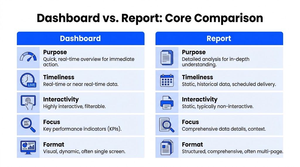
Purpose and value
A dashboard helps a team monitor a business in motion. A report helps a team explain a business event after enough evidence is on the table.
The difference shows up fast in startup work. A founder checking CAC, pipeline coverage, and churn risk before the Monday standup needs a dashboard. The same founder preparing for a board meeting needs a report that holds the numbers still, shows the timeframe, and explains why the quarter played out the way it did.
The common mistake is using a monitoring tool for root-cause analysis, or using an analysis tool for a decision that has to happen now.
Dashboards earn their keep by shortening reaction time. Reports earn their keep by adding confidence, context, and a record people can revisit later.
Data freshness and refresh cadence
This is usually the sharpest line between the two.
Dashboards work best when the underlying numbers change often enough that a stale view creates risk. Paid media pacing, sales activity, fulfillment backlog, support volume, and product sign-up flow all fit that pattern. Reports fit questions tied to a closed period, a review cycle, or a formal summary.
The core problem is the delay. If a team has to wait for a polished document to answer an operational question, the reporting format is getting in the way of the work. If a leadership team uses a constantly changing dashboard in a board discussion, the meeting turns into an argument about what changed five minutes ago instead of what the business should do next.
A useful rule is simple. Use a dashboard when freshness changes the decision. Use a report when stability improves the discussion.
Interactivity and exploration
Dashboards are built for quick probing. Filters, drill-downs, and segmented views help someone move from "something looks off" to "where is it off?" in a few clicks.
Reports can support exploration too, but that is not their main job. A report usually presents a defined story: timeframe, findings, supporting tables, and commentary. That structure is helpful when finance, leadership, or an investor expects one version of the truth and wants to review it in the same order every time.
Speed affects adoption here. If a dashboard opens quickly and answers the first question fast, teams keep using it. If getting a basic answer means loading a heavy report, switching tabs, and hunting through pages, people bypass the system and ask an analyst in Slack.
That is one reason the old dashboard vs. report split is weakening. Conversational AI now lets a user start with a quick operational question, then ask follow-ups that sound like report analysis without opening a separate asset. The job still changes. The interface does not have to.
Structure and layout
A dashboard should feel like a control panel. Tight scope, few distractions, clear priorities.
A report should feel like a case file. More room, more explanation, and a visible chain from summary to evidence.
That structural difference matters more than teams admit. I regularly see founders ask for a "dashboard" that scrolls through fifteen charts, three tables, and a wall of commentary. That is a report wearing dashboard clothing, and nobody uses it well. The opposite mistake is just as common: a quarterly business review reduced to six KPI tiles with no definitions, no date logic, and no explanation of what changed.
A clean way to separate them:
Dashboard: one screen, current state, fast scan
Report: multiple sections, fixed period, documented explanation
Bad hybrid: too crowded to monitor, too thin to analyze
Typical audience and usage pattern
Audience matters, but decision speed matters more.
Operators, sales managers, growth leads, and founders usually need the shortest path to "do we need to act?" Analysts, finance leads, and executives in review settings usually need "what happened, why, and can we defend this number?" Those are different jobs, even when the charts look similar.
Tool design often reflects that split. Single-screen monitoring views tend to win for daily use. Multi-page analysis artifacts tend to win for reviews, audits, planning, and cross-functional recaps. Neither is better in the abstract. The better choice is the one that matches the pace and stakes of the decision.
What works and what doesn't
Here are the trade-offs startup teams run into most often.
Situation | What works | What doesn't |
|---|---|---|
Monitoring ad spend during a launch | A live dashboard with a few KPIs | A weekly PDF report |
Explaining why conversion dropped last quarter | A structured report with context | A dashboard with no commentary |
Daily ops review | A single-screen dashboard | A slide deck with too many tabs |
Board prep | A report with historical framing | A live dashboard that changes mid-meeting |
An unexpected anomaly | Start with dashboard, then move into analysis | Waiting for a custom report request |
Use dashboards to spot. Use reports to explain. If your team keeps forcing one asset to do both jobs, fix the workflow first.
And increasingly, that workflow fix is not "pick one." It is giving people a system that can answer like a dashboard when speed matters, then continue like a report when they ask why.
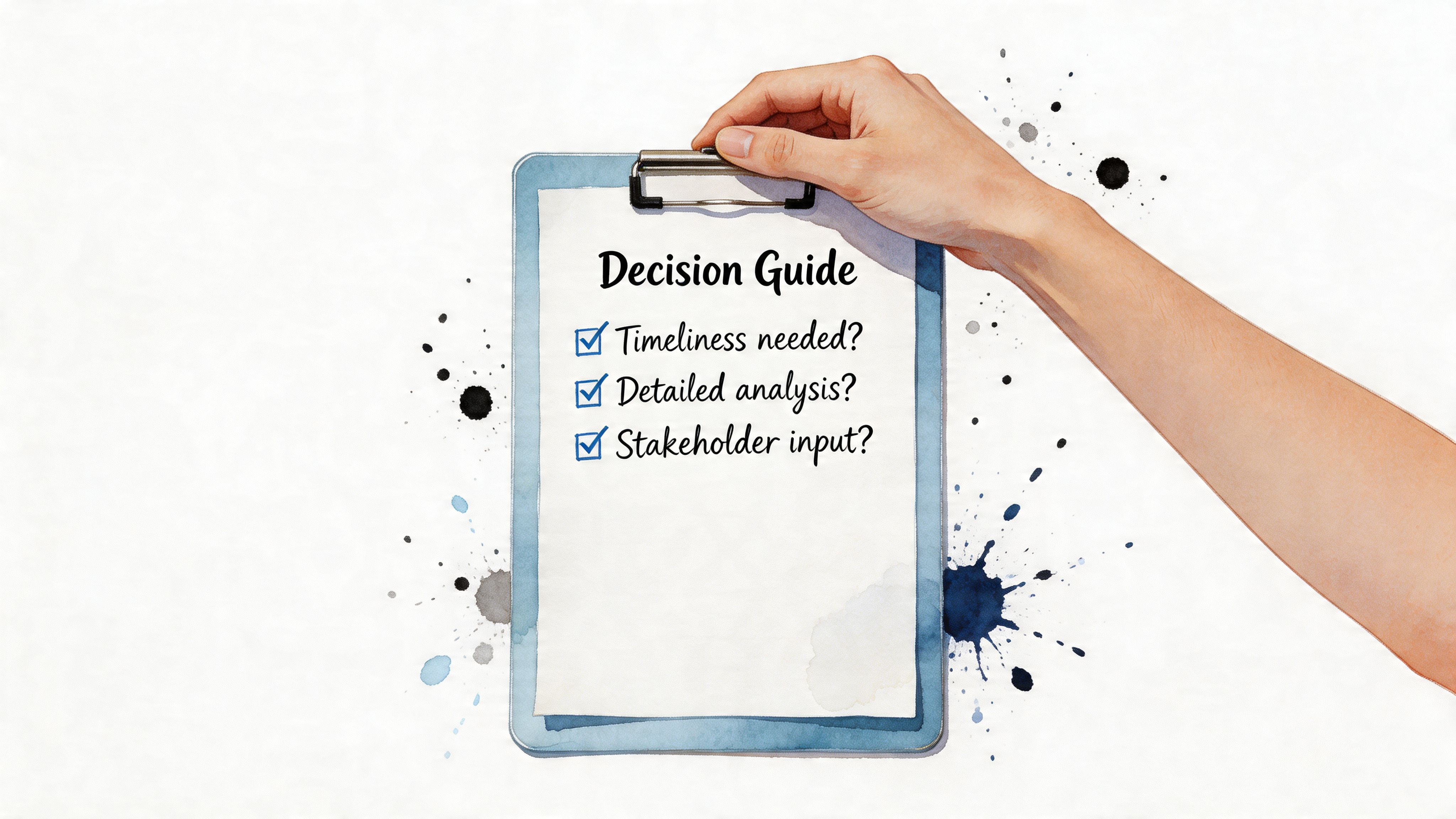
Your Decision Checklist When to Use Which
Teams often don't need a philosophical answer. They need a fast call. Use this checklist the way you'd triage an issue in product or growth.
Use a dashboard when the question is operational
Pick a dashboard if the answer needs to drive action today.
That usually means you're checking a metric that changes frequently and somebody is expected to react to it. Good candidates include sales pipeline health, inventory movement, support backlog, campaign pacing, or onboarding conversion after a product launch.
Ask these questions:
Do I need to know what's happening now?
Will someone check this repeatedly?
Do I need a fast scan before I need a deep explanation?
Will filters or drill-down help the team act?
If the answer is yes to most of those, build or use a dashboard.
Try asking your analytics tool: “Show me sign-ups by hour for the last 7 days and compare weekdays.”
Use a report when the question is explanatory
Choose a report when the goal is to understand, summarize, or document what happened over a defined period.
Reports particularly shine:
Board materials: Leadership needs a stable narrative.
Quarterly reviews: The timeframe matters as much as the result.
Compliance or audits: The data needs consistency and traceability.
Postmortems: You need context, sequence, and interpretation.
A report is the right call when you need a clean artifact people can revisit later without worrying that the numbers moved overnight.
If the audience will ask, “Can I forward this?” or “Can we use this in next week's review?”, you're often in report territory.
Use both when the work has two phases
Many business questions aren't either/or. They arrive in stages.
First, someone notices an issue. That's a dashboard moment. Then the team needs to unpack why it happened. That's a report moment.
A few examples:
Marketing sees paid conversions dip. Start with the dashboard to spot the anomaly. Follow with a report on channel performance over the quarter.
Ops notices shipping delays. Use a dashboard for live visibility. Use a report for root-cause analysis and trend review.
Sales misses target. The dashboard flags rep pacing. The report explains territory, pipeline quality, and timing effects.
Try asking your analytics tool: “Show me quarterly revenue by channel, then break out the last 30 days separately.”
A blunt shortcut
If you can answer the business question with a glance, choose a dashboard. If you need a meeting to interpret it properly, choose a report.
If you need both in the same conversation, you're already bumping into the limits of the old split.
How Conversational AI Makes This Debate Obsolete
The dashboard vs report debate exists because older BI workflows force you to choose your format before you know your next question.
That's backwards.
A founder doesn't wake up wanting a dashboard tile. A marketing lead doesn't crave a PDF. They want an answer. Then a follow-up answer. Then a chart. Then a segment cut. Then a trend line. Traditional BI makes those separate requests. Conversational analytics turns them into one thread.
The old binary is the real problem
Dashboards are fast but narrow. Reports are rich but slow. That trade-off made sense when analytics depended on fixed assets built by specialists.
It makes less sense now.
A modern team wants to ask, “Why did trial starts drop on Tuesday?” and immediately follow with, “Break that out by source,” then, “Show mobile only,” then, “Compare this week to the prior four.” That's neither dashboard behavior nor report behavior. It's a conversation.
If you want a broader primer on how AI systems are being explained to non-technical teams, BuddyPro has a useful library of detailed AI information. The important shift for analytics is simpler: the interface is no longer a menu of prebuilt charts. It's a question box.
What the new workflow looks like
Statspresso is a Conversational AI Data Analyst. Instead of asking someone to edit SQL, rebuild a dashboard, or export a report, users ask questions in plain English. Skip the SQL. Just ask your data a question and get a chart in seconds.
That changes the workflow from artifact-first to question-first.
Task | Old Way (Manual SQL/BI Tools) | New Way (Statspresso) |
|---|---|---|
Check a KPI trend | Open BI tool, find dashboard, hope the metric exists | Ask, “Show me revenue by month for the last year as a bar chart.” |
Investigate an anomaly | File a request, wait for analyst time, review custom output | Ask follow-up questions in the same thread until the issue is clear |
Segment a metric | Add filters in multiple reports or request a new view | Ask, “Now split that by channel and country.” |
Prepare an exec summary | Export visuals, copy into slides, rewrite explanations | Ask for the chart, summary, and breakdown directly from the data |
Answer a surprise question in a meeting | Promise to circle back later | Ask live and review the result immediately |
Try asking:
“Show me MRR by product line for the last 12 months.”
“Which acquisition channels had the biggest sign-up drop this week?”
“Compare conversion rate before and after the latest onboarding release.”
Why this matters more than another dashboard rebuild
Conversational analytics doesn't kill dashboards or reports. It demotes them from gatekeepers to outputs.
You can still keep a dashboard for recurring KPIs. You can still export a report for board review. The difference is that neither format has to be the starting point for every question. This insight offers a significant advantage.
A prebuilt dashboard is a predefined answer. A conversational system starts with the question you actually have.
For startup teams, that matters because the most valuable questions are usually the ones nobody predicted on Monday morning.
Design Best Practices and Data Governance
A dashboard or report only helps if people trust it under pressure.
I've seen startup teams lose a week arguing about why sign-ups dropped, only to learn two charts were using different definitions of "active user." The format was not the problem. The operating model was.
Dashboard design that people actually use
Useful dashboards are narrow by design. They answer the handful of questions a team asks every day, fast enough to support action in the moment.
That means restraint matters more than feature count. A dashboard packed with every metric from every function usually gets skimmed, misunderstood, then ignored. A good one makes trade-offs on purpose.
A few rules that hold up in practice:
Limit the surface area: Put only the KPIs tied to recurring decisions on the screen.
Use visual hierarchy: Place the metrics that drive action at the top left or top center, where attention goes first.
Write labels like a human: “Trial-to-paid conversion” is clearer than “CVR v2 adjusted.”
Design for scan time: If a founder needs a minute to decode it, the dashboard is carrying too much.
Keep interactions obvious: Filters and drill-downs should answer likely follow-up questions, not force users to hunt.
Layout matters too. Clear grouping, whitespace, and consistent chart choices reduce reading time. For practical examples, see this guide to data visualization dashboards.
Reports need narrative, not data dumps
Reports serve a different job. They should explain a result, not just display it.
The strongest reports read like a decision memo with evidence attached. They start with the conclusion, show what changed, break down the drivers, and end with the implication for the business. Busy leadership teams do not need another exported tab full of charts. They need a point of view they can challenge or approve.
A strong report usually includes:
A clear opening summary: What changed in the period?
Context: Was the shift planned, seasonal, or unexpected?
Breakdowns: Which segments, products, channels, or cohorts drove the result?
Implication: What decision should follow from this?
Good reporting shortens interpretation time. Great reporting shortens decision time.
Governance Builds Trust
Governance makes analytics usable at scale.
Start with metric definitions. Decide what counts as revenue, an active customer, a qualified lead, or churn. Document those definitions where people will see them. Then control access so teams can answer their questions without exposing data they should not touch.
The basics are not glamorous, but they prevent expensive confusion:
Metric definitions: One approved definition for each core KPI.
Access control: Give teams the data they need, and restrict sensitive fields.
Data quality checks: Catch broken pipelines, stale tables, and missing events early.
Change logs: If a metric formula changes, record when it changed and why.
This matters even more as conversational AI enters the workflow. If a founder can ask, "Why did CAC rise in March?" and get an instant answer, the semantic layer behind that answer has to be clean. Otherwise, AI just produces faster confusion.
That is the real shift in the dashboard vs. report debate. The old question was which container to build. The better question is whether your metrics, definitions, and permissions are strong enough to support any interface, including chat. When governance is solid, dashboards, reports, and conversational answers can all pull from the same logic. When it is weak, every format becomes a different version of the truth.
Key Takeaways and Your Next Step
The old dashboard vs report argument assumes you need to pick a container before you can get insight.
That assumption is aging badly.
Dashboards still matter when a team needs a live operating view. Reports still matter when leadership needs a structured historical narrative. But neither one solves the core business problem on its own, which is getting from question to answer fast enough to act with confidence.
The teams that move quicker don't just have more charts. They have less friction between curiosity and evidence.
TL;DR
Dashboards are for at-a-glance monitoring of live operational metrics.
Reports are for in-depth analysis across a defined historical period.
Use a dashboard when the question is recurring, time-sensitive, and operational.
Use a report when the question needs context, explanation, or formal distribution.
Use conversational analytics when the need is flexible, immediate answers without waiting for a rebuild.
Practical FAQ
Can conversational analytics replace a BI tool entirely
For many startup and SMB use cases, it can handle the daily workload that used to require custom dashboards and repetitive analyst requests. Teams may still keep traditional BI tools for formal reporting, specialized enterprise workflows, or heavily customized board materials.
Is this just a nicer front end on top of SQL
The useful shift isn't cosmetic. It's workflow. Instead of translating a business question into SQL, chart settings, filters, and exports, the user starts with the business question directly and works from the answer.
Do dashboards and reports still have a place
Yes. They become outputs, not bottlenecks. A dashboard is still useful for recurring operational visibility. A report is still useful when you need a stable artifact for review. The difference is that you don't need to wait for either one to start learning from your data.
What should a founder do next
Stop asking, “Do we need another dashboard?” Ask, “What decisions are we delaying because answers take too long?” That question usually points to the underlying fix faster.
If your team is still filing BI tickets for routine questions, you're not dealing with a tooling shortage. You're dealing with an access bottleneck.
Connect your first data source for free with Statspresso and ask your first question. That's the fastest way to find out whether your team needs another dashboard, another report, or just a better way to talk to its data.
You notice a drop in sign-ups on Tuesday afternoon. Not a tiny wobble. A real dip. Product thinks it might be a release issue. Marketing wonders if paid traffic quality changed. You ask for data, then wait behind three other requests and a dashboard rebuild nobody wanted in the first place.
Waiting weeks for a data analyst to build a dashboard is a relic of the past. The underlying problem isn't just missing charts. It's the gap between a business question and a usable answer. That gap slows launches, hides problems, and turns simple decisions into meetings.
Organizations were taught to solve this with two artifacts: dashboards and reports. Both matter. Both also break down when every useful follow-up question becomes another ticket. The smarter move is to know when each format helps, when it gets in your way, and what replaces the old trade-off.
Need | Dashboard | Report | Conversational analytics |
|---|---|---|---|
Best for | Live monitoring | Historical analysis | On-demand questions |
Typical format | Single-screen KPI view | Multi-page structured document | Chat plus instant chart |
Refresh style | Real-time or near real-time | Point-in-time snapshot | Query when asked |
Good at | Spotting issues fast | Explaining what happened | Combining speed with drill-down |
Bad at | Deep context | Fast iteration | Depends on trusted data definitions |
Example question | “Are sign-ups down right now?” | “What drove Q2 conversion changes?” | “Show sign-ups by channel since Tuesday, then break out mobile only.” |
The High Cost of Waiting for Answers
A founder doesn't need another beautifully labeled dashboard if the actual question changes every hour.
The painful part of dashboard vs report isn't the format debate. It's the delay. A dashboard helps only if the metric you need is already on it. A report helps only if someone already knew what story you'd need to tell. Most startup questions arrive uninvited. They show up in Slack, during standup, or ten minutes before an investor call.
What typically occurs is:
A metric moves: Sign-ups drop, churn ticks up, CAC looks weird, activation stalls.
A guess appears: Someone blames tracking, someone else blames the campaign, someone else blames onboarding.
The request queue starts: An analyst pulls data, checks definitions, writes SQL, exports charts, then explains caveats.
The moment passes: By the time the answer arrives, the team has either guessed or moved on.
That lag is expensive because growth decisions are perishable. A same-day answer can save a launch. A Friday report about a Tuesday problem is often just documentation of a miss.
Practical rule: If the value of an answer drops sharply after a few hours, you don't have a reporting problem. You have an access problem.
This is why founders often over-order dashboards. They aren't asking for another screen of charts. They're asking for faster decisions. But dashboards alone rarely fix that. Reports definitely don't. You need to understand what each tool is built to do, then stop using one as a substitute for the other.
Defining the Data Duo Dashboards and Reports
Dashboards and reports solve different parts of the same problem. One helps a team spot change fast. The other helps them explain that change well enough to act, defend a decision, or document it later.
A dashboard works like an instrument panel. A report works like the case file.

What a dashboard is really for
A dashboard is built for monitoring. It keeps a small set of live or near-live metrics in front of the people who need to react today.
For a startup team, that usually means sign-ups, activation, pipeline, burn, churn, or support load. The exact metrics change by function, but the job stays the same. Show current conditions fast enough that someone can decide whether to intervene.
A useful dashboard usually does three things well:
Highlights the few KPIs tied to action: If a number changes, someone knows what to check or who owns it.
Refreshes often enough for the decision at hand: Hourly may be enough for finance. Paid acquisition may need tighter updates.
Supports fast scanning: A founder should be able to look at it between meetings and know whether the business is on track.
That last point matters. Founders often over-order dashboards for this reason. They want speed, so they ask for one screen for every team, every question, and every metric. The result is usually clutter, not clarity.
If you need a concrete example, a good Marketing Performance Dashboard shows the principle well. It gives a shared view of what needs attention now, without turning the screen into a storage unit for every chart the company has ever made.
What a report is really for
A report is built for analysis, explanation, and recordkeeping. It adds structure, commentary, time boundaries, and detail. It is less about watching the business breathe in real time and more about understanding what happened over a defined period.
Reports are the better fit for work such as:
quarterly business reviews
board updates
channel ROI analysis
compliance and audit needs
postmortems
A good report answers questions a dashboard usually cannot answer cleanly. What changed over the quarter? Which segment drove the decline? Were there one-time events, tracking issues, or seasonality effects? What should the team do next?
The trade-off is speed. Reports are slower to produce and slower to consume, but they carry more context and hold up better under scrutiny.
A dashboard flags that something needs attention. A report explains what happened, over what period, and what evidence supports the conclusion.
Why teams confuse them
Teams confuse dashboards and reports because both contain charts, tables, and metrics. On the surface, they can look similar. In practice, they serve different decision speeds.
Problems start when a dashboard is asked to do analytical heavy lifting. It becomes a crowded wall of widgets nobody checks. Problems also start when a report is forced into daily operations. Then people wait for a polished document to answer a question that needed a same-day response.
That distinction matters even more now because conversational AI is starting to blur the old line. A founder can ask for today's conversion drop, then ask follow-up questions that sound like report analysis, without opening a separate artifact. The format matters less than it used to. The underlying jobs still matter.
Tool | Main job | Best timing | Typical user |
|---|---|---|---|
Dashboard | Monitor what matters now | Live or near real-time | Founders, managers, operators |
Report | Analyze what happened over time | Scheduled or point-in-time | Analysts, finance, leadership |
The Core Comparison Dashboard vs Report Showdown
Picking between a dashboard and a report changes how fast your team can act. Get it wrong, and you either slow down a live decision or force people to make a high-stakes call with thin context.

Purpose and value
A dashboard helps a team monitor a business in motion. A report helps a team explain a business event after enough evidence is on the table.
The difference shows up fast in startup work. A founder checking CAC, pipeline coverage, and churn risk before the Monday standup needs a dashboard. The same founder preparing for a board meeting needs a report that holds the numbers still, shows the timeframe, and explains why the quarter played out the way it did.
The common mistake is using a monitoring tool for root-cause analysis, or using an analysis tool for a decision that has to happen now.
Dashboards earn their keep by shortening reaction time. Reports earn their keep by adding confidence, context, and a record people can revisit later.
Data freshness and refresh cadence
This is usually the sharpest line between the two.
Dashboards work best when the underlying numbers change often enough that a stale view creates risk. Paid media pacing, sales activity, fulfillment backlog, support volume, and product sign-up flow all fit that pattern. Reports fit questions tied to a closed period, a review cycle, or a formal summary.
The core problem is the delay. If a team has to wait for a polished document to answer an operational question, the reporting format is getting in the way of the work. If a leadership team uses a constantly changing dashboard in a board discussion, the meeting turns into an argument about what changed five minutes ago instead of what the business should do next.
A useful rule is simple. Use a dashboard when freshness changes the decision. Use a report when stability improves the discussion.
Interactivity and exploration
Dashboards are built for quick probing. Filters, drill-downs, and segmented views help someone move from "something looks off" to "where is it off?" in a few clicks.
Reports can support exploration too, but that is not their main job. A report usually presents a defined story: timeframe, findings, supporting tables, and commentary. That structure is helpful when finance, leadership, or an investor expects one version of the truth and wants to review it in the same order every time.
Speed affects adoption here. If a dashboard opens quickly and answers the first question fast, teams keep using it. If getting a basic answer means loading a heavy report, switching tabs, and hunting through pages, people bypass the system and ask an analyst in Slack.
That is one reason the old dashboard vs. report split is weakening. Conversational AI now lets a user start with a quick operational question, then ask follow-ups that sound like report analysis without opening a separate asset. The job still changes. The interface does not have to.
Structure and layout
A dashboard should feel like a control panel. Tight scope, few distractions, clear priorities.
A report should feel like a case file. More room, more explanation, and a visible chain from summary to evidence.
That structural difference matters more than teams admit. I regularly see founders ask for a "dashboard" that scrolls through fifteen charts, three tables, and a wall of commentary. That is a report wearing dashboard clothing, and nobody uses it well. The opposite mistake is just as common: a quarterly business review reduced to six KPI tiles with no definitions, no date logic, and no explanation of what changed.
A clean way to separate them:
Dashboard: one screen, current state, fast scan
Report: multiple sections, fixed period, documented explanation
Bad hybrid: too crowded to monitor, too thin to analyze
Typical audience and usage pattern
Audience matters, but decision speed matters more.
Operators, sales managers, growth leads, and founders usually need the shortest path to "do we need to act?" Analysts, finance leads, and executives in review settings usually need "what happened, why, and can we defend this number?" Those are different jobs, even when the charts look similar.
Tool design often reflects that split. Single-screen monitoring views tend to win for daily use. Multi-page analysis artifacts tend to win for reviews, audits, planning, and cross-functional recaps. Neither is better in the abstract. The better choice is the one that matches the pace and stakes of the decision.
What works and what doesn't
Here are the trade-offs startup teams run into most often.
Situation | What works | What doesn't |
|---|---|---|
Monitoring ad spend during a launch | A live dashboard with a few KPIs | A weekly PDF report |
Explaining why conversion dropped last quarter | A structured report with context | A dashboard with no commentary |
Daily ops review | A single-screen dashboard | A slide deck with too many tabs |
Board prep | A report with historical framing | A live dashboard that changes mid-meeting |
An unexpected anomaly | Start with dashboard, then move into analysis | Waiting for a custom report request |
Use dashboards to spot. Use reports to explain. If your team keeps forcing one asset to do both jobs, fix the workflow first.
And increasingly, that workflow fix is not "pick one." It is giving people a system that can answer like a dashboard when speed matters, then continue like a report when they ask why.
Your Decision Checklist When to Use Which
Teams often don't need a philosophical answer. They need a fast call. Use this checklist the way you'd triage an issue in product or growth.

Use a dashboard when the question is operational
Pick a dashboard if the answer needs to drive action today.
That usually means you're checking a metric that changes frequently and somebody is expected to react to it. Good candidates include sales pipeline health, inventory movement, support backlog, campaign pacing, or onboarding conversion after a product launch.
Ask these questions:
Do I need to know what's happening now?
Will someone check this repeatedly?
Do I need a fast scan before I need a deep explanation?
Will filters or drill-down help the team act?
If the answer is yes to most of those, build or use a dashboard.
Try asking your analytics tool: “Show me sign-ups by hour for the last 7 days and compare weekdays.”
Use a report when the question is explanatory
Choose a report when the goal is to understand, summarize, or document what happened over a defined period.
Reports particularly shine:
Board materials: Leadership needs a stable narrative.
Quarterly reviews: The timeframe matters as much as the result.
Compliance or audits: The data needs consistency and traceability.
Postmortems: You need context, sequence, and interpretation.
A report is the right call when you need a clean artifact people can revisit later without worrying that the numbers moved overnight.
If the audience will ask, “Can I forward this?” or “Can we use this in next week's review?”, you're often in report territory.
Use both when the work has two phases
Many business questions aren't either/or. They arrive in stages.
First, someone notices an issue. That's a dashboard moment. Then the team needs to unpack why it happened. That's a report moment.
A few examples:
Marketing sees paid conversions dip. Start with the dashboard to spot the anomaly. Follow with a report on channel performance over the quarter.
Ops notices shipping delays. Use a dashboard for live visibility. Use a report for root-cause analysis and trend review.
Sales misses target. The dashboard flags rep pacing. The report explains territory, pipeline quality, and timing effects.
Try asking your analytics tool: “Show me quarterly revenue by channel, then break out the last 30 days separately.”
A blunt shortcut
If you can answer the business question with a glance, choose a dashboard. If you need a meeting to interpret it properly, choose a report.
If you need both in the same conversation, you're already bumping into the limits of the old split.
How Conversational AI Makes This Debate Obsolete
The dashboard vs report debate exists because older BI workflows force you to choose your format before you know your next question.
That's backwards.
A founder doesn't wake up wanting a dashboard tile. A marketing lead doesn't crave a PDF. They want an answer. Then a follow-up answer. Then a chart. Then a segment cut. Then a trend line. Traditional BI makes those separate requests. Conversational analytics turns them into one thread.
The old binary is the real problem
Dashboards are fast but narrow. Reports are rich but slow. That trade-off made sense when analytics depended on fixed assets built by specialists.
It makes less sense now.
A modern team wants to ask, “Why did trial starts drop on Tuesday?” and immediately follow with, “Break that out by source,” then, “Show mobile only,” then, “Compare this week to the prior four.” That's neither dashboard behavior nor report behavior. It's a conversation.
If you want a broader primer on how AI systems are being explained to non-technical teams, BuddyPro has a useful library of detailed AI information. The important shift for analytics is simpler: the interface is no longer a menu of prebuilt charts. It's a question box.
What the new workflow looks like
Statspresso is a Conversational AI Data Analyst. Instead of asking someone to edit SQL, rebuild a dashboard, or export a report, users ask questions in plain English. Skip the SQL. Just ask your data a question and get a chart in seconds.
That changes the workflow from artifact-first to question-first.
Task | Old Way (Manual SQL/BI Tools) | New Way (Statspresso) |
|---|---|---|
Check a KPI trend | Open BI tool, find dashboard, hope the metric exists | Ask, “Show me revenue by month for the last year as a bar chart.” |
Investigate an anomaly | File a request, wait for analyst time, review custom output | Ask follow-up questions in the same thread until the issue is clear |
Segment a metric | Add filters in multiple reports or request a new view | Ask, “Now split that by channel and country.” |
Prepare an exec summary | Export visuals, copy into slides, rewrite explanations | Ask for the chart, summary, and breakdown directly from the data |
Answer a surprise question in a meeting | Promise to circle back later | Ask live and review the result immediately |
Try asking:
“Show me MRR by product line for the last 12 months.”
“Which acquisition channels had the biggest sign-up drop this week?”
“Compare conversion rate before and after the latest onboarding release.”
Why this matters more than another dashboard rebuild
Conversational analytics doesn't kill dashboards or reports. It demotes them from gatekeepers to outputs.
You can still keep a dashboard for recurring KPIs. You can still export a report for board review. The difference is that neither format has to be the starting point for every question. This insight offers a significant advantage.
A prebuilt dashboard is a predefined answer. A conversational system starts with the question you actually have.
For startup teams, that matters because the most valuable questions are usually the ones nobody predicted on Monday morning.
Design Best Practices and Data Governance
A dashboard or report only helps if people trust it under pressure.
I've seen startup teams lose a week arguing about why sign-ups dropped, only to learn two charts were using different definitions of "active user." The format was not the problem. The operating model was.
Dashboard design that people actually use
Useful dashboards are narrow by design. They answer the handful of questions a team asks every day, fast enough to support action in the moment.
That means restraint matters more than feature count. A dashboard packed with every metric from every function usually gets skimmed, misunderstood, then ignored. A good one makes trade-offs on purpose.
A few rules that hold up in practice:
Limit the surface area: Put only the KPIs tied to recurring decisions on the screen.
Use visual hierarchy: Place the metrics that drive action at the top left or top center, where attention goes first.
Write labels like a human: “Trial-to-paid conversion” is clearer than “CVR v2 adjusted.”
Design for scan time: If a founder needs a minute to decode it, the dashboard is carrying too much.
Keep interactions obvious: Filters and drill-downs should answer likely follow-up questions, not force users to hunt.
Layout matters too. Clear grouping, whitespace, and consistent chart choices reduce reading time. For practical examples, see this guide to data visualization dashboards.
Reports need narrative, not data dumps
Reports serve a different job. They should explain a result, not just display it.
The strongest reports read like a decision memo with evidence attached. They start with the conclusion, show what changed, break down the drivers, and end with the implication for the business. Busy leadership teams do not need another exported tab full of charts. They need a point of view they can challenge or approve.
A strong report usually includes:
A clear opening summary: What changed in the period?
Context: Was the shift planned, seasonal, or unexpected?
Breakdowns: Which segments, products, channels, or cohorts drove the result?
Implication: What decision should follow from this?
Good reporting shortens interpretation time. Great reporting shortens decision time.
Governance Builds Trust
Governance makes analytics usable at scale.
Start with metric definitions. Decide what counts as revenue, an active customer, a qualified lead, or churn. Document those definitions where people will see them. Then control access so teams can answer their questions without exposing data they should not touch.
The basics are not glamorous, but they prevent expensive confusion:
Metric definitions: One approved definition for each core KPI.
Access control: Give teams the data they need, and restrict sensitive fields.
Data quality checks: Catch broken pipelines, stale tables, and missing events early.
Change logs: If a metric formula changes, record when it changed and why.
This matters even more as conversational AI enters the workflow. If a founder can ask, "Why did CAC rise in March?" and get an instant answer, the semantic layer behind that answer has to be clean. Otherwise, AI just produces faster confusion.
That is the real shift in the dashboard vs. report debate. The old question was which container to build. The better question is whether your metrics, definitions, and permissions are strong enough to support any interface, including chat. When governance is solid, dashboards, reports, and conversational answers can all pull from the same logic. When it is weak, every format becomes a different version of the truth.
Key Takeaways and Your Next Step
The old dashboard vs report argument assumes you need to pick a container before you can get insight.
That assumption is aging badly.
Dashboards still matter when a team needs a live operating view. Reports still matter when leadership needs a structured historical narrative. But neither one solves the core business problem on its own, which is getting from question to answer fast enough to act with confidence.
The teams that move quicker don't just have more charts. They have less friction between curiosity and evidence.
TL;DR
Dashboards are for at-a-glance monitoring of live operational metrics.
Reports are for in-depth analysis across a defined historical period.
Use a dashboard when the question is recurring, time-sensitive, and operational.
Use a report when the question needs context, explanation, or formal distribution.
Use conversational analytics when the need is flexible, immediate answers without waiting for a rebuild.
Practical FAQ
Can conversational analytics replace a BI tool entirely
For many startup and SMB use cases, it can handle the daily workload that used to require custom dashboards and repetitive analyst requests. Teams may still keep traditional BI tools for formal reporting, specialized enterprise workflows, or heavily customized board materials.
Is this just a nicer front end on top of SQL
The useful shift isn't cosmetic. It's workflow. Instead of translating a business question into SQL, chart settings, filters, and exports, the user starts with the business question directly and works from the answer.
Do dashboards and reports still have a place
Yes. They become outputs, not bottlenecks. A dashboard is still useful for recurring operational visibility. A report is still useful when you need a stable artifact for review. The difference is that you don't need to wait for either one to start learning from your data.
What should a founder do next
Stop asking, “Do we need another dashboard?” Ask, “What decisions are we delaying because answers take too long?” That question usually points to the underlying fix faster.
If your team is still filing BI tickets for routine questions, you're not dealing with a tooling shortage. You're dealing with an access bottleneck.
Connect your first data source for free with Statspresso and ask your first question. That's the fastest way to find out whether your team needs another dashboard, another report, or just a better way to talk to its data.
You notice a drop in sign-ups on Tuesday afternoon. Not a tiny wobble. A real dip. Product thinks it might be a release issue. Marketing wonders if paid traffic quality changed. You ask for data, then wait behind three other requests and a dashboard rebuild nobody wanted in the first place.
Waiting weeks for a data analyst to build a dashboard is a relic of the past. The underlying problem isn't just missing charts. It's the gap between a business question and a usable answer. That gap slows launches, hides problems, and turns simple decisions into meetings.
Organizations were taught to solve this with two artifacts: dashboards and reports. Both matter. Both also break down when every useful follow-up question becomes another ticket. The smarter move is to know when each format helps, when it gets in your way, and what replaces the old trade-off.
Need | Dashboard | Report | Conversational analytics |
|---|---|---|---|
Best for | Live monitoring | Historical analysis | On-demand questions |
Typical format | Single-screen KPI view | Multi-page structured document | Chat plus instant chart |
Refresh style | Real-time or near real-time | Point-in-time snapshot | Query when asked |
Good at | Spotting issues fast | Explaining what happened | Combining speed with drill-down |
Bad at | Deep context | Fast iteration | Depends on trusted data definitions |
Example question | “Are sign-ups down right now?” | “What drove Q2 conversion changes?” | “Show sign-ups by channel since Tuesday, then break out mobile only.” |
The High Cost of Waiting for Answers
A founder doesn't need another beautifully labeled dashboard if the actual question changes every hour.
The painful part of dashboard vs report isn't the format debate. It's the delay. A dashboard helps only if the metric you need is already on it. A report helps only if someone already knew what story you'd need to tell. Most startup questions arrive uninvited. They show up in Slack, during standup, or ten minutes before an investor call.
What typically occurs is:
A metric moves: Sign-ups drop, churn ticks up, CAC looks weird, activation stalls.
A guess appears: Someone blames tracking, someone else blames the campaign, someone else blames onboarding.
The request queue starts: An analyst pulls data, checks definitions, writes SQL, exports charts, then explains caveats.
The moment passes: By the time the answer arrives, the team has either guessed or moved on.
That lag is expensive because growth decisions are perishable. A same-day answer can save a launch. A Friday report about a Tuesday problem is often just documentation of a miss.
Practical rule: If the value of an answer drops sharply after a few hours, you don't have a reporting problem. You have an access problem.
This is why founders often over-order dashboards. They aren't asking for another screen of charts. They're asking for faster decisions. But dashboards alone rarely fix that. Reports definitely don't. You need to understand what each tool is built to do, then stop using one as a substitute for the other.
Defining the Data Duo Dashboards and Reports
Dashboards and reports solve different parts of the same problem. One helps a team spot change fast. The other helps them explain that change well enough to act, defend a decision, or document it later.
A dashboard works like an instrument panel. A report works like the case file.

What a dashboard is really for
A dashboard is built for monitoring. It keeps a small set of live or near-live metrics in front of the people who need to react today.
For a startup team, that usually means sign-ups, activation, pipeline, burn, churn, or support load. The exact metrics change by function, but the job stays the same. Show current conditions fast enough that someone can decide whether to intervene.
A useful dashboard usually does three things well:
Highlights the few KPIs tied to action: If a number changes, someone knows what to check or who owns it.
Refreshes often enough for the decision at hand: Hourly may be enough for finance. Paid acquisition may need tighter updates.
Supports fast scanning: A founder should be able to look at it between meetings and know whether the business is on track.
That last point matters. Founders often over-order dashboards for this reason. They want speed, so they ask for one screen for every team, every question, and every metric. The result is usually clutter, not clarity.
If you need a concrete example, a good Marketing Performance Dashboard shows the principle well. It gives a shared view of what needs attention now, without turning the screen into a storage unit for every chart the company has ever made.
What a report is really for
A report is built for analysis, explanation, and recordkeeping. It adds structure, commentary, time boundaries, and detail. It is less about watching the business breathe in real time and more about understanding what happened over a defined period.
Reports are the better fit for work such as:
quarterly business reviews
board updates
channel ROI analysis
compliance and audit needs
postmortems
A good report answers questions a dashboard usually cannot answer cleanly. What changed over the quarter? Which segment drove the decline? Were there one-time events, tracking issues, or seasonality effects? What should the team do next?
The trade-off is speed. Reports are slower to produce and slower to consume, but they carry more context and hold up better under scrutiny.
A dashboard flags that something needs attention. A report explains what happened, over what period, and what evidence supports the conclusion.
Why teams confuse them
Teams confuse dashboards and reports because both contain charts, tables, and metrics. On the surface, they can look similar. In practice, they serve different decision speeds.
Problems start when a dashboard is asked to do analytical heavy lifting. It becomes a crowded wall of widgets nobody checks. Problems also start when a report is forced into daily operations. Then people wait for a polished document to answer a question that needed a same-day response.
That distinction matters even more now because conversational AI is starting to blur the old line. A founder can ask for today's conversion drop, then ask follow-up questions that sound like report analysis, without opening a separate artifact. The format matters less than it used to. The underlying jobs still matter.
Tool | Main job | Best timing | Typical user |
|---|---|---|---|
Dashboard | Monitor what matters now | Live or near real-time | Founders, managers, operators |
Report | Analyze what happened over time | Scheduled or point-in-time | Analysts, finance, leadership |
The Core Comparison Dashboard vs Report Showdown
Picking between a dashboard and a report changes how fast your team can act. Get it wrong, and you either slow down a live decision or force people to make a high-stakes call with thin context.

Purpose and value
A dashboard helps a team monitor a business in motion. A report helps a team explain a business event after enough evidence is on the table.
The difference shows up fast in startup work. A founder checking CAC, pipeline coverage, and churn risk before the Monday standup needs a dashboard. The same founder preparing for a board meeting needs a report that holds the numbers still, shows the timeframe, and explains why the quarter played out the way it did.
The common mistake is using a monitoring tool for root-cause analysis, or using an analysis tool for a decision that has to happen now.
Dashboards earn their keep by shortening reaction time. Reports earn their keep by adding confidence, context, and a record people can revisit later.
Data freshness and refresh cadence
This is usually the sharpest line between the two.
Dashboards work best when the underlying numbers change often enough that a stale view creates risk. Paid media pacing, sales activity, fulfillment backlog, support volume, and product sign-up flow all fit that pattern. Reports fit questions tied to a closed period, a review cycle, or a formal summary.
The core problem is the delay. If a team has to wait for a polished document to answer an operational question, the reporting format is getting in the way of the work. If a leadership team uses a constantly changing dashboard in a board discussion, the meeting turns into an argument about what changed five minutes ago instead of what the business should do next.
A useful rule is simple. Use a dashboard when freshness changes the decision. Use a report when stability improves the discussion.
Interactivity and exploration
Dashboards are built for quick probing. Filters, drill-downs, and segmented views help someone move from "something looks off" to "where is it off?" in a few clicks.
Reports can support exploration too, but that is not their main job. A report usually presents a defined story: timeframe, findings, supporting tables, and commentary. That structure is helpful when finance, leadership, or an investor expects one version of the truth and wants to review it in the same order every time.
Speed affects adoption here. If a dashboard opens quickly and answers the first question fast, teams keep using it. If getting a basic answer means loading a heavy report, switching tabs, and hunting through pages, people bypass the system and ask an analyst in Slack.
That is one reason the old dashboard vs. report split is weakening. Conversational AI now lets a user start with a quick operational question, then ask follow-ups that sound like report analysis without opening a separate asset. The job still changes. The interface does not have to.
Structure and layout
A dashboard should feel like a control panel. Tight scope, few distractions, clear priorities.
A report should feel like a case file. More room, more explanation, and a visible chain from summary to evidence.
That structural difference matters more than teams admit. I regularly see founders ask for a "dashboard" that scrolls through fifteen charts, three tables, and a wall of commentary. That is a report wearing dashboard clothing, and nobody uses it well. The opposite mistake is just as common: a quarterly business review reduced to six KPI tiles with no definitions, no date logic, and no explanation of what changed.
A clean way to separate them:
Dashboard: one screen, current state, fast scan
Report: multiple sections, fixed period, documented explanation
Bad hybrid: too crowded to monitor, too thin to analyze
Typical audience and usage pattern
Audience matters, but decision speed matters more.
Operators, sales managers, growth leads, and founders usually need the shortest path to "do we need to act?" Analysts, finance leads, and executives in review settings usually need "what happened, why, and can we defend this number?" Those are different jobs, even when the charts look similar.
Tool design often reflects that split. Single-screen monitoring views tend to win for daily use. Multi-page analysis artifacts tend to win for reviews, audits, planning, and cross-functional recaps. Neither is better in the abstract. The better choice is the one that matches the pace and stakes of the decision.
What works and what doesn't
Here are the trade-offs startup teams run into most often.
Situation | What works | What doesn't |
|---|---|---|
Monitoring ad spend during a launch | A live dashboard with a few KPIs | A weekly PDF report |
Explaining why conversion dropped last quarter | A structured report with context | A dashboard with no commentary |
Daily ops review | A single-screen dashboard | A slide deck with too many tabs |
Board prep | A report with historical framing | A live dashboard that changes mid-meeting |
An unexpected anomaly | Start with dashboard, then move into analysis | Waiting for a custom report request |
Use dashboards to spot. Use reports to explain. If your team keeps forcing one asset to do both jobs, fix the workflow first.
And increasingly, that workflow fix is not "pick one." It is giving people a system that can answer like a dashboard when speed matters, then continue like a report when they ask why.
Your Decision Checklist When to Use Which
Teams often don't need a philosophical answer. They need a fast call. Use this checklist the way you'd triage an issue in product or growth.

Use a dashboard when the question is operational
Pick a dashboard if the answer needs to drive action today.
That usually means you're checking a metric that changes frequently and somebody is expected to react to it. Good candidates include sales pipeline health, inventory movement, support backlog, campaign pacing, or onboarding conversion after a product launch.
Ask these questions:
Do I need to know what's happening now?
Will someone check this repeatedly?
Do I need a fast scan before I need a deep explanation?
Will filters or drill-down help the team act?
If the answer is yes to most of those, build or use a dashboard.
Try asking your analytics tool: “Show me sign-ups by hour for the last 7 days and compare weekdays.”
Use a report when the question is explanatory
Choose a report when the goal is to understand, summarize, or document what happened over a defined period.
Reports particularly shine:
Board materials: Leadership needs a stable narrative.
Quarterly reviews: The timeframe matters as much as the result.
Compliance or audits: The data needs consistency and traceability.
Postmortems: You need context, sequence, and interpretation.
A report is the right call when you need a clean artifact people can revisit later without worrying that the numbers moved overnight.
If the audience will ask, “Can I forward this?” or “Can we use this in next week's review?”, you're often in report territory.
Use both when the work has two phases
Many business questions aren't either/or. They arrive in stages.
First, someone notices an issue. That's a dashboard moment. Then the team needs to unpack why it happened. That's a report moment.
A few examples:
Marketing sees paid conversions dip. Start with the dashboard to spot the anomaly. Follow with a report on channel performance over the quarter.
Ops notices shipping delays. Use a dashboard for live visibility. Use a report for root-cause analysis and trend review.
Sales misses target. The dashboard flags rep pacing. The report explains territory, pipeline quality, and timing effects.
Try asking your analytics tool: “Show me quarterly revenue by channel, then break out the last 30 days separately.”
A blunt shortcut
If you can answer the business question with a glance, choose a dashboard. If you need a meeting to interpret it properly, choose a report.
If you need both in the same conversation, you're already bumping into the limits of the old split.
How Conversational AI Makes This Debate Obsolete
The dashboard vs report debate exists because older BI workflows force you to choose your format before you know your next question.
That's backwards.
A founder doesn't wake up wanting a dashboard tile. A marketing lead doesn't crave a PDF. They want an answer. Then a follow-up answer. Then a chart. Then a segment cut. Then a trend line. Traditional BI makes those separate requests. Conversational analytics turns them into one thread.
The old binary is the real problem
Dashboards are fast but narrow. Reports are rich but slow. That trade-off made sense when analytics depended on fixed assets built by specialists.
It makes less sense now.
A modern team wants to ask, “Why did trial starts drop on Tuesday?” and immediately follow with, “Break that out by source,” then, “Show mobile only,” then, “Compare this week to the prior four.” That's neither dashboard behavior nor report behavior. It's a conversation.
If you want a broader primer on how AI systems are being explained to non-technical teams, BuddyPro has a useful library of detailed AI information. The important shift for analytics is simpler: the interface is no longer a menu of prebuilt charts. It's a question box.
What the new workflow looks like
Statspresso is a Conversational AI Data Analyst. Instead of asking someone to edit SQL, rebuild a dashboard, or export a report, users ask questions in plain English. Skip the SQL. Just ask your data a question and get a chart in seconds.
That changes the workflow from artifact-first to question-first.
Task | Old Way (Manual SQL/BI Tools) | New Way (Statspresso) |
|---|---|---|
Check a KPI trend | Open BI tool, find dashboard, hope the metric exists | Ask, “Show me revenue by month for the last year as a bar chart.” |
Investigate an anomaly | File a request, wait for analyst time, review custom output | Ask follow-up questions in the same thread until the issue is clear |
Segment a metric | Add filters in multiple reports or request a new view | Ask, “Now split that by channel and country.” |
Prepare an exec summary | Export visuals, copy into slides, rewrite explanations | Ask for the chart, summary, and breakdown directly from the data |
Answer a surprise question in a meeting | Promise to circle back later | Ask live and review the result immediately |
Try asking:
“Show me MRR by product line for the last 12 months.”
“Which acquisition channels had the biggest sign-up drop this week?”
“Compare conversion rate before and after the latest onboarding release.”
Why this matters more than another dashboard rebuild
Conversational analytics doesn't kill dashboards or reports. It demotes them from gatekeepers to outputs.
You can still keep a dashboard for recurring KPIs. You can still export a report for board review. The difference is that neither format has to be the starting point for every question. This insight offers a significant advantage.
A prebuilt dashboard is a predefined answer. A conversational system starts with the question you actually have.
For startup teams, that matters because the most valuable questions are usually the ones nobody predicted on Monday morning.
Design Best Practices and Data Governance
A dashboard or report only helps if people trust it under pressure.
I've seen startup teams lose a week arguing about why sign-ups dropped, only to learn two charts were using different definitions of "active user." The format was not the problem. The operating model was.
Dashboard design that people actually use
Useful dashboards are narrow by design. They answer the handful of questions a team asks every day, fast enough to support action in the moment.
That means restraint matters more than feature count. A dashboard packed with every metric from every function usually gets skimmed, misunderstood, then ignored. A good one makes trade-offs on purpose.
A few rules that hold up in practice:
Limit the surface area: Put only the KPIs tied to recurring decisions on the screen.
Use visual hierarchy: Place the metrics that drive action at the top left or top center, where attention goes first.
Write labels like a human: “Trial-to-paid conversion” is clearer than “CVR v2 adjusted.”
Design for scan time: If a founder needs a minute to decode it, the dashboard is carrying too much.
Keep interactions obvious: Filters and drill-downs should answer likely follow-up questions, not force users to hunt.
Layout matters too. Clear grouping, whitespace, and consistent chart choices reduce reading time. For practical examples, see this guide to data visualization dashboards.
Reports need narrative, not data dumps
Reports serve a different job. They should explain a result, not just display it.
The strongest reports read like a decision memo with evidence attached. They start with the conclusion, show what changed, break down the drivers, and end with the implication for the business. Busy leadership teams do not need another exported tab full of charts. They need a point of view they can challenge or approve.
A strong report usually includes:
A clear opening summary: What changed in the period?
Context: Was the shift planned, seasonal, or unexpected?
Breakdowns: Which segments, products, channels, or cohorts drove the result?
Implication: What decision should follow from this?
Good reporting shortens interpretation time. Great reporting shortens decision time.
Governance Builds Trust
Governance makes analytics usable at scale.
Start with metric definitions. Decide what counts as revenue, an active customer, a qualified lead, or churn. Document those definitions where people will see them. Then control access so teams can answer their questions without exposing data they should not touch.
The basics are not glamorous, but they prevent expensive confusion:
Metric definitions: One approved definition for each core KPI.
Access control: Give teams the data they need, and restrict sensitive fields.
Data quality checks: Catch broken pipelines, stale tables, and missing events early.
Change logs: If a metric formula changes, record when it changed and why.
This matters even more as conversational AI enters the workflow. If a founder can ask, "Why did CAC rise in March?" and get an instant answer, the semantic layer behind that answer has to be clean. Otherwise, AI just produces faster confusion.
That is the real shift in the dashboard vs. report debate. The old question was which container to build. The better question is whether your metrics, definitions, and permissions are strong enough to support any interface, including chat. When governance is solid, dashboards, reports, and conversational answers can all pull from the same logic. When it is weak, every format becomes a different version of the truth.
Key Takeaways and Your Next Step
The old dashboard vs report argument assumes you need to pick a container before you can get insight.
That assumption is aging badly.
Dashboards still matter when a team needs a live operating view. Reports still matter when leadership needs a structured historical narrative. But neither one solves the core business problem on its own, which is getting from question to answer fast enough to act with confidence.
The teams that move quicker don't just have more charts. They have less friction between curiosity and evidence.
TL;DR
Dashboards are for at-a-glance monitoring of live operational metrics.
Reports are for in-depth analysis across a defined historical period.
Use a dashboard when the question is recurring, time-sensitive, and operational.
Use a report when the question needs context, explanation, or formal distribution.
Use conversational analytics when the need is flexible, immediate answers without waiting for a rebuild.
Practical FAQ
Can conversational analytics replace a BI tool entirely
For many startup and SMB use cases, it can handle the daily workload that used to require custom dashboards and repetitive analyst requests. Teams may still keep traditional BI tools for formal reporting, specialized enterprise workflows, or heavily customized board materials.
Is this just a nicer front end on top of SQL
The useful shift isn't cosmetic. It's workflow. Instead of translating a business question into SQL, chart settings, filters, and exports, the user starts with the business question directly and works from the answer.
Do dashboards and reports still have a place
Yes. They become outputs, not bottlenecks. A dashboard is still useful for recurring operational visibility. A report is still useful when you need a stable artifact for review. The difference is that you don't need to wait for either one to start learning from your data.
What should a founder do next
Stop asking, “Do we need another dashboard?” Ask, “What decisions are we delaying because answers take too long?” That question usually points to the underlying fix faster.
If your team is still filing BI tickets for routine questions, you're not dealing with a tooling shortage. You're dealing with an access bottleneck.
Connect your first data source for free with Statspresso and ask your first question. That's the fastest way to find out whether your team needs another dashboard, another report, or just a better way to talk to its data.