
Create Charts from Data: Drive Decisions Fast

Waiting weeks for a data analyst to build a dashboard is a relic of the past. Your revenue lives in Shopify, leads sit in HubSpot, ops data hides in spreadsheets, and every urgent question turns into a mini archaeology project. The fix is not “become a BI engineer on weekends.” The fix is learning the shortest path to create charts from data that people can use.

A good chart is not decoration. It is a decision shortcut.

Your Data Is Everywhere But Your Answers Are Nowhere

Many teams do not have a data problem. They have a data access problem.

The numbers exist. They are just scattered, inconsistently named, and trapped inside tools that do not talk to each other. That is why so many chart tutorials feel useless. They start with a tidy CSV and a cheerful sample dataset. Real work rarely does.

The gap is obvious in practice. 2025 Gartner data says 74% of analysts at SMBs spend over 40 hours monthly on manual data prep from multiple sources, delaying charts by days, and Forrester reports 45% adoption growth in conversational AI analytics (Mind the Graph). That tracks with what founders and PMs complain about most. Not a lack of data. A lack of answers on demand.

The modern move is simple. Connect the data once, then ask questions in plain English.

Try asking an AI data analyst: “Show me revenue by channel for last month.”

That is the shift. Less dashboard babysitting. More decisions.

First Tame Your Data Without Losing Your Mind

A chart built on messy data is still a mess. It is just color-coded.
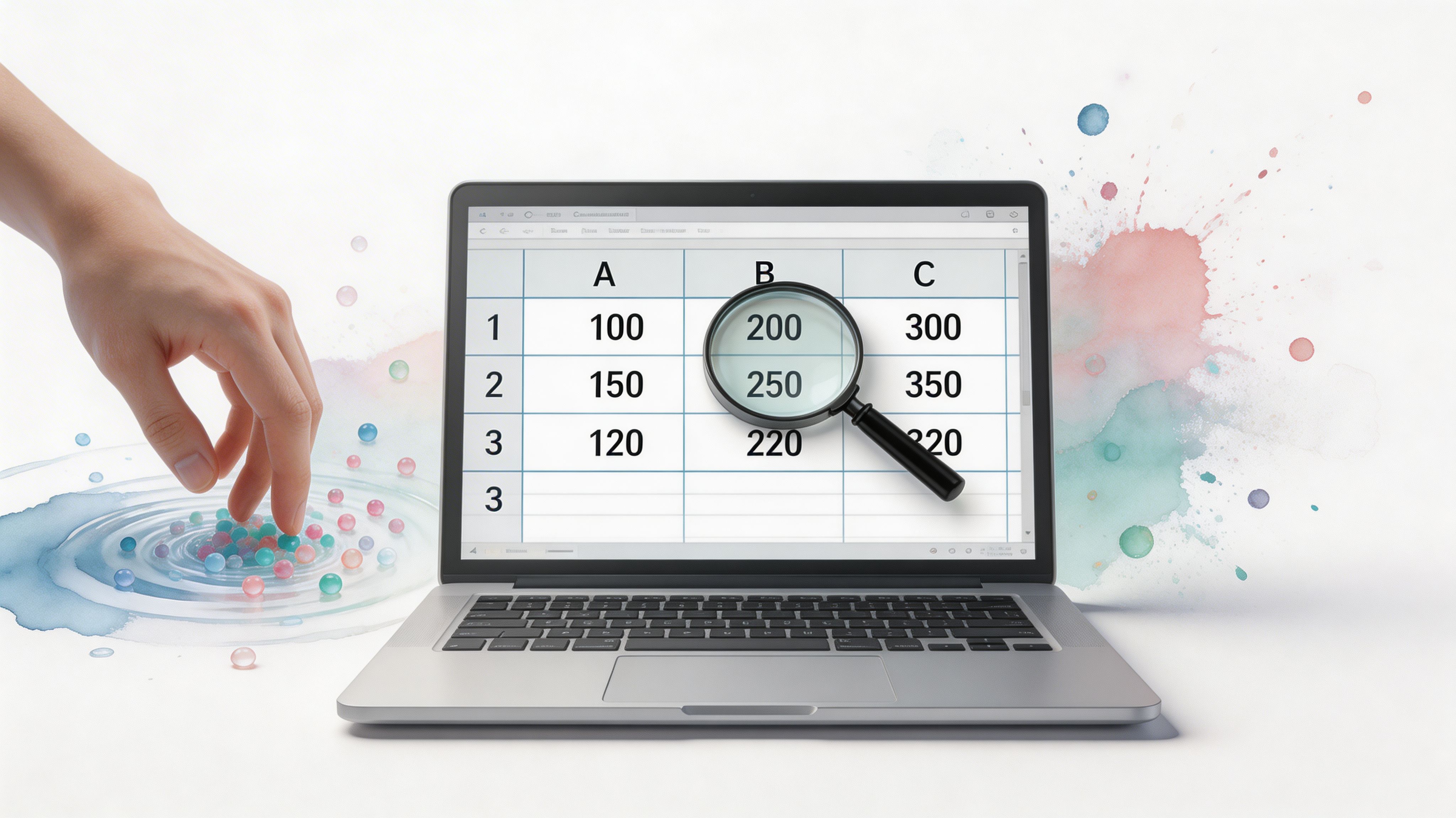

A hand interacting with colorful spheres near a laptop screen displaying a spreadsheet with a magnifying glass.

You do not need a full data engineering sprint before you create charts from data. You need a quick pre-flight check. Five minutes is often enough to catch the mistakes that make a chart misleading or flat-out wrong.

A foundational study makes the point nicely. Correctly grouping 450 subjects by education level showed they represented exactly 20.5% of the sample, which is the kind of basic categorization step charts depend on. The same source notes that modern tools can reduce manual errors in BI workflows by up to 80% when they automate this process (PMC).

Check the three usual suspects

Start with the boring stuff. It causes the loudest problems later.

  • Duplicates: Look for repeated rows, repeated order IDs, or the same lead imported twice.

  • Blanks: Empty cells break summaries fast, especially for averages, dates, and grouped reports.

  • Inconsistent labels: “USA,” “U.S.,” and “United States” are three categories if your sheet treats them that way.

If you are working from PDFs, statements, or exports that were clearly designed to annoy analysts, clean the format first. Converting files into something tabular helps a lot. A practical example is using a bank statement converter to Excel before you start grouping transactions or plotting spend trends.

Aim for good enough, not perfect

Perfection is where reporting projects go to die.

Use this fast checklist:

  1. One row per thing. One order, one lead, one support ticket.

  2. Dates in one format. Pick one and stick to it.

  3. Currency fields as numbers. Not text with symbols jammed in.

  4. Category names normalized. Same meaning, same label.

  5. Obvious outliers reviewed. A misplaced zero can wreck a chart.

Tip: If a number looks too dramatic, inspect the raw rows before you inspect the chart settings.

Let software handle the repetitive cleanup

Spreadsheets are fine for quick checks. They are not great for repeated multi-source cleanup.

When teams connect a database like Postgres to a conversational analytics layer, the software can often normalize columns, infer data types, and group records consistently enough to get a reliable first chart. That is a much better use of time than rebuilding the same pivot table every Monday.

The win is not elegance. It is trust. If the categories are clean, the chart has a fighting chance.

The Old Way vs The New Way of Getting Answers

The old way turns smart people into part-time file clerks.

You export CSVs. You merge tabs. You patch missing values. You open Excel. You try a pivot table. Then someone asks a follow-up question and the whole routine starts over.

The newer workflow is conversational. Connect the sources once. Ask the question. Refine the answer.

Creating a Revenue Chart Manual vs. Conversational AI

Stage

The Old Way (Manual SQL/Excel)

The New Way (Statspresso)

Get the data

Export from Shopify, HubSpot, Stripe, or Sheets separately

Connect sources once

Clean it

Fix labels, dates, blanks, and joins by hand

System handles much of the structure automatically

Build the chart

Write SQL, create a pivot table, or click through chart menus

Ask for the visual in plain English

Handle follow-ups

Re-run queries or rebuild filters

Ask another question immediately

Share results

Screenshot the chart or send a file

Share a live chart or dashboard

Skill required

SQL, spreadsheet formulas, BI tool familiarity

Clear business questions

Here is the key difference:

  • Manual workflow is chart-building.

  • Conversational workflow is answer-finding.

A founder should not need to know whether monthly revenue is better grouped by booking date or close date before seeing a first chart. They should be able to ask, inspect the output, then tighten the question.

Try asking: “Show monthly recurring revenue trend for the last year, then break it down by acquisition channel.”

If you still want a SQL-heavy path for edge cases, keep it. But for routine reporting, there is no prize for suffering through three exports and a lookup formula.

For teams comparing approaches, this is also where internal docs help. A useful companion topic is a guide on SQL-based charting, especially when you need to understand what the conversational layer is abstracting away.

Choose the Right Chart for Your Question

Many users do not need more chart types. They need fewer bad ones.

Infographic

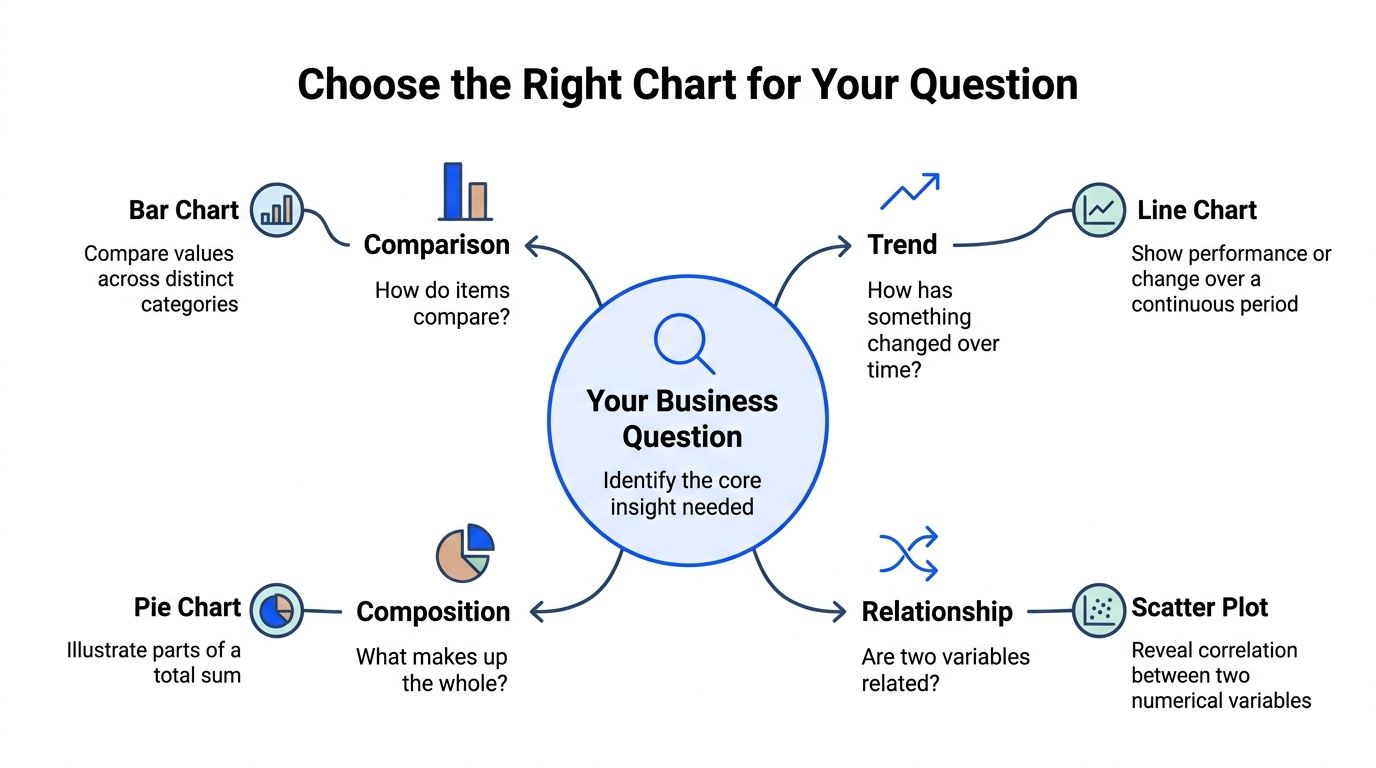
If you want to create charts from data quickly, match the chart to the question. That one habit fixes a surprising amount of confusion.

William Playfair invented the line, bar, and pie chart in 1786, and later research by Cleveland and McGill in 1984 established that people read position more accurately than length, and length more accurately than angle. That is why bar charts usually beat pie charts for comparisons (Statistics Canada).

If you want a broader primer on the basics behind chart reading, this explainer on What is data visualization is useful context.

Use a bar chart for comparisons

Ask for a bar chart when the question is basically, “Which one is bigger?”

Examples:

  • Revenue by channel

  • Leads by campaign

  • Support tickets by issue type

Bars work because people compare lengths well. They do not have to decode angles, slices, or visual gimmicks.

Use horizontal bars when category names are long. Your neck will thank you.

Use a line chart for trends

If time is on the x-axis, a line chart is usually the first thing to try.

Examples:

  • Revenue by month

  • Signups by week

  • Churn rate over time

Lines show movement, direction, and pace. They answer “what changed?” better than almost anything else. If the data is irregular or very sparse, a bar chart can still work, but line charts are the default for continuous trends for good reason.

Use a scatter plot for relationships

Scatter plots answer, “Do these two things move together?”

Examples:

  • Ad spend versus conversions

  • Response time versus CSAT

  • Price versus win rate

A good scatter plot can show clusters, weird outliers, or a relationship you suspected but had not proven. A bad one can look like birdshot. Label carefully and keep the point count manageable when possible.

Use part-to-whole charts carefully

Here, people often become ambitious and make analysis harder.

If you are showing composition, your first instinct might be a pie chart or donut chart. Sometimes that is fine. But because people read length better than angle, a sorted bar chart is often easier to compare across categories.

Use a pie only when:

  • Categories are mutually exclusive

  • The whole equals 100%

  • There are just a few slices

  • The question is about share, not rank

When in doubt, bars are safer. They are less flashy and more legible. In business reporting, that is a compliment.

Build Your Chart in Seconds Not Hours

Most chart tools still assume you want to click your way through the interface like it is 2014.

That works if your data is already clean, local, and sitting in one file. It breaks down when the question spans multiple systems and the person asking is a founder, not an analyst.


A young man looking surprised at a colorful, creative bar graph and line chart emerging from his laptop.

A Conversational AI Data Analyst earns its keep here. Instead of selecting fields, nesting filters, and adjusting chart settings manually, you ask for the output you want. Statspresso is one example. It connects sources like Shopify, HubSpot, Linear, and Postgres, then returns charts from plain-English questions.

That matters because repetitive reporting burns people out. Recent 2025 surveys found 68% of BI practitioners at startups report “dashboard fatigue” from repetitive standard charts, while underused visuals like horizon charts and beeswarm plots can reveal richer patterns that traditional tools often ignore (Observable).

Prompts that work

Skip vague prompts like “analyze my business.” Ask for a chart with a metric, dimension, timeframe, and optionally a filter.

Try prompts like these:

  • Revenue trend: “Show monthly revenue for the last year as a line chart.”

  • Channel comparison: “Compare revenue by acquisition channel for last quarter as a bar chart.”

  • Funnel drop-off: “Plot trial signups, activated users, and paid conversions by week.”

  • Regional breakdown: “Show orders by country for this month.”

  • Product mix: “What share of revenue came from each product line this quarter?”

  • Retention check: “Chart repeat purchase rate by cohort month.”

Those prompts work because they tell the system what to group, how to visualize it, and what period matters.

Ask follow-up questions like a human, not a query builder

This is the underrated part.

After the first chart appears, you can tighten the question naturally:

  • “Now show only paid acquisition.”

  • “Exclude refunds.”

  • “Break that out by device type.”

  • “Turn this into a stacked bar chart.”

  • “Add a note for the product launch week.”

That beats editing filters across three tabs and wondering why the totals changed.

Tip: The first chart does not need to be perfect. It needs to be close enough to reveal the next useful question.

Use AI for chart suggestions, not just chart generation

A smart system should also suggest when your chosen chart is the wrong one.

If you ask for a pie with too many categories, a better tool should nudge you toward bars. If your data is dense and trend-heavy, it may suggest a more compact visual. That is especially handy when teams are stuck in the same line-chart-and-bar-chart rut for every dashboard.

The practical payoff is speed. Not because charts are somehow magical, but because fewer clicks means more time spent thinking about the result.

Refine Your Visuals to Tell a Clear Story

A raw chart is not a story. It is evidence waiting for a sentence.
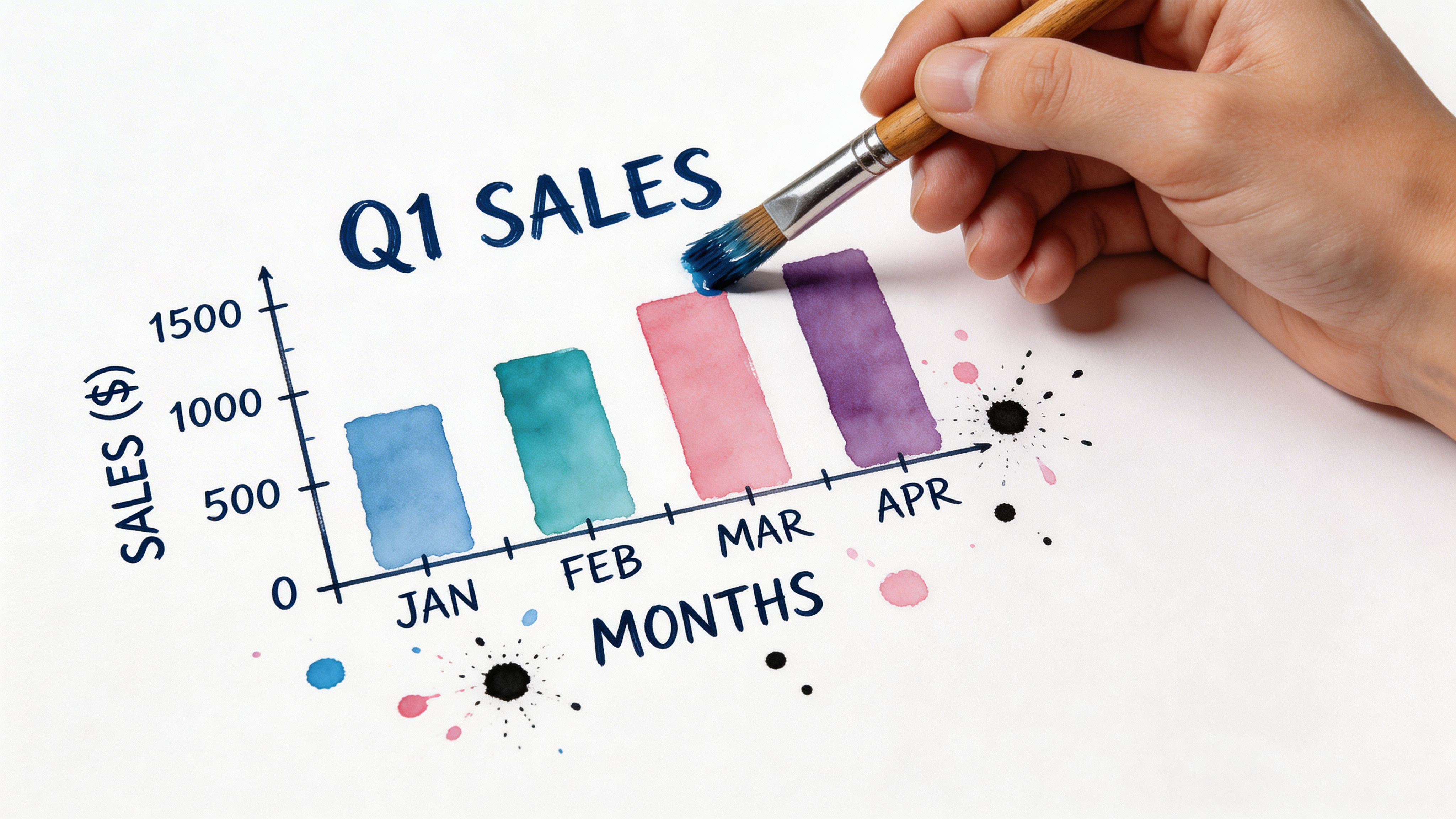

A hand painting a bar chart representing Q1 sales with a brush on a white surface.

Many teams stop too early at this stage. They build the chart, paste it into a deck, and expect the audience to infer the point. Audiences often will not. They will scan, shrug, and move on.

That is expensive. Enterprise case studies including Vanguard found clarity-optimized visualizations boosted audience engagement by 2.5x and decision speed by 40%, while 60% to 70% of corporate charts fail to drive decisions because they lack basic data communication skills (Practical Reporting).

Start with the title

Bad title: “Q2 Sales Data”

Better title: “Revenue grew after the pricing change, but only in the enterprise segment”

A title should do some interpretive work. Not all of it. Just enough to orient the reader.

Add labels that remove friction

Do not make people guess what the axes mean.

Use:

  • Clear units

  • Human date labels

  • Category names that match business language

  • Legends only when direct labels will not work

If your chart needs a paragraph to decode the axes, the chart is asking too much.

Annotate the one thing you want remembered

One sentence can transform a chart from passive report to decision tool.

Examples:

  • “Lead volume dipped after the campaign ended.”

  • “Refunds spiked in the week after the shipping delay.”

  • “The top two channels account for most qualified pipeline.”

That annotation is not fluff. It is the bridge between visual and action.

Key takeaway: The chart shows the pattern. The annotation tells your team why the pattern matters.

Use color like a highlighter, not confetti

Most business charts need restraint.

Use one accent color to draw attention to:

  • The latest period

  • The most important category

  • The outlier worth discussing

Everything else can stay neutral. If all bars scream for attention, none of them do.

For a deeper walkthrough on layout, labeling, and readability, Statspresso’s guide to data visualization best practices is a solid companion.

Troubleshooting Common Chart Disasters

You can clean the data perfectly and still wreck the chart. It happens fast.

The biggest repeat offender is the pie chart that should have been a bar chart. A systematic review of 320 scientific papers found pie charts were the most frequently misused visual, especially when creators used more than 7 categories or added 3D effects. Those choices produced a 12% higher rate of misinterpretation compared with bar charts (PMC).

Disaster one too many slices

If your pie chart looks like a pizza someone dropped, stop.

Fix:

  • Reduce categories

  • Group tiny categories into “Other”

  • Or switch to a sorted bar chart

Disaster two fake depth

3D effects make proportion charts harder to read. They add decoration and subtract honesty.

Fix:

  • Use flat shapes

  • Remove shadows

  • Keep the focus on the data, not the software’s effects menu

Disaster three manipulated bar axes

Bar charts should usually start at zero. If they do not, small differences can look huge.

Fix:

  • Start the y-axis at zero for bar charts

  • If you need to show subtle movement, consider a line chart instead

Disaster four unlabeled mystery graphics

A chart without clear labels, units, or timeframe creates meetings full of bad guesses.

Fix:

  • Add a direct title

  • Label axes

  • State the period

  • Include one takeaway

The quick test is simple. If a smart colleague can misread the chart in under three seconds, the chart needs another pass.

From Data to Decision in Minutes

TL;DR

  • Clean fast: Check duplicates, blanks, and inconsistent labels before you chart.

  • Match chart to question: Bar for comparisons, line for trends, scatter for relationships.

  • Ask instead of building: Conversational Analytics and Automated BI tools cut the grunt work.

  • Refine the message: A strong title and one annotation make the chart useful.

  • Avoid common traps: Too many pie slices, 3D effects, and misleading axes damage trust.

The fastest way to create charts from data is not mastering every menu in Excel or memorizing SQL syntax. It is reducing the path between question and answer.

That is what modern GenBI and conversational analytics tools change. They let non-technical leaders get to a reliable first chart quickly, then improve it with follow-up questions instead of rebuilding from scratch.

The spreadsheet is not the goal. The decision is.

Connect your first data source in Statspresso and ask your first question in plain English. If your data is scattered across Shopify, HubSpot, Postgres, or spreadsheets, a conversational AI data analyst can turn that mess into a shareable chart in seconds. Skip the SQL. Start with the question you already have.

Waiting weeks for a data analyst to build a dashboard is a relic of the past. Your revenue lives in Shopify, leads sit in HubSpot, ops data hides in spreadsheets, and every urgent question turns into a mini archaeology project. The fix is not “become a BI engineer on weekends.” The fix is learning the shortest path to create charts from data that people can use.

A good chart is not decoration. It is a decision shortcut.

Your Data Is Everywhere But Your Answers Are Nowhere

Many teams do not have a data problem. They have a data access problem.

The numbers exist. They are just scattered, inconsistently named, and trapped inside tools that do not talk to each other. That is why so many chart tutorials feel useless. They start with a tidy CSV and a cheerful sample dataset. Real work rarely does.

The gap is obvious in practice. 2025 Gartner data says 74% of analysts at SMBs spend over 40 hours monthly on manual data prep from multiple sources, delaying charts by days, and Forrester reports 45% adoption growth in conversational AI analytics (Mind the Graph). That tracks with what founders and PMs complain about most. Not a lack of data. A lack of answers on demand.

The modern move is simple. Connect the data once, then ask questions in plain English.

Try asking an AI data analyst: “Show me revenue by channel for last month.”

That is the shift. Less dashboard babysitting. More decisions.

First Tame Your Data Without Losing Your Mind

A chart built on messy data is still a mess. It is just color-coded.


A hand interacting with colorful spheres near a laptop screen displaying a spreadsheet with a magnifying glass.

You do not need a full data engineering sprint before you create charts from data. You need a quick pre-flight check. Five minutes is often enough to catch the mistakes that make a chart misleading or flat-out wrong.

A foundational study makes the point nicely. Correctly grouping 450 subjects by education level showed they represented exactly 20.5% of the sample, which is the kind of basic categorization step charts depend on. The same source notes that modern tools can reduce manual errors in BI workflows by up to 80% when they automate this process (PMC).

Check the three usual suspects

Start with the boring stuff. It causes the loudest problems later.

  • Duplicates: Look for repeated rows, repeated order IDs, or the same lead imported twice.

  • Blanks: Empty cells break summaries fast, especially for averages, dates, and grouped reports.

  • Inconsistent labels: “USA,” “U.S.,” and “United States” are three categories if your sheet treats them that way.

If you are working from PDFs, statements, or exports that were clearly designed to annoy analysts, clean the format first. Converting files into something tabular helps a lot. A practical example is using a bank statement converter to Excel before you start grouping transactions or plotting spend trends.

Aim for good enough, not perfect

Perfection is where reporting projects go to die.

Use this fast checklist:

  1. One row per thing. One order, one lead, one support ticket.

  2. Dates in one format. Pick one and stick to it.

  3. Currency fields as numbers. Not text with symbols jammed in.

  4. Category names normalized. Same meaning, same label.

  5. Obvious outliers reviewed. A misplaced zero can wreck a chart.

Tip: If a number looks too dramatic, inspect the raw rows before you inspect the chart settings.

Let software handle the repetitive cleanup

Spreadsheets are fine for quick checks. They are not great for repeated multi-source cleanup.

When teams connect a database like Postgres to a conversational analytics layer, the software can often normalize columns, infer data types, and group records consistently enough to get a reliable first chart. That is a much better use of time than rebuilding the same pivot table every Monday.

The win is not elegance. It is trust. If the categories are clean, the chart has a fighting chance.

The Old Way vs The New Way of Getting Answers

The old way turns smart people into part-time file clerks.

You export CSVs. You merge tabs. You patch missing values. You open Excel. You try a pivot table. Then someone asks a follow-up question and the whole routine starts over.

The newer workflow is conversational. Connect the sources once. Ask the question. Refine the answer.

Creating a Revenue Chart Manual vs. Conversational AI

Stage

The Old Way (Manual SQL/Excel)

The New Way (Statspresso)

Get the data

Export from Shopify, HubSpot, Stripe, or Sheets separately

Connect sources once

Clean it

Fix labels, dates, blanks, and joins by hand

System handles much of the structure automatically

Build the chart

Write SQL, create a pivot table, or click through chart menus

Ask for the visual in plain English

Handle follow-ups

Re-run queries or rebuild filters

Ask another question immediately

Share results

Screenshot the chart or send a file

Share a live chart or dashboard

Skill required

SQL, spreadsheet formulas, BI tool familiarity

Clear business questions

Here is the key difference:

  • Manual workflow is chart-building.

  • Conversational workflow is answer-finding.

A founder should not need to know whether monthly revenue is better grouped by booking date or close date before seeing a first chart. They should be able to ask, inspect the output, then tighten the question.

Try asking: “Show monthly recurring revenue trend for the last year, then break it down by acquisition channel.”

If you still want a SQL-heavy path for edge cases, keep it. But for routine reporting, there is no prize for suffering through three exports and a lookup formula.

For teams comparing approaches, this is also where internal docs help. A useful companion topic is a guide on SQL-based charting, especially when you need to understand what the conversational layer is abstracting away.

Choose the Right Chart for Your Question

Many users do not need more chart types. They need fewer bad ones.


Infographic

If you want to create charts from data quickly, match the chart to the question. That one habit fixes a surprising amount of confusion.

William Playfair invented the line, bar, and pie chart in 1786, and later research by Cleveland and McGill in 1984 established that people read position more accurately than length, and length more accurately than angle. That is why bar charts usually beat pie charts for comparisons (Statistics Canada).

If you want a broader primer on the basics behind chart reading, this explainer on What is data visualization is useful context.

Use a bar chart for comparisons

Ask for a bar chart when the question is basically, “Which one is bigger?”

Examples:

  • Revenue by channel

  • Leads by campaign

  • Support tickets by issue type

Bars work because people compare lengths well. They do not have to decode angles, slices, or visual gimmicks.

Use horizontal bars when category names are long. Your neck will thank you.

Use a line chart for trends

If time is on the x-axis, a line chart is usually the first thing to try.

Examples:

  • Revenue by month

  • Signups by week

  • Churn rate over time

Lines show movement, direction, and pace. They answer “what changed?” better than almost anything else. If the data is irregular or very sparse, a bar chart can still work, but line charts are the default for continuous trends for good reason.

Use a scatter plot for relationships

Scatter plots answer, “Do these two things move together?”

Examples:

  • Ad spend versus conversions

  • Response time versus CSAT

  • Price versus win rate

A good scatter plot can show clusters, weird outliers, or a relationship you suspected but had not proven. A bad one can look like birdshot. Label carefully and keep the point count manageable when possible.

Use part-to-whole charts carefully

Here, people often become ambitious and make analysis harder.

If you are showing composition, your first instinct might be a pie chart or donut chart. Sometimes that is fine. But because people read length better than angle, a sorted bar chart is often easier to compare across categories.

Use a pie only when:

  • Categories are mutually exclusive

  • The whole equals 100%

  • There are just a few slices

  • The question is about share, not rank

When in doubt, bars are safer. They are less flashy and more legible. In business reporting, that is a compliment.

Build Your Chart in Seconds Not Hours

Most chart tools still assume you want to click your way through the interface like it is 2014.

That works if your data is already clean, local, and sitting in one file. It breaks down when the question spans multiple systems and the person asking is a founder, not an analyst.


A young man looking surprised at a colorful, creative bar graph and line chart emerging from his laptop.

A Conversational AI Data Analyst earns its keep here. Instead of selecting fields, nesting filters, and adjusting chart settings manually, you ask for the output you want. Statspresso is one example. It connects sources like Shopify, HubSpot, Linear, and Postgres, then returns charts from plain-English questions.

That matters because repetitive reporting burns people out. Recent 2025 surveys found 68% of BI practitioners at startups report “dashboard fatigue” from repetitive standard charts, while underused visuals like horizon charts and beeswarm plots can reveal richer patterns that traditional tools often ignore (Observable).

Prompts that work

Skip vague prompts like “analyze my business.” Ask for a chart with a metric, dimension, timeframe, and optionally a filter.

Try prompts like these:

  • Revenue trend: “Show monthly revenue for the last year as a line chart.”

  • Channel comparison: “Compare revenue by acquisition channel for last quarter as a bar chart.”

  • Funnel drop-off: “Plot trial signups, activated users, and paid conversions by week.”

  • Regional breakdown: “Show orders by country for this month.”

  • Product mix: “What share of revenue came from each product line this quarter?”

  • Retention check: “Chart repeat purchase rate by cohort month.”

Those prompts work because they tell the system what to group, how to visualize it, and what period matters.

Ask follow-up questions like a human, not a query builder

This is the underrated part.

After the first chart appears, you can tighten the question naturally:

  • “Now show only paid acquisition.”

  • “Exclude refunds.”

  • “Break that out by device type.”

  • “Turn this into a stacked bar chart.”

  • “Add a note for the product launch week.”

That beats editing filters across three tabs and wondering why the totals changed.

Tip: The first chart does not need to be perfect. It needs to be close enough to reveal the next useful question.

Use AI for chart suggestions, not just chart generation

A smart system should also suggest when your chosen chart is the wrong one.

If you ask for a pie with too many categories, a better tool should nudge you toward bars. If your data is dense and trend-heavy, it may suggest a more compact visual. That is especially handy when teams are stuck in the same line-chart-and-bar-chart rut for every dashboard.

The practical payoff is speed. Not because charts are somehow magical, but because fewer clicks means more time spent thinking about the result.

Refine Your Visuals to Tell a Clear Story

A raw chart is not a story. It is evidence waiting for a sentence.


A hand painting a bar chart representing Q1 sales with a brush on a white surface.

Many teams stop too early at this stage. They build the chart, paste it into a deck, and expect the audience to infer the point. Audiences often will not. They will scan, shrug, and move on.

That is expensive. Enterprise case studies including Vanguard found clarity-optimized visualizations boosted audience engagement by 2.5x and decision speed by 40%, while 60% to 70% of corporate charts fail to drive decisions because they lack basic data communication skills (Practical Reporting).

Start with the title

Bad title: “Q2 Sales Data”

Better title: “Revenue grew after the pricing change, but only in the enterprise segment”

A title should do some interpretive work. Not all of it. Just enough to orient the reader.

Add labels that remove friction

Do not make people guess what the axes mean.

Use:

  • Clear units

  • Human date labels

  • Category names that match business language

  • Legends only when direct labels will not work

If your chart needs a paragraph to decode the axes, the chart is asking too much.

Annotate the one thing you want remembered

One sentence can transform a chart from passive report to decision tool.

Examples:

  • “Lead volume dipped after the campaign ended.”

  • “Refunds spiked in the week after the shipping delay.”

  • “The top two channels account for most qualified pipeline.”

That annotation is not fluff. It is the bridge between visual and action.

Key takeaway: The chart shows the pattern. The annotation tells your team why the pattern matters.

Use color like a highlighter, not confetti

Most business charts need restraint.

Use one accent color to draw attention to:

  • The latest period

  • The most important category

  • The outlier worth discussing

Everything else can stay neutral. If all bars scream for attention, none of them do.

For a deeper walkthrough on layout, labeling, and readability, Statspresso’s guide to data visualization best practices is a solid companion.

Troubleshooting Common Chart Disasters

You can clean the data perfectly and still wreck the chart. It happens fast.

The biggest repeat offender is the pie chart that should have been a bar chart. A systematic review of 320 scientific papers found pie charts were the most frequently misused visual, especially when creators used more than 7 categories or added 3D effects. Those choices produced a 12% higher rate of misinterpretation compared with bar charts (PMC).

Disaster one too many slices

If your pie chart looks like a pizza someone dropped, stop.

Fix:

  • Reduce categories

  • Group tiny categories into “Other”

  • Or switch to a sorted bar chart

Disaster two fake depth

3D effects make proportion charts harder to read. They add decoration and subtract honesty.

Fix:

  • Use flat shapes

  • Remove shadows

  • Keep the focus on the data, not the software’s effects menu

Disaster three manipulated bar axes

Bar charts should usually start at zero. If they do not, small differences can look huge.

Fix:

  • Start the y-axis at zero for bar charts

  • If you need to show subtle movement, consider a line chart instead

Disaster four unlabeled mystery graphics

A chart without clear labels, units, or timeframe creates meetings full of bad guesses.

Fix:

  • Add a direct title

  • Label axes

  • State the period

  • Include one takeaway

The quick test is simple. If a smart colleague can misread the chart in under three seconds, the chart needs another pass.

From Data to Decision in Minutes

TL;DR

  • Clean fast: Check duplicates, blanks, and inconsistent labels before you chart.

  • Match chart to question: Bar for comparisons, line for trends, scatter for relationships.

  • Ask instead of building: Conversational Analytics and Automated BI tools cut the grunt work.

  • Refine the message: A strong title and one annotation make the chart useful.

  • Avoid common traps: Too many pie slices, 3D effects, and misleading axes damage trust.

The fastest way to create charts from data is not mastering every menu in Excel or memorizing SQL syntax. It is reducing the path between question and answer.

That is what modern GenBI and conversational analytics tools change. They let non-technical leaders get to a reliable first chart quickly, then improve it with follow-up questions instead of rebuilding from scratch.

The spreadsheet is not the goal. The decision is.

Connect your first data source in Statspresso and ask your first question in plain English. If your data is scattered across Shopify, HubSpot, Postgres, or spreadsheets, a conversational AI data analyst can turn that mess into a shareable chart in seconds. Skip the SQL. Start with the question you already have.

Waiting weeks for a data analyst to build a dashboard is a relic of the past. Your revenue lives in Shopify, leads sit in HubSpot, ops data hides in spreadsheets, and every urgent question turns into a mini archaeology project. The fix is not “become a BI engineer on weekends.” The fix is learning the shortest path to create charts from data that people can use.

A good chart is not decoration. It is a decision shortcut.

Your Data Is Everywhere But Your Answers Are Nowhere

Many teams do not have a data problem. They have a data access problem.

The numbers exist. They are just scattered, inconsistently named, and trapped inside tools that do not talk to each other. That is why so many chart tutorials feel useless. They start with a tidy CSV and a cheerful sample dataset. Real work rarely does.

The gap is obvious in practice. 2025 Gartner data says 74% of analysts at SMBs spend over 40 hours monthly on manual data prep from multiple sources, delaying charts by days, and Forrester reports 45% adoption growth in conversational AI analytics (Mind the Graph). That tracks with what founders and PMs complain about most. Not a lack of data. A lack of answers on demand.

The modern move is simple. Connect the data once, then ask questions in plain English.

Try asking an AI data analyst: “Show me revenue by channel for last month.”

That is the shift. Less dashboard babysitting. More decisions.

First Tame Your Data Without Losing Your Mind

A chart built on messy data is still a mess. It is just color-coded.


A hand interacting with colorful spheres near a laptop screen displaying a spreadsheet with a magnifying glass.

You do not need a full data engineering sprint before you create charts from data. You need a quick pre-flight check. Five minutes is often enough to catch the mistakes that make a chart misleading or flat-out wrong.

A foundational study makes the point nicely. Correctly grouping 450 subjects by education level showed they represented exactly 20.5% of the sample, which is the kind of basic categorization step charts depend on. The same source notes that modern tools can reduce manual errors in BI workflows by up to 80% when they automate this process (PMC).

Check the three usual suspects

Start with the boring stuff. It causes the loudest problems later.

  • Duplicates: Look for repeated rows, repeated order IDs, or the same lead imported twice.

  • Blanks: Empty cells break summaries fast, especially for averages, dates, and grouped reports.

  • Inconsistent labels: “USA,” “U.S.,” and “United States” are three categories if your sheet treats them that way.

If you are working from PDFs, statements, or exports that were clearly designed to annoy analysts, clean the format first. Converting files into something tabular helps a lot. A practical example is using a bank statement converter to Excel before you start grouping transactions or plotting spend trends.

Aim for good enough, not perfect

Perfection is where reporting projects go to die.

Use this fast checklist:

  1. One row per thing. One order, one lead, one support ticket.

  2. Dates in one format. Pick one and stick to it.

  3. Currency fields as numbers. Not text with symbols jammed in.

  4. Category names normalized. Same meaning, same label.

  5. Obvious outliers reviewed. A misplaced zero can wreck a chart.

Tip: If a number looks too dramatic, inspect the raw rows before you inspect the chart settings.

Let software handle the repetitive cleanup

Spreadsheets are fine for quick checks. They are not great for repeated multi-source cleanup.

When teams connect a database like Postgres to a conversational analytics layer, the software can often normalize columns, infer data types, and group records consistently enough to get a reliable first chart. That is a much better use of time than rebuilding the same pivot table every Monday.

The win is not elegance. It is trust. If the categories are clean, the chart has a fighting chance.

The Old Way vs The New Way of Getting Answers

The old way turns smart people into part-time file clerks.

You export CSVs. You merge tabs. You patch missing values. You open Excel. You try a pivot table. Then someone asks a follow-up question and the whole routine starts over.

The newer workflow is conversational. Connect the sources once. Ask the question. Refine the answer.

Creating a Revenue Chart Manual vs. Conversational AI

Stage

The Old Way (Manual SQL/Excel)

The New Way (Statspresso)

Get the data

Export from Shopify, HubSpot, Stripe, or Sheets separately

Connect sources once

Clean it

Fix labels, dates, blanks, and joins by hand

System handles much of the structure automatically

Build the chart

Write SQL, create a pivot table, or click through chart menus

Ask for the visual in plain English

Handle follow-ups

Re-run queries or rebuild filters

Ask another question immediately

Share results

Screenshot the chart or send a file

Share a live chart or dashboard

Skill required

SQL, spreadsheet formulas, BI tool familiarity

Clear business questions

Here is the key difference:

  • Manual workflow is chart-building.

  • Conversational workflow is answer-finding.

A founder should not need to know whether monthly revenue is better grouped by booking date or close date before seeing a first chart. They should be able to ask, inspect the output, then tighten the question.

Try asking: “Show monthly recurring revenue trend for the last year, then break it down by acquisition channel.”

If you still want a SQL-heavy path for edge cases, keep it. But for routine reporting, there is no prize for suffering through three exports and a lookup formula.

For teams comparing approaches, this is also where internal docs help. A useful companion topic is a guide on SQL-based charting, especially when you need to understand what the conversational layer is abstracting away.

Choose the Right Chart for Your Question

Many users do not need more chart types. They need fewer bad ones.


Infographic

If you want to create charts from data quickly, match the chart to the question. That one habit fixes a surprising amount of confusion.

William Playfair invented the line, bar, and pie chart in 1786, and later research by Cleveland and McGill in 1984 established that people read position more accurately than length, and length more accurately than angle. That is why bar charts usually beat pie charts for comparisons (Statistics Canada).

If you want a broader primer on the basics behind chart reading, this explainer on What is data visualization is useful context.

Use a bar chart for comparisons

Ask for a bar chart when the question is basically, “Which one is bigger?”

Examples:

  • Revenue by channel

  • Leads by campaign

  • Support tickets by issue type

Bars work because people compare lengths well. They do not have to decode angles, slices, or visual gimmicks.

Use horizontal bars when category names are long. Your neck will thank you.

Use a line chart for trends

If time is on the x-axis, a line chart is usually the first thing to try.

Examples:

  • Revenue by month

  • Signups by week

  • Churn rate over time

Lines show movement, direction, and pace. They answer “what changed?” better than almost anything else. If the data is irregular or very sparse, a bar chart can still work, but line charts are the default for continuous trends for good reason.

Use a scatter plot for relationships

Scatter plots answer, “Do these two things move together?”

Examples:

  • Ad spend versus conversions

  • Response time versus CSAT

  • Price versus win rate

A good scatter plot can show clusters, weird outliers, or a relationship you suspected but had not proven. A bad one can look like birdshot. Label carefully and keep the point count manageable when possible.

Use part-to-whole charts carefully

Here, people often become ambitious and make analysis harder.

If you are showing composition, your first instinct might be a pie chart or donut chart. Sometimes that is fine. But because people read length better than angle, a sorted bar chart is often easier to compare across categories.

Use a pie only when:

  • Categories are mutually exclusive

  • The whole equals 100%

  • There are just a few slices

  • The question is about share, not rank

When in doubt, bars are safer. They are less flashy and more legible. In business reporting, that is a compliment.

Build Your Chart in Seconds Not Hours

Most chart tools still assume you want to click your way through the interface like it is 2014.

That works if your data is already clean, local, and sitting in one file. It breaks down when the question spans multiple systems and the person asking is a founder, not an analyst.


A young man looking surprised at a colorful, creative bar graph and line chart emerging from his laptop.

A Conversational AI Data Analyst earns its keep here. Instead of selecting fields, nesting filters, and adjusting chart settings manually, you ask for the output you want. Statspresso is one example. It connects sources like Shopify, HubSpot, Linear, and Postgres, then returns charts from plain-English questions.

That matters because repetitive reporting burns people out. Recent 2025 surveys found 68% of BI practitioners at startups report “dashboard fatigue” from repetitive standard charts, while underused visuals like horizon charts and beeswarm plots can reveal richer patterns that traditional tools often ignore (Observable).

Prompts that work

Skip vague prompts like “analyze my business.” Ask for a chart with a metric, dimension, timeframe, and optionally a filter.

Try prompts like these:

  • Revenue trend: “Show monthly revenue for the last year as a line chart.”

  • Channel comparison: “Compare revenue by acquisition channel for last quarter as a bar chart.”

  • Funnel drop-off: “Plot trial signups, activated users, and paid conversions by week.”

  • Regional breakdown: “Show orders by country for this month.”

  • Product mix: “What share of revenue came from each product line this quarter?”

  • Retention check: “Chart repeat purchase rate by cohort month.”

Those prompts work because they tell the system what to group, how to visualize it, and what period matters.

Ask follow-up questions like a human, not a query builder

This is the underrated part.

After the first chart appears, you can tighten the question naturally:

  • “Now show only paid acquisition.”

  • “Exclude refunds.”

  • “Break that out by device type.”

  • “Turn this into a stacked bar chart.”

  • “Add a note for the product launch week.”

That beats editing filters across three tabs and wondering why the totals changed.

Tip: The first chart does not need to be perfect. It needs to be close enough to reveal the next useful question.

Use AI for chart suggestions, not just chart generation

A smart system should also suggest when your chosen chart is the wrong one.

If you ask for a pie with too many categories, a better tool should nudge you toward bars. If your data is dense and trend-heavy, it may suggest a more compact visual. That is especially handy when teams are stuck in the same line-chart-and-bar-chart rut for every dashboard.

The practical payoff is speed. Not because charts are somehow magical, but because fewer clicks means more time spent thinking about the result.

Refine Your Visuals to Tell a Clear Story

A raw chart is not a story. It is evidence waiting for a sentence.


A hand painting a bar chart representing Q1 sales with a brush on a white surface.

Many teams stop too early at this stage. They build the chart, paste it into a deck, and expect the audience to infer the point. Audiences often will not. They will scan, shrug, and move on.

That is expensive. Enterprise case studies including Vanguard found clarity-optimized visualizations boosted audience engagement by 2.5x and decision speed by 40%, while 60% to 70% of corporate charts fail to drive decisions because they lack basic data communication skills (Practical Reporting).

Start with the title

Bad title: “Q2 Sales Data”

Better title: “Revenue grew after the pricing change, but only in the enterprise segment”

A title should do some interpretive work. Not all of it. Just enough to orient the reader.

Add labels that remove friction

Do not make people guess what the axes mean.

Use:

  • Clear units

  • Human date labels

  • Category names that match business language

  • Legends only when direct labels will not work

If your chart needs a paragraph to decode the axes, the chart is asking too much.

Annotate the one thing you want remembered

One sentence can transform a chart from passive report to decision tool.

Examples:

  • “Lead volume dipped after the campaign ended.”

  • “Refunds spiked in the week after the shipping delay.”

  • “The top two channels account for most qualified pipeline.”

That annotation is not fluff. It is the bridge between visual and action.

Key takeaway: The chart shows the pattern. The annotation tells your team why the pattern matters.

Use color like a highlighter, not confetti

Most business charts need restraint.

Use one accent color to draw attention to:

  • The latest period

  • The most important category

  • The outlier worth discussing

Everything else can stay neutral. If all bars scream for attention, none of them do.

For a deeper walkthrough on layout, labeling, and readability, Statspresso’s guide to data visualization best practices is a solid companion.

Troubleshooting Common Chart Disasters

You can clean the data perfectly and still wreck the chart. It happens fast.

The biggest repeat offender is the pie chart that should have been a bar chart. A systematic review of 320 scientific papers found pie charts were the most frequently misused visual, especially when creators used more than 7 categories or added 3D effects. Those choices produced a 12% higher rate of misinterpretation compared with bar charts (PMC).

Disaster one too many slices

If your pie chart looks like a pizza someone dropped, stop.

Fix:

  • Reduce categories

  • Group tiny categories into “Other”

  • Or switch to a sorted bar chart

Disaster two fake depth

3D effects make proportion charts harder to read. They add decoration and subtract honesty.

Fix:

  • Use flat shapes

  • Remove shadows

  • Keep the focus on the data, not the software’s effects menu

Disaster three manipulated bar axes

Bar charts should usually start at zero. If they do not, small differences can look huge.

Fix:

  • Start the y-axis at zero for bar charts

  • If you need to show subtle movement, consider a line chart instead

Disaster four unlabeled mystery graphics

A chart without clear labels, units, or timeframe creates meetings full of bad guesses.

Fix:

  • Add a direct title

  • Label axes

  • State the period

  • Include one takeaway

The quick test is simple. If a smart colleague can misread the chart in under three seconds, the chart needs another pass.

From Data to Decision in Minutes

TL;DR

  • Clean fast: Check duplicates, blanks, and inconsistent labels before you chart.

  • Match chart to question: Bar for comparisons, line for trends, scatter for relationships.

  • Ask instead of building: Conversational Analytics and Automated BI tools cut the grunt work.

  • Refine the message: A strong title and one annotation make the chart useful.

  • Avoid common traps: Too many pie slices, 3D effects, and misleading axes damage trust.

The fastest way to create charts from data is not mastering every menu in Excel or memorizing SQL syntax. It is reducing the path between question and answer.

That is what modern GenBI and conversational analytics tools change. They let non-technical leaders get to a reliable first chart quickly, then improve it with follow-up questions instead of rebuilding from scratch.

The spreadsheet is not the goal. The decision is.

Connect your first data source in Statspresso and ask your first question in plain English. If your data is scattered across Shopify, HubSpot, Postgres, or spreadsheets, a conversational AI data analyst can turn that mess into a shareable chart in seconds. Skip the SQL. Start with the question you already have.