
Calculating Descriptive Statistics: A Quick Guide

You have data. You have questions. You probably don’t have a spare afternoon to export CSVs, clean columns, build formulas, and argue with a dashboard filter that swears it’s helping.
That’s the pain point. A simple business question like “What’s our average order value?” or “What’s a normal signup day?” turns into a mini project. Calculating descriptive statistics fixes that. It gives you a compact summary of what already happened, so you can decide what to do next without waiting on a reporting queue.
Your Data Has Answers But Who Has the Time to Ask
The issue teams face isn’t a lack of data. Rather, they suffer from friction between question and answer.
A founder wants to know whether growth is steady or lumpy. A product manager wants the median time to value. A marketing lead wants to know whether a campaign worked for typical customers or just one giant account. The raw data often exists in Postgres, HubSpot, Shopify, or some spreadsheet that has seen things no spreadsheet should see.
The bottleneck is usually the same. Someone has to pull the data, shape it, pick the right summary metric, and explain the result in plain English. That’s fine for strategic analysis. It’s terrible for everyday decisions.
Practical rule: If a question comes up often, the answer shouldn’t require a ticket.
Calculating descriptive statistics is the first step toward self-serve analytics that people can trust. Not because it’s fancy. Because it reduces noise. You stop staring at rows and start seeing patterns.
And once you understand the mechanics, you also get better at spotting bad summaries. That matters more than is often realized. A wrong average can send a team sprinting in the wrong direction with full confidence. That’s not analytics. That’s cardio.
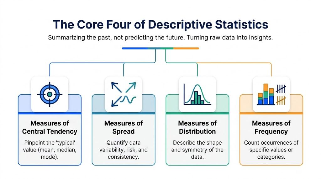
The Core Four of Descriptive Statistics
Descriptive statistics are about summarizing the past, not predicting the future. They condense a messy pile of observations into a few numbers you can discuss in a meeting without everyone glazing over.
Here’s the visual map.
Central tendency tells you what’s typical
When people say “average,” they usually mean mean. But central tendency includes more than one way to describe the center.
Mean is the arithmetic average. Good for stable data. Easy to explain.
Median is the middle value after sorting. Better when extreme values distort the picture.
Mode is the most common value. Useful when repetition matters more than arithmetic, such as order sizes, plan selections, or support ticket categories.
For business use, this family of metrics answers questions like:
What’s a normal order value?
What’s a typical daily signup count?
Which plan do customers pick most often?
A lot of confusion disappears when teams stop treating mean and median as interchangeable. They aren’t.
Spread tells you how reliable the center is
Two teams can have the same average and completely different realities.
If one sales team lands similar numbers every week and another swings between feast and famine, the average alone hides the underlying operational story. Measures of spread quantify that variability.
Common examples include:
Range, which captures the distance from smallest to largest value
Variance, which measures how far values drift from the mean
Standard deviation, which expresses that drift in the original unit
Interquartile range, which focuses on the middle portion of the data
Descriptive statistics transition from academic to managerial application. Spread is often a proxy for risk, consistency, and predictability.
A stable metric is often more useful than a flashy one.
Distribution shows the shape of the data
Shape matters. Some datasets cluster neatly. Others are skewed, lumpy, or full of long tails.
You don’t always need advanced modeling to benefit from this. You just need to notice whether your data behaves like a calm commuter train or a shopping cart with one bad wheel.
A quick look at distribution helps you judge whether:
the mean is trustworthy,
the median is safer,
unusual values deserve their own explanation,
separate segments should be analyzed on their own.
Frequency counts what keeps happening
Frequency sounds simple because it is. It tells you how often values or categories appear.
That makes it one of the most practical parts of calculating descriptive statistics. Founders use it to see which channels drive signups. Product teams use it to count feature adoption buckets. Marketing teams use it to spot repeated campaign outcomes.
If central tendency tells you “what’s typical,” frequency tells you what shows up again and again. Repetition is often where operational reality lives.
Finding the Center of Your Data By Hand
Let’s use a tiny dataset for the last ten days of SaaS signups:
[15, 20, 22, 18, 25, 20, 35, 17, 19, 21]
This is small enough to calculate manually and realistic enough to expose the trade-offs.

Mean gives you the familiar average
Add all the values and divide by the count.
The total is 212. The count is 10. The mean is 21.2.
That tells you the average day brings in a little over twenty-one signups. Clean, familiar, and easy to repeat in a status update. The catch is that the mean absorbs every value, including unusually high or low days.
If you’re building this in Sheets, a good refresher on useful Google Spreadsheet formulas can save you from reinventing every wheel manually.
Median gives you the middle
Sort the values first:
[15, 17, 18, 19, 20, 20, 21, 22, 25, 35]
With an even number of observations, the median is the average of the two middle values. Those are 20 and 20, so the median is 20.
That one number tells a different story from the mean. Half the days had signups at or below twenty, and half had signups at or above twenty. It gives you a stronger sense of the typical day when one standout value tries to steal the microphone.
Ask for the median whenever one unusual day could distort the business story.
Mode tells you what happens most often
The mode is the value that appears most often. Here, that’s 20.
This matters more than people expect. Mode is often useful when teams care about the most common operational outcome rather than the mathematical center. Think support ticket categories, order bundle sizes, or common session counts.
Here’s the same dataset viewed through all three lenses:
Measure | Result | What it tells you |
|---|---|---|
Mean | 21.2 | Average signup volume across all days |
Median | 20 | Middle daily experience, less affected by extremes |
Mode | 20 | Most common signup count |
The big lesson isn’t how to divide by ten. It’s knowing that these metrics answer slightly different questions. When someone asks for “the average,” it’s worth checking what they need.
Try asking Statspresso: “What is the median session duration for new users in the last 30 days?”
And yes, this is fine by hand for ten values. For a real product table with thousands of rows, manual work goes from educational to absurd very quickly.
Measuring Risk and Consistency With Spread
A center without spread is half a story.
Take the same signup data. You know the average. Great. But should you trust tomorrow to look roughly similar, or are you dealing with a metric that changes mood faster than a group chat after a failed deploy?

Range is blunt but useful
The range is the maximum minus the minimum.
In our signup data, the largest value is 35 and the smallest is 15, so the range is 20.
That’s simple and fast. It tells you the total swing between the quietest and busiest day. It’s also fragile. One extreme point can make the range look dramatic even when most days are pretty steady.
So use range as a quick smell test, not a final verdict.
Standard deviation is where consistency gets real
Variance and standard deviation do the heavier lifting.
Variance measures how far each value strays from the mean after squaring those differences. Standard deviation is the square root of variance, which brings the result back into the original unit. That makes it interpretable for business people who don’t enjoy squared signups as a concept.
For this dataset, the standard deviation is about 5.3. In plain English, daily signups typically move by about five users around the average of 21.2.
That’s useful because it turns “this metric feels volatile” into something more concrete. When a PM asks whether growth is stable enough to test a pricing change, spread matters just as much as the average.
For a broader intuition on uncertainty and fluctuation, this explainer on real versus assumed volatility is a helpful parallel. Different field, same mental habit. Don’t confuse an assumption about stability with observed variation.
Quartiles and IQR are more robust than they look
Quartiles divide ordered data into four parts. The interquartile range, or IQR, measures the spread of the middle half of the data.
That makes IQR especially useful when outliers would otherwise distort the picture. If you want to know where the bulk of customer values sit, quartiles are often more honest than range.
There’s a practical snag, though, and it catches teams all the time. The choice between quartile methods is underserved in educational content. Multiple approaches exist, such as inclusive and exclusive methods, and different tools use different defaults. That means teams using multiple analytics tools can end up with inconsistent interquartile ranges and conflicting insights, a problem noted in this discussion of quartile methods at Stats and R.
That sounds nerdy until it breaks trust in reporting.
The quartile problem most tutorials skip
Most tutorials act like quartiles are one fixed procedure. They aren’t.
Different software may calculate Q1 and Q3 differently. If your spreadsheet, BI tool, and code environment don’t use the same default, you can get slightly different quartiles and therefore different IQR values from the same underlying data.
For teams, that creates annoying questions:
Why does the dashboard disagree with the spreadsheet?
Which version should go into the client report?
Is the discrepancy a bug or just a different definition?
This is one of those issues that feels tiny until stakeholders notice it. Then it becomes political.
If two tools disagree on quartiles, check the method before you question the data.
When calculating descriptive statistics for business reporting, document the quartile method you use. If your team works across Excel, Python, R, and a BI layer, consistency matters more than elegance. A mathematically defensible method still causes trouble if nobody knows which one the organization adopted.
Common Pitfalls That Skew Your Story
Most mistakes in descriptive statistics don’t happen in the arithmetic. They happen in the interpretation.
A perfectly calculated metric can still tell the wrong story if the underlying data is messy, skewed, or badly grouped.

Stop worshipping the mean
The mean is popular because it’s easy. That doesn’t make it neutral.
In our signup example, the mean is 21.2, but the median is 20. That gap comes from the day with 35 signups. One strong day nudges the average upward and can make “typical” performance look healthier than it really is.
If a business metric can be pulled around by a few unusual records, ask for both the mean and the median. They don’t compete. They reveal different aspects of the same reality.
Handle outliers on purpose
Outliers can significantly increase or decrease the mean, but many guides stop there and never give people a process. They often skip the decision logic for whether to transform, exclude, or report outliers separately, even though that choice can reshape business conclusions, as noted in this discussion of descriptive statistics and outlier handling at The Complete Medic.
That matters in real teams. A product manager asking for average acquisition cost may get a completely different answer depending on whether a few unusual enterprise deals stay in the pool or get reported separately.
A practical workflow looks like this:
Detect first: Use a consistent method such as an IQR-based check before calculating summary metrics.
Classify the cause: Decide whether the value looks like measurement error, coding error, or genuine extreme behavior.
Choose treatment deliberately: Keep it, exclude it, transform it, or split it into a separate view.
Document the decision: Write down what you did and why, especially if the number will appear in executive reporting.
If your raw dataset is messy before you even get to outliers, clean-up discipline matters. This guide on how to clean up data is worth a read before you summarize anything.
Bad data cleaning creates fake certainty. That’s more dangerous than obvious uncertainty.
Don’t average unlike things
One of the quickest ways to produce a misleading statistic is to combine categories that shouldn’t live in the same bucket.
Examples show up everywhere:
combining self-serve and enterprise revenue in one “average deal size”
mixing brand and performance channels in one customer acquisition view
summarizing all users when new and returning users behave differently
Segmentation isn’t optional when the groups have markedly different economics or behavior. A blended average might be mathematically correct and managerially useless.
Try asking Statspresso: “Show me my revenue by month for the last year as a bar chart, and show me the median.”
From Hours to Seconds Getting Your Stats
Doing the math by hand is good training. Doing it that way every day is punishment.
Teams often still bounce between spreadsheets, SQL editors, and BI tools just to answer routine questions. The process works, but it’s slow, fragile, and highly dependent on who knows which tool.
The old way versus the new way
Here’s the practical contrast.
Method | Time & Effort | Required Skill | Example |
|---|---|---|---|
Manual spreadsheet work | High effort, lots of clicking and formula checking | Spreadsheet fluency and patience | Import data, sort values, calculate mean, median, and spread manually |
SQL plus BI workflow | Moderate to high effort, especially for ad hoc questions | SQL, schema knowledge, chart configuration | Query daily signups, aggregate by date, export or visualize in another tool |
Conversational AI with Statspresso | Low effort for first-pass analysis | Plain-English questioning | Ask for summary statistics on a metric and get an answer with a chart |
Statspresso is a Conversational AI Data Analyst. The appeal is simple. Skip the SQL. Just ask your data a question and get a chart in seconds.
That doesn’t replace analysts. It changes where they spend their time. Instead of pulling the same summary metric for the fifth time this month, they can focus on deeper analysis, better definitions, and the harder questions that deserve actual investigation.
Fast answers are useful when the question is clear
A lot of daily business questions are descriptive by nature:
What’s the average order value this month?
What’s the median time between signup and activation?
How variable are support response times?
Which plan appears most often in new subscriptions?
These don’t always need a dashboard build or a custom notebook. They need a fast, reliable first answer.
Try asking Statspresso: “Give me the summary statistics for user engagement scores this month.”
That’s where conversational analytics, automated BI, and GenBI tools fit. They reduce the gap between curiosity and action. For busy operators, that gap is often the whole problem.
Stop Calculating Start Deciding
Calculating descriptive statistics isn’t about becoming a part-time statistician. It’s about learning how to summarize reality without mangling it.
You need the center. You need the spread. You need enough judgment to spot when the mean is flattering, when an outlier deserves scrutiny, and when mixed segments should never be averaged together. That’s the difference between reporting numbers and fully understanding them.
The good news is that the concepts are straightforward once you see the trade-offs. The better news is that you no longer need to wrestle every answer out of SQL, spreadsheets, or a dashboard backlog.
Statspresso turns those everyday business questions into a conversation with your data. As a Conversational AI Data Analyst, it helps teams skip the SQL, ask plain-English questions, and get charts and answers in seconds. Connect your first data source for free and ask your first question.
You have data. You have questions. You probably don’t have a spare afternoon to export CSVs, clean columns, build formulas, and argue with a dashboard filter that swears it’s helping.
That’s the pain point. A simple business question like “What’s our average order value?” or “What’s a normal signup day?” turns into a mini project. Calculating descriptive statistics fixes that. It gives you a compact summary of what already happened, so you can decide what to do next without waiting on a reporting queue.
Your Data Has Answers But Who Has the Time to Ask
The issue teams face isn’t a lack of data. Rather, they suffer from friction between question and answer.
A founder wants to know whether growth is steady or lumpy. A product manager wants the median time to value. A marketing lead wants to know whether a campaign worked for typical customers or just one giant account. The raw data often exists in Postgres, HubSpot, Shopify, or some spreadsheet that has seen things no spreadsheet should see.
The bottleneck is usually the same. Someone has to pull the data, shape it, pick the right summary metric, and explain the result in plain English. That’s fine for strategic analysis. It’s terrible for everyday decisions.
Practical rule: If a question comes up often, the answer shouldn’t require a ticket.
Calculating descriptive statistics is the first step toward self-serve analytics that people can trust. Not because it’s fancy. Because it reduces noise. You stop staring at rows and start seeing patterns.
And once you understand the mechanics, you also get better at spotting bad summaries. That matters more than is often realized. A wrong average can send a team sprinting in the wrong direction with full confidence. That’s not analytics. That’s cardio.
The Core Four of Descriptive Statistics
Descriptive statistics are about summarizing the past, not predicting the future. They condense a messy pile of observations into a few numbers you can discuss in a meeting without everyone glazing over.
Here’s the visual map.

Central tendency tells you what’s typical
When people say “average,” they usually mean mean. But central tendency includes more than one way to describe the center.
Mean is the arithmetic average. Good for stable data. Easy to explain.
Median is the middle value after sorting. Better when extreme values distort the picture.
Mode is the most common value. Useful when repetition matters more than arithmetic, such as order sizes, plan selections, or support ticket categories.
For business use, this family of metrics answers questions like:
What’s a normal order value?
What’s a typical daily signup count?
Which plan do customers pick most often?
A lot of confusion disappears when teams stop treating mean and median as interchangeable. They aren’t.
Spread tells you how reliable the center is
Two teams can have the same average and completely different realities.
If one sales team lands similar numbers every week and another swings between feast and famine, the average alone hides the underlying operational story. Measures of spread quantify that variability.
Common examples include:
Range, which captures the distance from smallest to largest value
Variance, which measures how far values drift from the mean
Standard deviation, which expresses that drift in the original unit
Interquartile range, which focuses on the middle portion of the data
Descriptive statistics transition from academic to managerial application. Spread is often a proxy for risk, consistency, and predictability.
A stable metric is often more useful than a flashy one.
Distribution shows the shape of the data
Shape matters. Some datasets cluster neatly. Others are skewed, lumpy, or full of long tails.
You don’t always need advanced modeling to benefit from this. You just need to notice whether your data behaves like a calm commuter train or a shopping cart with one bad wheel.
A quick look at distribution helps you judge whether:
the mean is trustworthy,
the median is safer,
unusual values deserve their own explanation,
separate segments should be analyzed on their own.
Frequency counts what keeps happening
Frequency sounds simple because it is. It tells you how often values or categories appear.
That makes it one of the most practical parts of calculating descriptive statistics. Founders use it to see which channels drive signups. Product teams use it to count feature adoption buckets. Marketing teams use it to spot repeated campaign outcomes.
If central tendency tells you “what’s typical,” frequency tells you what shows up again and again. Repetition is often where operational reality lives.
Finding the Center of Your Data By Hand
Let’s use a tiny dataset for the last ten days of SaaS signups:
[15, 20, 22, 18, 25, 20, 35, 17, 19, 21]
This is small enough to calculate manually and realistic enough to expose the trade-offs.

Mean gives you the familiar average
Add all the values and divide by the count.
The total is 212. The count is 10. The mean is 21.2.
That tells you the average day brings in a little over twenty-one signups. Clean, familiar, and easy to repeat in a status update. The catch is that the mean absorbs every value, including unusually high or low days.
If you’re building this in Sheets, a good refresher on useful Google Spreadsheet formulas can save you from reinventing every wheel manually.
Median gives you the middle
Sort the values first:
[15, 17, 18, 19, 20, 20, 21, 22, 25, 35]
With an even number of observations, the median is the average of the two middle values. Those are 20 and 20, so the median is 20.
That one number tells a different story from the mean. Half the days had signups at or below twenty, and half had signups at or above twenty. It gives you a stronger sense of the typical day when one standout value tries to steal the microphone.
Ask for the median whenever one unusual day could distort the business story.
Mode tells you what happens most often
The mode is the value that appears most often. Here, that’s 20.
This matters more than people expect. Mode is often useful when teams care about the most common operational outcome rather than the mathematical center. Think support ticket categories, order bundle sizes, or common session counts.
Here’s the same dataset viewed through all three lenses:
Measure | Result | What it tells you |
|---|---|---|
Mean | 21.2 | Average signup volume across all days |
Median | 20 | Middle daily experience, less affected by extremes |
Mode | 20 | Most common signup count |
The big lesson isn’t how to divide by ten. It’s knowing that these metrics answer slightly different questions. When someone asks for “the average,” it’s worth checking what they need.
Try asking Statspresso: “What is the median session duration for new users in the last 30 days?”
And yes, this is fine by hand for ten values. For a real product table with thousands of rows, manual work goes from educational to absurd very quickly.
Measuring Risk and Consistency With Spread
A center without spread is half a story.
Take the same signup data. You know the average. Great. But should you trust tomorrow to look roughly similar, or are you dealing with a metric that changes mood faster than a group chat after a failed deploy?

Range is blunt but useful
The range is the maximum minus the minimum.
In our signup data, the largest value is 35 and the smallest is 15, so the range is 20.
That’s simple and fast. It tells you the total swing between the quietest and busiest day. It’s also fragile. One extreme point can make the range look dramatic even when most days are pretty steady.
So use range as a quick smell test, not a final verdict.
Standard deviation is where consistency gets real
Variance and standard deviation do the heavier lifting.
Variance measures how far each value strays from the mean after squaring those differences. Standard deviation is the square root of variance, which brings the result back into the original unit. That makes it interpretable for business people who don’t enjoy squared signups as a concept.
For this dataset, the standard deviation is about 5.3. In plain English, daily signups typically move by about five users around the average of 21.2.
That’s useful because it turns “this metric feels volatile” into something more concrete. When a PM asks whether growth is stable enough to test a pricing change, spread matters just as much as the average.
For a broader intuition on uncertainty and fluctuation, this explainer on real versus assumed volatility is a helpful parallel. Different field, same mental habit. Don’t confuse an assumption about stability with observed variation.
Quartiles and IQR are more robust than they look
Quartiles divide ordered data into four parts. The interquartile range, or IQR, measures the spread of the middle half of the data.
That makes IQR especially useful when outliers would otherwise distort the picture. If you want to know where the bulk of customer values sit, quartiles are often more honest than range.
There’s a practical snag, though, and it catches teams all the time. The choice between quartile methods is underserved in educational content. Multiple approaches exist, such as inclusive and exclusive methods, and different tools use different defaults. That means teams using multiple analytics tools can end up with inconsistent interquartile ranges and conflicting insights, a problem noted in this discussion of quartile methods at Stats and R.
That sounds nerdy until it breaks trust in reporting.
The quartile problem most tutorials skip
Most tutorials act like quartiles are one fixed procedure. They aren’t.
Different software may calculate Q1 and Q3 differently. If your spreadsheet, BI tool, and code environment don’t use the same default, you can get slightly different quartiles and therefore different IQR values from the same underlying data.
For teams, that creates annoying questions:
Why does the dashboard disagree with the spreadsheet?
Which version should go into the client report?
Is the discrepancy a bug or just a different definition?
This is one of those issues that feels tiny until stakeholders notice it. Then it becomes political.
If two tools disagree on quartiles, check the method before you question the data.
When calculating descriptive statistics for business reporting, document the quartile method you use. If your team works across Excel, Python, R, and a BI layer, consistency matters more than elegance. A mathematically defensible method still causes trouble if nobody knows which one the organization adopted.
Common Pitfalls That Skew Your Story
Most mistakes in descriptive statistics don’t happen in the arithmetic. They happen in the interpretation.
A perfectly calculated metric can still tell the wrong story if the underlying data is messy, skewed, or badly grouped.

Stop worshipping the mean
The mean is popular because it’s easy. That doesn’t make it neutral.
In our signup example, the mean is 21.2, but the median is 20. That gap comes from the day with 35 signups. One strong day nudges the average upward and can make “typical” performance look healthier than it really is.
If a business metric can be pulled around by a few unusual records, ask for both the mean and the median. They don’t compete. They reveal different aspects of the same reality.
Handle outliers on purpose
Outliers can significantly increase or decrease the mean, but many guides stop there and never give people a process. They often skip the decision logic for whether to transform, exclude, or report outliers separately, even though that choice can reshape business conclusions, as noted in this discussion of descriptive statistics and outlier handling at The Complete Medic.
That matters in real teams. A product manager asking for average acquisition cost may get a completely different answer depending on whether a few unusual enterprise deals stay in the pool or get reported separately.
A practical workflow looks like this:
Detect first: Use a consistent method such as an IQR-based check before calculating summary metrics.
Classify the cause: Decide whether the value looks like measurement error, coding error, or genuine extreme behavior.
Choose treatment deliberately: Keep it, exclude it, transform it, or split it into a separate view.
Document the decision: Write down what you did and why, especially if the number will appear in executive reporting.
If your raw dataset is messy before you even get to outliers, clean-up discipline matters. This guide on how to clean up data is worth a read before you summarize anything.
Bad data cleaning creates fake certainty. That’s more dangerous than obvious uncertainty.
Don’t average unlike things
One of the quickest ways to produce a misleading statistic is to combine categories that shouldn’t live in the same bucket.
Examples show up everywhere:
combining self-serve and enterprise revenue in one “average deal size”
mixing brand and performance channels in one customer acquisition view
summarizing all users when new and returning users behave differently
Segmentation isn’t optional when the groups have markedly different economics or behavior. A blended average might be mathematically correct and managerially useless.
Try asking Statspresso: “Show me my revenue by month for the last year as a bar chart, and show me the median.”
From Hours to Seconds Getting Your Stats
Doing the math by hand is good training. Doing it that way every day is punishment.
Teams often still bounce between spreadsheets, SQL editors, and BI tools just to answer routine questions. The process works, but it’s slow, fragile, and highly dependent on who knows which tool.
The old way versus the new way
Here’s the practical contrast.
Method | Time & Effort | Required Skill | Example |
|---|---|---|---|
Manual spreadsheet work | High effort, lots of clicking and formula checking | Spreadsheet fluency and patience | Import data, sort values, calculate mean, median, and spread manually |
SQL plus BI workflow | Moderate to high effort, especially for ad hoc questions | SQL, schema knowledge, chart configuration | Query daily signups, aggregate by date, export or visualize in another tool |
Conversational AI with Statspresso | Low effort for first-pass analysis | Plain-English questioning | Ask for summary statistics on a metric and get an answer with a chart |
Statspresso is a Conversational AI Data Analyst. The appeal is simple. Skip the SQL. Just ask your data a question and get a chart in seconds.
That doesn’t replace analysts. It changes where they spend their time. Instead of pulling the same summary metric for the fifth time this month, they can focus on deeper analysis, better definitions, and the harder questions that deserve actual investigation.
Fast answers are useful when the question is clear
A lot of daily business questions are descriptive by nature:
What’s the average order value this month?
What’s the median time between signup and activation?
How variable are support response times?
Which plan appears most often in new subscriptions?
These don’t always need a dashboard build or a custom notebook. They need a fast, reliable first answer.
Try asking Statspresso: “Give me the summary statistics for user engagement scores this month.”
That’s where conversational analytics, automated BI, and GenBI tools fit. They reduce the gap between curiosity and action. For busy operators, that gap is often the whole problem.
Stop Calculating Start Deciding
Calculating descriptive statistics isn’t about becoming a part-time statistician. It’s about learning how to summarize reality without mangling it.
You need the center. You need the spread. You need enough judgment to spot when the mean is flattering, when an outlier deserves scrutiny, and when mixed segments should never be averaged together. That’s the difference between reporting numbers and fully understanding them.
The good news is that the concepts are straightforward once you see the trade-offs. The better news is that you no longer need to wrestle every answer out of SQL, spreadsheets, or a dashboard backlog.
Statspresso turns those everyday business questions into a conversation with your data. As a Conversational AI Data Analyst, it helps teams skip the SQL, ask plain-English questions, and get charts and answers in seconds. Connect your first data source for free and ask your first question.
You have data. You have questions. You probably don’t have a spare afternoon to export CSVs, clean columns, build formulas, and argue with a dashboard filter that swears it’s helping.
That’s the pain point. A simple business question like “What’s our average order value?” or “What’s a normal signup day?” turns into a mini project. Calculating descriptive statistics fixes that. It gives you a compact summary of what already happened, so you can decide what to do next without waiting on a reporting queue.
Your Data Has Answers But Who Has the Time to Ask
The issue teams face isn’t a lack of data. Rather, they suffer from friction between question and answer.
A founder wants to know whether growth is steady or lumpy. A product manager wants the median time to value. A marketing lead wants to know whether a campaign worked for typical customers or just one giant account. The raw data often exists in Postgres, HubSpot, Shopify, or some spreadsheet that has seen things no spreadsheet should see.
The bottleneck is usually the same. Someone has to pull the data, shape it, pick the right summary metric, and explain the result in plain English. That’s fine for strategic analysis. It’s terrible for everyday decisions.
Practical rule: If a question comes up often, the answer shouldn’t require a ticket.
Calculating descriptive statistics is the first step toward self-serve analytics that people can trust. Not because it’s fancy. Because it reduces noise. You stop staring at rows and start seeing patterns.
And once you understand the mechanics, you also get better at spotting bad summaries. That matters more than is often realized. A wrong average can send a team sprinting in the wrong direction with full confidence. That’s not analytics. That’s cardio.
The Core Four of Descriptive Statistics
Descriptive statistics are about summarizing the past, not predicting the future. They condense a messy pile of observations into a few numbers you can discuss in a meeting without everyone glazing over.
Here’s the visual map.

Central tendency tells you what’s typical
When people say “average,” they usually mean mean. But central tendency includes more than one way to describe the center.
Mean is the arithmetic average. Good for stable data. Easy to explain.
Median is the middle value after sorting. Better when extreme values distort the picture.
Mode is the most common value. Useful when repetition matters more than arithmetic, such as order sizes, plan selections, or support ticket categories.
For business use, this family of metrics answers questions like:
What’s a normal order value?
What’s a typical daily signup count?
Which plan do customers pick most often?
A lot of confusion disappears when teams stop treating mean and median as interchangeable. They aren’t.
Spread tells you how reliable the center is
Two teams can have the same average and completely different realities.
If one sales team lands similar numbers every week and another swings between feast and famine, the average alone hides the underlying operational story. Measures of spread quantify that variability.
Common examples include:
Range, which captures the distance from smallest to largest value
Variance, which measures how far values drift from the mean
Standard deviation, which expresses that drift in the original unit
Interquartile range, which focuses on the middle portion of the data
Descriptive statistics transition from academic to managerial application. Spread is often a proxy for risk, consistency, and predictability.
A stable metric is often more useful than a flashy one.
Distribution shows the shape of the data
Shape matters. Some datasets cluster neatly. Others are skewed, lumpy, or full of long tails.
You don’t always need advanced modeling to benefit from this. You just need to notice whether your data behaves like a calm commuter train or a shopping cart with one bad wheel.
A quick look at distribution helps you judge whether:
the mean is trustworthy,
the median is safer,
unusual values deserve their own explanation,
separate segments should be analyzed on their own.
Frequency counts what keeps happening
Frequency sounds simple because it is. It tells you how often values or categories appear.
That makes it one of the most practical parts of calculating descriptive statistics. Founders use it to see which channels drive signups. Product teams use it to count feature adoption buckets. Marketing teams use it to spot repeated campaign outcomes.
If central tendency tells you “what’s typical,” frequency tells you what shows up again and again. Repetition is often where operational reality lives.
Finding the Center of Your Data By Hand
Let’s use a tiny dataset for the last ten days of SaaS signups:
[15, 20, 22, 18, 25, 20, 35, 17, 19, 21]
This is small enough to calculate manually and realistic enough to expose the trade-offs.

Mean gives you the familiar average
Add all the values and divide by the count.
The total is 212. The count is 10. The mean is 21.2.
That tells you the average day brings in a little over twenty-one signups. Clean, familiar, and easy to repeat in a status update. The catch is that the mean absorbs every value, including unusually high or low days.
If you’re building this in Sheets, a good refresher on useful Google Spreadsheet formulas can save you from reinventing every wheel manually.
Median gives you the middle
Sort the values first:
[15, 17, 18, 19, 20, 20, 21, 22, 25, 35]
With an even number of observations, the median is the average of the two middle values. Those are 20 and 20, so the median is 20.
That one number tells a different story from the mean. Half the days had signups at or below twenty, and half had signups at or above twenty. It gives you a stronger sense of the typical day when one standout value tries to steal the microphone.
Ask for the median whenever one unusual day could distort the business story.
Mode tells you what happens most often
The mode is the value that appears most often. Here, that’s 20.
This matters more than people expect. Mode is often useful when teams care about the most common operational outcome rather than the mathematical center. Think support ticket categories, order bundle sizes, or common session counts.
Here’s the same dataset viewed through all three lenses:
Measure | Result | What it tells you |
|---|---|---|
Mean | 21.2 | Average signup volume across all days |
Median | 20 | Middle daily experience, less affected by extremes |
Mode | 20 | Most common signup count |
The big lesson isn’t how to divide by ten. It’s knowing that these metrics answer slightly different questions. When someone asks for “the average,” it’s worth checking what they need.
Try asking Statspresso: “What is the median session duration for new users in the last 30 days?”
And yes, this is fine by hand for ten values. For a real product table with thousands of rows, manual work goes from educational to absurd very quickly.
Measuring Risk and Consistency With Spread
A center without spread is half a story.
Take the same signup data. You know the average. Great. But should you trust tomorrow to look roughly similar, or are you dealing with a metric that changes mood faster than a group chat after a failed deploy?

Range is blunt but useful
The range is the maximum minus the minimum.
In our signup data, the largest value is 35 and the smallest is 15, so the range is 20.
That’s simple and fast. It tells you the total swing between the quietest and busiest day. It’s also fragile. One extreme point can make the range look dramatic even when most days are pretty steady.
So use range as a quick smell test, not a final verdict.
Standard deviation is where consistency gets real
Variance and standard deviation do the heavier lifting.
Variance measures how far each value strays from the mean after squaring those differences. Standard deviation is the square root of variance, which brings the result back into the original unit. That makes it interpretable for business people who don’t enjoy squared signups as a concept.
For this dataset, the standard deviation is about 5.3. In plain English, daily signups typically move by about five users around the average of 21.2.
That’s useful because it turns “this metric feels volatile” into something more concrete. When a PM asks whether growth is stable enough to test a pricing change, spread matters just as much as the average.
For a broader intuition on uncertainty and fluctuation, this explainer on real versus assumed volatility is a helpful parallel. Different field, same mental habit. Don’t confuse an assumption about stability with observed variation.
Quartiles and IQR are more robust than they look
Quartiles divide ordered data into four parts. The interquartile range, or IQR, measures the spread of the middle half of the data.
That makes IQR especially useful when outliers would otherwise distort the picture. If you want to know where the bulk of customer values sit, quartiles are often more honest than range.
There’s a practical snag, though, and it catches teams all the time. The choice between quartile methods is underserved in educational content. Multiple approaches exist, such as inclusive and exclusive methods, and different tools use different defaults. That means teams using multiple analytics tools can end up with inconsistent interquartile ranges and conflicting insights, a problem noted in this discussion of quartile methods at Stats and R.
That sounds nerdy until it breaks trust in reporting.
The quartile problem most tutorials skip
Most tutorials act like quartiles are one fixed procedure. They aren’t.
Different software may calculate Q1 and Q3 differently. If your spreadsheet, BI tool, and code environment don’t use the same default, you can get slightly different quartiles and therefore different IQR values from the same underlying data.
For teams, that creates annoying questions:
Why does the dashboard disagree with the spreadsheet?
Which version should go into the client report?
Is the discrepancy a bug or just a different definition?
This is one of those issues that feels tiny until stakeholders notice it. Then it becomes political.
If two tools disagree on quartiles, check the method before you question the data.
When calculating descriptive statistics for business reporting, document the quartile method you use. If your team works across Excel, Python, R, and a BI layer, consistency matters more than elegance. A mathematically defensible method still causes trouble if nobody knows which one the organization adopted.
Common Pitfalls That Skew Your Story
Most mistakes in descriptive statistics don’t happen in the arithmetic. They happen in the interpretation.
A perfectly calculated metric can still tell the wrong story if the underlying data is messy, skewed, or badly grouped.

Stop worshipping the mean
The mean is popular because it’s easy. That doesn’t make it neutral.
In our signup example, the mean is 21.2, but the median is 20. That gap comes from the day with 35 signups. One strong day nudges the average upward and can make “typical” performance look healthier than it really is.
If a business metric can be pulled around by a few unusual records, ask for both the mean and the median. They don’t compete. They reveal different aspects of the same reality.
Handle outliers on purpose
Outliers can significantly increase or decrease the mean, but many guides stop there and never give people a process. They often skip the decision logic for whether to transform, exclude, or report outliers separately, even though that choice can reshape business conclusions, as noted in this discussion of descriptive statistics and outlier handling at The Complete Medic.
That matters in real teams. A product manager asking for average acquisition cost may get a completely different answer depending on whether a few unusual enterprise deals stay in the pool or get reported separately.
A practical workflow looks like this:
Detect first: Use a consistent method such as an IQR-based check before calculating summary metrics.
Classify the cause: Decide whether the value looks like measurement error, coding error, or genuine extreme behavior.
Choose treatment deliberately: Keep it, exclude it, transform it, or split it into a separate view.
Document the decision: Write down what you did and why, especially if the number will appear in executive reporting.
If your raw dataset is messy before you even get to outliers, clean-up discipline matters. This guide on how to clean up data is worth a read before you summarize anything.
Bad data cleaning creates fake certainty. That’s more dangerous than obvious uncertainty.
Don’t average unlike things
One of the quickest ways to produce a misleading statistic is to combine categories that shouldn’t live in the same bucket.
Examples show up everywhere:
combining self-serve and enterprise revenue in one “average deal size”
mixing brand and performance channels in one customer acquisition view
summarizing all users when new and returning users behave differently
Segmentation isn’t optional when the groups have markedly different economics or behavior. A blended average might be mathematically correct and managerially useless.
Try asking Statspresso: “Show me my revenue by month for the last year as a bar chart, and show me the median.”
From Hours to Seconds Getting Your Stats
Doing the math by hand is good training. Doing it that way every day is punishment.
Teams often still bounce between spreadsheets, SQL editors, and BI tools just to answer routine questions. The process works, but it’s slow, fragile, and highly dependent on who knows which tool.
The old way versus the new way
Here’s the practical contrast.
Method | Time & Effort | Required Skill | Example |
|---|---|---|---|
Manual spreadsheet work | High effort, lots of clicking and formula checking | Spreadsheet fluency and patience | Import data, sort values, calculate mean, median, and spread manually |
SQL plus BI workflow | Moderate to high effort, especially for ad hoc questions | SQL, schema knowledge, chart configuration | Query daily signups, aggregate by date, export or visualize in another tool |
Conversational AI with Statspresso | Low effort for first-pass analysis | Plain-English questioning | Ask for summary statistics on a metric and get an answer with a chart |
Statspresso is a Conversational AI Data Analyst. The appeal is simple. Skip the SQL. Just ask your data a question and get a chart in seconds.
That doesn’t replace analysts. It changes where they spend their time. Instead of pulling the same summary metric for the fifth time this month, they can focus on deeper analysis, better definitions, and the harder questions that deserve actual investigation.
Fast answers are useful when the question is clear
A lot of daily business questions are descriptive by nature:
What’s the average order value this month?
What’s the median time between signup and activation?
How variable are support response times?
Which plan appears most often in new subscriptions?
These don’t always need a dashboard build or a custom notebook. They need a fast, reliable first answer.
Try asking Statspresso: “Give me the summary statistics for user engagement scores this month.”
That’s where conversational analytics, automated BI, and GenBI tools fit. They reduce the gap between curiosity and action. For busy operators, that gap is often the whole problem.
Stop Calculating Start Deciding
Calculating descriptive statistics isn’t about becoming a part-time statistician. It’s about learning how to summarize reality without mangling it.
You need the center. You need the spread. You need enough judgment to spot when the mean is flattering, when an outlier deserves scrutiny, and when mixed segments should never be averaged together. That’s the difference between reporting numbers and fully understanding them.
The good news is that the concepts are straightforward once you see the trade-offs. The better news is that you no longer need to wrestle every answer out of SQL, spreadsheets, or a dashboard backlog.
Statspresso turns those everyday business questions into a conversation with your data. As a Conversational AI Data Analyst, it helps teams skip the SQL, ask plain-English questions, and get charts and answers in seconds. Connect your first data source for free and ask your first question.