BI Software Comparison Guide (2026)

Waiting weeks for a data analyst to build a simple dashboard is a relic of the past. When you start your business intelligence software comparison, you'll see the market has split. On one side, you have powerful but complex giants like Tableau. On the other, a new breed of AI tools like Statspresso is emerging, built for teams that need answers now. The right choice boils down to a simple question: Do you have a team of data experts, or do you need business users to find insights on their own?
Key Takeaways (TL;DR)
Traditional BI is slow: Tools like Tableau and Power BI are powerful but require expert users and often create a bottleneck.
The "New Way" is Conversational: Modern tools like Statspresso act as a Conversational AI Data Analyst, letting you ask questions in plain English.
Skip the SQL: The core benefit of this new approach is speed. You can skip the SQL and just ask your data a question to get a chart in seconds.
Choose based on your team: The best tool depends on who needs the data. Do you have dedicated analysts or busy founders who need instant answers?
Action over analysis: Stop reading comparisons. Connect your data and ask your first question.
Find the Right BI Tool and Stop Waiting for Data

Tackling this decision can feel overwhelming. Checking out a list of the top data analytics companies is a good first step to see what’s out there. The market is exploding for a reason. Projections show the global BI software market will climb to USD 47.48 billion in 2026, according to Precedence Research. That growth isn’t about making more charts; it’s about getting data into the hands of people who can act on it, fast.
This guide skips the jargon. We'll focus on what really matters for busy teams: how easy a tool is for non-technical users and how it uses AI to speed up analysis.
The Old Way vs. The New Way
For years, "doing BI" meant filing a ticket and waiting. The new way is a conversation. As a Conversational AI Data Analyst, a tool like Statspresso lets your team get answers without writing SQL or wrestling with a drag-and-drop builder.
Key Benefit: Skip the SQL. Just ask your data a question and get a chart in seconds.
Our goal is to give you a clear framework to find the software that fits your team’s workflow, not force you into someone else’s.
The Core Criteria For Evaluating BI Software
Picking the right business intelligence tool goes beyond a flashy sales demo. To find a platform that sticks, you need a clear set of criteria. This isn't about chasing the tool with the longest feature list. It's about empowering your team, not forcing your marketing lead to file an IT ticket just to see campaign performance.
Our 4-Point Evaluation Framework
A great BI tool should feel like a natural extension of your team's workflow. We'll use these four key areas to see how the top contenders measure up for modern teams.
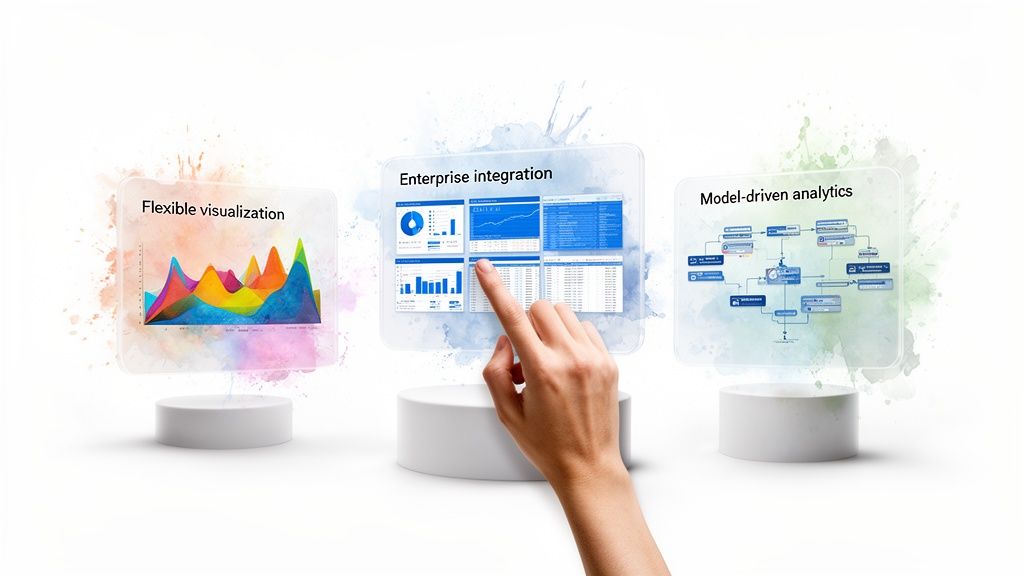
Data Connectivity: How easily can it connect to everything? We’re talking your production database (like Postgres), your CRM (HubSpot), and your ad platforms. Does it require a data engineer for every new source?
Ease of Use: Is the platform genuinely intuitive for the people who need the data most? Or does it take a data science degree to build a bar chart? We're looking for self-serve capabilities, not a bottleneck.
AI & Advanced Analytics: Does the tool actively help you find the "why" behind the numbers? This is about more than just visualization; it's about automated insights and what we call GenBI, or generative business intelligence.
Visualization & Customization: Can you build the exact charts and dashboards your team needs? Or are you boxed into rigid templates that don't fit? Flexibility is key.
When you dive into the world of business intelligence, three names almost always come up: Tableau, Microsoft Power BI, and Looker. These are the heavyweights. But they each approach data analysis from a completely different angle, a crucial point in any BI software comparison.
Think of these tools as three philosophies: the creative freedom of visualization, the power of deep platform integration, and the security of a governed data model. Knowing which aligns with your team is the first step to choosing the right tool.
Tableau: The Visual Artist
Tableau is for the data purist who thinks in charts. It’s the best for creating beautiful, intricate visualizations. If you can dream up a way to display your data, you can probably build it in Tableau. That power comes at a cost. The learning curve is steep, and the pricing is premium. It shines brightest in the hands of dedicated data analysts.
Microsoft Power BI: The Corporate Standard
Then you have Microsoft Power BI. Its market footprint is enormous. As part of the Microsoft family, it connects seamlessly with Azure, Excel, and Office 365. This makes it the default choice for many large organizations already on Microsoft's stack. For smaller, agile teams, that enterprise DNA can make the interface feel clunky. It's powerful, but it's built for a corporate workflow.
Looker: The Data Governor
Looker (now part of Google Cloud) was built on a simple but powerful idea: define your business logic once, and reuse it everywhere. It uses a proprietary modeling layer, LookML. This code-based approach is a data governor's dream—it ensures everyone gets the same number for "total monthly revenue." The trade-off? You need a developer to manage those models, creating a bottleneck for business teams needing fast answers.
To get a clearer picture, let's break them down side-by-side.
BI Titans Feature Matrix
Feature | Tableau | Microsoft Power BI | Looker |
|---|---|---|---|
Ease of Use | Difficult; steep learning curve. Best for data analysts. | Moderate; familiar for Excel users, but can be clunky. | Difficult; requires developer setup (LookML), but easy for end-users to explore. |
Visualizations | Best-in-class. Extremely powerful and flexible. | Good. Wide range of standard visuals, less flexible than Tableau. | Good. Strong core visualizations, but prioritizes data governance. |
Data Modeling | Limited. Relies on prepping data before it gets to Tableau. | Strong. Integrated Power Query and DAX for modeling. | Excellent. Centralized LookML layer ensures data consistency. |
Ideal User | Data analysts and visualization experts. | Large enterprises in the Microsoft ecosystem. | Data-mature companies that need strong governance and embedded analytics. |
Ultimately, while these platforms are capable, they all operate on the same principle: a data analyst manually builds dashboards for others to consume. This traditional workflow is what newer tools are disrupting.
The Rise of Conversational AI in Business Intelligence
The biggest shift in this business intelligence software comparison isn't a new chart type. It's moving away from the dashboard as the primary way we interact with data. Traditional BI tools have a fundamental bottleneck: an analyst builds a report, and a business user waits. This slows everyone down.
Conversational AI platforms like Statspresso are flipping that model. This new approach, part of the broader conversational analytics trend, gets rid of the middleman—not just the data analyst, but the complex software interface itself. The idea is simple.
Skip the SQL. Just ask your data a question and get a chart in seconds.
This is a huge deal for busy founders and product managers with a mountain of data but zero time to learn a new tool or write code.
From Dashboards to Dialogues
The move to the cloud fuels this change. Cloud-based BI is expected to be a $15.2 billion market by 2026, with over 60% of companies choosing cloud deployments. You can dig into these cloud BI trends to see how fast businesses are abandoning old systems. This cloud infrastructure is the perfect foundation for AI-powered business intelligence to provide instant answers.
Tools like Statspresso plug directly into your data sources and use natural language processing to pull insights on command.
Here’s what that conversational approach looks like in Statspresso.
Instead of clicking through menus, a user just types a question. The platform figures out what they need and immediately builds the right chart. This makes data accessible and shortens decision-making time. Imagine just asking:
"Try asking Statspresso: 'Show me my revenue by month for the last year as a bar chart.'"
That’s where analytics is heading—it’s direct, fast, and feels like a conversation.
Choosing Your BI Tool: A Persona-Based Decision
This is where the rubber meets the road. Picking the right BI tool isn't about the longest feature list; it's about finding one that fits how your team works. What’s best for a data-heavy enterprise is rarely what’s best for a fast-moving startup.
Matching Your Role To The Right Tool
Let's look at a few common scenarios.
The Bootstrapped Startup Founder: Your most valuable asset is time. You need to understand your data without hiring an analyst. The ability to ask a question and get an instant chart isn't a luxury—it's a necessity.
The SaaS Product Manager: Your focus is on shipping value. You need a solution that makes embedding analytics into your app simple, not a six-month engineering project.
The Marketing Lead at an SMB: You're swimming in data from Google Analytics and your CRM. You need to explore that data yourself to see what's working, without learning SQL or filing a dev ticket.
The decision often comes down to this: stick with the old, manual way, or embrace a modern, conversational approach?
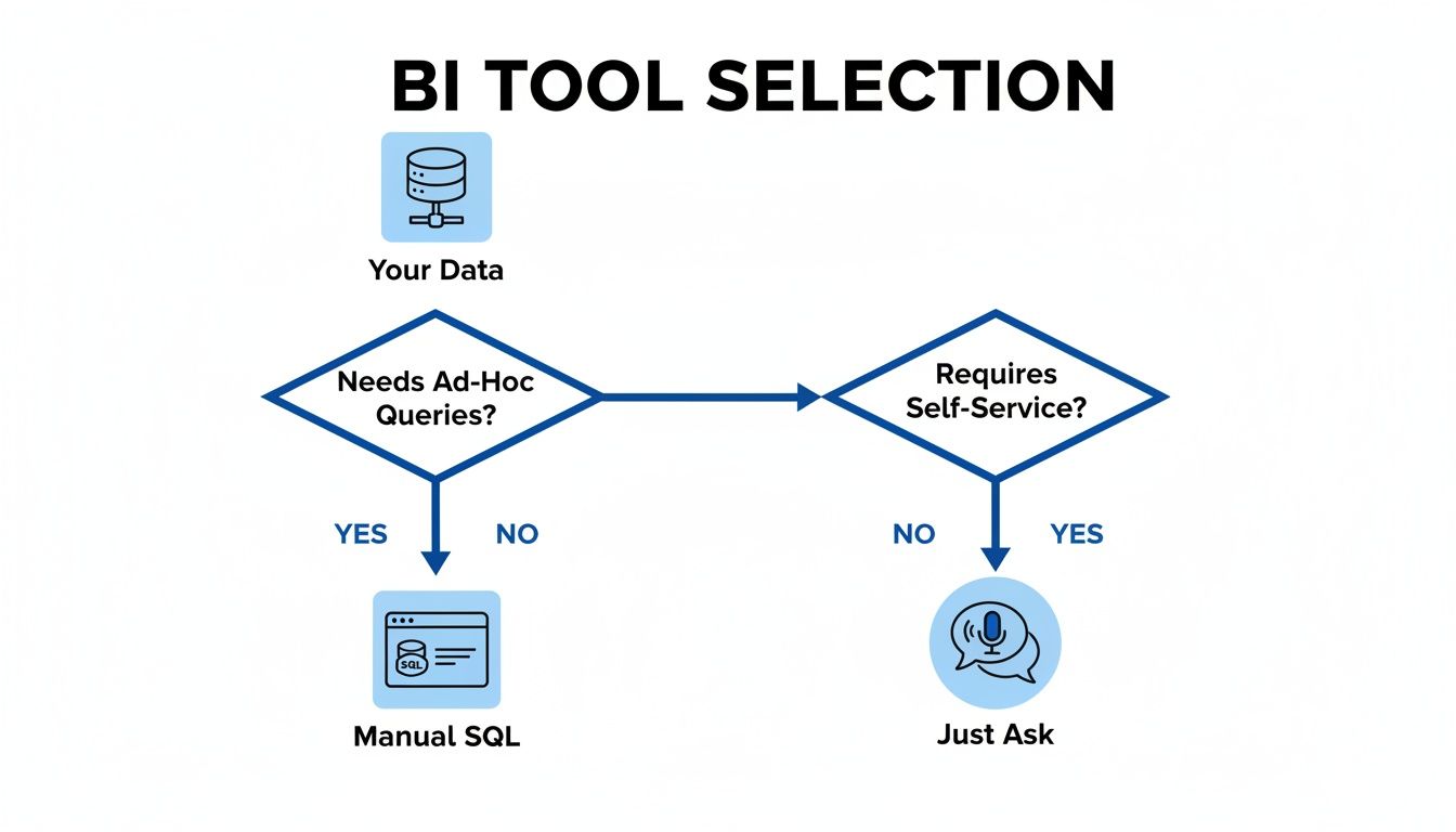
As you can see, there’s a clear fork in the road. One path relies on technical experts and creates a queue. The other empowers anyone on the team to "just ask."
This second path is exactly where Statspresso lives. It’s built from the ground up to be a Conversational AI Data Analyst for teams that value speed and self-sufficiency. The workflow difference is night and day.
The Old Way vs. The New Way
Task | Old Way (Manual SQL & Dashboards) | New Way (Statspresso) |
|---|---|---|
Get a New Metric | File a ticket. Wait days or weeks. | Ask a question. Get an answer in seconds. |
Explore a Trend | Request dashboard filter changes or a new SQL query. | Drill down by asking follow-up questions in the chat. |
Share an Insight | Take a screenshot, paste it into Slack, and type out context. | Share a live, interactive chart with a direct link. |
It really is that simple. One approach creates frustrating bottlenecks. The other creates momentum.
Your Next Move
Alright, we’ve covered a lot of ground. The old way of doing business intelligence is just too slow. Your data is full of insights, but they're useless if you can't get to them quickly.
Let's break down your options one last time:
Traditional BI Giants (Tableau, Power BI): Powerful, but with a steep learning curve and need for dedicated data teams. A fit for large corporations with established reporting structures.
The Modern Data Stack (Looker): Developer-centric, offering fantastic governance. The trade-off is you need engineering resources, which can slow down non-technical users.
Conversational AI Analytics (Statspresso): The direct route to answers. As a Conversational AI Data Analyst, Statspresso is designed for speed and self-service. Skip the SQL. Just ask your data a question and get a chart in seconds.
You can keep reading comparisons, but the only way to know what works is to try it.
Connect your first data source for free and ask your first question.
Frequently Asked Questions About BI Software
Making a direct business intelligence software comparison always brings up a few key questions. Let's walk through the most common ones.
What's the difference between a BI tool and a data visualization tool?
A data visualization tool like Tableau is a specialist that excels at creating charts from a prepared dataset. It's one piece of the puzzle. A true BI platform handles the entire pipeline: connecting, cleaning, modeling, and securing data. A Conversational AI Data Analyst like Statspresso automates that whole process. You can skip the SQL and get a chart in seconds just by asking a question. For a deeper dive, check out our guide on The Guide to SQL Charting.
How much technical skill do I need?
It depends on the tool. Traditional platforms like Looker or Tableau have a steep learning curve. Someone on your team will need a good grasp of SQL or data modeling. On the other hand, conversational AI tools were built for non-technical users. With a platform like Statspresso, the only skill you need is asking a question in plain English.
Can I embed analytics into my SaaS app?
Yes, but how you do it varies dramatically. Many legacy BI platforms offer embedding, but it's often a major engineering project. Modern tools have a serious advantage here. Statspresso’s embeddable chat and dashboards were designed for a simpler, developer-friendly integration, helping SaaS companies provide in-app analytics without months of development.
Ready to stop comparing and start asking?
Connect your first data source for free and ask your first question at https://www.statspresso.com.
Waiting weeks for a data analyst to build a simple dashboard is a relic of the past. When you start your business intelligence software comparison, you'll see the market has split. On one side, you have powerful but complex giants like Tableau. On the other, a new breed of AI tools like Statspresso is emerging, built for teams that need answers now. The right choice boils down to a simple question: Do you have a team of data experts, or do you need business users to find insights on their own?
Key Takeaways (TL;DR)
Traditional BI is slow: Tools like Tableau and Power BI are powerful but require expert users and often create a bottleneck.
The "New Way" is Conversational: Modern tools like Statspresso act as a Conversational AI Data Analyst, letting you ask questions in plain English.
Skip the SQL: The core benefit of this new approach is speed. You can skip the SQL and just ask your data a question to get a chart in seconds.
Choose based on your team: The best tool depends on who needs the data. Do you have dedicated analysts or busy founders who need instant answers?
Action over analysis: Stop reading comparisons. Connect your data and ask your first question.
Find the Right BI Tool and Stop Waiting for Data
Tackling this decision can feel overwhelming. Checking out a list of the top data analytics companies is a good first step to see what’s out there. The market is exploding for a reason. Projections show the global BI software market will climb to USD 47.48 billion in 2026, according to Precedence Research. That growth isn’t about making more charts; it’s about getting data into the hands of people who can act on it, fast.
This guide skips the jargon. We'll focus on what really matters for busy teams: how easy a tool is for non-technical users and how it uses AI to speed up analysis.
The Old Way vs. The New Way
For years, "doing BI" meant filing a ticket and waiting. The new way is a conversation. As a Conversational AI Data Analyst, a tool like Statspresso lets your team get answers without writing SQL or wrestling with a drag-and-drop builder.
Key Benefit: Skip the SQL. Just ask your data a question and get a chart in seconds.
Our goal is to give you a clear framework to find the software that fits your team’s workflow, not force you into someone else’s.
The Core Criteria For Evaluating BI Software
Picking the right business intelligence tool goes beyond a flashy sales demo. To find a platform that sticks, you need a clear set of criteria. This isn't about chasing the tool with the longest feature list. It's about empowering your team, not forcing your marketing lead to file an IT ticket just to see campaign performance.
Our 4-Point Evaluation Framework
A great BI tool should feel like a natural extension of your team's workflow. We'll use these four key areas to see how the top contenders measure up for modern teams.
Data Connectivity: How easily can it connect to everything? We’re talking your production database (like Postgres), your CRM (HubSpot), and your ad platforms. Does it require a data engineer for every new source?
Ease of Use: Is the platform genuinely intuitive for the people who need the data most? Or does it take a data science degree to build a bar chart? We're looking for self-serve capabilities, not a bottleneck.
AI & Advanced Analytics: Does the tool actively help you find the "why" behind the numbers? This is about more than just visualization; it's about automated insights and what we call GenBI, or generative business intelligence.
Visualization & Customization: Can you build the exact charts and dashboards your team needs? Or are you boxed into rigid templates that don't fit? Flexibility is key.
When you dive into the world of business intelligence, three names almost always come up: Tableau, Microsoft Power BI, and Looker. These are the heavyweights. But they each approach data analysis from a completely different angle, a crucial point in any BI software comparison.
Think of these tools as three philosophies: the creative freedom of visualization, the power of deep platform integration, and the security of a governed data model. Knowing which aligns with your team is the first step to choosing the right tool.
Tableau: The Visual Artist
Tableau is for the data purist who thinks in charts. It’s the best for creating beautiful, intricate visualizations. If you can dream up a way to display your data, you can probably build it in Tableau. That power comes at a cost. The learning curve is steep, and the pricing is premium. It shines brightest in the hands of dedicated data analysts.
Microsoft Power BI: The Corporate Standard
Then you have Microsoft Power BI. Its market footprint is enormous. As part of the Microsoft family, it connects seamlessly with Azure, Excel, and Office 365. This makes it the default choice for many large organizations already on Microsoft's stack. For smaller, agile teams, that enterprise DNA can make the interface feel clunky. It's powerful, but it's built for a corporate workflow.
Looker: The Data Governor
Looker (now part of Google Cloud) was built on a simple but powerful idea: define your business logic once, and reuse it everywhere. It uses a proprietary modeling layer, LookML. This code-based approach is a data governor's dream—it ensures everyone gets the same number for "total monthly revenue." The trade-off? You need a developer to manage those models, creating a bottleneck for business teams needing fast answers.
To get a clearer picture, let's break them down side-by-side.
BI Titans Feature Matrix
Feature | Tableau | Microsoft Power BI | Looker |
|---|---|---|---|
Ease of Use | Difficult; steep learning curve. Best for data analysts. | Moderate; familiar for Excel users, but can be clunky. | Difficult; requires developer setup (LookML), but easy for end-users to explore. |
Visualizations | Best-in-class. Extremely powerful and flexible. | Good. Wide range of standard visuals, less flexible than Tableau. | Good. Strong core visualizations, but prioritizes data governance. |
Data Modeling | Limited. Relies on prepping data before it gets to Tableau. | Strong. Integrated Power Query and DAX for modeling. | Excellent. Centralized LookML layer ensures data consistency. |
Ideal User | Data analysts and visualization experts. | Large enterprises in the Microsoft ecosystem. | Data-mature companies that need strong governance and embedded analytics. |
Ultimately, while these platforms are capable, they all operate on the same principle: a data analyst manually builds dashboards for others to consume. This traditional workflow is what newer tools are disrupting.
The Rise of Conversational AI in Business Intelligence
The biggest shift in this business intelligence software comparison isn't a new chart type. It's moving away from the dashboard as the primary way we interact with data. Traditional BI tools have a fundamental bottleneck: an analyst builds a report, and a business user waits. This slows everyone down.
Conversational AI platforms like Statspresso are flipping that model. This new approach, part of the broader conversational analytics trend, gets rid of the middleman—not just the data analyst, but the complex software interface itself. The idea is simple.
Skip the SQL. Just ask your data a question and get a chart in seconds.
This is a huge deal for busy founders and product managers with a mountain of data but zero time to learn a new tool or write code.
From Dashboards to Dialogues
The move to the cloud fuels this change. Cloud-based BI is expected to be a $15.2 billion market by 2026, with over 60% of companies choosing cloud deployments. You can dig into these cloud BI trends to see how fast businesses are abandoning old systems. This cloud infrastructure is the perfect foundation for AI-powered business intelligence to provide instant answers.
Tools like Statspresso plug directly into your data sources and use natural language processing to pull insights on command.
Here’s what that conversational approach looks like in Statspresso.
Instead of clicking through menus, a user just types a question. The platform figures out what they need and immediately builds the right chart. This makes data accessible and shortens decision-making time. Imagine just asking:
"Try asking Statspresso: 'Show me my revenue by month for the last year as a bar chart.'"
That’s where analytics is heading—it’s direct, fast, and feels like a conversation.
Choosing Your BI Tool: A Persona-Based Decision
This is where the rubber meets the road. Picking the right BI tool isn't about the longest feature list; it's about finding one that fits how your team works. What’s best for a data-heavy enterprise is rarely what’s best for a fast-moving startup.
Matching Your Role To The Right Tool
Let's look at a few common scenarios.
The Bootstrapped Startup Founder: Your most valuable asset is time. You need to understand your data without hiring an analyst. The ability to ask a question and get an instant chart isn't a luxury—it's a necessity.
The SaaS Product Manager: Your focus is on shipping value. You need a solution that makes embedding analytics into your app simple, not a six-month engineering project.
The Marketing Lead at an SMB: You're swimming in data from Google Analytics and your CRM. You need to explore that data yourself to see what's working, without learning SQL or filing a dev ticket.
The decision often comes down to this: stick with the old, manual way, or embrace a modern, conversational approach?
As you can see, there’s a clear fork in the road. One path relies on technical experts and creates a queue. The other empowers anyone on the team to "just ask."
This second path is exactly where Statspresso lives. It’s built from the ground up to be a Conversational AI Data Analyst for teams that value speed and self-sufficiency. The workflow difference is night and day.
The Old Way vs. The New Way
Task | Old Way (Manual SQL & Dashboards) | New Way (Statspresso) |
|---|---|---|
Get a New Metric | File a ticket. Wait days or weeks. | Ask a question. Get an answer in seconds. |
Explore a Trend | Request dashboard filter changes or a new SQL query. | Drill down by asking follow-up questions in the chat. |
Share an Insight | Take a screenshot, paste it into Slack, and type out context. | Share a live, interactive chart with a direct link. |
It really is that simple. One approach creates frustrating bottlenecks. The other creates momentum.
Your Next Move
Alright, we’ve covered a lot of ground. The old way of doing business intelligence is just too slow. Your data is full of insights, but they're useless if you can't get to them quickly.
Let's break down your options one last time:
Traditional BI Giants (Tableau, Power BI): Powerful, but with a steep learning curve and need for dedicated data teams. A fit for large corporations with established reporting structures.
The Modern Data Stack (Looker): Developer-centric, offering fantastic governance. The trade-off is you need engineering resources, which can slow down non-technical users.
Conversational AI Analytics (Statspresso): The direct route to answers. As a Conversational AI Data Analyst, Statspresso is designed for speed and self-service. Skip the SQL. Just ask your data a question and get a chart in seconds.
You can keep reading comparisons, but the only way to know what works is to try it.
Connect your first data source for free and ask your first question.
Frequently Asked Questions About BI Software
Making a direct business intelligence software comparison always brings up a few key questions. Let's walk through the most common ones.
What's the difference between a BI tool and a data visualization tool?
A data visualization tool like Tableau is a specialist that excels at creating charts from a prepared dataset. It's one piece of the puzzle. A true BI platform handles the entire pipeline: connecting, cleaning, modeling, and securing data. A Conversational AI Data Analyst like Statspresso automates that whole process. You can skip the SQL and get a chart in seconds just by asking a question. For a deeper dive, check out our guide on The Guide to SQL Charting.
How much technical skill do I need?
It depends on the tool. Traditional platforms like Looker or Tableau have a steep learning curve. Someone on your team will need a good grasp of SQL or data modeling. On the other hand, conversational AI tools were built for non-technical users. With a platform like Statspresso, the only skill you need is asking a question in plain English.
Can I embed analytics into my SaaS app?
Yes, but how you do it varies dramatically. Many legacy BI platforms offer embedding, but it's often a major engineering project. Modern tools have a serious advantage here. Statspresso’s embeddable chat and dashboards were designed for a simpler, developer-friendly integration, helping SaaS companies provide in-app analytics without months of development.
Ready to stop comparing and start asking?
Connect your first data source for free and ask your first question at https://www.statspresso.com.