

10 Best AI Tools for Data Visualization for 2026

Waiting weeks for a data analyst to build a dashboard is a relic of the past. AI visualization software has moved fast enough that Gartner expects 75% of enterprises will use AI visualization by 2026, up from 25% in 2022, according to ThoughtSpot’s roundup of AI visualization tools. That matters if you're a founder, PM, or marketer sitting on useful data but still depending on backlog-driven BI.

The best ai tools for data visualization now do three things well. They turn plain-English questions into charts, they explain what changed, and they cut the setup pain that made traditional BI feel like homework. Some are built for governed enterprise reporting. Others are built for speed. A few deliver both.

If you care about fast answers more than perfect dashboard architecture, prioritize conversational analytics over feature sprawl. If you need polished board-ready reporting, governance still matters. Organizations often require a mix. That's why this list leans hard into speed-to-insight for non-technical users while still calling out where each tool gets clunky.

For a broader look at why visual analysis matters in the first place, this guide on data visualization and analytics is a useful companion.

Busy teams don't need more dashboards. They need fewer clicks between a question and a trustworthy answer.

1. Statspresso

Statspresso

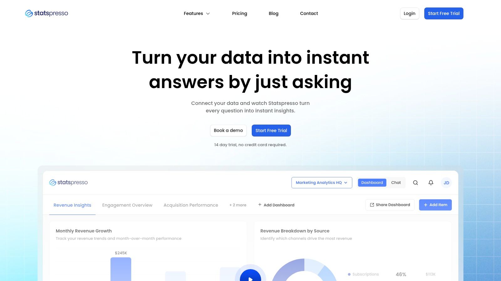
Statspresso is the tool I'd put in front of a startup founder, growth lead, or product manager who wants answers now and has zero interest in writing SQL. It's a Conversational AI Data Analyst. You connect your sources, ask a question in plain English, and get a chart, metric, or explanation back in seconds.

That sounds simple because it is. That's the point. Traditional BI asks non-technical users to think like report builders. Statspresso flips that. It asks the software to behave more like an analyst.

Why it stands out for speed

The strongest part of Statspresso is that it doesn't make you choose between exploration and reporting. Teams can ask one-off questions, save useful findings, and roll them into real-time dashboards without creating a mess of duplicate charts. The AI Insight Gallery is especially useful if your team keeps rediscovering the same patterns and forgetting to operationalize them.

It also fits how modern teams work. Sources like Shopify, HubSpot, Linear, and Postgres are part of the core pitch, and features like embeddable AI chat, branding controls, PDF exports, and workspace separation make it practical for agencies, SaaS products, and internal ops teams.

Try asking Statspresso: "Show me revenue by month for the last year as a bar chart."

Try asking Statspresso: "Which customers expanded fastest after onboarding, and what changed before the spike?"

What works and what doesn't

What works:

  • Fast self-serve analytics: Non-technical users can skip the SQL and go straight to the question.

  • Useful discovery flow: The Insight Gallery helps teams turn accidental findings into reusable reporting.

  • Good collaboration mechanics: Real-time dashboards and embeddable chat make it easier to share answers where people already work.

  • Clear packaging: A free trial and tiered plans make it easier to test before committing.

What doesn't:

  • Lower tiers can feel tight: If your team has lots of sources, dashboards, or frequent usage, you'll hit plan limits sooner.

  • Regulated teams should verify details first: The product talks about security and accuracy, but buyers with strict compliance needs should confirm governance requirements directly.

Practical rule: If your team keeps asking an analyst for the same five charts every week, a conversational tool like Statspresso is usually a better first buy than another heavyweight BI rollout.

If you want a deeper look at where this style of tooling fits, Statspresso's guide to automated data visualization is worth reading.

2. Tableau

Tableau

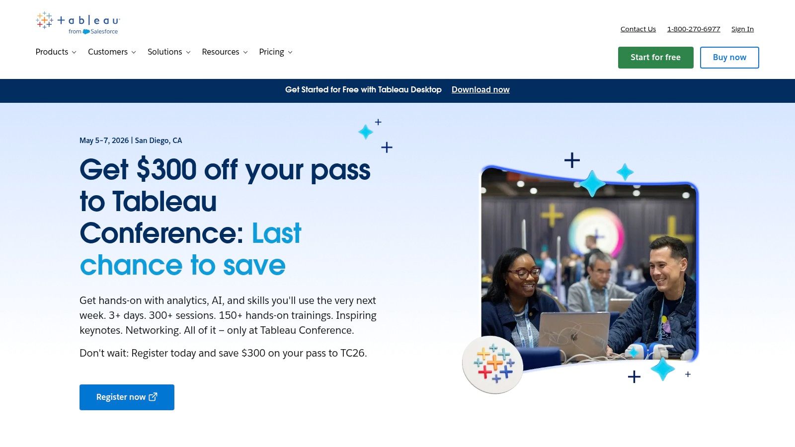
Tableau still sets the bar for dashboards that need to look polished in the boardroom and hold up under analyst scrutiny. If the goal is a durable reporting layer with strong visual control, Tableau earns its place. If the goal is speed to insight for a founder or marketer who just wants to ask a question and get a chart back, it can feel slower than the new conversational tools.

That trade-off matters.

Tableau has added more AI assistance, including natural language help, guided explanations, and faster chart creation. Those features make the product easier to use than it was a few years ago. But in practice, Tableau still performs best when somebody on the team understands data modeling, field logic, and dashboard design. Non-technical users can consume insights well. Building the system that produces those insights usually still needs a BI owner.

Where Tableau is strongest

Visual quality is the main reason teams keep buying Tableau. The charts are flexible, interactive, and presentation-ready without much compromise. For executive reporting, customer-facing analytics, and teams that care about design, that polish is real value.

It also fits well inside larger enterprise setups. Governance options are mature. Embedded analytics is well developed. Companies already working across Salesforce and the wider Microsoft Power Platform often still keep Tableau in the stack because it gives analysts more control over the final presentation layer.

I usually recommend Tableau when an organization already has analysts in place and needs consistency across departments. It is much less appealing when a small team wants answers now and does not want to wait on dashboard builds.

Best fit and trade-offs

Choose Tableau if:

  • You need polished executive dashboards: Few tools make BI outputs look this refined.

  • You have analyst support: Tableau rewards teams that can model data cleanly and maintain reporting standards.

  • You want a long-term BI layer: It works well for structured reporting that multiple teams rely on.

Skip it if:

  • You want question-to-chart speed: Conversational tools like Statspresso are usually faster for ad hoc business questions.

  • Your team is mostly non-technical: Tableau is easier to read than to set up well.

  • Your source data is messy: Tableau exposes bad definitions and broken joins fast, which is useful, but it slows time-to-value.

For busy operators, Tableau is rarely the fastest first answer. It is better as the place your company standardizes reporting after the metrics, definitions, and workflows are already under control.

3. Microsoft Power BI

Microsoft Power BI stays on shortlists for a simple reason. It gets companies from spreadsheets to shared reporting fast, especially if they already run on Microsoft.

That matters more than flashy AI demos. For ops, finance, and sales leaders who live in Excel, Teams, Outlook, and Azure, Power BI usually feels familiar on day one. Adoption is easier when the tool fits the stack people already use.

Where Power BI works well

Power BI is often the practical choice for standard business reporting. It handles scheduled dashboards, cross-team sharing, row-level security, and Microsoft-friendly admin controls without much drama. If the goal is to put reliable numbers in front of managers every week, it does that well.

Copilot improves the experience, but buyers should read the fine print. It can help with report summaries, DAX suggestions, and faster page creation. The catch is cost and access. Power BI Pro starts at $14 per user per month, but the fuller AI experience depends on premium capacity or Fabric setup, according to Microsoft's Power BI pricing page. Teams often miss that detail during evaluation.

Power BI also benefits from the wider Microsoft setup. For a primer on the ecosystem around it, this overview of Microsoft Power Platform gives useful context.

The real trade-off

Power BI is strong for repeatable reporting. It is less suited to the fastest question-to-answer workflow that non-technical leaders usually want.

That is the gap many teams feel. A founder or marketer does not always want another dashboard project. They want to ask, "Why did pipeline dip last week?" and get a visual answer now. Power BI can support that kind of analysis, but it still works best when someone has already modeled the data, built the report layer, and set permissions correctly. Tools built around conversational analytics, including Statspresso, usually cut more steps out of that process.

A few practical takeaways:

  • Choose Power BI if your company is already deep in Microsoft: Deployment, sharing, and governance are usually straightforward.

  • Expect solid operational BI, not instant magic: It shines once reports and models are in place.

  • Treat Copilot as an add-on, not the whole product story: AI helps, but the setup and licensing matter.

  • Check tenant and region availability early: Some AI features roll out unevenly, which can slow adoption.

Power BI is often the safe buy. For non-technical teams chasing speed-to-insight, it is usually not the fastest first answer.

4. Google Looker

Google Looker (with Gemini in Looker)

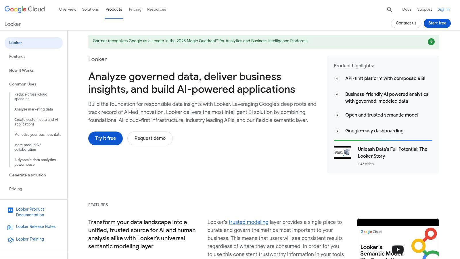
Google Looker is what I recommend when the company places high importance on metric consistency. Not "sort of consistent." Absolute consistency. Looker's semantic layer gives teams one governed definition of business logic, and that's a big deal when five departments all think "active customer" means something different.

Gemini makes the front end friendlier, but the core value hasn't changed. Looker is about trust before convenience.

Why governance-first teams like it

LookML is the reason many data teams stick with Looker. Once it's modeled well, business users can explore without breaking definitions or inventing conflicting KPIs. Gemini adds conversational help, AI-assisted charting, and narrative generation on top of that foundation.

That said, Looker is not the tool I'd hand to an early-stage startup looking for instant, lightweight answers. It tends to make the most sense when your data team wants a governed analytics layer and your business users want self-serve access without spreadsheet chaos.

If your biggest analytics problem is "everyone has a different number," Looker is usually more useful than a faster but looser chat interface.

Where it can frustrate people

Looker's biggest downside is simple. It often requires more planning, more setup, and more buy-in than speed-focused teams want. Procurement can be enterprise-heavy, and some Gemini features are still rolling out.

It's a strong fit when:

  • You need metric governance: This is the headline reason to buy it.

  • You're already on Google Cloud: Integration is a natural advantage.

  • You want APIs and embedding options: Looker supports product and workflow integration well.

It's a weaker fit when:

  • You need answers this afternoon: Setup discipline takes time.

  • Your team hates sales-led buying cycles: Looker can feel enterprise from day one.

5. ThoughtSpot

ThoughtSpot

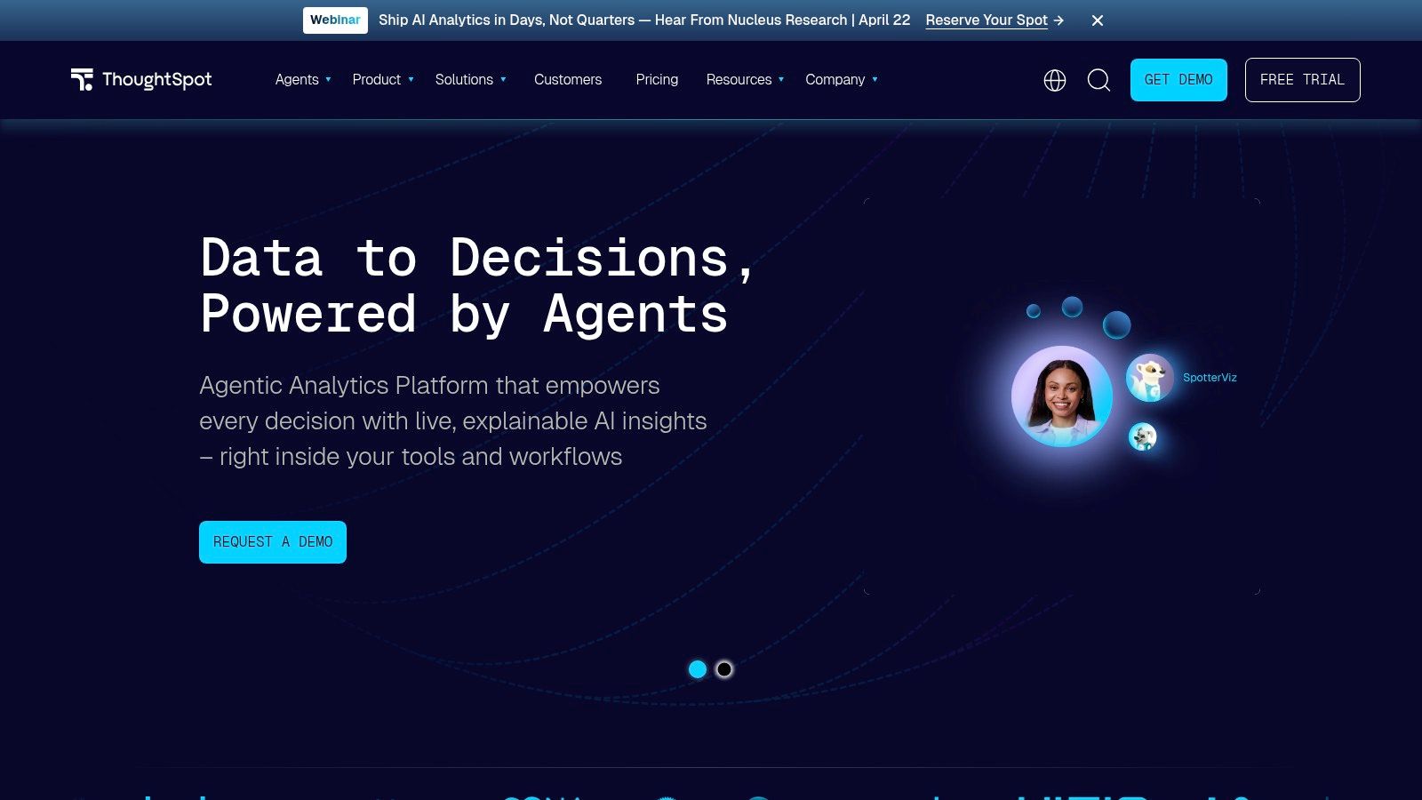
ThoughtSpot is one of the few BI tools that reduces time to insight for non-technical users. A founder, PM, or marketing lead can type a question, get a chart, and keep going. That sounds obvious now, but traditional BI still asks people to hunt through dashboards, guess which filter matters, and wait on an analyst when they hit a dead end.

That search-first experience is ThoughtSpot's real advantage. It lowers the effort required to ask a decent question, which is why business teams often adopt it faster than more model-heavy platforms. If Statspresso represents the newer conversational AI standard, ThoughtSpot is one of the clearest earlier proofs that people want analytics to work more like asking and answering than report building.

Why teams buy it

ThoughtSpot works well when speed matters more than dashboard craftsmanship. Sales leaders can check pipeline movement. Marketers can compare channel performance. Product teams can ask follow-up questions without rebuilding a report every time the meeting shifts direction.

I've seen this go well in companies where executives want direct access to answers but do not want to learn BI mechanics. ThoughtSpot removes a lot of that friction. Its embedded analytics story is also strong, so teams building customer-facing reporting often keep it on the shortlist.

The trade-off

ThoughtSpot is fast on the surface, but it still depends on clean underlying data. If your metrics are loosely defined, tables are messy, or joins need careful handling, the search box will expose those problems quickly. You get speed only after the foundation is reliable.

That makes it a strong choice for:

  • Business users who want to ask questions in plain English

  • Teams that care about fast exploration over pixel-perfect dashboard design

  • Products that need embedded, search-led analytics

Use caution if:

  • Your semantic layer is still immature

  • Your analysis depends on complicated business rules behind the scenes

  • You want the cheapest path to casual BI access

A simple test works here. Ask: "Which channels drove pipeline growth last quarter, and show the trend as a line chart?" If that kind of question is your team's daily workflow, ThoughtSpot is a serious contender.

6. Qlik Sense

Qlik Sense

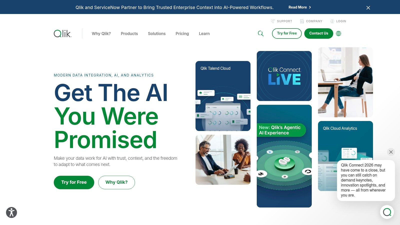
Qlik Sense is the tool people forget to mention until they hit a data problem that normal dashboard tools don't handle elegantly. Its associative engine is the differentiator. Instead of forcing users down one rigid query path, Qlik helps them explore relationships across data more flexibly.

That can surface useful patterns that other systems bury behind narrow filters and predefined joins. For analysts and data-savvy business teams, that's powerful.

What makes Qlik different

Qlik's Insight Advisor adds natural language questions, auto-generated analyses, and AI-guided charting on top of the platform's exploration model. In practical terms, that means users can ask for comparisons, rankings, and facts without building every view by hand.

The business logic layer is another underrated piece. It gives teams a way to shape results so users see answers that align better with actual business meaning, not just raw field relationships.

The catch with Qlik

Qlik isn't the easiest tool on this list to buy or configure. It rewards teams that have someone thoughtful guiding the setup. If that happens, the experience is strong. If it doesn't, users can end up with a platform that's technically powerful but awkward in practice.

Qlik makes sense when:

  • You need exploratory analysis across complex relationships

  • Governance matters, especially in regulated environments

  • You want both cloud options and automation capabilities

Qlik is less ideal when:

  • You need the simplest possible interface for non-technical users

  • You want very straightforward pricing

  • You don't have bandwidth to tune logic and setup

Qlik is often better for organizations with a real analytics function than for a three-person startup trying to move faster next week.

7. Amazon QuickSight

Amazon QuickSight (with Amazon Q)

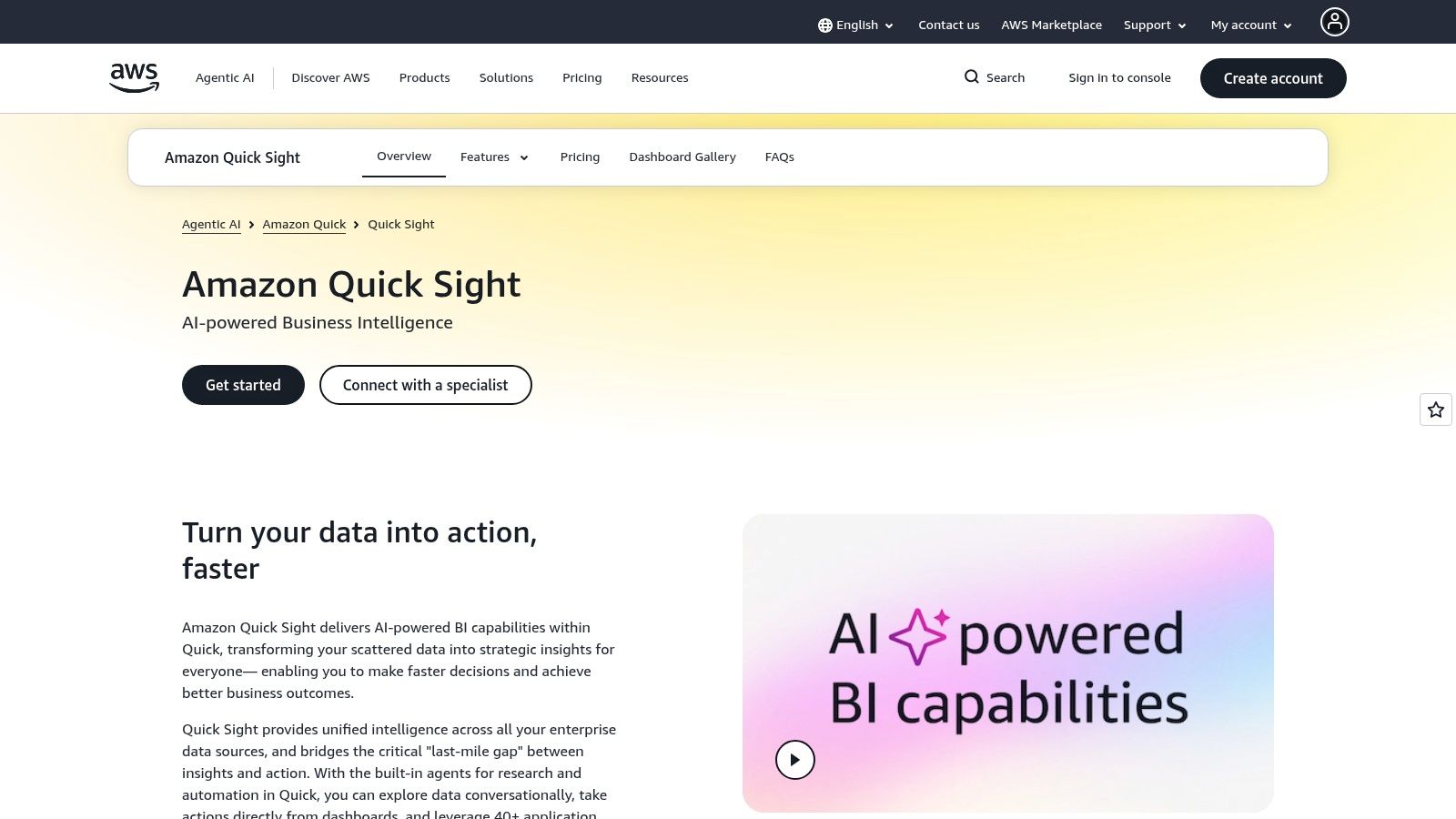
Amazon QuickSight makes the most sense when your data already lives in AWS and you don't want another analytics stack layered on top. With Amazon Q, the platform leans into generative BI. Users can create visuals and summaries through natural language, then share them across a broad audience without a lot of infrastructure fuss.

That serverless model is part of the appeal. Teams don't have to babysit as much plumbing.

Why AWS-native teams pick it

QuickSight works well with Redshift, Athena, and S3, which cuts down on integration friction for AWS-centric teams. Q&A Topics also help structure conversational exploration around governed areas, which is important if you want natural-language access without total metric chaos.

The reporting angle deserves mention too. QuickSight can support polished output for executive and operational reporting, so it's not only a lightweight Q&A layer.

What to watch closely

The trade-off is pricing complexity around AI capacity and account-level configuration. QuickSight itself can feel efficient, but the moment you expand AI features broadly, teams need to understand how capacity planning affects cost and access.

A simple way to look at it:

  • Best for AWS-first teams: Integration is the selling point.

  • Good for broad distribution: Serverless delivery can scale well.

  • Solid for governed question-answering: Curated topics help control the experience.

Less appealing if:

  • You're multi-cloud and want neutral tooling

  • You want the easiest pricing story

  • You need highly opinionated, premium dashboard design

For infrastructure-minded teams, QuickSight is often more practical than flashy. That's not a criticism. It's usually a buying signal.

8. Sigma

Sigma

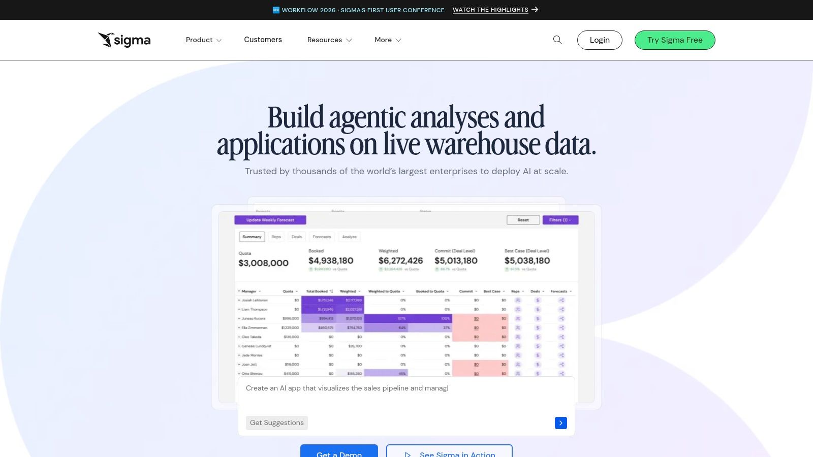
Sigma is one of the better answers to a specific problem. Your business users are comfortable in spreadsheets, your data team wants warehouse-native governance, and nobody wants to export CSVs for the hundredth time.

Sigma bridges that gap well. It feels familiar on the surface while staying connected to governed cloud data underneath.

Why Sigma clicks with business teams

Sigma Assistant lets users ask natural-language questions and work conversationally, but the bigger win is the surrounding interface. People can keep working in a workbook flow that resembles the tools they already know. That reduces training friction.

It also supports explaining charts, suggesting formulas, and embedding assistant workflows with customization options. For organizations that want governed self-serve analytics without forcing every user into a classic BI canvas, Sigma is a smart option.

Spreadsheet familiarity is underrated. If users already think in rows, columns, and formulas, forcing them into a dense BI interface usually slows adoption.

Where Sigma falls short

The biggest issue is transparency. Pricing isn't publicly straightforward, and AI features require admin setup with an external AI provider. That means Sigma can be elegant in production but slightly more involved to operationalize than the front-end experience suggests.

Sigma is strongest when:

  • Your company runs on a cloud data warehouse

  • Business users prefer spreadsheet workflows

  • You want governed access without constant exports

It can be a tougher fit when:

  • You want a quick self-serve trial with obvious pricing

  • Your team lacks admin bandwidth for AI configuration

  • You need a pure no-setup conversational product

9. Hex

Hex

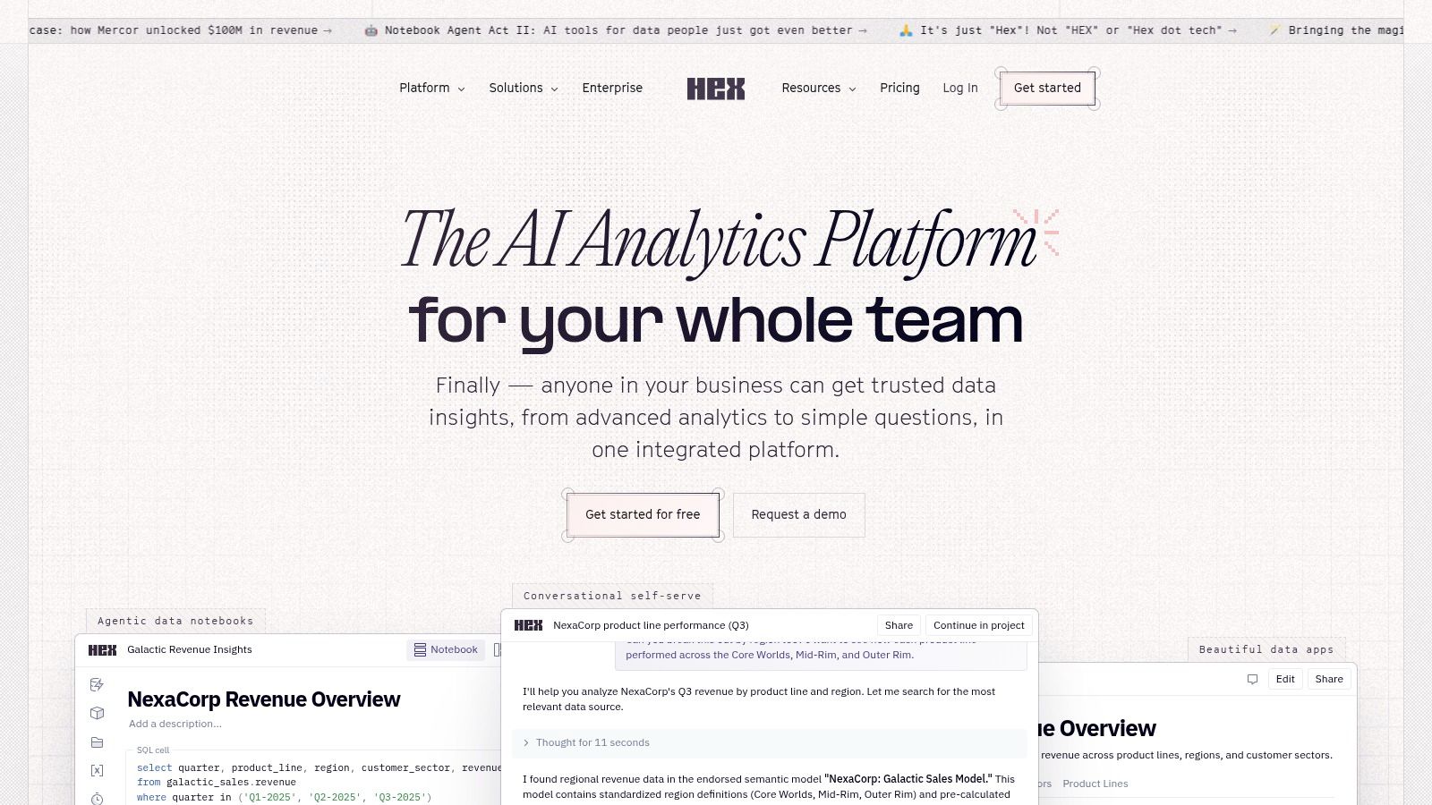
Hex isn't trying to replace analyst thinking. That's why technical teams like it. It blends notebooks, apps, dashboards, and AI helpers in a way that speeds up work without pretending AI should own the whole analytical process.

For mixed SQL and Python teams, Hex can feel like the fastest route from raw analysis to something shareable.

Where Hex earns its spot

Hex's AI helpers can generate, fix, and explain SQL, Python, and markdown. That's useful if analysts want acceleration, not abstraction. Add no-code cells for pivots and filters, and you get a workflow that supports both technical depth and lightweight presentation.

I like Hex most for teams that build internal tools, operational analytics apps, or reusable analyses that need more flexibility than a standard dashboard builder offers. It supports a wider range of analytical work than most pure BI tools.

The honest limitation

Hex is not really for non-technical leaders working alone. Yes, it has no-code pieces. Yes, AI helps. But the platform still shines brightest when analysts are in the loop and willing to review generated code and logic.

A quick read on fit:

  • Great for analyst-led teams: Especially where SQL and Python both matter.

  • Strong path from notebook to app: Good for internal-facing analytics experiences.

  • Helpful AI, not fake autopilot: It assists technical work instead of replacing judgment.

Less ideal if:

  • You want fully self-serve analytics for non-technical users

  • You don't have analysts to validate outputs

  • You mainly need a simple conversational BI layer

Hex is excellent. It's just excellent for a narrower audience than some of the tools above.

10. Zoho Analytics

Zoho Analytics is a practical BI buy for teams that want answers fast without signing up for an enterprise rollout.

That matters for founders, PMs, and marketers who are stuck between spreadsheet chaos and heavyweight BI. Zoho gives them a usable middle ground. They can connect common business apps, build dashboards with little friction, and use Zia for plain-English questions. It is still more traditional BI than fully conversational tools like Statspresso, so speed-to-insight depends more on how well the data is set up upfront.

Why Zoho works for smaller teams

Zoho is easy to recommend when budget, connector coverage, and setup time matter more than perfect enterprise architecture. The product covers a lot of ground for the price, which is exactly what many SMB teams need.

Zia is the key AI layer here. It helps users ask questions in natural language, generate charts, and get guided analysis without writing SQL. For non-technical leaders, that lowers the barrier to getting a quick answer. For a lean team with no dedicated BI owner, that counts.

The drag-and-drop builder also helps. Teams can assemble standard dashboards for sales, marketing, finance, and operations without a long implementation cycle.

The trade-off in plain English

Zoho works best when the goal is broad BI coverage at a sensible cost. It gets less attractive as data models, permissions, and governance needs become more complex.

That is the trade-off. You get accessibility and lower cost. You give up some of the depth and polish that larger platforms bring to enterprise-scale modeling and control.

Zoho is a good fit when:

  • You need dashboards and self-serve reporting without a heavy BI project

  • Your team wants natural-language querying for common business questions

  • You care more about fast setup and value than advanced governance

It is less ideal when:

  • You need a highly governed semantic layer across many teams

  • You expect the fastest conversational workflow from question to chart

  • Your analysts are managing very complex data logic or enterprise reporting standards

For growing companies, that can be a perfectly rational choice. Zoho will not feel as fast or as AI-native as the newer conversational analytics tools, but it can get a non-technical team from disconnected data to useful dashboards without much drama.

Top 10 AI Data Visualization Tools: Feature Comparison

Product

Key features

AI / NLQ & Insights

Best for / Target audience

Pricing & trial

Unique selling point

Statspresso (Recommended)

Connectors (Shopify, HubSpot, Postgres…), conversational Q&A, AI Insight Gallery, embeddable chat, real‑time dashboards, PDF export

Plain‑English Q&A → instant charts, numbers & explanations; AI Insight Gallery surfaces patterns and one‑click findings

Startups, SMBs, product & growth teams, agencies, SaaS teams replacing dashboard sprawl

14‑day free trial; Starter $49/mo, Growth $249/mo, Advanced $499/mo; yearly ~15% off

Conversational analytics + insight gallery + embeddable chat, fast, actionable answers without SQL

Tableau

Rich visualization library, role‑based licensing, broad connectors, Cloud/Server options

Tableau Pulse (cloud): AI metric summaries and narrative highlights

Enterprises and analysts needing best‑in‑class visuals and governance

Tiered user licensing (Creator/Explorer/Viewer); cloud editions enable Pulse

Industry‑leading visual interactivity and mature analytics ecosystem

Microsoft Power BI (Copilot in Fabric)

Reports, DAX, tight Microsoft 365/Teams integration, Fabric integration

Copilot creates report pages, writes DAX, and summarizes visuals (requires Fabric/Premium)

Microsoft‑centric organizations and enterprises with MS stack

Free/Pro tiers; Copilot features require Fabric or Premium capacity (paid)

Deep Microsoft ecosystem integration and enterprise governance

Google Looker (Gemini)

Governed semantic layer (LookML), APIs, Google Cloud integrations

Gemini-powered conversational analytics, chart & narrative generation (some features preview)

Data-governed enterprises on Google Cloud

Enterprise sales pricing; some Gemini features in preview

Strong semantic governance (LookML) + Google Cloud AI (Gemini) integration

ThoughtSpot

Natural‑language search, AI agents, embed SDKs

Very approachable NLQ with charts, insights and "explain why" narratives

Self‑serve analytics, embedded analytics scenarios, business users

Per‑user / per‑query pricing models; startup & embedded options

Fast NLQ search experience and clear entry pricing for quick adoption

Qlik Sense

Associative engine, Insight Advisor, augmented analytics, cloud options

NLQ, auto‑generated analyses and conversational chat

Exploratory analysis across complex data relationships; regulated industries

Complex user/capacity tiers (enterprise pricing)

Associative exploration that reveals relationships standard SQL can miss

Amazon QuickSight (Amazon Q)

Serverless BI, Q&A Topics, pixel‑perfect reporting add‑ons

Amazon Q: natural‑language authoring, AI summaries, curated Q&A topics

Teams on AWS using Redshift/Athena/S3 who need scalable BI

Capacity‑based pricing; some Q features add account‑level infra fees

Deep AWS integration with predictable serverless scaling

Sigma

Spreadsheet‑style workbook UX on cloud warehouse, embedding support

Sigma Assistant: NLQ, chart/table generation, analysis breakdowns, formula suggestions

Warehouse‑native teams that prefer spreadsheet workflows with governance

No public list pricing (enterprise sales)

Familiar spreadsheet UX running directly on cloud warehouses

Hex

Notebooks, apps and dashboards, integrations with Snowflake/AISQL

AI helpers generate/edit SQL & Python, explain code, turn prompts into charts

Analytics teams that move from code to shareable apps

Plan‑based pricing; AI included in plans

Fast path from analysis to interactive apps with AI code assistance

Zoho Analytics (Ask Zia)

NLQ assistant, DataPrep, wide connectors, embedding & Teams integration

Ask Zia generates charts, KPIs and automated insight narration

SMBs seeking cost‑effective BI and quick setup

Transparent tiered pricing with free plan and trials; Ask Zia on Premium tiers

Competitive pricing and generous feature ...

Waiting weeks for a data analyst to build a dashboard is a relic of the past. AI visualization software has moved fast enough that Gartner expects 75% of enterprises will use AI visualization by 2026, up from 25% in 2022, according to ThoughtSpot’s roundup of AI visualization tools. That matters if you're a founder, PM, or marketer sitting on useful data but still depending on backlog-driven BI.

The best ai tools for data visualization now do three things well. They turn plain-English questions into charts, they explain what changed, and they cut the setup pain that made traditional BI feel like homework. Some are built for governed enterprise reporting. Others are built for speed. A few deliver both.

If you care about fast answers more than perfect dashboard architecture, prioritize conversational analytics over feature sprawl. If you need polished board-ready reporting, governance still matters. Organizations often require a mix. That's why this list leans hard into speed-to-insight for non-technical users while still calling out where each tool gets clunky.

For a broader look at why visual analysis matters in the first place, this guide on data visualization and analytics is a useful companion.

Busy teams don't need more dashboards. They need fewer clicks between a question and a trustworthy answer.

1. Statspresso


Statspresso

Statspresso is the tool I'd put in front of a startup founder, growth lead, or product manager who wants answers now and has zero interest in writing SQL. It's a Conversational AI Data Analyst. You connect your sources, ask a question in plain English, and get a chart, metric, or explanation back in seconds.

That sounds simple because it is. That's the point. Traditional BI asks non-technical users to think like report builders. Statspresso flips that. It asks the software to behave more like an analyst.

Why it stands out for speed

The strongest part of Statspresso is that it doesn't make you choose between exploration and reporting. Teams can ask one-off questions, save useful findings, and roll them into real-time dashboards without creating a mess of duplicate charts. The AI Insight Gallery is especially useful if your team keeps rediscovering the same patterns and forgetting to operationalize them.

It also fits how modern teams work. Sources like Shopify, HubSpot, Linear, and Postgres are part of the core pitch, and features like embeddable AI chat, branding controls, PDF exports, and workspace separation make it practical for agencies, SaaS products, and internal ops teams.

Try asking Statspresso: "Show me revenue by month for the last year as a bar chart."

Try asking Statspresso: "Which customers expanded fastest after onboarding, and what changed before the spike?"

What works and what doesn't

What works:

  • Fast self-serve analytics: Non-technical users can skip the SQL and go straight to the question.

  • Useful discovery flow: The Insight Gallery helps teams turn accidental findings into reusable reporting.

  • Good collaboration mechanics: Real-time dashboards and embeddable chat make it easier to share answers where people already work.

  • Clear packaging: A free trial and tiered plans make it easier to test before committing.

What doesn't:

  • Lower tiers can feel tight: If your team has lots of sources, dashboards, or frequent usage, you'll hit plan limits sooner.

  • Regulated teams should verify details first: The product talks about security and accuracy, but buyers with strict compliance needs should confirm governance requirements directly.

Practical rule: If your team keeps asking an analyst for the same five charts every week, a conversational tool like Statspresso is usually a better first buy than another heavyweight BI rollout.

If you want a deeper look at where this style of tooling fits, Statspresso's guide to automated data visualization is worth reading.

2. Tableau


Tableau

Tableau still sets the bar for dashboards that need to look polished in the boardroom and hold up under analyst scrutiny. If the goal is a durable reporting layer with strong visual control, Tableau earns its place. If the goal is speed to insight for a founder or marketer who just wants to ask a question and get a chart back, it can feel slower than the new conversational tools.

That trade-off matters.

Tableau has added more AI assistance, including natural language help, guided explanations, and faster chart creation. Those features make the product easier to use than it was a few years ago. But in practice, Tableau still performs best when somebody on the team understands data modeling, field logic, and dashboard design. Non-technical users can consume insights well. Building the system that produces those insights usually still needs a BI owner.

Where Tableau is strongest

Visual quality is the main reason teams keep buying Tableau. The charts are flexible, interactive, and presentation-ready without much compromise. For executive reporting, customer-facing analytics, and teams that care about design, that polish is real value.

It also fits well inside larger enterprise setups. Governance options are mature. Embedded analytics is well developed. Companies already working across Salesforce and the wider Microsoft Power Platform often still keep Tableau in the stack because it gives analysts more control over the final presentation layer.

I usually recommend Tableau when an organization already has analysts in place and needs consistency across departments. It is much less appealing when a small team wants answers now and does not want to wait on dashboard builds.

Best fit and trade-offs

Choose Tableau if:

  • You need polished executive dashboards: Few tools make BI outputs look this refined.

  • You have analyst support: Tableau rewards teams that can model data cleanly and maintain reporting standards.

  • You want a long-term BI layer: It works well for structured reporting that multiple teams rely on.

Skip it if:

  • You want question-to-chart speed: Conversational tools like Statspresso are usually faster for ad hoc business questions.

  • Your team is mostly non-technical: Tableau is easier to read than to set up well.

  • Your source data is messy: Tableau exposes bad definitions and broken joins fast, which is useful, but it slows time-to-value.

For busy operators, Tableau is rarely the fastest first answer. It is better as the place your company standardizes reporting after the metrics, definitions, and workflows are already under control.

3. Microsoft Power BI

Microsoft Power BI stays on shortlists for a simple reason. It gets companies from spreadsheets to shared reporting fast, especially if they already run on Microsoft.

That matters more than flashy AI demos. For ops, finance, and sales leaders who live in Excel, Teams, Outlook, and Azure, Power BI usually feels familiar on day one. Adoption is easier when the tool fits the stack people already use.

Where Power BI works well

Power BI is often the practical choice for standard business reporting. It handles scheduled dashboards, cross-team sharing, row-level security, and Microsoft-friendly admin controls without much drama. If the goal is to put reliable numbers in front of managers every week, it does that well.

Copilot improves the experience, but buyers should read the fine print. It can help with report summaries, DAX suggestions, and faster page creation. The catch is cost and access. Power BI Pro starts at $14 per user per month, but the fuller AI experience depends on premium capacity or Fabric setup, according to Microsoft's Power BI pricing page. Teams often miss that detail during evaluation.

Power BI also benefits from the wider Microsoft setup. For a primer on the ecosystem around it, this overview of Microsoft Power Platform gives useful context.

The real trade-off

Power BI is strong for repeatable reporting. It is less suited to the fastest question-to-answer workflow that non-technical leaders usually want.

That is the gap many teams feel. A founder or marketer does not always want another dashboard project. They want to ask, "Why did pipeline dip last week?" and get a visual answer now. Power BI can support that kind of analysis, but it still works best when someone has already modeled the data, built the report layer, and set permissions correctly. Tools built around conversational analytics, including Statspresso, usually cut more steps out of that process.

A few practical takeaways:

  • Choose Power BI if your company is already deep in Microsoft: Deployment, sharing, and governance are usually straightforward.

  • Expect solid operational BI, not instant magic: It shines once reports and models are in place.

  • Treat Copilot as an add-on, not the whole product story: AI helps, but the setup and licensing matter.

  • Check tenant and region availability early: Some AI features roll out unevenly, which can slow adoption.

Power BI is often the safe buy. For non-technical teams chasing speed-to-insight, it is usually not the fastest first answer.

4. Google Looker


Google Looker (with Gemini in Looker)

Google Looker is what I recommend when the company places high importance on metric consistency. Not "sort of consistent." Absolute consistency. Looker's semantic layer gives teams one governed definition of business logic, and that's a big deal when five departments all think "active customer" means something different.

Gemini makes the front end friendlier, but the core value hasn't changed. Looker is about trust before convenience.

Why governance-first teams like it

LookML is the reason many data teams stick with Looker. Once it's modeled well, business users can explore without breaking definitions or inventing conflicting KPIs. Gemini adds conversational help, AI-assisted charting, and narrative generation on top of that foundation.

That said, Looker is not the tool I'd hand to an early-stage startup looking for instant, lightweight answers. It tends to make the most sense when your data team wants a governed analytics layer and your business users want self-serve access without spreadsheet chaos.

If your biggest analytics problem is "everyone has a different number," Looker is usually more useful than a faster but looser chat interface.

Where it can frustrate people

Looker's biggest downside is simple. It often requires more planning, more setup, and more buy-in than speed-focused teams want. Procurement can be enterprise-heavy, and some Gemini features are still rolling out.

It's a strong fit when:

  • You need metric governance: This is the headline reason to buy it.

  • You're already on Google Cloud: Integration is a natural advantage.

  • You want APIs and embedding options: Looker supports product and workflow integration well.

It's a weaker fit when:

  • You need answers this afternoon: Setup discipline takes time.

  • Your team hates sales-led buying cycles: Looker can feel enterprise from day one.

5. ThoughtSpot


ThoughtSpot

ThoughtSpot is one of the few BI tools that reduces time to insight for non-technical users. A founder, PM, or marketing lead can type a question, get a chart, and keep going. That sounds obvious now, but traditional BI still asks people to hunt through dashboards, guess which filter matters, and wait on an analyst when they hit a dead end.

That search-first experience is ThoughtSpot's real advantage. It lowers the effort required to ask a decent question, which is why business teams often adopt it faster than more model-heavy platforms. If Statspresso represents the newer conversational AI standard, ThoughtSpot is one of the clearest earlier proofs that people want analytics to work more like asking and answering than report building.

Why teams buy it

ThoughtSpot works well when speed matters more than dashboard craftsmanship. Sales leaders can check pipeline movement. Marketers can compare channel performance. Product teams can ask follow-up questions without rebuilding a report every time the meeting shifts direction.

I've seen this go well in companies where executives want direct access to answers but do not want to learn BI mechanics. ThoughtSpot removes a lot of that friction. Its embedded analytics story is also strong, so teams building customer-facing reporting often keep it on the shortlist.

The trade-off

ThoughtSpot is fast on the surface, but it still depends on clean underlying data. If your metrics are loosely defined, tables are messy, or joins need careful handling, the search box will expose those problems quickly. You get speed only after the foundation is reliable.

That makes it a strong choice for:

  • Business users who want to ask questions in plain English

  • Teams that care about fast exploration over pixel-perfect dashboard design

  • Products that need embedded, search-led analytics

Use caution if:

  • Your semantic layer is still immature

  • Your analysis depends on complicated business rules behind the scenes

  • You want the cheapest path to casual BI access

A simple test works here. Ask: "Which channels drove pipeline growth last quarter, and show the trend as a line chart?" If that kind of question is your team's daily workflow, ThoughtSpot is a serious contender.

6. Qlik Sense


Qlik Sense

Qlik Sense is the tool people forget to mention until they hit a data problem that normal dashboard tools don't handle elegantly. Its associative engine is the differentiator. Instead of forcing users down one rigid query path, Qlik helps them explore relationships across data more flexibly.

That can surface useful patterns that other systems bury behind narrow filters and predefined joins. For analysts and data-savvy business teams, that's powerful.

What makes Qlik different

Qlik's Insight Advisor adds natural language questions, auto-generated analyses, and AI-guided charting on top of the platform's exploration model. In practical terms, that means users can ask for comparisons, rankings, and facts without building every view by hand.

The business logic layer is another underrated piece. It gives teams a way to shape results so users see answers that align better with actual business meaning, not just raw field relationships.

The catch with Qlik

Qlik isn't the easiest tool on this list to buy or configure. It rewards teams that have someone thoughtful guiding the setup. If that happens, the experience is strong. If it doesn't, users can end up with a platform that's technically powerful but awkward in practice.

Qlik makes sense when:

  • You need exploratory analysis across complex relationships

  • Governance matters, especially in regulated environments

  • You want both cloud options and automation capabilities

Qlik is less ideal when:

  • You need the simplest possible interface for non-technical users

  • You want very straightforward pricing

  • You don't have bandwidth to tune logic and setup

Qlik is often better for organizations with a real analytics function than for a three-person startup trying to move faster next week.

7. Amazon QuickSight


Amazon QuickSight (with Amazon Q)

Amazon QuickSight makes the most sense when your data already lives in AWS and you don't want another analytics stack layered on top. With Amazon Q, the platform leans into generative BI. Users can create visuals and summaries through natural language, then share them across a broad audience without a lot of infrastructure fuss.

That serverless model is part of the appeal. Teams don't have to babysit as much plumbing.

Why AWS-native teams pick it

QuickSight works well with Redshift, Athena, and S3, which cuts down on integration friction for AWS-centric teams. Q&A Topics also help structure conversational exploration around governed areas, which is important if you want natural-language access without total metric chaos.

The reporting angle deserves mention too. QuickSight can support polished output for executive and operational reporting, so it's not only a lightweight Q&A layer.

What to watch closely

The trade-off is pricing complexity around AI capacity and account-level configuration. QuickSight itself can feel efficient, but the moment you expand AI features broadly, teams need to understand how capacity planning affects cost and access.

A simple way to look at it:

  • Best for AWS-first teams: Integration is the selling point.

  • Good for broad distribution: Serverless delivery can scale well.

  • Solid for governed question-answering: Curated topics help control the experience.

Less appealing if:

  • You're multi-cloud and want neutral tooling

  • You want the easiest pricing story

  • You need highly opinionated, premium dashboard design

For infrastructure-minded teams, QuickSight is often more practical than flashy. That's not a criticism. It's usually a buying signal.

8. Sigma


Sigma

Sigma is one of the better answers to a specific problem. Your business users are comfortable in spreadsheets, your data team wants warehouse-native governance, and nobody wants to export CSVs for the hundredth time.

Sigma bridges that gap well. It feels familiar on the surface while staying connected to governed cloud data underneath.

Why Sigma clicks with business teams

Sigma Assistant lets users ask natural-language questions and work conversationally, but the bigger win is the surrounding interface. People can keep working in a workbook flow that resembles the tools they already know. That reduces training friction.

It also supports explaining charts, suggesting formulas, and embedding assistant workflows with customization options. For organizations that want governed self-serve analytics without forcing every user into a classic BI canvas, Sigma is a smart option.

Spreadsheet familiarity is underrated. If users already think in rows, columns, and formulas, forcing them into a dense BI interface usually slows adoption.

Where Sigma falls short

The biggest issue is transparency. Pricing isn't publicly straightforward, and AI features require admin setup with an external AI provider. That means Sigma can be elegant in production but slightly more involved to operationalize than the front-end experience suggests.

Sigma is strongest when:

  • Your company runs on a cloud data warehouse

  • Business users prefer spreadsheet workflows

  • You want governed access without constant exports

It can be a tougher fit when:

  • You want a quick self-serve trial with obvious pricing

  • Your team lacks admin bandwidth for AI configuration

  • You need a pure no-setup conversational product

9. Hex


Hex

Hex isn't trying to replace analyst thinking. That's why technical teams like it. It blends notebooks, apps, dashboards, and AI helpers in a way that speeds up work without pretending AI should own the whole analytical process.

For mixed SQL and Python teams, Hex can feel like the fastest route from raw analysis to something shareable.

Where Hex earns its spot

Hex's AI helpers can generate, fix, and explain SQL, Python, and markdown. That's useful if analysts want acceleration, not abstraction. Add no-code cells for pivots and filters, and you get a workflow that supports both technical depth and lightweight presentation.

I like Hex most for teams that build internal tools, operational analytics apps, or reusable analyses that need more flexibility than a standard dashboard builder offers. It supports a wider range of analytical work than most pure BI tools.

The honest limitation

Hex is not really for non-technical leaders working alone. Yes, it has no-code pieces. Yes, AI helps. But the platform still shines brightest when analysts are in the loop and willing to review generated code and logic.

A quick read on fit:

  • Great for analyst-led teams: Especially where SQL and Python both matter.

  • Strong path from notebook to app: Good for internal-facing analytics experiences.

  • Helpful AI, not fake autopilot: It assists technical work instead of replacing judgment.

Less ideal if:

  • You want fully self-serve analytics for non-technical users

  • You don't have analysts to validate outputs

  • You mainly need a simple conversational BI layer

Hex is excellent. It's just excellent for a narrower audience than some of the tools above.

10. Zoho Analytics

Zoho Analytics is a practical BI buy for teams that want answers fast without signing up for an enterprise rollout.

That matters for founders, PMs, and marketers who are stuck between spreadsheet chaos and heavyweight BI. Zoho gives them a usable middle ground. They can connect common business apps, build dashboards with little friction, and use Zia for plain-English questions. It is still more traditional BI than fully conversational tools like Statspresso, so speed-to-insight depends more on how well the data is set up upfront.

Why Zoho works for smaller teams

Zoho is easy to recommend when budget, connector coverage, and setup time matter more than perfect enterprise architecture. The product covers a lot of ground for the price, which is exactly what many SMB teams need.

Zia is the key AI layer here. It helps users ask questions in natural language, generate charts, and get guided analysis without writing SQL. For non-technical leaders, that lowers the barrier to getting a quick answer. For a lean team with no dedicated BI owner, that counts.

The drag-and-drop builder also helps. Teams can assemble standard dashboards for sales, marketing, finance, and operations without a long implementation cycle.

The trade-off in plain English

Zoho works best when the goal is broad BI coverage at a sensible cost. It gets less attractive as data models, permissions, and governance needs become more complex.

That is the trade-off. You get accessibility and lower cost. You give up some of the depth and polish that larger platforms bring to enterprise-scale modeling and control.

Zoho is a good fit when:

  • You need dashboards and self-serve reporting without a heavy BI project

  • Your team wants natural-language querying for common business questions

  • You care more about fast setup and value than advanced governance

It is less ideal when:

  • You need a highly governed semantic layer across many teams

  • You expect the fastest conversational workflow from question to chart

  • Your analysts are managing very complex data logic or enterprise reporting standards

For growing companies, that can be a perfectly rational choice. Zoho will not feel as fast or as AI-native as the newer conversational analytics tools, but it can get a non-technical team from disconnected data to useful dashboards without much drama.

Top 10 AI Data Visualization Tools: Feature Comparison

Product

Key features

AI / NLQ & Insights

Best for / Target audience

Pricing & trial

Unique selling point

Statspresso (Recommended)

Connectors (Shopify, HubSpot, Postgres…), conversational Q&A, AI Insight Gallery, embeddable chat, real‑time dashboards, PDF export

Plain‑English Q&A → instant charts, numbers & explanations; AI Insight Gallery surfaces patterns and one‑click findings

Startups, SMBs, product & growth teams, agencies, SaaS teams replacing dashboard sprawl

14‑day free trial; Starter $49/mo, Growth $249/mo, Advanced $499/mo; yearly ~15% off

Conversational analytics + insight gallery + embeddable chat, fast, actionable answers without SQL

Tableau

Rich visualization library, role‑based licensing, broad connectors, Cloud/Server options

Tableau Pulse (cloud): AI metric summaries and narrative highlights

Enterprises and analysts needing best‑in‑class visuals and governance

Tiered user licensing (Creator/Explorer/Viewer); cloud editions enable Pulse

Industry‑leading visual interactivity and mature analytics ecosystem

Microsoft Power BI (Copilot in Fabric)

Reports, DAX, tight Microsoft 365/Teams integration, Fabric integration

Copilot creates report pages, writes DAX, and summarizes visuals (requires Fabric/Premium)

Microsoft‑centric organizations and enterprises with MS stack

Free/Pro tiers; Copilot features require Fabric or Premium capacity (paid)

Deep Microsoft ecosystem integration and enterprise governance

Google Looker (Gemini)

Governed semantic layer (LookML), APIs, Google Cloud integrations

Gemini-powered conversational analytics, chart & narrative generation (some features preview)

Data-governed enterprises on Google Cloud

Enterprise sales pricing; some Gemini features in preview

Strong semantic governance (LookML) + Google Cloud AI (Gemini) integration

ThoughtSpot

Natural‑language search, AI agents, embed SDKs

Very approachable NLQ with charts, insights and "explain why" narratives

Self‑serve analytics, embedded analytics scenarios, business users

Per‑user / per‑query pricing models; startup & embedded options

Fast NLQ search experience and clear entry pricing for quick adoption

Qlik Sense

Associative engine, Insight Advisor, augmented analytics, cloud options

NLQ, auto‑generated analyses and conversational chat

Exploratory analysis across complex data relationships; regulated industries

Complex user/capacity tiers (enterprise pricing)

Associative exploration that reveals relationships standard SQL can miss

Amazon QuickSight (Amazon Q)

Serverless BI, Q&A Topics, pixel‑perfect reporting add‑ons

Amazon Q: natural‑language authoring, AI summaries, curated Q&A topics

Teams on AWS using Redshift/Athena/S3 who need scalable BI

Capacity‑based pricing; some Q features add account‑level infra fees

Deep AWS integration with predictable serverless scaling

Sigma

Spreadsheet‑style workbook UX on cloud warehouse, embedding support

Sigma Assistant: NLQ, chart/table generation, analysis breakdowns, formula suggestions

Warehouse‑native teams that prefer spreadsheet workflows with governance

No public list pricing (enterprise sales)

Familiar spreadsheet UX running directly on cloud warehouses

Hex

Notebooks, apps and dashboards, integrations with Snowflake/AISQL

AI helpers generate/edit SQL & Python, explain code, turn prompts into charts

Analytics teams that move from code to shareable apps

Plan‑based pricing; AI included in plans

Fast path from analysis to interactive apps with AI code assistance

Zoho Analytics (Ask Zia)

NLQ assistant, DataPrep, wide connectors, embedding & Teams integration

Ask Zia generates charts, KPIs and automated insight narration

SMBs seeking cost‑effective BI and quick setup

Transparent tiered pricing with free plan and trials; Ask Zia on Premium tiers

Competitive pricing and generous feature ...

Waiting weeks for a data analyst to build a dashboard is a relic of the past. AI visualization software has moved fast enough that Gartner expects 75% of enterprises will use AI visualization by 2026, up from 25% in 2022, according to ThoughtSpot’s roundup of AI visualization tools. That matters if you're a founder, PM, or marketer sitting on useful data but still depending on backlog-driven BI.

The best ai tools for data visualization now do three things well. They turn plain-English questions into charts, they explain what changed, and they cut the setup pain that made traditional BI feel like homework. Some are built for governed enterprise reporting. Others are built for speed. A few deliver both.

If you care about fast answers more than perfect dashboard architecture, prioritize conversational analytics over feature sprawl. If you need polished board-ready reporting, governance still matters. Organizations often require a mix. That's why this list leans hard into speed-to-insight for non-technical users while still calling out where each tool gets clunky.

For a broader look at why visual analysis matters in the first place, this guide on data visualization and analytics is a useful companion.

Busy teams don't need more dashboards. They need fewer clicks between a question and a trustworthy answer.

1. Statspresso


Statspresso

Statspresso is the tool I'd put in front of a startup founder, growth lead, or product manager who wants answers now and has zero interest in writing SQL. It's a Conversational AI Data Analyst. You connect your sources, ask a question in plain English, and get a chart, metric, or explanation back in seconds.

That sounds simple because it is. That's the point. Traditional BI asks non-technical users to think like report builders. Statspresso flips that. It asks the software to behave more like an analyst.

Why it stands out for speed

The strongest part of Statspresso is that it doesn't make you choose between exploration and reporting. Teams can ask one-off questions, save useful findings, and roll them into real-time dashboards without creating a mess of duplicate charts. The AI Insight Gallery is especially useful if your team keeps rediscovering the same patterns and forgetting to operationalize them.

It also fits how modern teams work. Sources like Shopify, HubSpot, Linear, and Postgres are part of the core pitch, and features like embeddable AI chat, branding controls, PDF exports, and workspace separation make it practical for agencies, SaaS products, and internal ops teams.

Try asking Statspresso: "Show me revenue by month for the last year as a bar chart."

Try asking Statspresso: "Which customers expanded fastest after onboarding, and what changed before the spike?"

What works and what doesn't

What works:

  • Fast self-serve analytics: Non-technical users can skip the SQL and go straight to the question.

  • Useful discovery flow: The Insight Gallery helps teams turn accidental findings into reusable reporting.

  • Good collaboration mechanics: Real-time dashboards and embeddable chat make it easier to share answers where people already work.

  • Clear packaging: A free trial and tiered plans make it easier to test before committing.

What doesn't:

  • Lower tiers can feel tight: If your team has lots of sources, dashboards, or frequent usage, you'll hit plan limits sooner.

  • Regulated teams should verify details first: The product talks about security and accuracy, but buyers with strict compliance needs should confirm governance requirements directly.

Practical rule: If your team keeps asking an analyst for the same five charts every week, a conversational tool like Statspresso is usually a better first buy than another heavyweight BI rollout.

If you want a deeper look at where this style of tooling fits, Statspresso's guide to automated data visualization is worth reading.

2. Tableau


Tableau

Tableau still sets the bar for dashboards that need to look polished in the boardroom and hold up under analyst scrutiny. If the goal is a durable reporting layer with strong visual control, Tableau earns its place. If the goal is speed to insight for a founder or marketer who just wants to ask a question and get a chart back, it can feel slower than the new conversational tools.

That trade-off matters.

Tableau has added more AI assistance, including natural language help, guided explanations, and faster chart creation. Those features make the product easier to use than it was a few years ago. But in practice, Tableau still performs best when somebody on the team understands data modeling, field logic, and dashboard design. Non-technical users can consume insights well. Building the system that produces those insights usually still needs a BI owner.

Where Tableau is strongest

Visual quality is the main reason teams keep buying Tableau. The charts are flexible, interactive, and presentation-ready without much compromise. For executive reporting, customer-facing analytics, and teams that care about design, that polish is real value.

It also fits well inside larger enterprise setups. Governance options are mature. Embedded analytics is well developed. Companies already working across Salesforce and the wider Microsoft Power Platform often still keep Tableau in the stack because it gives analysts more control over the final presentation layer.

I usually recommend Tableau when an organization already has analysts in place and needs consistency across departments. It is much less appealing when a small team wants answers now and does not want to wait on dashboard builds.

Best fit and trade-offs

Choose Tableau if:

  • You need polished executive dashboards: Few tools make BI outputs look this refined.

  • You have analyst support: Tableau rewards teams that can model data cleanly and maintain reporting standards.

  • You want a long-term BI layer: It works well for structured reporting that multiple teams rely on.

Skip it if:

  • You want question-to-chart speed: Conversational tools like Statspresso are usually faster for ad hoc business questions.

  • Your team is mostly non-technical: Tableau is easier to read than to set up well.

  • Your source data is messy: Tableau exposes bad definitions and broken joins fast, which is useful, but it slows time-to-value.

For busy operators, Tableau is rarely the fastest first answer. It is better as the place your company standardizes reporting after the metrics, definitions, and workflows are already under control.

3. Microsoft Power BI

Microsoft Power BI stays on shortlists for a simple reason. It gets companies from spreadsheets to shared reporting fast, especially if they already run on Microsoft.

That matters more than flashy AI demos. For ops, finance, and sales leaders who live in Excel, Teams, Outlook, and Azure, Power BI usually feels familiar on day one. Adoption is easier when the tool fits the stack people already use.

Where Power BI works well

Power BI is often the practical choice for standard business reporting. It handles scheduled dashboards, cross-team sharing, row-level security, and Microsoft-friendly admin controls without much drama. If the goal is to put reliable numbers in front of managers every week, it does that well.

Copilot improves the experience, but buyers should read the fine print. It can help with report summaries, DAX suggestions, and faster page creation. The catch is cost and access. Power BI Pro starts at $14 per user per month, but the fuller AI experience depends on premium capacity or Fabric setup, according to Microsoft's Power BI pricing page. Teams often miss that detail during evaluation.

Power BI also benefits from the wider Microsoft setup. For a primer on the ecosystem around it, this overview of Microsoft Power Platform gives useful context.

The real trade-off

Power BI is strong for repeatable reporting. It is less suited to the fastest question-to-answer workflow that non-technical leaders usually want.

That is the gap many teams feel. A founder or marketer does not always want another dashboard project. They want to ask, "Why did pipeline dip last week?" and get a visual answer now. Power BI can support that kind of analysis, but it still works best when someone has already modeled the data, built the report layer, and set permissions correctly. Tools built around conversational analytics, including Statspresso, usually cut more steps out of that process.

A few practical takeaways:

  • Choose Power BI if your company is already deep in Microsoft: Deployment, sharing, and governance are usually straightforward.

  • Expect solid operational BI, not instant magic: It shines once reports and models are in place.

  • Treat Copilot as an add-on, not the whole product story: AI helps, but the setup and licensing matter.

  • Check tenant and region availability early: Some AI features roll out unevenly, which can slow adoption.

Power BI is often the safe buy. For non-technical teams chasing speed-to-insight, it is usually not the fastest first answer.

4. Google Looker


Google Looker (with Gemini in Looker)

Google Looker is what I recommend when the company places high importance on metric consistency. Not "sort of consistent." Absolute consistency. Looker's semantic layer gives teams one governed definition of business logic, and that's a big deal when five departments all think "active customer" means something different.

Gemini makes the front end friendlier, but the core value hasn't changed. Looker is about trust before convenience.

Why governance-first teams like it

LookML is the reason many data teams stick with Looker. Once it's modeled well, business users can explore without breaking definitions or inventing conflicting KPIs. Gemini adds conversational help, AI-assisted charting, and narrative generation on top of that foundation.

That said, Looker is not the tool I'd hand to an early-stage startup looking for instant, lightweight answers. It tends to make the most sense when your data team wants a governed analytics layer and your business users want self-serve access without spreadsheet chaos.

If your biggest analytics problem is "everyone has a different number," Looker is usually more useful than a faster but looser chat interface.

Where it can frustrate people

Looker's biggest downside is simple. It often requires more planning, more setup, and more buy-in than speed-focused teams want. Procurement can be enterprise-heavy, and some Gemini features are still rolling out.

It's a strong fit when:

  • You need metric governance: This is the headline reason to buy it.

  • You're already on Google Cloud: Integration is a natural advantage.

  • You want APIs and embedding options: Looker supports product and workflow integration well.

It's a weaker fit when:

  • You need answers this afternoon: Setup discipline takes time.

  • Your team hates sales-led buying cycles: Looker can feel enterprise from day one.

5. ThoughtSpot


ThoughtSpot

ThoughtSpot is one of the few BI tools that reduces time to insight for non-technical users. A founder, PM, or marketing lead can type a question, get a chart, and keep going. That sounds obvious now, but traditional BI still asks people to hunt through dashboards, guess which filter matters, and wait on an analyst when they hit a dead end.

That search-first experience is ThoughtSpot's real advantage. It lowers the effort required to ask a decent question, which is why business teams often adopt it faster than more model-heavy platforms. If Statspresso represents the newer conversational AI standard, ThoughtSpot is one of the clearest earlier proofs that people want analytics to work more like asking and answering than report building.

Why teams buy it

ThoughtSpot works well when speed matters more than dashboard craftsmanship. Sales leaders can check pipeline movement. Marketers can compare channel performance. Product teams can ask follow-up questions without rebuilding a report every time the meeting shifts direction.

I've seen this go well in companies where executives want direct access to answers but do not want to learn BI mechanics. ThoughtSpot removes a lot of that friction. Its embedded analytics story is also strong, so teams building customer-facing reporting often keep it on the shortlist.

The trade-off

ThoughtSpot is fast on the surface, but it still depends on clean underlying data. If your metrics are loosely defined, tables are messy, or joins need careful handling, the search box will expose those problems quickly. You get speed only after the foundation is reliable.

That makes it a strong choice for:

  • Business users who want to ask questions in plain English

  • Teams that care about fast exploration over pixel-perfect dashboard design

  • Products that need embedded, search-led analytics

Use caution if:

  • Your semantic layer is still immature

  • Your analysis depends on complicated business rules behind the scenes

  • You want the cheapest path to casual BI access

A simple test works here. Ask: "Which channels drove pipeline growth last quarter, and show the trend as a line chart?" If that kind of question is your team's daily workflow, ThoughtSpot is a serious contender.

6. Qlik Sense


Qlik Sense

Qlik Sense is the tool people forget to mention until they hit a data problem that normal dashboard tools don't handle elegantly. Its associative engine is the differentiator. Instead of forcing users down one rigid query path, Qlik helps them explore relationships across data more flexibly.

That can surface useful patterns that other systems bury behind narrow filters and predefined joins. For analysts and data-savvy business teams, that's powerful.

What makes Qlik different

Qlik's Insight Advisor adds natural language questions, auto-generated analyses, and AI-guided charting on top of the platform's exploration model. In practical terms, that means users can ask for comparisons, rankings, and facts without building every view by hand.

The business logic layer is another underrated piece. It gives teams a way to shape results so users see answers that align better with actual business meaning, not just raw field relationships.

The catch with Qlik

Qlik isn't the easiest tool on this list to buy or configure. It rewards teams that have someone thoughtful guiding the setup. If that happens, the experience is strong. If it doesn't, users can end up with a platform that's technically powerful but awkward in practice.

Qlik makes sense when:

  • You need exploratory analysis across complex relationships

  • Governance matters, especially in regulated environments

  • You want both cloud options and automation capabilities

Qlik is less ideal when:

  • You need the simplest possible interface for non-technical users

  • You want very straightforward pricing

  • You don't have bandwidth to tune logic and setup

Qlik is often better for organizations with a real analytics function than for a three-person startup trying to move faster next week.

7. Amazon QuickSight


Amazon QuickSight (with Amazon Q)

Amazon QuickSight makes the most sense when your data already lives in AWS and you don't want another analytics stack layered on top. With Amazon Q, the platform leans into generative BI. Users can create visuals and summaries through natural language, then share them across a broad audience without a lot of infrastructure fuss.

That serverless model is part of the appeal. Teams don't have to babysit as much plumbing.

Why AWS-native teams pick it

QuickSight works well with Redshift, Athena, and S3, which cuts down on integration friction for AWS-centric teams. Q&A Topics also help structure conversational exploration around governed areas, which is important if you want natural-language access without total metric chaos.

The reporting angle deserves mention too. QuickSight can support polished output for executive and operational reporting, so it's not only a lightweight Q&A layer.

What to watch closely

The trade-off is pricing complexity around AI capacity and account-level configuration. QuickSight itself can feel efficient, but the moment you expand AI features broadly, teams need to understand how capacity planning affects cost and access.

A simple way to look at it:

  • Best for AWS-first teams: Integration is the selling point.

  • Good for broad distribution: Serverless delivery can scale well.

  • Solid for governed question-answering: Curated topics help control the experience.

Less appealing if:

  • You're multi-cloud and want neutral tooling

  • You want the easiest pricing story

  • You need highly opinionated, premium dashboard design

For infrastructure-minded teams, QuickSight is often more practical than flashy. That's not a criticism. It's usually a buying signal.

8. Sigma


Sigma

Sigma is one of the better answers to a specific problem. Your business users are comfortable in spreadsheets, your data team wants warehouse-native governance, and nobody wants to export CSVs for the hundredth time.

Sigma bridges that gap well. It feels familiar on the surface while staying connected to governed cloud data underneath.

Why Sigma clicks with business teams

Sigma Assistant lets users ask natural-language questions and work conversationally, but the bigger win is the surrounding interface. People can keep working in a workbook flow that resembles the tools they already know. That reduces training friction.

It also supports explaining charts, suggesting formulas, and embedding assistant workflows with customization options. For organizations that want governed self-serve analytics without forcing every user into a classic BI canvas, Sigma is a smart option.

Spreadsheet familiarity is underrated. If users already think in rows, columns, and formulas, forcing them into a dense BI interface usually slows adoption.

Where Sigma falls short

The biggest issue is transparency. Pricing isn't publicly straightforward, and AI features require admin setup with an external AI provider. That means Sigma can be elegant in production but slightly more involved to operationalize than the front-end experience suggests.

Sigma is strongest when:

  • Your company runs on a cloud data warehouse

  • Business users prefer spreadsheet workflows

  • You want governed access without constant exports

It can be a tougher fit when:

  • You want a quick self-serve trial with obvious pricing

  • Your team lacks admin bandwidth for AI configuration

  • You need a pure no-setup conversational product

9. Hex


Hex

Hex isn't trying to replace analyst thinking. That's why technical teams like it. It blends notebooks, apps, dashboards, and AI helpers in a way that speeds up work without pretending AI should own the whole analytical process.

For mixed SQL and Python teams, Hex can feel like the fastest route from raw analysis to something shareable.

Where Hex earns its spot

Hex's AI helpers can generate, fix, and explain SQL, Python, and markdown. That's useful if analysts want acceleration, not abstraction. Add no-code cells for pivots and filters, and you get a workflow that supports both technical depth and lightweight presentation.

I like Hex most for teams that build internal tools, operational analytics apps, or reusable analyses that need more flexibility than a standard dashboard builder offers. It supports a wider range of analytical work than most pure BI tools.

The honest limitation

Hex is not really for non-technical leaders working alone. Yes, it has no-code pieces. Yes, AI helps. But the platform still shines brightest when analysts are in the loop and willing to review generated code and logic.

A quick read on fit:

  • Great for analyst-led teams: Especially where SQL and Python both matter.

  • Strong path from notebook to app: Good for internal-facing analytics experiences.

  • Helpful AI, not fake autopilot: It assists technical work instead of replacing judgment.

Less ideal if:

  • You want fully self-serve analytics for non-technical users

  • You don't have analysts to validate outputs

  • You mainly need a simple conversational BI layer

Hex is excellent. It's just excellent for a narrower audience than some of the tools above.

10. Zoho Analytics

Zoho Analytics is a practical BI buy for teams that want answers fast without signing up for an enterprise rollout.

That matters for founders, PMs, and marketers who are stuck between spreadsheet chaos and heavyweight BI. Zoho gives them a usable middle ground. They can connect common business apps, build dashboards with little friction, and use Zia for plain-English questions. It is still more traditional BI than fully conversational tools like Statspresso, so speed-to-insight depends more on how well the data is set up upfront.

Why Zoho works for smaller teams

Zoho is easy to recommend when budget, connector coverage, and setup time matter more than perfect enterprise architecture. The product covers a lot of ground for the price, which is exactly what many SMB teams need.

Zia is the key AI layer here. It helps users ask questions in natural language, generate charts, and get guided analysis without writing SQL. For non-technical leaders, that lowers the barrier to getting a quick answer. For a lean team with no dedicated BI owner, that counts.

The drag-and-drop builder also helps. Teams can assemble standard dashboards for sales, marketing, finance, and operations without a long implementation cycle.

The trade-off in plain English

Zoho works best when the goal is broad BI coverage at a sensible cost. It gets less attractive as data models, permissions, and governance needs become more complex.

That is the trade-off. You get accessibility and lower cost. You give up some of the depth and polish that larger platforms bring to enterprise-scale modeling and control.

Zoho is a good fit when:

  • You need dashboards and self-serve reporting without a heavy BI project

  • Your team wants natural-language querying for common business questions

  • You care more about fast setup and value than advanced governance

It is less ideal when:

  • You need a highly governed semantic layer across many teams

  • You expect the fastest conversational workflow from question to chart

  • Your analysts are managing very complex data logic or enterprise reporting standards

For growing companies, that can be a perfectly rational choice. Zoho will not feel as fast or as AI-native as the newer conversational analytics tools, but it can get a non-technical team from disconnected data to useful dashboards without much drama.

Top 10 AI Data Visualization Tools: Feature Comparison

Product

Key features

AI / NLQ & Insights

Best for / Target audience

Pricing & trial

Unique selling point

Statspresso (Recommended)

Connectors (Shopify, HubSpot, Postgres…), conversational Q&A, AI Insight Gallery, embeddable chat, real‑time dashboards, PDF export

Plain‑English Q&A → instant charts, numbers & explanations; AI Insight Gallery surfaces patterns and one‑click findings

Startups, SMBs, product & growth teams, agencies, SaaS teams replacing dashboard sprawl

14‑day free trial; Starter $49/mo, Growth $249/mo, Advanced $499/mo; yearly ~15% off

Conversational analytics + insight gallery + embeddable chat, fast, actionable answers without SQL

Tableau

Rich visualization library, role‑based licensing, broad connectors, Cloud/Server options

Tableau Pulse (cloud): AI metric summaries and narrative highlights

Enterprises and analysts needing best‑in‑class visuals and governance

Tiered user licensing (Creator/Explorer/Viewer); cloud editions enable Pulse

Industry‑leading visual interactivity and mature analytics ecosystem

Microsoft Power BI (Copilot in Fabric)

Reports, DAX, tight Microsoft 365/Teams integration, Fabric integration

Copilot creates report pages, writes DAX, and summarizes visuals (requires Fabric/Premium)

Microsoft‑centric organizations and enterprises with MS stack

Free/Pro tiers; Copilot features require Fabric or Premium capacity (paid)

Deep Microsoft ecosystem integration and enterprise governance

Google Looker (Gemini)

Governed semantic layer (LookML), APIs, Google Cloud integrations

Gemini-powered conversational analytics, chart & narrative generation (some features preview)

Data-governed enterprises on Google Cloud

Enterprise sales pricing; some Gemini features in preview

Strong semantic governance (LookML) + Google Cloud AI (Gemini) integration

ThoughtSpot

Natural‑language search, AI agents, embed SDKs

Very approachable NLQ with charts, insights and "explain why" narratives

Self‑serve analytics, embedded analytics scenarios, business users

Per‑user / per‑query pricing models; startup & embedded options

Fast NLQ search experience and clear entry pricing for quick adoption

Qlik Sense

Associative engine, Insight Advisor, augmented analytics, cloud options

NLQ, auto‑generated analyses and conversational chat

Exploratory analysis across complex data relationships; regulated industries

Complex user/capacity tiers (enterprise pricing)

Associative exploration that reveals relationships standard SQL can miss

Amazon QuickSight (Amazon Q)

Serverless BI, Q&A Topics, pixel‑perfect reporting add‑ons

Amazon Q: natural‑language authoring, AI summaries, curated Q&A topics

Teams on AWS using Redshift/Athena/S3 who need scalable BI

Capacity‑based pricing; some Q features add account‑level infra fees

Deep AWS integration with predictable serverless scaling

Sigma

Spreadsheet‑style workbook UX on cloud warehouse, embedding support

Sigma Assistant: NLQ, chart/table generation, analysis breakdowns, formula suggestions

Warehouse‑native teams that prefer spreadsheet workflows with governance

No public list pricing (enterprise sales)

Familiar spreadsheet UX running directly on cloud warehouses

Hex

Notebooks, apps and dashboards, integrations with Snowflake/AISQL

AI helpers generate/edit SQL & Python, explain code, turn prompts into charts

Analytics teams that move from code to shareable apps

Plan‑based pricing; AI included in plans

Fast path from analysis to interactive apps with AI code assistance

Zoho Analytics (Ask Zia)

NLQ assistant, DataPrep, wide connectors, embedding & Teams integration

Ask Zia generates charts, KPIs and automated insight narration

SMBs seeking cost‑effective BI and quick setup

Transparent tiered pricing with free plan and trials; Ask Zia on Premium tiers

Competitive pricing and generous feature ...