Automated Root Cause Analysis (2026 Guide)

A core metric drops, and the whole company suddenly becomes an amateur detective agency.
Sales are down. Trial conversions slipped. Activation fell after the last release. Someone opens five dashboards. Someone else asks for a CSV. A PM pings the data team. Marketing swears nothing changed. Engineering says the deploy looked clean. Two days later, everyone has screenshots and opinions, but not an answer.
That workflow is broken.
Most writing about automated root cause analysis focuses on infrastructure incidents. Server latency. CPU spikes. Broken services. That's useful, but it doesn't help much when your real problem is a dip in Shopify revenue, a weird HubSpot funnel drop, or a usage cliff in your product analytics.
The 'Why' That Haunts Every Business
The hard part isn't noticing that a KPI moved. Noticing a KPI movement is generally straightforward for teams. The hard part is finding out why it moved before the next meeting, the next campaign, or the next bad decision.
For business teams, root cause analysis is usually a clumsy relay race. One person spots the issue. Another person slices the dashboard by date. Then someone asks for channel, geo, device, or plan-level cuts. Then the follow-up questions start. Was it one segment? A tracking bug? Pricing? Seasonality? A campaign change? A release?
By then, the room is full of plausible stories.
Tellius points out a gap that anyone working with business KPIs already knows: manual investigation consumes the majority of analyst time on metric anomalies, and automated RCA coverage still leans heavily toward IT use cases rather than messy, multi-causal business questions like conversion drops or engagement declines (Tellius).
Business anomalies are messier than server outages
A server can fail in a fairly direct way. Business metrics rarely do.
A drop in qualified leads might come from:
Channel mix changes: Paid traffic brought lower-intent visitors.
Tracking drift: A form event stopped firing correctly.
Funnel friction: A landing page changed and hurt completion.
Downstream process issues: Sales follow-up slowed, and conversion fell later.
All four can be true at once.
That’s why founders get stuck. They don't need another dashboard. They need a fast way to move from what happened to what likely caused it.
Business RCA fails when teams treat a KPI drop like a reporting problem instead of an investigation problem.
If you want a useful primer on incident thinking from the operations side, CloudCops has a good piece on understanding the nature of incidents and how they are managed. The language comes from security and ops, but the mental model carries over cleanly to business metrics. An incident is still an interruption to expected performance. You still need to isolate cause, impact, and next action.
What Exactly Is Automated Root Cause Analysis
Automated root cause analysis is software that does the first hard part of investigation for you. It scans the evidence, tests patterns, narrows suspects, and surfaces the most likely explanation behind a problem.
Think of it as an AI detective with perfect patience.
A human analyst might check traffic, filter by segment, compare time windows, inspect event logs, and look for recent changes. Automated RCA does the same kind of work, but it can process much more context, much faster, without getting tired or skipping the boring steps.
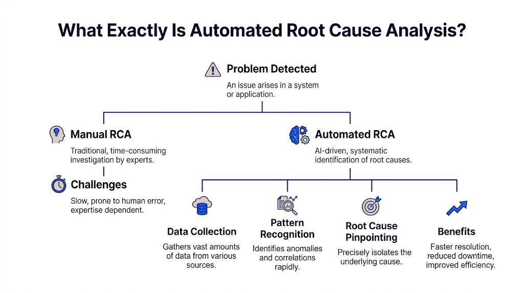
Acerta makes the practical case well: automated RCA scales to escalating data complexity, processes immense volumes in real time, and handles relationships that are too complex for manual review, while manual RCA breaks down as systems and business processes generate more data (Acerta).
The simple version
Here’s what automated RCA usually does behind the scenes:
Detects the problem It spots that a metric moved in a way worth investigating.
Collects relevant context It pulls nearby signals, dimensions, recent changes, dependencies, and related metrics.
Finds unusual patterns It checks which cuts of the data changed most sharply or changed first.
Ranks likely causes It surfaces the most plausible explanations instead of making you inspect every chart manually.
Shows evidence Good systems don't just blurt out an answer. They show the segments, timing, and logic behind it.
What manual RCA gets wrong
Manual analysis isn't bad. It's just expensive.
It depends on the right person being available. It often starts too broad. It usually produces static charts that trigger three more questions. And it invites bias. Once someone says, "It must be the pricing change," every chart gets interpreted through that lens.
That’s why I like the analogy of an AI code debugger. A solid debugger doesn't replace engineering judgment. It shortens the path from symptom to cause. Automated root cause analysis should work the same way for metrics.
What actually matters for non-analysts
If you're a founder, PM, or marketing lead, you don't need to understand every algorithm. You need to know whether the system helps you answer questions like:
Why did trial-to-paid conversion drop last week?
What changed after the product release?
Which traffic sources drove the revenue dip?
Did the issue hit one segment or the whole funnel?
That’s the useful definition. Not "AI-powered observability" or some glossy vendor phrase.
Practical rule: If a tool can identify an anomaly but can't explain which dimension, event, or recent change likely caused it, it's not doing root cause analysis. It's doing alerting.
The Old Way vs The New Way of Finding Answers
Most business teams still investigate performance issues with a mashup of dashboards, ad hoc SQL, Slack threads, and guesswork. It works eventually. Sometimes. But it’s slow, fragile, and heavily dependent on whoever knows the schema.
The better model is conversational analysis. Ask a question in plain English, let the system inspect the data, and keep drilling until the cause is clear.
Finding your why with less friction
Metric | The Old Way (Manual SQL & Dashboards) | The New Way (Statspresso) |
|---|---|---|
Starting point | Someone notices a drop on a dashboard and opens three more tabs. | Someone asks, "Why did new user signups from the US drop last week?" |
Access to answers | You wait for an analyst or BI lead to pull data. | You ask directly in plain English. |
Context gathering | Each follow-up requires another filter, chart, or query. | The system can break the problem down by segment, source, date, or behavior in the same workflow. |
Speed of iteration | Slow. One question becomes a queue of requests. | Fast. You can ask the next question immediately. |
Dependency on technical skills | High. Someone needs SQL knowledge and schema context. | Low. The interface handles the query logic for you. |
Output quality | Static screenshots and one-off charts that go stale fast. | Interactive answers, charts, and explanations tied to live data. |
Handling ambiguity | Humans often stop after the first plausible explanation. | The system can test multiple slices and surface competing drivers. |
Team collaboration | Insights live in DMs, spreadsheets, and memory. | Answers are easier to share and revisit. |
Decision quality | Meetings drift into opinion because evidence arrives late. | Teams can make decisions while the question is still fresh. |
Why the old way survives
People tolerate manual RCA because they've normalized it.
They assume data work is supposed to be slow. They assume each follow-up question requires a new dashboard. They assume someone technical has to sit in the middle and translate business questions into database logic.
None of that is sacred. It's just inherited process.
What changes with conversational analytics
The big shift isn't only speed. It's who gets to investigate.
A product manager can ask a business question without writing a ticket. A growth lead can test a hypothesis while the campaign is still live. A founder can inspect a metric without waiting for Monday's KPI deck.
That's a different operating model. Less dashboard archaeology. More direct questioning.
Four Common Methods for Automated RCA Explained
Under the hood, automated root cause analysis usually relies on a mix of methods. Good systems don't bet everything on one trick. They combine statistical checks, anomaly spotting, causal reasoning, and attribution logic.
You don't need to become a data scientist to use them. But it helps to know what each method is good at, and where each one can mislead you.
Statistical tests
This is the boring workhorse, and boring is good.
Statistical tests help answer a simple question: is this difference probably real, or is it just noise? If conversion from one segment fell while the rest held steady, statistical checks help determine whether the drop is meaningful enough to investigate.
For business teams, this matters because not every wiggle deserves a war room.
A decent RCA system uses statistical logic to keep you from chasing harmless variation. It can compare time windows, evaluate segment changes, and reduce the chance that you obsess over a blip that vanishes tomorrow.
Use it when:
A metric moved slightly: You need to know if it’s signal or noise.
A segment looks suspicious: You want confidence before escalating.
You’re comparing periods: Week over week and pre/post changes need grounding.
What it doesn't do well is explain mechanism. It can tell you something changed. It usually can't tell you why.
Anomaly detection
Anomaly detection asks a different question: what looks unusual right now?
Instead of testing one hand-picked hypothesis, it scans for surprising behavior across many dimensions. That might mean a traffic source behaving oddly, a sharp drop in one country, or a conversion step suddenly underperforming after a release.
This is often where automated RCA starts. It finds the weird thing first, then investigates.
Here's the business value. Humans tend to inspect the dimensions they already expect to matter. The machine doesn't care about your pet theory. It can surface the odd segment you wouldn't have checked, like one browser version, one campaign naming pattern, or one pricing tier.
If your investigation always starts with the dimensions everyone already talks about, you'll miss the real cause more often than you think.
The trade-off is that anomaly detection can produce too many leads if it's not tuned well. A tool that flags everything unusual becomes another noisy dashboard in nicer packaging.
Causal inference
This is the part everyone wants, because it's the closest thing to an answer with backbone.
Causal inference tries to separate what is associated with the problem from what drove the problem. That's harder than it sounds. Lots of business metrics move together. Fewer of them have a true cause-effect relationship.
Databricks explains why this matters. Causal AI integrates domain knowledge with observational data to model true cause-effect relationships, and in manufacturing use cases it has delivered 20 to 50 percent more accurate defect prevention than traditional ML by distinguishing causes from correlations (Databricks).
The manufacturing example isn't your growth dashboard, but the lesson carries over cleanly. If signups dropped at the same time as a pricing update, an email outage, and a paid spend cut, correlation alone won't help much. Causal reasoning is what stops teams from blaming the loudest coincidental change.
Attribution and driver analysis
Attribution and driver analysis answer the question most business users ask: which factors contributed most to the change?**
This method is less philosophical than causal inference and often more useful day to day. It decomposes a metric change into likely drivers. Maybe most of the decline came from one acquisition channel. Maybe the drag was lower conversion on mobile. Maybe the top-line dip was concentrated in one plan type.
RCA becomes operational at this stage.
A founder doesn't always need a pristine causal model. They often need a ranked list of likely contributors with evidence strong enough to act on. Driver analysis provides that middle ground. More practical than a broad dashboard. Less brittle than a single hand-built query.
Why combining methods works best
Each method has blind spots.
Statistical tests keep you honest, but they're not explanatory.
Anomaly detection finds surprises, but can get noisy.
Causal inference is powerful, but demanding.
Driver analysis is actionable, but can oversimplify complex interactions.
Strong automated RCA systems blend them. They flag the unusual pattern, test whether it matters, rank likely contributors, and use causal logic where possible.
That combination is what makes modern RCA useful for business metrics instead of just technical monitoring.
Automated RCA in Action Real World Use Cases
Theory is nice. Teams buy tools because they have a question on Tuesday afternoon and need an answer before Wednesday morning.
Here’s what automated root cause analysis looks like when the problem is commercial, not infrastructural.
ScienceLogic notes that automated RCA tools can reduce MTTR by up to 10x compared to manual methods, which is a useful proxy for business teams too because it shortens the time from "something's wrong" to "we know where to look" (ScienceLogic).
For a product manager
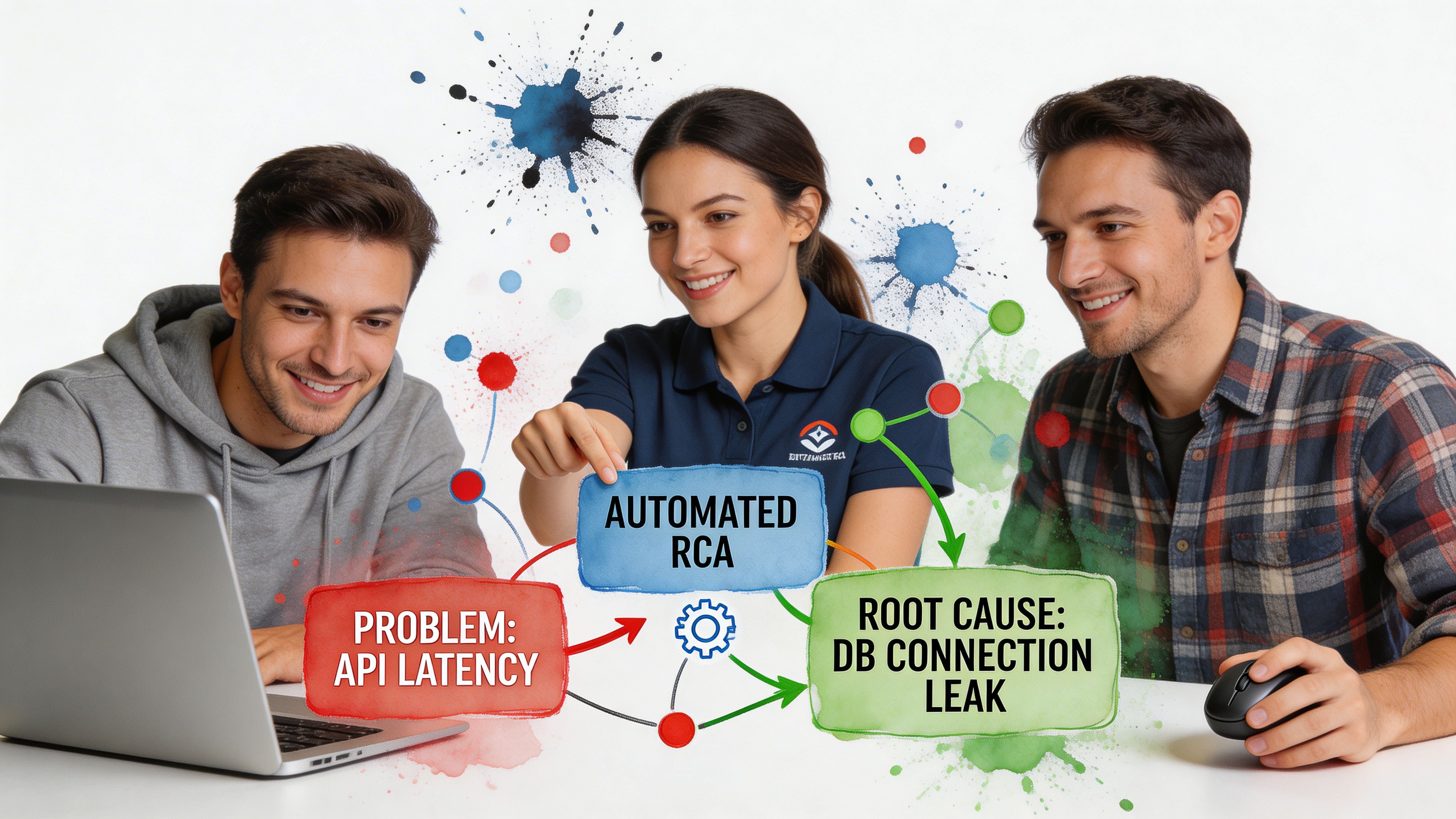
A PM notices that activation dropped after the latest release.
The old workflow starts with a scramble. Was it onboarding? A feature flag? Mobile only? New users versus returning users? Someone pulls Mixpanel. Someone else checks tickets. Engineering scans deployment notes.
Automated RCA tightens the loop.
The system can inspect the timing of the release, compare pre and post behavior, break the drop down by platform or cohort, and surface where the change concentrated. Maybe the issue is isolated to one entry point. Maybe one event stopped firing. Maybe usage didn't fall, and only the tracking changed.
Try asking your AI analyst:
"Why did activation rate drop after the last product release? Break it down by device, signup cohort, and onboarding step."
That prompt is better than a dashboard because it starts with a question, not a prebuilt view.
For a marketing lead
Marketing sees lead-to-demo conversion soften.
In this situation, teams often waste a week arguing about channel quality. Paid blames landing pages. Content blames paid. Sales blames lead quality. Nobody wants to say the CRM sync may have broken.
An automated RCA workflow can compare conversion by source, campaign family, geo, device, and form path. It can also surface whether the drop started at lead capture, qualification, or meeting booking.
A useful follow-up sequence looks like this:
Start broad: "Why did lead-to-demo conversion drop this month?"
Then narrow: "Show the biggest changes by acquisition source and landing page."
Then validate impact: "Did form completion change, or did the drop happen after handoff?"
The point isn't that AI magically knows your business. The point is that it can inspect more plausible drivers, faster than a human working tab by tab.
For a founder
A founder sees revenue flatten and wants the answer without waiting for the BI queue.
Conversational analysis earns its keep in this scenario. Founders don't want a schema lecture. They want to ask, "What's dragging revenue?" and immediately see whether the issue came from fewer customers, lower conversion, weaker expansion, or a concentrated problem in one segment.
Good RCA helps separate these paths cleanly.
The fastest way to make a bad decision is to act on a top-line metric without decomposing it first.
Try prompts like:
Revenue: "What changed most in revenue this week by product, region, and customer segment?"
Sales funnel: "Why did closed-won deals decline? Show changes across stage progression."
Retention: "Which customer cohorts drove the churn increase, and what behaviors changed before churn?"
These aren't technical prompts. That's the point. The best business RCA tools let non-analysts investigate without turning every question into a miniature data project.
Your Implementation Guide to Automated RCA
Teams often overcomplicate adoption. They think they need a major BI rebuild before they can do useful root cause analysis.
They don't.
The practical path is smaller. Connect the data you already trust most. Start with one painful question. Build a habit of investigation before you build a cathedral of dashboards.
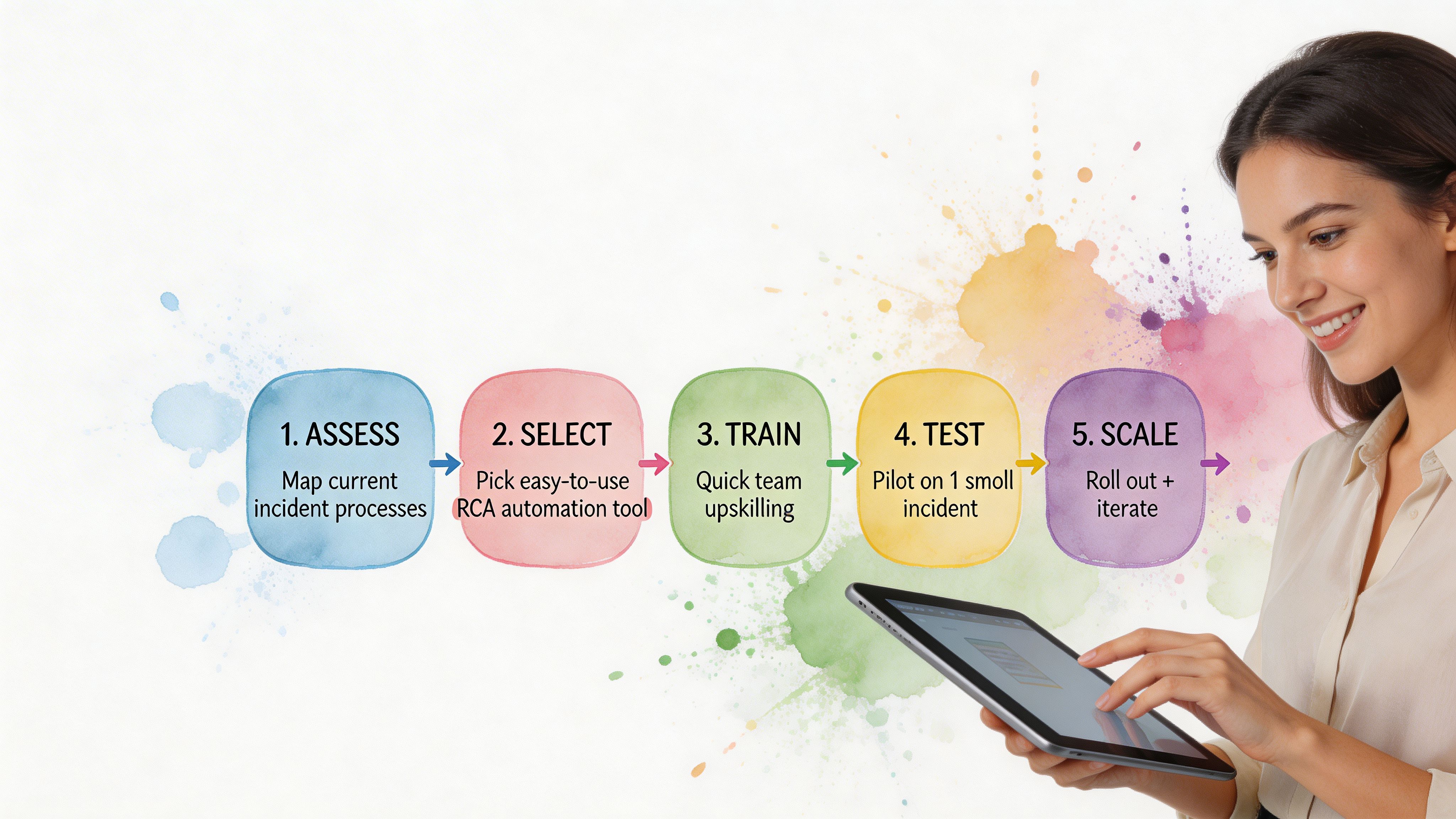
Start with one business-critical metric
Pick a KPI that creates urgency.
Good candidates include:
Revenue conversion: Because it ties directly to commercial performance.
Activation: Because product and growth both care.
Lead quality or demo rate: Because marketing and sales will feel the pain fast.
Retention signals: Because lagging churn is expensive to discover late.
Don't start with a vanity metric. Start with the number that causes Slack panic when it dips.
Connect the systems where the answer lives
For most SMB teams, that means some mix of Shopify, HubSpot, Postgres, product analytics, ticketing data, and CRM records.
The goal isn't total coverage on day one. The goal is enough connected context to investigate across systems instead of arguing between systems.
If you need a broader view of how AI changes the analysis workflow itself, this guide on AI for data analysis is a useful companion read.
Teach people to ask better questions
This matters more than most software demos admit.
Weak question:
"What happened to signups?"
Better question:
"Why did signups decline last week, and which segments changed most?"
Best question:
"Why did signups decline last week? Compare paid versus organic, mobile versus desktop, and new landing pages versus old."
The more investigation-shaped the question, the better the RCA output.
Create a human feedback loop
Automated RCA should accelerate judgment, not replace it.
When the system surfaces a likely driver, someone still needs to ask:
Does this fit what changed operationally?
Is the evidence broad or concentrated in one segment?
Could this be instrumentation rather than behavior?
What action would we take if this is true?
That last question is the acid test. If the result doesn't change what you'd do next, the analysis may be interesting but not useful.
Reality check: The best RCA setup isn't the one with the fanciest model. It's the one your team actually uses when a metric goes sideways.
Common Pitfalls and How to Avoid Them
Automated root cause analysis is powerful. It's not magic.
Teams get into trouble when they treat RCA outputs like courtroom verdicts instead of ranked, evidence-backed leads. That's how you end up with very fast wrong answers.
Confusing correlation with cause
This is the classic failure mode.
A metric drops at the same time as a campaign launch, a product update, and a seasonality shift. The system highlights one of them, and the team runs with it. That can still happen even with modern tools.
The fix is simple. Ask for competing explanations. Compare timing. Check whether the issue holds across segments or is isolated. If the conclusion only survives in one narrow slice, be careful.
Trusting a black box too quickly
If a tool says, "This caused the issue," but can't show the logic, that's a problem.
You need to see the path. Which segment changed? When did it start? What comparison was used? Which related metrics moved with it? Explainability matters, especially when the finding will trigger product, spend, or staffing changes.
Ignoring data quality
RCA can only work with the evidence you feed it.
If event tracking broke, attribution rules changed, or source systems are out of sync, the analysis may be technically clean and practically wrong. Bad inputs don't always look bad on the surface.
A good operating habit is to verify instrumentation any time the root cause feels too neat.
Letting analysis sprawl
Some teams go from "we have no answers" to "we have thirty possible drivers" in one sitting.
That's not progress. That's a more complex form of getting stuck.
Use a simple filter:
Actionability: Can we do something about this now?
Impact: Does it explain a meaningful share of the change?
Confidence: Is there enough evidence to treat it seriously?
If a suspected cause fails two of those three, park it.
Expecting one clean root cause every time
Business metrics often have layered causes.
A conversion drop might come from weaker traffic quality and a broken form experience. Churn might rise because onboarding worsened and support response slowed. Automated RCA should help untangle the bundle, not force a fake single-cause story.
The better habit is to rank drivers and act in sequence.
Conclusion Stop Digging and Start Asking
Teams typically do not have a visibility problem. They have an investigation problem.
They can see the KPI. They can see the red line. What slows them down is the ugly manual process between noticing a change and understanding it. That gap is where hours disappear, meetings drift, and bad decisions sneak in.
Automated root cause analysis closes that gap.
Not by turning everyone into a data scientist. By making investigation faster, more structured, and far less dependent on SQL, dashboard sprawl, or whichever analyst still remembers how the event schema was patched together last year.
TLDR
Business teams need RCA too: Most coverage focuses on IT incidents, but sales, funnel, and product anomalies are just as painful.
Manual investigation is the bottleneck: The slow part isn't spotting the dip. It's finding the why.
Automated RCA works best when it combines methods: Statistical checks, anomaly detection, causal reasoning, and driver analysis each solve a different part of the puzzle.
Conversational workflows remove friction: Plain-English questions beat ticket queues and static dashboards.
Good RCA shows evidence: If the tool can't explain its conclusion, don't trust it blindly.
You don't need a giant rollout: Start with one critical KPI and the systems that shape it.
The old routine was digging through dashboards and waiting on analysts. The better routine is asking sharper questions and getting answers while they still matter.
Connect your first data source in Statspresso, your Conversational AI Data Analyst, and skip the SQL. Just ask your data a question and get a chart in seconds. If you're tired of chasing KPI drops through clunky dashboards, start free and ask your first question today.
A core metric drops, and the whole company suddenly becomes an amateur detective agency.
Sales are down. Trial conversions slipped. Activation fell after the last release. Someone opens five dashboards. Someone else asks for a CSV. A PM pings the data team. Marketing swears nothing changed. Engineering says the deploy looked clean. Two days later, everyone has screenshots and opinions, but not an answer.
That workflow is broken.
Most writing about automated root cause analysis focuses on infrastructure incidents. Server latency. CPU spikes. Broken services. That's useful, but it doesn't help much when your real problem is a dip in Shopify revenue, a weird HubSpot funnel drop, or a usage cliff in your product analytics.
The 'Why' That Haunts Every Business
The hard part isn't noticing that a KPI moved. Noticing a KPI movement is generally straightforward for teams. The hard part is finding out why it moved before the next meeting, the next campaign, or the next bad decision.
For business teams, root cause analysis is usually a clumsy relay race. One person spots the issue. Another person slices the dashboard by date. Then someone asks for channel, geo, device, or plan-level cuts. Then the follow-up questions start. Was it one segment? A tracking bug? Pricing? Seasonality? A campaign change? A release?
By then, the room is full of plausible stories.
Tellius points out a gap that anyone working with business KPIs already knows: manual investigation consumes the majority of analyst time on metric anomalies, and automated RCA coverage still leans heavily toward IT use cases rather than messy, multi-causal business questions like conversion drops or engagement declines (Tellius).
Business anomalies are messier than server outages
A server can fail in a fairly direct way. Business metrics rarely do.
A drop in qualified leads might come from:
Channel mix changes: Paid traffic brought lower-intent visitors.
Tracking drift: A form event stopped firing correctly.
Funnel friction: A landing page changed and hurt completion.
Downstream process issues: Sales follow-up slowed, and conversion fell later.
All four can be true at once.
That’s why founders get stuck. They don't need another dashboard. They need a fast way to move from what happened to what likely caused it.
Business RCA fails when teams treat a KPI drop like a reporting problem instead of an investigation problem.
If you want a useful primer on incident thinking from the operations side, CloudCops has a good piece on understanding the nature of incidents and how they are managed. The language comes from security and ops, but the mental model carries over cleanly to business metrics. An incident is still an interruption to expected performance. You still need to isolate cause, impact, and next action.
What Exactly Is Automated Root Cause Analysis
Automated root cause analysis is software that does the first hard part of investigation for you. It scans the evidence, tests patterns, narrows suspects, and surfaces the most likely explanation behind a problem.
Think of it as an AI detective with perfect patience.
A human analyst might check traffic, filter by segment, compare time windows, inspect event logs, and look for recent changes. Automated RCA does the same kind of work, but it can process much more context, much faster, without getting tired or skipping the boring steps.
Acerta makes the practical case well: automated RCA scales to escalating data complexity, processes immense volumes in real time, and handles relationships that are too complex for manual review, while manual RCA breaks down as systems and business processes generate more data (Acerta).
The simple version
Here’s what automated RCA usually does behind the scenes:
Detects the problem It spots that a metric moved in a way worth investigating.
Collects relevant context It pulls nearby signals, dimensions, recent changes, dependencies, and related metrics.
Finds unusual patterns It checks which cuts of the data changed most sharply or changed first.
Ranks likely causes It surfaces the most plausible explanations instead of making you inspect every chart manually.
Shows evidence Good systems don't just blurt out an answer. They show the segments, timing, and logic behind it.
What manual RCA gets wrong
Manual analysis isn't bad. It's just expensive.
It depends on the right person being available. It often starts too broad. It usually produces static charts that trigger three more questions. And it invites bias. Once someone says, "It must be the pricing change," every chart gets interpreted through that lens.
That’s why I like the analogy of an AI code debugger. A solid debugger doesn't replace engineering judgment. It shortens the path from symptom to cause. Automated root cause analysis should work the same way for metrics.
What actually matters for non-analysts
If you're a founder, PM, or marketing lead, you don't need to understand every algorithm. You need to know whether the system helps you answer questions like:
Why did trial-to-paid conversion drop last week?
What changed after the product release?
Which traffic sources drove the revenue dip?
Did the issue hit one segment or the whole funnel?
That’s the useful definition. Not "AI-powered observability" or some glossy vendor phrase.
Practical rule: If a tool can identify an anomaly but can't explain which dimension, event, or recent change likely caused it, it's not doing root cause analysis. It's doing alerting.
The Old Way vs The New Way of Finding Answers
Most business teams still investigate performance issues with a mashup of dashboards, ad hoc SQL, Slack threads, and guesswork. It works eventually. Sometimes. But it’s slow, fragile, and heavily dependent on whoever knows the schema.
The better model is conversational analysis. Ask a question in plain English, let the system inspect the data, and keep drilling until the cause is clear.
Finding your why with less friction
Metric | The Old Way (Manual SQL & Dashboards) | The New Way (Statspresso) |
|---|---|---|
Starting point | Someone notices a drop on a dashboard and opens three more tabs. | Someone asks, "Why did new user signups from the US drop last week?" |
Access to answers | You wait for an analyst or BI lead to pull data. | You ask directly in plain English. |
Context gathering | Each follow-up requires another filter, chart, or query. | The system can break the problem down by segment, source, date, or behavior in the same workflow. |
Speed of iteration | Slow. One question becomes a queue of requests. | Fast. You can ask the next question immediately. |
Dependency on technical skills | High. Someone needs SQL knowledge and schema context. | Low. The interface handles the query logic for you. |
Output quality | Static screenshots and one-off charts that go stale fast. | Interactive answers, charts, and explanations tied to live data. |
Handling ambiguity | Humans often stop after the first plausible explanation. | The system can test multiple slices and surface competing drivers. |
Team collaboration | Insights live in DMs, spreadsheets, and memory. | Answers are easier to share and revisit. |
Decision quality | Meetings drift into opinion because evidence arrives late. | Teams can make decisions while the question is still fresh. |
Why the old way survives
People tolerate manual RCA because they've normalized it.
They assume data work is supposed to be slow. They assume each follow-up question requires a new dashboard. They assume someone technical has to sit in the middle and translate business questions into database logic.
None of that is sacred. It's just inherited process.
What changes with conversational analytics
The big shift isn't only speed. It's who gets to investigate.
A product manager can ask a business question without writing a ticket. A growth lead can test a hypothesis while the campaign is still live. A founder can inspect a metric without waiting for Monday's KPI deck.
That's a different operating model. Less dashboard archaeology. More direct questioning.
Four Common Methods for Automated RCA Explained
Under the hood, automated root cause analysis usually relies on a mix of methods. Good systems don't bet everything on one trick. They combine statistical checks, anomaly spotting, causal reasoning, and attribution logic.
You don't need to become a data scientist to use them. But it helps to know what each method is good at, and where each one can mislead you.
Statistical tests
This is the boring workhorse, and boring is good.
Statistical tests help answer a simple question: is this difference probably real, or is it just noise? If conversion from one segment fell while the rest held steady, statistical checks help determine whether the drop is meaningful enough to investigate.
For business teams, this matters because not every wiggle deserves a war room.
A decent RCA system uses statistical logic to keep you from chasing harmless variation. It can compare time windows, evaluate segment changes, and reduce the chance that you obsess over a blip that vanishes tomorrow.
Use it when:
A metric moved slightly: You need to know if it’s signal or noise.
A segment looks suspicious: You want confidence before escalating.
You’re comparing periods: Week over week and pre/post changes need grounding.
What it doesn't do well is explain mechanism. It can tell you something changed. It usually can't tell you why.
Anomaly detection
Anomaly detection asks a different question: what looks unusual right now?
Instead of testing one hand-picked hypothesis, it scans for surprising behavior across many dimensions. That might mean a traffic source behaving oddly, a sharp drop in one country, or a conversion step suddenly underperforming after a release.
This is often where automated RCA starts. It finds the weird thing first, then investigates.
Here's the business value. Humans tend to inspect the dimensions they already expect to matter. The machine doesn't care about your pet theory. It can surface the odd segment you wouldn't have checked, like one browser version, one campaign naming pattern, or one pricing tier.
If your investigation always starts with the dimensions everyone already talks about, you'll miss the real cause more often than you think.
The trade-off is that anomaly detection can produce too many leads if it's not tuned well. A tool that flags everything unusual becomes another noisy dashboard in nicer packaging.
Causal inference
This is the part everyone wants, because it's the closest thing to an answer with backbone.
Causal inference tries to separate what is associated with the problem from what drove the problem. That's harder than it sounds. Lots of business metrics move together. Fewer of them have a true cause-effect relationship.
Databricks explains why this matters. Causal AI integrates domain knowledge with observational data to model true cause-effect relationships, and in manufacturing use cases it has delivered 20 to 50 percent more accurate defect prevention than traditional ML by distinguishing causes from correlations (Databricks).
The manufacturing example isn't your growth dashboard, but the lesson carries over cleanly. If signups dropped at the same time as a pricing update, an email outage, and a paid spend cut, correlation alone won't help much. Causal reasoning is what stops teams from blaming the loudest coincidental change.
Attribution and driver analysis
Attribution and driver analysis answer the question most business users ask: which factors contributed most to the change?**
This method is less philosophical than causal inference and often more useful day to day. It decomposes a metric change into likely drivers. Maybe most of the decline came from one acquisition channel. Maybe the drag was lower conversion on mobile. Maybe the top-line dip was concentrated in one plan type.
RCA becomes operational at this stage.
A founder doesn't always need a pristine causal model. They often need a ranked list of likely contributors with evidence strong enough to act on. Driver analysis provides that middle ground. More practical than a broad dashboard. Less brittle than a single hand-built query.
Why combining methods works best
Each method has blind spots.
Statistical tests keep you honest, but they're not explanatory.
Anomaly detection finds surprises, but can get noisy.
Causal inference is powerful, but demanding.
Driver analysis is actionable, but can oversimplify complex interactions.
Strong automated RCA systems blend them. They flag the unusual pattern, test whether it matters, rank likely contributors, and use causal logic where possible.
That combination is what makes modern RCA useful for business metrics instead of just technical monitoring.
Automated RCA in Action Real World Use Cases
Theory is nice. Teams buy tools because they have a question on Tuesday afternoon and need an answer before Wednesday morning.
Here’s what automated root cause analysis looks like when the problem is commercial, not infrastructural.
ScienceLogic notes that automated RCA tools can reduce MTTR by up to 10x compared to manual methods, which is a useful proxy for business teams too because it shortens the time from "something's wrong" to "we know where to look" (ScienceLogic).
For a product manager
A PM notices that activation dropped after the latest release.
The old workflow starts with a scramble. Was it onboarding? A feature flag? Mobile only? New users versus returning users? Someone pulls Mixpanel. Someone else checks tickets. Engineering scans deployment notes.
Automated RCA tightens the loop.
The system can inspect the timing of the release, compare pre and post behavior, break the drop down by platform or cohort, and surface where the change concentrated. Maybe the issue is isolated to one entry point. Maybe one event stopped firing. Maybe usage didn't fall, and only the tracking changed.
Try asking your AI analyst:
"Why did activation rate drop after the last product release? Break it down by device, signup cohort, and onboarding step."
That prompt is better than a dashboard because it starts with a question, not a prebuilt view.
For a marketing lead
Marketing sees lead-to-demo conversion soften.
In this situation, teams often waste a week arguing about channel quality. Paid blames landing pages. Content blames paid. Sales blames lead quality. Nobody wants to say the CRM sync may have broken.
An automated RCA workflow can compare conversion by source, campaign family, geo, device, and form path. It can also surface whether the drop started at lead capture, qualification, or meeting booking.
A useful follow-up sequence looks like this:
Start broad: "Why did lead-to-demo conversion drop this month?"
Then narrow: "Show the biggest changes by acquisition source and landing page."
Then validate impact: "Did form completion change, or did the drop happen after handoff?"
The point isn't that AI magically knows your business. The point is that it can inspect more plausible drivers, faster than a human working tab by tab.
For a founder
A founder sees revenue flatten and wants the answer without waiting for the BI queue.
Conversational analysis earns its keep in this scenario. Founders don't want a schema lecture. They want to ask, "What's dragging revenue?" and immediately see whether the issue came from fewer customers, lower conversion, weaker expansion, or a concentrated problem in one segment.
Good RCA helps separate these paths cleanly.
The fastest way to make a bad decision is to act on a top-line metric without decomposing it first.
Try prompts like:
Revenue: "What changed most in revenue this week by product, region, and customer segment?"
Sales funnel: "Why did closed-won deals decline? Show changes across stage progression."
Retention: "Which customer cohorts drove the churn increase, and what behaviors changed before churn?"
These aren't technical prompts. That's the point. The best business RCA tools let non-analysts investigate without turning every question into a miniature data project.
Your Implementation Guide to Automated RCA
Teams often overcomplicate adoption. They think they need a major BI rebuild before they can do useful root cause analysis.
They don't.
The practical path is smaller. Connect the data you already trust most. Start with one painful question. Build a habit of investigation before you build a cathedral of dashboards.
Start with one business-critical metric
Pick a KPI that creates urgency.
Good candidates include:
Revenue conversion: Because it ties directly to commercial performance.
Activation: Because product and growth both care.
Lead quality or demo rate: Because marketing and sales will feel the pain fast.
Retention signals: Because lagging churn is expensive to discover late.
Don't start with a vanity metric. Start with the number that causes Slack panic when it dips.
Connect the systems where the answer lives
For most SMB teams, that means some mix of Shopify, HubSpot, Postgres, product analytics, ticketing data, and CRM records.
The goal isn't total coverage on day one. The goal is enough connected context to investigate across systems instead of arguing between systems.
If you need a broader view of how AI changes the analysis workflow itself, this guide on AI for data analysis is a useful companion read.
Teach people to ask better questions
This matters more than most software demos admit.
Weak question:
"What happened to signups?"
Better question:
"Why did signups decline last week, and which segments changed most?"
Best question:
"Why did signups decline last week? Compare paid versus organic, mobile versus desktop, and new landing pages versus old."
The more investigation-shaped the question, the better the RCA output.
Create a human feedback loop
Automated RCA should accelerate judgment, not replace it.
When the system surfaces a likely driver, someone still needs to ask:
Does this fit what changed operationally?
Is the evidence broad or concentrated in one segment?
Could this be instrumentation rather than behavior?
What action would we take if this is true?
That last question is the acid test. If the result doesn't change what you'd do next, the analysis may be interesting but not useful.
Reality check: The best RCA setup isn't the one with the fanciest model. It's the one your team actually uses when a metric goes sideways.
Common Pitfalls and How to Avoid Them
Automated root cause analysis is powerful. It's not magic.
Teams get into trouble when they treat RCA outputs like courtroom verdicts instead of ranked, evidence-backed leads. That's how you end up with very fast wrong answers.
Confusing correlation with cause
This is the classic failure mode.
A metric drops at the same time as a campaign launch, a product update, and a seasonality shift. The system highlights one of them, and the team runs with it. That can still happen even with modern tools.
The fix is simple. Ask for competing explanations. Compare timing. Check whether the issue holds across segments or is isolated. If the conclusion only survives in one narrow slice, be careful.
Trusting a black box too quickly
If a tool says, "This caused the issue," but can't show the logic, that's a problem.
You need to see the path. Which segment changed? When did it start? What comparison was used? Which related metrics moved with it? Explainability matters, especially when the finding will trigger product, spend, or staffing changes.
Ignoring data quality
RCA can only work with the evidence you feed it.
If event tracking broke, attribution rules changed, or source systems are out of sync, the analysis may be technically clean and practically wrong. Bad inputs don't always look bad on the surface.
A good operating habit is to verify instrumentation any time the root cause feels too neat.
Letting analysis sprawl
Some teams go from "we have no answers" to "we have thirty possible drivers" in one sitting.
That's not progress. That's a more complex form of getting stuck.
Use a simple filter:
Actionability: Can we do something about this now?
Impact: Does it explain a meaningful share of the change?
Confidence: Is there enough evidence to treat it seriously?
If a suspected cause fails two of those three, park it.
Expecting one clean root cause every time
Business metrics often have layered causes.
A conversion drop might come from weaker traffic quality and a broken form experience. Churn might rise because onboarding worsened and support response slowed. Automated RCA should help untangle the bundle, not force a fake single-cause story.
The better habit is to rank drivers and act in sequence.
Conclusion Stop Digging and Start Asking
Teams typically do not have a visibility problem. They have an investigation problem.
They can see the KPI. They can see the red line. What slows them down is the ugly manual process between noticing a change and understanding it. That gap is where hours disappear, meetings drift, and bad decisions sneak in.
Automated root cause analysis closes that gap.
Not by turning everyone into a data scientist. By making investigation faster, more structured, and far less dependent on SQL, dashboard sprawl, or whichever analyst still remembers how the event schema was patched together last year.
TLDR
Business teams need RCA too: Most coverage focuses on IT incidents, but sales, funnel, and product anomalies are just as painful.
Manual investigation is the bottleneck: The slow part isn't spotting the dip. It's finding the why.
Automated RCA works best when it combines methods: Statistical checks, anomaly detection, causal reasoning, and driver analysis each solve a different part of the puzzle.
Conversational workflows remove friction: Plain-English questions beat ticket queues and static dashboards.
Good RCA shows evidence: If the tool can't explain its conclusion, don't trust it blindly.
You don't need a giant rollout: Start with one critical KPI and the systems that shape it.
The old routine was digging through dashboards and waiting on analysts. The better routine is asking sharper questions and getting answers while they still matter.
Connect your first data source in Statspresso, your Conversational AI Data Analyst, and skip the SQL. Just ask your data a question and get a chart in seconds. If you're tired of chasing KPI drops through clunky dashboards, start free and ask your first question today.