Automated Data Insights (2026 Guide)
Your team already knows the feeling. You need one chart for a board slide, one retention cut for a product review, or one clean CAC trend before tomorrow’s budget call. Instead of getting an answer, you open a ticket, wait for the BI queue, and hope the metric definition matches what you meant.
Waiting weeks for a data analyst to build a dashboard is a relic of the past. Automated data insights change the workflow. A Conversational AI Data Analyst lets teams skip the SQL, ask a question in plain English, and get a chart in seconds.
Your Data Has Answers Why Are You Still Waiting
Companies typically don't have a data problem. They have an access problem.
The data lives somewhere. Postgres has the product events. Shopify has order history. HubSpot has pipeline stages. The blocker is the gap between a business question and the technical work required to answer it.
The old workflow is clunky for simple reasons:
Requests pile up: Founders, PMs, and marketers all need answers from the same small analytics team.
Questions change midstream: You ask for monthly revenue, then realize you need it split by channel.
Dashboards age fast: Static charts answer last quarter’s questions, not today’s.
That’s why automated data insights matter. They don’t just make reporting faster. They change who gets to ask questions, when they ask them, and how quickly they can act on the answer.
Practical rule: If a team waits longer to get the chart than it takes to decide what to do with it, the reporting process is broken.
A good conversational analytics tool feels less like software and more like having an analyst on call. You ask, it checks the data, returns a chart, and explains what it found. No handoff. No backlog. No “circle back next sprint.”
That shift is the significant story. It’s not about replacing thinking. It’s about removing the friction between curiosity and clarity.
Unpacking Automated Data Insights
Think of automated data insights as hiring a junior analyst who never sleeps, never complains about another ad hoc request, and can translate plain English into analysis.
That’s the useful definition. Not “AI-powered business intelligence.” Not “next-gen analytics.” Just a system that takes a question like “Which campaigns drove the most qualified leads last month?” and turns it into an answer you can use.

What it does
At a practical level, automated data insights combine a few capabilities:
Natural language understanding: You ask a question the way you’d ask a teammate.
Query generation: The tool figures out the tables, joins, filters, and calculations behind that question.
Visualization: It picks a sensible way to show the result, usually as a chart, table, or summary.
Explanation: It tells you what changed, what stands out, or what deserves a second look.
If you’ve seen spreadsheet assistants emerge, this will feel familiar. A helpful primer on that broader shift is What Is Excel AI, which shows how plain-language analysis is changing day-to-day work for people who aren’t analysts by title.
How this differs from traditional BI
Traditional BI tools like Tableau, Power BI, and Looker are useful. I still use them. But they were built around a different assumption: someone technical creates the structure first, and everyone else consumes it later.
That model breaks when business teams need answers now.
Here’s the difference in plain terms:
Approach | What you do | What happens |
|---|---|---|
Traditional BI | Open dashboards, click filters, request custom reports | You work within prebuilt views |
Conversational analytics | Ask a direct question in English | The system builds the answer on demand |
Static dashboards are like restaurant menus. Helpful, but limited to what’s already listed.
Automated data insights are closer to talking to a chef. You can ask for something specific, change the ingredients, and get a better fit for the moment.
Why non-technical teams care
Founders don’t want to learn SQL just to check runway-related trends. Product managers don’t want to wait on a custom funnel view. Marketing leads don’t want another dashboard with twelve tabs and no direct answer to “what changed?”
They want speed, clarity, and enough confidence to act.
Good automated BI doesn’t force people to think like database engineers. It lets them think like operators.
That’s why Conversational AI Data Analyst tools are gaining attention. They reduce the translation layer. Instead of moving from question to analyst to query to chart to meeting, the loop gets much shorter.
And shorter loops usually mean better decisions.
From Raw Data to Actionable Chart The AI Workflow
When people first use automated data insights, the process can feel like magic. It isn’t. It’s a workflow.
A good system follows a sequence that’s surprisingly sensible once you strip away the AI branding.
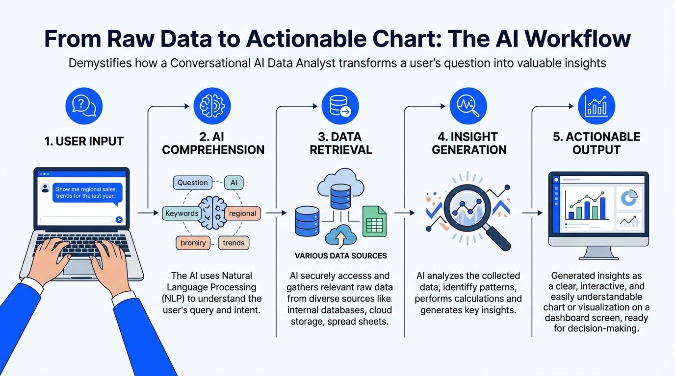
Connect and understand the data
The first job is not answering questions. It’s learning the shape of your data.
That means connecting to sources like Postgres, Shopify, HubSpot, or Stripe and reading the schema. Which tables store customers? Which fields represent order value? What counts as a closed deal versus an open one?
Many implementations succeed or fail at this stage. If the system can’t understand your naming conventions, date fields, or business logic, every answer after that gets shaky.
A simple test helps: connect one source, then ask a few obvious questions your team already knows the answer to.
Revenue sanity check: “Show monthly revenue for the last year.”
Customer check: “How many new customers did we add by month?”
Source check: “Break leads down by acquisition channel.”
If your raw data is messy, fix that first. The fastest AI layer in the world won’t rescue bad inputs. If you need a practical starting point, this guide on https://www.statspresso.com/blog/how-to-clean-up-data is worth reviewing before you roll a tool out broadly.
Translate the question into a real query
This is the part people usually mean when they say “skip the SQL.”
Under the hood, the tool still has to do SQL-like work. It just hides the mechanics.
You ask something like, “Compare churned customers and retained customers by signup month.” The system has to infer definitions, identify the right tables, choose date logic, and write the query needed to retrieve the answer.
That translation layer matters more than flashy chat UX.
A weak tool gives you a confident chart built on the wrong interpretation. A stronger one asks clarifying questions when the prompt is ambiguous. For example, if “active users” could mean logins, purchases, or sessions, the tool should slow down before it speeds up.
The best systems don’t just answer quickly. They know when not to guess.
Analyze and choose the right visual
Once the data comes back, the next job is presentation.
This sounds simple, but it isn’t. A chart can clarify a pattern or bury it. A line chart tells a trend story. A bar chart compares categories. A table may be better when precision matters more than shape.
Useful automated data insights systems don’t just fetch data. They decide how to display it in a way a busy person can understand at a glance.
At this point, conversational analytics starts to feel different from dashboard hunting. You’re not scanning tabs hoping someone built the view you need. You’re asking for the exact cut that matters.
Try prompts like these:
Try asking: “Show me revenue by month for the last year as a bar chart.”
Try asking: “Compare trial-to-paid conversion by acquisition channel.”
Try asking: “Plot support tickets and churn rate over time.”
Explain what the chart means
A chart without context is just decoration.
Good automated insight tools add a short narrative. They point out the spike, the dip, the outlier segment, or the time period worth discussing. They don’t replace judgment, but they reduce the blank-page problem that slows teams down in meetings.
The final output should answer three questions:
What happened
Where it happened
What deserves follow-up
When those three show up together, a chart becomes an operating tool instead of a screenshot for slides.
The Tangible ROI of Instant Data Answers
A leadership team is ten minutes into an operating review. Revenue is on plan, but conversion is soft in one segment. In the old setup, someone says, "We’ll have BI pull that after the meeting." The moment passes, the discussion moves on, and the team makes a partial decision with partial evidence.
That delay is a significant cost.
Organizations buy automated data insights to remove lag from routine decision-making. The return usually shows up in three places: faster operating decisions, lower reporting overhead, and earlier detection of risks or openings that would otherwise sit unnoticed for another week.
Speed changes how teams decide
Fast answers improve more than convenience. They improve the quality of the conversation.
When a leader can ask a follow-up question and get an answer while the context is still fresh, the meeting stays analytical instead of political. Fewer decisions rely on stale exports. Fewer assumptions survive untested. Teams can pressure-test a number before it turns into a plan.
Businesses using AI-driven data insights report a 45% increase in operational efficiency, and AI-driven data analytics is projected to reach 80% enterprise adoption by 2025, with an average $3.70 ROI per dollar invested (source: Sparkco’s 2025 AI-driven data insights outlook).
Speed also has a second-order effect. People ask the next question because they know they will get an answer in time to use it.
Cost is mostly workflow, not headcount
Leaders often frame the ROI question too narrowly.
The savings do not come from cutting analysts. They come from stopping the misuse of analysts. Strong BI teams should be defining metrics, checking data quality, resolving edge cases, and digging into exceptions that require expertise. They should not be buried under repeat requests for last month's pipeline trend or a basic by-region breakdown.
Automated insights shift those common asks into self-serve workflows. That reduces ticket volume, shortens backlog, and gives analysts room to do higher-value work.
For teams weighing the broader operating impact, this explanation of how AI automation can drive business growth is useful because it treats automation as a change in day-to-day execution, not just a software line item.
Old way versus new way
Here is the practical difference.
Metric | Old Way (Manual BI) | New Way (Automated Insights) |
|---|---|---|
Question intake | Slack messages, tickets, meeting follow-ups | Plain-English questions from the user |
Time to first answer | Depends on backlog and analyst availability | Often immediate for common business questions |
Who can explore data | Mostly analysts and BI specialists | Founders, PMs, marketers, and operators |
Iteration speed | Slow. Each follow-up may require another request | Fast. Users can refine questions on the spot |
Dashboard maintenance | Heavy upkeep on fixed reports | Lighter reliance on static dashboards |
Analyst workload | Repetitive reporting and one-off pulls | More time for validation and deeper analysis |
Decision rhythm | Meetings pause while teams wait for data | Teams investigate while the context is fresh |
The trade-off is real. Faster access only pays off if the metric layer is clean and permissions are set correctly. A bad semantic model can produce confident-looking nonsense very quickly. But once definitions are stable, the gain is hard to ignore.
Opportunity discovery is the sleeper benefit
Speed gets attention first. Discovery usually ends up delivering the bigger payoff.
When the cost of asking drops, question volume goes up. Product teams compare cohorts they used to ignore. Marketing leaders test channel quality instead of judging channels by spend alone. Founders go into board prep with fewer blind spots because they can check one more angle without opening a ticket and waiting three days.
I have seen this shift change the tone of operating reviews. Teams stop treating data as a monthly artifact and start using it as working material.
If every new question requires a ticket, people stop asking the useful questions.
That is the ROI static dashboards rarely produce.
Automated Insights in Action Use Cases
The easiest way to understand automated data insights is to watch how different teams use them on a normal Tuesday.
Not in some polished demo. In the scramble before a meeting, a launch review, or a campaign check-in.

The startup founder before a board update
The founder doesn’t need a giant dashboard. That means revenue trend, burn-related operating metrics, customer growth, pipeline movement, and maybe one slice that explains why this month looks different from last month.
A conversational workflow fits because the questions are rarely static. One answer triggers the next.
Try asking: “Show me monthly recurring revenue growth for the last 12 months.”
Try asking: “Break new customers down by acquisition source.”
Try asking: “Which sales stages slowed down this quarter?”
The practical gain is focus. Instead of collecting screenshots from five tools, the founder spends time interpreting the numbers.
The product manager checking feature impact
PMs don’t need more dashboards. They need fewer dashboards and sharper questions.
After a launch, the useful prompts are specific. Did activation improve? Did retention move for the right cohort? Did support volume rise after release? Did usage shift in one segment but not another? In such scenarios, automated data insights feel particularly useful because product questions mutate quickly.
Try asking: “Compare activation rate before and after the new onboarding flow.”
Try asking: “Show retention by signup cohort for users who used the new feature.”
Try asking: “Chart daily usage of the feature since launch.”
A static dashboard can show the broad trend. Conversational analytics helps the PM chase the second and third questions without rebuilding the whole report.
The marketing lead cutting through channel noise
Marketing teams live in attribution arguments. Paid says one thing. CRM says another. Finance has a third number.
Automated BI helps by shortening the path from channel question to visual answer. Not perfect truth. Faster alignment.
Common prompts sound like this:
Try asking: “Show pipeline created by campaign for this quarter.”
Try asking: “Compare cost efficiency by channel over time.”
Try asking: “Which lead sources have the highest conversion to closed-won?”
That speed matters because campaign decisions decay fast. If a lead source is spiking but quality is slipping, the team needs to catch it while the budget is still movable.
The agency serving clients without dashboard sprawl
Agencies frequently end up as part analyst, part translator, part report factory.
Clients want answers in plain language. Internal teams need a repeatable way to surface trends across accounts. Automated data insights can reduce the grunt work by letting account managers explore the data directly, then package the useful findings.
One practical option in this category is Statspresso, a conversational AI data analyst that connects to business data sources and returns charts and explanations from plain-English questions.
Useful agency prompts include:
Try asking: “Show lead volume and conversion trend for this client by month.”
Try asking: “Which campaigns drove the strongest sales-qualified leads?”
Try asking: “Summarize the biggest changes in account performance this period.”
The win isn’t just speed. It’s consistency. Teams spend less time wrangling exports and more time explaining what the client should do next.
Navigating the Pitfalls of Automated Analysis
A leadership team asks a simple question about churn by segment. The tool returns a clean chart in seconds. Ten minutes later, sales says the customer tiers are wrong, finance says the dates are wrong, and success says half the accounts are missing. Trust drops fast, and it usually does not recover because of one bad answer.
That failure rarely comes from the analysis layer alone. It starts in the data model, the metric definitions, and the access rules around them.
Garbage in still wins
Automated analysis will surface whatever is in your systems, including confusion. If your CRM has duplicate companies, product events are named inconsistently, or revenue means one thing in billing and another in finance, the tool will turn that mess into polished output.
The practical fix is boring and effective. Start with a small set of questions your team already knows how to answer manually. Use those as calibration checks before anyone treats the system as a daily decision tool.
The warning signs are usually easy to spot:
Metric drift: “Customer,” “pipeline,” or “active user” means different things to different teams.
Date confusion: Created date, close date, invoice date, and recognized revenue date get blended together.
Join problems: Records for the same customer do not match cleanly across CRM, product, and finance systems.
Orphaned fields: Important dimensions exist in the schema, but nobody can explain whether they are reliable.
Data deserts create silent failure
A bigger problem is missing representation.
Some teams have plenty of data overall but very little usable data for a product line, customer segment, geography, or acquisition source. The system still produces an answer. It just builds that answer from the segments with enough volume and leaves the thin areas underexplored or invisible.
MIT Sloan notes that sparse, fragmented, or low-quality data can exclude groups from algorithmic systems entirely, and that absent outputs should be treated as failures rather than neutral blanks. It also notes that 20-30% of SMB datasets in global markets may show desert-like qualities, according to MIT Sloan’s analysis of algorithmic data deserts.
That is not just an ethics issue. It affects commercial decisions.
If a smaller customer segment barely appears in the source data, the system may underweight it without saying so. A growth team can miss an underserved market. An agency can give clients recommendations based on the loudest segment, not the most strategic one. A product team can miss where adoption breaks down for smaller accounts or newer regions.
Missing predictions can matter as much as bad ones.
Human context still decides whether the answer is usable
Automated analysis is strong at finding patterns. It is weak at knowing what changed in the business last Tuesday.
A drop in conversion might reflect a real demand problem. It might also come from a new qualification rule in sales, a broken event in one browser, a pricing test, or a regional launch that shifted the mix. The chart will not know that unless your data model captures it and someone checks the result against reality.
Teams that get value from these tools keep a few operating habits in place:
Validate surprises first: Confirm the metric definition, filters, and time range before reacting.
Ask comparative questions: Check segment versus segment, period versus period, or cohort versus cohort instead of stopping at the topline.
Look for absence: Ask which customer types, regions, or channels are missing or underrepresented.
Assign ownership: Someone should own metric definitions and review high-stakes outputs before they drive budget, headcount, or product changes.
Used well, automated insights reduce report backlog and speed up decisions. They do not replace judgment, data stewardship, or business context.
Choosing and Implementing Your Solution
If you’re evaluating tools, skip the feature bingo. Focus on whether the product fits how your team works.
What to look for
A useful solution should clear a few practical tests.
Data source coverage: It should connect to the systems you already use, such as product databases, CRM, ecommerce, and support tools.
Plain-English usability: Non-technical users should be able to ask questions without learning a query language.
Query reliability: The system should handle common business questions accurately and ask for clarification when prompts are ambiguous.
Explainability: Users should see how the answer was framed, not just a chart with no context.
Security controls: Access should reflect who can see what. Sensitive data shouldn’t become broadly visible because chat made access easier.
Dashboard handoff: Good tools should let teams turn one useful answer into a reusable view instead of starting from scratch every time.
A simple rollout that doesn’t stall
Most implementations fail because the scope is too big on day one.
Start small. Pick one source and a handful of questions your team asks constantly.
Connect one high-value data source. Postgres, Shopify, or HubSpot is usually enough to start.
Ask your top three business questions. Use real prompts, not demo prompts.
Invite one teammate to test it. Choose someone non-technical who asks for reports often.
Save the first answers people trust. Turn those into a lightweight dashboard or shared view.
That rollout does two useful things. It exposes data issues early, and it gives the team a fast win.
The right implementation goal isn’t “replace all BI.” It’s simpler than that. Get one trustworthy answer quickly enough that people want to ask the next question.
TLDR From Data Overload to Data Clarity
TL;DR
Automated data insights remove the reporting bottleneck. Teams ask questions in plain English and get charts without waiting for a SQL expert.
The workflow shift is the primary benefit. This is less about flashy AI and more about reducing the delay between question and action.
Traditional dashboards still have a role. But they struggle when users need ad hoc answers, follow-up cuts, and context-specific views.
ROI comes from speed, self-serve access, and better use of analyst time. Analysts spend less time on repetitive requests and more time on judgment-heavy work.
Not every output should be trusted blindly. Messy source data, weak definitions, and missing segments can distort results.
Data deserts matter. Sparse or low-quality data can exclude parts of your market from analysis, which creates both bias risk and missed opportunity.
The best setup starts small. Connect one source, ask a few important questions, validate the answers, and build from there.
Busy teams don’t need another dashboard graveyard. They need a faster path from raw data to a useful answer.
That’s what conversational analytics gets right. Skip the SQL. Just ask your data a question and get a chart in seconds.
If your team still waits on reporting queues for everyday decisions, the workflow is outdated. Connect one source. Ask one real question. See whether the answer arrives fast enough to change what happens in the meeting you’re already in.
Frequently Asked Questions
Is this just ChatGPT connected to my database
Not quite.
A general-purpose AI tool is built to generate language. A specialized analytics product is built to understand schemas, map business questions to queries, return charts, and support validation workflows around real company data.
That difference matters. Analytics tools need grounding in your tables, metric definitions, and access controls. Otherwise you get polished language wrapped around shaky logic.
What if the answer looks wrong
Treat that as a useful signal, not a disaster.
Unexpected answers often stem from one of three places: the prompt was ambiguous, the data model has issues, or the metric definition doesn’t match what the user assumed. Start by narrowing the question. Then inspect the filters, timeframe, and underlying fields.
A good process is:
Rephrase the question: Make the metric and date range explicit.
Compare against a known report: Use one trusted benchmark if you have it.
Check edge cases: Missing dates, null values, duplicate records, and odd joins cause a lot of confusion.
Ask a follow-up cut: Break the metric down by segment, source, or cohort.
Can automated insights replace analysts
No. They change the job.
Automated systems are strong at finding patterns in historical data, but they can miss subtle, novel disruptions. Research also warns that AI can project false certainty from past patterns, which is why human judgment and interactive exploration still matter, as discussed in Research World’s analysis of how AI can subtly distort understanding.
Analysts still matter for metric design, validation, business context, and the uncomfortable but necessary question: “What are we not seeing?”
Is my data secure in this kind of tool
That depends on the product and your setup.
The basics are straightforward. Check how authentication works, how permissions map to roles, what data the tool stores, and whether access can be limited by workspace or source. Also confirm whether users can see raw rows, summarized outputs only, or both.
A common practical rule is simple. If you wouldn’t give the same person access in your warehouse or BI tool, don’t assume chat should bypass that standard.
Connect your first data source in Statspresso and ask your first real business question. If your team can get a chart and explanation in the next five minutes, you’ll know exactly how much reporting friction you’ve been tolerating.
Your team already knows the feeling. You need one chart for a board slide, one retention cut for a product review, or one clean CAC trend before tomorrow’s budget call. Instead of getting an answer, you open a ticket, wait for the BI queue, and hope the metric definition matches what you meant.
Waiting weeks for a data analyst to build a dashboard is a relic of the past. Automated data insights change the workflow. A Conversational AI Data Analyst lets teams skip the SQL, ask a question in plain English, and get a chart in seconds.
Your Data Has Answers Why Are You Still Waiting
Companies typically don't have a data problem. They have an access problem.
The data lives somewhere. Postgres has the product events. Shopify has order history. HubSpot has pipeline stages. The blocker is the gap between a business question and the technical work required to answer it.
The old workflow is clunky for simple reasons:
Requests pile up: Founders, PMs, and marketers all need answers from the same small analytics team.
Questions change midstream: You ask for monthly revenue, then realize you need it split by channel.
Dashboards age fast: Static charts answer last quarter’s questions, not today’s.
That’s why automated data insights matter. They don’t just make reporting faster. They change who gets to ask questions, when they ask them, and how quickly they can act on the answer.
Practical rule: If a team waits longer to get the chart than it takes to decide what to do with it, the reporting process is broken.
A good conversational analytics tool feels less like software and more like having an analyst on call. You ask, it checks the data, returns a chart, and explains what it found. No handoff. No backlog. No “circle back next sprint.”
That shift is the significant story. It’s not about replacing thinking. It’s about removing the friction between curiosity and clarity.
Unpacking Automated Data Insights
Think of automated data insights as hiring a junior analyst who never sleeps, never complains about another ad hoc request, and can translate plain English into analysis.
That’s the useful definition. Not “AI-powered business intelligence.” Not “next-gen analytics.” Just a system that takes a question like “Which campaigns drove the most qualified leads last month?” and turns it into an answer you can use.
What it does
At a practical level, automated data insights combine a few capabilities:
Natural language understanding: You ask a question the way you’d ask a teammate.
Query generation: The tool figures out the tables, joins, filters, and calculations behind that question.
Visualization: It picks a sensible way to show the result, usually as a chart, table, or summary.
Explanation: It tells you what changed, what stands out, or what deserves a second look.
If you’ve seen spreadsheet assistants emerge, this will feel familiar. A helpful primer on that broader shift is What Is Excel AI, which shows how plain-language analysis is changing day-to-day work for people who aren’t analysts by title.
How this differs from traditional BI
Traditional BI tools like Tableau, Power BI, and Looker are useful. I still use them. But they were built around a different assumption: someone technical creates the structure first, and everyone else consumes it later.
That model breaks when business teams need answers now.
Here’s the difference in plain terms:
Approach | What you do | What happens |
|---|---|---|
Traditional BI | Open dashboards, click filters, request custom reports | You work within prebuilt views |
Conversational analytics | Ask a direct question in English | The system builds the answer on demand |
Static dashboards are like restaurant menus. Helpful, but limited to what’s already listed.
Automated data insights are closer to talking to a chef. You can ask for something specific, change the ingredients, and get a better fit for the moment.
Why non-technical teams care
Founders don’t want to learn SQL just to check runway-related trends. Product managers don’t want to wait on a custom funnel view. Marketing leads don’t want another dashboard with twelve tabs and no direct answer to “what changed?”
They want speed, clarity, and enough confidence to act.
Good automated BI doesn’t force people to think like database engineers. It lets them think like operators.
That’s why Conversational AI Data Analyst tools are gaining attention. They reduce the translation layer. Instead of moving from question to analyst to query to chart to meeting, the loop gets much shorter.
And shorter loops usually mean better decisions.
From Raw Data to Actionable Chart The AI Workflow
When people first use automated data insights, the process can feel like magic. It isn’t. It’s a workflow.
A good system follows a sequence that’s surprisingly sensible once you strip away the AI branding.
Connect and understand the data
The first job is not answering questions. It’s learning the shape of your data.
That means connecting to sources like Postgres, Shopify, HubSpot, or Stripe and reading the schema. Which tables store customers? Which fields represent order value? What counts as a closed deal versus an open one?
Many implementations succeed or fail at this stage. If the system can’t understand your naming conventions, date fields, or business logic, every answer after that gets shaky.
A simple test helps: connect one source, then ask a few obvious questions your team already knows the answer to.
Revenue sanity check: “Show monthly revenue for the last year.”
Customer check: “How many new customers did we add by month?”
Source check: “Break leads down by acquisition channel.”
If your raw data is messy, fix that first. The fastest AI layer in the world won’t rescue bad inputs. If you need a practical starting point, this guide on https://www.statspresso.com/blog/how-to-clean-up-data is worth reviewing before you roll a tool out broadly.
Translate the question into a real query
This is the part people usually mean when they say “skip the SQL.”
Under the hood, the tool still has to do SQL-like work. It just hides the mechanics.
You ask something like, “Compare churned customers and retained customers by signup month.” The system has to infer definitions, identify the right tables, choose date logic, and write the query needed to retrieve the answer.
That translation layer matters more than flashy chat UX.
A weak tool gives you a confident chart built on the wrong interpretation. A stronger one asks clarifying questions when the prompt is ambiguous. For example, if “active users” could mean logins, purchases, or sessions, the tool should slow down before it speeds up.
The best systems don’t just answer quickly. They know when not to guess.
Analyze and choose the right visual
Once the data comes back, the next job is presentation.
This sounds simple, but it isn’t. A chart can clarify a pattern or bury it. A line chart tells a trend story. A bar chart compares categories. A table may be better when precision matters more than shape.
Useful automated data insights systems don’t just fetch data. They decide how to display it in a way a busy person can understand at a glance.
At this point, conversational analytics starts to feel different from dashboard hunting. You’re not scanning tabs hoping someone built the view you need. You’re asking for the exact cut that matters.
Try prompts like these:
Try asking: “Show me revenue by month for the last year as a bar chart.”
Try asking: “Compare trial-to-paid conversion by acquisition channel.”
Try asking: “Plot support tickets and churn rate over time.”
Explain what the chart means
A chart without context is just decoration.
Good automated insight tools add a short narrative. They point out the spike, the dip, the outlier segment, or the time period worth discussing. They don’t replace judgment, but they reduce the blank-page problem that slows teams down in meetings.
The final output should answer three questions:
What happened
Where it happened
What deserves follow-up
When those three show up together, a chart becomes an operating tool instead of a screenshot for slides.
The Tangible ROI of Instant Data Answers
A leadership team is ten minutes into an operating review. Revenue is on plan, but conversion is soft in one segment. In the old setup, someone says, "We’ll have BI pull that after the meeting." The moment passes, the discussion moves on, and the team makes a partial decision with partial evidence.
That delay is a significant cost.
Organizations buy automated data insights to remove lag from routine decision-making. The return usually shows up in three places: faster operating decisions, lower reporting overhead, and earlier detection of risks or openings that would otherwise sit unnoticed for another week.
Speed changes how teams decide
Fast answers improve more than convenience. They improve the quality of the conversation.
When a leader can ask a follow-up question and get an answer while the context is still fresh, the meeting stays analytical instead of political. Fewer decisions rely on stale exports. Fewer assumptions survive untested. Teams can pressure-test a number before it turns into a plan.
Businesses using AI-driven data insights report a 45% increase in operational efficiency, and AI-driven data analytics is projected to reach 80% enterprise adoption by 2025, with an average $3.70 ROI per dollar invested (source: Sparkco’s 2025 AI-driven data insights outlook).
Speed also has a second-order effect. People ask the next question because they know they will get an answer in time to use it.
Cost is mostly workflow, not headcount
Leaders often frame the ROI question too narrowly.
The savings do not come from cutting analysts. They come from stopping the misuse of analysts. Strong BI teams should be defining metrics, checking data quality, resolving edge cases, and digging into exceptions that require expertise. They should not be buried under repeat requests for last month's pipeline trend or a basic by-region breakdown.
Automated insights shift those common asks into self-serve workflows. That reduces ticket volume, shortens backlog, and gives analysts room to do higher-value work.
For teams weighing the broader operating impact, this explanation of how AI automation can drive business growth is useful because it treats automation as a change in day-to-day execution, not just a software line item.
Old way versus new way
Here is the practical difference.
Metric | Old Way (Manual BI) | New Way (Automated Insights) |
|---|---|---|
Question intake | Slack messages, tickets, meeting follow-ups | Plain-English questions from the user |
Time to first answer | Depends on backlog and analyst availability | Often immediate for common business questions |
Who can explore data | Mostly analysts and BI specialists | Founders, PMs, marketers, and operators |
Iteration speed | Slow. Each follow-up may require another request | Fast. Users can refine questions on the spot |
Dashboard maintenance | Heavy upkeep on fixed reports | Lighter reliance on static dashboards |
Analyst workload | Repetitive reporting and one-off pulls | More time for validation and deeper analysis |
Decision rhythm | Meetings pause while teams wait for data | Teams investigate while the context is fresh |
The trade-off is real. Faster access only pays off if the metric layer is clean and permissions are set correctly. A bad semantic model can produce confident-looking nonsense very quickly. But once definitions are stable, the gain is hard to ignore.
Opportunity discovery is the sleeper benefit
Speed gets attention first. Discovery usually ends up delivering the bigger payoff.
When the cost of asking drops, question volume goes up. Product teams compare cohorts they used to ignore. Marketing leaders test channel quality instead of judging channels by spend alone. Founders go into board prep with fewer blind spots because they can check one more angle without opening a ticket and waiting three days.
I have seen this shift change the tone of operating reviews. Teams stop treating data as a monthly artifact and start using it as working material.
If every new question requires a ticket, people stop asking the useful questions.
That is the ROI static dashboards rarely produce.
Automated Insights in Action Use Cases
The easiest way to understand automated data insights is to watch how different teams use them on a normal Tuesday.
Not in some polished demo. In the scramble before a meeting, a launch review, or a campaign check-in.
The startup founder before a board update
The founder doesn’t need a giant dashboard. That means revenue trend, burn-related operating metrics, customer growth, pipeline movement, and maybe one slice that explains why this month looks different from last month.
A conversational workflow fits because the questions are rarely static. One answer triggers the next.
Try asking: “Show me monthly recurring revenue growth for the last 12 months.”
Try asking: “Break new customers down by acquisition source.”
Try asking: “Which sales stages slowed down this quarter?”
The practical gain is focus. Instead of collecting screenshots from five tools, the founder spends time interpreting the numbers.
The product manager checking feature impact
PMs don’t need more dashboards. They need fewer dashboards and sharper questions.
After a launch, the useful prompts are specific. Did activation improve? Did retention move for the right cohort? Did support volume rise after release? Did usage shift in one segment but not another? In such scenarios, automated data insights feel particularly useful because product questions mutate quickly.
Try asking: “Compare activation rate before and after the new onboarding flow.”
Try asking: “Show retention by signup cohort for users who used the new feature.”
Try asking: “Chart daily usage of the feature since launch.”
A static dashboard can show the broad trend. Conversational analytics helps the PM chase the second and third questions without rebuilding the whole report.
The marketing lead cutting through channel noise
Marketing teams live in attribution arguments. Paid says one thing. CRM says another. Finance has a third number.
Automated BI helps by shortening the path from channel question to visual answer. Not perfect truth. Faster alignment.
Common prompts sound like this:
Try asking: “Show pipeline created by campaign for this quarter.”
Try asking: “Compare cost efficiency by channel over time.”
Try asking: “Which lead sources have the highest conversion to closed-won?”
That speed matters because campaign decisions decay fast. If a lead source is spiking but quality is slipping, the team needs to catch it while the budget is still movable.
The agency serving clients without dashboard sprawl
Agencies frequently end up as part analyst, part translator, part report factory.
Clients want answers in plain language. Internal teams need a repeatable way to surface trends across accounts. Automated data insights can reduce the grunt work by letting account managers explore the data directly, then package the useful findings.
One practical option in this category is Statspresso, a conversational AI data analyst that connects to business data sources and returns charts and explanations from plain-English questions.
Useful agency prompts include:
Try asking: “Show lead volume and conversion trend for this client by month.”
Try asking: “Which campaigns drove the strongest sales-qualified leads?”
Try asking: “Summarize the biggest changes in account performance this period.”
The win isn’t just speed. It’s consistency. Teams spend less time wrangling exports and more time explaining what the client should do next.
Navigating the Pitfalls of Automated Analysis
A leadership team asks a simple question about churn by segment. The tool returns a clean chart in seconds. Ten minutes later, sales says the customer tiers are wrong, finance says the dates are wrong, and success says half the accounts are missing. Trust drops fast, and it usually does not recover because of one bad answer.
That failure rarely comes from the analysis layer alone. It starts in the data model, the metric definitions, and the access rules around them.
Garbage in still wins
Automated analysis will surface whatever is in your systems, including confusion. If your CRM has duplicate companies, product events are named inconsistently, or revenue means one thing in billing and another in finance, the tool will turn that mess into polished output.
The practical fix is boring and effective. Start with a small set of questions your team already knows how to answer manually. Use those as calibration checks before anyone treats the system as a daily decision tool.
The warning signs are usually easy to spot:
Metric drift: “Customer,” “pipeline,” or “active user” means different things to different teams.
Date confusion: Created date, close date, invoice date, and recognized revenue date get blended together.
Join problems: Records for the same customer do not match cleanly across CRM, product, and finance systems.
Orphaned fields: Important dimensions exist in the schema, but nobody can explain whether they are reliable.
Data deserts create silent failure
A bigger problem is missing representation.
Some teams have plenty of data overall but very little usable data for a product line, customer segment, geography, or acquisition source. The system still produces an answer. It just builds that answer from the segments with enough volume and leaves the thin areas underexplored or invisible.
MIT Sloan notes that sparse, fragmented, or low-quality data can exclude groups from algorithmic systems entirely, and that absent outputs should be treated as failures rather than neutral blanks. It also notes that 20-30% of SMB datasets in global markets may show desert-like qualities, according to MIT Sloan’s analysis of algorithmic data deserts.
That is not just an ethics issue. It affects commercial decisions.
If a smaller customer segment barely appears in the source data, the system may underweight it without saying so. A growth team can miss an underserved market. An agency can give clients recommendations based on the loudest segment, not the most strategic one. A product team can miss where adoption breaks down for smaller accounts or newer regions.
Missing predictions can matter as much as bad ones.
Human context still decides whether the answer is usable
Automated analysis is strong at finding patterns. It is weak at knowing what changed in the business last Tuesday.
A drop in conversion might reflect a real demand problem. It might also come from a new qualification rule in sales, a broken event in one browser, a pricing test, or a regional launch that shifted the mix. The chart will not know that unless your data model captures it and someone checks the result against reality.
Teams that get value from these tools keep a few operating habits in place:
Validate surprises first: Confirm the metric definition, filters, and time range before reacting.
Ask comparative questions: Check segment versus segment, period versus period, or cohort versus cohort instead of stopping at the topline.
Look for absence: Ask which customer types, regions, or channels are missing or underrepresented.
Assign ownership: Someone should own metric definitions and review high-stakes outputs before they drive budget, headcount, or product changes.
Used well, automated insights reduce report backlog and speed up decisions. They do not replace judgment, data stewardship, or business context.
Choosing and Implementing Your Solution
If you’re evaluating tools, skip the feature bingo. Focus on whether the product fits how your team works.
What to look for
A useful solution should clear a few practical tests.
Data source coverage: It should connect to the systems you already use, such as product databases, CRM, ecommerce, and support tools.
Plain-English usability: Non-technical users should be able to ask questions without learning a query language.
Query reliability: The system should handle common business questions accurately and ask for clarification when prompts are ambiguous.
Explainability: Users should see how the answer was framed, not just a chart with no context.
Security controls: Access should reflect who can see what. Sensitive data shouldn’t become broadly visible because chat made access easier.
Dashboard handoff: Good tools should let teams turn one useful answer into a reusable view instead of starting from scratch every time.
A simple rollout that doesn’t stall
Most implementations fail because the scope is too big on day one.
Start small. Pick one source and a handful of questions your team asks constantly.
Connect one high-value data source. Postgres, Shopify, or HubSpot is usually enough to start.
Ask your top three business questions. Use real prompts, not demo prompts.
Invite one teammate to test it. Choose someone non-technical who asks for reports often.
Save the first answers people trust. Turn those into a lightweight dashboard or shared view.
That rollout does two useful things. It exposes data issues early, and it gives the team a fast win.
The right implementation goal isn’t “replace all BI.” It’s simpler than that. Get one trustworthy answer quickly enough that people want to ask the next question.
TLDR From Data Overload to Data Clarity
TL;DR
Automated data insights remove the reporting bottleneck. Teams ask questions in plain English and get charts without waiting for a SQL expert.
The workflow shift is the primary benefit. This is less about flashy AI and more about reducing the delay between question and action.
Traditional dashboards still have a role. But they struggle when users need ad hoc answers, follow-up cuts, and context-specific views.
ROI comes from speed, self-serve access, and better use of analyst time. Analysts spend less time on repetitive requests and more time on judgment-heavy work.
Not every output should be trusted blindly. Messy source data, weak definitions, and missing segments can distort results.
Data deserts matter. Sparse or low-quality data can exclude parts of your market from analysis, which creates both bias risk and missed opportunity.
The best setup starts small. Connect one source, ask a few important questions, validate the answers, and build from there.
Busy teams don’t need another dashboard graveyard. They need a faster path from raw data to a useful answer.
That’s what conversational analytics gets right. Skip the SQL. Just ask your data a question and get a chart in seconds.
If your team still waits on reporting queues for everyday decisions, the workflow is outdated. Connect one source. Ask one real question. See whether the answer arrives fast enough to change what happens in the meeting you’re already in.
Frequently Asked Questions
Is this just ChatGPT connected to my database
Not quite.
A general-purpose AI tool is built to generate language. A specialized analytics product is built to understand schemas, map business questions to queries, return charts, and support validation workflows around real company data.
That difference matters. Analytics tools need grounding in your tables, metric definitions, and access controls. Otherwise you get polished language wrapped around shaky logic.
What if the answer looks wrong
Treat that as a useful signal, not a disaster.
Unexpected answers often stem from one of three places: the prompt was ambiguous, the data model has issues, or the metric definition doesn’t match what the user assumed. Start by narrowing the question. Then inspect the filters, timeframe, and underlying fields.
A good process is:
Rephrase the question: Make the metric and date range explicit.
Compare against a known report: Use one trusted benchmark if you have it.
Check edge cases: Missing dates, null values, duplicate records, and odd joins cause a lot of confusion.
Ask a follow-up cut: Break the metric down by segment, source, or cohort.
Can automated insights replace analysts
No. They change the job.
Automated systems are strong at finding patterns in historical data, but they can miss subtle, novel disruptions. Research also warns that AI can project false certainty from past patterns, which is why human judgment and interactive exploration still matter, as discussed in Research World’s analysis of how AI can subtly distort understanding.
Analysts still matter for metric design, validation, business context, and the uncomfortable but necessary question: “What are we not seeing?”
Is my data secure in this kind of tool
That depends on the product and your setup.
The basics are straightforward. Check how authentication works, how permissions map to roles, what data the tool stores, and whether access can be limited by workspace or source. Also confirm whether users can see raw rows, summarized outputs only, or both.
A common practical rule is simple. If you wouldn’t give the same person access in your warehouse or BI tool, don’t assume chat should bypass that standard.
Connect your first data source in Statspresso and ask your first real business question. If your team can get a chart and explanation in the next five minutes, you’ll know exactly how much reporting friction you’ve been tolerating.