
Automate Reports Save Time: Make Faster Decisions with AI

Waiting a week for a dashboard update so you can answer a basic business question is absurd. Yet smart teams still burn hours every month exporting CSVs, fixing spreadsheet formulas, and rebuilding the same charts for people who only wanted one clear answer.

If you want to automate reports save time, the key upgrade isn’t just faster reporting. It’s moving from static reports to conversational analytics. Skip the SQL. Ask your data a question. Get a chart in seconds. That shift changes how quickly a founder, product lead, or marketer can make a call.

The True Cost of Manual Reporting

Manual reporting looks harmless because it hides inside routine work. Open spreadsheet. Export data. Clean columns. Recheck joins. Copy chart. Paste into slides. Send. Repeat next week like nothing happened.

That routine is expensive.

Individuals and teams can reclaim 10+ hours per week from manual reporting by using AI-powered tools, according to a documented example cited in this automation workflow video. The important part isn’t just the hours. It’s what those hours were replacing: repetitive data pulls instead of analysis, diagnosis, and decision support.

The hours are only the first problem

A manual report has three built-in weaknesses:

  • It arrives late. By the time the report is ready, the team is often reacting to old information.

  • It breaks easily. One changed column name or one bad copy-paste can throw off the whole thing.

  • It doesn’t scale. The more stakeholders ask for segmented views, the more the analyst becomes a report factory.

Busy operators feel this before they articulate it. Marketing wants channel performance now. Product wants retention sliced by cohort. Finance wants the same metric, but defined slightly differently. Suddenly one analyst is doing custom data assembly for half the company.

Practical rule: If a report has to be rebuilt by hand on a schedule, it’s not a reporting system. It’s a recurring interruption.

That’s why broader automation conversations matter too. If you’re thinking beyond dashboards, this AI business process automation guide is useful because it frames reporting as one piece of a bigger operational cleanup.

Manual reporting versus conversational analytics

The old model assumes someone has to translate every business question into SQL, charts, and formatting. The new model assumes the business user can ask directly and get a grounded answer.

Metric

The Old Way (Manual Spreadsheets/SQL)

The New Way (Statspresso)

Question to answer

Analyst receives request, clarifies scope, writes or edits query

User asks a plain-English question

Speed

Hours or days, depending on backlog

Seconds to a usable chart and explanation

Report maintenance

Rebuilt or patched manually each cycle

Saved as reusable dashboards and scheduled outputs

Technical barrier

SQL, BI modeling, spreadsheet cleanup

Conversational interface

Decision quality

Often delayed by reporting lag

Immediate follow-up questions while context is fresh

The “aha” moment is simple. You stop thinking, “How do we build this report?” and start asking, “What do we need to know right now?”

That’s a very different operating model. A static report answers yesterday’s planned question. Conversational analytics answers today’s actual one.

Why the old way lingers

Manual reporting survives because teams get used to pain that arrives on a schedule. Weekly pain feels normal. Monthly pain gets budgeted into calendars. Nobody notices how much strategic thinking disappears into formatting work.

The fix isn’t another prettier dashboard alone. It’s a workflow where the data connection, metric logic, visualization, and delivery happen without human babysitting. Then the analyst can do the job the business needs: interpret patterns, challenge assumptions, and explain what to do next.

Designing Your Automated Reporting Engine

Automation works when the plumbing is boring and the metric definitions are not up for debate. Most failed setups come from skipping that part and jumping straight to charts.

This is the blueprint worth following.
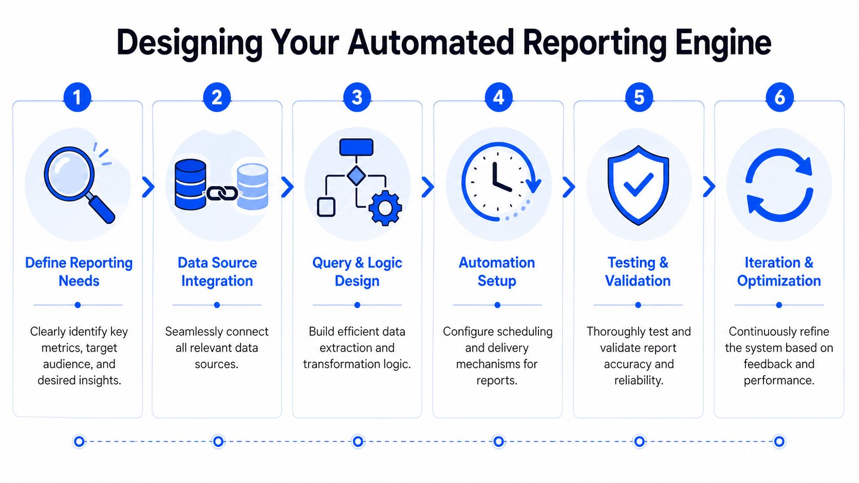

A six-step infographic illustrating the process of designing an automated reporting engine for business efficiency.

A proven implementation method starts with clear goals and KPIs, then data validation, then source integration. Successful implementations have saved teams 80-90 hours per report, as described in this automated reporting methodology guide.

Start with business questions, not dashboards

Teams often choose a tool first and only later ask what the reporting system is supposed to answer. That’s backward.

Use questions like these:

  1. What decisions should this report support?
    “Should we increase paid spend?” is a useful reporting target. “Show all marketing metrics” is not.

  2. Who needs the answer?
    A founder needs summary and exception flags. A channel manager needs drill-downs. Don’t cram both into one cluttered artifact.

  3. Which KPIs are trusted enough to automate?
    If revenue, churn, pipeline, or conversion definitions are still debated, fix that before scheduling anything.

A vanity metric is a terrible candidate for automation. It just gives you bad information faster.

Clean data beats clever tooling

Automation doesn’t forgive messy inputs. It just republishes the mess on time.

A sound setup includes:

  • Validation rules so broken fields don’t flow into executive dashboards

  • Standardized definitions so “active customer” means the same thing across teams

  • Source mapping so everyone knows which system owns which metric

  • Regular audits because data pipelines drift

The fastest way to lose trust in automated reporting is to automate a number nobody can explain.

Many teams underestimate the work involved. Tool setup is often easy. Agreement is harder. Governance is harder. But once those are in place, the whole system gets dramatically easier to maintain.

For teams mapping the broader workflow around AI and operations, Wisely's business automation expertise is a solid companion read because it pushes the same point: automation only works when the process itself is clear.

Connect sources without creating another mess

A good reporting engine reduces silos. A bad one creates a fancier silo.

Connect the systems that matter to recurring decisions. For many startups that means product data, CRM, billing, and ad performance. For commerce teams, it may be Shopify plus support and inventory data. For SaaS, often Postgres, HubSpot, Stripe, and app events.

The principle is simple. One reporting layer should pull from the source systems automatically and preserve shared metric logic. If every department still exports its own files, you haven’t automated reporting. You’ve distributed the chaos.

A useful reference point here is this post on dashboard automation, which gets at the operational value of turning repeated reporting tasks into maintained, shared assets.

Design for recurring use

The system should answer the same core questions repeatedly without rebuilding from scratch. That means:

  • Saved queries or prompt patterns for recurring asks

  • Dashboard tiles that represent trusted metrics

  • Scheduled delivery for stakeholders who want updates in email or Slack

  • A human interpretation layer for context when a number moves sharply

Notice what’s missing: heroic manual effort.

The strongest setups feel almost boring after launch. The report refreshes. The chart updates. The logic stays stable. People spend less time chasing data and more time arguing about the business, which is exactly where the energy should go.

Building Reusable Queries and Smart Alerts

A one-off answer is useful. A reusable answer is how teams get their time back.

The trick is to stop treating every data request like a custom analytics project. If a question comes up repeatedly, it should become a reusable query, a dashboard tile, or an alert. That’s how you automate reports save time in a way that sticks.
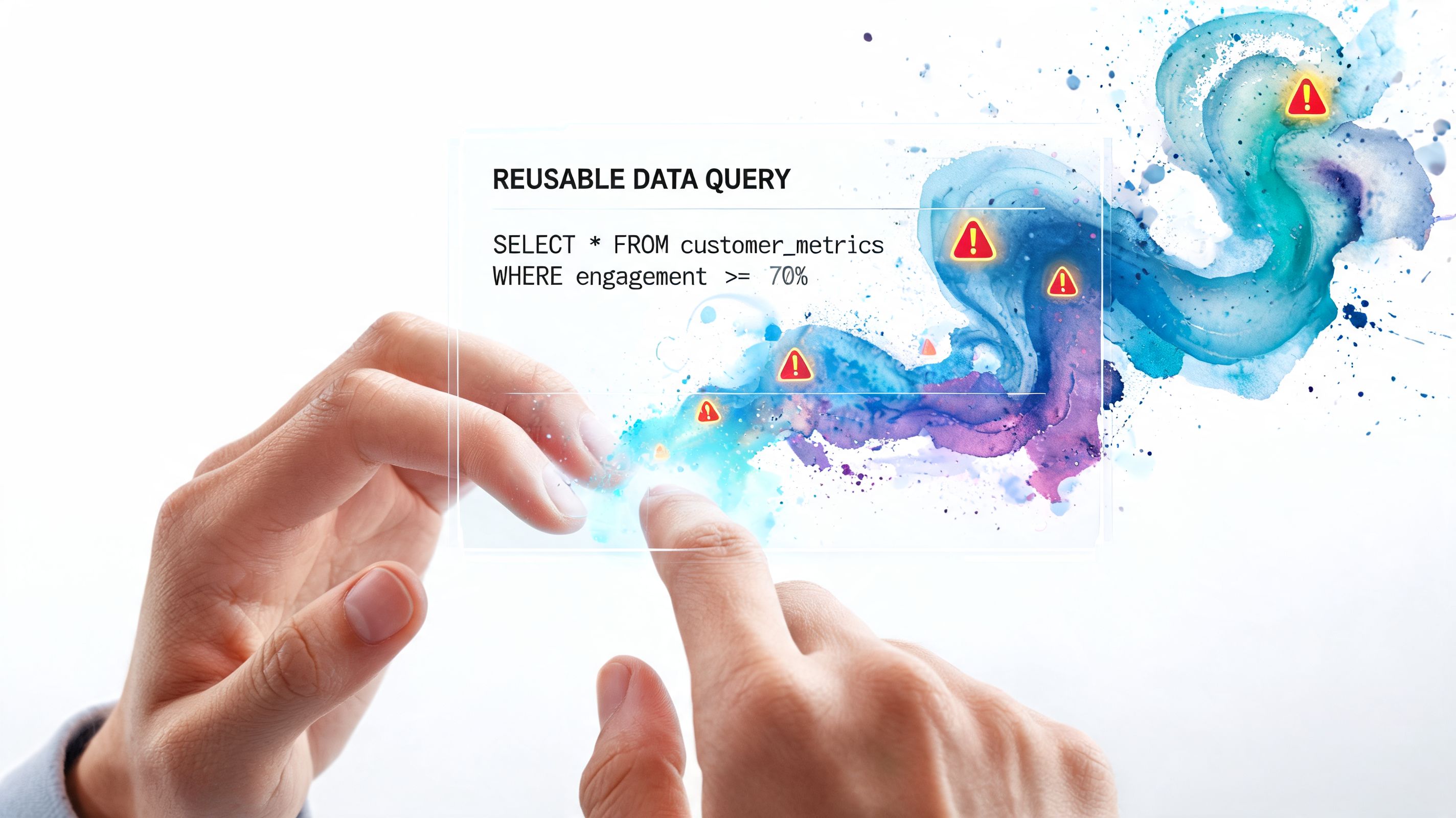

A person interacting with a digital holographic screen showing SQL query code and data visualizations.

By automating weekly reports, professionals can save over 10 hours per month while reducing the 15-20% error rates common in manual processes, according to this report automation example from Keboola.

Turn plain-English questions into reporting assets

Most business users don’t need SQL. They need a reliable way to ask repeatable questions.

Start with the queries your team already asks all the time:

  • Revenue trends: monthly revenue, by product, by region

  • Customer health: churn by cohort, expansion by account segment

  • Marketing efficiency: leads, CAC-related views, campaign conversion paths

  • Product usage: activation, retention, feature adoption

Write them in business language first. If the reporting layer supports natural-language interaction, save the result once it’s validated. Now it becomes a trusted asset instead of another ad hoc request floating around in Slack.

Try asking Statspresso: “What was our user churn rate by month for the last 6 months?”

That prompt is useful because it’s specific, time-bound, and chart-friendly. Good prompts aren’t fancy. They’re clear.

Build a metric library, not a graveyard of charts

A lot of dashboards fail because nobody knows which chart is the official one. The result is screenshot archaeology. Someone shares version three from a deck. Someone else has a spreadsheet called final_final_v2. Everyone pretends this is manageable.

Create a small library of trusted outputs:

  • Name each metric clearly

  • Document the business definition

  • Save the preferred visualization

  • Note the source systems involved

  • Retire duplicates aggressively

Fewer, better assets beat dozens of half-trusted visuals.

The payoff is cumulative. Once your team trusts the core library, follow-up requests become faster. You’re not reinventing report logic. You’re reusing it.

Alerts should help, not heckle

Scheduled alerts are where automation becomes proactive. But they are often overdone.

Good alerts have three qualities:

  1. They’re tied to action.
    If no one knows what to do when the alert fires, it’s just noise.

  2. They use stable metrics.
    Don’t alert on a number that changes definition every quarter.

  3. They respect attention.
    Daily for operational metrics. Weekly for trend reviews. Monthly for board-style summaries. More isn’t smarter.

A practical setup might include a morning Slack summary for operations, a weekly leadership snapshot by email, and a monthly PDF for external stakeholders. The key is consistency. People should know what arrives, when, and why.

Once that’s in place, reporting stops being a scavenger hunt. It becomes a dependable pulse on the business.

Measuring Success and Sidestepping Hidden Costs

Plenty of teams automate reporting, declare victory, and then discover they’ve built a machine that still needs babysitting. That’s the part people leave out when they sell the dream.

Automation can save serious time. It can also create a new class of maintenance work if the setup is brittle, overcomplicated, or poorly governed.
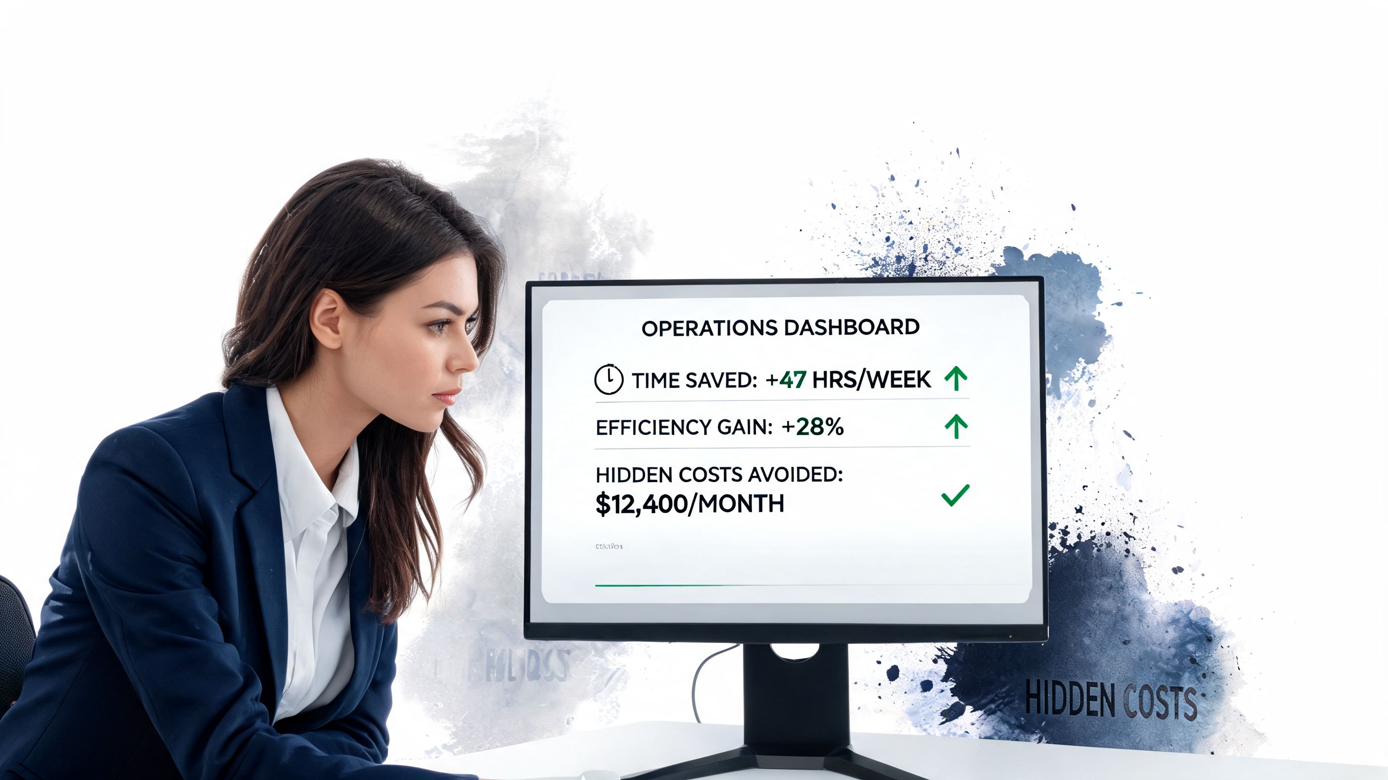

A professional woman in a business suit reviewing analytics on a computer screen showing operational gains.

According to this analysis of automated reporting trade-offs, 25-35% of reclaimed time can be lost to debugging and maintenance, and 52% of practitioners doubt automated insights without human review.

Measure more than hours saved

Hours matter, but they’re not the whole ROI story.

A better scorecard asks:

  • Did analysts stop doing repetitive assembly work?

  • Did decision-makers get answers faster?

  • Did reporting consistency improve across teams?

  • Did stakeholders trust the output enough to use it without side calculations?

The first wins are easy to see. The second-order gains take more attention. If a founder can answer a revenue question during the meeting instead of after three follow-ups, that’s a real operational improvement even if it never appears in a timesheet.

Trust is the actual bottleneck

The biggest failure mode isn’t usually the chart. It’s trust.

If people suspect the logic is wrong, they’ll export the data and check it manually. Then your “automated” workflow becomes a double workflow. You pay for the tool and keep the old habit. That’s a terrible bargain.

A few practices reduce the trust gap fast:

  • Show source lineage so users know where the answer came from

  • Validate a short list of core metrics first before expanding coverage

  • Keep human review for interpretation, especially when a trend looks surprising

  • Document metric definitions in plain English

  • Monitor failed refreshes and broken joins proactively

“Automated” should mean the pipeline runs on its own. It should not mean nobody understands it.

Hidden costs usually come from overengineering

The most fragile automation projects share a pattern. Too many custom transformations. Too many edge-case exceptions. Too many reports no one asked for but everyone is afraid to delete.

You avoid that by staying disciplined:

Common mistake

Better move

Automating every report at once

Start with high-frequency, high-value reporting

Skipping validation

Compare automated outputs against trusted historical results

Creating bespoke logic for each team

Standardize metric definitions where possible

Sending alerts for everything

Reserve alerts for metrics tied to real action

Assuming output equals insight

Add human interpretation to explain what changed and why

This is also where a Conversational AI Data Analyst can help if it grounds responses in your connected data, keeps outputs reusable, and makes it easy to inspect the numbers behind the answer. The point isn’t flashy AI. The point is reducing the friction between question and trusted answer.

What good ROI looks like in practice

A healthy automation setup does three things well.

First, it handles recurring reporting without handholding. Second, it gives business users self-serve access to common questions. Third, it leaves analysts with the high-value work: root-cause analysis, stakeholder guidance, and metric design.

If your team still spends meetings arguing over whose spreadsheet is right, you haven’t finished the job. If the system gives current numbers, clear definitions, and fast follow-up answers, then the ROI is real.

Statspresso in Action A Founder's Workflow

A founder wants to know which products are pulling their weight this quarter. Not next Tuesday. Not after an analyst has time to “take a look.” Today.

That workflow is where conversational analytics earns its keep.
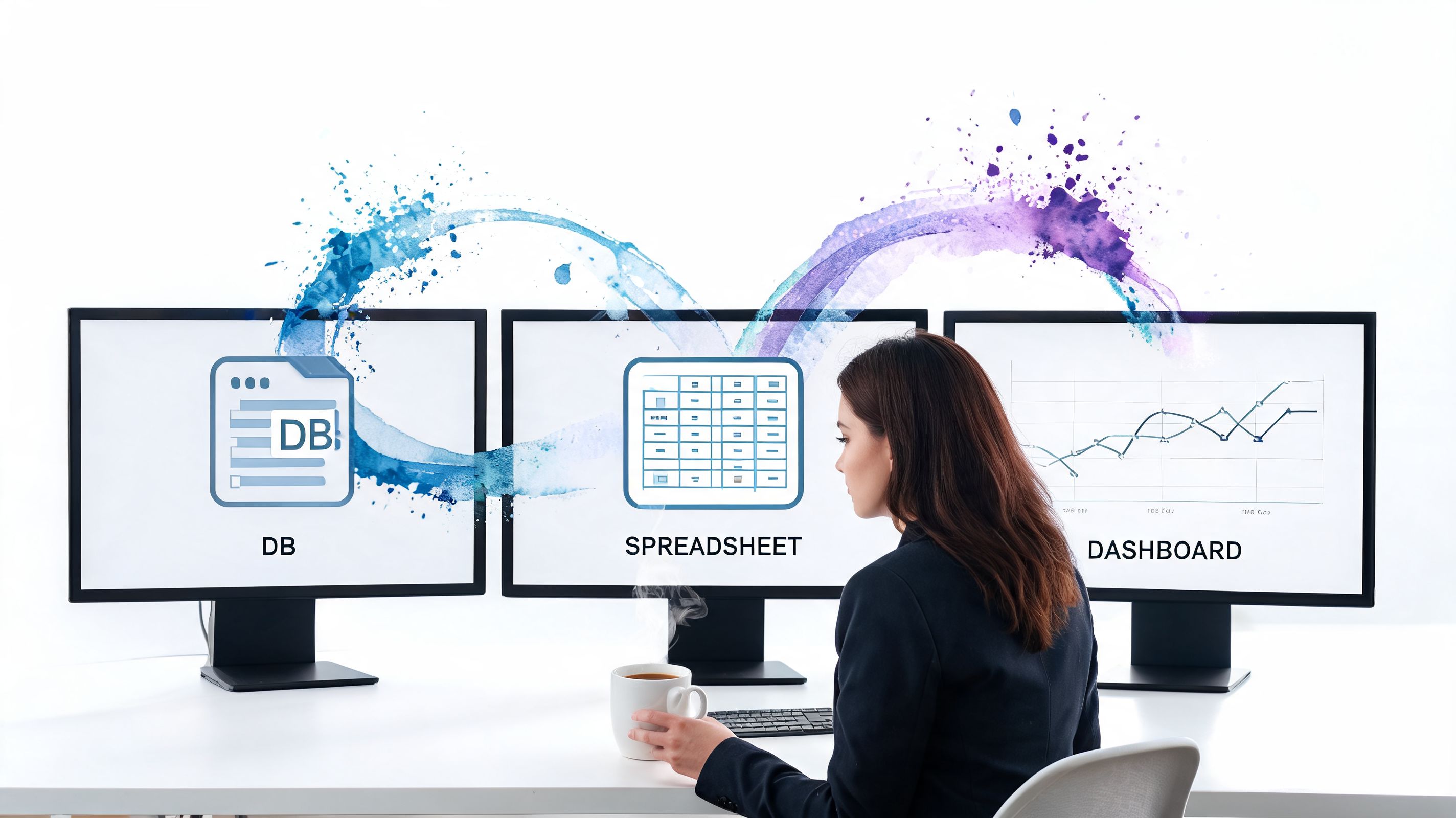

A professional woman working at three computer monitors showing a database, spreadsheet, and data dashboard.

The question comes first

The founder connects a source such as Postgres or Shopify, then asks the business question in plain English. No ticket. No SQL draft. No dashboard detour.

Try asking Statspresso: “Show me my top 5 products by revenue this quarter and compare to last quarter.”

That’s a useful operator question because it naturally leads to action. Keep investing in the winners. Investigate the drop-offs. Check whether pricing, inventory, acquisition mix, or seasonality changed.

The answer becomes reusable

The chart isn’t just a one-time output. It can be saved to a shared dashboard, reused in team reviews, and included in scheduled reporting. That’s the jump from reactive analysis to an actual system.

A founder or product lead can then ask follow-ups such as:

  • Which acquisition channels drove those top products?

  • Did margin move with revenue, or just volume?

  • Which products grew, but only after discounting?

  • Are repeat customers driving the lift, or first-time buyers?

Statspresso functions as a Conversational AI Data Analyst. It lets teams connect sources, ask plain-English questions, generate charts and explanations, and save those outputs into dashboards or scheduled reports without going through a traditional BI backlog.

Why this workflow feels different

Classic BI asks users to adapt to the tool. Conversational analytics adapts to the question.

That difference matters when the person asking has six other decisions waiting. A founder doesn’t want a lesson in joins. A PM doesn’t want to wait for dashboard grooming. They want a grounded answer, enough context to trust it, and a clean way to share it with the rest of the team.

That’s why the best reporting workflow no longer feels like “reporting.” It feels like asking the business a question and getting an answer while the meeting is still happening.

Stop Building Reports Start Having Conversations

The primary benefit isn’t prettier automation. It’s faster understanding.

Manual reporting keeps teams staring at snapshots after the fact. Conversational analytics gives them a way to ask what’s happening now, why it changed, and what deserves attention next. That’s a competitive advantage, not just a productivity tweak.

If you’re already cleaning up repetitive work in other parts of the business, this piece on automated meeting notes is a good parallel. Same pattern. Remove the rote task, keep the human judgment.

TL;DR

  • Manual reporting wastes time: Teams can lose huge chunks of the week to repetitive reporting work instead of analysis.

  • A better system starts with trust: Clear KPIs, validated data, and consistent definitions matter more than fancy charts.

  • Reusable queries change the game: Save recurring questions as trusted assets instead of rebuilding the same analysis.

  • Alerts should drive action: Schedule only what people will use.

  • Conversational analytics is the upgrade: Skip the SQL and ask your data direct questions for immediate answers.

Ready to stop waiting? Connect your first data source for free and ask your first question.

Statspresso gives teams a practical way to move from static reporting to conversational analytics. Connect your data, ask a question in plain English, and turn the answer into a reusable dashboard or scheduled report without rebuilding the same workflow every week.

Waiting a week for a dashboard update so you can answer a basic business question is absurd. Yet smart teams still burn hours every month exporting CSVs, fixing spreadsheet formulas, and rebuilding the same charts for people who only wanted one clear answer.

If you want to automate reports save time, the key upgrade isn’t just faster reporting. It’s moving from static reports to conversational analytics. Skip the SQL. Ask your data a question. Get a chart in seconds. That shift changes how quickly a founder, product lead, or marketer can make a call.

The True Cost of Manual Reporting

Manual reporting looks harmless because it hides inside routine work. Open spreadsheet. Export data. Clean columns. Recheck joins. Copy chart. Paste into slides. Send. Repeat next week like nothing happened.

That routine is expensive.

Individuals and teams can reclaim 10+ hours per week from manual reporting by using AI-powered tools, according to a documented example cited in this automation workflow video. The important part isn’t just the hours. It’s what those hours were replacing: repetitive data pulls instead of analysis, diagnosis, and decision support.

The hours are only the first problem

A manual report has three built-in weaknesses:

  • It arrives late. By the time the report is ready, the team is often reacting to old information.

  • It breaks easily. One changed column name or one bad copy-paste can throw off the whole thing.

  • It doesn’t scale. The more stakeholders ask for segmented views, the more the analyst becomes a report factory.

Busy operators feel this before they articulate it. Marketing wants channel performance now. Product wants retention sliced by cohort. Finance wants the same metric, but defined slightly differently. Suddenly one analyst is doing custom data assembly for half the company.

Practical rule: If a report has to be rebuilt by hand on a schedule, it’s not a reporting system. It’s a recurring interruption.

That’s why broader automation conversations matter too. If you’re thinking beyond dashboards, this AI business process automation guide is useful because it frames reporting as one piece of a bigger operational cleanup.

Manual reporting versus conversational analytics

The old model assumes someone has to translate every business question into SQL, charts, and formatting. The new model assumes the business user can ask directly and get a grounded answer.

Metric

The Old Way (Manual Spreadsheets/SQL)

The New Way (Statspresso)

Question to answer

Analyst receives request, clarifies scope, writes or edits query

User asks a plain-English question

Speed

Hours or days, depending on backlog

Seconds to a usable chart and explanation

Report maintenance

Rebuilt or patched manually each cycle

Saved as reusable dashboards and scheduled outputs

Technical barrier

SQL, BI modeling, spreadsheet cleanup

Conversational interface

Decision quality

Often delayed by reporting lag

Immediate follow-up questions while context is fresh

The “aha” moment is simple. You stop thinking, “How do we build this report?” and start asking, “What do we need to know right now?”

That’s a very different operating model. A static report answers yesterday’s planned question. Conversational analytics answers today’s actual one.

Why the old way lingers

Manual reporting survives because teams get used to pain that arrives on a schedule. Weekly pain feels normal. Monthly pain gets budgeted into calendars. Nobody notices how much strategic thinking disappears into formatting work.

The fix isn’t another prettier dashboard alone. It’s a workflow where the data connection, metric logic, visualization, and delivery happen without human babysitting. Then the analyst can do the job the business needs: interpret patterns, challenge assumptions, and explain what to do next.

Designing Your Automated Reporting Engine

Automation works when the plumbing is boring and the metric definitions are not up for debate. Most failed setups come from skipping that part and jumping straight to charts.

This is the blueprint worth following.


A six-step infographic illustrating the process of designing an automated reporting engine for business efficiency.

A proven implementation method starts with clear goals and KPIs, then data validation, then source integration. Successful implementations have saved teams 80-90 hours per report, as described in this automated reporting methodology guide.

Start with business questions, not dashboards

Teams often choose a tool first and only later ask what the reporting system is supposed to answer. That’s backward.

Use questions like these:

  1. What decisions should this report support?
    “Should we increase paid spend?” is a useful reporting target. “Show all marketing metrics” is not.

  2. Who needs the answer?
    A founder needs summary and exception flags. A channel manager needs drill-downs. Don’t cram both into one cluttered artifact.

  3. Which KPIs are trusted enough to automate?
    If revenue, churn, pipeline, or conversion definitions are still debated, fix that before scheduling anything.

A vanity metric is a terrible candidate for automation. It just gives you bad information faster.

Clean data beats clever tooling

Automation doesn’t forgive messy inputs. It just republishes the mess on time.

A sound setup includes:

  • Validation rules so broken fields don’t flow into executive dashboards

  • Standardized definitions so “active customer” means the same thing across teams

  • Source mapping so everyone knows which system owns which metric

  • Regular audits because data pipelines drift

The fastest way to lose trust in automated reporting is to automate a number nobody can explain.

Many teams underestimate the work involved. Tool setup is often easy. Agreement is harder. Governance is harder. But once those are in place, the whole system gets dramatically easier to maintain.

For teams mapping the broader workflow around AI and operations, Wisely's business automation expertise is a solid companion read because it pushes the same point: automation only works when the process itself is clear.

Connect sources without creating another mess

A good reporting engine reduces silos. A bad one creates a fancier silo.

Connect the systems that matter to recurring decisions. For many startups that means product data, CRM, billing, and ad performance. For commerce teams, it may be Shopify plus support and inventory data. For SaaS, often Postgres, HubSpot, Stripe, and app events.

The principle is simple. One reporting layer should pull from the source systems automatically and preserve shared metric logic. If every department still exports its own files, you haven’t automated reporting. You’ve distributed the chaos.

A useful reference point here is this post on dashboard automation, which gets at the operational value of turning repeated reporting tasks into maintained, shared assets.

Design for recurring use

The system should answer the same core questions repeatedly without rebuilding from scratch. That means:

  • Saved queries or prompt patterns for recurring asks

  • Dashboard tiles that represent trusted metrics

  • Scheduled delivery for stakeholders who want updates in email or Slack

  • A human interpretation layer for context when a number moves sharply

Notice what’s missing: heroic manual effort.

The strongest setups feel almost boring after launch. The report refreshes. The chart updates. The logic stays stable. People spend less time chasing data and more time arguing about the business, which is exactly where the energy should go.

Building Reusable Queries and Smart Alerts

A one-off answer is useful. A reusable answer is how teams get their time back.

The trick is to stop treating every data request like a custom analytics project. If a question comes up repeatedly, it should become a reusable query, a dashboard tile, or an alert. That’s how you automate reports save time in a way that sticks.


A person interacting with a digital holographic screen showing SQL query code and data visualizations.

By automating weekly reports, professionals can save over 10 hours per month while reducing the 15-20% error rates common in manual processes, according to this report automation example from Keboola.

Turn plain-English questions into reporting assets

Most business users don’t need SQL. They need a reliable way to ask repeatable questions.

Start with the queries your team already asks all the time:

  • Revenue trends: monthly revenue, by product, by region

  • Customer health: churn by cohort, expansion by account segment

  • Marketing efficiency: leads, CAC-related views, campaign conversion paths

  • Product usage: activation, retention, feature adoption

Write them in business language first. If the reporting layer supports natural-language interaction, save the result once it’s validated. Now it becomes a trusted asset instead of another ad hoc request floating around in Slack.

Try asking Statspresso: “What was our user churn rate by month for the last 6 months?”

That prompt is useful because it’s specific, time-bound, and chart-friendly. Good prompts aren’t fancy. They’re clear.

Build a metric library, not a graveyard of charts

A lot of dashboards fail because nobody knows which chart is the official one. The result is screenshot archaeology. Someone shares version three from a deck. Someone else has a spreadsheet called final_final_v2. Everyone pretends this is manageable.

Create a small library of trusted outputs:

  • Name each metric clearly

  • Document the business definition

  • Save the preferred visualization

  • Note the source systems involved

  • Retire duplicates aggressively

Fewer, better assets beat dozens of half-trusted visuals.

The payoff is cumulative. Once your team trusts the core library, follow-up requests become faster. You’re not reinventing report logic. You’re reusing it.

Alerts should help, not heckle

Scheduled alerts are where automation becomes proactive. But they are often overdone.

Good alerts have three qualities:

  1. They’re tied to action.
    If no one knows what to do when the alert fires, it’s just noise.

  2. They use stable metrics.
    Don’t alert on a number that changes definition every quarter.

  3. They respect attention.
    Daily for operational metrics. Weekly for trend reviews. Monthly for board-style summaries. More isn’t smarter.

A practical setup might include a morning Slack summary for operations, a weekly leadership snapshot by email, and a monthly PDF for external stakeholders. The key is consistency. People should know what arrives, when, and why.

Once that’s in place, reporting stops being a scavenger hunt. It becomes a dependable pulse on the business.

Measuring Success and Sidestepping Hidden Costs

Plenty of teams automate reporting, declare victory, and then discover they’ve built a machine that still needs babysitting. That’s the part people leave out when they sell the dream.

Automation can save serious time. It can also create a new class of maintenance work if the setup is brittle, overcomplicated, or poorly governed.


A professional woman in a business suit reviewing analytics on a computer screen showing operational gains.

According to this analysis of automated reporting trade-offs, 25-35% of reclaimed time can be lost to debugging and maintenance, and 52% of practitioners doubt automated insights without human review.

Measure more than hours saved

Hours matter, but they’re not the whole ROI story.

A better scorecard asks:

  • Did analysts stop doing repetitive assembly work?

  • Did decision-makers get answers faster?

  • Did reporting consistency improve across teams?

  • Did stakeholders trust the output enough to use it without side calculations?

The first wins are easy to see. The second-order gains take more attention. If a founder can answer a revenue question during the meeting instead of after three follow-ups, that’s a real operational improvement even if it never appears in a timesheet.

Trust is the actual bottleneck

The biggest failure mode isn’t usually the chart. It’s trust.

If people suspect the logic is wrong, they’ll export the data and check it manually. Then your “automated” workflow becomes a double workflow. You pay for the tool and keep the old habit. That’s a terrible bargain.

A few practices reduce the trust gap fast:

  • Show source lineage so users know where the answer came from

  • Validate a short list of core metrics first before expanding coverage

  • Keep human review for interpretation, especially when a trend looks surprising

  • Document metric definitions in plain English

  • Monitor failed refreshes and broken joins proactively

“Automated” should mean the pipeline runs on its own. It should not mean nobody understands it.

Hidden costs usually come from overengineering

The most fragile automation projects share a pattern. Too many custom transformations. Too many edge-case exceptions. Too many reports no one asked for but everyone is afraid to delete.

You avoid that by staying disciplined:

Common mistake

Better move

Automating every report at once

Start with high-frequency, high-value reporting

Skipping validation

Compare automated outputs against trusted historical results

Creating bespoke logic for each team

Standardize metric definitions where possible

Sending alerts for everything

Reserve alerts for metrics tied to real action

Assuming output equals insight

Add human interpretation to explain what changed and why

This is also where a Conversational AI Data Analyst can help if it grounds responses in your connected data, keeps outputs reusable, and makes it easy to inspect the numbers behind the answer. The point isn’t flashy AI. The point is reducing the friction between question and trusted answer.

What good ROI looks like in practice

A healthy automation setup does three things well.

First, it handles recurring reporting without handholding. Second, it gives business users self-serve access to common questions. Third, it leaves analysts with the high-value work: root-cause analysis, stakeholder guidance, and metric design.

If your team still spends meetings arguing over whose spreadsheet is right, you haven’t finished the job. If the system gives current numbers, clear definitions, and fast follow-up answers, then the ROI is real.

Statspresso in Action A Founder's Workflow

A founder wants to know which products are pulling their weight this quarter. Not next Tuesday. Not after an analyst has time to “take a look.” Today.

That workflow is where conversational analytics earns its keep.


A professional woman working at three computer monitors showing a database, spreadsheet, and data dashboard.

The question comes first

The founder connects a source such as Postgres or Shopify, then asks the business question in plain English. No ticket. No SQL draft. No dashboard detour.

Try asking Statspresso: “Show me my top 5 products by revenue this quarter and compare to last quarter.”

That’s a useful operator question because it naturally leads to action. Keep investing in the winners. Investigate the drop-offs. Check whether pricing, inventory, acquisition mix, or seasonality changed.

The answer becomes reusable

The chart isn’t just a one-time output. It can be saved to a shared dashboard, reused in team reviews, and included in scheduled reporting. That’s the jump from reactive analysis to an actual system.

A founder or product lead can then ask follow-ups such as:

  • Which acquisition channels drove those top products?

  • Did margin move with revenue, or just volume?

  • Which products grew, but only after discounting?

  • Are repeat customers driving the lift, or first-time buyers?

Statspresso functions as a Conversational AI Data Analyst. It lets teams connect sources, ask plain-English questions, generate charts and explanations, and save those outputs into dashboards or scheduled reports without going through a traditional BI backlog.

Why this workflow feels different

Classic BI asks users to adapt to the tool. Conversational analytics adapts to the question.

That difference matters when the person asking has six other decisions waiting. A founder doesn’t want a lesson in joins. A PM doesn’t want to wait for dashboard grooming. They want a grounded answer, enough context to trust it, and a clean way to share it with the rest of the team.

That’s why the best reporting workflow no longer feels like “reporting.” It feels like asking the business a question and getting an answer while the meeting is still happening.

Stop Building Reports Start Having Conversations

The primary benefit isn’t prettier automation. It’s faster understanding.

Manual reporting keeps teams staring at snapshots after the fact. Conversational analytics gives them a way to ask what’s happening now, why it changed, and what deserves attention next. That’s a competitive advantage, not just a productivity tweak.

If you’re already cleaning up repetitive work in other parts of the business, this piece on automated meeting notes is a good parallel. Same pattern. Remove the rote task, keep the human judgment.

TL;DR

  • Manual reporting wastes time: Teams can lose huge chunks of the week to repetitive reporting work instead of analysis.

  • A better system starts with trust: Clear KPIs, validated data, and consistent definitions matter more than fancy charts.

  • Reusable queries change the game: Save recurring questions as trusted assets instead of rebuilding the same analysis.

  • Alerts should drive action: Schedule only what people will use.

  • Conversational analytics is the upgrade: Skip the SQL and ask your data direct questions for immediate answers.

Ready to stop waiting? Connect your first data source for free and ask your first question.

Statspresso gives teams a practical way to move from static reporting to conversational analytics. Connect your data, ask a question in plain English, and turn the answer into a reusable dashboard or scheduled report without rebuilding the same workflow every week.

Waiting a week for a dashboard update so you can answer a basic business question is absurd. Yet smart teams still burn hours every month exporting CSVs, fixing spreadsheet formulas, and rebuilding the same charts for people who only wanted one clear answer.

If you want to automate reports save time, the key upgrade isn’t just faster reporting. It’s moving from static reports to conversational analytics. Skip the SQL. Ask your data a question. Get a chart in seconds. That shift changes how quickly a founder, product lead, or marketer can make a call.

The True Cost of Manual Reporting

Manual reporting looks harmless because it hides inside routine work. Open spreadsheet. Export data. Clean columns. Recheck joins. Copy chart. Paste into slides. Send. Repeat next week like nothing happened.

That routine is expensive.

Individuals and teams can reclaim 10+ hours per week from manual reporting by using AI-powered tools, according to a documented example cited in this automation workflow video. The important part isn’t just the hours. It’s what those hours were replacing: repetitive data pulls instead of analysis, diagnosis, and decision support.

The hours are only the first problem

A manual report has three built-in weaknesses:

  • It arrives late. By the time the report is ready, the team is often reacting to old information.

  • It breaks easily. One changed column name or one bad copy-paste can throw off the whole thing.

  • It doesn’t scale. The more stakeholders ask for segmented views, the more the analyst becomes a report factory.

Busy operators feel this before they articulate it. Marketing wants channel performance now. Product wants retention sliced by cohort. Finance wants the same metric, but defined slightly differently. Suddenly one analyst is doing custom data assembly for half the company.

Practical rule: If a report has to be rebuilt by hand on a schedule, it’s not a reporting system. It’s a recurring interruption.

That’s why broader automation conversations matter too. If you’re thinking beyond dashboards, this AI business process automation guide is useful because it frames reporting as one piece of a bigger operational cleanup.

Manual reporting versus conversational analytics

The old model assumes someone has to translate every business question into SQL, charts, and formatting. The new model assumes the business user can ask directly and get a grounded answer.

Metric

The Old Way (Manual Spreadsheets/SQL)

The New Way (Statspresso)

Question to answer

Analyst receives request, clarifies scope, writes or edits query

User asks a plain-English question

Speed

Hours or days, depending on backlog

Seconds to a usable chart and explanation

Report maintenance

Rebuilt or patched manually each cycle

Saved as reusable dashboards and scheduled outputs

Technical barrier

SQL, BI modeling, spreadsheet cleanup

Conversational interface

Decision quality

Often delayed by reporting lag

Immediate follow-up questions while context is fresh

The “aha” moment is simple. You stop thinking, “How do we build this report?” and start asking, “What do we need to know right now?”

That’s a very different operating model. A static report answers yesterday’s planned question. Conversational analytics answers today’s actual one.

Why the old way lingers

Manual reporting survives because teams get used to pain that arrives on a schedule. Weekly pain feels normal. Monthly pain gets budgeted into calendars. Nobody notices how much strategic thinking disappears into formatting work.

The fix isn’t another prettier dashboard alone. It’s a workflow where the data connection, metric logic, visualization, and delivery happen without human babysitting. Then the analyst can do the job the business needs: interpret patterns, challenge assumptions, and explain what to do next.

Designing Your Automated Reporting Engine

Automation works when the plumbing is boring and the metric definitions are not up for debate. Most failed setups come from skipping that part and jumping straight to charts.

This is the blueprint worth following.


A six-step infographic illustrating the process of designing an automated reporting engine for business efficiency.

A proven implementation method starts with clear goals and KPIs, then data validation, then source integration. Successful implementations have saved teams 80-90 hours per report, as described in this automated reporting methodology guide.

Start with business questions, not dashboards

Teams often choose a tool first and only later ask what the reporting system is supposed to answer. That’s backward.

Use questions like these:

  1. What decisions should this report support?
    “Should we increase paid spend?” is a useful reporting target. “Show all marketing metrics” is not.

  2. Who needs the answer?
    A founder needs summary and exception flags. A channel manager needs drill-downs. Don’t cram both into one cluttered artifact.

  3. Which KPIs are trusted enough to automate?
    If revenue, churn, pipeline, or conversion definitions are still debated, fix that before scheduling anything.

A vanity metric is a terrible candidate for automation. It just gives you bad information faster.

Clean data beats clever tooling

Automation doesn’t forgive messy inputs. It just republishes the mess on time.

A sound setup includes:

  • Validation rules so broken fields don’t flow into executive dashboards

  • Standardized definitions so “active customer” means the same thing across teams

  • Source mapping so everyone knows which system owns which metric

  • Regular audits because data pipelines drift

The fastest way to lose trust in automated reporting is to automate a number nobody can explain.

Many teams underestimate the work involved. Tool setup is often easy. Agreement is harder. Governance is harder. But once those are in place, the whole system gets dramatically easier to maintain.

For teams mapping the broader workflow around AI and operations, Wisely's business automation expertise is a solid companion read because it pushes the same point: automation only works when the process itself is clear.

Connect sources without creating another mess

A good reporting engine reduces silos. A bad one creates a fancier silo.

Connect the systems that matter to recurring decisions. For many startups that means product data, CRM, billing, and ad performance. For commerce teams, it may be Shopify plus support and inventory data. For SaaS, often Postgres, HubSpot, Stripe, and app events.

The principle is simple. One reporting layer should pull from the source systems automatically and preserve shared metric logic. If every department still exports its own files, you haven’t automated reporting. You’ve distributed the chaos.

A useful reference point here is this post on dashboard automation, which gets at the operational value of turning repeated reporting tasks into maintained, shared assets.

Design for recurring use

The system should answer the same core questions repeatedly without rebuilding from scratch. That means:

  • Saved queries or prompt patterns for recurring asks

  • Dashboard tiles that represent trusted metrics

  • Scheduled delivery for stakeholders who want updates in email or Slack

  • A human interpretation layer for context when a number moves sharply

Notice what’s missing: heroic manual effort.

The strongest setups feel almost boring after launch. The report refreshes. The chart updates. The logic stays stable. People spend less time chasing data and more time arguing about the business, which is exactly where the energy should go.

Building Reusable Queries and Smart Alerts

A one-off answer is useful. A reusable answer is how teams get their time back.

The trick is to stop treating every data request like a custom analytics project. If a question comes up repeatedly, it should become a reusable query, a dashboard tile, or an alert. That’s how you automate reports save time in a way that sticks.


A person interacting with a digital holographic screen showing SQL query code and data visualizations.

By automating weekly reports, professionals can save over 10 hours per month while reducing the 15-20% error rates common in manual processes, according to this report automation example from Keboola.

Turn plain-English questions into reporting assets

Most business users don’t need SQL. They need a reliable way to ask repeatable questions.

Start with the queries your team already asks all the time:

  • Revenue trends: monthly revenue, by product, by region

  • Customer health: churn by cohort, expansion by account segment

  • Marketing efficiency: leads, CAC-related views, campaign conversion paths

  • Product usage: activation, retention, feature adoption

Write them in business language first. If the reporting layer supports natural-language interaction, save the result once it’s validated. Now it becomes a trusted asset instead of another ad hoc request floating around in Slack.

Try asking Statspresso: “What was our user churn rate by month for the last 6 months?”

That prompt is useful because it’s specific, time-bound, and chart-friendly. Good prompts aren’t fancy. They’re clear.

Build a metric library, not a graveyard of charts

A lot of dashboards fail because nobody knows which chart is the official one. The result is screenshot archaeology. Someone shares version three from a deck. Someone else has a spreadsheet called final_final_v2. Everyone pretends this is manageable.

Create a small library of trusted outputs:

  • Name each metric clearly

  • Document the business definition

  • Save the preferred visualization

  • Note the source systems involved

  • Retire duplicates aggressively

Fewer, better assets beat dozens of half-trusted visuals.

The payoff is cumulative. Once your team trusts the core library, follow-up requests become faster. You’re not reinventing report logic. You’re reusing it.

Alerts should help, not heckle

Scheduled alerts are where automation becomes proactive. But they are often overdone.

Good alerts have three qualities:

  1. They’re tied to action.
    If no one knows what to do when the alert fires, it’s just noise.

  2. They use stable metrics.
    Don’t alert on a number that changes definition every quarter.

  3. They respect attention.
    Daily for operational metrics. Weekly for trend reviews. Monthly for board-style summaries. More isn’t smarter.

A practical setup might include a morning Slack summary for operations, a weekly leadership snapshot by email, and a monthly PDF for external stakeholders. The key is consistency. People should know what arrives, when, and why.

Once that’s in place, reporting stops being a scavenger hunt. It becomes a dependable pulse on the business.

Measuring Success and Sidestepping Hidden Costs

Plenty of teams automate reporting, declare victory, and then discover they’ve built a machine that still needs babysitting. That’s the part people leave out when they sell the dream.

Automation can save serious time. It can also create a new class of maintenance work if the setup is brittle, overcomplicated, or poorly governed.


A professional woman in a business suit reviewing analytics on a computer screen showing operational gains.

According to this analysis of automated reporting trade-offs, 25-35% of reclaimed time can be lost to debugging and maintenance, and 52% of practitioners doubt automated insights without human review.

Measure more than hours saved

Hours matter, but they’re not the whole ROI story.

A better scorecard asks:

  • Did analysts stop doing repetitive assembly work?

  • Did decision-makers get answers faster?

  • Did reporting consistency improve across teams?

  • Did stakeholders trust the output enough to use it without side calculations?

The first wins are easy to see. The second-order gains take more attention. If a founder can answer a revenue question during the meeting instead of after three follow-ups, that’s a real operational improvement even if it never appears in a timesheet.

Trust is the actual bottleneck

The biggest failure mode isn’t usually the chart. It’s trust.

If people suspect the logic is wrong, they’ll export the data and check it manually. Then your “automated” workflow becomes a double workflow. You pay for the tool and keep the old habit. That’s a terrible bargain.

A few practices reduce the trust gap fast:

  • Show source lineage so users know where the answer came from

  • Validate a short list of core metrics first before expanding coverage

  • Keep human review for interpretation, especially when a trend looks surprising

  • Document metric definitions in plain English

  • Monitor failed refreshes and broken joins proactively

“Automated” should mean the pipeline runs on its own. It should not mean nobody understands it.

Hidden costs usually come from overengineering

The most fragile automation projects share a pattern. Too many custom transformations. Too many edge-case exceptions. Too many reports no one asked for but everyone is afraid to delete.

You avoid that by staying disciplined:

Common mistake

Better move

Automating every report at once

Start with high-frequency, high-value reporting

Skipping validation

Compare automated outputs against trusted historical results

Creating bespoke logic for each team

Standardize metric definitions where possible

Sending alerts for everything

Reserve alerts for metrics tied to real action

Assuming output equals insight

Add human interpretation to explain what changed and why

This is also where a Conversational AI Data Analyst can help if it grounds responses in your connected data, keeps outputs reusable, and makes it easy to inspect the numbers behind the answer. The point isn’t flashy AI. The point is reducing the friction between question and trusted answer.

What good ROI looks like in practice

A healthy automation setup does three things well.

First, it handles recurring reporting without handholding. Second, it gives business users self-serve access to common questions. Third, it leaves analysts with the high-value work: root-cause analysis, stakeholder guidance, and metric design.

If your team still spends meetings arguing over whose spreadsheet is right, you haven’t finished the job. If the system gives current numbers, clear definitions, and fast follow-up answers, then the ROI is real.

Statspresso in Action A Founder's Workflow

A founder wants to know which products are pulling their weight this quarter. Not next Tuesday. Not after an analyst has time to “take a look.” Today.

That workflow is where conversational analytics earns its keep.


A professional woman working at three computer monitors showing a database, spreadsheet, and data dashboard.

The question comes first

The founder connects a source such as Postgres or Shopify, then asks the business question in plain English. No ticket. No SQL draft. No dashboard detour.

Try asking Statspresso: “Show me my top 5 products by revenue this quarter and compare to last quarter.”

That’s a useful operator question because it naturally leads to action. Keep investing in the winners. Investigate the drop-offs. Check whether pricing, inventory, acquisition mix, or seasonality changed.

The answer becomes reusable

The chart isn’t just a one-time output. It can be saved to a shared dashboard, reused in team reviews, and included in scheduled reporting. That’s the jump from reactive analysis to an actual system.

A founder or product lead can then ask follow-ups such as:

  • Which acquisition channels drove those top products?

  • Did margin move with revenue, or just volume?

  • Which products grew, but only after discounting?

  • Are repeat customers driving the lift, or first-time buyers?

Statspresso functions as a Conversational AI Data Analyst. It lets teams connect sources, ask plain-English questions, generate charts and explanations, and save those outputs into dashboards or scheduled reports without going through a traditional BI backlog.

Why this workflow feels different

Classic BI asks users to adapt to the tool. Conversational analytics adapts to the question.

That difference matters when the person asking has six other decisions waiting. A founder doesn’t want a lesson in joins. A PM doesn’t want to wait for dashboard grooming. They want a grounded answer, enough context to trust it, and a clean way to share it with the rest of the team.

That’s why the best reporting workflow no longer feels like “reporting.” It feels like asking the business a question and getting an answer while the meeting is still happening.

Stop Building Reports Start Having Conversations

The primary benefit isn’t prettier automation. It’s faster understanding.

Manual reporting keeps teams staring at snapshots after the fact. Conversational analytics gives them a way to ask what’s happening now, why it changed, and what deserves attention next. That’s a competitive advantage, not just a productivity tweak.

If you’re already cleaning up repetitive work in other parts of the business, this piece on automated meeting notes is a good parallel. Same pattern. Remove the rote task, keep the human judgment.

TL;DR

  • Manual reporting wastes time: Teams can lose huge chunks of the week to repetitive reporting work instead of analysis.

  • A better system starts with trust: Clear KPIs, validated data, and consistent definitions matter more than fancy charts.

  • Reusable queries change the game: Save recurring questions as trusted assets instead of rebuilding the same analysis.

  • Alerts should drive action: Schedule only what people will use.

  • Conversational analytics is the upgrade: Skip the SQL and ask your data direct questions for immediate answers.

Ready to stop waiting? Connect your first data source for free and ask your first question.

Statspresso gives teams a practical way to move from static reporting to conversational analytics. Connect your data, ask a question in plain English, and turn the answer into a reusable dashboard or scheduled report without rebuilding the same workflow every week.