Automate Reporting Real-Time: A No-SQL Guide

You already know the problem. A founder asks for yesterday’s CAC by channel. A PM wants churn broken down by cohort. Marketing needs to know whether today’s spend is working or burning cash. Then everyone waits. Someone opens SQL, exports to CSV, cleans a spreadsheet, updates a dashboard, and sends a screenshot that’s half obsolete by the time it lands in Slack.
That workflow is dead weight. Automate reporting real-time and you stop treating analytics like a ticket queue. Better yet, use a Conversational AI Data Analyst so people can skip the SQL, ask a question in plain English, and get a chart in seconds. If you’re also tightening operations across the stack, this same mindset helps reduce cloud spend with automation, not just reporting chaos.
Introduction
Waiting days for a “quick data pull” is a relic. Your team already has the data. What it lacks is a fast path from raw inputs to trusted answers.
Real-time reporting fixes the delay. Conversational analytics fixes the bottleneck. That’s the fundamental change. Not prettier dashboards. Not more BI licenses. Fewer handoffs, faster decisions, and less dependence on whoever knows SQL.
The End of Waiting for Data
Most reporting stacks fail in one predictable way. They make simple questions expensive.
A marketing lead asks why ROAS dipped. An analyst checks three tools. Finance wants numbers reconciled. Product asks for a segment cut that isn’t on the dashboard. The result is the same every time. Delay, context switching, and decisions made from stale numbers.
That’s why the market moved. The adoption of automated reporting tools has surged since 2015, and businesses in major markets report saving up to 80% of manual reporting time, while the global BI market is projected to exceed $30 billion by 2026, with 65% growth attributed to AI-enhanced tools that connect scattered sources for instant metrics, according to Displayr’s review of automated reporting tools.

Static dashboards solved yesterday’s problem
Classic BI helped teams centralize reporting. Good. Necessary. Still incomplete.
A fixed dashboard works when the question never changes. That’s not how founders, PMs, or growth teams operate. Their questions change mid-week, often mid-meeting. They don’t want to submit a request. They want an answer.
Your business doesn’t slow down so your dashboard can catch up.
Automated BI and Conversational Analytics split from old-school reporting. Automated BI keeps data fresh. Conversational analytics makes it usable by normal humans.
If you want a deeper look at live analytics patterns, Statspresso has a useful post on real-time data analytics.
The old way is a labor tax
Manual reporting is not just annoying. It creates predictable business drag:
Slow reactions: You spot spend problems after the damage is done.
Analyst bottlenecks: Smart people spend time pulling numbers instead of interpreting them.
Version chaos: Someone always has a “final_v7” file floating around.
Low trust: Teams argue about whose metric is right instead of what to do next.
And once reporting touches email workflows, CRM tasks, and campaign follow-up, the mess spreads. If you’re cleaning up adjacent ops too, this practical guide on how to automate tasks with Gmail and HubSpot is worth a look.
Manual reporting vs automated conversational analytics
Task | The Old Way (Manual SQL & BI) | The New Way (Statspresso) |
|---|---|---|
Check today’s performance | Wait for dashboard refresh or ask analyst | Ask a plain-English question and get a live answer |
Combine Shopify, HubSpot, and database data | Export files, join manually, fix field mismatches | Connect sources once and query across them |
Answer an ad-hoc exec question | Rebuild chart or write one-off SQL | Ask follow-up questions in the same workflow |
Share results | Screenshot, PDF, or spreadsheet attachment | Share a live chart or dashboard |
Trust the output | Hope filters and formulas were applied correctly | Use one connected source of truth with repeatable logic |
Stop buying more dashboard debt
Here’s my blunt advice. Don’t start by asking, “Which dashboard should we build first?” Start by asking, “Which decisions are currently blocked by reporting delay?”
If your answer includes budget pacing, churn risk, lead quality, inventory movement, or product adoption, you don’t have a dashboard problem. You have an access problem.
The best reporting setup for a fast-moving team isn’t one with the most charts. It’s the one that gets the right answer to the right person, fast, without an analyst acting as a translator.
Defining Your Real-Time Reporting Needs
A lot of teams overcomplicate this step. They start with tools, connectors, and architecture diagrams. Wrong order.
Start with decisions. If a metric doesn’t change what someone does this week, it doesn’t deserve front-row placement.
Pick fewer KPIs and make them count
To automate real-time reporting well, define 5 to 10 KPIs tied to business goals. Limiting KPIs reduces confusion by 40%, and automated validation helps cut the manual errors that affect 70% of traditional reports. Automation success can reach 80% to 90% with strong governance, though scaling issues can slow systems by 50% under heavy volume, according to PandaDoc’s guide on report automation.
That should push you toward restraint, not dashboard sprawl.
Use a short list like this:
Revenue health: Revenue, gross margin, average order value.
Growth efficiency: CAC, ROAS, pipeline by source.
Retention: Churn, repeat purchase rate, expansion revenue.
Product usage: Activation, weekly active users, feature adoption.
Operations: Ticket backlog, fulfillment lag, cash flow status.
If you track fifty things, nobody knows what matters. If you track seven good things, people act.
Practical rule: If a KPI doesn’t trigger a decision, demote it.
Know whether you need streaming or polling
Non-technical teams get spooked by these terms. They shouldn’t.
Think of streaming like live TV. The signal keeps flowing. Think of polling like checking the news every few minutes. Both can work. The right choice depends on how quickly you need to react.
Use this simple rule of thumb:
Choose streaming when delay is expensive. Fraud signals, checkout failures, bid pacing, support incidents.
Choose polling when fresh-enough is enough. Daily marketing summaries, weekly board views, monthly finance trends.
You don’t need to become a data engineer to decide this. You just need to know the cost of waiting.
Data quality comes before dashboard quality
A fast wrong number is worse than a slow right one.
Before you automate reporting real-time, lock down the boring stuff:
Naming consistency: “Revenue” shouldn’t mean one thing in Stripe and another in your warehouse.
Date logic: Teams break trust with time-zone mistakes more often than they admit.
Source ownership: Someone must own each core metric.
Validation checks: Nulls, duplicate rows, weird spikes, broken joins.
This is why many BI projects feel flaky. Teams obsess over chart polish and ignore metric hygiene.
Questions first, charts second
Your team shouldn’t have to guess which dashboard tab has the answer. Start from the questions people already ask in meetings.
Try prompts like these:
Try asking Statspresso: “Show me revenue by month for the last year as a bar chart.”
Try asking Statspresso: “Which paid channels had the highest CAC this week?”
Try asking Statspresso: “Compare churn for customers acquired in the last two quarters.”
Those prompts do two things. They expose what the business needs, and they reveal whether your reporting model is built for exploration or just display.
If you can’t answer common business questions without opening SQL, your setup isn’t self-serve. It’s analyst-assisted.
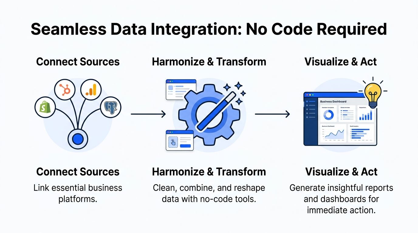
Connecting and Transforming Your Data Without Code
Most founders expect pain, imagining a six-week implementation, a consultant, a warehouse cleanup, and some poor analyst babysitting connectors.
That was the old reality. Modern tooling is much simpler.
Real-time reporting tools now cut decision-making time by 40% to 60%, and by 2026 real-time updates from over 1,000 connectors are expected to be standard. These platforms merge multiple sources, normalize data for accurate KPIs, and embedded reporting in CRMs boosts actionability by 75%, while human error drops by up to 85%, according to ReportDash’s automated reporting overview.
Connect once, stop exporting forever
For most SMBs and startups, the important sources are predictable:
Revenue systems: Shopify, Stripe, invoices, payment tools
Marketing systems: Google Analytics, ad platforms, email tools
CRM and pipeline: HubSpot, Salesforce
Product data: Postgres, event tables, app databases
Work management: Linear, support tools, internal ops systems
The mistake is treating each source as a separate reporting island. You don’t want five mini-truths. You want one place where business questions can cross systems.
A founder question is rarely confined to one tool. “Did lower trial conversion come from weaker lead quality or a broken onboarding step?” requires joined context. CRM plus product plus marketing. That’s the point of integration.
If your team is new to this category, this guide to no code integration for SMBs gives a useful primer on how non-engineering teams can connect systems without a custom build.
Transformation is just cleanup with a plan
“Data transformation” sounds technical. It isn’t magic. It means making raw data usable.
Examples:
Standardizing date formats
Renaming confusing fields
Joining customers across systems
Calculating derived metrics like CAC, LTV, or conversion rate
Filtering junk rows and duplicates
That work matters because raw source data is built for operations, not analysis. Shopify records orders. HubSpot records contacts. Postgres records application events. None of them wake up in the morning thinking about your weekly KPI review.
Materialized views without the headache
Here’s the simplest way to think about materialized views. They’re pre-calculated answers stored so your question loads fast.
If your team asks the same classes of questions repeatedly, you don’t want to recompute everything from scratch every time. You want a prepared layer that says, “Here’s clean revenue by day,” or “Here’s trial conversion by cohort,” ready to query instantly.
That’s one of the behind-the-scenes jobs modern platforms should handle for you.
Build once. Reuse often. Reporting gets fast when the plumbing stops improvising.
For technical readers who still want the traditional route, a deeper SQL-heavy workflow can make sense. That’s where a post like The Guide to SQL Charting can help. For everyone else, the better option is usually to skip the hand-written query layer entirely.
What a sane no-code setup looks like
A practical implementation usually looks like this:
Connect core systems first
Start with the tools tied directly to revenue, acquisition, and retention.Normalize shared entities
Make sure customers, accounts, orders, and dates line up across systems.Define trusted metrics
Lock definitions before the dashboard layer spreads confusion.Enable plain-English access
Let teams ask follow-up questions without rebuilding charts.
One option in this category is Statspresso, a conversational AI data analyst that connects sources like Shopify, HubSpot, Linear, and Postgres so teams can ask plain-English questions and get charts, numbers, and explanations without SQL.
That matters because no-code isn’t just about setup speed. It’s about maintenance. If only one analyst can keep the system alive, you haven’t simplified anything. You’ve hidden complexity under a nicer UI.
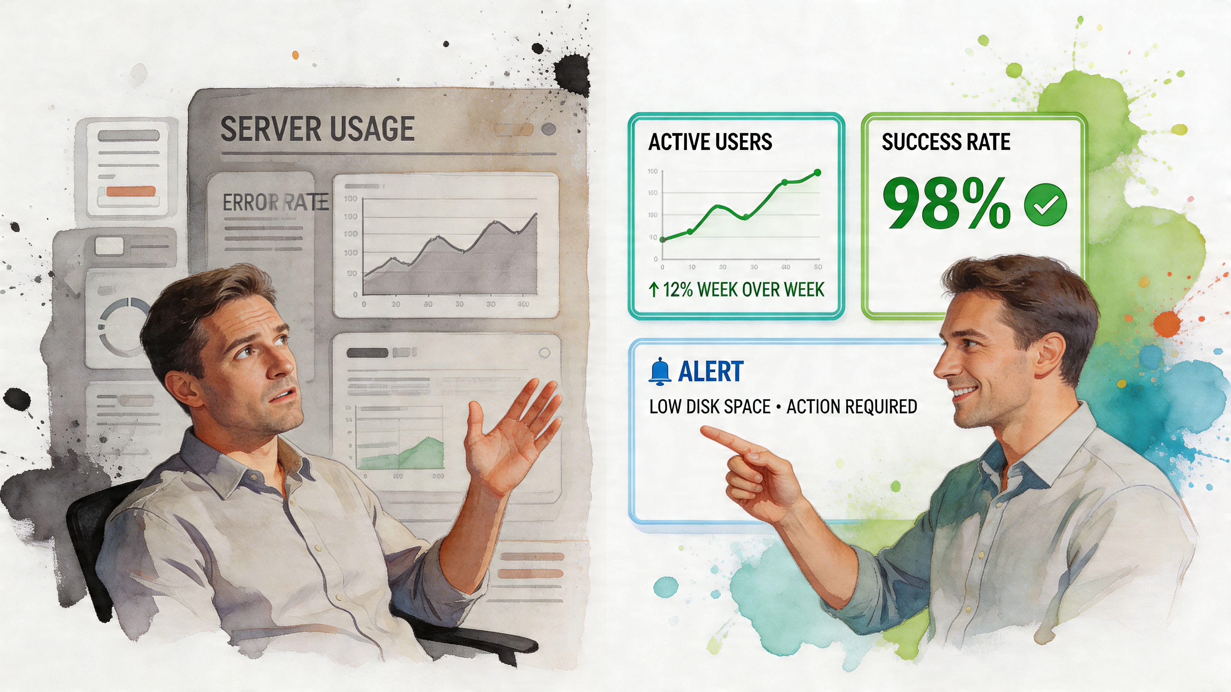
Building Dashboards and Alerts That Work for You
A bloated dashboard is just a quiet graveyard for metrics nobody uses.
I’ve seen teams build beautiful reporting hubs that answer no urgent question. Twenty charts. Eight filters. A rainbow of vanity metrics. Then everyone goes back to Slack and asks the analyst anyway.
The fix is simple. Build fewer dashboards. Make each one earn its keep.
Advanced real-time reporting automation relies on continuous syncs every 1 to 5 minutes and built-in validation to eliminate errors common in 80% of manual processes. Automated systems can deliver 99% accuracy versus 85% for manual, dashboards detect issues like SLA breaches 70% faster, and SMBs can save over 50 reporting hours per month, with a 15% to 20% revenue uplift cited for competitive markets in Oak Hill Financial Services’ automation guide.
Build dashboards for roles, not departments
A founder dashboard should not look like a lifecycle marketer’s dashboard. Same company. Different questions.
Use role-based views:
Founder view: Revenue trend, cash position, pipeline health, churn risk
Marketing view: Spend, ROAS, CAC, conversion by channel
Product view: Activation, retention, feature adoption, cohort behavior
Ops view: Ticket volume, SLA risk, fulfillment exceptions
That keeps dashboards useful. One screen, one job.
Use prompts to create the first version fast
The fastest way to build a dashboard today isn’t drag-and-drop fiddling. It’s asking for the chart you need.
Try prompts like:
“Show weekly trial-to-paid conversion for the last 90 days.”
“Break down support tickets by priority and response time.”
“Compare revenue, refunds, and gross margin by month.”
A good conversational analytics layer turns those into charts you can save, share, and reuse. That’s how you move from reporting backlog to reporting flow.
Alerts are where real-time reporting becomes operational
Dashboards help you see. Alerts help you act.
This is the part many teams skip. They automate visibility but not intervention. Then they still discover problems by accident.
Set alerts for conditions that deserve action:
Spend drift: Ad spend spikes without matching conversions
Churn risk: Renewal cancellations rise above normal
Revenue drops: Orders or pipeline creation fall suddenly
Support stress: SLA breaches or backlog growth
Product breakage: Activation or checkout completion slips
A dashboard tells you what happened. An alert gives you a chance to stop what’s about to happen.
Be selective. If everything alerts, nothing alerts. Pick a handful of triggers tied to money, retention, or customer experience.
Put charts where people already work
Another mistake. Teams expect everyone to log into the analytics tool all day.
They won’t.
Embed live charts into places people already use: Notion, internal wikis, CRM views, recurring email reports, operating docs. Reporting should meet the workflow, not demand a field trip.
A good real-time setup lets the marketing lead review a weekly channel chart inside the planning doc, the PM check activation trends in the team workspace, and leadership skim the same trusted metrics without chasing screenshots.
That’s when analytics starts behaving like infrastructure instead of a special event.
Governance Cost Control and Future-Proofing
Founders get practical, fast. Good. They should.
If your reporting layer creates security headaches, surprise bills, or a new dependency on specialist talent, it’s not mature. It’s just a shinier bottleneck.

Governance is mostly access discipline
Many teams don’t need exotic governance. They need sane permissions.
That means:
Role-based access: Sales shouldn’t see finance internals. Agencies shouldn’t see every client’s data in one flat workspace.
Shared metric definitions: Revenue, churn, pipeline stage, and activation need one accepted meaning.
Controlled sharing: Dashboards and exports should be easy to share, but not accidentally public.
Auditability: Teams should know where a number came from and who can edit the logic behind it.
None of that is glamorous. All of it matters.
Cost control starts with fewer moving parts
Reporting costs balloon when teams stack too many tools. One for ETL. One for dashboards. One for reverse ETL. One for alerting. One for exports. One for embedded analytics. Then someone glues them together with custom scripts.
That architecture looks flexible on a diagram and expensive in real life.
The cheaper long-term path is usually simpler:
Connect only the sources tied to important decisions.
Standardize key metrics early.
Avoid custom work until the business case is obvious.
Prefer tools that reduce analyst babysitting.
You don’t future-proof by buying more components. You future-proof by reducing fragility.
The real gap is adoption, not infrastructure
This is the part the BI world still misses. The hard problem for most SMBs isn’t connector setup. It’s human adoption.
Existing automated reporting tools still underserve non-technical teams. Most SMBs don’t have data engineers to configure and maintain BI systems, and the unmet need is getting real-time answers to ad-hoc questions without learning SQL or waiting for an analyst. Conversational AI addresses that gap by democratizing access to insights for fast-moving teams, as discussed in Whatagraph’s article on automated reporting tools.
That’s the future-proofing angle that matters.
If only two people in the company can get answers from data, your analytics operation is brittle.
A conversational AI data analyst scales data access across the team. Product managers can self-serve. Growth teams can explore without filing tickets. Executives can ask follow-ups in plain English instead of relying on static dashboards built weeks ago.
That doesn’t replace analysts. It frees them to do the work that deserves a human brain: interpretation, modeling, anomaly review, strategic guidance.
Key Takeaways and Your Next Step
TL;DR
Manual reporting is a drag on decision speed. If your team waits on analysts for routine questions, you’re paying an invisible tax every week.
Real-time reporting matters most when tied to action. Fresh data is useful. Fresh data plus alerts and plain-English access is where the value shows up.
Track fewer KPIs. Focus on the handful that change decisions, not every metric your tools can generate.
No-code data connection is enough for most SMB teams. You don’t need a giant BI project to connect Shopify, HubSpot, Google Analytics, and Postgres.
Dashboards should be role-based. Founders, PMs, marketing leads, and ops teams need different views.
Conversational analytics is the pivotal capability. The biggest gap in reporting isn’t chart design. It’s getting ad-hoc answers without SQL or analyst wait time.
Governance and cost control matter early. Keep access clean, metric definitions consistent, and tool sprawl under control.
Here’s the blunt version. The biggest reporting upgrade isn’t moving from weekly spreadsheets to live dashboards. It’s moving from “someone build me a report” to “I can ask my data directly.”
That’s why automate reporting real-time matters now. Not as a BI vanity project. As an operating advantage. Faster questions. Faster answers. Fewer handoffs. Better decisions while there’s still time to do something with them.
If your team is still stuck between static dashboards and analyst queues, don’t add more reporting debt. Connect your core data, define your few critical metrics, and give people a way to explore in plain English.
Connect your first data source in Statspresso for free and ask your first question. That’s the fastest path from scattered dashboards and analyst bottlenecks to a chart you can use today.
You already know the problem. A founder asks for yesterday’s CAC by channel. A PM wants churn broken down by cohort. Marketing needs to know whether today’s spend is working or burning cash. Then everyone waits. Someone opens SQL, exports to CSV, cleans a spreadsheet, updates a dashboard, and sends a screenshot that’s half obsolete by the time it lands in Slack.
That workflow is dead weight. Automate reporting real-time and you stop treating analytics like a ticket queue. Better yet, use a Conversational AI Data Analyst so people can skip the SQL, ask a question in plain English, and get a chart in seconds. If you’re also tightening operations across the stack, this same mindset helps reduce cloud spend with automation, not just reporting chaos.
Introduction
Waiting days for a “quick data pull” is a relic. Your team already has the data. What it lacks is a fast path from raw inputs to trusted answers.
Real-time reporting fixes the delay. Conversational analytics fixes the bottleneck. That’s the fundamental change. Not prettier dashboards. Not more BI licenses. Fewer handoffs, faster decisions, and less dependence on whoever knows SQL.
The End of Waiting for Data
Most reporting stacks fail in one predictable way. They make simple questions expensive.
A marketing lead asks why ROAS dipped. An analyst checks three tools. Finance wants numbers reconciled. Product asks for a segment cut that isn’t on the dashboard. The result is the same every time. Delay, context switching, and decisions made from stale numbers.
That’s why the market moved. The adoption of automated reporting tools has surged since 2015, and businesses in major markets report saving up to 80% of manual reporting time, while the global BI market is projected to exceed $30 billion by 2026, with 65% growth attributed to AI-enhanced tools that connect scattered sources for instant metrics, according to Displayr’s review of automated reporting tools.
Static dashboards solved yesterday’s problem
Classic BI helped teams centralize reporting. Good. Necessary. Still incomplete.
A fixed dashboard works when the question never changes. That’s not how founders, PMs, or growth teams operate. Their questions change mid-week, often mid-meeting. They don’t want to submit a request. They want an answer.
Your business doesn’t slow down so your dashboard can catch up.
Automated BI and Conversational Analytics split from old-school reporting. Automated BI keeps data fresh. Conversational analytics makes it usable by normal humans.
If you want a deeper look at live analytics patterns, Statspresso has a useful post on real-time data analytics.
The old way is a labor tax
Manual reporting is not just annoying. It creates predictable business drag:
Slow reactions: You spot spend problems after the damage is done.
Analyst bottlenecks: Smart people spend time pulling numbers instead of interpreting them.
Version chaos: Someone always has a “final_v7” file floating around.
Low trust: Teams argue about whose metric is right instead of what to do next.
And once reporting touches email workflows, CRM tasks, and campaign follow-up, the mess spreads. If you’re cleaning up adjacent ops too, this practical guide on how to automate tasks with Gmail and HubSpot is worth a look.
Manual reporting vs automated conversational analytics
Task | The Old Way (Manual SQL & BI) | The New Way (Statspresso) |
|---|---|---|
Check today’s performance | Wait for dashboard refresh or ask analyst | Ask a plain-English question and get a live answer |
Combine Shopify, HubSpot, and database data | Export files, join manually, fix field mismatches | Connect sources once and query across them |
Answer an ad-hoc exec question | Rebuild chart or write one-off SQL | Ask follow-up questions in the same workflow |
Share results | Screenshot, PDF, or spreadsheet attachment | Share a live chart or dashboard |
Trust the output | Hope filters and formulas were applied correctly | Use one connected source of truth with repeatable logic |
Stop buying more dashboard debt
Here’s my blunt advice. Don’t start by asking, “Which dashboard should we build first?” Start by asking, “Which decisions are currently blocked by reporting delay?”
If your answer includes budget pacing, churn risk, lead quality, inventory movement, or product adoption, you don’t have a dashboard problem. You have an access problem.
The best reporting setup for a fast-moving team isn’t one with the most charts. It’s the one that gets the right answer to the right person, fast, without an analyst acting as a translator.
Defining Your Real-Time Reporting Needs
A lot of teams overcomplicate this step. They start with tools, connectors, and architecture diagrams. Wrong order.
Start with decisions. If a metric doesn’t change what someone does this week, it doesn’t deserve front-row placement.
Pick fewer KPIs and make them count
To automate real-time reporting well, define 5 to 10 KPIs tied to business goals. Limiting KPIs reduces confusion by 40%, and automated validation helps cut the manual errors that affect 70% of traditional reports. Automation success can reach 80% to 90% with strong governance, though scaling issues can slow systems by 50% under heavy volume, according to PandaDoc’s guide on report automation.
That should push you toward restraint, not dashboard sprawl.
Use a short list like this:
Revenue health: Revenue, gross margin, average order value.
Growth efficiency: CAC, ROAS, pipeline by source.
Retention: Churn, repeat purchase rate, expansion revenue.
Product usage: Activation, weekly active users, feature adoption.
Operations: Ticket backlog, fulfillment lag, cash flow status.
If you track fifty things, nobody knows what matters. If you track seven good things, people act.
Practical rule: If a KPI doesn’t trigger a decision, demote it.
Know whether you need streaming or polling
Non-technical teams get spooked by these terms. They shouldn’t.
Think of streaming like live TV. The signal keeps flowing. Think of polling like checking the news every few minutes. Both can work. The right choice depends on how quickly you need to react.
Use this simple rule of thumb:
Choose streaming when delay is expensive. Fraud signals, checkout failures, bid pacing, support incidents.
Choose polling when fresh-enough is enough. Daily marketing summaries, weekly board views, monthly finance trends.
You don’t need to become a data engineer to decide this. You just need to know the cost of waiting.
Data quality comes before dashboard quality
A fast wrong number is worse than a slow right one.
Before you automate reporting real-time, lock down the boring stuff:
Naming consistency: “Revenue” shouldn’t mean one thing in Stripe and another in your warehouse.
Date logic: Teams break trust with time-zone mistakes more often than they admit.
Source ownership: Someone must own each core metric.
Validation checks: Nulls, duplicate rows, weird spikes, broken joins.
This is why many BI projects feel flaky. Teams obsess over chart polish and ignore metric hygiene.
Questions first, charts second
Your team shouldn’t have to guess which dashboard tab has the answer. Start from the questions people already ask in meetings.
Try prompts like these:
Try asking Statspresso: “Show me revenue by month for the last year as a bar chart.”
Try asking Statspresso: “Which paid channels had the highest CAC this week?”
Try asking Statspresso: “Compare churn for customers acquired in the last two quarters.”
Those prompts do two things. They expose what the business needs, and they reveal whether your reporting model is built for exploration or just display.
If you can’t answer common business questions without opening SQL, your setup isn’t self-serve. It’s analyst-assisted.
Connecting and Transforming Your Data Without Code
Most founders expect pain, imagining a six-week implementation, a consultant, a warehouse cleanup, and some poor analyst babysitting connectors.
That was the old reality. Modern tooling is much simpler.
Real-time reporting tools now cut decision-making time by 40% to 60%, and by 2026 real-time updates from over 1,000 connectors are expected to be standard. These platforms merge multiple sources, normalize data for accurate KPIs, and embedded reporting in CRMs boosts actionability by 75%, while human error drops by up to 85%, according to ReportDash’s automated reporting overview.
Connect once, stop exporting forever
For most SMBs and startups, the important sources are predictable:
Revenue systems: Shopify, Stripe, invoices, payment tools
Marketing systems: Google Analytics, ad platforms, email tools
CRM and pipeline: HubSpot, Salesforce
Product data: Postgres, event tables, app databases
Work management: Linear, support tools, internal ops systems
The mistake is treating each source as a separate reporting island. You don’t want five mini-truths. You want one place where business questions can cross systems.
A founder question is rarely confined to one tool. “Did lower trial conversion come from weaker lead quality or a broken onboarding step?” requires joined context. CRM plus product plus marketing. That’s the point of integration.
If your team is new to this category, this guide to no code integration for SMBs gives a useful primer on how non-engineering teams can connect systems without a custom build.
Transformation is just cleanup with a plan
“Data transformation” sounds technical. It isn’t magic. It means making raw data usable.
Examples:
Standardizing date formats
Renaming confusing fields
Joining customers across systems
Calculating derived metrics like CAC, LTV, or conversion rate
Filtering junk rows and duplicates
That work matters because raw source data is built for operations, not analysis. Shopify records orders. HubSpot records contacts. Postgres records application events. None of them wake up in the morning thinking about your weekly KPI review.
Materialized views without the headache
Here’s the simplest way to think about materialized views. They’re pre-calculated answers stored so your question loads fast.
If your team asks the same classes of questions repeatedly, you don’t want to recompute everything from scratch every time. You want a prepared layer that says, “Here’s clean revenue by day,” or “Here’s trial conversion by cohort,” ready to query instantly.
That’s one of the behind-the-scenes jobs modern platforms should handle for you.
Build once. Reuse often. Reporting gets fast when the plumbing stops improvising.
For technical readers who still want the traditional route, a deeper SQL-heavy workflow can make sense. That’s where a post like The Guide to SQL Charting can help. For everyone else, the better option is usually to skip the hand-written query layer entirely.
What a sane no-code setup looks like
A practical implementation usually looks like this:
Connect core systems first
Start with the tools tied directly to revenue, acquisition, and retention.Normalize shared entities
Make sure customers, accounts, orders, and dates line up across systems.Define trusted metrics
Lock definitions before the dashboard layer spreads confusion.Enable plain-English access
Let teams ask follow-up questions without rebuilding charts.
One option in this category is Statspresso, a conversational AI data analyst that connects sources like Shopify, HubSpot, Linear, and Postgres so teams can ask plain-English questions and get charts, numbers, and explanations without SQL.
That matters because no-code isn’t just about setup speed. It’s about maintenance. If only one analyst can keep the system alive, you haven’t simplified anything. You’ve hidden complexity under a nicer UI.
Building Dashboards and Alerts That Work for You
A bloated dashboard is just a quiet graveyard for metrics nobody uses.
I’ve seen teams build beautiful reporting hubs that answer no urgent question. Twenty charts. Eight filters. A rainbow of vanity metrics. Then everyone goes back to Slack and asks the analyst anyway.
The fix is simple. Build fewer dashboards. Make each one earn its keep.
Advanced real-time reporting automation relies on continuous syncs every 1 to 5 minutes and built-in validation to eliminate errors common in 80% of manual processes. Automated systems can deliver 99% accuracy versus 85% for manual, dashboards detect issues like SLA breaches 70% faster, and SMBs can save over 50 reporting hours per month, with a 15% to 20% revenue uplift cited for competitive markets in Oak Hill Financial Services’ automation guide.
Build dashboards for roles, not departments
A founder dashboard should not look like a lifecycle marketer’s dashboard. Same company. Different questions.
Use role-based views:
Founder view: Revenue trend, cash position, pipeline health, churn risk
Marketing view: Spend, ROAS, CAC, conversion by channel
Product view: Activation, retention, feature adoption, cohort behavior
Ops view: Ticket volume, SLA risk, fulfillment exceptions
That keeps dashboards useful. One screen, one job.
Use prompts to create the first version fast
The fastest way to build a dashboard today isn’t drag-and-drop fiddling. It’s asking for the chart you need.
Try prompts like:
“Show weekly trial-to-paid conversion for the last 90 days.”
“Break down support tickets by priority and response time.”
“Compare revenue, refunds, and gross margin by month.”
A good conversational analytics layer turns those into charts you can save, share, and reuse. That’s how you move from reporting backlog to reporting flow.
Alerts are where real-time reporting becomes operational
Dashboards help you see. Alerts help you act.
This is the part many teams skip. They automate visibility but not intervention. Then they still discover problems by accident.
Set alerts for conditions that deserve action:
Spend drift: Ad spend spikes without matching conversions
Churn risk: Renewal cancellations rise above normal
Revenue drops: Orders or pipeline creation fall suddenly
Support stress: SLA breaches or backlog growth
Product breakage: Activation or checkout completion slips
A dashboard tells you what happened. An alert gives you a chance to stop what’s about to happen.
Be selective. If everything alerts, nothing alerts. Pick a handful of triggers tied to money, retention, or customer experience.
Put charts where people already work
Another mistake. Teams expect everyone to log into the analytics tool all day.
They won’t.
Embed live charts into places people already use: Notion, internal wikis, CRM views, recurring email reports, operating docs. Reporting should meet the workflow, not demand a field trip.
A good real-time setup lets the marketing lead review a weekly channel chart inside the planning doc, the PM check activation trends in the team workspace, and leadership skim the same trusted metrics without chasing screenshots.
That’s when analytics starts behaving like infrastructure instead of a special event.
Governance Cost Control and Future-Proofing
Founders get practical, fast. Good. They should.
If your reporting layer creates security headaches, surprise bills, or a new dependency on specialist talent, it’s not mature. It’s just a shinier bottleneck.
Governance is mostly access discipline
Many teams don’t need exotic governance. They need sane permissions.
That means:
Role-based access: Sales shouldn’t see finance internals. Agencies shouldn’t see every client’s data in one flat workspace.
Shared metric definitions: Revenue, churn, pipeline stage, and activation need one accepted meaning.
Controlled sharing: Dashboards and exports should be easy to share, but not accidentally public.
Auditability: Teams should know where a number came from and who can edit the logic behind it.
None of that is glamorous. All of it matters.
Cost control starts with fewer moving parts
Reporting costs balloon when teams stack too many tools. One for ETL. One for dashboards. One for reverse ETL. One for alerting. One for exports. One for embedded analytics. Then someone glues them together with custom scripts.
That architecture looks flexible on a diagram and expensive in real life.
The cheaper long-term path is usually simpler:
Connect only the sources tied to important decisions.
Standardize key metrics early.
Avoid custom work until the business case is obvious.
Prefer tools that reduce analyst babysitting.
You don’t future-proof by buying more components. You future-proof by reducing fragility.
The real gap is adoption, not infrastructure
This is the part the BI world still misses. The hard problem for most SMBs isn’t connector setup. It’s human adoption.
Existing automated reporting tools still underserve non-technical teams. Most SMBs don’t have data engineers to configure and maintain BI systems, and the unmet need is getting real-time answers to ad-hoc questions without learning SQL or waiting for an analyst. Conversational AI addresses that gap by democratizing access to insights for fast-moving teams, as discussed in Whatagraph’s article on automated reporting tools.
That’s the future-proofing angle that matters.
If only two people in the company can get answers from data, your analytics operation is brittle.
A conversational AI data analyst scales data access across the team. Product managers can self-serve. Growth teams can explore without filing tickets. Executives can ask follow-ups in plain English instead of relying on static dashboards built weeks ago.
That doesn’t replace analysts. It frees them to do the work that deserves a human brain: interpretation, modeling, anomaly review, strategic guidance.
Key Takeaways and Your Next Step
TL;DR
Manual reporting is a drag on decision speed. If your team waits on analysts for routine questions, you’re paying an invisible tax every week.
Real-time reporting matters most when tied to action. Fresh data is useful. Fresh data plus alerts and plain-English access is where the value shows up.
Track fewer KPIs. Focus on the handful that change decisions, not every metric your tools can generate.
No-code data connection is enough for most SMB teams. You don’t need a giant BI project to connect Shopify, HubSpot, Google Analytics, and Postgres.
Dashboards should be role-based. Founders, PMs, marketing leads, and ops teams need different views.
Conversational analytics is the pivotal capability. The biggest gap in reporting isn’t chart design. It’s getting ad-hoc answers without SQL or analyst wait time.
Governance and cost control matter early. Keep access clean, metric definitions consistent, and tool sprawl under control.
Here’s the blunt version. The biggest reporting upgrade isn’t moving from weekly spreadsheets to live dashboards. It’s moving from “someone build me a report” to “I can ask my data directly.”
That’s why automate reporting real-time matters now. Not as a BI vanity project. As an operating advantage. Faster questions. Faster answers. Fewer handoffs. Better decisions while there’s still time to do something with them.
If your team is still stuck between static dashboards and analyst queues, don’t add more reporting debt. Connect your core data, define your few critical metrics, and give people a way to explore in plain English.
Connect your first data source in Statspresso for free and ask your first question. That’s the fastest path from scattered dashboards and analyst bottlenecks to a chart you can use today.