Reporting From Different Platforms (2026)

Your weekly reporting ritual probably looks like this. Shopify in one tab. HubSpot in another. Platform dashboards everywhere. A spreadsheet open for “just a quick merge” that turns into an hour of cleanup. You wanted an answer. You got a scavenger hunt.
That’s why reporting from different platforms keeps breaking teams. The problem usually isn’t lack of data. It’s that every system describes performance differently, updates on its own schedule, and tells only part of the story. Waiting weeks for an analyst to build a dashboard is a relic of the past. What busy teams need now is a clean way to unify data, define trusted metrics, and get answers fast without babysitting exports.
Your Data Is Everywhere and Your Answers Are Nowhere
Monday morning is where bad reporting habits become visible.
Marketing wants to know whether last week’s push influenced sales. Product wants to know whether signups from that campaign activated. Finance wants one number for performance, not five numbers with footnotes and excuses. Instead, the team opens platform dashboards, copies screenshots, pastes CSVs into a sheet, and argues about which number is “right.”

This is common, not a niche headache. 33% of marketers say assessing campaign effectiveness is their biggest challenge, even though many already track engagement and conversions, according to Improvado’s social media reporting analysis. The same analysis describes a digital marketing agency managing 30+ client accounts that spent 20–30 hours per week manually compiling reports across platforms, with copy-paste mistakes and broken exports dragging accuracy down.
Manual reporting fails in predictable ways
I’ve seen the same mistakes repeat across startups, agencies, and in-house teams:
Too many tabs: Each platform answers a narrow question, but nobody sees the whole customer path.
Too much copying: The minute someone exports data into a spreadsheet, the clock starts ticking on freshness and accuracy.
Too many definitions: “Conversion,” “engagement,” and even “user” can mean different things depending on the tool.
Practical rule: If your reporting process depends on one person remembering which filters they used last month, you don’t have a reporting system. You have a fragile ritual.
The painful part is that teams often try to solve this with more dashboards. That usually creates dashboard sprawl, not clarity. A static dashboard can show a result, but it rarely helps a founder ask the next question without calling the analyst back into the room.
Faster answers matter more than prettier dashboards
A useful reporting setup does three things well:
Pulls data from the systems your team already uses
Defines a small set of trusted metrics
Lets people ask follow-up questions without opening another tool
That’s why more teams are leaning on automation before they add more manual process. If you’re looking at the broader category of workflow cleanup, this guide to AI workflow automation tools is useful because it frames the issue correctly. The bottleneck usually isn’t effort. It’s repeated human handoffs.
And that’s where a Conversational AI Data Analyst starts to matter. The point isn’t novelty. The point is speed and clarity. Skip the SQL. Just ask your data a question and get a chart in seconds.
Try asking Statspresso: “Show revenue by campaign source for the last 30 days.”
Stop Counting Everything Start Measuring What Matters
The fastest way to ruin cross-platform reporting is to track everything.
Teams do this because it feels responsible. More charts. More scorecards. More tabs. More screenshots. In practice, it just creates a dashboard nobody opens and a meeting nobody enjoys. The right move is almost always subtraction.
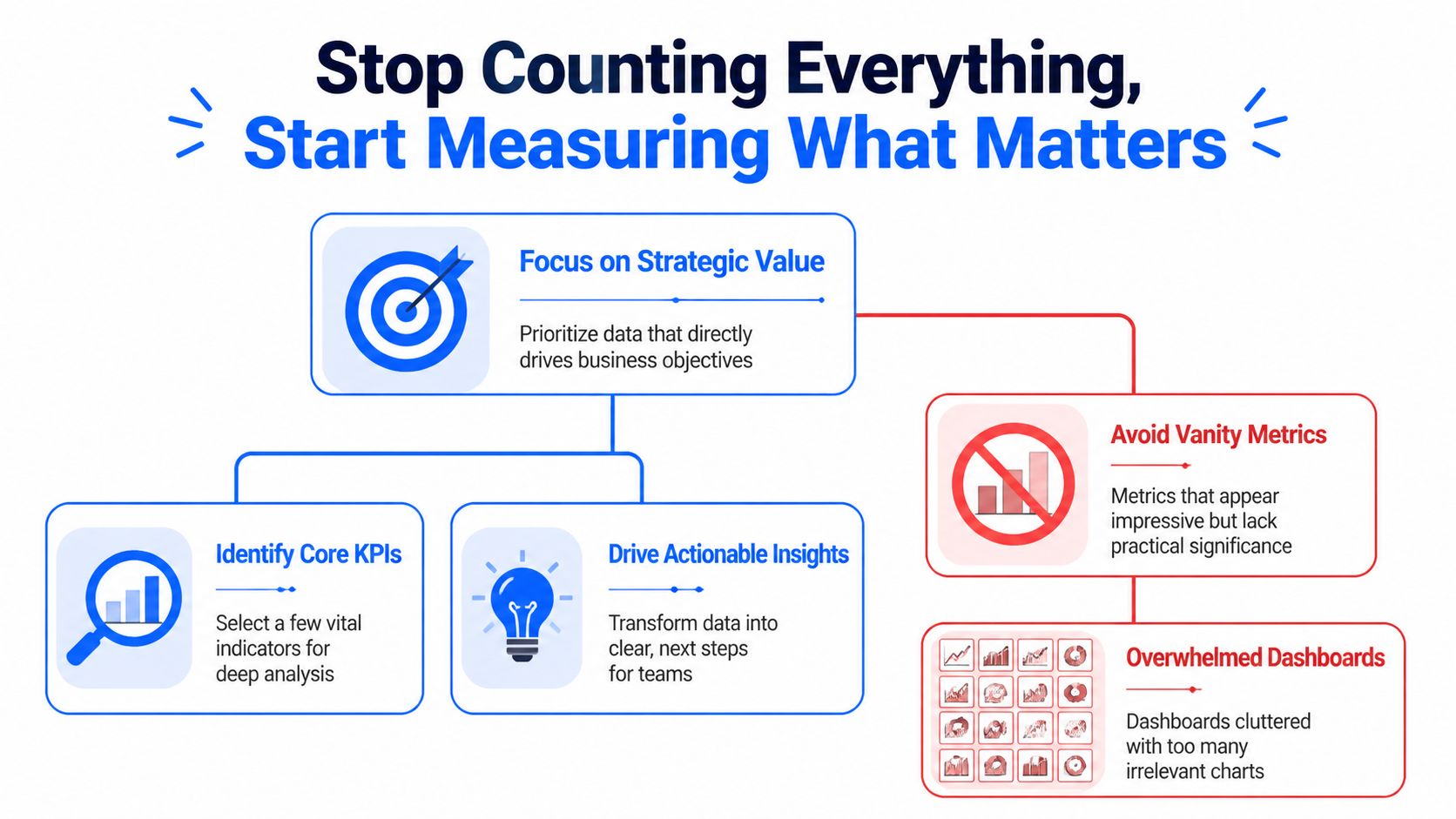
The evidence here is blunt. Dashboards with 20+ charts see near-zero opens, while teams that narrow focus to a few core metrics with drill-downs have seen adoption jump from 18% to 71% in weeks, according to GroupBWT’s data analytics write-up. Their advice is the right one: use the 80/20 rule, and focus on the 20% of metrics that drive 80% of decisions.
Pick metrics by decision, not by availability
Founders and team leads usually ask, “What should we track?” The better question is, “What decision will this number change?”
If the metric won’t change budget, product priority, staffing, or campaign direction, it probably belongs in the background. Not on the front page.
A cleaner way to choose KPIs:
For executives: Pick the handful of metrics that reflect business health. Revenue, retention, pipeline quality, or another metric tied closely to outcomes.
For marketing: Track metrics that connect effort to results, not just activity to applause.
For product: Focus on usage, activation, and behavior tied to expansion or churn risk.
For support or community teams: Use role-specific measures, not generic engagement counts. If community-led support is part of your funnel, this breakdown of Mava metrics for community-driven support is a solid example of choosing metrics based on operational purpose rather than vanity.
The best KPI list is short enough to remember
If your team needs the dashboard to remember what matters, you’ve already lost the plot.
A strong cross-platform reporting setup usually starts with 3 to 5 core metrics per role. That constraint forces clarity. It also makes adoption far more likely because people can tell, at a glance, whether the business is healthy or drifting.
Here’s a simple filter I use with teams:
Question | Keep it on the main dashboard | Push it to drill-down |
|---|---|---|
Does this metric drive an immediate decision? | Yes | No |
Does every stakeholder need it weekly? | Yes | No |
Is it a diagnostic detail rather than a core outcome? | No | Yes |
Will this number start an action, not just a discussion? | Yes | Maybe |
Bad reporting asks teams to inspect everything. Good reporting tells them where to look first.
Vanity metrics are seductive because they’re easy
Every platform offers metrics that look important because they’re visible. Likes. Impressions. Reach. Follower movement. Open rates. Session counts. Those can be useful, but only in context.
A founder doesn’t need twenty indicators blinking at once. A founder needs to know whether the company is moving in the right direction and which lever deserves attention. That’s a very different job.
Try asking Statspresso: “Which five metrics changed most this month for marketing performance?”
Or ask: “Show the top drivers behind trial-to-paid conversion last quarter.”
That’s the shift. Stop collecting numbers because platforms hand them to you. Start measuring the few that help your team act.
Connecting and Normalizing Your Data Without SQL
Many reporting projects often cease at this point.
Someone says, “We just need to connect the tools.” Then they discover that Shopify, HubSpot, and Postgres don’t describe the same customer the same way. The exports don’t line up. The timestamps don’t align. And one system thinks a contact is an email address while another thinks it’s an account record. Welcome to the glamorous world of data integration.
Connecting data is not the same as understanding it
A connector gets data into one place. Useful. Necessary. Not sufficient.
The harder problem is normalization. That means making different systems speak a shared business language. A customer in Shopify, a contact in HubSpot, and a user record in Postgres might all represent the same human, but the software won’t magically agree unless someone defines the relationship.
Manual workflows become absurd fast. A team starts with CSV exports and spreadsheet joins. Then someone adds naming conventions. Then someone else creates a lookup table. A month later, nobody trusts the outputs and the most important file is named “final_v7_actual_final.”
Platform context changes metric meaning
Normalization is not just ID matching. It’s meaning matching.
That matters because performance behaves differently across platforms. In news consumption, 47% of Facebook users regularly get news on the platform, while 55% of Twitter users do, according to Pew Research Center’s analysis of social media news use. So a “like” on a news-heavy Twitter account is not equivalent to a “like” on a broader Facebook page. Same label, different context.
That same problem shows up in business reporting all the time. A lead from one platform may arrive with strong buying intent. A lead from another may be cheaper but weaker. If you only unify field names and ignore platform behavior, your report will be clean, consistent, and wrong.
Field matching is plumbing. Metric normalization is judgment.
Two paths to integration
Here’s the practical comparison.
Task | The Old Way (Manual) | The New Way (Statspresso) |
|---|---|---|
Pull data from Shopify, HubSpot, and Postgres | Export CSVs from each system and merge manually | Connect sources directly and query them together |
Match customer records | Build ad hoc joins using email, IDs, or spreadsheet lookups | Define relationships in plain English or use inferred mappings |
Standardize metric names | Rename columns by hand in sheets or BI models | Save consistent business definitions once |
Handle platform differences | Add notes in slides and hope people read them | Keep metric logic visible with shared definitions |
Answer follow-up questions | Ask an analyst to rewrite SQL or rebuild the chart | Ask a plain-English question and get a chart quickly |
Keep reports fresh | Re-export and refresh manually | Use live or scheduled refreshes |
What works in practice
When teams unify reporting from different platforms without drowning in BI complexity, they usually follow a pattern:
Start with business entities: Define customer, order, lead, account, or user before you worry about charts.
Map systems to those entities: Decide which fields identify the same person or company across tools.
Set one business vocabulary: Choose one approved meaning for terms like conversion, active user, revenue, and attribution source.
Build top-level views first: Main dashboard first. Diagnostics second.
Keep human review in the loop: Automation helps. Blind trust doesn’t.
A Conversational AI Data Analyst is useful here because it removes a lot of the technical friction. People can ask for the relationship they want in plain language instead of opening SQL editors and reverse-engineering schemas.
Try asking Statspresso: “Join Shopify customers with HubSpot contacts and show repeat purchase rate by original campaign.”
You’re not avoiding rigor. You’re avoiding unnecessary drudgery.
Validating Metrics and Automating Trust
A reporting project usually stops feeling fun the first time Stripe says one thing, HubSpot says another, and GA4 adds a third number just to be annoying.
That moment matters. It tells you whether you’re building a real reporting system or just stacking screenshots from different tools.

The fix is not chasing perfect parity across every platform. That wastes time and usually ends in arguments about whose dashboard is “right.” The fix is to choose a reporting authority for each metric, document the logic, and make that version easy to inspect. That is how multi-platform chaos becomes a source of truth instead of a weekly debate.
Pick the system you trust for each decision
Different systems are good at different jobs. Treating them as equal sources for every metric is how teams end up overstating performance.
For planning, board updates, and cash decisions, trust the system closest to the transaction. That is usually the billing platform, payment processor, or internal product database. Use ad platforms and web analytics for optimization questions, not final business reporting.
A practical trust order looks like this:
Billing system or internal database: Revenue, paid customers, orders, renewals
CRM: Qualified pipeline, deal stage history, owner-level sales activity
Marketing platforms: Campaign spend, clicks, impressions, ad-level performance
Web analytics: Session patterns, landing-page behavior, referral paths
That hierarchy saves a lot of pain. It also gives conversational AI a clean set of rules to work from. If someone asks for monthly revenue by campaign, the system should already know where revenue comes from and where campaign metadata comes from. No guessing. No hidden spreadsheet logic.
Validate the metric before you automate the chart
Teams get into trouble when they automate fast and define late.
A useful metric definition answers a few boring but necessary questions:
What exactly counts as a customer?
Which event makes revenue official?
Which date field drives weekly and monthly reporting?
How do returns, refunds, and failed payments affect the number?
Which source wins when attribution fields conflict?
Write those rules down once. Save them where the team can see them. Then reuse them everywhere.
I have seen this part skipped more times than I can count. The result is always the same. Marketing presents one conversion rate, finance presents another, and the founder spends half the meeting trying to figure out whether the business changed or the math changed. Usually it was the math.
If the team wants faster reporting without repeating that mess, build the validation step into the workflow. A good setup for automated reporting workflows should store approved metric logic, show the source inputs, and keep refreshes tied to those definitions.
Trust comes from visible logic
People do not trust dashboards because the colors look polished. They trust them when they can trace a number back to its source and understand why it differs from another platform.
That means every key metric needs three things:
A named owner who approves the definition
A clear calculation that others can inspect
A refresh cadence people can rely on
Once those pieces are in place, automation starts helping instead of making bad numbers arrive faster.
Use scheduled refreshes for the repetitive work. Keep human review for exceptions, new metrics, and odd jumps that need context. Late-arriving transactions, broken UTMs, duplicate contacts, and timezone issues still happen. Good teams automate the plumbing and keep judgment where it belongs.
Try asking Statspresso: “Show the approved definition of monthly revenue, list its source tables, and chart the last 12 weeks.”
That is the shift. You are not just pulling reports from different platforms. You are creating a system where the answers are consistent, explainable, and available on demand.
From Static Dashboards to Active Conversations
Most dashboards die the same death. Somebody builds them. Everybody praises them. A week later, nobody uses them unless a meeting requires a screenshot.
Static reporting has one core flaw. It ends the interaction too early. It tells people what happened, but it doesn’t help them ask why.

Real reporting starts after the first chart
Say your team sees a dip in conversion after a campaign launch. In a traditional BI setup, the next steps are annoying:
Export the chart
Message the analyst
Wait for a breakout by region, plan, or source
Revisit the topic three days later when everyone has already moved on
That delay kills momentum. Busy teams don’t need a prettier dashboard. They need a faster path from observation to explanation.
That’s why a conversational layer matters so much. A team member should be able to click into the result and ask follow-ups in plain English:
Why did this metric drop?
Break it down by acquisition channel.
Compare new customers versus returning customers.
Show only users on the new pricing plan.
Teams act on questions, not on generic metrics
This problem isn’t unique to marketers. Research from the Reuters Institute notes that most journalists were too busy with their daily assignments to think extensively or abstractly about which metrics complemented their goals, in its Trends and Predictions 2026 report. That’s true across departments. Product managers, founders, and growth leads all have the same issue. They don’t need more metrics in the abstract. They need answers to the question in front of them.
A reporting tool becomes useful when it helps a team move from “What happened?” to “What should we do next?”
That’s also why role-specific reporting beats one giant company dashboard. Marketing needs campaign context. Product needs usage context. Leadership needs business outcomes. One view can support all three, but not if it tries to answer every question at once.
Shared insight beats emailed PDFs
The best reporting cultures don’t stop at self-serve charts. They create a habit of publishing insights, not just dashboards.
One person notices that a content theme pulls in stronger customers. Another sees that trial users from one channel activate faster. Those findings should be easy to save, annotate, and share with the rest of the team. Otherwise the insight stays trapped in one person’s browser history.
If your team is still sending monthly PDF decks around, it’s worth rethinking the whole habit. A better model is living, collaborative reporting. This practical guide on how to automate reports gets at the right operational shift. Reporting should reduce lag between question and action, not create more admin.
Try asking Statspresso: “Why did conversion rate fall last week? Break it down by campaign source and landing page.”
That’s what modern reporting from different platforms should feel like. Less like filing paperwork. More like having a conversation with the business while it’s still moving.
Get Unified Reporting Right The First Time
Most broken reporting systems aren’t broken because the team lacks effort. They’re broken because the process was built backwards. Too many metrics. Too many exports. Too little agreement on definitions. Then everyone wonders why the dashboard looks impressive and answers nothing.
The fix is more practical than dramatic.
TL DR
Cut the KPI list hard: Keep the main view focused on the few metrics that drive decisions.
Connect systems directly: Stop moving data by hand when connectors can do the boring work.
Normalize meaning, not just field names: A matched ID isn’t enough if the platforms measure behavior differently.
Define trusted metrics once: Save the logic for business-critical numbers and make those definitions visible.
Automate refreshes: Manual updates create stale reports and fresh mistakes.
Make reporting interactive: Teams need to ask follow-up questions, not stare at a frozen chart.
The old way is still hanging around because people are used to it, not because it works. The smarter approach is to build one source of truth, keep the metric layer clean, and let people query the business in plain English.
A Conversational AI Data Analyst makes that jump a lot easier. Skip the SQL. Just ask your data a question and get a chart in seconds.
If you’re done wrestling spreadsheets and want reporting from different platforms to work, try Statspresso. Connect your first data source, ask a plain-English question, and see what your team’s been missing without waiting on SQL, dashboard rebuilds, or another “final_v2” spreadsheet.
Your weekly reporting ritual probably looks like this. Shopify in one tab. HubSpot in another. Platform dashboards everywhere. A spreadsheet open for “just a quick merge” that turns into an hour of cleanup. You wanted an answer. You got a scavenger hunt.
That’s why reporting from different platforms keeps breaking teams. The problem usually isn’t lack of data. It’s that every system describes performance differently, updates on its own schedule, and tells only part of the story. Waiting weeks for an analyst to build a dashboard is a relic of the past. What busy teams need now is a clean way to unify data, define trusted metrics, and get answers fast without babysitting exports.
Your Data Is Everywhere and Your Answers Are Nowhere
Monday morning is where bad reporting habits become visible.
Marketing wants to know whether last week’s push influenced sales. Product wants to know whether signups from that campaign activated. Finance wants one number for performance, not five numbers with footnotes and excuses. Instead, the team opens platform dashboards, copies screenshots, pastes CSVs into a sheet, and argues about which number is “right.”
This is common, not a niche headache. 33% of marketers say assessing campaign effectiveness is their biggest challenge, even though many already track engagement and conversions, according to Improvado’s social media reporting analysis. The same analysis describes a digital marketing agency managing 30+ client accounts that spent 20–30 hours per week manually compiling reports across platforms, with copy-paste mistakes and broken exports dragging accuracy down.
Manual reporting fails in predictable ways
I’ve seen the same mistakes repeat across startups, agencies, and in-house teams:
Too many tabs: Each platform answers a narrow question, but nobody sees the whole customer path.
Too much copying: The minute someone exports data into a spreadsheet, the clock starts ticking on freshness and accuracy.
Too many definitions: “Conversion,” “engagement,” and even “user” can mean different things depending on the tool.
Practical rule: If your reporting process depends on one person remembering which filters they used last month, you don’t have a reporting system. You have a fragile ritual.
The painful part is that teams often try to solve this with more dashboards. That usually creates dashboard sprawl, not clarity. A static dashboard can show a result, but it rarely helps a founder ask the next question without calling the analyst back into the room.
Faster answers matter more than prettier dashboards
A useful reporting setup does three things well:
Pulls data from the systems your team already uses
Defines a small set of trusted metrics
Lets people ask follow-up questions without opening another tool
That’s why more teams are leaning on automation before they add more manual process. If you’re looking at the broader category of workflow cleanup, this guide to AI workflow automation tools is useful because it frames the issue correctly. The bottleneck usually isn’t effort. It’s repeated human handoffs.
And that’s where a Conversational AI Data Analyst starts to matter. The point isn’t novelty. The point is speed and clarity. Skip the SQL. Just ask your data a question and get a chart in seconds.
Try asking Statspresso: “Show revenue by campaign source for the last 30 days.”
Stop Counting Everything Start Measuring What Matters
The fastest way to ruin cross-platform reporting is to track everything.
Teams do this because it feels responsible. More charts. More scorecards. More tabs. More screenshots. In practice, it just creates a dashboard nobody opens and a meeting nobody enjoys. The right move is almost always subtraction.
The evidence here is blunt. Dashboards with 20+ charts see near-zero opens, while teams that narrow focus to a few core metrics with drill-downs have seen adoption jump from 18% to 71% in weeks, according to GroupBWT’s data analytics write-up. Their advice is the right one: use the 80/20 rule, and focus on the 20% of metrics that drive 80% of decisions.
Pick metrics by decision, not by availability
Founders and team leads usually ask, “What should we track?” The better question is, “What decision will this number change?”
If the metric won’t change budget, product priority, staffing, or campaign direction, it probably belongs in the background. Not on the front page.
A cleaner way to choose KPIs:
For executives: Pick the handful of metrics that reflect business health. Revenue, retention, pipeline quality, or another metric tied closely to outcomes.
For marketing: Track metrics that connect effort to results, not just activity to applause.
For product: Focus on usage, activation, and behavior tied to expansion or churn risk.
For support or community teams: Use role-specific measures, not generic engagement counts. If community-led support is part of your funnel, this breakdown of Mava metrics for community-driven support is a solid example of choosing metrics based on operational purpose rather than vanity.
The best KPI list is short enough to remember
If your team needs the dashboard to remember what matters, you’ve already lost the plot.
A strong cross-platform reporting setup usually starts with 3 to 5 core metrics per role. That constraint forces clarity. It also makes adoption far more likely because people can tell, at a glance, whether the business is healthy or drifting.
Here’s a simple filter I use with teams:
Question | Keep it on the main dashboard | Push it to drill-down |
|---|---|---|
Does this metric drive an immediate decision? | Yes | No |
Does every stakeholder need it weekly? | Yes | No |
Is it a diagnostic detail rather than a core outcome? | No | Yes |
Will this number start an action, not just a discussion? | Yes | Maybe |
Bad reporting asks teams to inspect everything. Good reporting tells them where to look first.
Vanity metrics are seductive because they’re easy
Every platform offers metrics that look important because they’re visible. Likes. Impressions. Reach. Follower movement. Open rates. Session counts. Those can be useful, but only in context.
A founder doesn’t need twenty indicators blinking at once. A founder needs to know whether the company is moving in the right direction and which lever deserves attention. That’s a very different job.
Try asking Statspresso: “Which five metrics changed most this month for marketing performance?”
Or ask: “Show the top drivers behind trial-to-paid conversion last quarter.”
That’s the shift. Stop collecting numbers because platforms hand them to you. Start measuring the few that help your team act.
Connecting and Normalizing Your Data Without SQL
Many reporting projects often cease at this point.
Someone says, “We just need to connect the tools.” Then they discover that Shopify, HubSpot, and Postgres don’t describe the same customer the same way. The exports don’t line up. The timestamps don’t align. And one system thinks a contact is an email address while another thinks it’s an account record. Welcome to the glamorous world of data integration.
Connecting data is not the same as understanding it
A connector gets data into one place. Useful. Necessary. Not sufficient.
The harder problem is normalization. That means making different systems speak a shared business language. A customer in Shopify, a contact in HubSpot, and a user record in Postgres might all represent the same human, but the software won’t magically agree unless someone defines the relationship.
Manual workflows become absurd fast. A team starts with CSV exports and spreadsheet joins. Then someone adds naming conventions. Then someone else creates a lookup table. A month later, nobody trusts the outputs and the most important file is named “final_v7_actual_final.”
Platform context changes metric meaning
Normalization is not just ID matching. It’s meaning matching.
That matters because performance behaves differently across platforms. In news consumption, 47% of Facebook users regularly get news on the platform, while 55% of Twitter users do, according to Pew Research Center’s analysis of social media news use. So a “like” on a news-heavy Twitter account is not equivalent to a “like” on a broader Facebook page. Same label, different context.
That same problem shows up in business reporting all the time. A lead from one platform may arrive with strong buying intent. A lead from another may be cheaper but weaker. If you only unify field names and ignore platform behavior, your report will be clean, consistent, and wrong.
Field matching is plumbing. Metric normalization is judgment.
Two paths to integration
Here’s the practical comparison.
Task | The Old Way (Manual) | The New Way (Statspresso) |
|---|---|---|
Pull data from Shopify, HubSpot, and Postgres | Export CSVs from each system and merge manually | Connect sources directly and query them together |
Match customer records | Build ad hoc joins using email, IDs, or spreadsheet lookups | Define relationships in plain English or use inferred mappings |
Standardize metric names | Rename columns by hand in sheets or BI models | Save consistent business definitions once |
Handle platform differences | Add notes in slides and hope people read them | Keep metric logic visible with shared definitions |
Answer follow-up questions | Ask an analyst to rewrite SQL or rebuild the chart | Ask a plain-English question and get a chart quickly |
Keep reports fresh | Re-export and refresh manually | Use live or scheduled refreshes |
What works in practice
When teams unify reporting from different platforms without drowning in BI complexity, they usually follow a pattern:
Start with business entities: Define customer, order, lead, account, or user before you worry about charts.
Map systems to those entities: Decide which fields identify the same person or company across tools.
Set one business vocabulary: Choose one approved meaning for terms like conversion, active user, revenue, and attribution source.
Build top-level views first: Main dashboard first. Diagnostics second.
Keep human review in the loop: Automation helps. Blind trust doesn’t.
A Conversational AI Data Analyst is useful here because it removes a lot of the technical friction. People can ask for the relationship they want in plain language instead of opening SQL editors and reverse-engineering schemas.
Try asking Statspresso: “Join Shopify customers with HubSpot contacts and show repeat purchase rate by original campaign.”
You’re not avoiding rigor. You’re avoiding unnecessary drudgery.
Validating Metrics and Automating Trust
A reporting project usually stops feeling fun the first time Stripe says one thing, HubSpot says another, and GA4 adds a third number just to be annoying.
That moment matters. It tells you whether you’re building a real reporting system or just stacking screenshots from different tools.
The fix is not chasing perfect parity across every platform. That wastes time and usually ends in arguments about whose dashboard is “right.” The fix is to choose a reporting authority for each metric, document the logic, and make that version easy to inspect. That is how multi-platform chaos becomes a source of truth instead of a weekly debate.
Pick the system you trust for each decision
Different systems are good at different jobs. Treating them as equal sources for every metric is how teams end up overstating performance.
For planning, board updates, and cash decisions, trust the system closest to the transaction. That is usually the billing platform, payment processor, or internal product database. Use ad platforms and web analytics for optimization questions, not final business reporting.
A practical trust order looks like this:
Billing system or internal database: Revenue, paid customers, orders, renewals
CRM: Qualified pipeline, deal stage history, owner-level sales activity
Marketing platforms: Campaign spend, clicks, impressions, ad-level performance
Web analytics: Session patterns, landing-page behavior, referral paths
That hierarchy saves a lot of pain. It also gives conversational AI a clean set of rules to work from. If someone asks for monthly revenue by campaign, the system should already know where revenue comes from and where campaign metadata comes from. No guessing. No hidden spreadsheet logic.
Validate the metric before you automate the chart
Teams get into trouble when they automate fast and define late.
A useful metric definition answers a few boring but necessary questions:
What exactly counts as a customer?
Which event makes revenue official?
Which date field drives weekly and monthly reporting?
How do returns, refunds, and failed payments affect the number?
Which source wins when attribution fields conflict?
Write those rules down once. Save them where the team can see them. Then reuse them everywhere.
I have seen this part skipped more times than I can count. The result is always the same. Marketing presents one conversion rate, finance presents another, and the founder spends half the meeting trying to figure out whether the business changed or the math changed. Usually it was the math.
If the team wants faster reporting without repeating that mess, build the validation step into the workflow. A good setup for automated reporting workflows should store approved metric logic, show the source inputs, and keep refreshes tied to those definitions.
Trust comes from visible logic
People do not trust dashboards because the colors look polished. They trust them when they can trace a number back to its source and understand why it differs from another platform.
That means every key metric needs three things:
A named owner who approves the definition
A clear calculation that others can inspect
A refresh cadence people can rely on
Once those pieces are in place, automation starts helping instead of making bad numbers arrive faster.
Use scheduled refreshes for the repetitive work. Keep human review for exceptions, new metrics, and odd jumps that need context. Late-arriving transactions, broken UTMs, duplicate contacts, and timezone issues still happen. Good teams automate the plumbing and keep judgment where it belongs.
Try asking Statspresso: “Show the approved definition of monthly revenue, list its source tables, and chart the last 12 weeks.”
That is the shift. You are not just pulling reports from different platforms. You are creating a system where the answers are consistent, explainable, and available on demand.
From Static Dashboards to Active Conversations
Most dashboards die the same death. Somebody builds them. Everybody praises them. A week later, nobody uses them unless a meeting requires a screenshot.
Static reporting has one core flaw. It ends the interaction too early. It tells people what happened, but it doesn’t help them ask why.
Real reporting starts after the first chart
Say your team sees a dip in conversion after a campaign launch. In a traditional BI setup, the next steps are annoying:
Export the chart
Message the analyst
Wait for a breakout by region, plan, or source
Revisit the topic three days later when everyone has already moved on
That delay kills momentum. Busy teams don’t need a prettier dashboard. They need a faster path from observation to explanation.
That’s why a conversational layer matters so much. A team member should be able to click into the result and ask follow-ups in plain English:
Why did this metric drop?
Break it down by acquisition channel.
Compare new customers versus returning customers.
Show only users on the new pricing plan.
Teams act on questions, not on generic metrics
This problem isn’t unique to marketers. Research from the Reuters Institute notes that most journalists were too busy with their daily assignments to think extensively or abstractly about which metrics complemented their goals, in its Trends and Predictions 2026 report. That’s true across departments. Product managers, founders, and growth leads all have the same issue. They don’t need more metrics in the abstract. They need answers to the question in front of them.
A reporting tool becomes useful when it helps a team move from “What happened?” to “What should we do next?”
That’s also why role-specific reporting beats one giant company dashboard. Marketing needs campaign context. Product needs usage context. Leadership needs business outcomes. One view can support all three, but not if it tries to answer every question at once.
Shared insight beats emailed PDFs
The best reporting cultures don’t stop at self-serve charts. They create a habit of publishing insights, not just dashboards.
One person notices that a content theme pulls in stronger customers. Another sees that trial users from one channel activate faster. Those findings should be easy to save, annotate, and share with the rest of the team. Otherwise the insight stays trapped in one person’s browser history.
If your team is still sending monthly PDF decks around, it’s worth rethinking the whole habit. A better model is living, collaborative reporting. This practical guide on how to automate reports gets at the right operational shift. Reporting should reduce lag between question and action, not create more admin.
Try asking Statspresso: “Why did conversion rate fall last week? Break it down by campaign source and landing page.”
That’s what modern reporting from different platforms should feel like. Less like filing paperwork. More like having a conversation with the business while it’s still moving.
Get Unified Reporting Right The First Time
Most broken reporting systems aren’t broken because the team lacks effort. They’re broken because the process was built backwards. Too many metrics. Too many exports. Too little agreement on definitions. Then everyone wonders why the dashboard looks impressive and answers nothing.
The fix is more practical than dramatic.
TL DR
Cut the KPI list hard: Keep the main view focused on the few metrics that drive decisions.
Connect systems directly: Stop moving data by hand when connectors can do the boring work.
Normalize meaning, not just field names: A matched ID isn’t enough if the platforms measure behavior differently.
Define trusted metrics once: Save the logic for business-critical numbers and make those definitions visible.
Automate refreshes: Manual updates create stale reports and fresh mistakes.
Make reporting interactive: Teams need to ask follow-up questions, not stare at a frozen chart.
The old way is still hanging around because people are used to it, not because it works. The smarter approach is to build one source of truth, keep the metric layer clean, and let people query the business in plain English.
A Conversational AI Data Analyst makes that jump a lot easier. Skip the SQL. Just ask your data a question and get a chart in seconds.
If you’re done wrestling spreadsheets and want reporting from different platforms to work, try Statspresso. Connect your first data source, ask a plain-English question, and see what your team’s been missing without waiting on SQL, dashboard rebuilds, or another “final_v2” spreadsheet.